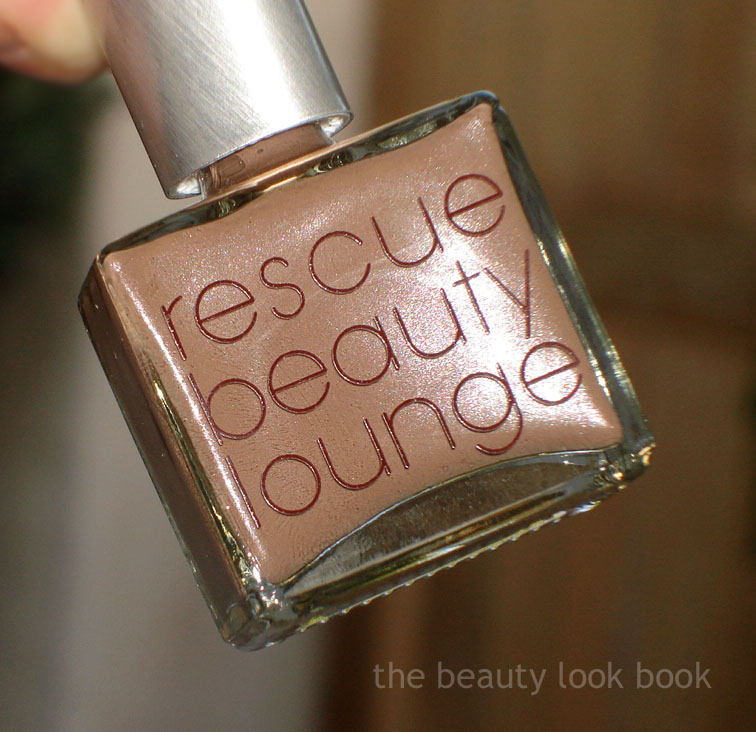
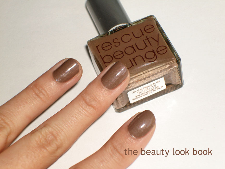
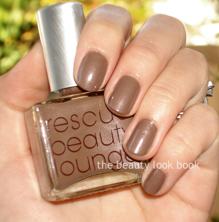
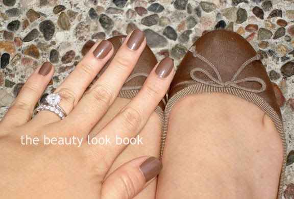
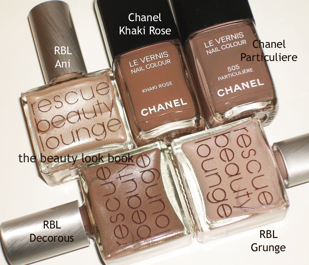
Here is RBL’s Decorous. Two coats to achieve a creamy cocoa brown with a slight sheen. I loved it on Gaia of The Non-Blonde, Temptalia and KarlaSugar. On me, not so much. I think it’s better as a toe color for me. Much like Butter London’s All Hail McQueen – pretty in the bottle, not so flattering for me with my olive tones. Comparisons below. I found it unique in my collection and couldn’t find any dupes – but I don’t have many browns for nail polish colors. I like that it matches my J.Crew flats in Coconut Shell though 🙂
I’m a neutral lover at heart but brights are nice to wear in sheer washes mixed in with neutrals. For coordinating brights I don’t there are any rules you need to stick to. Just experiment with different combinations of colors to see what you’re most comfortable with. I mainly pick out colors depending on the occasion or what clothes I’m wearing for the day (one example here with a yellow top, bright coral cheek, coppery bronze eye and nude gold lip). I usually go for something that is as natural as possible and here are a few things I go by:
Brighten the face by applying bronzer first then layer a soft wash of bright pink or coral or peach on top
Mixing pinks and peach blushes together can add depth and dimension
Can you match your lip color to your blush? Sure! For example using different variations of pink can create a pretty coordinated look
You don’t have to match lips and cheeks, having a bright coral cheek with a sheer bright or soft pink lip can work well too
If something is too bright, you can sheer it out with a soft blending brush or by adding a paler shimmer color on top
A few ideas – use these for color ideas rather than the specific name of the brand or product.
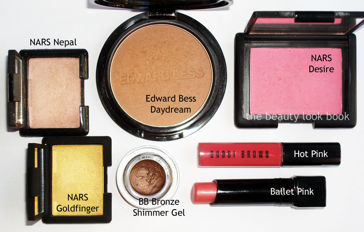
* Tip – At a national artist event for NARS, the artist blended Goldfinger with Nepal together and it created the most beautiful soft rose gold shadow. When using bronzer and a bright blush, I usually apply bronzer first, but most artists at events apply bronzer as the final touch.
* Tip – For the eyes, layering colors can be done by applying the lightest shade first, then the cream, and finally the bronzey powder on top. For MAC Fleur Power Blush, I find it so universally flattering it will go with either a bright lip and a pale lip, or the bright and pale mixed together for a softer peachy glow.
* Tip – Mix pinks and peaches by layering them on top of each other on the cheeks. Depending on your mood or preference, you can adjust the color by applying one color more heavily than the other.
* Tip – Coral blushes can be coordinated with either bright pinks or bright peaches for lips since many have both pink and peach mixed in.
You may notice there are no nail polishes featured in any of these looks. I think bright nails can be mixed and matched in almost any combination to work with a variety of looks. I hope you found this mini series helpful. Summer collections are about to trickle in soon – so I’m sure there will plenty of inspiration for all of you in the upcoming months!
If you have any tips or want to share how you wear brighter colors, feel free in the comments! Makeup events with a good artist can be incredibly useful for tips, tricks and ideas on how to incorporate new things with well-used loves 🙂
Bright blushes are a definitely must-have for me, although I usually layer two colors for more depth and dimension. Most of the time I will layer a soft wash of bright over a bronzer. For eyes I don’t really wear brights. The brightest shades I have are golds or pinky-peachy shimmers. I’ll feature a few non-neutrals, but for bright eye colors I’m a bit lacking.
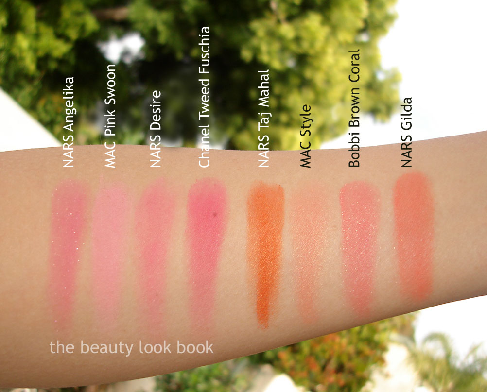
Bright pink blushes (L to R)*: NARS Angelika, MAC Pink Swoon, NARS Desire, Chanel Tweed Fuschia
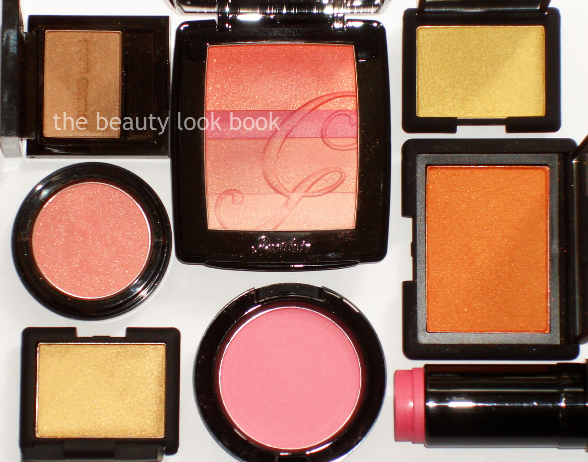
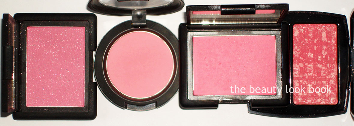
Bright peaches (also see my peach obsession here): NARS Taj Mahal, MAC Style , Bobbi Brown Coral Shimmer Blush, NARS Gilda
Bright corals (clockwise from left): NARS Cactus Flower Cream Blush, Guerlain Série Noire Blush G, Bobbi Brown Pink Coral Shimmer Wash, MAC Fleur Power
Brighter eye colors for me (not necessarily bright for everyone): NARS Goldfinger, NARS Étrusque, MAC Pink Bronze Pigment* (note the picture has been corrected, it’s Pink Bronze, not Pink Gold), Edward Bess Escape (which isn’t bright but I put it in just for a color reference)
The next and final part of this series will include a few tips and look ideas of how I incorporate brights with neutrals.
* Those who follow me on Twitter know that I no longer have my NARS Angelika Multiple since my Jack Russell pup Lucy ate it. Thanks to all who have asked about her! She is fine and dandy just like the vet assured me over the phone. In fact she is acting like it was any other puppy treat. The picture above at the very top was taken pre-puppy-consumption.
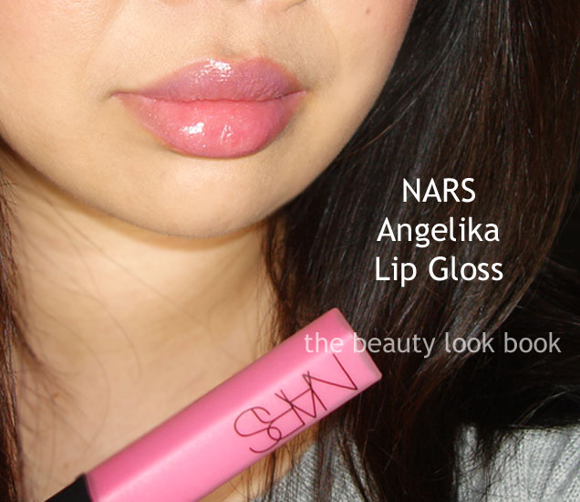
For lips, I like to wear sheer see-through colors for brights. What I like (left to right from above): NARS Velvet Gloss Lip Pencil in New Lover, Dior Addict in Model 564, NARS Angelika Lip Gloss, Chanel Nakkar Glossimer, Chanel Pink Pulsion Glossimer (see it here) Paul & Joe Lip Lacquer in 08 Bouquet, Bobbi Brown Hot Pink Lip Gloss, Edward Bess Island Rose Compact Rouge.
Swatched on arm, same order, in direct sunlight:
One more view, with flash:
I haven’t done lip-swatches of all the colors yet, but here are the ones I do have:
NARS New Lover (also here), this is a unique shade that looks different on everyone. It looks so different on my hand compared to my lips. See it on Cafe Makeup on Liz who is fairer and slightly cooler toned (here) while this is what it looks like on me below:
Nars Angelika Lip Gloss:
Paul & Joe Lip Lacquer 08 (looks brighter in real life, flash washed out color a bit, all my Paul & Joe Lip Lacquers here they are among my favorite lip glosses, I have almost every color):
Edward Bess Island Rose Compact Rouge (also here and swatched for Karlasugar here):
I apologize if all the links have you clicking in too many places. I’ve just referenced them in case you wanted to see more detailed reviews or comparison from past reviews. Have a happy Friday!
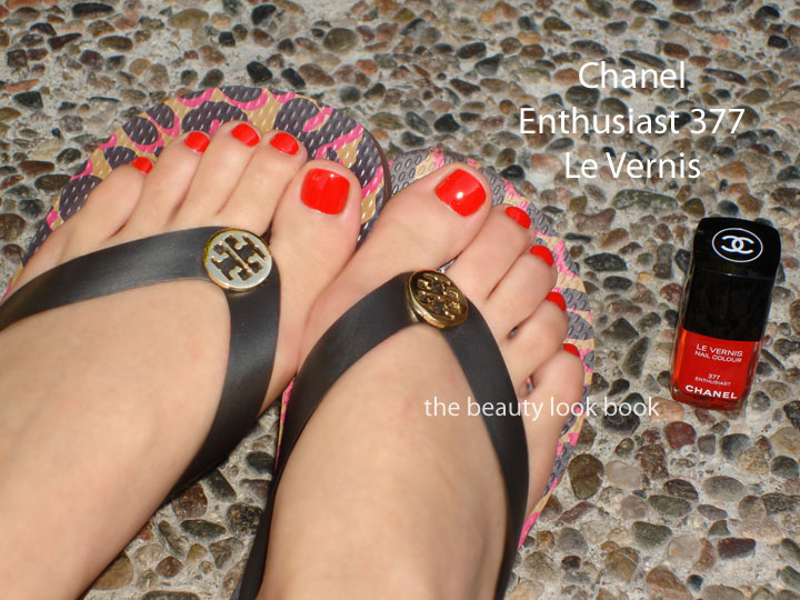
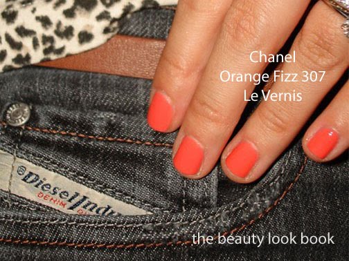
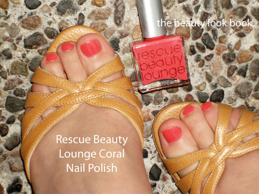
I’m known for loving neutrals. Bright colors are usually not my thing unless its on the fingers, toes or blush {I love bright blushes}. I’m doing a three-part series for the brights that I love and adore {for Debra who requested a summer brights feature}. Part 1 features bright nails in orange, pink and red. It’s too early to be thinking about summer but brights on nails can be pulled off in any season.
I’ve linked previous reviews and features. There are a few I’ve republished below along with a few new mani-pedi pictures.
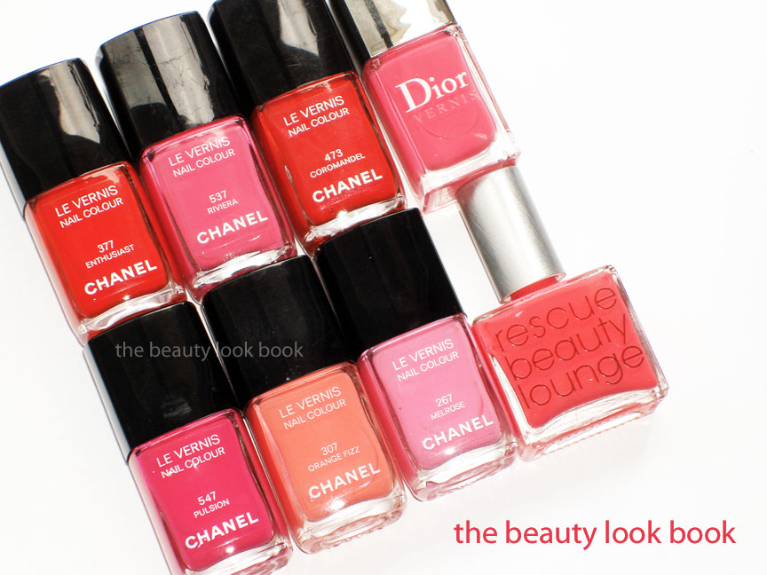
Chanel Riviera – reviewed compared and dupe attempts here and here
I believe you can still find all the shades currently except for Chanel Enthusiast, Riviera and Melrose. Riviera is very close to Chanel’s Rose Insolent and Dior’s Cabaret Pink though. Are you wearing bright colors right now?
Edward Bess has a beautifully edited, sophisticated and classic beauty line. I first discovered his products while flipping through a Bergdorf Goodman catalog and was instantly intrigued by the sleek black lipstick tubes all lined up in a row. I googled it but to my dismay, found it was only available in NYC. I could not see the items in person. Thanks to LeslieCZ, Alexa, Leanne, Blogdorf Goodman, Fab Over Forty among other Edward Bess fans, I was able to get the scoop. Several gave me wonderful recommendations and urged me to contact the Edward Bess counter Bergdorf Goodman. I’m so glad I did. I’ve never met a more helpful team of artists. On each and every occasion that I’ve called them, they have given helpful descriptions and recommendations over the phone as they listened to me describe my tastes/likes/dislikes. They put me completely at ease ordering items sight-unseen.
The items from Edward Bess are classics and naturally flattering. They are reliable staples in my beauty wardrobe and versatile to create a number of different looks.
Many of you have asked for my own recommendations of what I like from Edward Bess. I thought I’d put together a resource page of what I’ve tried that has been reviewed since I can imagine what a hassle it must be to search through over 600 posts =) I’ve loved almost everything I’ve tried (with the exception of the original mascara). I hope this helps!
Where to buy & info
Bergdorf Goodman, Neiman Marcus Beverly Hills, EdwardBess.com (prices, full collection and other locations on his website)
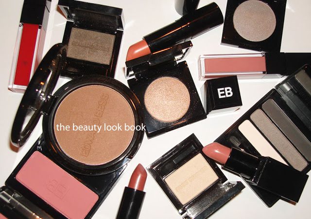
The Beauty Look Book’s Top Five Favorites from Edward Bess
(only because so many have asked)
Daydream Bronzer (my holy grail)
Pure Impulse Lipstick
Forever Yours Lipstick
Dusk Eyeshadow
Soft Smoke Eyeshadow Trio
Island Rose Compact Rouge (oops, six!)
* Tip – Yes, the price points are high, but Bergdorf Goodman occasionally puts together beauty events and gift-card events, many times with nice gift-with-purchases. Their GWPs are usually one full-sized item (they pick out the item) and occasionally they have a step-up gift. I think their next one is in April.
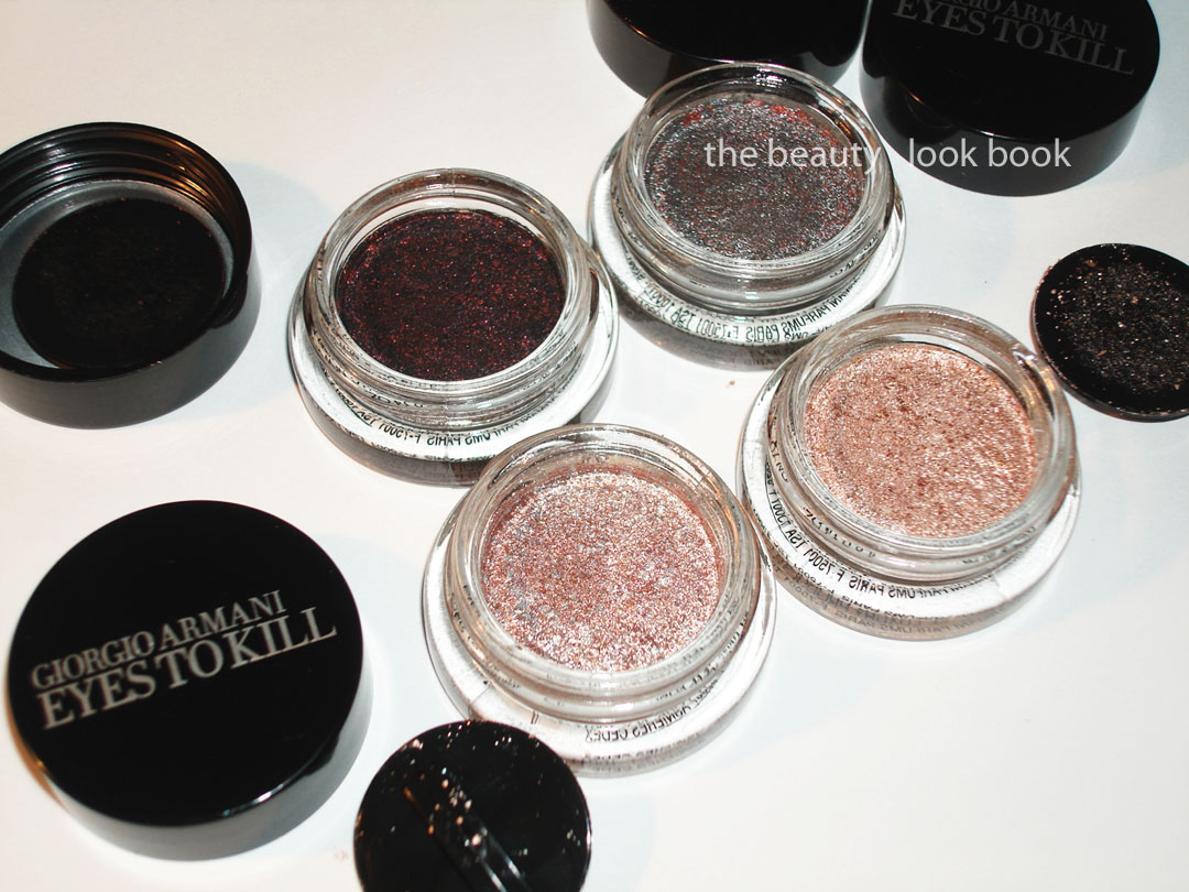
My picks from the new Armani Eyes to Kill Intense release: #2 Red Lust, #4 Pulp Fiction, #8 Champagne and #9 Rock Sand ($32 each). Armani has extended their color selection for the Eyes To Kill shadows from Holiday 2010 (#13 and #15 here). These are a hybrid powder-cream type of shadow with a lightweight almost sponge-like texture. They are highly metallic and richly pigmented with a long-lasting finish. To me these are high-performance eyeshadows – they deliver much more than the average shadow.
(click for large viewing of the beautiful multi-colored speckles)
Descriptions then thoughts: Each shade has a complex mixture of metallics. The resemble beautiful speckled eggs. #2 Red Lust is a blackened plum with red flecks, #4 Pulp Fiction is a highly metallic blueish grey with red and silver flecks, #8 Champagne is a silvery pink with flecks of metallic pink and silver, #9 Rock Sand is a champagne-peachy color with darker peach flecks and silver/gold sparkles.
I played with these over the past few days layering them on top of each other (two shades at the most, first the lighter shade then darker shade on top). Overall I’m extremely impressed with the lasting power. In terms of the colors, I prefer the darker ones for the eyes. The lighter shades are super metallic and frosty – a bit too much for my taste. I did mix a non-shimmer flesh shade (Bobbi Brown Shore) with a paler Armani ETK (#8) by mixing them together on the fingers which helped to minimize the frost. They are lovely colors and office appropriate – just not quite as finely milled as Chanel’s Ombrees de Perles from Spring {love and reviewed here}.
Close ups, swatches and one comparison set:
Close ups of 2, 8 and 9 (both 8 and 9 are similar, 8 is more pink while 9 is more peach):
New picks + last holiday’s shades arm-swatched with finger:
Comparisons of the silvery and lighter colors below. Bobbi Brown Galaxy is warmer and sheerer compared to #2 Pulp Fiction. For the lighter shades I recommend clicking below for larger viewing. MAC Vintage Selection is more pinkish/mauve, MAC Bare Study almost looks like a white gold compared to #8/#9, MUFE Aqua #13 is even more metallic and pigmented but lacks the complex multi-color sparkles the Armani have which makes it more of a silvery-champagne finish.
Are these must-haves? I think I am happier with the shades from Holiday mainly because I found them more wearable but there are quite a few lovely shades from this new collection. The shimmer/metallic/frost factor isn’t a deal-breaker (like Bobbi Brown Metallic Creams were for me) – I just think those iffy on high-metallic finish shadows should definitely try these on the eyes first (not just on the hand) before deciding whether or not to buy. The upside of these is that they are super long lasting. I had no fading or smudging on the days I’ve tried mine. I can’t report on the crease-factor as I have no crease in my lids.


