Browsing Category

Uncategorized

Uncategorized

Bond No. 9 Cooper Square

July 20, 2011

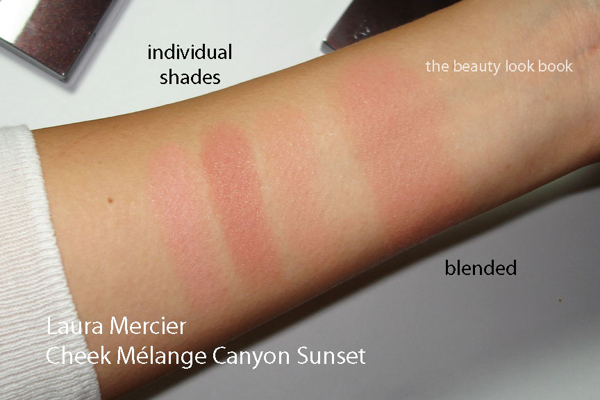
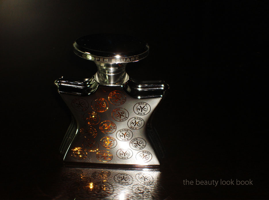
Bond No. 9 Cooper Square Eau de Parfum made its debut a year ago inspired by “that up-and-coming hotspot, Cooper Square, where the East Village meets NoHo, and the Bowery and the new über-Downtown begin.” I believe this was designed as a unisex scent, but to me this is predominantly masculine and extremely complex. My husband fell in love with this the minute he smelled the sample from a Saks catalog describing it as “incredible”. The notes include cognac, juniper berry, lavender, myrrh, oblibanum, patchouli, cashmere wood, musk, vetiver, ciste labdanum and timberwood. This comes in three different sizes (check pricing and sizes here on BondNo9.com) in a lovely silver bottle with a Bond No.9 print in a see-through metallic coppery-gold type of finish.

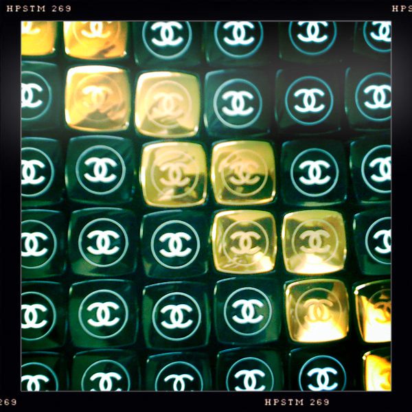
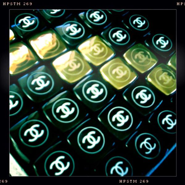
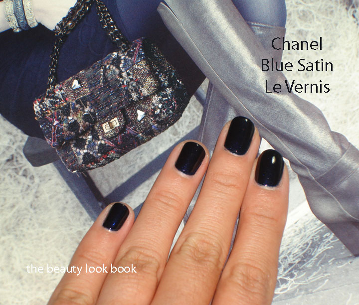
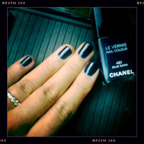
I have to admit this isn’t really a review from me, but more of a mini photography project. I could not resist playing with my photo apps using the beautiful reflective silver bottle as my test subject. I’m still new to the different lenses, filters and lighting options – this was the perfect opportunity to play. These apps can make even a shopping cart look good. (Just google hipstamatic images and you’ll be amazed.)
I’m horrible at describing complex scents, but if I were to describe this, I would say it’s spicy, earthy, rich and completely seductive. If this were a movie, it would be the equivalent of Meet Joe Black. I asked my husband for his thoughts (since it is his cologne).

Me, “describe Cooper Square for me … please.”
His response, “I don’t know, it smells good and I just spray it on.”

L-O-L. We’ve known each other for nearly a decade and ever since our first date, he’s shown an amazing ability to find amazing scents … for him of course. It doesn’t matter what he wears, it just always works. In this sense, we’re opposites since I find it rare that a fragrance smells good on me. When it comes to describing fragrances, I guess we’re the same: we just know it when we smell it. 

Some instagram and hipstamatic fun:

There are a couple Bond No.9 fragrances I’ve tried from samples that I liked. Given the fact that I’m super fickle with scents, I’ve never splurged on a bottle for myself. I can’t help but admire the displays at Saks everytime I go though. Visiting the individual stores is high on my list of things to do when I eventually find the time to go to NY 🙂
What are your favorite Bond No.9 scents? Do you like them? Or do you find them too strong?

All photos taken by me. Kindly do not republish, thanks! For inquiring minds, all photos are still taken with my trusty Sony (see it here) and the vintage photos were taken with my iPhone 3G.
Uncategorized

Le Métier de Beauté True Romance Nail Lacquer (Nordstrom Anniversary Exclusive)

July 18, 2011

I couldn’t resist the oh-so-cute mini nail lacquer set called Rock ‘n’ Romance by Le Métier de Beauté. At $25 for four gorgeous shades, how can anyone pass this up? Every color in this set looks amazing on everyone I’ve seen it on. There’s not a bad shade in the bunch. I tried True Romance first. It’s a beautiful complex shade, described on Nordstrom as “a delicate pale rose with a subtle metallic nude finish.” The color changes depending on how the light reflects on your hands. Sometimes it looks like a rosy-bronze. Other times it looks like a soft metallic rose-nude. At certain angles you see a soft silver cashmere taupe.

Le Métier True Romance is in a similar color family to Chanel Trapeze and Quartz. I would say the Le Métier is more metallic/frosty while the Chanels have a multi-colored sparkle making the colors even more complex. They are all just a tiny bit different in undertone. Here are the shades compared to each other. As you can see, the colors transform depending on the light.

Overall LOVE. The tiny bottle is to die for (so cute) although the size does make it a bit hard to apply. I have small fingers to begin with and still found it a bit challenging to hold the top while applying. It can be a bit streaky because of the metallic finish, but I still love it. The color is not too warm and not too cool. It’s a perfect metallic neutral. I haven’t bought a Le Metier nail polish in over two years (see my original post on Lenton Rose, Phlox, Violaceous Splendor and Black Orchid linked here from 2009). I simply found them too small for the price. The Nordstrom set  however is priced just right in my opinion with to-die-for colors that will be perfect as we transition to fall.
Uncategorized

Just a random photo for the day

July 17, 2011

Just a random photo for the day.

My latest discovery (a bit late): iPhone photo apps that give a vintage feel by applying different filters to your photos. The two I’ve been playing with non-stop are Hipstamatic and Instagram. What’s the difference? This website here explains the differences well. Hipstamatic requires you to pick your film/lighting/lense before taking the photo. Instagram allows you to pick filters after you’ve already taken photos. I’ve put a few photos up using these filters in recent posts just for fun. If you want to know the settings used, I’ll include them in future posts. The OCD part of me tried to get a shot that had all the lipsticks perfectly lined up and straight on all sides. After several attempts I gave up trying to get this perfect. It’s un-edited (except for sizing). The fun part is the learning though, right?

Hope you’re having a wonderful Sunday!


Uncategorized

YSL Volupté Sheer Candy in Lush Coconut 01

July 17, 2011
YSL Volupté Sheer Candy ($30) is one of the newest lipstick/lipbalm formulas from YSL. It comes in 6 different shades (all shades seen and reviewed on Karla Sugar and Best Things in Beauty) and is designed to give a sheer but hydrating tint of color to the lips. I saw these at Sephora about a month ago, had a gift card burning a hole in my wallet and decided to give the light beige-gold, Lush Coconut 01, a try.

Lush Coconut is a pale beige gold shimmer in the tube. On the hands and lips, it’s so sheer, nothing shows up. Just shine. I know these are meant to be sheer, but I was rather disappointed with the finish. For $30, I could have achieved the same effect (hydration and shine) with something much more cost-friendly. The darker and brighter shades do give a tint, but from what I saw/tested, you can also find cheaper drugstore chapsticks that will do the same trick for a much better deal. The formula isn’t long-wearing. It has a somewhat slippery texture and feels like it will slide right off the lips within 2 minutes (even though it does not). Are there any pros? They do have a delicious mango-candy scent, however I wasn’t really keen on the taste from it sliding off my lips within minutes. The packaging is the most beautiful out of all the Rouge Voluptés with the silver tube (instead of the gold). These deliver a high shine which is nice, but it’s not enough to win me over.

Here it is compared to Chanel Rouge Coco Shine in Canotier and YSL’s Rouge Volupté Perle in Beige Caress. I prefer Chanel’s even though the swatch looks sheer, on the lips there is a better finish with the Chanel.

Bottom line: Save your money unless you like super sheer and pretty packaging. Normally I like sheer, but I found this one just too-sheer to feel worth the price. Perhaps you will have better luck with the reds in this collection. Still, I think you can find better for cheaper in other brands. MAC Lustres are just one type of sheer lipstick that comes to mind. I did swatch Lush Coconut on my lips for this review, but it looks clear so I decided not to publish the lip-swatch photo. * Update* Per request, I’ve uploaded a lip swatch.

Some might wonder if these might work as a finishing gloss over a lip pencil. Perhaps it would work. I personally would not try it, especially in the summer time. Given the slip of this lipstick, I think that applying these over lipliner would not extend the longevity of the wear. I would be worried that it would make even long-lasting lipliners bleed.
Uncategorized

Chanel Blue Satin Le Vernis

July 15, 2011
Chanel Blue Satin 461 was originally launched in Spring 2008 (see details on Temptalia here) as a permanent shade. Per Cafe Makeup’s keen eye, it looks it might be making a comeback as seen on the runway at the Fall-Winter 2011-12 Couture Collection at the Grand Palais in Paris, France. It’s a dark navy blue with an iridescent glow in the bottle. On the nails, the shimmer disappears (unless in direct sunlight) and you see a dark glossy deep rich navy. Since it’s mid-summer, I was initially a bit weary of wearing this right now. Thanks to the help of a few tweets from fellow bloggers, I was assured that Blue Satin is one of those shades that is good for any time of year. They were right!

The newly released Neiman Marcus catalog has a feature on Chanel. Blue Satin complements the dark blue tones of the clothing and accessories. If you don’t receive the catalog in the mail, they usually have extras in-store. I highly recommend that you try to pick one up. The photography is phenomenal and absolutely beautiful!

Two coats, with flash and artificial light, you can see the shimmer a bit:

In direct sun

This is what Blue Satin looks like most of the time, without the direct sun, a deep dark navy:

Overall love. However, this color isn’t the most unique and I think it should be easily dupeble. If you want shimmer, then this is not the navy for you. I haven’t checked out the Dior Blue Tie, but from pictures it appears to be more visibly shimmery than Chanel Blue Satin. Rescue Beauty Lounge’s Under The Stars is slightly more shimmery. See the comparison here. The formula, however, even after having this for several years is still excellent. It has a thin texture but the coverage is rich and very smooth.

One more just for fun even if it’s blurry:
Uncategorized

Wearing Today: Chanel

July 14, 2011
Today all of my makeup was from one single brand: from skincare, to foundation to mascara. All Chanel with something old and something new. There are few brands I can do this with. Few as in 3. I rarely wear all of one brand at one time and have only been able to do this with Armani, Becca and Chanel. I realize this would be more useful shown on my face, but I’m still camera shy. I hope this will help some for coordination ideas.

  • Eyes: Mystic Eyes Quad layered with Illusoire Illusion d’Ombre (also here) and Sublime Mascara (Asia/Europe exclusive)
  • Cheeks: Rose Ecrin blush (also reviewed here)
  • Lips: Tulip Lip Definer, Boy Rouge Coco Shine, Liaison Glossimer (also here)
  • Nails: Blue Satin (compared here and here, individual feature to come soon)
  • Skincare prep: Ultra Lift Sculpting Firming Concentrate (initial thoughts here)
  • Foundation & powder: Vitalumiere Aqua B30 and Powder Foundation Tender Bisque

Everything was easy to apply with a few swipes. The colors are virtually goof proof. For the eyes, I tried using Illusoire as a base under the powder Mystic Eyes Quad, however brushing the shadow on top of the gel made the purple disappear. After applying the silver 1/2 way up the lid, I re-applied the Illusoire purple Illusion d’Ombre on top of the powder, blended, added the bronze on outer corners and then applied the darkest quad shade wet as a liner. The result was pretty! After testing, I think I prefer the Illusoire Illusion d’Ombre by itself, only with a liner and mascara. That way the sparkle stays put and doesn’t disappear.
I loved the look so much today, I’m going to do the exact same tomorrow.
P.S. Thanks to those on Twitter who helped me pick Blue Satin even though it’s mid-summer and the dark blue is more “fall.” A detail to come tomorrow.
Uncategorized

Laura Mercier Cheek Mélange in Canyon Sunset

July 12, 2011

Laura Mercier Cheek Mélange in Canyon Sunset ($40) is “a cheek colour with sunset inspired hues perfect for adding warm glow to the face.” This is a new product for fall from Laura Mercier. It’s a beautiful embossed cheek powder that gives a beautiful luminous darkened pink. Canyon Sunset has three colors with a lovely overspray. From top to bottom: light powder pink, medium plum-brown-pink with silver sparkles, medium darker peachy pink. On me it goes on very warm-toned, not quite bronzer like, but with a heavy hand, it feels like a pink bronzer. The overspray disappears after a few swipes. The pigment is medium, soft, luminous and natural like Laura Mercier’s regular blushes. The shimmer is very soft and makes the skin glow.

Without flash in natural light, still with overspray on

I used a MAC duo fibre brush to apply for a soft sweep of color. Here’s what it looks like with the overspray removed. The powder underneath is still soft and luminous.

Swatched on arm, separately and then blended, on the arm it looks more pinkish, on my face it darkens slightly for a more browned peachy pink look (probably because of a heavier application on the face)

Overall love.