
I’ve gushed over and over again raving that Armani’s Eyes to Kill Mascara is my holy-grail-life-changing type of product. I have medium length lashes that are super straight which makes them look shorter than they really are. After discovering the magic of eyelash curlers I still found it challenging to find the right mascara for my eye shape and lash type: one that thickens, lengthens, defines and does not smudge, flake or irritate my eyes, and most importantly, one that also holds the curl.
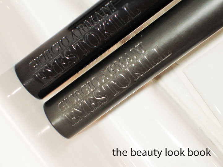
Armani’s Eyes to Kill was the answer to my seemingly never ending quest for the perfect mascara. There are a number of other mascaras I like, but none had the wow-factor like Armani’s. It’s also interesting to note that I’ve been a long-time Armani fan, but I hated every single previous mascara release from the brand. So I was skeptic when I first tried Eyes to Kill, especially at a jaw-dropping $30 per tube, but I’m glad I did. I actually tried a mini sample first before buying a full-sized tube. The heavy weight sleek black tube makes it feel worth it when it’s in your hands.
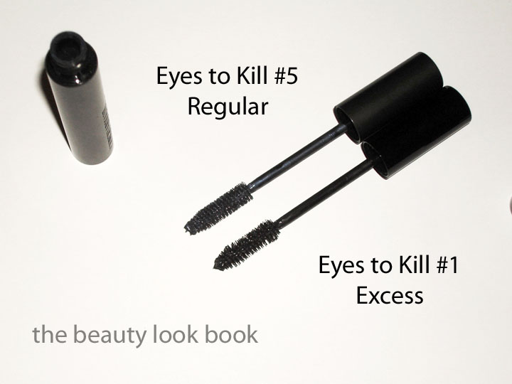
 Left = Excess, Right = Regular
Armani has since released 2 other variations, a waterproof version and Megan Fox’s Eyes to Kill Excess. I never tried the waterproof version – my experience with waterproof versions is that they tend to be too harsh on my lashes, the formula is just too thick and dries to a consistency that makes my lashes feel brittle. Not to mention they are a huge pain to remove from the eyes in the evenings. The new Eyes to Kill Excess has a killer slogan, “exceptionally volumizing mascara, drop dead seduction in a single stroke.” As soon as I opened the e-mail about this, I had to try it out.
So how do they compare? You can read more detailed product information about the Eyes to Kill Excess formula on Armani’s website (linked here for your convenience). I will start by saying that I prefer the regular formula, read on to find out why. Here is what I noticed about each:
Eyes to Kill Regular: According to Armani, “Dress the eye with powerful, plush, voluminous lashes. Fine, fluid Microfil technology creates intensely captivating lash texture. Micro-waxes combined with a fineness agent allow for smooth and easy application, revealing weightless volume and length.”
I’m featuring my #5 Blue Grey Night in the photos, but mainly rely on my #1 Steel Black (currently missing in action). The formula dries to a stiffer finish which holds the curl and lasts all day (unless you start crying or are splashed with water). There’s also something about the texture of the mascara + the big bristles that grabs onto your lashes coating them evenly and fully. This results in thick lush lashes for me. The #1 Steel Black doesn’t look like a true black when wet, but applies darker than what you see resulting in a true black finish. Finding a true black is hard for me – many brands have black mascaras that dry down to a greyish finish making my lashes look ashy. Even though my lashes are black, I’ve often had better success with dark brown mascaras. I love the way the sleek heavy tube feels – it’s simple, straight and nice to look at.

Eyes to Kill Excess: Seems to be the exact same in bristle shape/size to me. The difference is in the formula which, according to Armani contains “The fusion of a Wax™ Complex and the new texturizing agents creates a fluid and creamy texture that glides onto the lashes and allows for an easy, homogeneous application.” Also, the Excess formula is supposed to be a darker black color than anything they’ve made before.
My personal observations is that the Excess is a great mascara. I definitely notice that it’s a deeper more dramatic true black. I also notice a difference in formula in the sense that it’s more creamy and less stiff. There is no smudging or flaking. It holds the curl and lasts all day. I personally found that I had to pump the brush a bit inside the tube to get more product on the brush for a better application. On me it clumped a bit the first few applications. I had to experiment with my application technique to get a smooth finish and thick even look. It definitely has a softer feel on my lashes. The packaging is still heavyweight and sleek, it just has a glossy finish on the tube.
Regular vs. Excess: Because I have such wimpy lashes, I need all the help I can get. The Regular formula has a stiffer, thicker, more volumizing dramatic finish, but I can definitely feel like I am wearing mascara. If you have sensitive eyes and found the Regular formula too much for your lashes, but still want a similar finish with a weightless more natural feel, try out the Excess formula. Unfortunately the Excess only comes in 1 shade, black.
My review might seem odd since the Excess formula has been marketed as a darker more dramatic version of the Regular Eyes to Kill. I like them both.
Summary comparison of the features for the Black shades (sorry for the confusion, I can’t find my regular Steel Black right now):
- Color: Both are true blacks, Excess is a deeper darker black
- Volumizing: Regular is more volumizing
- Defining: Excess is more defining
- Lasting Power: Same, all day, but not waterproof or cry-proof
- Texture: Regular is thicker
- How it Feels on the Lashes: Regular is stiffer more dramatic, Excess is softer and more gentle
- Smell: Same scent, not noticeable once on the eyes
- Overall Effect: Regular has more of a wow-factor, Excess has a darker blacker finish
- Brush Size & Shape: Same, although in the photo, the blue seems fuller (it just has more product on the bristles from more frequent use, the excess has only been used 4 times so far) – this can show you the difference in formulas though, the regular just seems to adhere to bristles and lashes better

Both retail for $30. I usually buy mine from Neimans or Bloomingdales. At this time I don’t know if the Excess is limited edition or not. I can only say that I hope they keep the regular formula. I don’t regret buying the Excess and have no intention of returning it. Sometimes it’s nice to have variety.
If you have tried either, what are your thoughts? Experiences? Rants or raves?
For your reference, my other mascara loves include DiorShow, Dolce & Gabbana, NARS Volumizing, Estee Lauder Projectionist, Clinique High Impact Mascara, MAC Plush Lash, Kiehl’s Marvelous Mineral Mascara, Shu Uemura Basic.
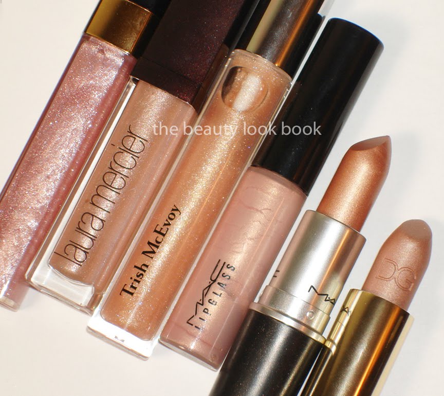
Mascaras I’ve tried and did not like include MAC Zoom Lash, all of Chanel/Bobbi Brown, Laura Mercier Thickening, Lancome Definicils, YSL Faux Cils, Trish McEvoy High Volume, Le Metier Waterproof, Clinique Naturally Glossy, Clinique Lash Doubling, Benefit BADGal (note – this is based on my own personal experience). In general I do not like waterproof formula mascaras.
There are a number of mascaras I’ve tried that I’m indifferent to – ones that weren’t great but weren’t bad. Too many to mention, although I definitely haven’t tried all types or brands.


