I love layering and blending out colors, especially for makeup. Layering different textures and shades allows me to create extra depth and also helps to give that slight glowy finish. Layering multiple products is something I usually only do when going out for a special occasion. In the mornings, I’m always running 5 minutes behind. Makeup for work is usually kept as simple as possible, except for the rare occasions that I am able to wake up an extra 30 minutes early.
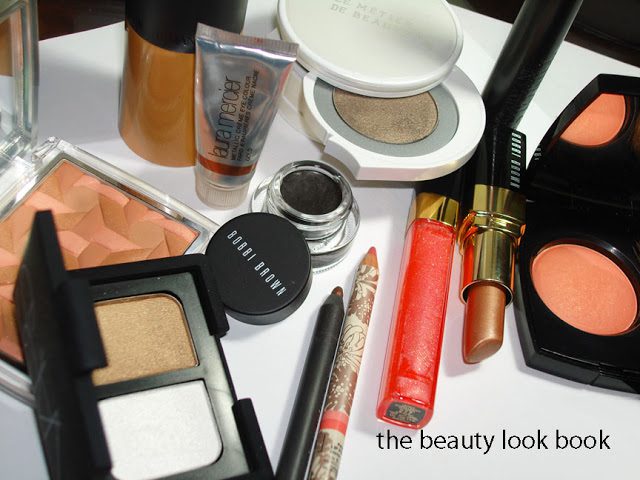
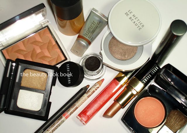
My makeup looks usually revolve around my clothes/outfit of the day or night. This past weekend I wore a simple floral strapless dress (shown here). It was fairly neutral so virtually any look would go with it. I realize this would be more helpful if I had a photo of my face to go with this, but this is more for my own personal reference since I was quite happy with the result. The numbers in each photo indicate the order of application.
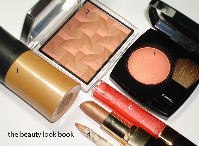
Cheeks: I applied Armani’s Fluid Sheer #10 on cheeks and then applied Dior’s Aurora on top as a contour. I then took a separate blush brush and applied Chanel Espiègle just on the apples.
Lips: Simply line with liner. Fill with a sheer gold lipstick. Top with a sheer coral gloss.
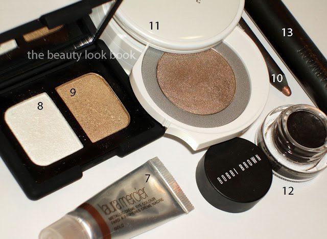
Eyes: The first step was to apply Laura Mercier’s Metallic Gold Creme shadow on the lids as a base. I took the white side of NARS Exotic Dance and and dipped MAC’s 242 (a stiffer brush) into the frosty white and patted it on 1/2 way up the eyes. Taking a larger fluffy brush, I swished it into the golden tan shimmer of Exotic Dance and loosely applied it all over. Next, I took MAC’s Spare Change and applied it along upper lashes in a messy smudgey line and layered Le Metier’s Splendid Frost taupe on top to blend. Last steps were to add a clean fine black line along upper lashes and outer corners on the bottom. Finishing step was with Armani’s Eyes to Kill Mascara.
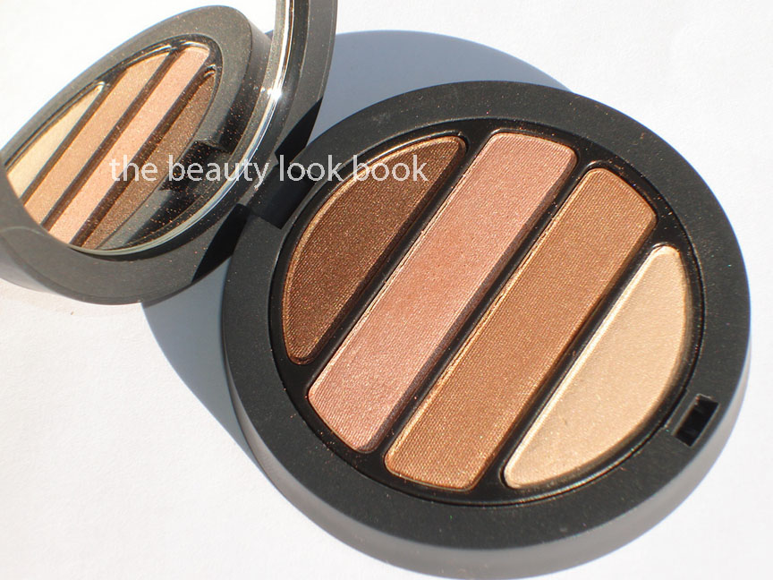
Armani has established a long standing tradition of releasing a collection in their Bronze Mania/Mediterranean theme for summer each year. Armani has released their latest edition of the Mediterranean Palette in a four-pan eyeshadow quad for Summer 2011 ($59).
Going back as far as I can remember, Armani has released different variations of double-decker palettes for summer usually a bronzer and eyeshadow combination. I am excited this year they have released a full sized quad. Even more excited that this summer is one of the first seasons I’ve seen something appears to be something truly Armani. Something gorgeous, glowing and gloriously neutral. You might find these links interesting to see the history of Bronze Mania in the following awesome reviews:
The Summer 2011 Mediterranean Eye Palette has four shimmery summery shades. From top to bottom I would describe them as:
warm shimmery deep bronze
complex apricot champagne infused with a warm gold shimmer
warm coppery gold frost
warm champagne cream glow
The texture is soft. Pigment is rich. The colors are easily blendable. It’s stunning in the compact and on the back of the hand. The shades are amazing when you pick them up with your fingertips. There is a little instruction card that comes with the palette to give you ideas on how to create a day or night look. The verdict? I don’t think it’s a must-have. I’ll explain why below. First, here are the photos in direct sunlight and with a high flash:
Instructional card with helpful diagrams:
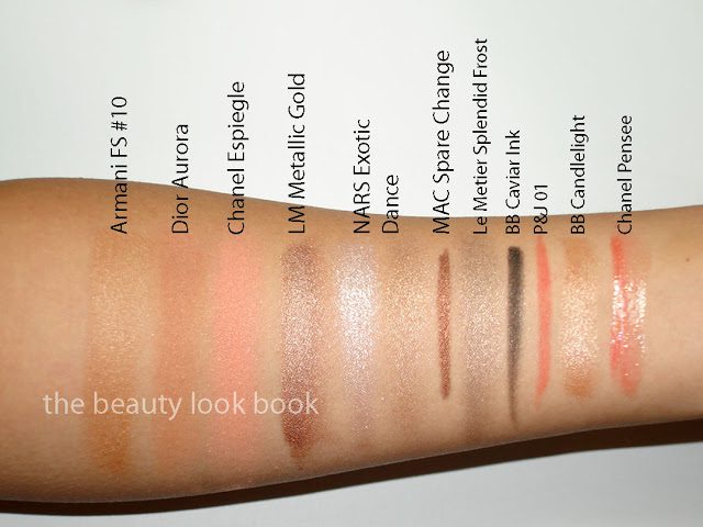
Swatched on a slightly moisturized arm, although no base was really needed to pick up the color:
Closer swatches so you can see the sheen:
So why am I not raving like crazy about this one? For some reason, warm shades like the ones in this palette simply blend together and melt into my skin so you can’t really see much. I need a good moist base and a slightly damp brush to apply wet for them to show up on my olive skin. Plus, I can only use 3 shades at most for these colors. Another thing – I noticed it looked very familiar and went through my quads in search of a dupe. I found it virtually identical to Chanel Spices. The Armani is more intense and more pigmented, but the effect is strikingly similar.
The differences are noticeable, but subtle:
I just know on my eyes, both quads will look identical. If you have pinkish undertones or fair skin, I think this will be *the perfect* combination of colors for you. I envision it will be stunning on blue-eyed and green-eyed girls. As much as I love neutrals, it doesn’t really show up on my eyes. Your mileage may vary. I worry when some really take to heart when I say I’m not in love with something. I don’t want you to write something off simply because I do. As other bloggers have noted in their reviews, this is a beautiful palette. Indeed it is. Due to the vastness of my stash, I knew there was a likely chance that I would have something similar.
If you liked the colors in Chanel Spices but don’t like Chanel quads, this Armani is the one for you. The texture is more blendable than the Chanel and more visible on the skin so it will stand out more on most of you (even if it just blends away into nothingness on me). Armani is more pigmented/intensified so it’s slightly better for the wear.
All in all the quality is still amazing. The pigment is surprisingly good. The texture is to die for. I’ll figure out a way to play with the colors and layer them to make them show up better. I already have ideas of layering these with a few of those powder/cream Eyes to Kill Hybrids that I think will be interesting.
At the time of this post, I don’t think it’s online yet. I found mine at Neiman Marcus instore. I did not check out the other items in the collection so I can’t comment on those. I’m still smitten with Chanel and Dior. More on the Dior quints soon. If you have an Armani counter near you GO and play with this to decide for yourself 🙂
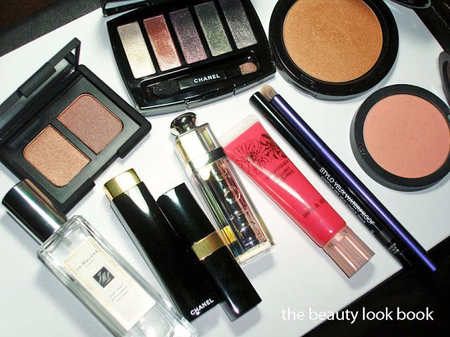
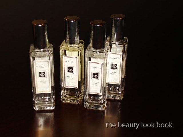
Jo Malone Tea Fragrances – layering these together creates the most lovely uplifting scents. I find them simple, pure and refreshing! (each scent reviewed here)
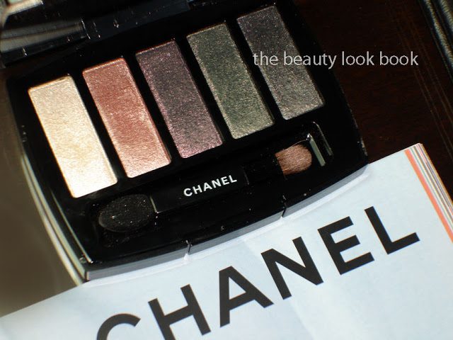
Chanel Ombres Perleés de Chanel, perfect for a lovely glow and easy to apply with fingers (reviewed and swatched here)
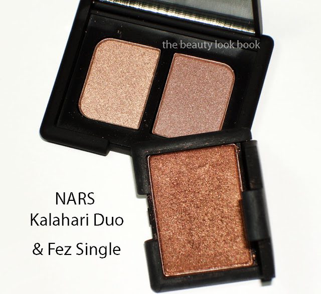
NARS Kalahari Duo & Fez Single Eyeshadow – I’ve been using my depotted Kalahari and it was about time for a replacement so I bought a new one. It’s one of my holy-grail neutrals. Fez is a beautiful bronzey copper (swatched here).
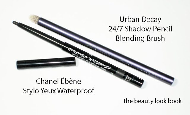
Chanel Stylo Yeux Waterproof in Ébène is a pure black and stays put all day and Urban Decay’s 24/7 Shadow Pencil Blending Brush is the perfect brush for blending smokey colors (not so great for blending lighter shades all over the lid, but for darker shades and detail areas or smudging it’s great)
Giorgio Armani Blush #2 – the original Armani products were the best in my opinion. Classic nude soft neutrals never go out of style. #2 is a soft luminous peachy pink.
Bobbi Brown Aruba Illuminating Bronzing Powder is a golden shimmer bronze (see it here too)
Chanel Joyeuse from the Le Blanc Asia Exclusive Collection is a beautiful bright pink (see it reviewed here as well)
More bright lips: Paul & Joe Lip Lacquer 02 Can-Can (here too), Dior Model Addict Lipstick (also here) and Chanel’s Rouge Coco Shine in Adventure (I used up the entire sample from the little card I received and went out to buy the full sized version)
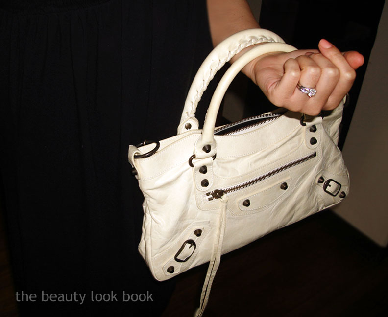
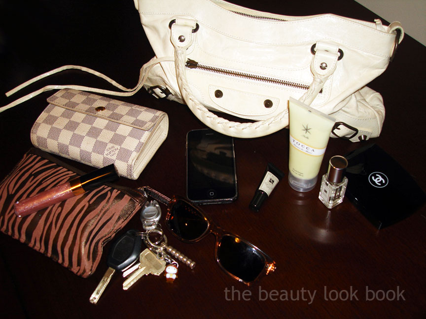
I think every week should have a three-day weekend. Two days simply isn’t enough time to do the things I want to do (the fun stuff). Today’s look is quick and easy with a simple black cotton dress, tan belt, black flats, ivory leather bag. Outfit is almost entirely J.Crew (I can always rely on them for a classic simple look). Leather bag is by Balenciaga. Makeup is all barely-there natural colors. I’m a minimalist at heart even if my natural “no makeup” look isn’t really minimalist if you break it down to what I’m wearing.
Inside the bag:
What I’m wearing today: Chanel Tweed Rose Blush, Chanel Taupe-Délicat Eyeshadow Duo, Chanel Espresso Stylo Yeux, Armani Eyes to Kill Mascara, Chanel Confidentielle Rouge Allure, Chanel Star Glossimer, Jo Malone Orange Blossom Cologne, Chanel Peche Nacree Le Vernis
I hope each and every one of you have a great week! Remember Chanel Rouge Coco Shines come out this week in the US!
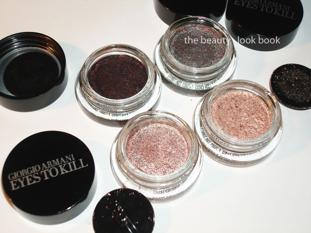
My picks from the new Armani Eyes to Kill Intense release: #2 Red Lust, #4 Pulp Fiction, #8 Champagne and #9 Rock Sand ($32 each). Armani has extended their color selection for the Eyes To Kill shadows from Holiday 2010 (#13 and #15 here). These are a hybrid powder-cream type of shadow with a lightweight almost sponge-like texture. They are highly metallic and richly pigmented with a long-lasting finish. To me these are high-performance eyeshadows – they deliver much more than the average shadow.
(click for large viewing of the beautiful multi-colored speckles)
Descriptions then thoughts: Each shade has a complex mixture of metallics. The resemble beautiful speckled eggs. #2 Red Lust is a blackened plum with red flecks, #4 Pulp Fiction is a highly metallic blueish grey with red and silver flecks, #8 Champagne is a silvery pink with flecks of metallic pink and silver, #9 Rock Sand is a champagne-peachy color with darker peach flecks and silver/gold sparkles.
I played with these over the past few days layering them on top of each other (two shades at the most, first the lighter shade then darker shade on top). Overall I’m extremely impressed with the lasting power. In terms of the colors, I prefer the darker ones for the eyes. The lighter shades are super metallic and frosty – a bit too much for my taste. I did mix a non-shimmer flesh shade (Bobbi Brown Shore) with a paler Armani ETK (#8) by mixing them together on the fingers which helped to minimize the frost. They are lovely colors and office appropriate – just not quite as finely milled as Chanel’s Ombrees de Perles from Spring {love and reviewed here}.
Close ups, swatches and one comparison set:
Close ups of 2, 8 and 9 (both 8 and 9 are similar, 8 is more pink while 9 is more peach):
New picks + last holiday’s shades arm-swatched with finger:
Comparisons of the silvery and lighter colors below. Bobbi Brown Galaxy is warmer and sheerer compared to #2 Pulp Fiction. For the lighter shades I recommend clicking below for larger viewing. MAC Vintage Selection is more pinkish/mauve, MAC Bare Study almost looks like a white gold compared to #8/#9, MUFE Aqua #13 is even more metallic and pigmented but lacks the complex multi-color sparkles the Armani have which makes it more of a silvery-champagne finish.
Are these must-haves? I think I am happier with the shades from Holiday mainly because I found them more wearable but there are quite a few lovely shades from this new collection. The shimmer/metallic/frost factor isn’t a deal-breaker (like Bobbi Brown Metallic Creams were for me) – I just think those iffy on high-metallic finish shadows should definitely try these on the eyes first (not just on the hand) before deciding whether or not to buy. The upside of these is that they are super long lasting. I had no fading or smudging on the days I’ve tried mine. I can’t report on the crease-factor as I have no crease in my lids.
After seeing those heart-stopping photos on Pink Sith of Eyes To Kill Intense #4 Pulp Fiction and a few others on Best Things in Beauty – I went to Neimans hoping they arrived on the west coast. They did! I picked up a few (to be reviewed soon, so much to review, so little time) and took note of a few other “maybes.” I had my eye on #5 Gold Blitz and #6 Khaki Pulse but they didn’t have the tester of #15 from holiday in store for me to compare. I left the store with hand swatches to do some testing at home.
Left to right: #15, #5 and then #6 (note the curved features of my hand made it difficult to photograph, but I hope this helps a bit)
Does anyone need all three? I’ll leave that up to you to decide. The jury is still out on the must-have factor for me. Khaki tones tend to make me look tired and warm shades can turn orangey on me. They did have a lovely sparkle in the sunlight and are indeed super long lasting. I still have remnants on my hand this morning.
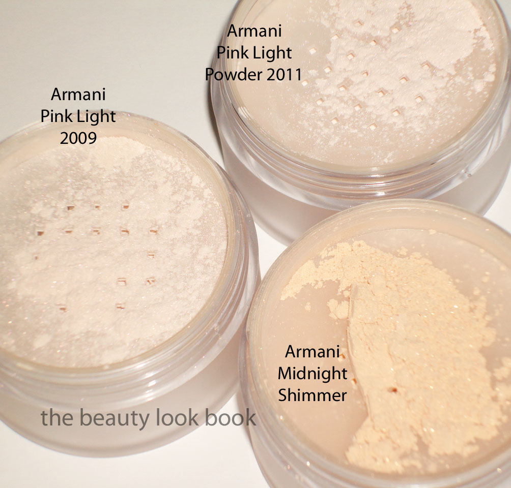
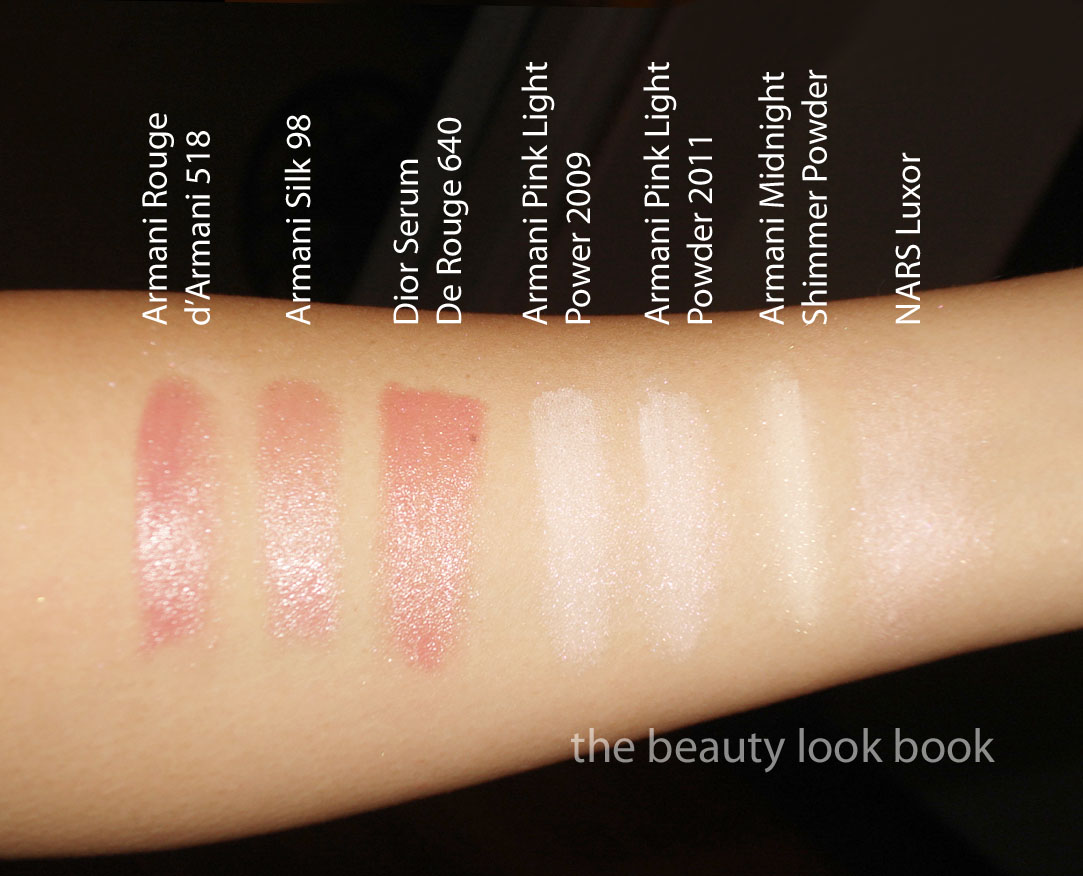
Photos, swatches and what I’m coordinating with the Armani Spring 2011 items. Picks include: Pink Light Micro-fil Powder for Spring 2011, Rouge d’Armani #518 and the new La Femme Bleue Blush Palette.
*Update Friday Evening* What a week! TGIF a million times over. The Spring 2011 Collection from Armani is lovely and fresh with soft feminine pinks for lips and cheeks. I viewed the eyeshadow quad as the misfit in the collection – lovely and vibrant and very original, just not for me. I ended up with the classic soft pinks – gorgeous and naturally flattering, but dupeable and a bit unoriginal. Photos are separated by Spring Product Picks first, followed by comparisons all the way at the bottom.
#518 Rouge d’Armani is extremely close to last spring’s Silk Lipstick #98 and Dior’s Serum de Rouge in 640. It’s a lovely soft cool pink but I found it applied a bit streaky and uneven. It took a bit of work layering combined with a brush for me to get an even application. I like the effect but it’s been done before. The texture is smooth and creamy and those who avoid Armani Lipsticks because of lack of staying power – the good news is the Rouge d’Armani formula does last longer. The finish is natural with a soft shine. No detectable scent.
The Spring 2011 blush was the item I was anticipating the most. I’m a huge fan of Armani blushes for their subtle natural finish. They are soft and light but noticeable on my skin and I love the way they look when layered over a soft cream highlighter. The Spring Blush is a soft powder pink with a luminous glow. There’s a soft silver sparkle that you can barely see. The finish of this blush is very natural. More comparisons down below.
I was a bit disappointed to find this season’s Pink Light Powder is the exact same as 2009’s Pink Light Powder. I think my sister will be happy to take this off my hands. If you missed out a couple years ago, definitely try to find a counter to try this. It’s like their Fluid Sheer #7 and NARS Luxor in a powder form. It’s a soft opalescent pink that is beautifully luminous and gives that glow from within effect. I love this layered over other blushes to add shimmer. It’s really lovely without being too sparkly or frosty. Can’t rave enough even though I wish this was slightly different than the previous release, it’s still an awesome product.
What I’m wearing with the Spring 2011 items today:


