Browsing Tag

Nail Polish

Uncategorized

Neutral & Bright: Zoya Naomi, Rescue Beauty Lounge Pink Shimmer, Chanel Enthusiast

February 21, 2011

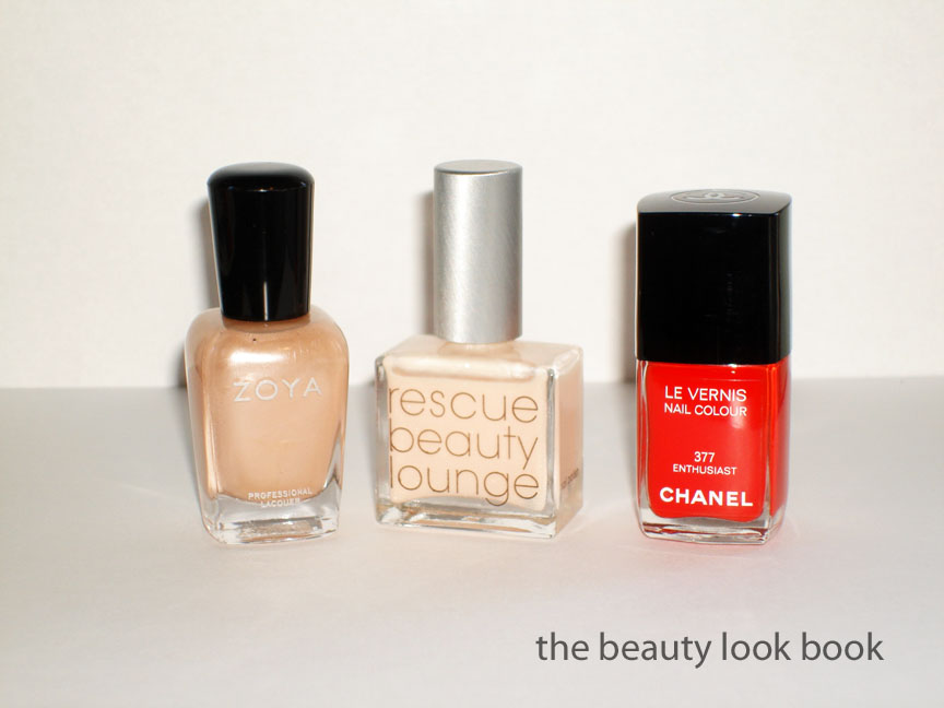
Nails of the day (from Sunday):
  • On the fingers = 1 coat of Zoya Naomi + 1 coat of Rescue Beauty Lounge Pink Shimmer on top
  • On the toes = 2 coats of Chanel Enthusiast


Yesterday I featured Zoya Naomi and mentioned how I felt it was a bit too warm for my olive-beige skintone. I experimented layering different sheer and glittery shades on top to see what different effects I could make and decided adding a coat of a sheer white-opal-pink shimmer created a nice neutral. The winner was adding one coat of Rescue Beauty Lounge Pink Shimmer (previously reviewed here). Here is the final result:


I decided to go super bright on the toes with Chanel Enthusiast 377 (Part of the London Madness mini collection from Summer 2009 & a Neimans Exclusive). It was a limited edition shade but extremely close to Chanel Coromandel, previously reviewed here (scroll down for comparisons). The difference is that Enthusiast is more vibrant, more orange, and has no shimmer.

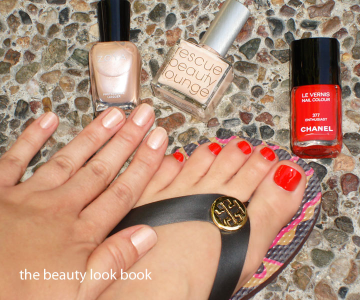
The mani & pedi combo:

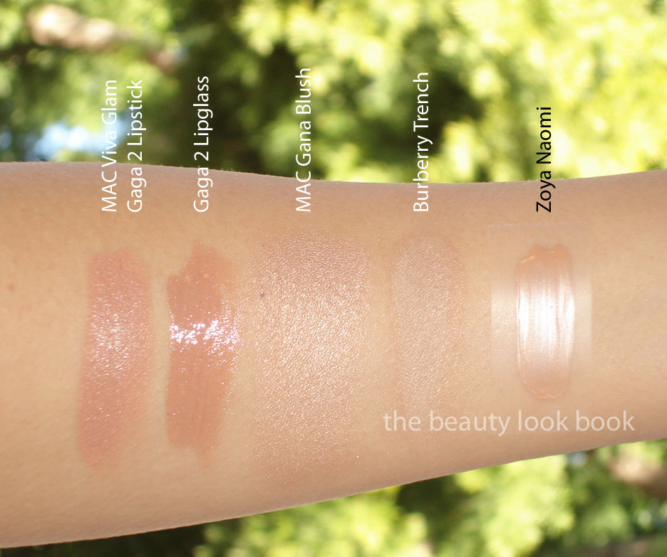
L to R comparisons: Rescue Beauty Lounge Ani, Zoya Naomi, Rescue Beauty Lounge Pink Shimmer, the mixed shades, Chanel Enthusiast, Chanel Dragon, Chanel Coromandel


I sometimes get off the wall comments – just an FYI, I’m in Southern California where wearing sandals this time of year is do-able. We’ve had on and off rain, but the sun peeked out enough for me to slip on the flip flops and not freeze my toes off.
Uncategorized

Trying Out A Few New Nudes: MAC, Burberry & Zoya

February 21, 2011

I’m always looking for that perfect shade of nude even though I have quite a few favorites (Chanel Mythic & Luminous, Bobbi Brown Beige Gold, MAC High Tea). Everyone has a different interpretation of what they see as a true nude (see an older post here, What’s Your Definition of Nude?) – for me a true nude is something flesh colored. Light nude beiges don’t always work for me, many require tweaking with layering of extra gloss or liner (what I call my high maintenance nudes). Sometimes there are nude colors that are simply too neutral or beige and end up washing me out, but my curiosity always gets the best of me, I can’t help but check out every variation of beige.

A few new discoveries, thoughts, and swatches: MAC Viva Glam Gaga 2 Lipstick & Lipglass, Zoya Naomi Nail Polish, Burberry Trench Eyeshadow, MAC Gana Blush (from the Mickey Contractor collection).

First up are the newest additions to the MAC Viva Glam series: Gaga 2 Lipstick and Lipglass. Both are creamy neutral grey-beiges in the tubes but go on with a slightly peachy cast on the skin. These are true nudes, both of which I find fall under my “high maintenance” nudes category. The Gaga 2 Lipstick resembles concealer on my lips. It has full coverage (the amplified formula) with rich and creamy texture. Having tried other MAC nudes like Cherish, Creme d’Nude and Peachstock, I know this one will work better once layered over a darker liner (and blended of course) like MAC Stripdown and then topped with clear lipglass. I’ve swatched it alone below. Thumbs down by itself – the color just makes my skin look dirty and I look lifeless. Gaga 2 Lipglass is the exact same shade of nude, it’s not quite as flat and has the tiniest bit of sparkle in the tube. The shimmer doesn’t show up on the lips. For some reason the glossy texture makes it more forgiving on the lips. Thumbs up for this one! It’s a wearable nude, but I think MAC Revealing Lipglass is a more universally flattering beige nude. This one is also featured below alone (no lipstick or liner underneath).


In direct sunlight:

Zoya Naomi is an opalescent beige with a soft silver sheen. I ordered this from Zoya.com sight unseen along with a few of the Zoya Spoons. I haven’t tried too many Zoya Nail Polishes yet, but so far I’ve been extremely pleased with the finish, pigment and wearability of the colors. However, my experience with the Zoya neutrals is similar to my experience with Essie neutrals – what you see in the bottle doesn’t always translate to what you get on the fingers. In this case, I found Zoya Naomi a bit too warm for my beige skintone. I had to tweak it with a layer of a sheer silvery pink to get it to work. (Stay tuned for tomorrow’s post to see what I used.) Lovely color with 2 coats, just needed a slight change for my own liking.

Burberry Trench Eyeshadow is one of the best nudes I have ever tried. It’s deceptively boring and dull looking in the pan and swatched on my fingers, but it has a soft velvety texture that brightens and evens out the eye lids with a subtle luminescence. I love it. This isn’t entirely new (bought it back in late August in San Francisco’s Nordstrom) but I haven’t gotten around to reviewing it. I really love Burberry’s soft eyeshadows. I can’t wait for them to release more colors.

Burberry Trench finger swatched (on the hands it just melts/blends):

MAC Gana Frost Blush from the Mickey Contractor Collection was exclusive to select MAC Pro Stores and online. It’s a soft champagne grey pink shimmer powder that looks pretty on the eyes and as a highlighter on the temples. I don’t know if it’s still available or easy to find. It’s the closest thing I’ve found to Estee Lauder’s Tom Pecheux Highlighter (reviewed here) but with a pinkish/grey sheen. Those who can’t find it and want something similar that you can still find, MAC’s Beauty Powder in Play it Proper similar in effect.

Gana Swatched on bare skin:

All the new nudes swatched on arm, two views:


Have you tried any of these nudes I just reviewed? What are your thoughts if you have tried them? I’m especially interested to hear your thoughts on the Viva Glam Gaga 2 Lipstick and Lipglass – how are you making these work for you?
Uncategorized

Estée Lauder Wild Storm Nail Lacquer

February 16, 2011

I couldn’t resist the stormy steel blue grey shimmer from Estée Lauder’s Spring 2011 collection. I picked up Wild Storm ($19) the day it was released instore at Nordstrom about one month ago. Most of you have probably had a chance to test it out or see it in person by now. I haven’t tried many nail polishes by Estée Lauder but have been impressed by the ones I had tried to date. Wild Storm however was a bit of a disappointment for me. The silver shimmer left it looking a bit dull even with a shiny top coat. It’s a pretty color but just lacked luster for me. The wear was ok with no chips, but it wore down on the tips of the nails very fast, much to my disappointment (by the end of the day I saw visible tip wear). I have tried it three times (two manicures and one pedicure) with different top coats but all applications had the same dull finish. That being said, my hair dresser loved it when she saw it on me. Perhaps it will be something I’ll like later on in the season, this spring I think I have just been so completely smitten with Chanel Black Pearl, it’s hard for other darker shimmers to live up to it (for me).

Still the product is good for the price. Application is smooth with 2 coats. The texture is easy to apply and layer for intensity. The color is listed as Limited Edition for Spring 2011.


Overall – pretty, but not really my favorite for nails. I prefer this color for eyeshadows like these from MAC, NARS, Urban Decay and Paul & Joe (picture taken for Josie months ago). But who knows what my mood will be like 6 months from now. (My nail polish preferences are highly dependent on mood.)

Uncategorized

Dior Nude Chic & Bond Street on Tips & Toes

February 7, 2011

A few weeks ago in my Nail Polish Styling post a few of you asked “what’s that Dior Nude with the Chanel Khaki Vert?” It’s Dior’s Nude Chic which was released three springs ago (I think). I don’t think they make it anymore, but I have noticed Dior has been going through a nail polish revamp. Perhaps it will be re-released? Who knows. I had it applied yesterday afternoon for a much-needed manicure and picked Bond Street for the toes. Boring but work appropriate.

Bond Street has previously been reviewed in detail. This is one of three limited edition shades released in NY and on Dior.com as part of the Gris City Collection. Refer to my Gris City Collection post here and here for more comparisons.

For those of you who like the look of Nude Chic but can’t get your hands on it, comparisons are shown below (scroll down to the bottom).


* This photo below is republished from my previous review for your reference


See the Bond Street comparisons linked here.

Uncategorized

Nail Polish Styling: How Do You Coordinate Colors?

January 25, 2011

Several readers have asked for tips on how I pick out nail polish colors for tips and toes. I’d like to open this up to hear how you coordinate your nail polish too! My personal style is on the conservative side and I work in a corporate office environment with a business casual dress code. I rarely match my fingers with toes for nail polish, although sometimes I will use shades within the same color family. My nail polish picks are usually spur of the moment picks based on mood. Often times I cannot decide on my own so I photo-text a picture to my sister to help me decide or I bring 3-4 bottles of my own to the salon and ask for assistance with coordination.

I’m usually open to trying anything. I’ll mix creams with frosts, brights with pales, darks with lights, blues with greens, corals with pinks etc. Often times I’ll use similar colors, just with slightly different variations like a cream grey and a shimmery grey. Swatch testing on fingers or holding the bottles next to each other help me figure out which colors go together. Some combinations are total failures (like Jade + Lilac Sky). There are a number of mani/pedi posts I’ve featured before if you search through the archives you might get some more ideas. Below are a few I’ve done before. There are way too many for me to remember most.

Swatch testing on my fingers to see which is a yay or nay combination:

Left = nay, right = yay! (purple on fingers, steel on toes)

Holding the bottles next to each other, Left = Nay, Right = Yay! (green on toes, beige on fingers)


My nail polish picks are usually spur of the moment, but if I try to think more about my method, I would have to say my picks usually revolve around the following:

1) Is it during the week or nearing the weekend? If it’s during the week I’ll try to keep the brights or non-neutrals on the toes (less visible and more forgiving to wear those super bright shades). If it’s nearing the weekend then I’m more brave in wearing non-neutrals.

2) What time of year is it? Southern California has great weather year round, but I still prefer brights in spring/summer and darks/reds during the fall/holiday season.

3) What am I in the mood for? I often like to mix something old with something new. My nail polish moods usually revolve around my clothing moods. For clothing I go through waves of color phases. Sometimes I’m all about gray, sometimes I like adding a pop of color to neutrals, sometimes I just can’t get enough darks.


A few other frequently asked nail polish questions:

1) Are my mani/pedis done by myself or at a salon? Mostly at the salon (75%), occasionally on my own (25%).

2) How often do I get my nails done? It varies depending on how busy I am, but it ranges from once a week to once every other week.

How do you pick out your nail colors?
Uncategorized

Dior Vernis Gris City Collection Review Part 2: Details & Comparisons

January 6, 2011

Here is Part 2 featuring a more detailed review of the Dior Gris City Collection. Up first is Gris Montaigne. As mentioned in my Dior Spring feature, I don’t have many cream finish grey colors. The formula is on par with RBL in the sense that you get full smooth application with 2 coats. The color is similar to RBL Stormy, only the Dior is slightly darker and more neutral (RBL’s stormy is cooler in undertone). The NARS and Butter London have sheerer formulas and require three coats for full coverage for me.

L to R: Rescue Beauty Lounge Stormy, Dior Gris Montaigne, Dior Silver Pearl, Butter London Chimney Sweep and NARS Full Metal Jacket


Bond Street is a beautiful deep blue. Compared to the other shades below you can see that it does seem to have a unique undertone that prevents it from being a straight navy or pure teal. I love it. I find that it’s closest to Rescue Beauty Lounge Teal in depth/darkness, but the color is different since Bond Street is not really teal. Note how interesting it is that the MAC Blue India looks darker in the bottle but on the nails is significantly lighter than the other blues. All shades here featured with 2 coats.

L to R: Chanel Blue Satin, Dior Bond Street, MAC Blue India, Rescue Beauty Lounge Teal, Rescue Beauty Lounge Under the Stars


Finally, below you will see why I described Dior NY57th as a true gunmetal. Compared to other steely blacks and greys, Dior NY57th is one of those deeper silvery gunmetals that really shows up as a “gunmetal” on the nails. It’s nice to add to your collection if you want a dark shade but don’t want something too dark. You can see the contrast to the bottle photos to what you get on the nails. NY57th is lighter than Chanel Steel but darker than NARS Full Metal Jacket. If you think Essie Over the Top is a dupe, the Essie required 5 coats for the same coverage that Dior got with only 2. Also the Essie has more visible silver shimmers in real life.

L to R: NARS Full Metal Jacket, Dior NY57th, Dior Black Sequins, Chanel Steel, Essie Over the Top


Overall I’m very pleased with these colors. Looking at other web photos and blogs were extremely helpful but I still wasn’t sure that these were must-haves. As I discussed with a few blogger friends, I wasn’t convinced that spending $68 (included tax) on three colors I might have dupes for would be justified. But my curiosity got the better of me. If you’re a Chanel or Dior collector, definitely get these while they are available. They are listed as Limited Edition but I am not sure how limited they really are. If you already have a lot of similar shades you definitely won’t find these to be must-haves. However, do note the undertones may be different than your current stash. I really like the formula and hope Dior continues to release more!
Uncategorized

Dior Vernis Gris City Collection: Gris Montaigne, Bond Street & NY57th

January 6, 2011


The Dior Vernis Gris City Collection has finally been released on Dior.com. Each shade was inspired by the three greatest fashion capitals in the world, Paris, London and New York. As far as I know the Gris City Collection has been released in very limited supply. In the US, the Dior Gris City colors are exclusive to the NY boutique and Dior.com. They were released in NY for the Dior Boutique re-opening, but I did have several women tell me they were unable to place phone orders. They were told the colors were reserved for sale only for those who attended the event. However, one told me she was persistent and was able to find a sales associate who did a phone-order. I haven’t tried myself. Check out this link here on Chic Profile for additional availability information.

The limited edition collection contains the following shades (L to R in photo directly above and below):

  • Gris Montaigne – inspired by the color theme of the Dior Boutique on Avenue Montaigne in Paris (also part of the Spring 2011 collection, reviewed here)
  • Bond Street – inspired by the chic & urban style of London
  • NY57th – designed for the grand re-opening of the New York Dior Boutique on 57th Street

The nail colors by Dior have been revamped in a strengthening formula. I haven’t tried them long enough to notice a difference in the hardness of my nails, but I am impressed with the formulas of these shades. They do require two coats, but the application is flawless, smooth and fast drying. I’m not usually a fan of revamps, but I like the direction Dior is going with their product innovations and newer formulas.


Many have asked me what I think about the new tapered brush. Two different manicurists I go to did not like the brush. They applied it with the skinny side on the nail, instead of flat and wide. I’ve tried application on my own now about 6 times and I am slowly getting used to it, however, I find the pointy tip makes it a bit challenging to get the color even along the cuticles. It’s perfect for my pinky because it just happens to be the same size as my little finger. For the others it definitely takes practice.

I’m going to split my review up into two parts. Part 1 will feature the Dior Gris City Nail Polishes. Part 2 will feature comparisons. I felt like putting everything into one single post would be overwhelming for you.

I featured Gris Montaigne a few days ago (here) but here are a few more photos. I really love this color, it’s a perfect straight neutral gray.


Bond Street is a deep blue with the slightest hint of teal. It’s not so dark that it looks navy, but it’s close to navy. It’s cream-finish perfection. You’ll see it compared to RBL Teal, Chanel Blue Satin and a few others in Part 2 (coming soon).


NY57th is a steel gunmetal frost with silver pearl. Even though it’s a frost, the brush strokes aren’t too visible which is definitely a plus. Not quite silver and not quite black. This is a true gunmetal color.


Each color retails for $21 each and are listed as limited edition. I bought mine on Dior.com in the US. Gris Montaigne is part of the Spring 2011 collection and I found that color at Nordstrom instore. Are these must haves? Are there dupes? Wait for my Part 2 to see, it will be up very soon so check back around 10:00 am PST.