Browsing Tag

Nail Polish

Uncategorized

Dior Gris-Gris 034 Quint & Gris Montaigne 707 Nail Lacquer for Spring 2011

January 2, 2011


I spotted Dior’s Spring 2011 collection at Nordstrom but the tester unit seemed to be missing a few things from the previews we’ve been seeing (see magazine scan here). I wasn’t sure if they simply filled in the slots with pre-existing items temporarily or if the US really wasn’t getting all the items we’ve been seeing. The usual Dior rep was off at the time I was there, so I couldn’t verify with her. Some of the items may be Sephora exclusives. I ended up with Gris-Gris 034 Couture Colour Eyeshadow Palette and Gris Montaigne 707 Nail Lacquer – which also happens to be one of the shades from the Gris City nail polish trio.

Gris-Gris 034 is a palette of cool grey, silver, charcoal and sky blue. Using all 5 shades on the eye at one time is not practical for me – the colors are too cool-toned for my skin. I find that the best way to use this is to use 3 shades at the most from this palette and applying the paler shades with a light hand, using a dark grey or black liner smudged, then applying the middle dark charcoal shade on top blending for a smokey eye.

The colors on the outer corners have a high-frost finish when applied with a heavy hand, but blend out to a pretty soft frosty glow. Applied with a softer hand you get a nice dusting of sparkle. The middle shade is a matte dark greyish-black with the prettiest multi-colored micro sparkles. It twinkles when the slightest bit of light hits it. It’s borderline too cool for my skin, it needs a bit of tweaking with something warm like a light dusting of bronzer to make it work better for me.

Gris-Gris unique in the sense that the formula and finish of Dior Quints are hard to match from any other brand. I don’t know of a similar palette that has all 5 shades in one compact. However, the silvery shades have definitely been done before – but in separate palettes, brands and singles. For your reference, here is Dior Gris-Gris compared to other Dior Quints such as Moonlight, Smoky Crystal and Sky Glow. Below it is also compared to Chanel single eyeshadows in Platine, Silvery and Black Star. While the Gris-Gris shades aren’t identical to any of the other colors, you can see quite a few similarities in other eyeshadows.


For the nails, there was a cream pink and a cream grey shade in the tester unit. I picked Gris Montaigne 707. This comes with the same new chiseled/tapered brush that came with the Holiday Nail Lacquers (see here). I find the metallic Dior nail polishes to be a hit or miss, but this non-shimmer formula has me really impressed! You do need 2 thin coats, but the result is a smooth and glossy and the formula is non-goopy. It also seems to dry faster than most nail polishes I’ve tried. A big thumbs up for me.

Two coats, no base or top coat:

I went through my nail polish stash and didn’t find many non-shimmery greys. The only one I have is RBL Stormy (which you can see is lighter than Gris Montaigne). Here is the Dior compared to other silvery greyish colors.


Uncategorized

Chanel Pearl Drop #511 Le Vernis for Spring 2011

December 30, 2010

I had a girls’-day-out with my mother and sister the other day and we all treated ourselves to a mani/pedi together. My sister texted me earlier in the day, “can you bring a light red for mom?” so I brought 3 different shades of Chanel red for her to pick from. She ended up picking Dragon (one of my favorites). I decided to go light and give Chanel’s Pearl Drop #511 Le Vernis a try even though it is my least favorite color out of all the spring shades (see review and comparisons here). After trying it out on a full manicure with 2 professionally applied coats, my heart softened a little for this color – but only in the slightest bit.

Chanel Pearl Drop #511 is a frost-finish white gold shimmer. The base is mostly white with a bit of pink and the shimmer is golden. It’s not the easiest shade to apply – the frost in this makes it easy to streak if not applied with a steady hand. Also, the gold shimmer makes this yellow, much like NARS Albatross Highlighting Powder. I already have yellow undertones being Asian so I feel like yellowy-golds aren’t the most flattering for my skintone. (If you’re wondering why I have Albatross even though I don’t like it, the compact was received as a gift.)

Now that I’ve ranted enough about it, you might wonder: is there anything good about this color? The answer is yes. I actually like this color in brighter lighting or natural light because it appears less yellow and more pearly. The coverage is decent, but you definitely need 2 coats with this color. It’s definitely a brightening color because it’s on the lighter side. Compared to actual pearls, Chanel’s Pearl Drop flashes more yellow-gold than most pearls do.


With flash:

Outdoors without flash:

My mom and sister were wowed by this color. Their comments were, “it matches your outfit perfectly!” So don’t write this off just because I’m not so wowed by it. Overall I think I am just picky when it comes to lighter colors. If you try this on at the counter, definitely try and apply 2 coats, not just one. My heart still belongs to Black Pearl (reviewed here).


I think it’s pretty but I don’t think it’s a must-have. You can probably get a similar effect with other colors but most will be more gold or more white. The streaks aren’t too visible at arm’s length. At this time I do not know if this is limited edition or not. I found mine at Nordstrom. By this time, most counters in the US should have the spring collection available for sale.
Uncategorized

Getting Ready for New Year’s Eve with Metallic Glitzy Nails

December 29, 2010

New Year’s Eve is only a few nights away! I’m keeping it low-key this year with family but it’s still fun to get dressed up in the spirit. This year I’m in the mood for those high metallic, chrome-like/foil-like colors on the nails which is out of the ordinary for me as I’m not the biggest fan of those high-shine metallics. I end up feeling like an ornament or metal statue, but for NYE I think it’s fun. My picks (which I am still trying to decide on) include:
  • Dior Timeless Gold (Holiday 2010) reviewed here
  • Dior Silver Pearl (Last Spring 2010) reviewed here
  • YSL Pink Gold #140 (Holiday 2010) reviewed here
  • YSL Gold #139 (Holiday 2010) reviewed here
  • MAC Soirée (Holiday 2010)
  • OPI Lucerne-tainly Look Marvelous (Swiss Collection, Fall 2010)
  • Rococo Nail Apparel R2T2 (can be found in the US at Space NK) reviewed here
  • Rococo Nail Apparel Metal Jacket (can be found in the US at Space NK reviewed here

The fun part about metallic nails is how the colors change depending on the light and how you move your fingers. I love how these have rich pigment and the metallic finish pearl particles make these dry really fast and last long. The formulas of these have a semi-matte finish, not quite like the OPI suede colors, but not like a shiny varnish either. I always love the colors in the bottles, but what goes on the nails is sometimes too intense for my personal taste.


Close ups and on the nails, Dior Timeless Gold, Dior Silver Pearl, YSL #140, YSL #139:


Close ups and on the nails, MAC Soiree, OPI lucerne-tainly look marvelous, Rococo R2T2, Rococo Metal Jacket:


I have too many options and can’t decide! Maybe you can help me pick 🙂 Of course it will depend on what I’m wearing. I have a few outfits picked out which are versatile and will go with any of these nail colors.
Uncategorized

A Closer Look at Chanel Black Pearl #513 Le Vernis

December 18, 2010

A few readers wanted to know how Chanel Black Pearl 513 compared to other shades such as Chanel Steel and NARS Full Metal Jacket. Due to differences on computer screens it may be hard to tell. I hope these close ups will give you a better idea of what this looks like. To me, Chanel Black Pearl is a dark greyed-teal shimmer. It has a pearly finish with a bit of silver veining which makes the color look different depending on what angle and lighting you see this in. I had my nails done today with this color and keep getting distracted by the pretty color. It’s a darker dramatic color, but the soft pearl gives it a soft glow that prevents it from being too sharp.

Balenciaga fans, if you’re familiar with the Anthracite colors you know how it’s evolved over the years with each new seasonal release. The first generation of Anthra was a murky dark greenish teal. (You can see all the variations from Anthra fans at The Purse Forum: Balenciaga Clubhouse.) I compared it to Lancome Pop Petrol back in February (see here). You can see Chanel Black Pearl is better matched to the 2007 Anthra Balenciaga. The Lancome is sharper, deeper and more contrasted in color.

Here is Chanel Black Pearl swatched next to my Balenciaga First – Anthracite from 2007

Next to my Ocean Le Creuset (if you think this is nuts, you’re not the only one, but I have limited teal in my house).

Close up from the side, looks a bit more blue-ish rather than greenish:


I already did some comparisons yesterday but here are more. I hope this helps you! On my screen, Chanel Black Pearl has that greenish sheen that NARS Full Metal Jacket and Chanel Steel lack.

NARS Full Metal Jacket, Chanel Steel, Chanel Black Pearl, Laura Mercier Caviar Dreams, Lancome Pop Petrol, OPI Cuckoo For This Color shown below

*UPDATE* I hope this doesn’t confuse you even more, but people keep asking for more comparisons! I dug up a review from the past that has Deborah Lippman’s Don’t Tell Mama, China Glaze Gussied Up Green and Hard Candy Envy and Laura Mercier Caviar Dreams. It was from last January (Color Focus: Teal Eyes & Nails Inspired by . . .) – I decided to do one last set of comparisons for you. I can’t believe how many greens I have. I didn’t think green was really my color.

Comparison Set #2 with China Glaze, Hard Candy & Deborah Lippmann


Bottom line: GET THE CHANEL BLACK PEARL. It’s unique. It’s gorgeous. It’s different enough to justify owning. There is no comparison.

Uncategorized

Dear Chanel, I Love You! Spring 2011 Le Vernis Shades Have Arrived

December 17, 2010

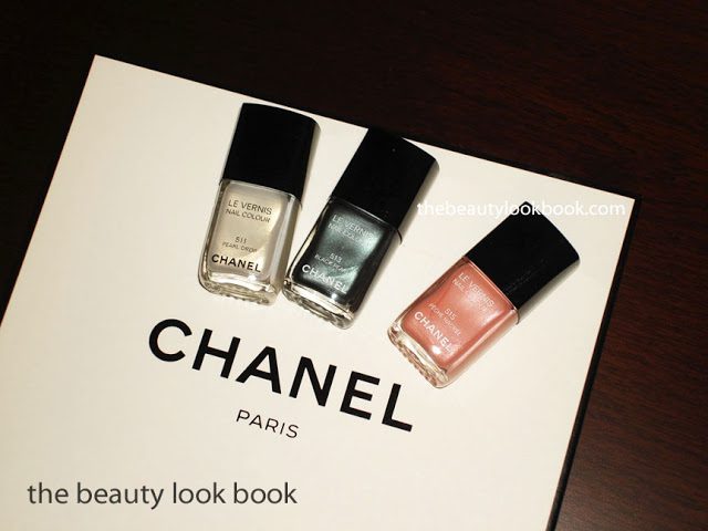
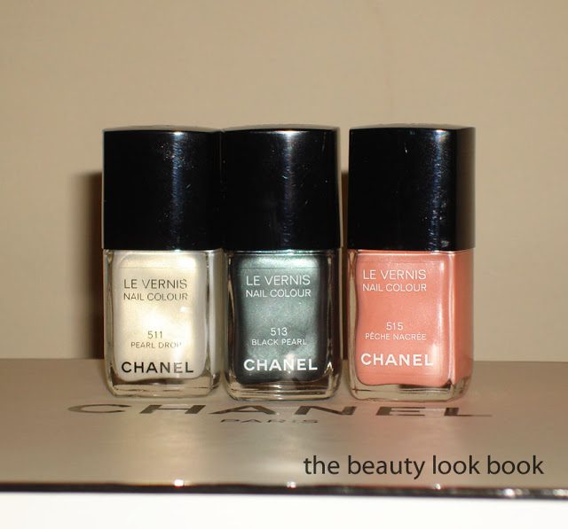
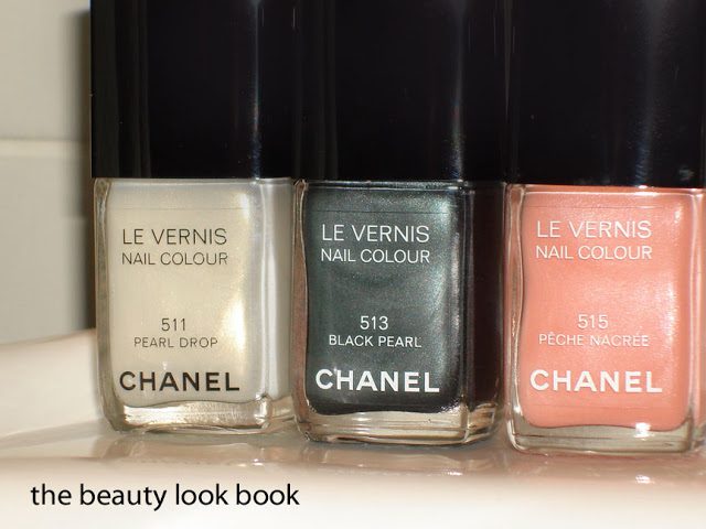
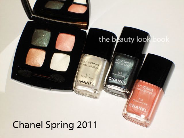
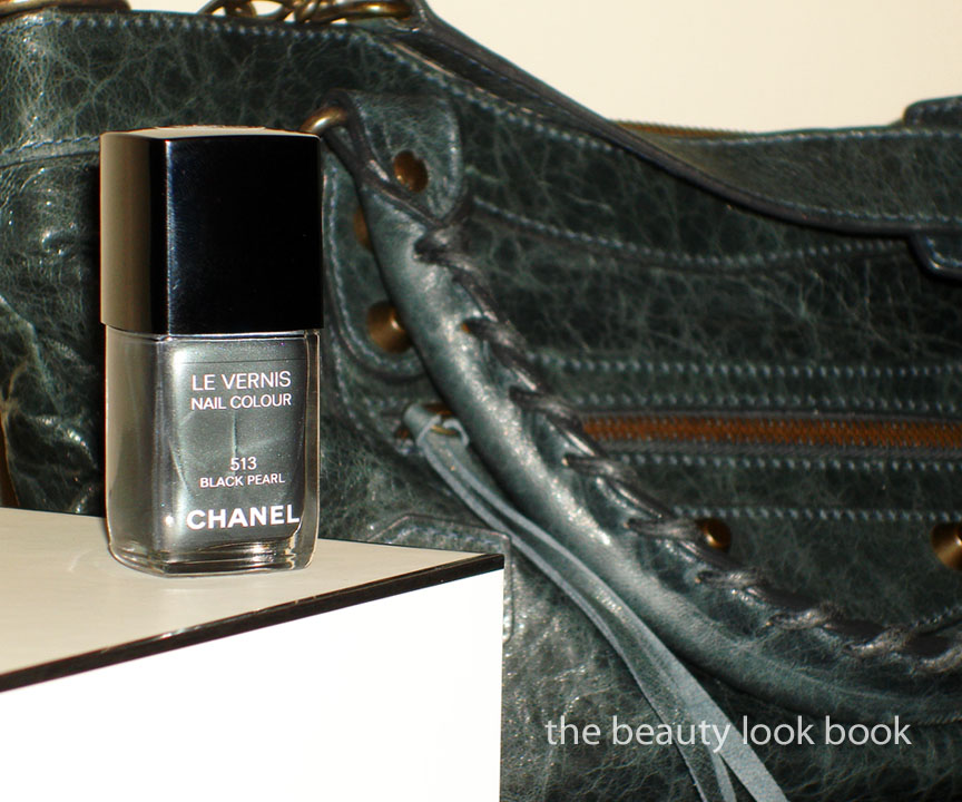
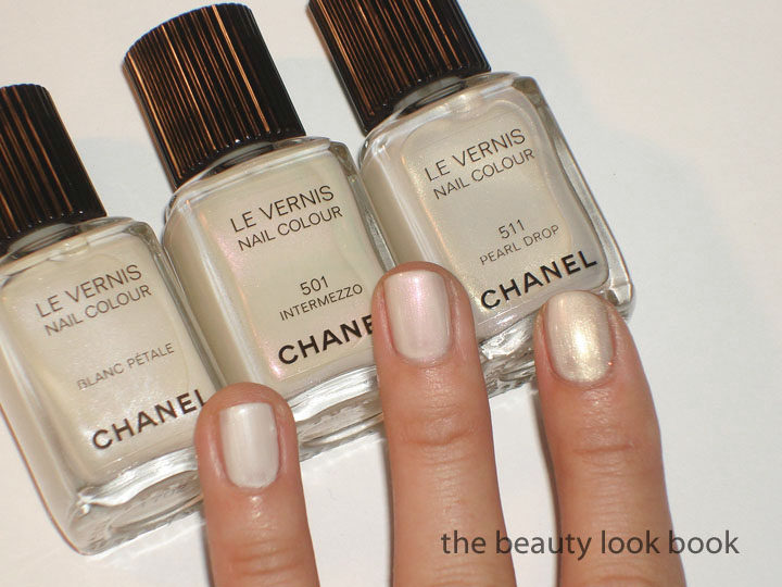
Chanel spring is starting to trickle in stores and the best news is that in the U.S. they have brought back the American-style formulas of the blush (no longer baked) and eyeshadow quad (back to square). I’m ecstatic! With the past few collections I was worried that in 2011 I would fall out of love with Chanel. There is so much to cover and I haven’t had time to play with everything yet so I’m going to split up my reviews. The first review will cover the new Le Vernis shades: Pearl Drop 511, Black Pearl 513, Pêche Nacrée 515.

The colors of white-gold, murky greyed-green and soft peachy-pink are an interesting combination for nails, but I love them. I love how Chanel matched the new Eyeshadow Quad, Regard Perlé (review coming soon). You might think the colors have been done before – but Chanel has a way of combining colors and pigments that no other brand can match. The result is a sophisticated and fresh palette that is appropriate for now and also serves as the perfect transition to spring.

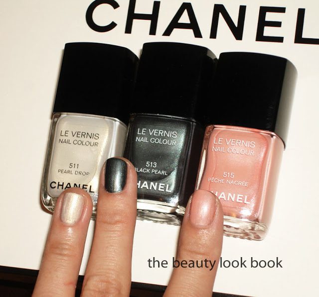
Nails matched to the quad:

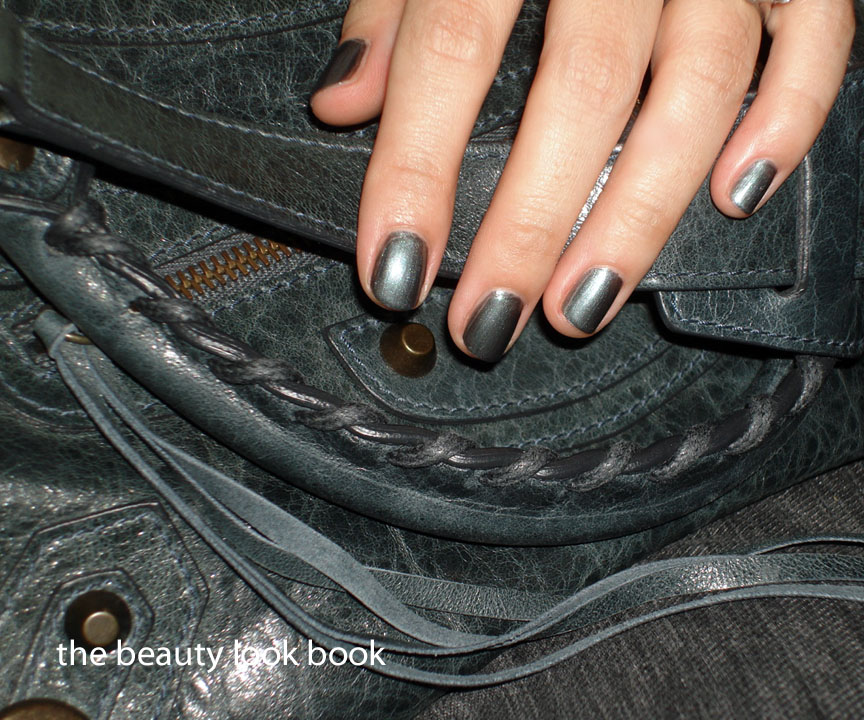
The finish of these spring nail colors is a pearl-frost. You can see brush strokes on Pearl Drop and Black Pearl if applied with a shakey hand, but the streaks aren’t too bad. All of them are a bit sheerer than your typical Chanel nail polish (in my opinion). I find the cream-non-shimmers to be full coverage while these are not full-coverage-with-1-coat. The Spring Shades definitely need 2-3 coats. Fortunately, they aren’t as sheer as Riva is. The nice thing about the texture is it allows you to build your color as you like.

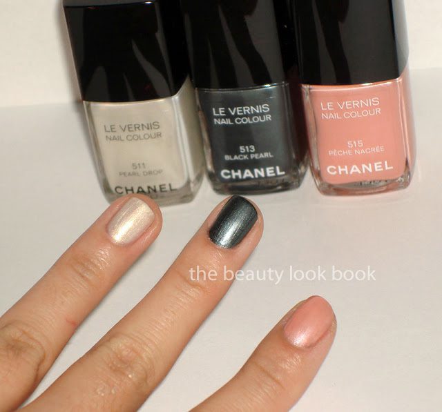
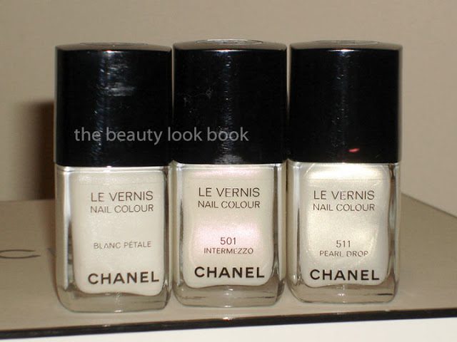
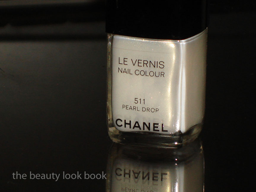
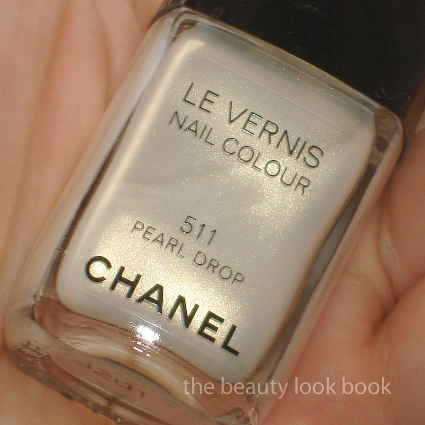
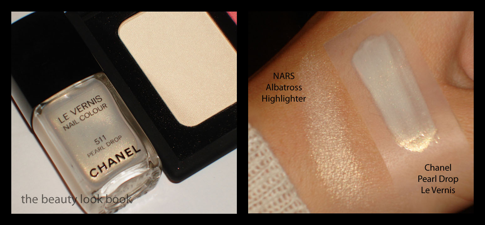
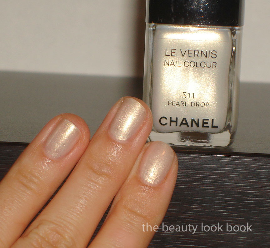
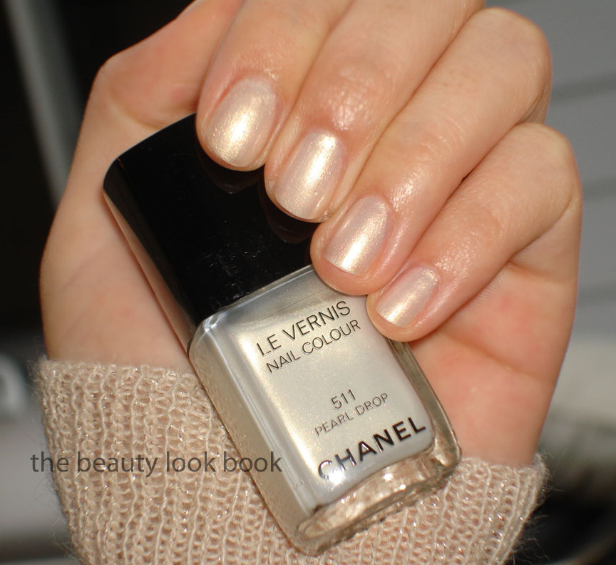
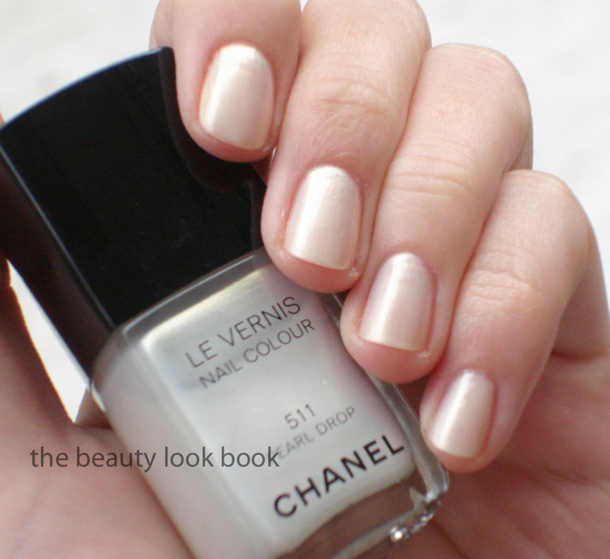
Pearl Drop 511 is a white base with gold shimmer. It’s almost a duo-chrome color. This color is lovely, but not exactly my favorite. It’s simply too contrasted with my skintone. The yellowish undertones in my skin also don’t really help with this color. I wanted to compare it to Hard Candy’s Sugar Daddy, but it appears I had gifted that shade away. So, I pulled a few other Chanel whites for your reference. Blanc Petal is a pure white frost, Intermezzo has that opal-pinkish sheen, Pearl Drop is clearly a white-gold frost.

L to R: Chanel Blanc Petale, Intermezzo 501, Pearl Drop 511


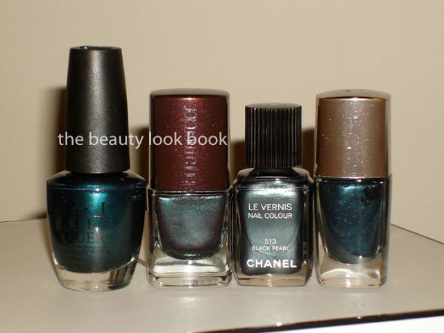
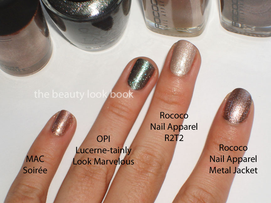
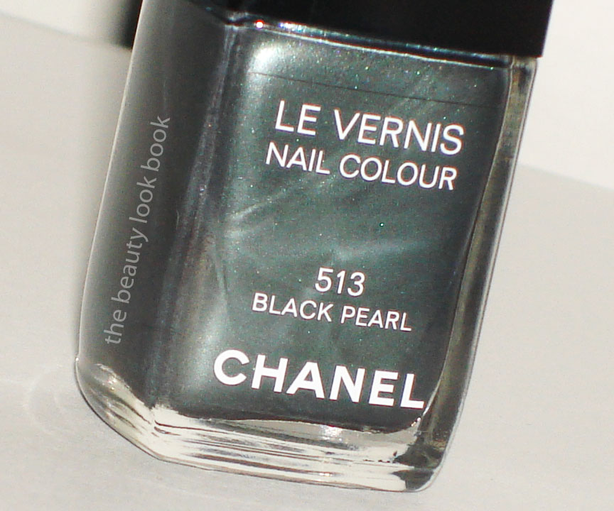
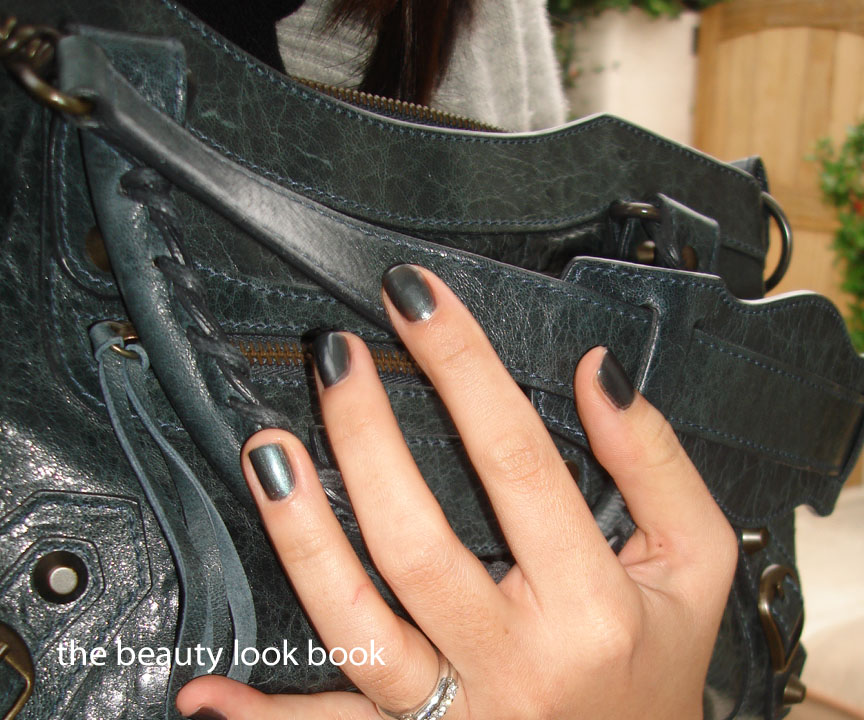
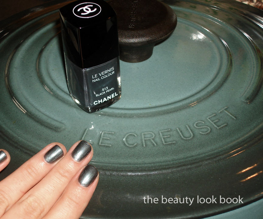
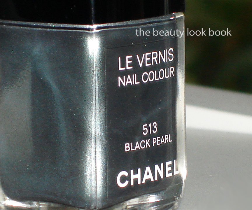
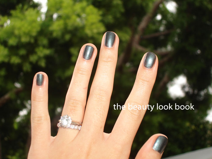
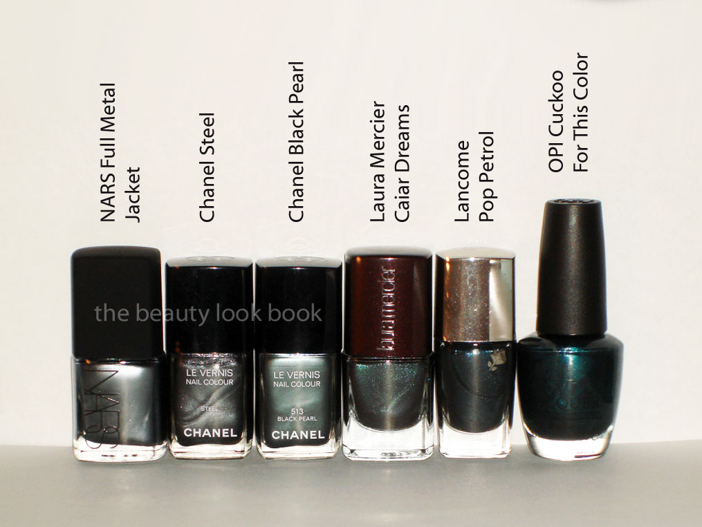
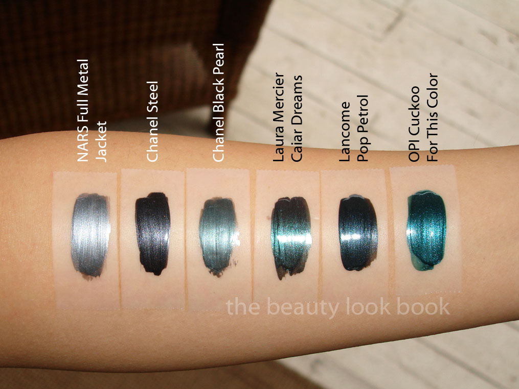
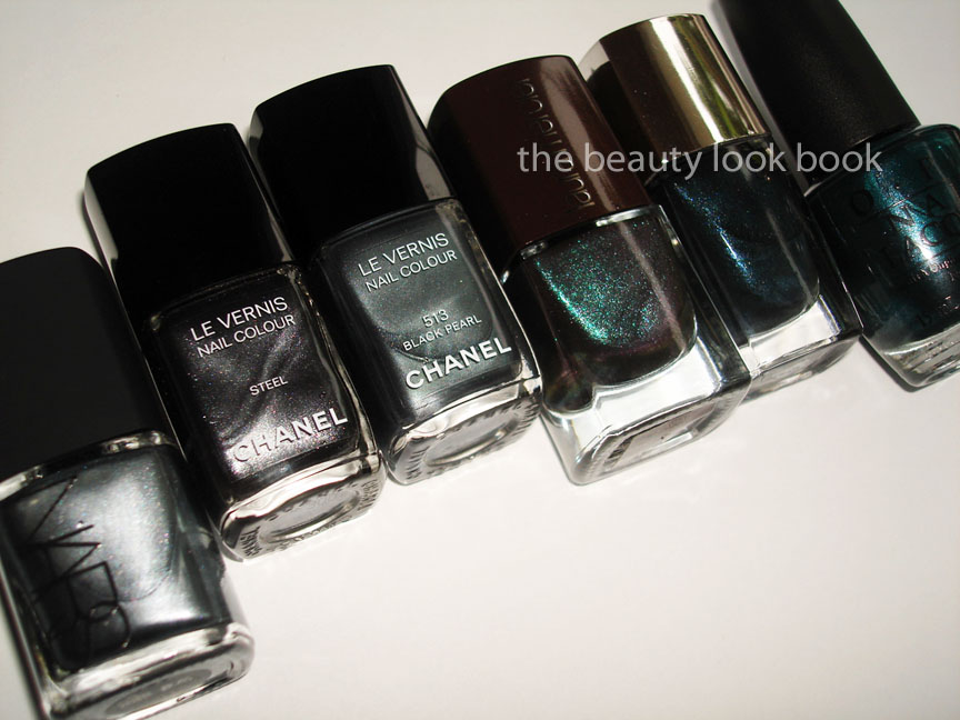
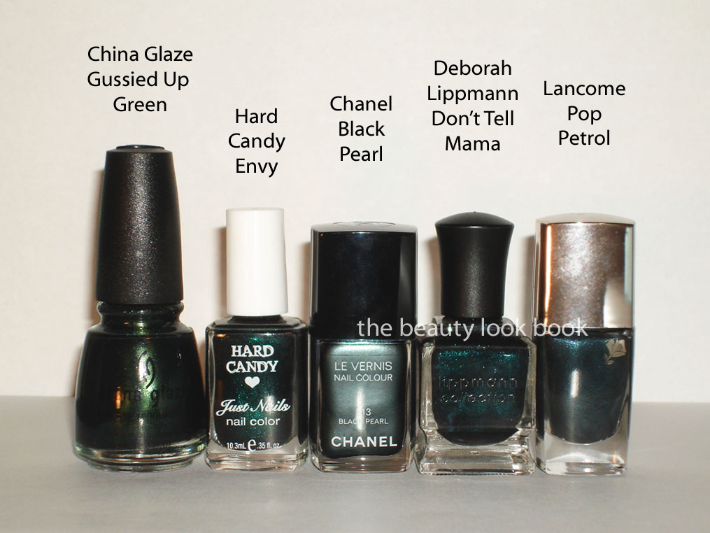
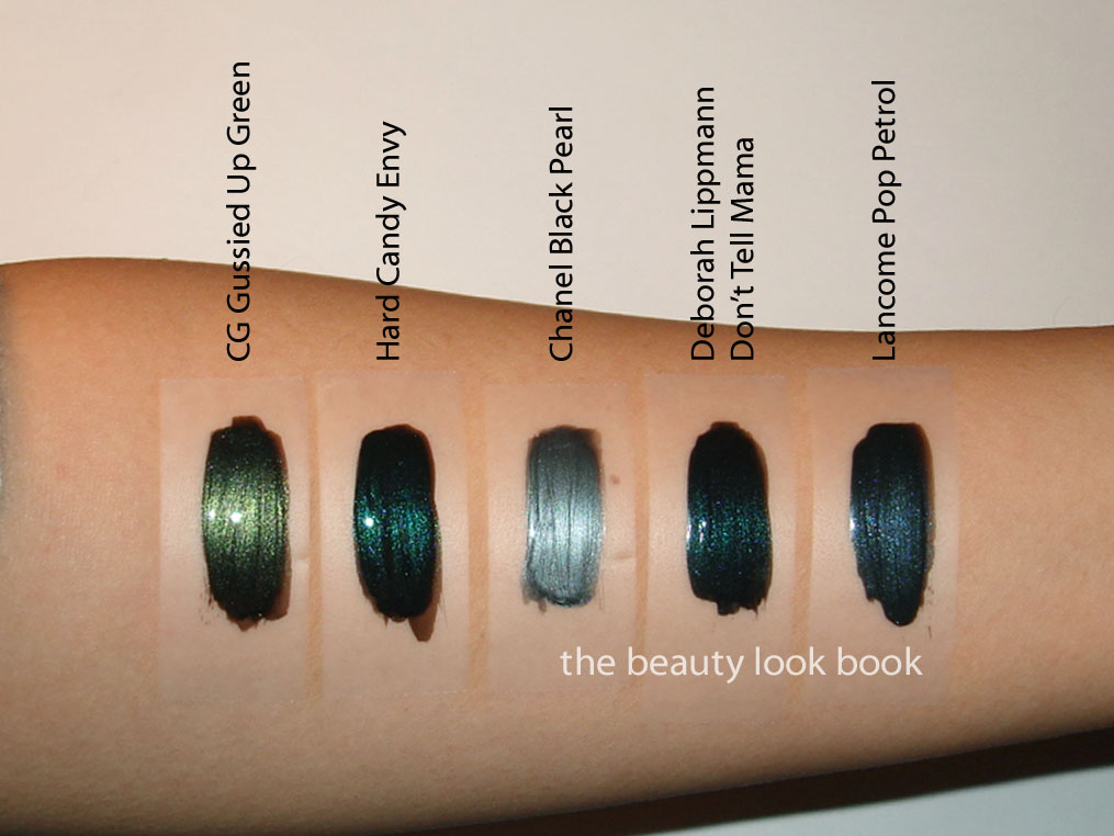
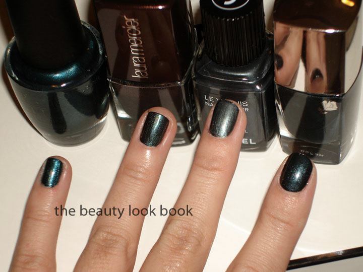
Black Pearl 513 is the most highly anticipated shade of spring (for me). I have been dying of curiosity to see how it compares to other greenish murky shades. I am happy to report that Black Pearl appears to be truly unique. It’s one of those shades that is true-to-the-bottle in the sense that what you see in the bottle is what you get on the nails. So many dark greenish teals look gorgeous in the bottle, but go on nearly black on the nails. Chanel Black Pearl has a beautiful sheen to it with a mixture of teal, grey, silver, dark green. It’s hard for me to describe but it’s a stunner! Compared to the colors below, it’s lighter in color and exactly as gorgeous as I had hoped.

L to R comparisons: OPI Cuckoo For This Color, Laura Mercier Caviar Dreams, Chanel Black Pearl 513, Lancome Pop Petrol (reviews/swatches on other colors are linked)

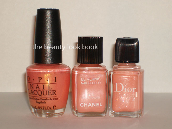
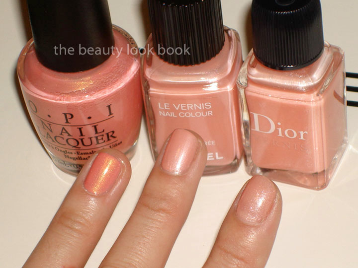
Pêche Nacrée 515 was a pleasant surprise. I expected it to be an unflattering frosty shade of peach but it has just the right amount of pearliness which makes it a lovely soft peachy-pinky-pearly color. It is on the sheerer side, so it definitely requires 3 full coats. This is the most spring-like color out of all 3 shades.

L to R comparisons: OPI Love Me Tender, Chanel Pêche Nacrée 515, Dior Angelic Rose 152

FYI: The spring collection is up on Chanel.com and I found the items in-store at Nordstrom in Southern California. I’ve also heard reports that it’s been spotted at Bloomingdales in NY. So ladies, call your counters – it should be arriving any day now if it hasn’t already!

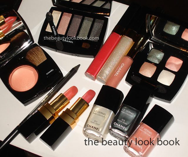
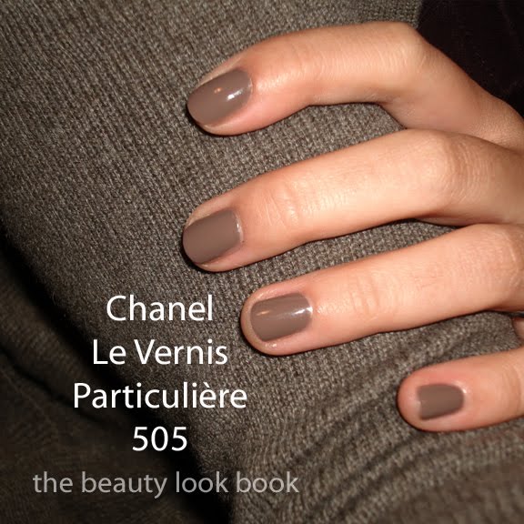
More reviews to come soon, here’s a sneak peek . . . please do not republish or hotlink my photos, all content is copyrighted!

Uncategorized

Dior Aztec Chocolate Vernis: Chocolate or Plum?

December 12, 2010

I’ve been eyeing Dior’s Aztec Chocolate #886 Nail Polish on Sephora.com for a while and was hoping it would arrive instore. Unfortunately, it’s labeled as “online only” and I couldn’t find it anywhere else. When the VIB $20 off promo came up, I couldn’t resist.


I had seen Aztec Chocolate featured on Vampy Varnish and The Nail Phile and both blogs showed the complex nature of the product. I wondered if it was more plum or chocolate. The product that arrived proved to be both, but it’s definitely more plum on me. Depending on the angle and lighting you’ll see one color dominate over the other. Also, there’s pretty gold veining throughout that you can see in the sunlight. This doesn’t really show up on the nails but it makes for a pretty bottle.

Justify Full

It comes with the new chiseled-style brush (similar to the brushes on Timeless Gold & Czarina Gold reviewed back in October). The color is beautiful with three coats, but the formula is a bit sheer and hard to work with. The first coat is pretty sad, but if you have time and don’t mind waiting for each coat to dry, you can get full coverage with three.


The same polish, Dior Aztec Chocolate, with and without flash:

In direct sunlight, definitely plum:

So how plum or taupe or chocolatey is it? Well, it depends on how you look at it.

  • By itself it looks like a plummy brown in the bottle
  • Next to other shades, it looks brownish
  • On the nails, it’s more plum with a slight brownish base
  • It’s just very hard to describe since it looks so different in the bottle v on the nails

I pulled out what I thought might be similar which includes NARS Tokaïdo Express, OPI YDKJ Suede, OPI Holiday Glow, Dior Lemon Balm and Dior Bronze Libertine.

Conclusion: When compared to others (as seen below) it definitely looks brown in the bottle, however when it’s applied on the fingers it’s clearly plum.


A closer detail. While Aztec Chocolate is definitely more plum on me, it looks brownish in the bottle compared to some of the other shades. You can see Lemon Balm is similar, just slightly more purples in the swatch.

L to R: Aztec Chocolate, Lemon Balm, OPI Holiday Glow

Overall, like the color, but not the formula. Have any of you been able to see/test this in person? As far as I know, it appears to be a Sephora exclusive, but I could be wrong.
Uncategorized

Chanel Particulière Re-Visited

December 3, 2010

It’s hard to believe that it’s been almost 1 year since Chanel Particulière 505 Le Vernis was released. I feel that it’s one of those “trendy” shades that has transitioned into a classic. I was never into the taupe nail trend until Chanel released Particulière. What I love about this is how different it looks on everyone depending on skintone. On me it’s a mink-taupe cream with slight cool mauve tones. I love it on the fingers and toes. It’s a color that can do no wrong for me. In the past year, I’ve featured it here, here and here. Here it is again photographed against different colored backgrounds. My DIY manicure is with 2 coats.


LOVE.