Browsing Tag

Nail Polish

Uncategorized

Dolce & Gabbana Chocolate Nail Lacquer

August 1, 2011

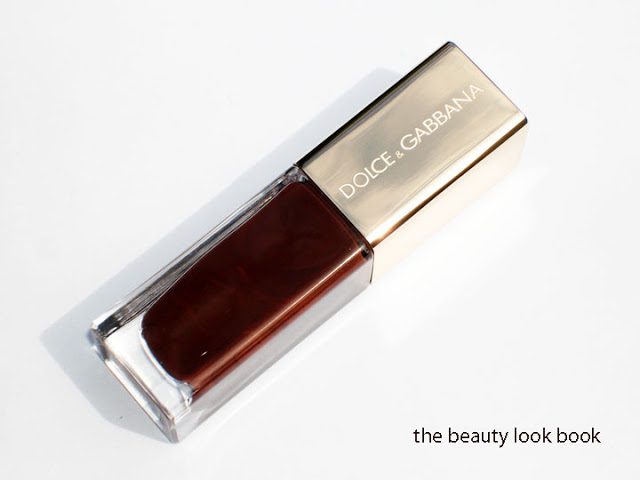
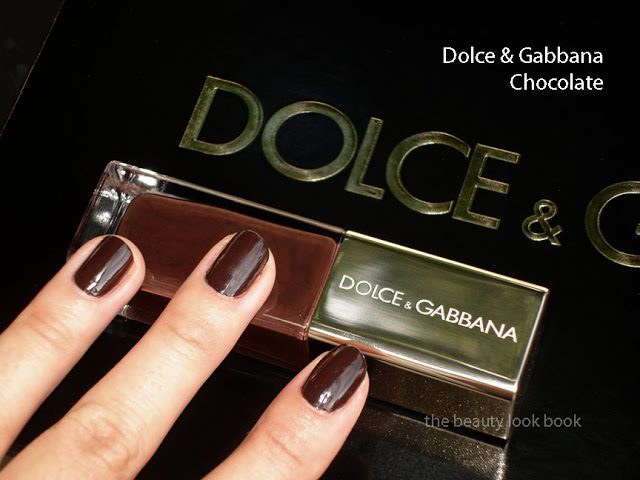
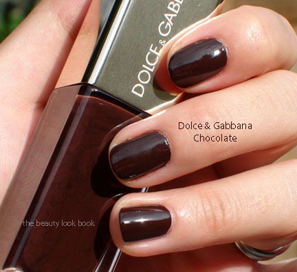
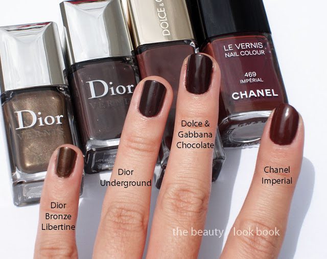
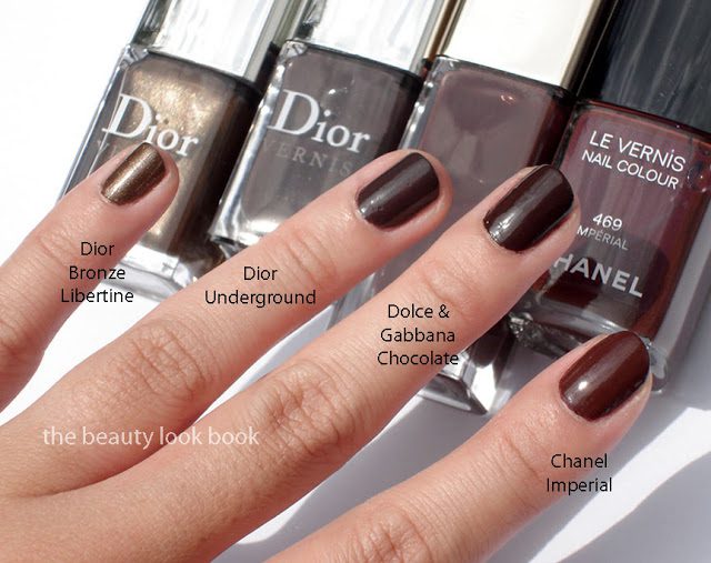
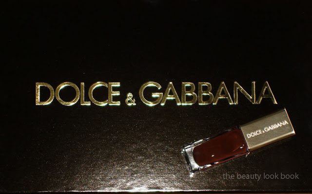
Dolce & Gabbana Chocolate Nail Polish is a rich dark chocolate color, just as it is named. In the bottle it’s a reddish warm milk-chocolate brown. On the nails it darkens to a deep espresso shade without any visible red tones. The formula seems a bit thicker than most Dolce & Gabbana nail polishes but applies smoothly with 2 coats. There is a naturally glossy finish. In my experience, Dolce & Gabbana nail polishes last well past the usual 4 days for me for manicures and over a week for pedicures. I just applied Chocolate today for swatching purposes (not a full manicure) so I can’t assess the lasting power of this color in particular. Overall Dolce & Gabbana’s nail polish formulas seem very consistent for me and are highly under-rated.

Two coats without any top coat

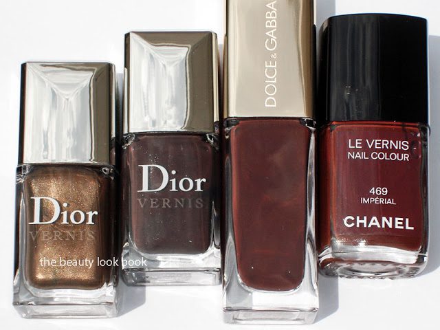
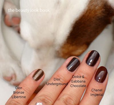
While Dolce & Gabbana Chocolate is very basic, there’s something about the depth of this color that seems sophisticated to me. It’s not the most unique brown since I found it very similar to Dior Underground (from the Rock Your Nails collection) and Chanel Imperial. The difference is very slight with Dolce & Gabbana Chocolate being the richest and darkest, Dior Underground has more grey, Chanel Imperial has the most visible red. I added a comparison of Bronze Libertine from Dior (I think this was a Neimans exclusive?) for another brown-bronze comparison. Although it’s not super unique, I still like it.

In the bottle Dolce & Gabbana Chocolate looks most similar to Chanel Imperial. But when applied on the nail, you can see Dolce & Gabbana Chocolate actually resembles Dior Underground more. Odd, right?

Finally one last comparison to Jake’s spots. He wouldn’t sit still for a photo as he was too busy chomping down his treat. Compared to Dolce & Gabbana Chocolate his spots now look more tan rather than brown. Here you can see the natural shiny finish of the polishes (all without a top coat).

Overall lovely, rich and deep. This will be perfect for fall. I do however suspect this color will be easily dupeable. If I had had the access to all these shades at Saks I would have passed on this since it’s so close to the Dior. However, this is never the case because so many shades are either limited edition or exclusive to certain stores (why we all often end up with dupes). I suspect that this will also be very similar to the upcoming US release of Dior Ebony (as seen on Cafe Makeup from her Paris trip).

What do you think? Will you be wearing chocolate tones on your nails this season? Or when the real fall season arrives? Or are there other colors that catch your eye? This year, the colors for nails seem to be all over the place!

Uncategorized

Le Métier de Beauté True Romance Nail Lacquer (Nordstrom Anniversary Exclusive)

July 18, 2011

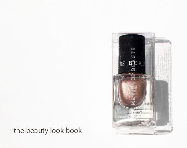
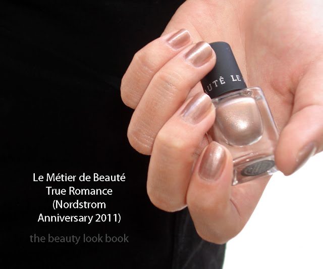
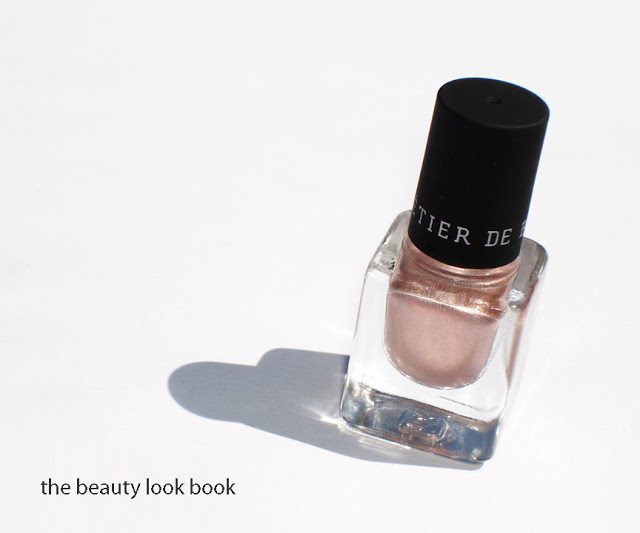
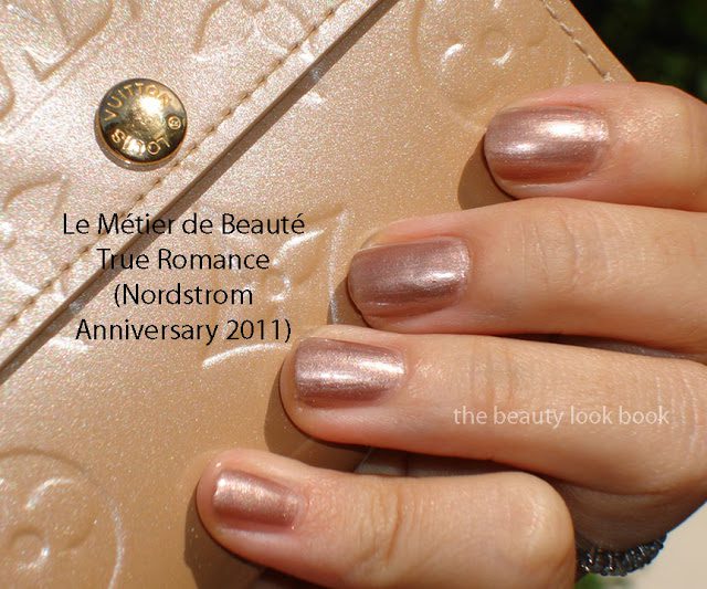
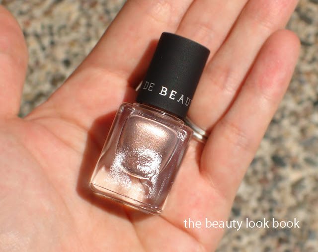
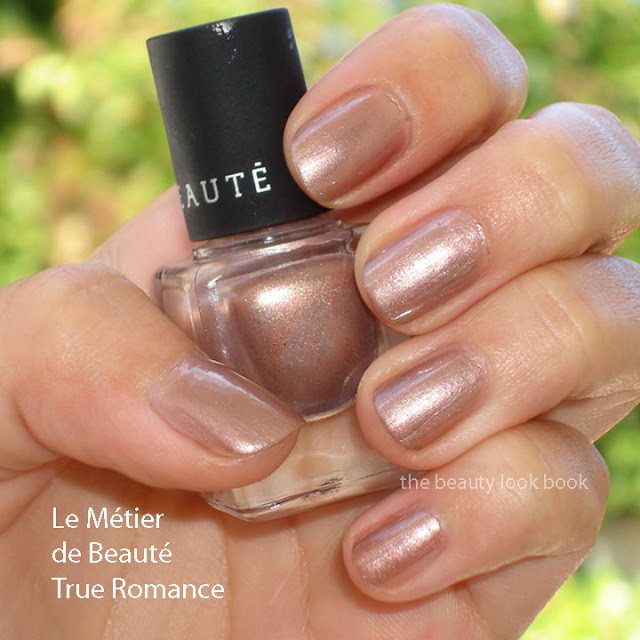
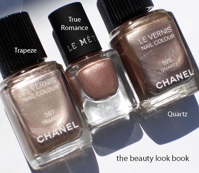
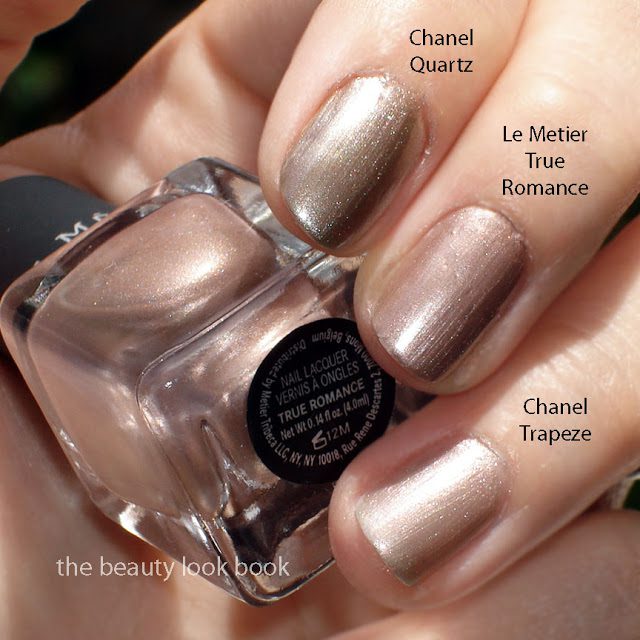
I couldn’t resist the oh-so-cute mini nail lacquer set called Rock ‘n’ Romance by Le Métier de Beauté. At $25 for four gorgeous shades, how can anyone pass this up? Every color in this set looks amazing on everyone I’ve seen it on. There’s not a bad shade in the bunch. I tried True Romance first. It’s a beautiful complex shade, described on Nordstrom as “a delicate pale rose with a subtle metallic nude finish.” The color changes depending on how the light reflects on your hands. Sometimes it looks like a rosy-bronze. Other times it looks like a soft metallic rose-nude. At certain angles you see a soft silver cashmere taupe.

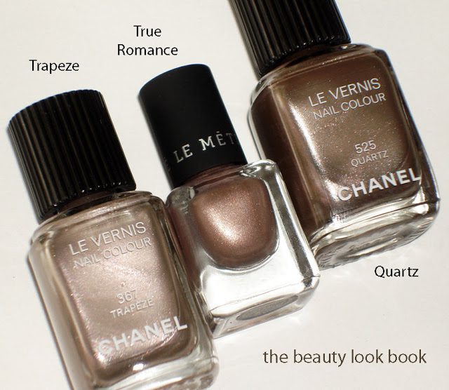
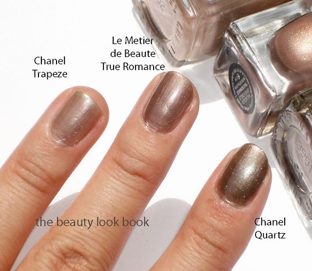
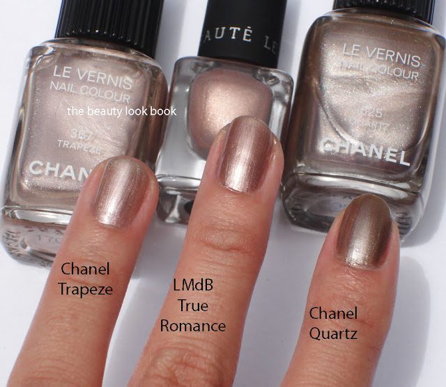
Le Métier True Romance is in a similar color family to Chanel Trapeze and Quartz. I would say the Le Métier is more metallic/frosty while the Chanels have a multi-colored sparkle making the colors even more complex. They are all just a tiny bit different in undertone. Here are the shades compared to each other. As you can see, the colors transform depending on the light.

Overall LOVE. The tiny bottle is to die for (so cute) although the size does make it a bit hard to apply. I have small fingers to begin with and still found it a bit challenging to hold the top while applying. It can be a bit streaky because of the metallic finish, but I still love it. The color is not too warm and not too cool. It’s a perfect metallic neutral. I haven’t bought a Le Metier nail polish in over two years (see my original post on Lenton Rose, Phlox, Violaceous Splendor and Black Orchid linked here from 2009). I simply found them too small for the price. The Nordstrom set  however is priced just right in my opinion with to-die-for colors that will be perfect as we transition to fall.
Uncategorized

Chanel Blue Satin Le Vernis

July 15, 2011
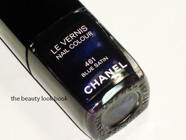
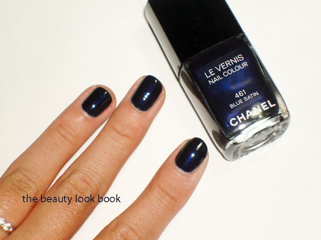
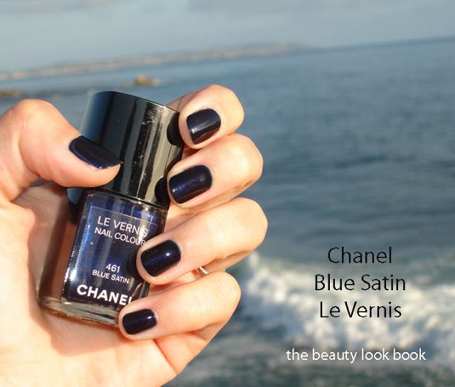
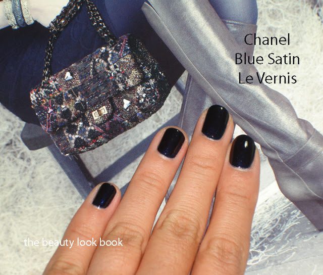
Chanel Blue Satin 461 was originally launched in Spring 2008 (see details on Temptalia here) as a permanent shade. Per Cafe Makeup’s keen eye, it looks it might be making a comeback as seen on the runway at the Fall-Winter 2011-12 Couture Collection at the Grand Palais in Paris, France. It’s a dark navy blue with an iridescent glow in the bottle. On the nails, the shimmer disappears (unless in direct sunlight) and you see a dark glossy deep rich navy. Since it’s mid-summer, I was initially a bit weary of wearing this right now. Thanks to the help of a few tweets from fellow bloggers, I was assured that Blue Satin is one of those shades that is good for any time of year. They were right!
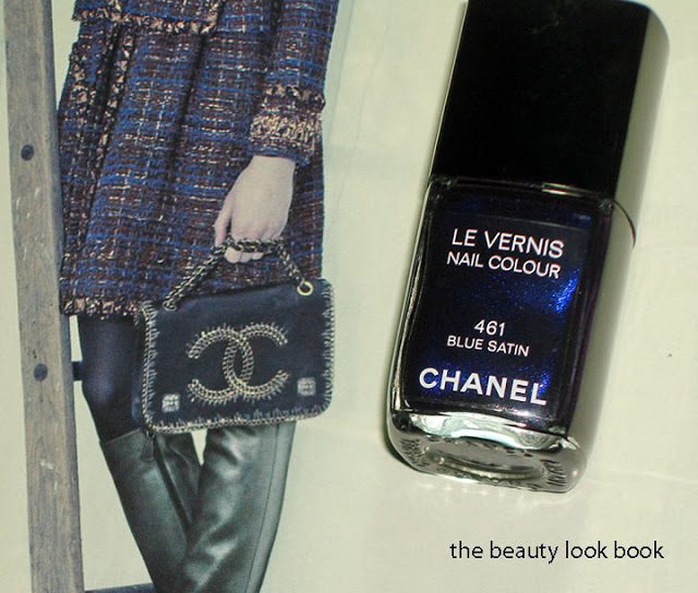
The newly released Neiman Marcus catalog has a feature on Chanel. Blue Satin complements the dark blue tones of the clothing and accessories. If you don’t receive the catalog in the mail, they usually have extras in-store. I highly recommend that you try to pick one up. The photography is phenomenal and absolutely beautiful!

Two coats, with flash and artificial light, you can see the shimmer a bit:

In direct sun

This is what Blue Satin looks like most of the time, without the direct sun, a deep dark navy:

Overall love. However, this color isn’t the most unique and I think it should be easily dupeble. If you want shimmer, then this is not the navy for you. I haven’t checked out the Dior Blue Tie, but from pictures it appears to be more visibly shimmery than Chanel Blue Satin. Rescue Beauty Lounge’s Under The Stars is slightly more shimmery. See the comparison here. The formula, however, even after having this for several years is still excellent. It has a thin texture but the coverage is rich and very smooth.

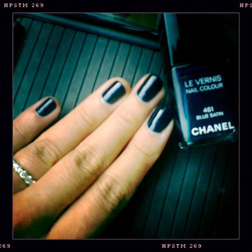
One more just for fun even if it’s blurry:
Uncategorized

Looking Back on Past Years of Chanel Fall Le Vernis Nail Colours

July 11, 2011
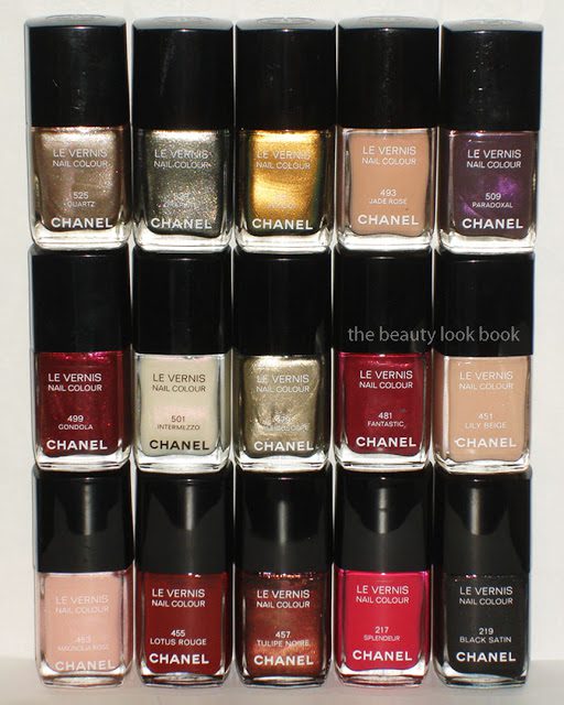
Chanel has developed a cult following for their beautiful cutting-edge seasonal nail polishes. As each new collection rolls out, it’s the new Chanel nail polish creations that I anticipate seeing the most. Since Chanel’s Fall Illusion d’Ombre Collection for 2011 was just released, I thought it would be fun to go through past years to see the history of Fall-Autumm Le Vernis colors. This year’s theme is highly metallic, very different than past collections. The colors shown below represent a partial history of the shades from Chanel Fall Collections, the mini releases and special boutique releases are excluded. Also, I did not start collecting until recent years so I know there are a few that I know I am missing and unfortunately I cannot recall releases prior to 2006. Starting from the present and going back in reverse chronological order, these are the shades Chanel has released for Fall.

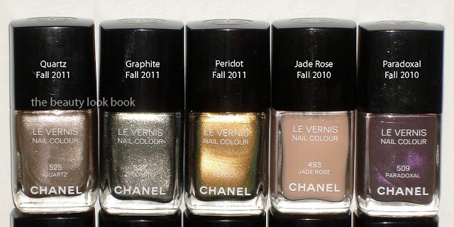
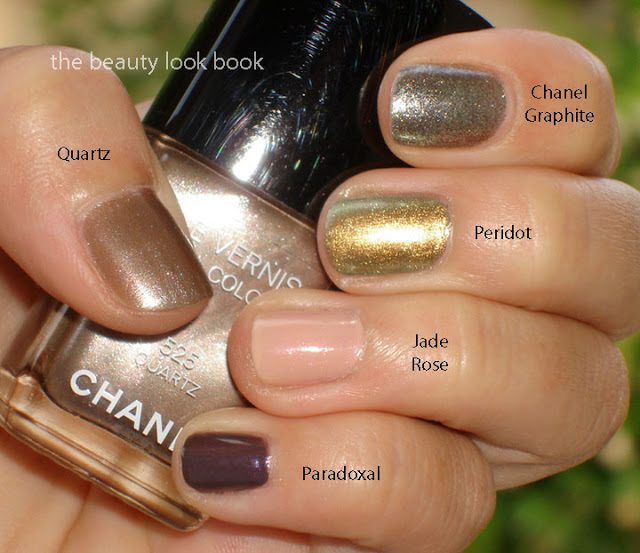
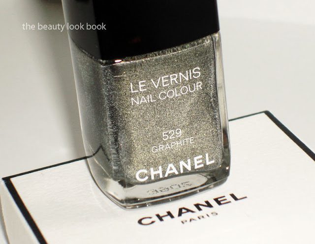
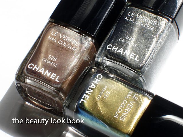
Fall 2011 Quartz 525, Graphite 529, Peridot 531
Fall 2010 Jade Rose 493, Paradoxal 509
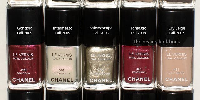
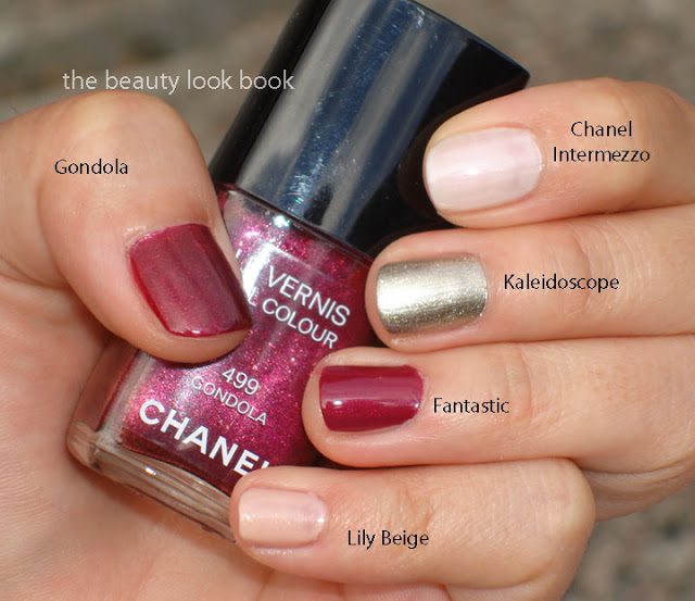
Fall 2009 Gondola 499, Intermezzo 501
Fall 2008 Kaleidoscope 479, Fantastic 481, (missing Gold Fiction)
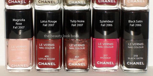
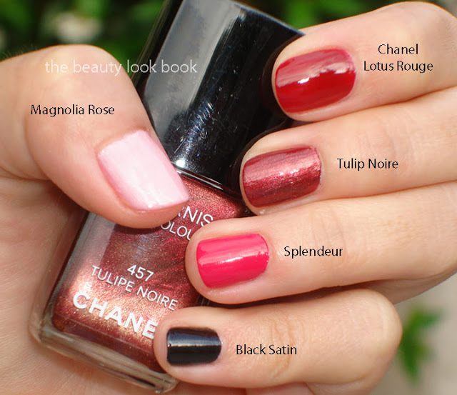
Fall 2007 Lily Beige 451, Magnolia Rose 453, Lotus Rouge 455, Tulip Noire 457
Fall 2006 Splendeur 217, Black Satin 219, (might be missing a few)

As you can see from the swatches, not all Chanels are created equal. The formula has improved tremendously over the years. Some of the lighter shades apply blotchy and uneven requiring 3 coats. Overall the quality is superb and complexity of colors amazing. Each year Chanel typically releases something unique but timeless, although this most recent season for 2011 seems more trendy than classic, but beautiful nevertheless. I believe a good number have been limited edition and can no longer be found in the US. From traveling overseas, I know some can still be found in Europe, Asia or Duty-Free stores, but I do not have an up-to-date list.
Are you a Chanel Nail Polish collector? If so, can you help me fill in the gaps? What was your favorite Chanel Fall collection? Or do you have a different favorite season?
Uncategorized

Chanel Péridot #531 Le Vernis Re-Visited

June 27, 2011

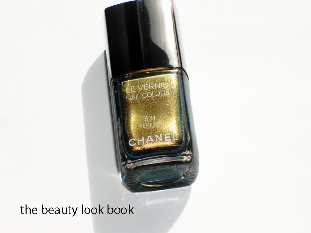
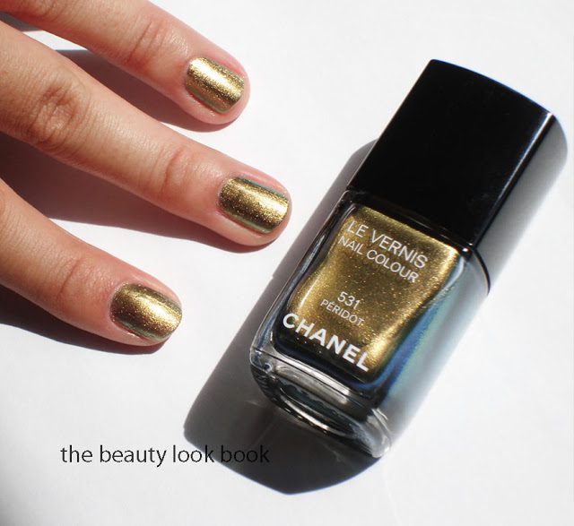
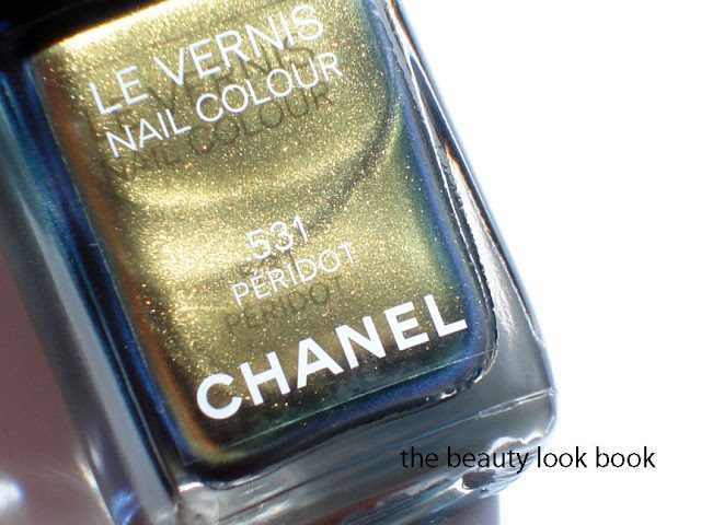
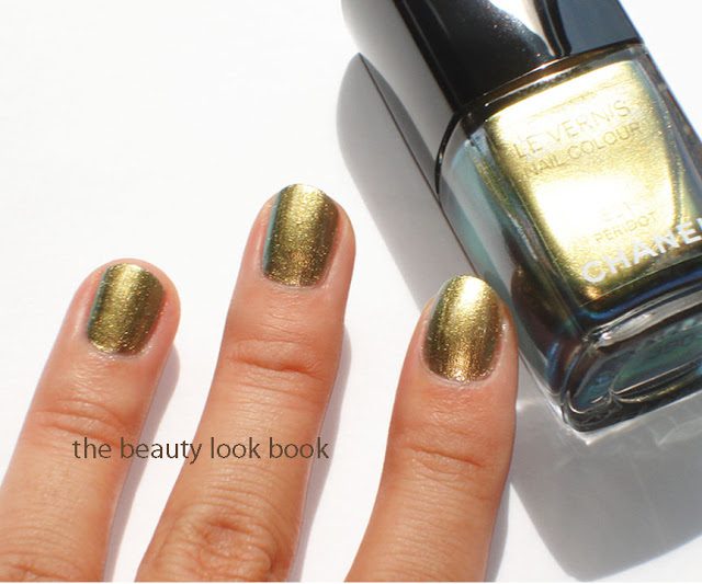
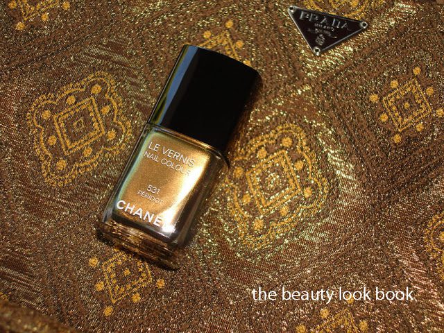
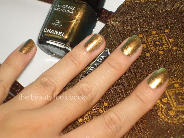
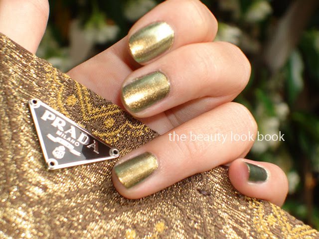
Since reviewing Chanel Péridot 531 Le Vernis last week (see all three fall shades here) I’ve received a few questions asking to describe this color in a bit more detail. As fall trickles in-stores and you see more reviews of this color, you will see that Péridot is such a complex unique color making it almost impossible for to describe in words. Looking in the bottle, I see glowing yellow gold that flashes different variations of brown, green and yellow pearl. The closest thing I can think of is that it reminds me of a scarab beetle. Depending on the angle I hold my hand, sometimes I see a lot more green than gold – but regardless of lighting and angles, I always see more than one color and my fingers glow.

On my fingers it’s predominantly yellow/gold and the green flashes on the edges. Initially I did not like. After playing with it a few more days, I still am not completely won over. No matter what angle I look at it, Péridot just appears so unflattering on me. Still it’s extremely unique and the complexity keeps me interested. I hope these photos will give you a better idea of how it might look in real life.

See Péridot swatched here on these other amazing sites as well:
The Purse Forum here and here
Uncategorized

Chanel Fall 2011 Le Vernis Comparisons

June 19, 2011


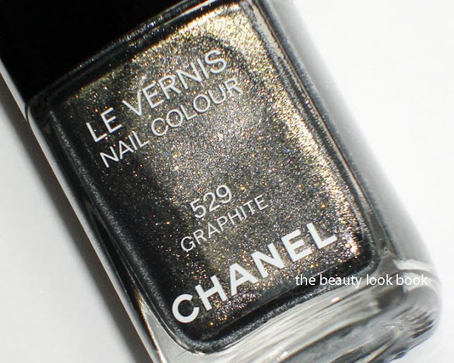
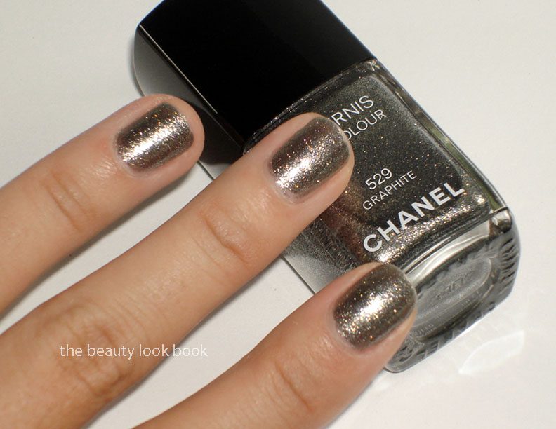
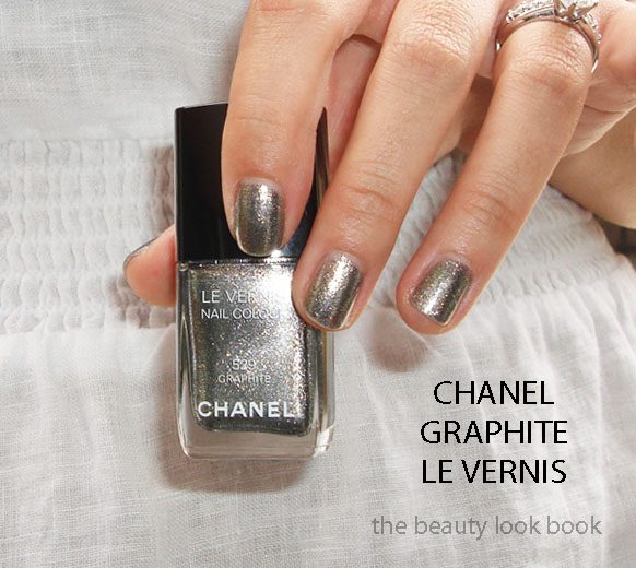
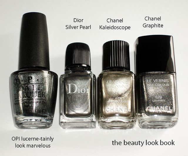
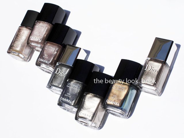
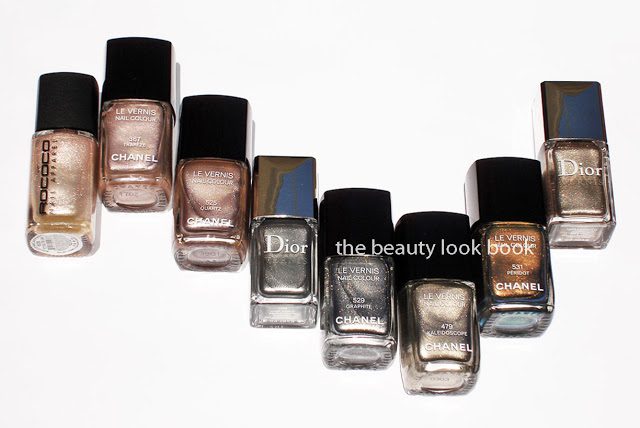
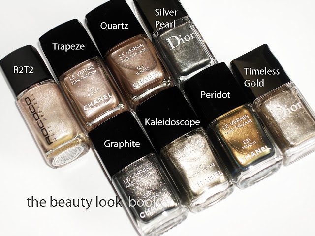
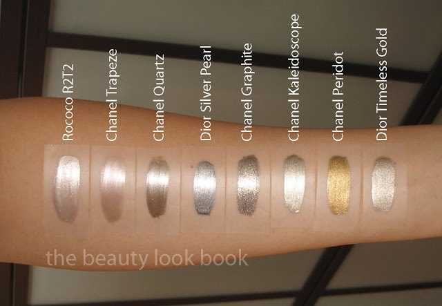
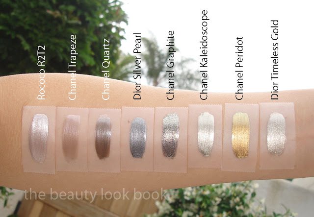
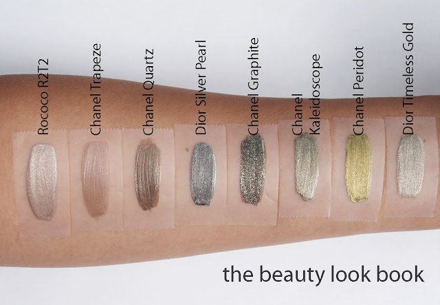
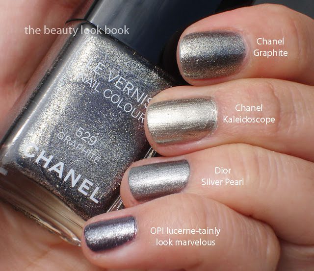
No dupes to be found. Here are the shades Quartz, Graphite and Peridot compared to prior releases from Rococo Nail Apparel, Chanel and Dior.

The fall shades

Comparisons L to R: Rococo Nail Apparel R2T2, Chanel Trapeze, Chanel Quartz, Dior Silver Pearl, Chanel Graphite, Chanel Kaleidoscope, Chanel Peridot, Dior Timeless Gold


Swatches with 3 different views (since metallics look different depending on the light)


FYI: Polish Police has a comparison of Chanel Graphite to OPI Lucerne-tainly Look Marvelous. Those who think it’s a dupe will see from her blog that it’s really not 🙂