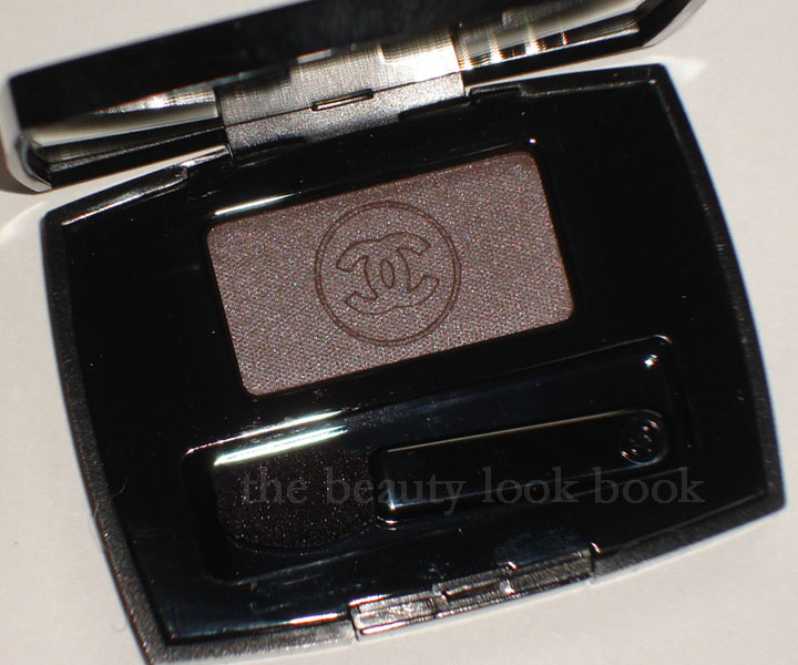
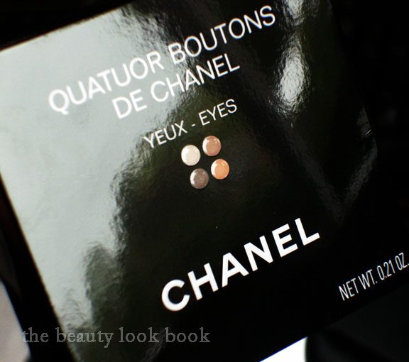
Ever since I saw the Chanel Quatuor Boutons de Chanel $65 swatched on KarlaSugar (see here for her review) I knew I had to have it. I didn’t even need to see the tester even though it was of the round-pan design – that’s how good Karla Sugar is.
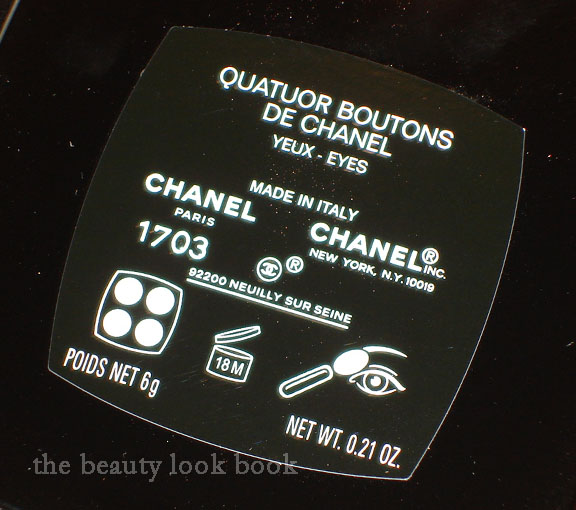
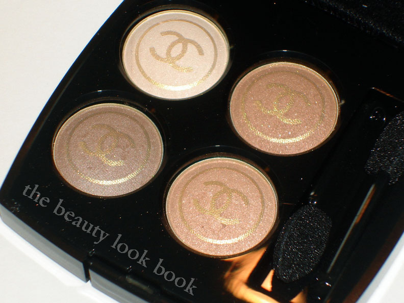
It seems like Nordstrom has been sending out their pre-sales early this year because UPS arrived with a package from Nordstrom today. (I hear from my local store associates that you can pick up your pre-sale items as early as the 13th. Let’s keep our fingers crossed that what happened with SR doesn’t happen with the other “pre-sales.”) I was even more pleased to find out that while these shadows come in the round pan, they are not the baked variety! Yay! I’m not sure if where it’s made makes a difference, but these ones were made in Italy. This quad seems very similar in texture to the Les Folies Noires from the Noirs Obscurs collection.
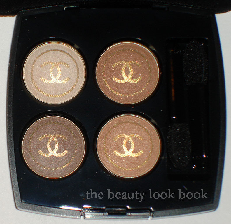
This quad has four neutral shades in a soft ivory, light brownish-red clay color, soft fleshy peach and a sheer cool-mauve-brownish color. All have the gold Chanel logo as an overspray which disappears after one swipe. The quad seems to be more on the sheerer side for me, perhaps the color doesn’t show up as well as they do on Karla because I’m darker than her, hence the shades seem to blend in with my skin better. I will say that this quad swatches better on the fingers and apply better on the eyes with brush. Once I put them on my arm the color seemed to disappear a little.
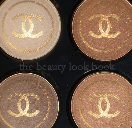
The gold overspray disappears:
In natural light, no flash (still cloudy here in Southern California):
Swatched on bare skin, NOTE they swatched sheer on my arm,
but on my fingers and eyes the color shows up better:
I will say I had no idea these were $65 when I did my pre-sale. Regular quads are $56 which is still highway robbery. At that price, I can’t say it’s a must-have. Pretty, but the price is pretty steep for what you get considering it’s on the sheer side. It seems to have a similar texture/pigment to the Noirs Obscurs quad which was something I was tempted by but passed on because I found it too sheer for the price.
This post is for one of my readers Jo Ann, a fellow Chanel Nail Polish collector, she was kind enough to search for shades I did not have from Asia during her recent business travels. I apologize to her, but this has been a few months delayed. She hoped I would feature an updated post on my Chanel Le Vernis Nail Polish collection in order to try and figure out which shades she was missing. Upon returning from her trip, I heard she brought back over 20 bottles (Chanel + Dior) 🙂 Many were for her friends. One was for me. I was ecstatic (it was Magnolia Rose which I had missed out on years ago).
I never thought this would happen, but I’ve recently run out of space for my Chanel Nail Polishes in my nail polish rack. There are now four lone bottles without their own space. I need an intervention, but don’t really want one. Most of these shades were limited edition from past seasons. Chanel is the brand that set off my interest in nail polishes. The formulas weren’t always great quality (in my opinion). I can’t remember the exact year, perhaps it was the early 2000’s was the time Chanel revamped their formulas. My first two were Le Perle (see dupes here) and Vamp (see swatches here). Some of the shades are from Canada, Europe and Asia, so US girls might not recognize or remember all the shades being released here in the US. This is definitely not comprehensive of all the shades that have been released in the US.
I may have missed a few swatch links. Also, I haven’t always photographed every mani/pedi I’ve had in the past year. I’ll try to include more in the future. Do you have any favorite Chanel Nail Colors?
Taupe + Shimmer + Chanel = must buy. If there’s a taupe Chanel makes, it’s instantly a must have for me. I am taupe-obsessed much like Elvira and Josie, and there’s no stopping us, ever. Taupe Grisé 87 is the newest taupe released by Chanel for their Fall 2010 collection. My makeup-twin Amy at Café Makeup has given a lovely review here (I call her my twin because we love the same things, although she has fairer skintone = Chanel Cameo/NC15 while I am Chanel Shell/NC30-35).
There a number of other great reviews, photos and swatches out there so the focus of this post will be on comparisons to similar shades.
There are a million other taupes out there (click on the Taupe Label below this post to see the other ones I have obsessed over) but I picked out the ones in my mind I thought, “Could this one be a dupe?” I personally could not find a dupe for this lovely color. There are similar shades, but from what I have, no dupe.
Compared to: Chanel Silvery, Chanel Safari, Chanel Vega (d/c), MAC Moth Brown (l/e), MAC Sweet Sienna (l/e), MAC Smoke & Diamonds (l/e), MAC Clue (l/e), Stila Dapple (d/c), Chanetcaille Meteorite, Laura Mercier Sable
In natural light (still cloudy weather):
Swatched over bare skin:
One more view with different lighting:
Is it a must-have? For me it was being a Chanel fan and a taupe fan. I have no willpower when it comes to Chanel. I played around with it on the eyes today, it works better when applied over a cream base, otherwise it just ended up looking bruisey on my eyes. I would describe it as having a subtle sheen. It looks shimmery in the container but when applied on the eyes, it looks more satin-matte rather than shimmery.
*Update* Upon reviewing my swatches and those on other websites, I thought Taupe Grise looked extremely brown on me compared to other girls. Much more brown than it appears in the container. I swatched it again alone, and then next to MAC Moth Brown to see if perhaps I made a mistake – but no. For some reason, it looks cool in the container, but on my skin, it’s not quite as cool. Here is another swatch comparison. Note that I have olive medium skin. This may look different on you. It’s still a cool colored taupe in my opinion, but next to Moth Brown it just looks warm perhaps because Moth Brown is overwhelmingly cool with an almost blueish sheen.
Another one of my picks from Chanel Fall 2010, Pink Explosion Powder Blush, a dusty cool pink with tiny bits of silver sparkle. It’s a lovely shade of pink, but I bring my first less-than-satisfactory review for Chanel. I normally love the color products Chanel makes – the formula, texture, finish are all divine and I feel the higher price tag justifies the purchase because of the higher quality. The items I don’t like are typically just because the color isn’t me, but I am usually able to find at least one thing that I like with each collection. This fall, Chanel has released the blushes in the Asia/Euro baked version and I am slightly disappointed.
Chanel has two types of product batches they produce (as far as I know): U.S. versions and Euro/Asia/Canada versions. The difference is in the product names and finish (why many like the number reference so they know which overseas products to compare). Euro/Asia eyeshadows and blushes come in a baked formula with round pans and have a more powdery-like finish. I will say up front, I am not a fan of the Euro/Asia formulas at all. I have a couple Euro blushes from custom purchases (Candy and Tea Rose) and I only purchased them because I was interested in the color. The formula has left me wanting for more. Both definitely show up, but the finish is not the same as the U.S. – they are sheerer, more powdery, and just sit on the skin rather than blending into the skin like a natural blush does.
The labeling shows Made In U.S.A. versus Made in France:
That being said, I decided to give Pink Explosion a try. The verdict is still out. The color is pretty, but I’m less than thrilled with the finish – one swipe and you get a powdery mess. I find the formula too soft. Also there’s the glitter. Granted, it’s extremely fine and tiny. But still, I love Chanel for their finely milled shimmers, not glitter. Hence the less-than-satisfactory review. I know I would have loved this one had it been in the US formula.
Here you can see the powdery crumbly debris,
(natural light, no flash but cloudy weather):
If you own other Chanel blushes, you may be wondering how it compares to other pinks. Here it is compared to Narcisse and Turbulent (both discontinued):
No flash, in natural light (cloudy weather light though):
Swatch comparisons to other Chanel Pinks:
Narcisse, Pink Explosion, Turbulent,
Rose Petale, Tweed Pink
So all in all, I think it’s a nice blush. Just not the usual quality I find for Chanel. The clouds have me slightly off my game – photography wise. I’d suggest checking out other blogs to see how Pink Explosion looks photographed in different lighting. It will give you a better idea of how it looks. I’m in between a MAC NC30-35.
Check it out on darker skintone on Karen at Makeup and Beauty Blog here.
Also check it out on lighter skintone like Christine’s from Temptalia here.
I’d say my skintone is probably somewhere in between those two 🙂 If you have this photographed or swatched, please feel free to link to your blog in the comments.
US girls who have purchased Chanel blushes in the past – what are your thoughts about the Asia/Euro formula for blushes?
The Chanel Fall 2010 collection is trickling in stores and finally arrived at a Neimans near me. Among the things I picked up, the most anticipated item for me was the new Paradoxal 509 Nail Polish. I saw it featured by Jen at Beauty Moogle and fellow Chanel fan Leslieal sent me pics of it swatched on her. It’s an odd shade because it looks so different depending on what lighting your fingers are in making it a bit difficult to tell what it really looks like. If you’ve seen the photos on the web you may be wondering, “so which photo is the most accurate?” My answer is: they all seem to be accurate, it just depends on what light you’re in.
In the bottle Paradoxal is a greyed mauve plum with visible purple shimmer. On the nails, the shimmer disappears, much like Vendetta (Spring 2009) and Jade Rose (featured here) which has been repromoted with the fall collection. In the sunlight there is a subtle sheen to the polish but from arm’s length, it appears to be a flat-cream finish. The formula and finish on this shade is pretty good. I was able to get a full color application with 2 coats. While I would have liked the shimmer to be more visible, I did like that it applied smoothly without streaks. I took a number of photos in different lighting:
Swatches all applied with 2 coats, no topcoat:
Photo with high flash:
Photographed in artificial light:
This is what the color looks like in natural light:
Compared to NARS Tokaïdo Express & Chanel Vendetta 483:
Artificial light (shimmer is not as visible):
With high flash (shimmers visible here):
Outdoors, natural light:
I found the collection at Neimans, but I’ve also heard reports that it’s available at Macy’s. My Nordstrom and Macy’s both said they weren’t expecting the shipment until right before July 4th. So those still trying to hunt the collection down – it will most likely be in store near you within the next week.
NARS Beverly Hills Multiple Tint NARS Sertao Blush NARS Cordura Eyeshadow Duo Urban Decay YDK Eyeshadow Bobbi Brown Bronzer Brush Bobbi Brown Shore Cream Eyeshadow Chanel Nail Polishes MAC Blonde’s Gold Pigment MAC Fleur Power J.Crew Skinny Belts
* Sorry for the misspelling on the NARS blush, it’s Sertao, not Serato
Paul & Joe Creamy Facial Foam – I tried this from a sample and finally purchased the full size. It’s thick and creamy and cleanses the skin really well. Leaves the skin feeling clean and refreshed.
NARS Beverly Hills Multiple Tint – See more swatches and the review here, a nice swipe & go type of product, easy to use and blend, gives a pop of color, can’t rave enough about these
NARS Sertao Blush – A pretty shimmery light golden tan
NARS Cordura Eyeshadow Duo – Great for a smokey bronzed eye look
Urban Decay YDK Eyeshadow – This is from the old packaging, a nice nude-taupey-bronze sparkle
Bobbi Brown Bronzer Brush – This is from the Black Plum set, but is available in the regular brush handle, the most luxurious soft bronzer brush you’ll ever find. Definitely worth the price even though it is pricier.
Bobbi Brown Shore Cream Eyeshadow – My perfect lids-but-better base, review here
Chanel Nail Polishes – Especially love Riviera (check out dupes here) and Orange Blossom (see the manicure here)
MAC Fleur Power – The perfect healthy warm pink blush
MAC Blonde’s Gold Pigment – The prettiest wash of soft gold-champagne
J.Crew Skinny Belts – Simple, classic and makes a nice accent to the waist, now I just need to go back and find a black one
What are you loving right now? I always love reading your favorites.
*Update* I wasn’t happy with the swatches for this post – I think they were a bit misleading because the lighting was off so I removed them so I don’t confuse my readers. Sorry for any confusion!
A few summery brights for the tips and toes with Chanel Orange Fizz (a vibrant orange) and Rococo Trash (a pretty raspberry cream). Fall collections are tempting me, but I’m still in spring mode. I just started feeling like it’s really summer – but haven’t quite fully transitioned (in my mind at least).
I have never really been into coral or orangey nail polishes. I usually feel like they are so loud but I thought Chanel Orange Fizz would be fun to try something different. I find it still a bit too bright/loud on the fingers. I think I’ll like it better for a pedicure. Rococo Trash on the other hand is a stunning red raspberry. I’m sure there’s a dupeable color out there by Zoya or OPI, I just haven’t looked into it. It was a bit of a hunt for me to track down Chanel Orange Fizz. As far as I can tell, there are plenty of online places to buy it. I had to go to a few counters near me to find this one even though it’s been out for a while. I finally found it at one of my local Macys and they only had 2 bottles left. The Rococo was found at Space NK Bloomingdales South Coast Plaza.
Chanel Orange Fizz:
Rococo Trash on the toes:
There’s a lovely coral-peachy-pink that I saw at Sephora that I need to check out again. I can’t remember the name but it’s by the OPI for Sephora line.
All the coral nail polish lovers. Do you have any favorites you’d like to share? I’m open for recommendations for summer!