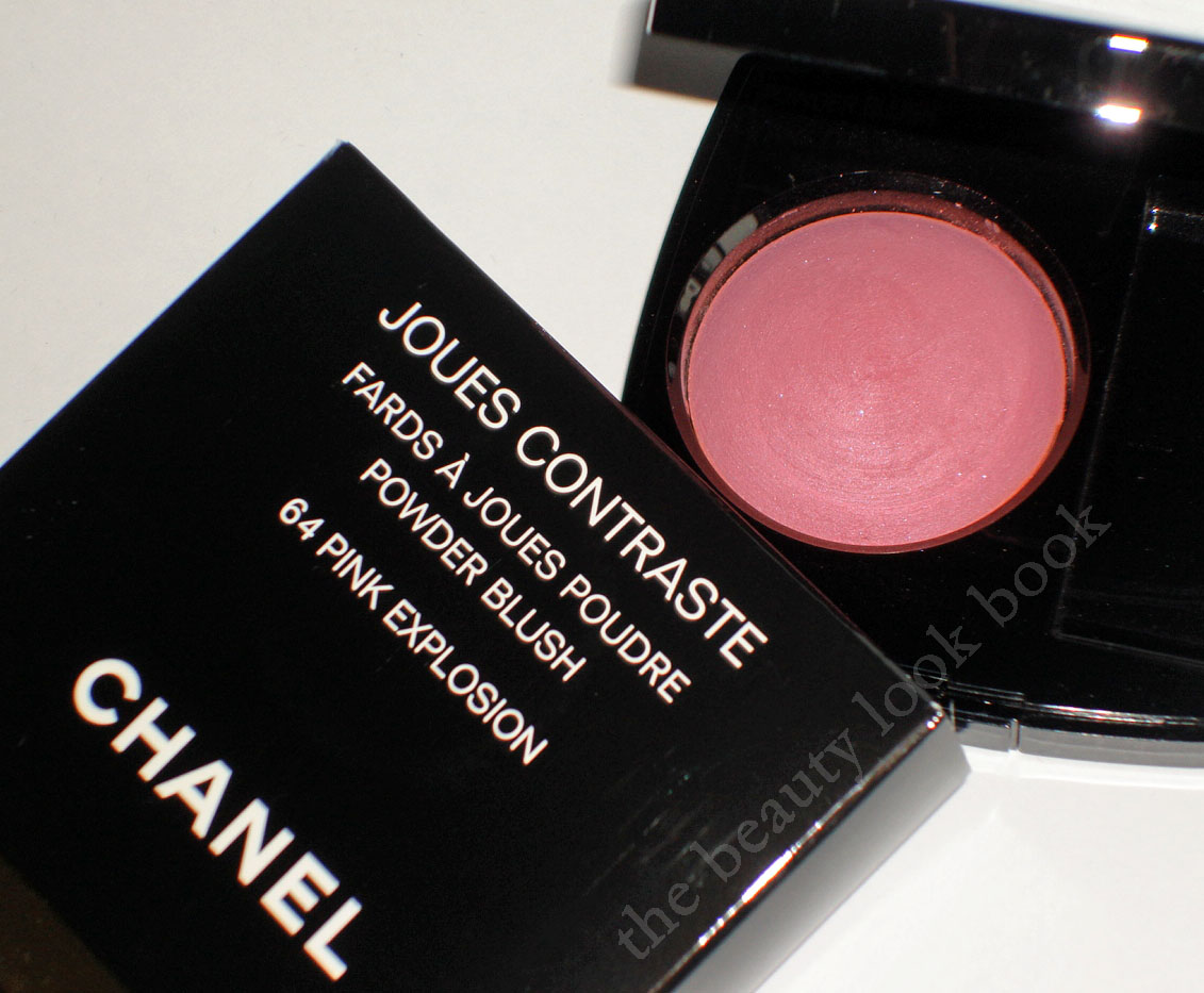
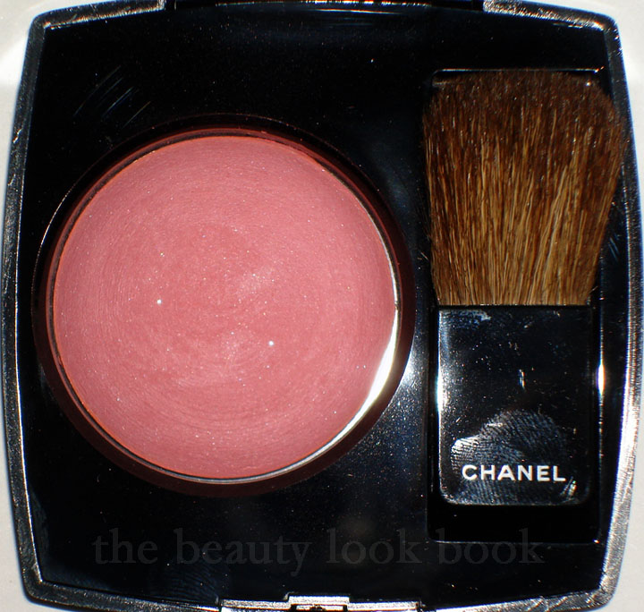
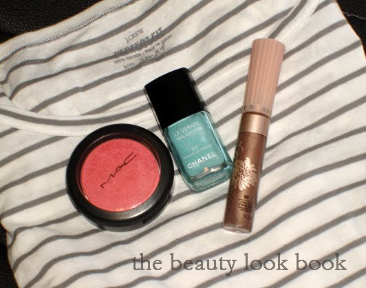
Another one of my picks from Chanel Fall 2010, Pink Explosion Powder Blush, a dusty cool pink with tiny bits of silver sparkle. It’s a lovely shade of pink, but I bring my first less-than-satisfactory review for Chanel. I normally love the color products Chanel makes – the formula, texture, finish are all divine and I feel the higher price tag justifies the purchase because of the higher quality. The items I don’t like are typically just because the color isn’t me, but I am usually able to find at least one thing that I like with each collection. This fall, Chanel has released the blushes in the Asia/Euro baked version and I am slightly disappointed.
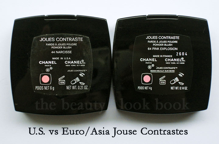
Chanel has two types of product batches they produce (as far as I know): U.S. versions and Euro/Asia/Canada versions. The difference is in the product names and finish (why many like the number reference so they know which overseas products to compare). Euro/Asia eyeshadows and blushes come in a baked formula with round pans and have a more powdery-like finish. I will say up front, I am not a fan of the Euro/Asia formulas at all. I have a couple Euro blushes from custom purchases (Candy and Tea Rose) and I only purchased them because I was interested in the color. The formula has left me wanting for more. Both definitely show up, but the finish is not the same as the U.S. – they are sheerer, more powdery, and just sit on the skin rather than blending into the skin like a natural blush does.
The labeling shows Made In U.S.A. versus Made in France:
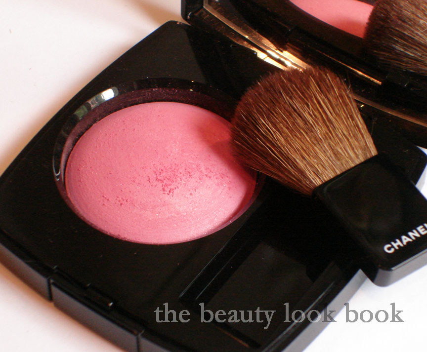
That being said, I decided to give Pink Explosion a try. The verdict is still out. The color is pretty, but I’m less than thrilled with the finish – one swipe and you get a powdery mess. I find the formula too soft. Also there’s the glitter. Granted, it’s extremely fine and tiny. But still, I love Chanel for their finely milled shimmers, not glitter. Hence the less-than-satisfactory review. I know I would have loved this one had it been in the US formula.
Here you can see the powdery crumbly debris,
(natural light, no flash but cloudy weather):
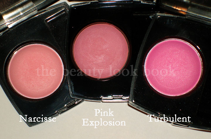
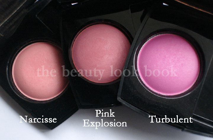
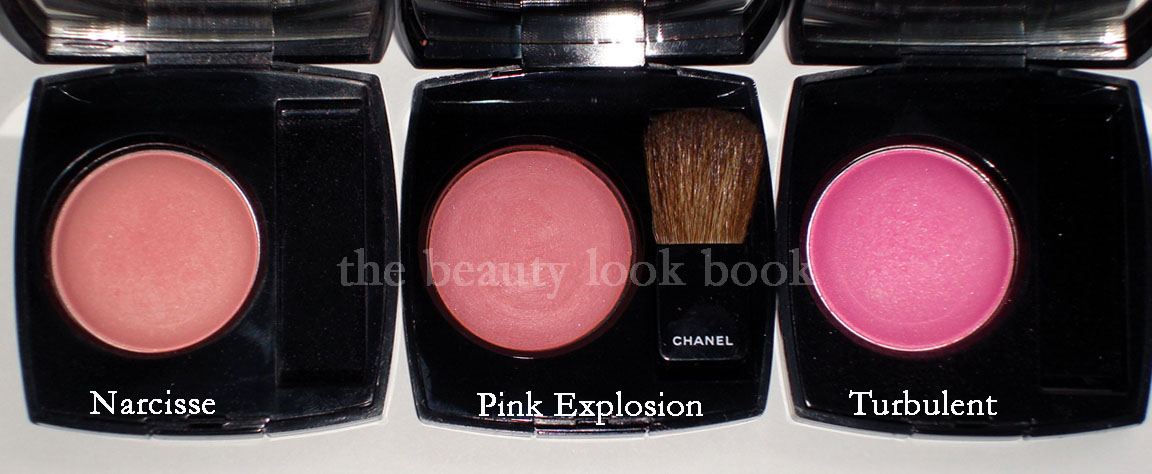
If you own other Chanel blushes, you may be wondering how it compares to other pinks. Here it is compared to Narcisse and Turbulent (both discontinued):
No flash, in natural light (cloudy weather light though):
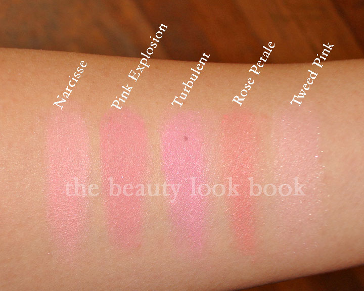
Swatch comparisons to other Chanel Pinks:
Narcisse, Pink Explosion, Turbulent,
Rose Petale, Tweed Pink
So all in all, I think it’s a nice blush. Just not the usual quality I find for Chanel. The clouds have me slightly off my game – photography wise. I’d suggest checking out other blogs to see how Pink Explosion looks photographed in different lighting. It will give you a better idea of how it looks. I’m in between a MAC NC30-35.
Check it out on darker skintone on Karen at Makeup and Beauty Blog here.
Also check it out on lighter skintone like Christine’s from Temptalia here.
I’d say my skintone is probably somewhere in between those two 🙂 If you have this photographed or swatched, please feel free to link to your blog in the comments.
US girls who have purchased Chanel blushes in the past – what are your thoughts about the Asia/Euro formula for blushes?
The Chanel Fall 2010 collection is trickling in stores and finally arrived at a Neimans near me. Among the things I picked up, the most anticipated item for me was the new Paradoxal 509 Nail Polish. I saw it featured by Jen at Beauty Moogle and fellow Chanel fan Leslieal sent me pics of it swatched on her. It’s an odd shade because it looks so different depending on what lighting your fingers are in making it a bit difficult to tell what it really looks like. If you’ve seen the photos on the web you may be wondering, “so which photo is the most accurate?” My answer is: they all seem to be accurate, it just depends on what light you’re in.
In the bottle Paradoxal is a greyed mauve plum with visible purple shimmer. On the nails, the shimmer disappears, much like Vendetta (Spring 2009) and Jade Rose (featured here) which has been repromoted with the fall collection. In the sunlight there is a subtle sheen to the polish but from arm’s length, it appears to be a flat-cream finish. The formula and finish on this shade is pretty good. I was able to get a full color application with 2 coats. While I would have liked the shimmer to be more visible, I did like that it applied smoothly without streaks. I took a number of photos in different lighting:
Swatches all applied with 2 coats, no topcoat:
Photo with high flash:
Photographed in artificial light:
This is what the color looks like in natural light:
Compared to NARS Tokaïdo Express & Chanel Vendetta 483:
Artificial light (shimmer is not as visible):
With high flash (shimmers visible here):
Outdoors, natural light:
I found the collection at Neimans, but I’ve also heard reports that it’s available at Macy’s. My Nordstrom and Macy’s both said they weren’t expecting the shipment until right before July 4th. So those still trying to hunt the collection down – it will most likely be in store near you within the next week.
NARS Beverly Hills Multiple Tint NARS Sertao Blush NARS Cordura Eyeshadow Duo Urban Decay YDK Eyeshadow Bobbi Brown Bronzer Brush Bobbi Brown Shore Cream Eyeshadow Chanel Nail Polishes MAC Blonde’s Gold Pigment MAC Fleur Power J.Crew Skinny Belts
* Sorry for the misspelling on the NARS blush, it’s Sertao, not Serato
Paul & Joe Creamy Facial Foam – I tried this from a sample and finally purchased the full size. It’s thick and creamy and cleanses the skin really well. Leaves the skin feeling clean and refreshed.
NARS Beverly Hills Multiple Tint – See more swatches and the review here, a nice swipe & go type of product, easy to use and blend, gives a pop of color, can’t rave enough about these
NARS Sertao Blush – A pretty shimmery light golden tan
NARS Cordura Eyeshadow Duo – Great for a smokey bronzed eye look
Urban Decay YDK Eyeshadow – This is from the old packaging, a nice nude-taupey-bronze sparkle
Bobbi Brown Bronzer Brush – This is from the Black Plum set, but is available in the regular brush handle, the most luxurious soft bronzer brush you’ll ever find. Definitely worth the price even though it is pricier.
Bobbi Brown Shore Cream Eyeshadow – My perfect lids-but-better base, review here
Chanel Nail Polishes – Especially love Riviera (check out dupes here) and Orange Blossom (see the manicure here)
MAC Fleur Power – The perfect healthy warm pink blush
MAC Blonde’s Gold Pigment – The prettiest wash of soft gold-champagne
J.Crew Skinny Belts – Simple, classic and makes a nice accent to the waist, now I just need to go back and find a black one
What are you loving right now? I always love reading your favorites.
*Update* I wasn’t happy with the swatches for this post – I think they were a bit misleading because the lighting was off so I removed them so I don’t confuse my readers. Sorry for any confusion!
A few summery brights for the tips and toes with Chanel Orange Fizz (a vibrant orange) and Rococo Trash (a pretty raspberry cream). Fall collections are tempting me, but I’m still in spring mode. I just started feeling like it’s really summer – but haven’t quite fully transitioned (in my mind at least).
I have never really been into coral or orangey nail polishes. I usually feel like they are so loud but I thought Chanel Orange Fizz would be fun to try something different. I find it still a bit too bright/loud on the fingers. I think I’ll like it better for a pedicure. Rococo Trash on the other hand is a stunning red raspberry. I’m sure there’s a dupeable color out there by Zoya or OPI, I just haven’t looked into it. It was a bit of a hunt for me to track down Chanel Orange Fizz. As far as I can tell, there are plenty of online places to buy it. I had to go to a few counters near me to find this one even though it’s been out for a while. I finally found it at one of my local Macys and they only had 2 bottles left. The Rococo was found at Space NK Bloomingdales South Coast Plaza.
Chanel Orange Fizz:
Rococo Trash on the toes:
There’s a lovely coral-peachy-pink that I saw at Sephora that I need to check out again. I can’t remember the name but it’s by the OPI for Sephora line.
All the coral nail polish lovers. Do you have any favorites you’d like to share? I’m open for recommendations for summer!
Face: Chanel Sunkissed Illuminator MAC Refined Golden Bronzer MAC Dollymix Blush
Eyes: Paul & Joe Eye Gloss 05 Bobbi Brown Seashell Shimmerwash MAC Naked Dark Pigment (swatches here) Bobbi Brown Java Metallic Eyeshadow (Java comparisons)
Lips: MAC Dervish Paul & Joe Liplacquer 06
Brushes Used:
Eye look was a smokey taupe, here’s how:
Step 1: Apply Paul & Joe Eye Gloss in Murmur 05 on lids (for asian eyes, 1/2 way up eye from lash to middle of eye, heavier near lash line)
Step 2: Apply Bobbi Brown Java Metallic from lash to 1/2 way up lid for a smokey eye, also heavier near lash line
Step 3: Apply MAC Naked Dark Pigment over center of eye to blend out any harsh lines from the darker shades
Step 4: Apply Bobbi Brown Seashell Shimmerwash from brow downwards softly to create a subtle highlight
Step 5: Curl lashes and apply mascara
Nails of the Day: Chanel Django & Nouvelle Vague
The mani/pedi combo:
I’m surprised that I’m liking the blue nail polish! FYI – the Jcrew top seems to run a bit small. I’m normally an XS in their shirts but found it to be a bit too snug. Or perhaps I just have been having too many sugary drinks and gained weight.
Feedback appreciated! Too much info in one post? Is the look too casual to write about? Would you style the top differently? I like that it can be dressed up a little with a nice skirt or dress pants. But it’s nice as a loungy-carefree-top too. Being in Southern California – my daily style is pretty casual.
I already did a lip swatch and EOTD attempt – neither turned out decent this morning. I’ll try and feature the Paul & Joe Lip Lacquer by itself in another post in the near future.
Chanel Jade Rose was released as part of a limited edition collection last September. Luckily for those who missed out the first time, Jade Rose will be re-released with the upcoming fall collection, so those trying to find it will have another chance to buy it. I wrote about it when I received my order last fall and did a few photo comparisons (see here, Chanel Jade Rose Nail Polish) but realized I never featured it swatched on a full manicure, so here it is.
Jade Rose is a creamy nude pink with slight iridescence in the bottle. You can barely see the shimmer-glow once it’s applied on the nails though, unless you are in direct sunlight. The result is a creamy nude pink on me. I gave a bottle to one of my friends for Christmas – she loves this (more so than me), but she is fairer in skintone (probably the equivalent of a MAC NC15) so it looks more peachy on her.
When I first received this, I was less than thrilled. Even for a neutral-lover like me, it was just another boring shade of neutral pink. However, the more I wear it, the more it grows on me. It’s a demure shade of pink that gives a nice classic polished look to the hands without drawing too much attention to them. This required three coats though. Two coats left a streaky finish, even by a professional. I personally could not find a dupe for this.
Compared to my other soft shades from Chanel & Dior, left to right:
I recently received an e-mail from one of my readers asking if I knew of a dupe for Chanel Riviera. She had decided to wait a bit to think about purchasing it and by the time she decided to purchase it, the color was sold out everywhere online and at all the stores and counters near her. Knowing that “oh no it’s sold out” feeling all too well, I was more than happy to help. I called & visited a number of local stores (about a dozen) but I too was unable to locate the nail polish – so began my quest to find the perfect dupe.
I narrowed down my search to brands that had testers available thus eliminating brands without testers such as Zoya, China Glaze, Essie and all drugstore brands. I swatched about a dozen hot pinks in my notebook and then went back to each counter/store to swatch the four closest matches on my fingers. I have to admit I was a bit nervous swatching so many shades in my notebook – but the Chanel reps were so sweet at each store. They even chimed in with their input about which ones they thought looked the most similar to the Riviera shade.
For some reason the fuschia undertones of some of the shades were throwing off my camera flash, so it was hard to get an accurate picture. Here are two views (to the best of my ability).
Thumb: Sephora by OPI It’s All About Me – about 2 shades darker and brighter and a smidge cooler toned
Index: NARS Schiap – same intensity, one shade bluer, looks more magenta
Middle: MAC Steamy – closest dupe in my opinion, just a bit more intense/sharper looking
Ring: Chanel Riviera
Pinkie: OPI Strawberry Margarita – second closest dupe, slightly lighter (only a touch)
So, which are the closest dupes? The verdict: MAC Steamy and OPI Strawberry Margarita. From an arms distance glance – you can barely tell the difference. Here they are photographed next to Chanel Riviera. Note that while they look slightly different in the bottles, on the fingers the difference is not noticeable. Are the exact dupes? No.
I was also asked how it compared to Lancome’s Miss Perfectly Pink and Illamasqua Collide – Lancome’s is significantly cooler toned and Illamasqua is a hot electric neon pink. So if you missed out on Chanel Riviera, not to worry – no need to shell out extra money for the shade on ebay. You can definitely find a similar shade! Not an exact dupe, but yes, similar. (Here’s one more shot with the Lancome – can’t swatch it b/c it’s a present.)
In terms of pigment, I actually found all the dupes to be pretty smooth and nicely pigmented. The Chanel did apply the best IMHO, but after 2 coats, you get the same result.
Note that this is by no means the most comprehensive list – just the ones I found 🙂 I hope this helps some! All work is copyrighted. Please do not republish these photos.