Browsing Category

Uncategorized

Uncategorized

Chanel Rose Écrin Joues Contraste for Fall 2011

June 21, 2011

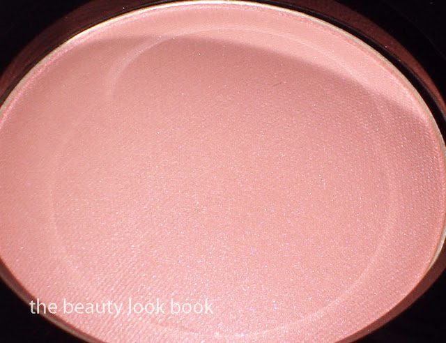
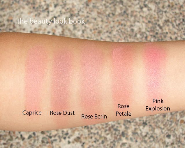
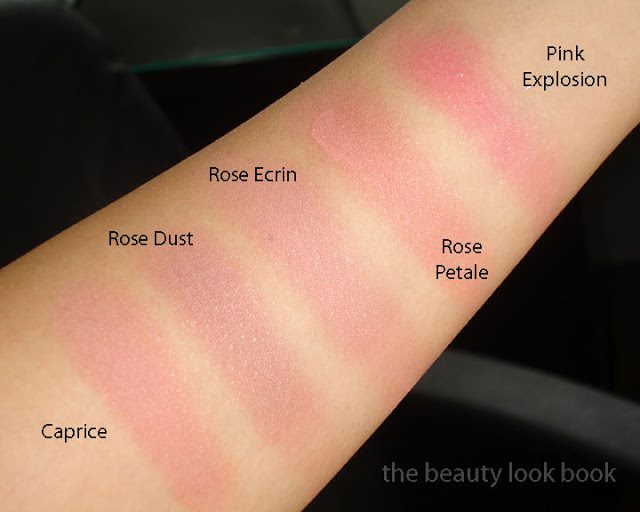
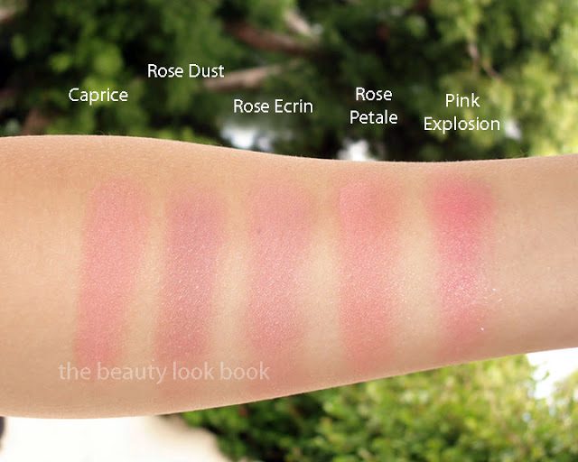
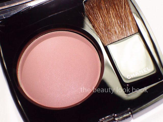
Chanel Rose Écrin #68 is a soft luminous pale rose pink. It’s a neutral-cool, leaning slightly more towards the cool side. The shimmer is finely milled (no frost). The texture is soft and there is noticeable rose scent which fades quickly. Pigment is soft but buildable. Lasting power is average as with most powder blushes.

UPDATE: A few have mentioned that Rose Écrin appears to have peachy tones from my photos, from what I see on my screen and in the pot it’s a true pink, no peach. If you see any other relevant reviews pop up of this blush, please link in the comments, thanks!

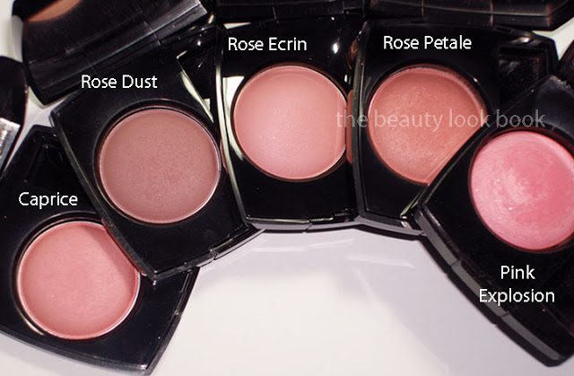
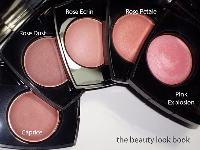
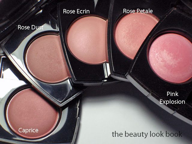
Compared to other Chanel pinks, it’s closest to Caprice (long discontinued). The difference is Caprice has more warmth and almost looks peachy. Rose Écrin is very similar but more pink/cool-toned. Note that I am doing a comparison of the US formulas. The Euro/Asia formulas of shades with the same name might be slightly different. This might be overkill, but here are the comparisons and swatches in different lighting. Compared to Caprice, Rose Dust, Rose Petale and Pink Explosion. As always, YMMV (your mileage may vary) per computer screen. I found the Chanel promotional photos to be fairly accurate this year, the promo photo is just slightly more dusty/pale than the actual product for the blush (see them on Cafe Makeup here also on Beauty Crazed in CA here).

With flash

Without flash

I’m working as fast as I can to swatch the lips and the new eyeshadows, but I’ve come down with a  bad cold 🙁 I’ve made it so long without getting sick and then all of a sudden bam. Sorry for the delay in getting all the reviews, swatches and photos/details etc. Thanks for your patience!
Uncategorized

Chanel Fall 2011 Prélude Quadra Eyeshadow & Precision Eye Definer Khaki Platine

June 20, 2011

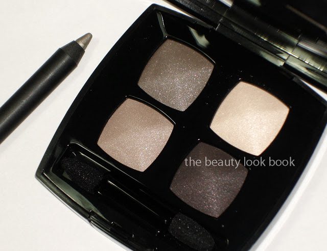
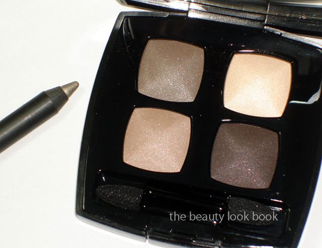
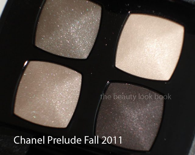
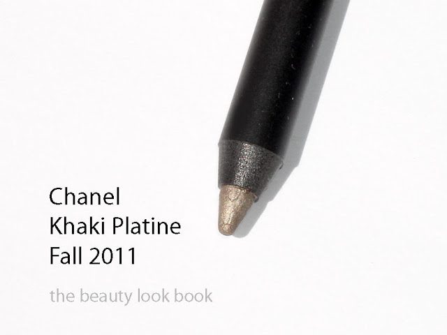
Chanel Prélude Quad and Khaki Platine for fall this year are gorgeous neutrals. Prélude pulls more cool in the compact but depending on the light it looks more neutral-cool. This is one I think everyone needs to try on themselves. Last fall Taupe Grisé 87 pulled oddly warm on my skin while it looked blueish-cool on most everyone else. Khaki Platine is stunning and reminds me of Lancome Erika F in a liner form (less sparkly too).

Khaki Platine and Prélude in slightly different lighting, not sure if you can tell the difference but in this one it’s not as cool-toned


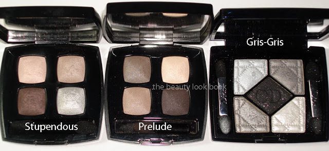
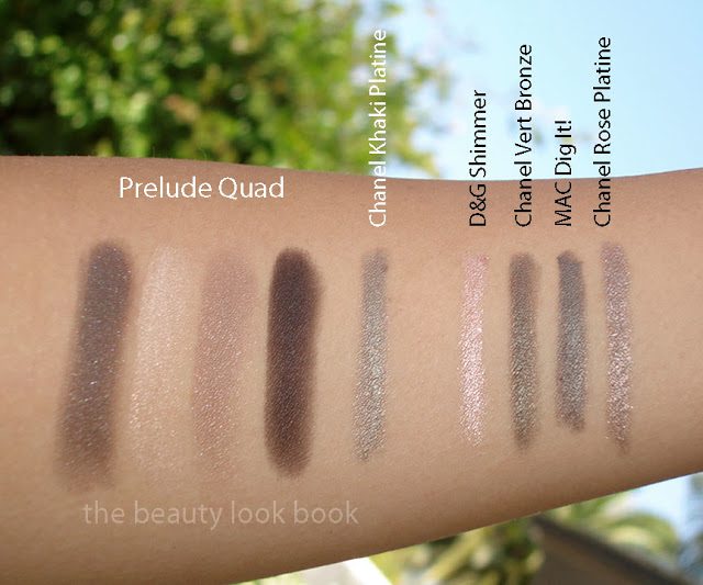
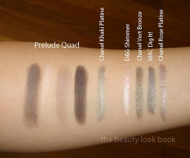
Les 4 Ombres Quadra Eye Shadow in Prélude #33 – In the compact, the colors are cool toned, on my skin, they pull more neutral. The colors are variations of beige, taupe, and plum. All have a luminous soft sheen. Scroll down below to see swatches and you’ll see that the colors are very subdued and neutral.
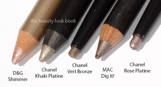
Le Crayon Yeux Precision Eye Definer in Khaki Platine #70 – a beautiful pigmented yet soft light khaki silver. The texture is soft making it easy to apply, but not too soft that it slips.

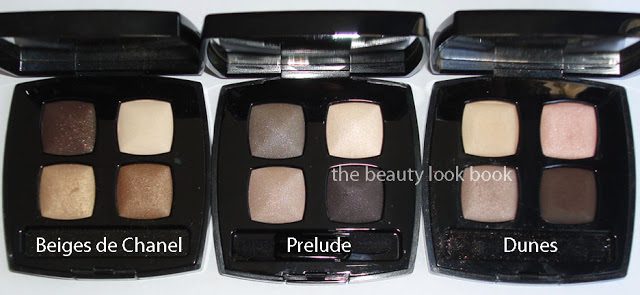
Here are a few other quads and liners to help you gauge the color depending on how your monitors show the colors differently to mine. Quads compared include Beiges de Chanel, Dunes, Stupendous and Dior Gris-Gris.

Eyeliners include D&G, Chanel Vert Bronze, MAC Dig It! and Chanel Rose Platine.

Swatches of the Fall Quad and Eye Liners on my arm:


Soft and beautiful. Lasting power, colors and pigment are typical of Chanel quads and liners – which I find to be of high quality, medium lasting power, highly versatile to coordinate with other colors for lips and cheeks.
Uncategorized

Chanel Fall 2011 Le Vernis Comparisons

June 19, 2011


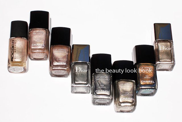
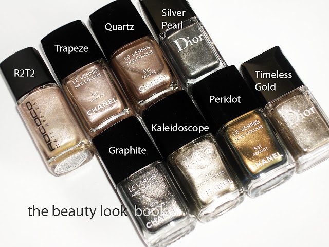
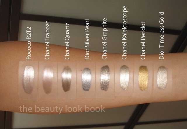
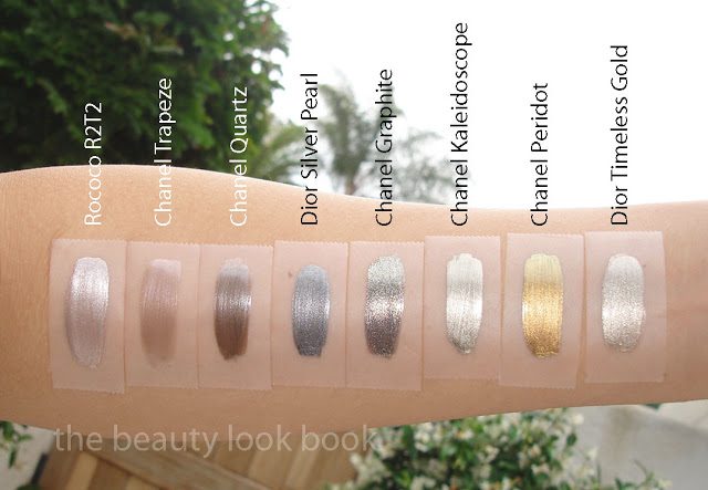
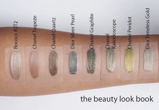
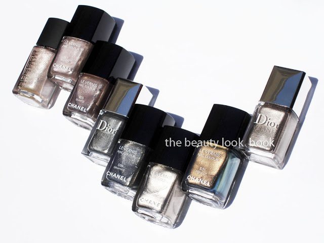
No dupes to be found. Here are the shades Quartz, Graphite and Peridot compared to prior releases from Rococo Nail Apparel, Chanel and Dior.

The fall shades

Comparisons L to R: Rococo Nail Apparel R2T2, Chanel Trapeze, Chanel Quartz, Dior Silver Pearl, Chanel Graphite, Chanel Kaleidoscope, Chanel Peridot, Dior Timeless Gold


Swatches with 3 different views (since metallics look different depending on the light)


FYI: Polish Police has a comparison of Chanel Graphite to OPI Lucerne-tainly Look Marvelous. Those who think it’s a dupe will see from her blog that it’s really not 🙂
Uncategorized

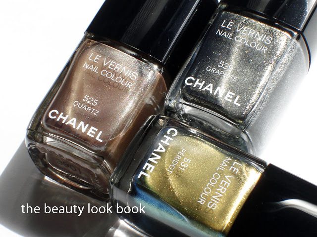
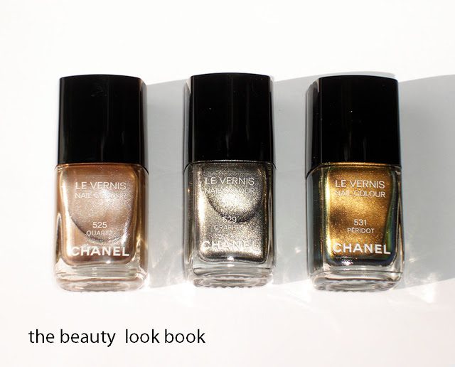
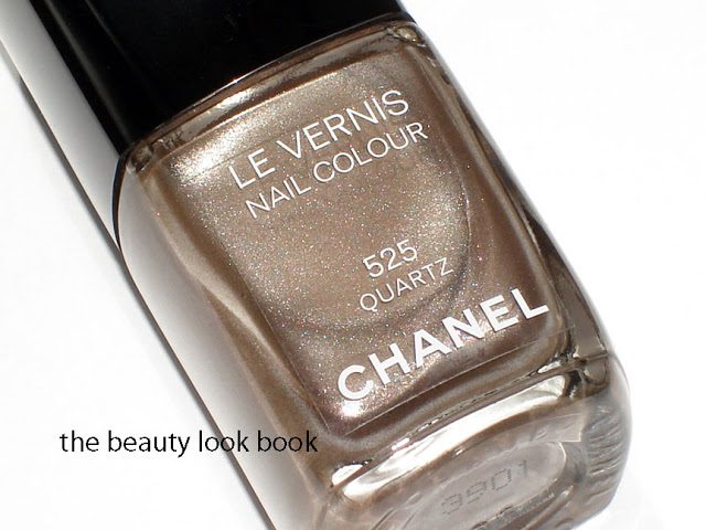
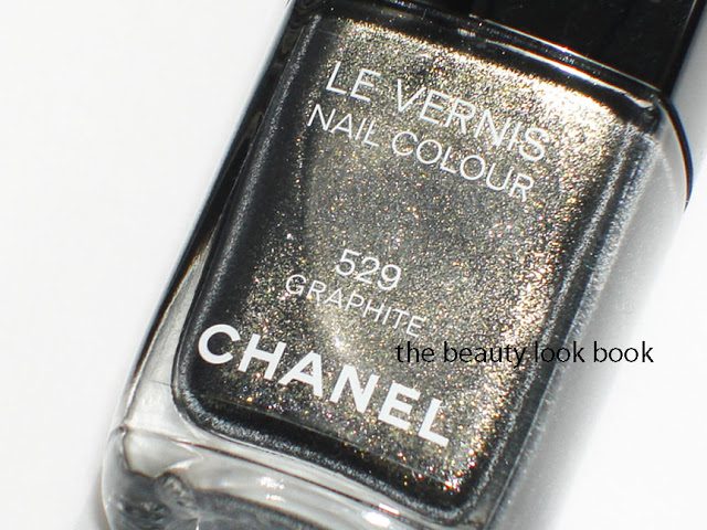
Chanel Le Vernis for Fall 2011: Quartz, Graphite and Peridot

June 18, 2011

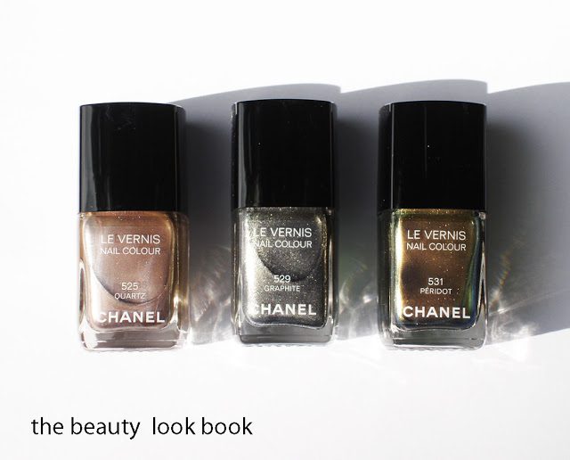
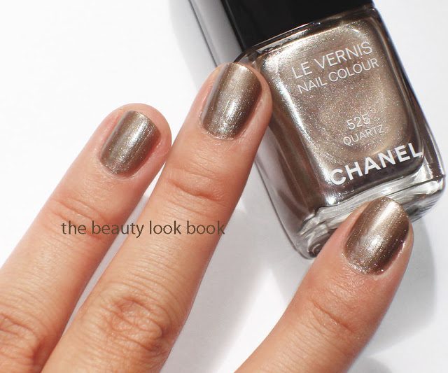
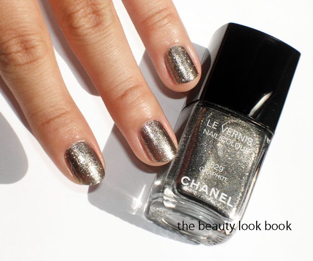
Chanel Fall 2011 has broken my blog break and has also eaten into my savings for a Chanel mini-flap. I am still highly ecstatic. My first feature on the Fall Collection will be on new Le Vernis shades ($25 each). The theme for nails is metallic where light plays a key role in the final result of what you see on the nails. The colors are slightly translucent in texture so you can build intensity with two or more coats. Each shade has a slightly different finish and quality making each color unique.

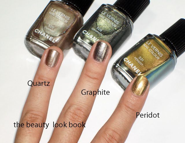
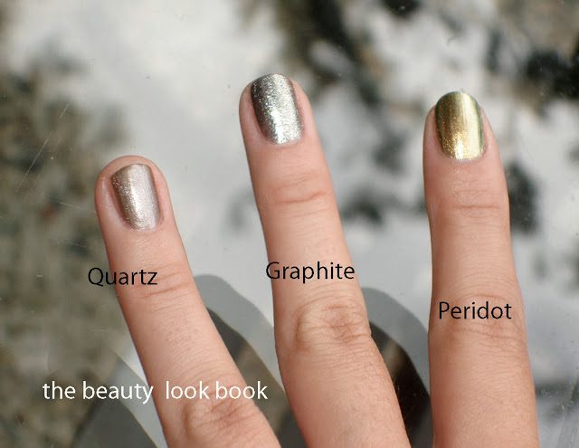
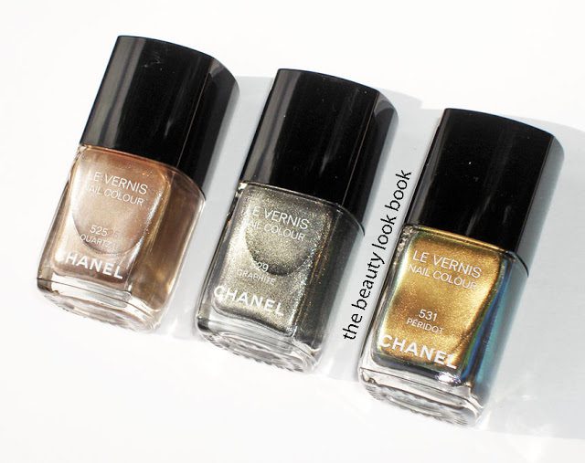
  • Quartz 525 is a frosted silvery brown taupe (I’d describe this as a smooth and soft metallic)
  • Graphite 529 is a highly metallic glittery silver-gunmetal (this one is intense, almost foiled-like, the tiny particles reflect light making this a multi-dimensional shade)
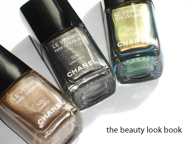
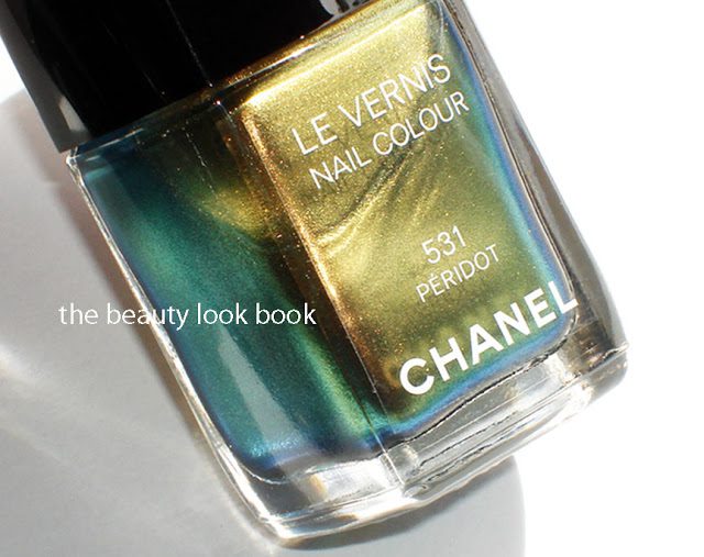
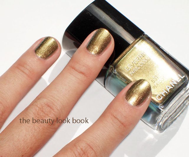
  • Peridot 531 reminds me of a scarab beetle, the color is complex with green, yellow, brown, blue I’m hard pressed to put a description on this (it’s almost duochrome, almost frost-like, but non-streaky and simply glows)
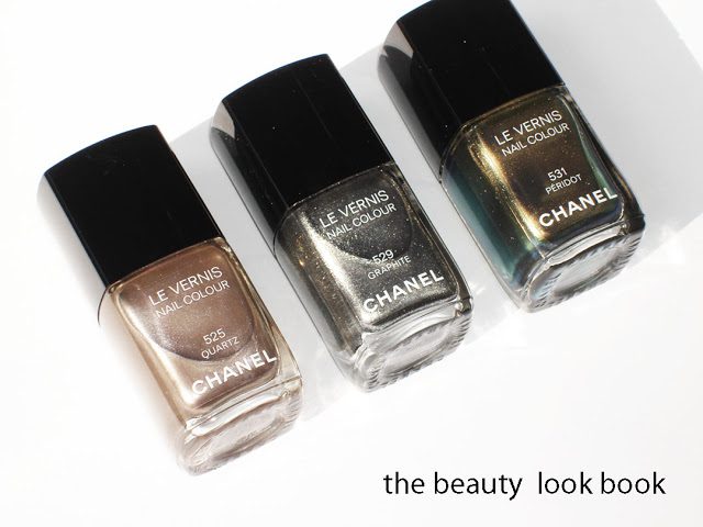
The photo at the very top shows the shades in natural light, no flash but with direct sun shining on the colors. The photo below is the same angle and also with natural light, but with an added high flash from the camera so you can see the other metallic qualities/colors.

Another angle reveals the complexity of these shades


Quartz

Graphite

Peridot

Each swatch has 2 coats. I love Quartz and Graphite. Peridot is such a unique color but I’m not loving it. Comparisons to other shades to come soon but for inquiring minds – these are all very unique and different from any previous Chanel or Dior release. These are very “fall” though. I personally adore virtually everything Chanel releases. However some of you might not be feeling in the mood to wear these for a couple months when the real fall season arrives. (FYI this is how I felt with Chanel Paradoxal last year when it came out end of June.)
Uncategorized

Dear Chanel, You Make My Heart Sing!

June 18, 2011

Chanel Fall 2011, Illusions d’Ombre, has arrived online at Chanel.com and Bergdorf Goodman in NYC. See KarlaSugar for the lineup on an easy-to-read sheet with descriptions. Check online at Chanel.com for prices, product info, and the breakdown of the fall look. I suspect this will be launched in-store in the next few days and upcoming week – I’m on the West Coast and a few of my local Nordstroms have scheduled Chanel events the weekend of June 24th-26th which I assume were planned to coincide with the fall launch.
I have not yet had a chance to play with the items very much, although I have swiped a few of the new shadows on my eyes and the nail polishes on my nails. I have promised myself a break from my computer the entire weekend, so I can leave work at work and not be tempted, although I know many of you are anxious for the 411, so I will try my best to do full reviews this weekend. I don’t want to rush it though, I want to be thorough so no promises. In the meantime I snapped a few pictures and tried to beat the clouds that were rolling in for June gloom. Here is a sneak peek which I hope will satisfy your curiosity for the time being.

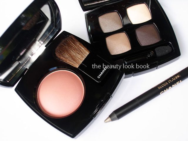
Rose Ecrin Blush, Prelude Quad & Khaki Platine Eyeliner

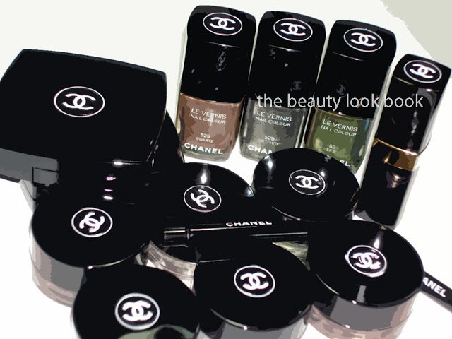
Quartz, Graphite, Peridot Le Vernis

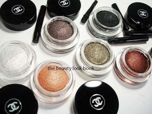
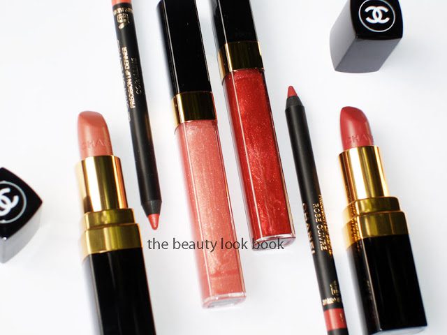
Plumetis Rouge Coco, Coralline Lipliner, Pampille Glossimer, Braise Glossimer, Rose Cuivre Lipliner, Etole Rouge Coco
Illusion d’Ombres

Overall, everything looks amazing. Had I seen the lip items in person first, I probably would have skipped the lipliners and glossimer, but they are gorgeous nevertheless. Happy Friday everyone!

Uncategorized

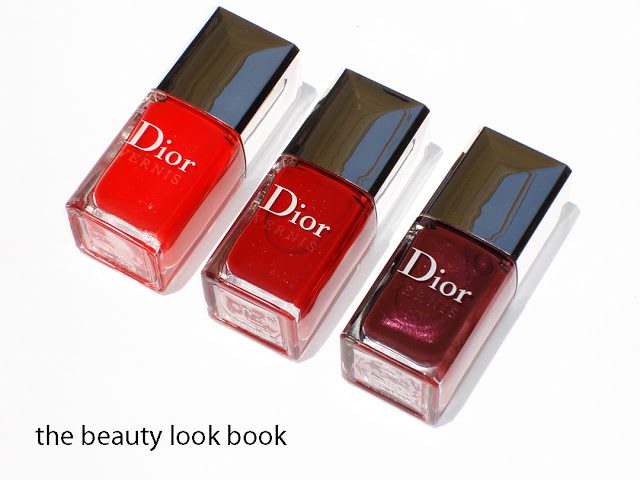
Les Rouges by Dior: Trafalgar, Gruau G and Icône

June 14, 2011

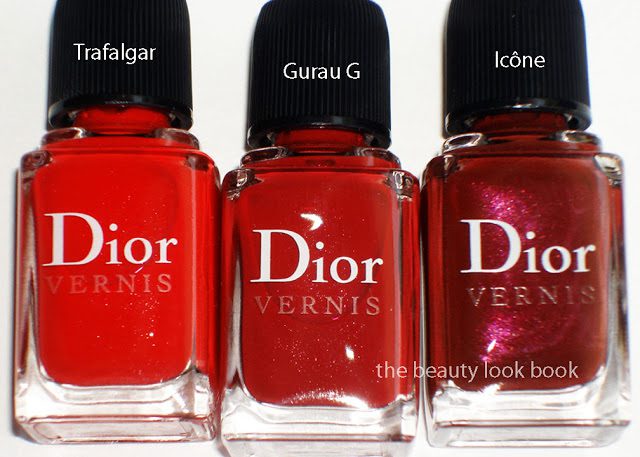
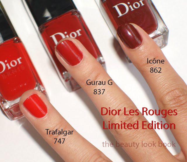
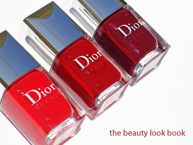
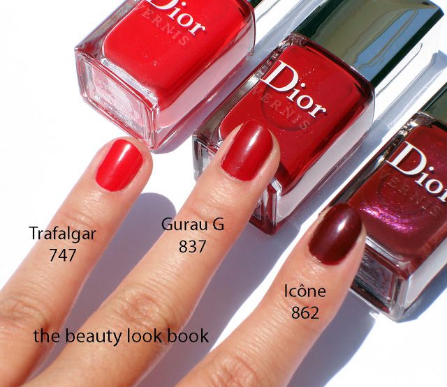
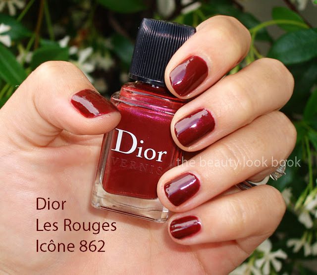
In January, Dior released their limited edition Gris City Collection. This fall, Dior brings us another limited edition nail polish trio in a red theme called Les Rouges. The three new shades are called Trafalgar 747, Gruau G 837 and Icône 862 ($21 each). Fashion Polish gave us an amazing sneak peek last month. I wasn’t expecting these to arrive instore/online until September, but many thanks to a few who let me know these arrived early at the Dior Boutique in Las Vegas! I suspect they will be online at Dior.com soon, store availability will most likely be exclusive to select Dior Boutiques if these are like the Gris City collection. According to Dior:

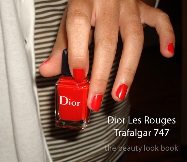
“Trafalgar 747 A bright luminous poppy red with a hint of orange. A dynamic echo of the spectacular red designs that Christian Dior liked to send out right in the middle of his shows to catch the audience’s attention.

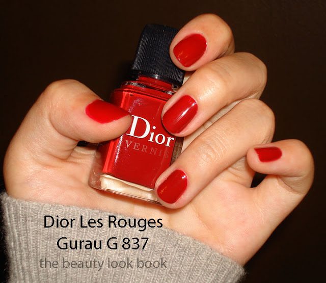
Gruau G 837 Flamboyant and seductive, a sophisticated tribute to the radiant red of Gruau’s illustrations. The eternal passionate red of a chic Parisian. A red celebrated in a blaze at thelatest Spring-Summer 2011 Haute-Couture show, inspired by Gruau G*.

Icône 862 A dense and enchanting subtly pearly red brown, recalling Rouge icône, created by Christian Dior to light up the mythical Spring-Summer 1955 “Atout Coeur” dress. Today the House of Dior still pays symbolic tribute to this refined red with lavish dresses in every show.

When these arrived at my door, my heart sank a little bit as they looked a bit too basic in the bottle but I knew I had to see them on the fingers to get a better idea of how they would look on me. Two coats each on three fingers resulted in absolute red perfection. They are so much better on the hands than what you see in the bottle (although the color in the bottles is still very pretty).

With a high flash:


In direct sunlight:


Dior’s descriptions are spot on and Fashion Polish had swatches and photographs that are gorgeously accurate. Trafalgar is a vibrant coral red poppy creme with the slightest hint of sparkle. The shimmer is barely detectable but I believe it gives this hot red a bit of depth to prevent it from being flat and shocking from the brightness. Gruau G is a vibrant brick red creme, also has the same finish with a tiny bit of microsparkle. Icône is a deep burgandy brownish shimmer. This one has visible shimmer but the color is dark so unless you look at the nail closely, what you see looks like a cream.


The formula is impeccable. Rich, opaque, smooth, glossy and quick-drying although Icône is a bit thicker and needs 2 full coats to get a smooth application (first coat is slightly blotchy). All swatches are without a topcoat.

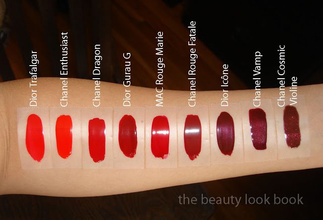
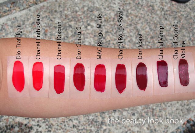
Are they must-haves or unique? I would say they are not the most unique and if you have reds in your collection these are not must-haves. Still, once on the fingers, these look rich and classic and the formula is amazing. My comparisons (some are really really close in color):

L to R – Dior Trafalgar, Chanel Enthusiast, Chanel Dragon, Dior Gruau G, MAC Rouge Marie, Dior Icône, Chanel Vamp, Chanel Cosmic Violine

All content and photos are copyrighted. Kindly please do not steal, republish or hotlink on other websites, blogs or message boards.

To those inquiring, yes, I am still on a blogging break. These were just TOO amazing to wait until July to write about and as Chanel fall arrives instores, I suspect I will not be able to contain my excitement either.
Uncategorized

Chanel Dragon 475 Le Vernis: Ode To Café Makeup
June 11, 2011

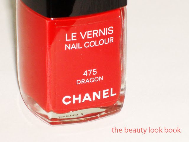
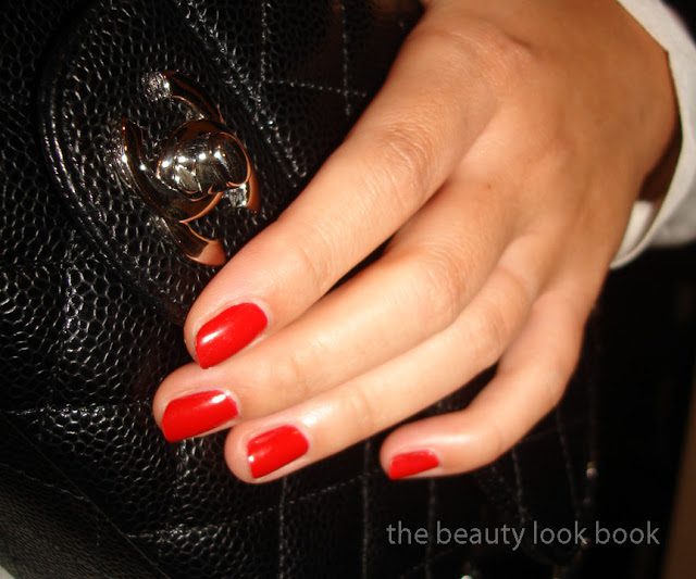
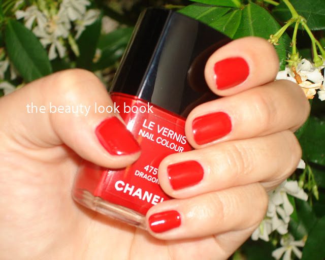
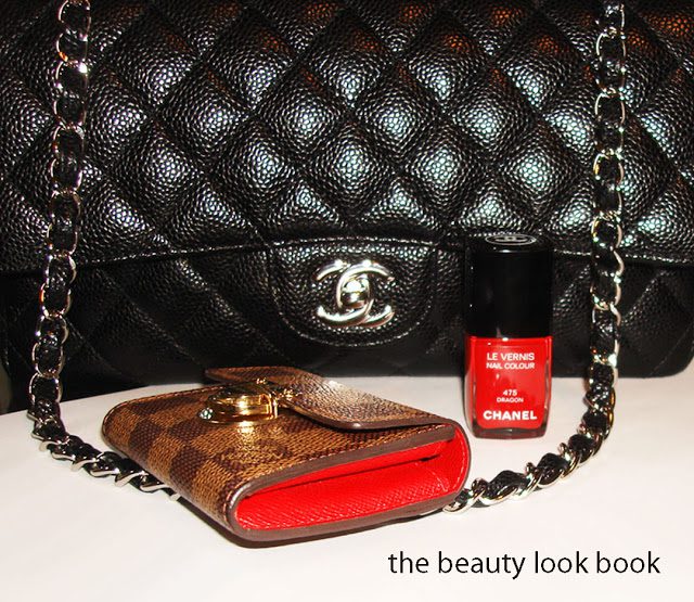
I’ve written about Dragon Le Vernis by Chanel on numerous occasions but as I was going through my archives and realized I haven’t done a full proper review on this classic red. This post is dedicated to Café Makeup, currently gone, but definitely not forgotten. Her blog was phenomenal and an extremely valuable resource to us all. I know we are all hopeful for a possible return in the near future! At the same time, I wish her and Liz all the best for their plans right now. Chanel Dragon was Café Makeup’s signature red. Everytime I thought of or looked at my Chanel Dragon, I thought of Cafe Makeup 🙂 She described it as epic. Indeed it is. It’s sharp, crisp, rich, eye-catching in a classic sophisticated way. It looked amazing on her fair skin and it seems to be a universally flattering red for all skintones.

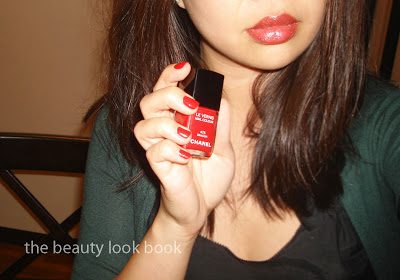
Here are a few photos of Chanel Dragon Le Vernis.

Nars Baroque on the lips (previously featured here)

I have quite a few favorite reds, Chanel Dragon is at the top of my list. Do you have a favorite red nail polish? Note I will be out of town most of the day, so I will be checking in comments but you may see a delay in approvals. I hope everyone has a wonderful weekend!