Browsing Tag

Palettes

Uncategorized

Dior Blue Tie for Fall 2011: Blue Tie Palette & Serum de Rouge Crystal

July 29, 2011

Dior’s Fall Collection this year is called Blue Tie with a heavy emphasis on deep rich navy blues for eyes and nails. The look featured for Dior is quite dramatic with an intense smokey eye and soft pink lips. The collection launched several weeks ago and I initially decided to pass on the entire collection. I can’t pull off navy on the eyes and I was already smitten with Chanel Blue Satin for the nails. The colors for lips are amazing (there are some amazing pinks and nudes) but did not seem like must-haves for me.
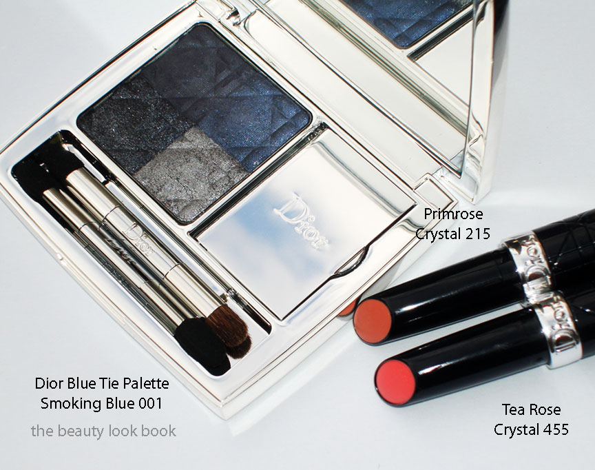
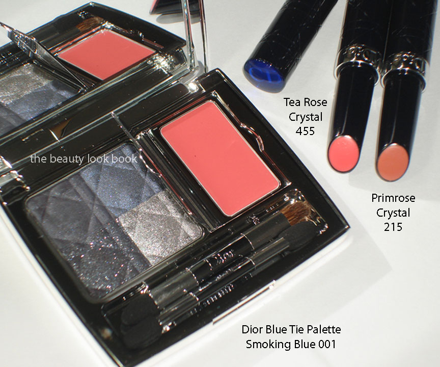
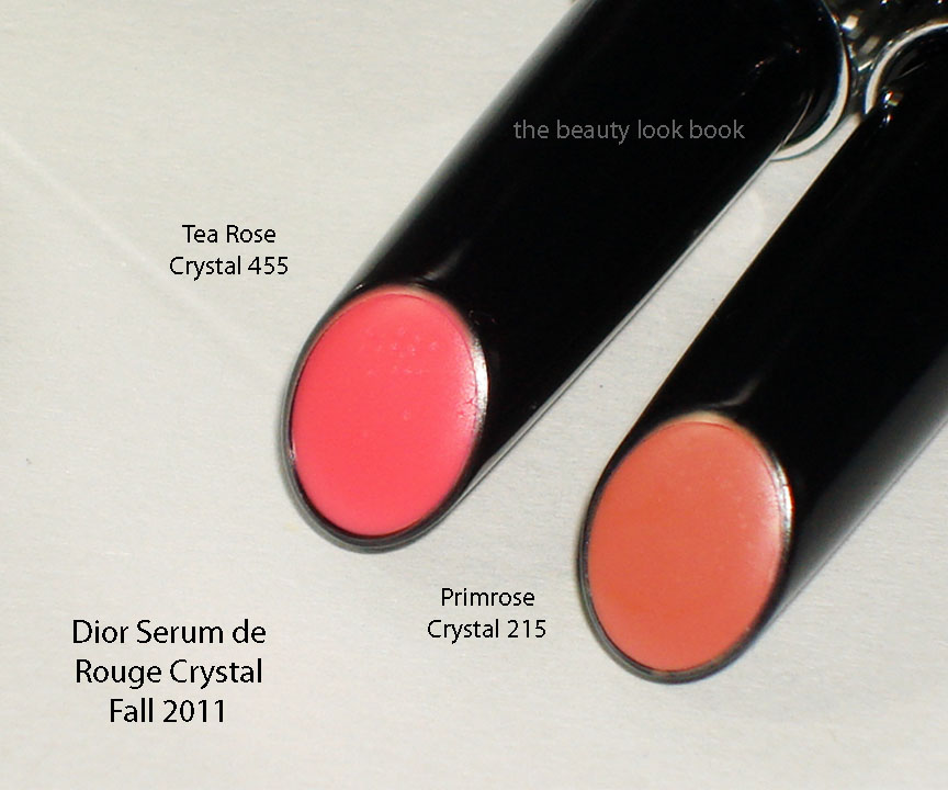
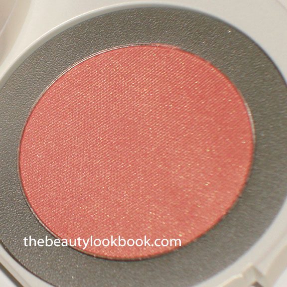
So how did I end up with items from this collection? Well, after I played at the counter and passed, I saw Karla Sugar’s Blue Tie swatches and knew I had to go back. The Serum de Rouge formula is among my favorites (I’m not sure why I haven’t written about them before) for lipsticks. They are truly moisturizing and make the lips glow and feel hydrated without having too much slip. The colors work well to enhance the lips while making them look completely luscious. I picked out Primrose Crystal 215 and Tea Rose Crystal 455.
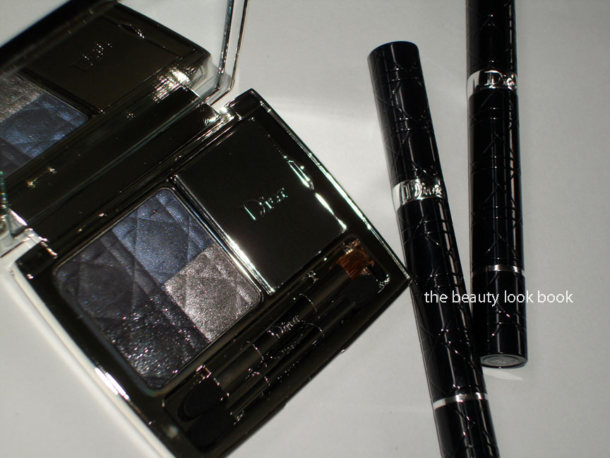
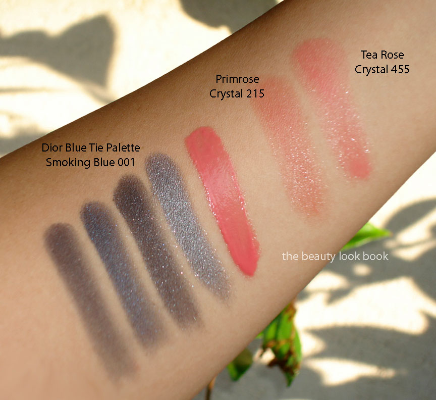
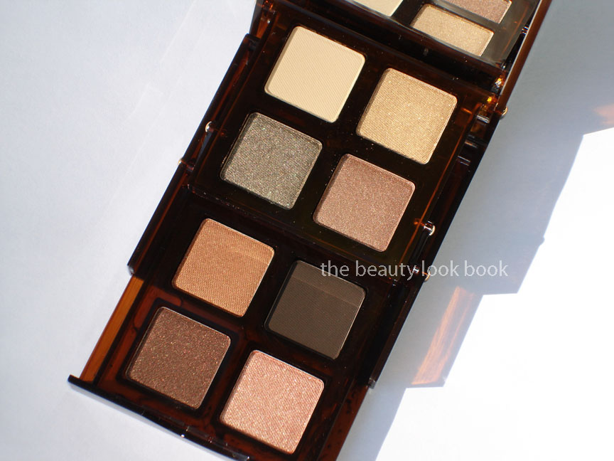
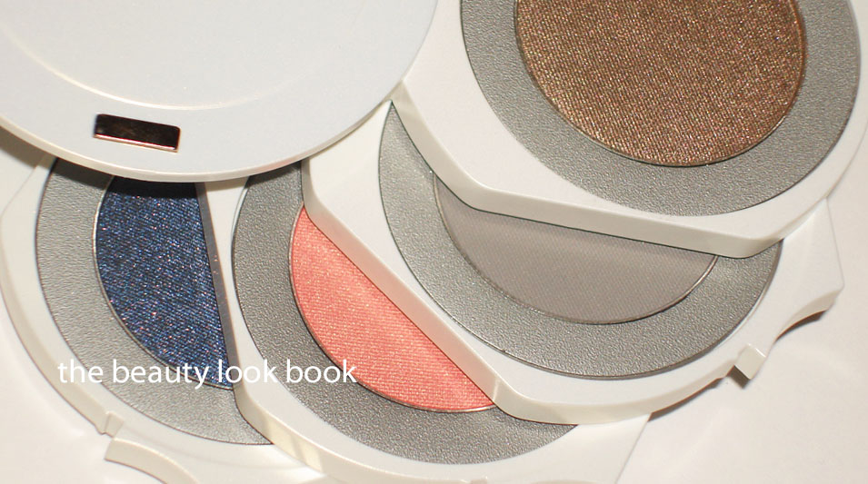
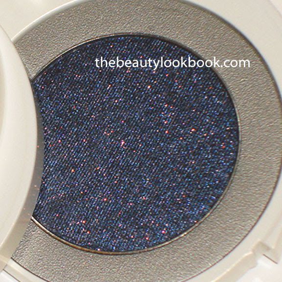
The Blue Tie Palette in Smoking Blue 001 was kindly sent to me by Dior (a lovely surprise!). I would not have purchased this on my own since navy looks too sharp on my skin and especially given the reports of sheerness and chalky textures on KarlaSugar, Temptalia and  Beauty Moogle. The packaging is indeed stunning in a heavy silver mirrored compact complete with applicators and a swivel lid to protect the lip product from shadow debris. I was a bit weary of how this would perform, but a few beautiful look reviews gave me hope, especially from The RAEviewer, Lipstick Musings and Tiffany’s Makeup Story. Photos first and then my review at the bottom of this post.

My thoughts:
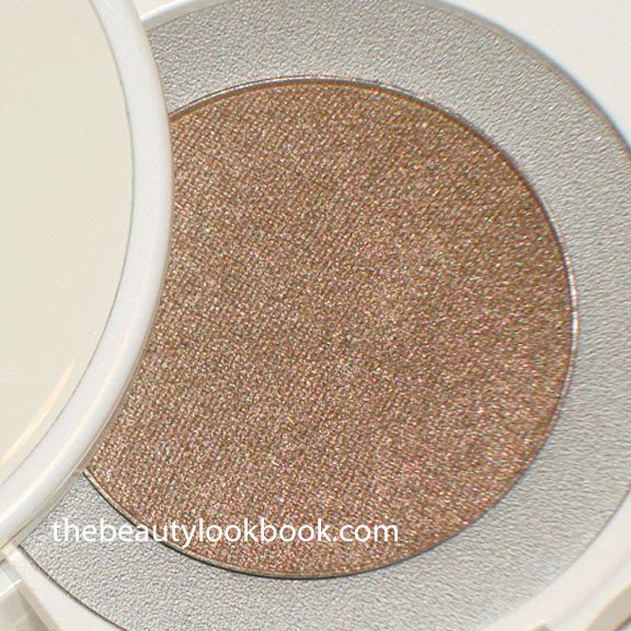
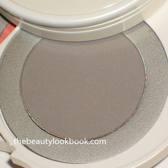
The Blue Tie Palette in Smoking Blue 001 has a quad of smoky colors in sheer matte navy-black, deep denim blue shimmer, deep charcoal with silver flecks and a metallic smoky grey. The lipgloss seems to be a lipstick-lipgloss hybrid and is a sheer petal pink without shimmer. When swatched on the back of my hand, the shadows barely showed up. The texture is indeed rather dry. I layered a primer (UDPP) on the arm and then swatched the shadows as heavily as I could with the sponge tip applicators. As you can see, they are still fairly sheer, especially the top left matte shade. I applied this on the eyes following the tips from the other vlogs and blogs. I was pleasantly surprised to find the color shows up better on the eyes (but only over a  well primed eye.) Still, the product looks so much prettier in the palette. The result for me was a soft smokey eye. If you’re scared of over-doing a smokey eye, then sheer-darks are the way to go because it will be virtually impossible for you to mess up your eye makeup. The colors are layerable for a medium-intense smoky eye. Still, the colors aren’t really me, I would not have purchased this palette on my own. It’s workable, but takes more effort than your average eyeshadow palette to get a decent application.

Primrose Crystal is a nude pink-beige and Tea Rose Crystal is a sheer brighter pink. I picked the most neutral of the options but really all of the colors in this collection are lovely. The colors I picked look sheer when swatched but they work well with your natural lip color to enhance the lips and they do show up. Karla’s swatches are a better representation of the true color (in my opinion). These are pricey at $32 but completely worth every penny. I love the twist-up and click feature. Makes these easy to use and non-messy. They are your easy swipe-and-go kind of lipstick and require no extra tweaking.

Did you try anything from the Blue Tie Collection? What were your likes/dislikes?

Uncategorized

Bobbi Brown Bronze Tortoiseshell Eye Palette

July 1, 2011
Bobbi Brown has 2 different neutral eye palette options with her Tortoiseshell Collection: Sand and Bronze. I opted for the darker version, Bronze Tortoiseshell ($60), although both were equally gorgeous. The palette comes in a two-tiered brown mirrored compact and I love that the packaging is beautiful, simple and sturdy with no frills. These palettes have a good mix of textures ranging from matte to shimmer to sparkle. I think Bronze will be an extremely versatile palette that will allow one to create a wide range of looks.
The Bronze Palette is the warmer/darker option of the two in Bobbi Brown’s Fall collection. I find it neutral-warm, leaning more towards warm. The shades in the top layer of this palette:
  • Banana is a matte yellowish cream (doesn’t show up on my arm, but mattes out the lids)
  • Gold Nugget Sparkle is a bright gold with micro sparkles (I normally don’t like Bobbi Brown’s sparkle eyeshadow formula but this one is lovely)
  • Olive Sparkle is a sparkly olive-gold (same lovely olive with gold flecks, subtle enough so the sparkles aren’t like glitter)
  • Bronze Metallic is a soft warm bronze (not to be confused with her Bronze Shimmer Wash Eyeshadow which is more golden)
The bottom layer colors include:
  • Tiger’s Eye Metallic is a shimmery orangey amber
  • Espresso is a matte dark brown
  • Copper Cocoa Shimmer Wash is a shimmery warm chocolate
  • Amber Shimmer Wash is a soft peachy orange-gold

When I saw the preview photos pop up a few weeks ago, I immediately dismissed these thinking they would be repeats of prior seasons. Both Sand and Bronze are indeed similar to past creations, and while I’m not a fan of palettes that have more than 5 shades, they are good staples. I wouldn’t call these must-haves. However, Bronze does have a gorgeous palette of shimmers with a few new unique shades. This is very “summery” which I find season-appropriate for right now. Add the fact that I liked 6 of the 8 shades in this palette made it a very easy sell for me. To date, I’ve only had a chance to do one look with this using the top four shades layered and blended together with Espresso applied with a damp brush as a liner. I’m looking forward to experimenting more with this.
Uncategorized

Bobbi Brown Bronze Tortoiseshell Eye Palette & Soft Nude Rich Lip Color Coming Soon …

July 1, 2011

Bobbi Brown’s Fall 2011 Tortoise Shell Collection features two gorgeous palettes of classic neutrals along with beautiful naturals for lips. I had vowed to not cave for another BB palette, but my resolve was weakened by KarlaSugar and Best Things In Beauty. I opted for the Bronze Tortoiseshell Eye Palette (a double decker eyeshadow palette with 8 shades) and Soft Nude Lipstick (a lovely full coverage true nude-pink). Initially I was a bit concerned the Bronze Palette might be too warm for me. Today, DSK Steph’s lovely feature confirmed that the Bronze option is gorgeous, wearable and naturally flattering.

 Details, swatches and review on each to come separately very soon.

Uncategorized

Dior Summer 2011 Eyeshadow Palettes in Rosy Nude 534 and Rosy Tan 754

May 2, 2011

Dior hit it big this summer with their bronzers and quints, in particular with and Rosy Nude 534 and Rosy Tan 754. I’ve featured Aurora and Sunset here along with Aloha here and Paradise here. Many of you ask me season over season “who did it best this season?” For me it typically depends on product category. Often times I cannot pick my favorite because I tend to fall in love with multiples. But to answer the question: who did it best for the eyes for summer 2011? The answer: hands down, is DIOR! I haven’t been this excited about a Dior Quint since Iridescent Leather (Fall 2008) and Goldfever (Summer 2008). The quints for summer 2011 do not disappoint.

Rosy Nude 534 and Rosy Tan 754 ($58 each) are both the prettiest palettes of shimmery neutrals I think I have ever seen. Both are medium to high frost but look lovely on the eyes without being too glitzy. The texture is soft and smooth. Pigment is rich and easily blendable. I typically can only wear 3 shades at one time per quint – I consider my eye lid space small and especially since I have no visible crease – contouring abilities are limited without looking fake. With these quints, I still prefer 3 shades but the texture is layerable and blendable enough so I have been able to wear all 5 shades at once.

How do I wear these? There are a number of ways. In the few weeks I’ve had these, I’ve typically worn 3 shades (just pick 3 in any palette) and you can layer them together:
  • Method 1: apply lightest shade first 1/2 way up the lid, smudge darkest shade on top along lash line, apply medium shade above dark color to blend upwards
  • Method 2: apply any medium shade first and mix with the darkest color in each palette blending on lids, then apply a wash of a lighter color on top to give a glow
  • Method 3: just layer lightest to darkest in a gradient pattern (lightest all over, and blend each progressively darker shade on a smaller portion of the eye, ending with the darkest shade along the lash line smudged over a pencil liner)
Rosy Nude 534 is the lighter option with: shimmering cream, shimmering sandy champagne, glowing fawn, glittery peach-pink, soft candy powder pink.

Rosy Tan 754 has a high frost pink, shimmering deep chocolate with gold flecks, frosted cool creamy white, warm frosty taupe-tan, warm cocoa satin.


They are both must haves in my opinion. Even at the high price they are still must haves. To put it into perspective for product/cost.

  • Dior costs $58 for 5 shades, approximately $11.60 for 1.2 grams
  • MAC for a shadow pan costs $11 for 1.5 grams
While I’m always one to have an eye on brands who skimp on product, I do recognize that there is so much more to a product than just the quantity of product. Yet, even a high quality product that is way overpriced is like a punch in the stomach. That being said, to me, the Dior Quints are reasonably priced for the quality, packaging, color, texture, uniqueness and convenience. I don’t need a cream base for these to apply well, although layering over a cream shadow does extend the wear for me.

Make sure you check Amy’s gorgeous reviews if you missed them on Café Makeup. Here they are swatched on my arm without any moisturizer or base (applied with fingers):

Here are comparisons to a few other neutral quints by Dior. First set has Endless Shine (Holiday 2010) and Crush Glow (Summer 2010):

Second set has Elegante and Parisian Lights (Spring 2009):

Third set has Iridescent Leather (Fall 2008) and Earth Reflection (2008):

Swatched next to Crush Glow in sunlight:

Iridescent Leather, Earth Reflection and Rosy Tan:

Elegante, Parisian Lights, Endless Shine (note these aren’t as sheer as they look on my arm, the swatches are crummy plus I think these apply wonderfully on the eye – they just need a base for better application on the arm):

Those who are interested in a nice points program, check out the Dior Diva US program (save your original receipts, authorized retailers are listed on the website). I redeemed a bunch of receipts last year for the highest tier and the gift they sent was very generous.

Overall: Dior wins my heart for eyeshadows this summer. I didn’t even test Chanel’s summer quad (because of that lime green), although I did think Chanel won for spring. Dior’s Rosy Nude and Rosy Tan are versatile, gorgeous, and wearable for year round and for any occasion. The neutrals balance out well with brights for lips and cheeks but also work as the perfect accent for neutrals on the rest of the face.

Uncategorized

Bobbi Brown Python & Peony Continued …

March 9, 2011

Here is the second installment of the Bobbi Brown & Tibi collaboration, new for spring 2011. We got our first sneak peek with an exclusive set from Neimans Preview Set (reviewed here). I finally had a chance to see the other items in the Python & Peony Collection and fell in love with the new eyeshadow palette, Lilac lipstick and Pale Peony gloss.

Lilac Rich Lip Color has previously been reviewed and swatched here. To recap, it’s a lovely lilac-pinkish cream color. It’s on the neutral-cool side, but not too cool. Beautiful full coverage, soft lightweight but creamy texture, long lasting. Pale Peony Rich Color Gloss is a sheerish cream pink – compared to other colors in this formula I found Pale Peony on the sheer side, but it still gives a noticeable coverage. There is a slight mint scent. Texture is not as sticky as her regular glosses. Here they are compared to the Pink Lilac Brightening Gloss so you can gauge how cool/lavender/pink these are.

Pale Peony lip-swatched by itself (no liner or lipstick underneath):

I was going to pass on the Python & Peony Eyeshadow Palette mainly because I wasn’t too keen on the packaging. The zip closure is a bit difficult to handle for me (not to mention a bit difficult to hold while applying). However I was smitten with the color palette – I do wish these were available in individual pan form (would have passed on Cool Ivory, Plum Orchid and Eclipse). Opal is a pale cool greyish cream, Lavender is a cool pinkish lilac, Cool Ivory is a grey beige, Cobra is a metallic steel grey, Plum Orchid is a sheer plum, Eclipse is a sheer black. I found the matte colors chalky by themselves, but liked the way they layered over her gel liner or applied with a slightly damp brush.

Over the weekend, I applied Laura Mercier’s Gold Metallic Creme shadow on the lids and topped with Opal 1/2 way up the lid, layered Cobra on top mixed with the Plum Orchid & Eclipse over a dark black liner smudged and then blended.

Today for work, I applied UD’s Sin Primer Potion all over the lids, applied Opal as a wash with Lavender on the center of lids and blended softly upwards. Then I mixed Cobra with Eclipse together as a smokey liner over her Caviar Ink Gel Liner.

Swatched on the arm:

I do think the Lavender in the palette can look a bit too cool if applied with a heavy hand by itself. I’m one who loves light purples but often times in saturated doses it can look very dated. I personally think it looks best when combined with the other colors in the palette. Layering it over a sheer gold cream shadow (not something I think most think of) like Laura Mercier’s Gold Metallic Creme shadow can help balance out the pink/cool tones. If you are finding it too cool – play around with it and layer it on top of other shades or add a smokey silver on top and blend together.

Overall love but I do hope Bobbi Brown slows down with the palettes. I like to pick out my own colors =)

Uncategorized

Chanel Spring 2011: Ombres Perleés de Chanel, Regard Perlé & Gris Scintillant

December 19, 2010

The palettes for eyes this spring from Chanel are beautiful. I’m glad the look for the Collection Les Perles de Chanel for Spring 2011 is lighter and less dramatic than what we saw on the runways (gorgeous but simply too dark and vampy for everyday wear). The theme this spring seems to be all about that pearl finish. The new items from the collection include:
  • Ombres Perleés de Chanel Eyeshadow Palette – A beautiful palette of 5 high-shine pearl finish colors I would describe as white cream, pink shell, violet, seaweed and blueish-gray, all have a complex mixture of multi-colored shimmers. The texture is a soft almost creamy-like powder, but not quite cream. These are high-shimmer colors, I have to play around with this more, but I think this will work best when layered over regular shadows for a luminous effect.
  • Gris Scintillant Precision Eye Definer – A sparkly cool grey with silver flecks that looks more blueish-purple on my skin rather than gray, this is probably the most sparkly eyeliner I own.
  • Regard Perlé Quadra Eye Shadow Palette – A soft buttery-textured combination of white-gold, peach, pink and forest green. All have a soft luminous shimmer quality (not frosty). The palette isn’t all that unique in the sense that you can probably find similar shades elsewhere, but Chanel always has a way of creating colors with a the most beautiful luxurious finish. It’s perfect for an everyday look. I can’t express my excitement that the US formula is back! To me this is a more wearable neutral version of Garden Party (from fall 2007) that I passed on.
More photos, swatches and comparisons below:

Swatched on bare skin, note these are a bit washed out, the pearl finishes had me cursing while photographing these. The colors are fairly accurate (at least on my screen), but they just aren’t as washed out as these appear below. I find the palette sheer, but buildable. Click to enlarge for better viewing of the shimmer particles, perhaps you’ll be able to see the complexity of the colors in a larger view.

With flash:

In natural light:

Details and close up of the Pearl Palette (if you have this, tell me how you’re wearing it!):

This is what the shades look like swatched on the fingers. Sorry for the blur, but the shimmer/pearls were difficult to photograph for some reason. I’m sure other bloggers will have better luck with their photos, I can’t wait to read other reviews. This shows how the pigment can be heavier with a high-frost finish when applied with a heavier hand, but can be blended out (like on the arm photos above) for a luminous glow.

Details of Regard Perlé Quad:


I couldn’t find a dupe, but some wanted to know how it compared to a few other quads by Chanel. I didn’t have time to swatch them, but the textures/finishes are typical of the usual Chanel quads: soft, silky smooth, medium pigment, soft shimmer, beautiful sparkle. Here is Regard Perlé next to Winter Nights and Murano. To me, the runway looks from the Spring 2011 show seemed more like Murano on the eyes rather than Regard Perlé.

Last, but not least, Gris Scintillant Precision Eye Definer. It’s beautiful with those silver flecks, but on the softer side. Those who like a more dramatic defined eye will probably find this too soft/sheer. I think it would be a beautiful cream shadow. Note that it pulls very blue on me. It might be more neutral/grey on you depending on your undertones.


Eyeliner comparisons, L to R:

  • Bobbi Brown Thunderstorm Ink (reviewed here, Bloomies exclusive)
  • MAC Zinc Zone Greasepaint Stick
  • MAC Dig It! Eye Kohl
  • D&G Onxy #11 Eyeliner (reviewed here, D&G Fall 2010)
  • Chanel Gris Scintillant #69 Precision Eye Definer
  • Chanel Graphite #64 Intense Eye Pencil
  • Chanel Gris #35 Stylo Yeux (reviewed here)
  • Chanel Black Shimmer #70 Stylo Yeux
  • MAC Wolf Pearlglide Eyeliner


Overall thoughts: Beautiful, especially for our first look at spring. The Perleés de Chanel palette is the winner for me. The other two are items I adore but don’t know that others will share the same love as I do for soft wearable natural makeup. If you’re looking for a good everyday eyeshadow palette that isn’t your basic boring black or brown, then Regard Perlé is a great option. It has enough color to brighten the face without being too basic. However, those who prefer something more colorful will probably be let down a bit. I feel like the colors in this quad have been done before, yet when I searched my stash, I couldn’t find anything quite like it.

Chanel Spring 2011 is starting to trickle in stores. The first sightings were just a few days ago. I expect most counters in the US to have this within the next week. Cheeks and lips to be reviewed soon.

Uncategorized

Le Métier de Beauté Splendid Frost Kaleidoscope Eye Kit, Holiday 2010

December 15, 2010

I told myself I wasn’t going to buy another $95 kit so I blame this purchase on The Non-Blonde & Best Things in Beauty. Ok, well not entirely. I sat in my Le Métier de Beauté makeup artist’s chair at my local Neimans and fell in love with what she did with the new Splendid Frost Kaleidoscope Eye Kit. The colors are luxurious, highly pigmented and just breathtaking. Even at a jaw-dropping $95, it’s still worth every penny (if you do the math, it comes out to about $23 per shadow not counting the compact). The texture is smooth and easy to blend. Even the high-frost shades are extremely wearable, so those who can’t pull off high shimmers need not worry. Beautiful for the holidays, going out, and yet appropriate for day-wear if worn with a lighter touch.


The colors, described by me are as follows:
  • First tier – a brassy gold high frost shimmer, if you remember Bobbi Brown’s Platinum Metallic from last year, this is a slightly more golden/brassy type of color but similar in concept
  • Second tier – soft matte grey but full-pigment, it’s a true neutral grey on me
  • Third tier – coral-pink infused with gold shimmer, this one just glows, it’s not too peachy/pinky that you can’t wear it on the eyes, but I would recommend applying with a soft hand
  • Fourth tier – my favorite, a deep navy with just the right amount of brightness so it doesn’t appear black, comes with tiny red and gold microglitters that make this one of those colors that make you gasp “wow”
Close ups of each shade:


I’ve heard different things about the packaging this season. Some who purchased from Bergdorf Goodman received their kit in the regular black packaging. I can’t confirm if their packaging is different or not though. The one I bought from my Neimans came in a beautiful frosted white case.

L to R: Regular Packaging, Holiday 2010, Lip Kits

Swatches:


Overall – L O V E!!!! It’s so pretty, I nearly died when I saw it in person. I couldn’t find it anywhere online yet. I recommend calling your local Neimans to see if they stock Le Metier de Beaute. Chances are if they do carry the brand, the holiday kit is in stock since they recently had their InCircle events going on.

All content copyrighted. Please do not republish, hotlink or post on other websites or message boards. Thank you.