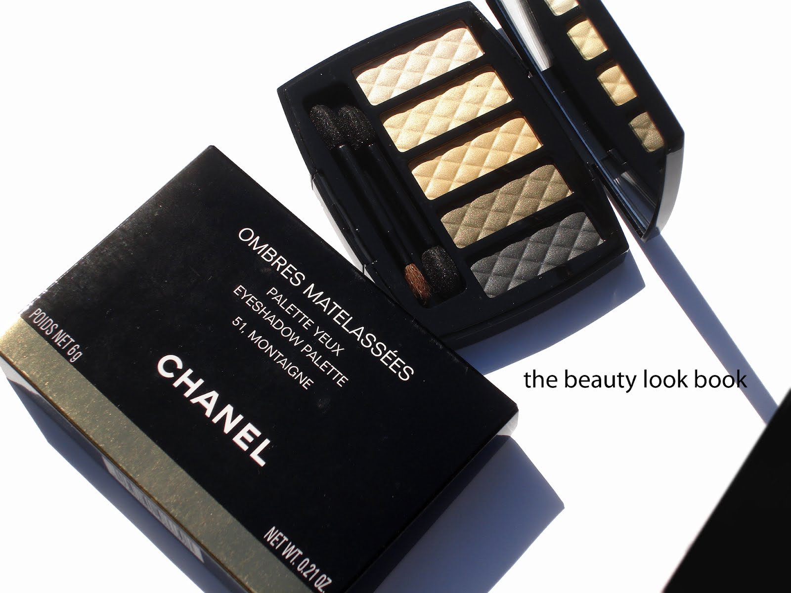
Chanel has released a new beautiful palette to celebrate the opening of one of their new boutiques in Paris. The palette is called Ombres Matelassées 51, Montaigne ($80 for 6g/0.21 oz, Made in Italy). It comes with five stunning soft silky-smooth shimmery eyeshadows embossed with the classic quilted pattern. The colors aren’t all that unique to Chanel’s prior releases but the texture is amazing with an ultra-smooth finish and satiny feel. Pigmentation is medium, like most Chanel eyeshadows. The shimmer is very soft and subtle. At $80 this is extremely pricey (especially when you consider the fact that the Ombres Perleés de Chanel from Spring 2011 was $65). I fell in love with the beautiful presentation and packaging but I’m not really comfortable with the price. (I skipped the Vegas de Chanel face highlighter and so felt this splurge was justified.)
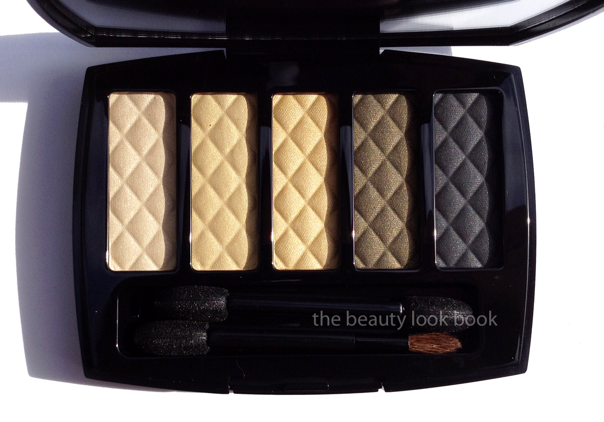
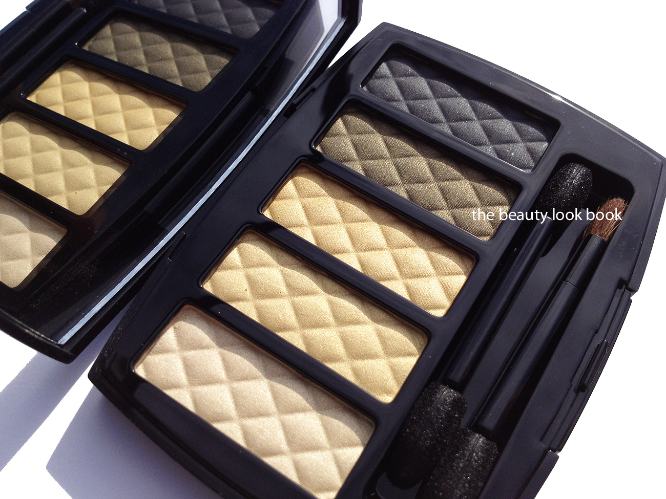
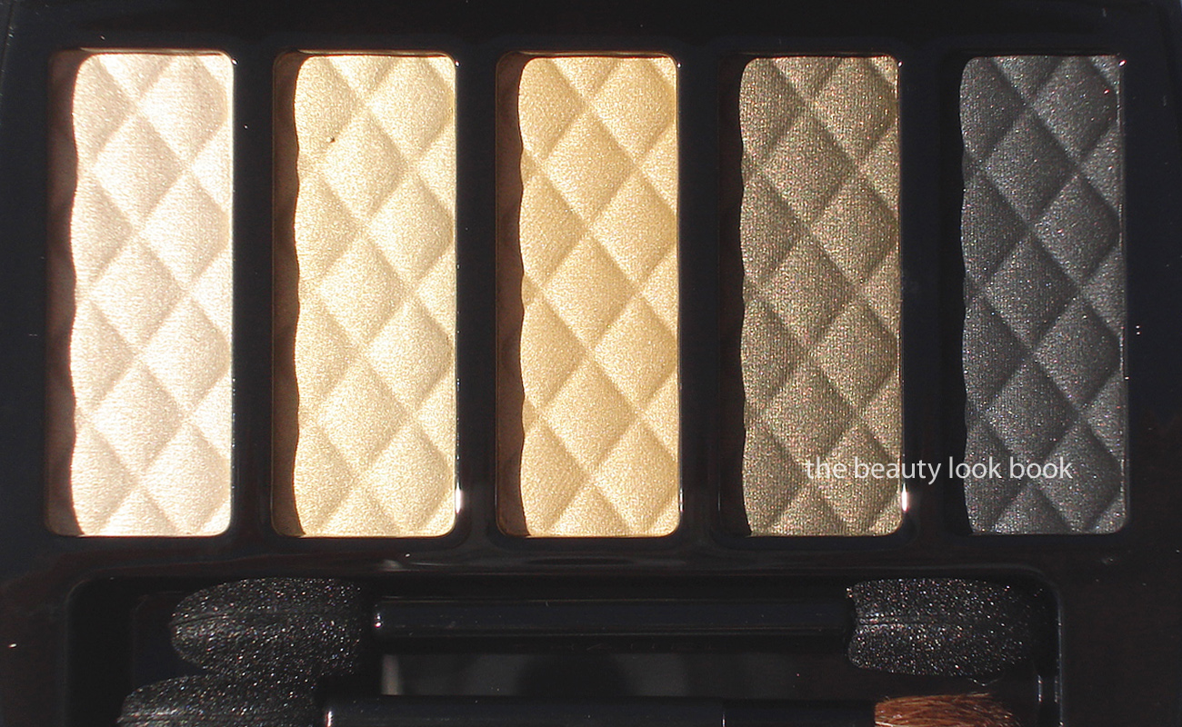
The colors, left to right: soft iridescent ivory, pale gold shimmer, satiny warm gold, khaki olive shimmer, soft greyed-black with a tinge of navy. A few more close ups.
Swatches:
Comparisons to a few other shades, Chanel Ivory, Chanel Blazing Gold, Burberry Midnight Black, Chanel Black Star and Chanel Noir-Ivoire. (The greenish/olive shade wasn’t compared because I don’t own any of the Chanel khaki shimmers.) As you can see the theme is not extremely unique, but still extremely beautiful.
I’m not sure exactly where this will be available. My guess is this will be available at the counters and stores that receive the special exclusive launches (such as Les Jeans de Chanel, Vegas de Chanel, etc.) I know Nordstrom in Seattle has received the palette and have seen reports of this being spotted at various Boutiques and select Neiman Marcus counters. I’m assuming it will be launched online at Chanel.com eventually but at this time I’m not sure. I purchased mine at my local Neiman Marcus although they did not have any testers. See other photos at Best Things in Beauty and Luxury-Makeup Livejournal.
Overall beautiful presentation and extremely high quality. There is a lack of originality with the colors (I found them to be repeats of prior/existing shades) but the palette is a classic and I really love it. The texture is better than some of the singles, which I’m a huge fan of, but sometimes can be a bit chunky in feel. I personally cannot envision wearing all 5 shades at once. I’ve tried a few combinations and prefer to use 3 at most at one time. I find it wears very well and adheres well to the lids like the classic Chanel eyeshadows do.
Bottom line, it’s a true luxury product, not a necessity. I love it but I don’t think it’s a must-have for those who have a lot of other Chanel eyeshadows. I simply think you will find this redundant. I like the convenience of having all shades in one palette and felt the presentation is just exquisite. At the price it’s definitely a splurge. If I could only have 1 palette this season, I think it would still be Dior Grège 734 (reviewed here), although a few photos of summer collections have been surfacing and I’m kinda dying over the NARS trio coming out for summer (see it on Specktra.net here).
Have you seen/tried this yet? What are your thoughts?
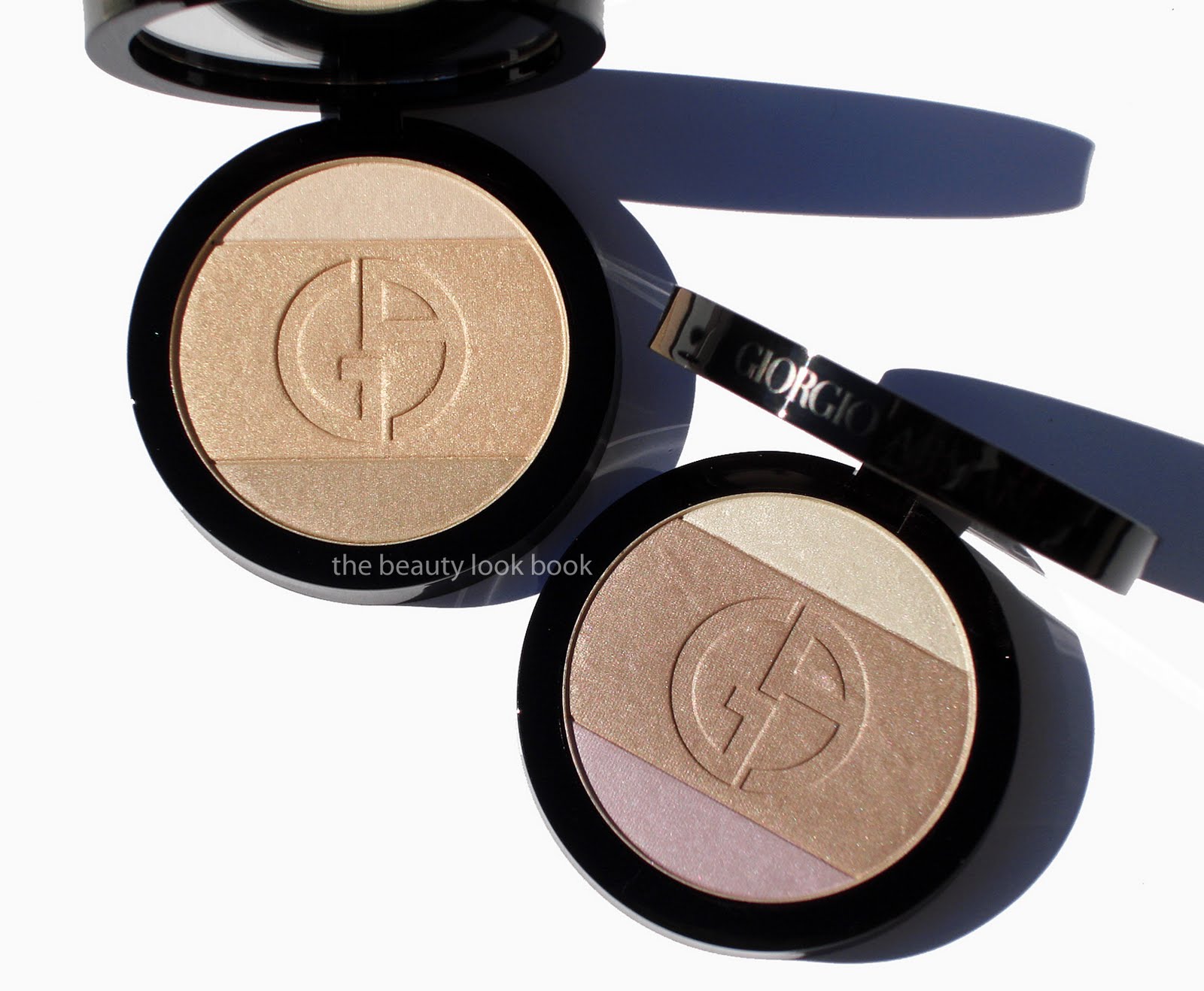
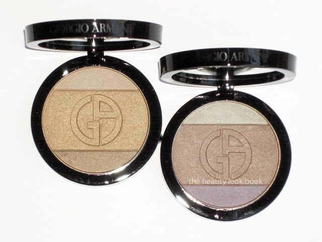
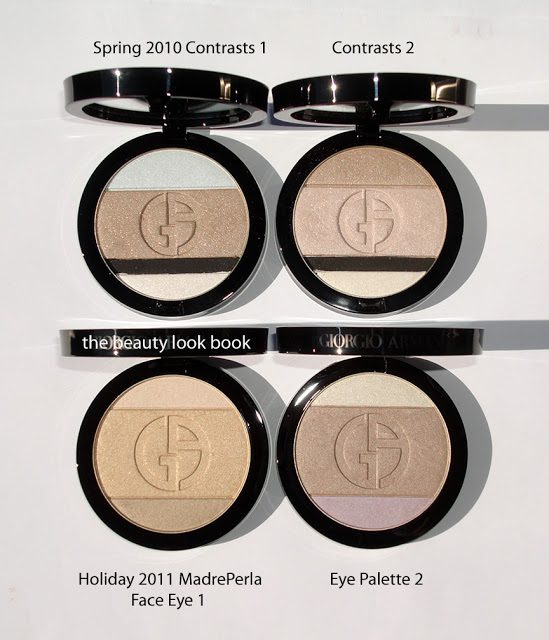
Armani has released two palettes this holiday season for their Madre Perla Collection. The theme for the eyes and cheeks are shimmery golds, nudes, pearls and silvers. I found the collection has arrived in-store at Neiman Marcus. One is a Face & Eye Palette #1 (the golden one) and the other is designed as an Eye Palette #2. Both are $59 each and are limited edition. The two palettes contain three shades each, very reminiscent of Nude Contrasts from Spring 2010. I approached these with a bit of hesitation. As beautiful as the colors were from Spring, I have to admit both palettes have barely been used. All the colors (except the black) from the spring eye palettes show up similar on the skin which results in just one overly-sparkly eye when the colors are layered. Still, the palettes this season took my breath away as soon as I saw them. The palettes were a bit difficult to photograph to capture the dimensional aspect of the shimmer. I’ve tried several angles to try and help give you an idea.
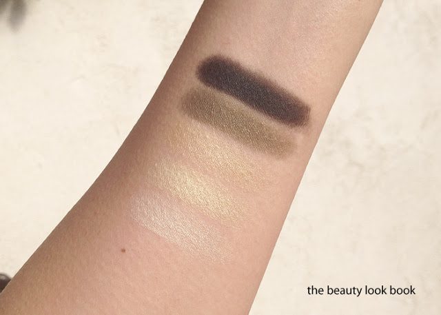
Madre Perla Face and Eye Palette 1 is a trio of golds. The texture is soft, slightly powdery and fairly shimmery. Applying with an eyeshadow brush (or a denser brush) results in a very shimmery pigmented application. I wore this on the eyes last night to a play and it was beautiful but definitely on the sparkly side. The three colors you have are pale ivory, warm pale gold, neutral tan gold. I feel the colors are uniquely distinct from each other when swatched on the hand but if you want to layer three shades I think you can only create a subtle gradient. Since the payoff with a small brush was so pigmented I was worried it would be too frosty for the face, but applying with a regular brush brush (I used Bobbi Brown’s when testing this one) resulted in a sheer but visible wash of shimmer. Love!
Madre Perla Eye Palette 1 is also beautiful with a cool sharp white with gold frost, neutral tan beige shimmer and cool lavender. I’m not a fan of lavender shades but I learned from Le Metier that this color can be a great highlight to layer over beiges/tans and golds. I really love the middle shade, it’s like a soft beige with a slight hint of grey shimmer. I applied the middle shade first over most of the lid, then added the lavender to center on top and blended. I then added the ivory-gold as a very soft highlight near the top. Today I used Bobbi Brown Bronze gel liner to finish the look. Overall it’s a stunner but very pale. Next time I will need to add a darker contour like Chanel Sand.
Here’s another close up plus swatches:
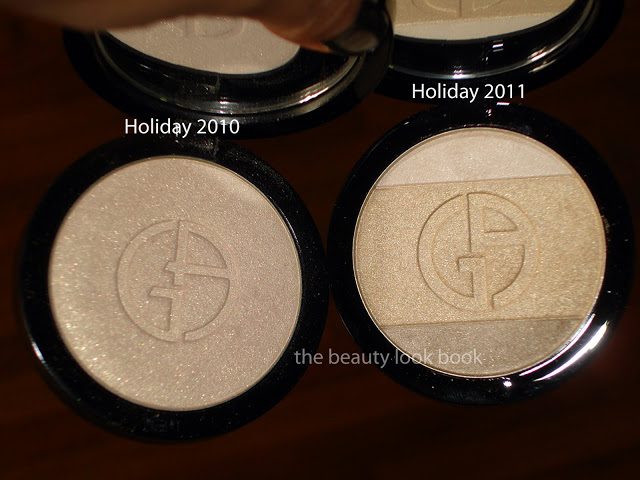
Comparisons of last year’s highlighter (less yellow and lighter) to this year’s:
Palette comparisons from Spring 2010 to Holiday:
Overall all out gorgeous, not overly frosty, beautiful for holiday. I will definitely get more use out of these than the spring 2010 palettes. They are more versatile and wearable in my opinion.
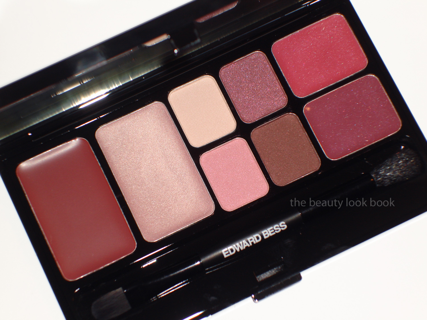
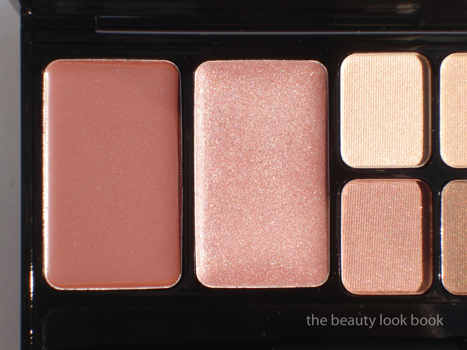
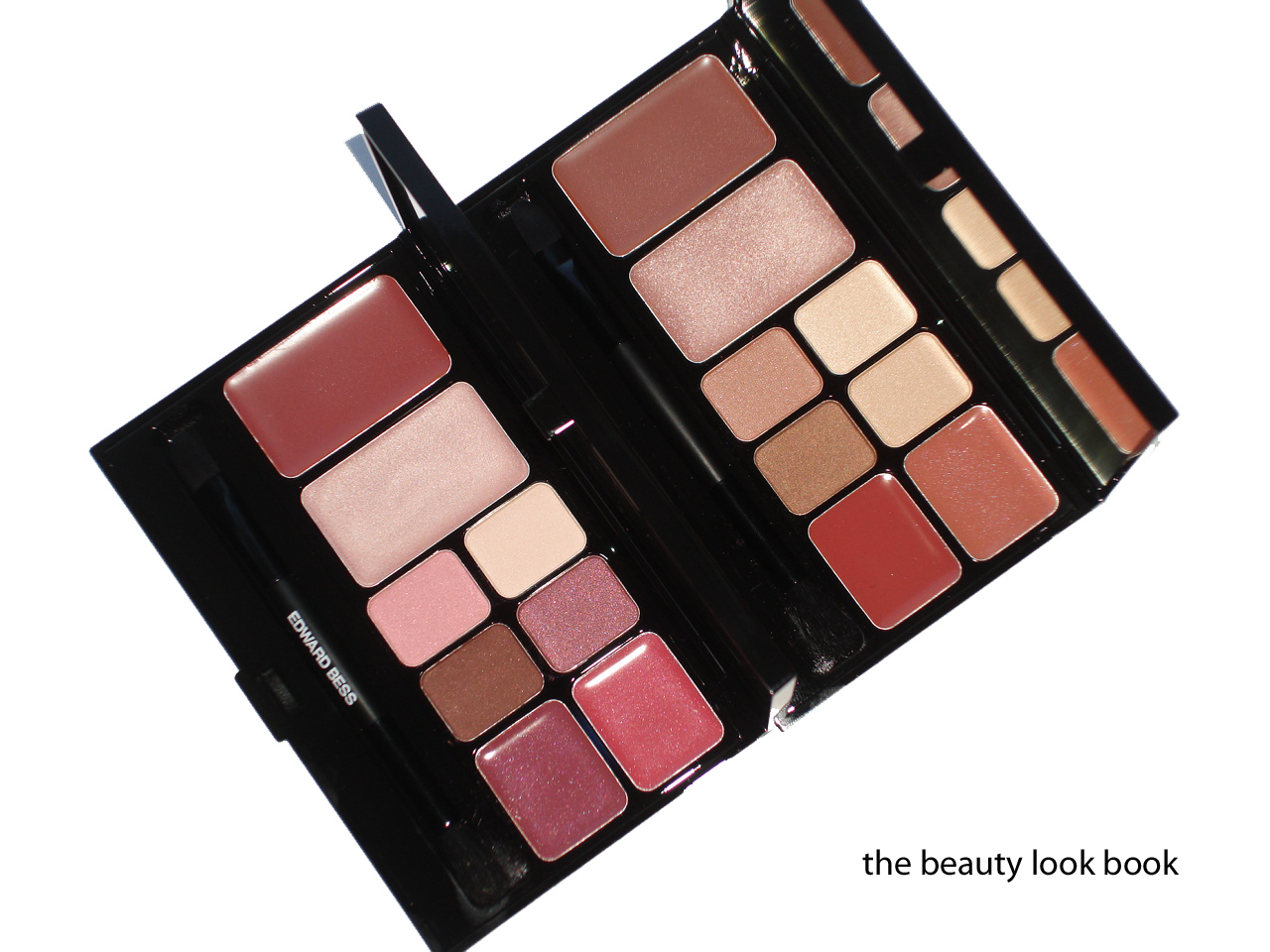
Edward Bess Berry Chic is the more dramatic pink-plum palette option this season. I ordered this sight unseen and did not ask for descriptions in advance so I did not know what to expect. I will say that Back to Basics is my favorite of the two, but Berry Chic is surprisingly wearable even though it has pinks and warm plums for the eyes (which I normally cannot wear at all). The formulas/textures are the same as his other palette so I will mainly describe the colors. The cream products also have the same fig scent as his lipsticks, glosses and bronzer.
Lip/Cheek color – muted plum rose (not as bright as his Island Rose Compact Rouge)
Highlighter – pale shimmery pink (smoother in texture than his Back to Basics highlighter)
Eyeshadows -soft satin ivory, warm pink-tinged plum shimmer, warm pale bubblegum pink, warm brown shimmer (all very pigmented, layerable and easy to blend)
Glosses – top shade is a sheer cool light fuschia, bottom shade was a complete surprise, the top layer seemed to be slightly oxidized, the color once top layer was swiped was a warm rich plum-red (the bottom color is very pigmented)
I applied this over the weekend with slight hesitation. I think the eyecolors in this palette aren’t the easiest to pull off with ease. If you can wear warm pinks or plums (think NARS Kuala Lumpur or MAC Swish) then this will be pure love for you. I tend to avoid pure pinks or warm reds/burgandies/plums on the eyes because they give me that pink eye look. Edward Bess Berry Chic was surprisingly wearable and naturally flattering. I applied the eyeshadow colors by layering them (lightest to darkest). Still I will mainly stick to my safer neutrals for eyes. Perhaps the next time I visit the EB counter I will ask someone to show me how to use it. Bottom line: still undecided but trying to go outside my comfort zone.
LA/OC girls, not to sound like a broken record, but Edward will be in LA starting tomorrow for a week. If you can get to the Beverly Hills Neimans I highly recommend you try and visit.
Berry Chic retails for $75 and is available online at EdwardBess.com and instore at Bergdorf Goodman.
Edward Bess Back to Basics ($75) is the perfect palette of polished neutrals for the woman on the go. It’s natural yet not too natural and I believe it’s as goof-proof and universally flattering as his Daydream Bronzer. The Non-Blonde has a great review with beautiful photos and swatches. I agree whole-heartedly with everything she says. My thoughts & descriptions (working my way from the left side of the palette to the right side):
Lip/Cheek color – This has the same texture as the Compact Rouges. The color in pan for Back to Basics was slightly misleading but in a good way. In the compact I expected a warm nude with brown tones. Instead it goes on a nude-pink. It’s lovely on the cheeks for an understated pink tint and gorgeous on the lips. The pigment is excellent – buildable, non-greasy and easy to blend very much like his compact rouges. Also has the fig scent.
Highlighter – The highlighter is a cream formula. It’s a warm sheer nude sparkle. I felt the texture of this one was slightly textured to the touch of the fingers (in pan) but it felt completely smooth when applied to the skin. The color is sheer but more sparkly than his other cream highlighters. Still not overly so. I layered this over the lip/cheek color on the face and it added a wonderful highlight. This does have the fig scent.
Eyeshadows – The eyeshadows in the palette are beautifully pigmented – even more so than his regular shadows. The colors are all shimmery. I found the shimmer factor to be higher than all his other shadows. The colors are an ivory shimmer, a beige shimmer, a warm pale copper frost, a deeper warm brown shimmer. I was scared of the light coppery shade thinking it would be too warm. Alone, I think it is. But when layered with the other paler shades it gives the eyes warmth and depth.
Glosses – I agree with The Non-Blonde these were the weakest points of his palette. Both are sheer beiges, one with slight pink tones. They do add a nice shine to the lip/cheek color, but alone I suspect they will appear very sheer.
The Brush – The double-ended brush contains one side for applying cream products, the other for shadows. Initially thoughts were a let-down. The brush seemed to be not-the-greatest quality. The bristles for the powder didn’t appear to be hand-made. Yet again Edward Bess never fails to please. The brush is a wonderful mini applicator and applied the eyeshadows with ease.
A few close ups of each side:
Swatches below. Note mine are applied with a very heavy hand. Don’t be scared of the shimmer factor for the shadows. If you’re familiar with Edward Bess Eyeshadows you know they apply beautifully but are layerable. The colors in his palette work the same magic as the individual colors. The frost isn’t overpowering at all. Be sure to check out The Non-Blonde’s review. Her swatches are more inline with what the colors look like when applied naturally.
Bottom line: Even though I prefer to pick items individually (rather than palettes) and prefer creams to be separated from powders (in palettes), I adore this. It made my whole face glow naturally. It’s worth every penny and I will just take extra care to try and not get the debris from the shadows in the other cream-based products. The palette is available at Bergdorf Goodman in-store. It is also up online at Neimanmarcus.com and EdwardBess.com. I haven’t checked with the Beverly Hills store to see if they have this yet, their number is (310) 550-5900. PS – I just heard that Edward will be in LA starting tomorrow until next Thursday. I highly recommend calling the counter for the details, if you can visit while he is in-store, you are in for a real treat.
Edward Bess has released his first two palettes this holiday season ($75 each). Each palette comes in a black mirrored rectangular compact containing:
one lip/cheek color (similar to Compact Rouges)
one cream highlighter
four eyeshadows
two glosses
a double-ended brush (one side for creams other for shadows)
Back to Basics is the neutral-nudes option and Berry Chic is a palette which has cool-toned pink plum shades. The palettes are currently available at counter in-store at Bergdorf Goodman and also on EdwardBess.com. Here is the packaging:
A few close ups of the lips/cheeks:
Next up will be details, descriptions, reviews and swatches of each palette individually. Both were purchased sight-unseen. I’ve only been testing for a few days but initial thoughts are thumbs-up. All the cream items in this palette have the beautiful EB fig scent (I can’t smell anything from the shadows). I’ll be putting up my reviews as fast as I can. For more details you can call the Bergdorf Goodman Edward Bess counter (212) 872-8826.
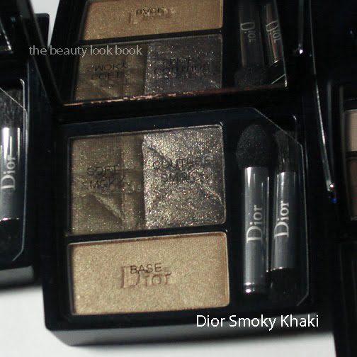
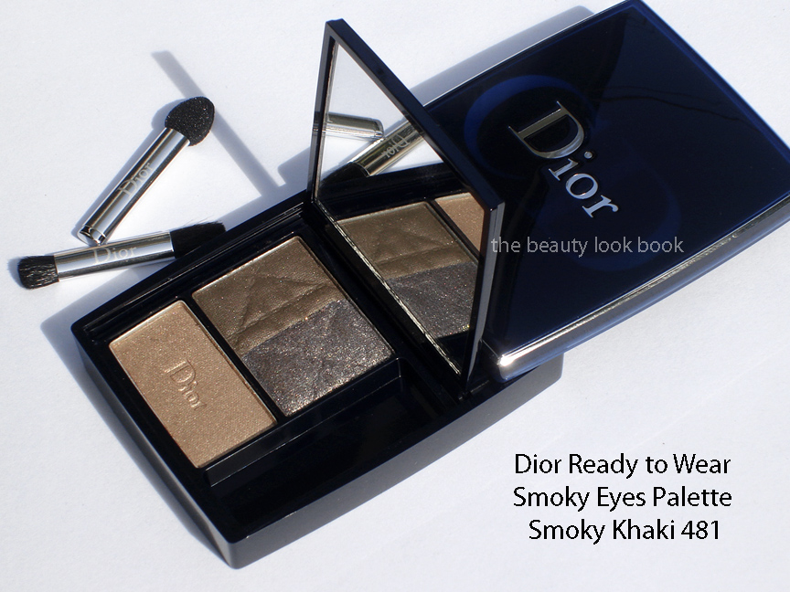
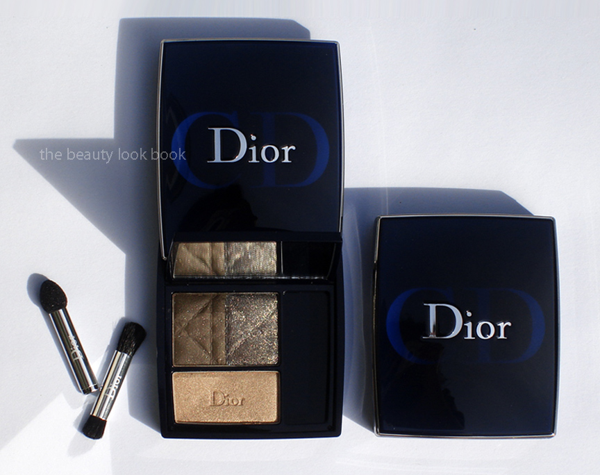
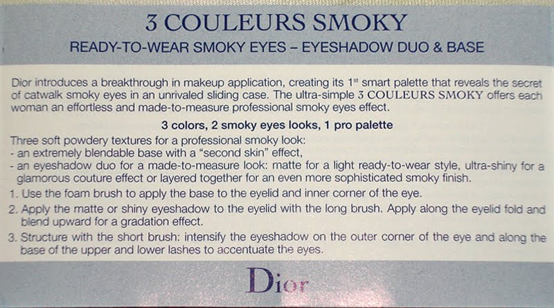
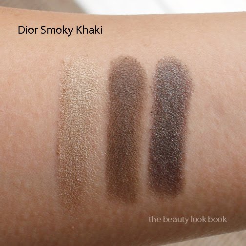
This season seems to be the season of new innovations in eyeshadows. Chanel released their Sophisticated Eye Collection with new quads, singles and eyelash curler and Guerlain came out with nine new quads. Dior has also released a beautiful collection of Smoky Eyeshadow palettes with six new trios that have just started to trickle in stores (I spotted these at Nordstrom). Fab Over Forty has details on the full lineup and Cafe Makeup has a lovely feature on Smoky Pink #051. The trio that captured my attention the most was Smoky Khaki #481 ($48 each).
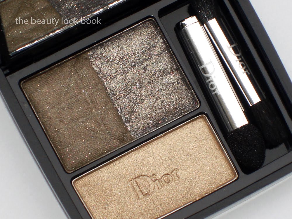
These trios come with a new type of packaging with a sliding top and a mirror that flips open once the top slides back. According to the National Artists at the store, the mirrors are designed at the perfect angle so you can apply your eyeshadow while looking down. The compacts are on the smaller side with a small mirror. It’s great for a detail touch-up but too small to be ideal for normal application (in my opinion). Each trio has three colors with different finishes/textures designed to create the perfect smokey eye by layering. The colors in Smoky Khaki are:
Base: golden beige shimmer (soft and buttery smooth)
Soft smoky: dusty khaki-brown (subtle shimmer but very fine)
Couture smoky: high sparkle khaki gold
Don’t let the sparkle in these palettes scare you. They apply beautifully on the eye without having an overly glitter or frosty appearance. Yes, the sparkle is extremely intense, but the colors look amazing once you apply. The base comes in a soft smooth texture while the other two shades have a slightly harder finish giving them a more sheer finish. The colors are easily buildable though so I found the pigment payoff excellent with a bit of layering.
The trios all come with a small instruction booklet and diagrams. The application recommendations:
I tried this today using my regular eyeshadow brushes from MAC and Trish McEvoy and the result was a pretty polished neutral smokey golden khaki eye. Swatches over NARS Primer:
In outdoor natural light, no flash:
I played with only 3 of the palettes and all seemed to have the same quality and texture and color payoff. I love Dior’s interpretation of the smoky eye this season and am thrilled with the variety and uniqueness of each palette. For me, the traditional smokey eye palette of cream, grey and black doesn’t always work for my skin making me look dead and washed out. The new trios from Dior offer a diverse range of options to give a modern smokey eye. I highly recommend you check these out.
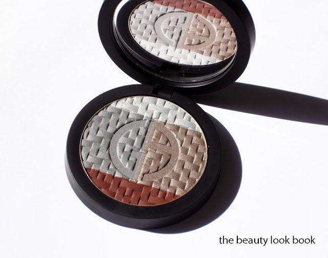
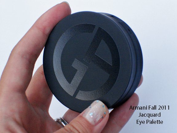
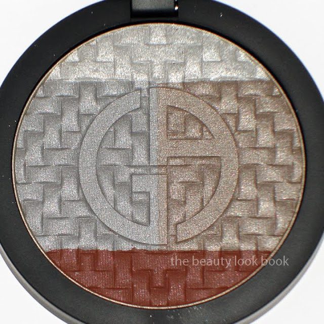
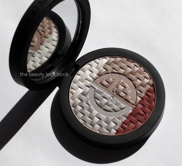
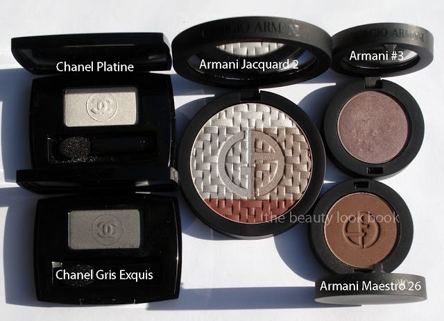
Giorgio Armani’s Jacquard Collection this fall is among the most beautiful and unique for the intricate embossed woven texture of the palettes. I ordered Eye Palette #2 ($59) after seeing it featured on Front Row Beauty. The palette has a unique trio of shimmery greys combined with a deep matte warm brown with a tinge of auburn. This fall the compacts are magnetized instead of having the snap-click closure. The top comes with painted with the Armani logo in a high gloss black finish.
At first glance when I received this, I was a bit concerned the frost might look too washed out on my skin. The silvery greys are indeed frosty. At the top you have a frosty pale grey-white, in the middle you have two variations of silver: one is more of a pale grey shimmer, the other is a pale mauve grey shimmer. The colors do have a contrast with my medium-tan skintone, but there is a lovely shimmer quality that gives the colors depth even though they are fairly pale.
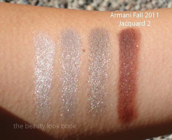
In direct sunlight you can see the sparkle:
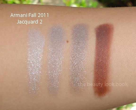
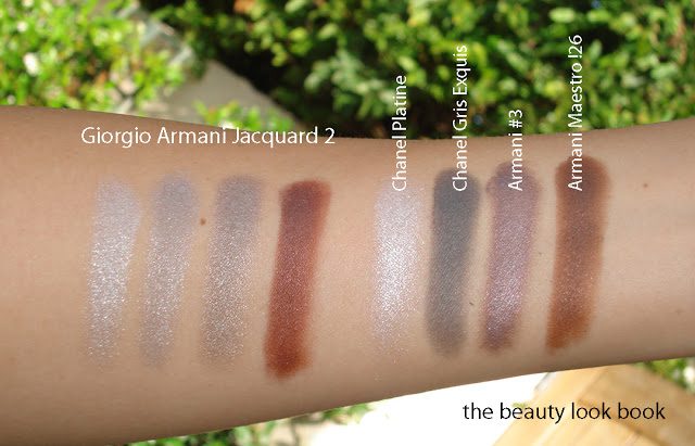
Swatches in different lighting:
Comparisons to a few other shades:
This morning I applied this quad over MAC Groundwork Paint Pot. I’ll report later on the lasting power. I find this palette a bit hard to wear. 3 of the 4 shades are so similar they all end up looking the same on the eye. It took quite a bit of blending and I had to mix the dark auburn shade with a matte black (both applied damp) to get a non-reddish smokey line. After blending and layering though I’ve achieved a subtle smokey eye and I love it. I’ll have to experiment more with this palette for application ideas.
In addition to #2, there is a green palette Eye Palette #1 (greens) and a Face Palette (pinks, beiges and dark pink). The items are all beautiful but Eye Palette #2 was the only one that intrigued me. I don’t typically wear greens on larger portions of the eyes and I found the face palette too frosty. For the lips, cheeks and new mascara, I haven’t caved on anything yet. There are some lovely lipsticks but I’ve overindulged on Chanel and Guerlain lately. Front Row Beauty reviewed all three palettes. Best Things in Beauty also has all three palettes reviewed plus some other items as well.
Have you seen the Armani Jacquard collection yet? Thoughts? Any loves?


