


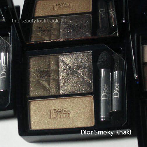
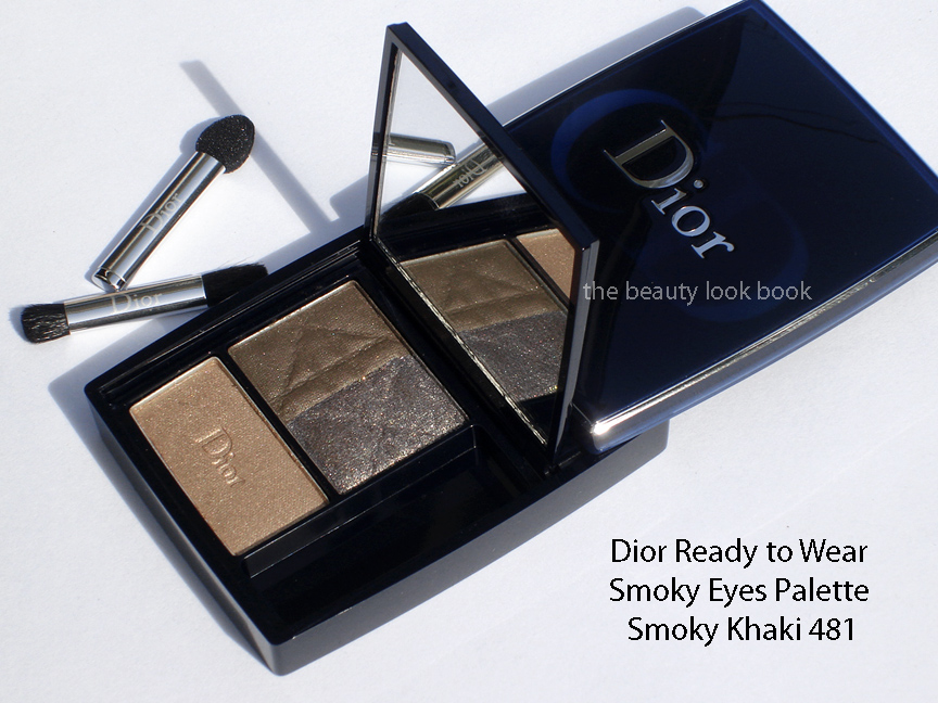
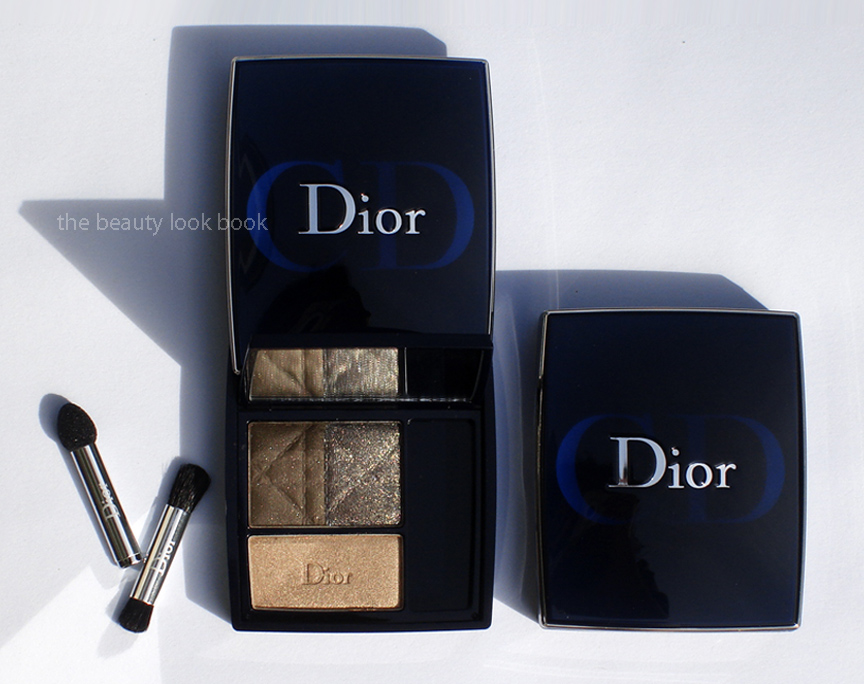
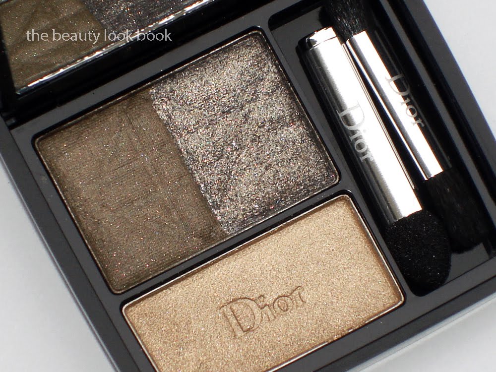
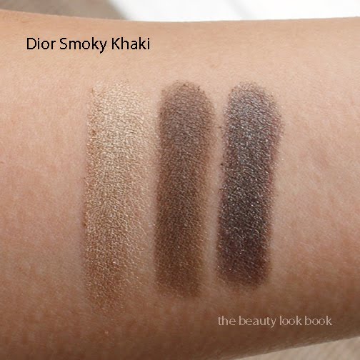
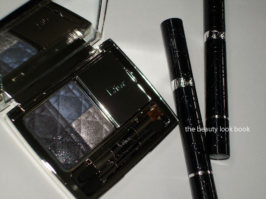
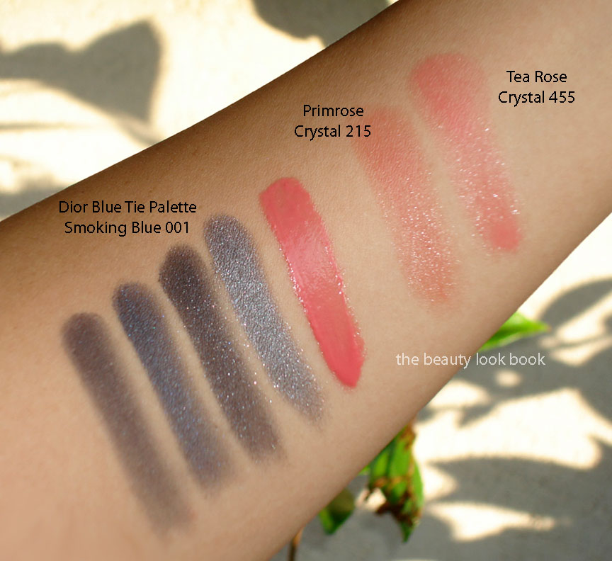
After seeing this swatched and reviewed on Beauty Moogle Zone, Café Makeup, Iron Spy I was worried it would be too warm for my olive skin. Still I could not resist the lovely descriptions of the satiny finish and when I tested the palette at Sephora I fell in love. The colors are very soft and refined. I find them a bit different from the traditional Dior palettes which typically have at least 1 high frost shade. This palette has a very subtle sheen in all shades and a very natural finish. If you’re looking for high impact or high shimmer, you might be disappointed with this one but I love it.
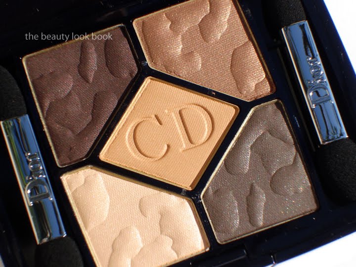
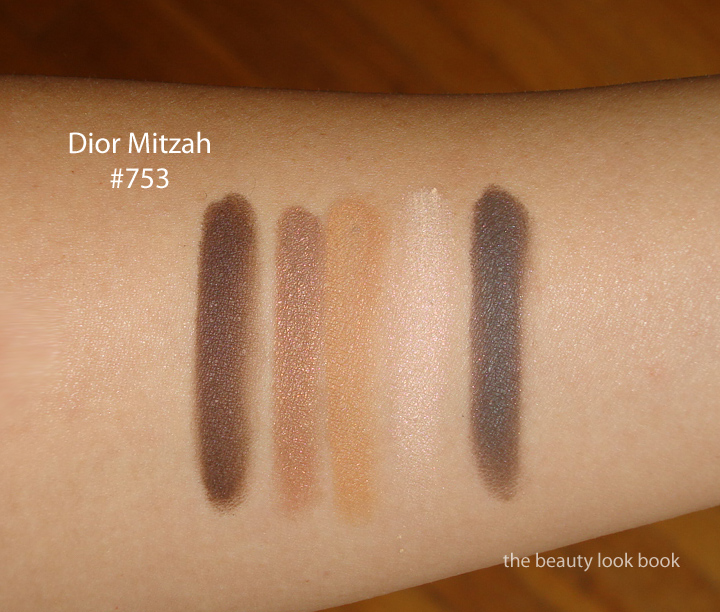
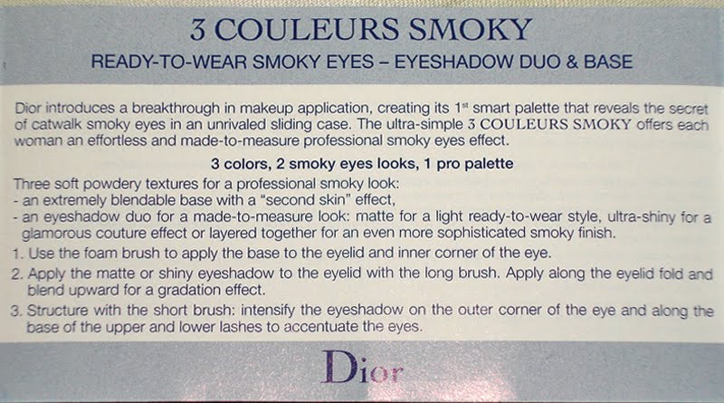
It’s usually difficult for me to use all 5 shades in Dior quints, however the Mitzah Quint has a wonderful layering quality and today I put all 5 shades on my eyes. I apologize I do not have photos to share, but for my application method, I started with MAC’s Cream Color Base in Seaside, applied the pale cream all over the lid, then followed with the bronzey top right about 1/2 way up the lid brushing the color back and forth into a soft gradient from the lashline upwards. I then took the bottom right greyish brown and smudged it right along the upper lashlines heavily. Next I took the upper left aubergine and applied it from outer corners about 1/4 way into the eye. Last step was to take the middle orange shade and lightly dip a soft fluffy brush and blend the two dark shades just to soften the edges.
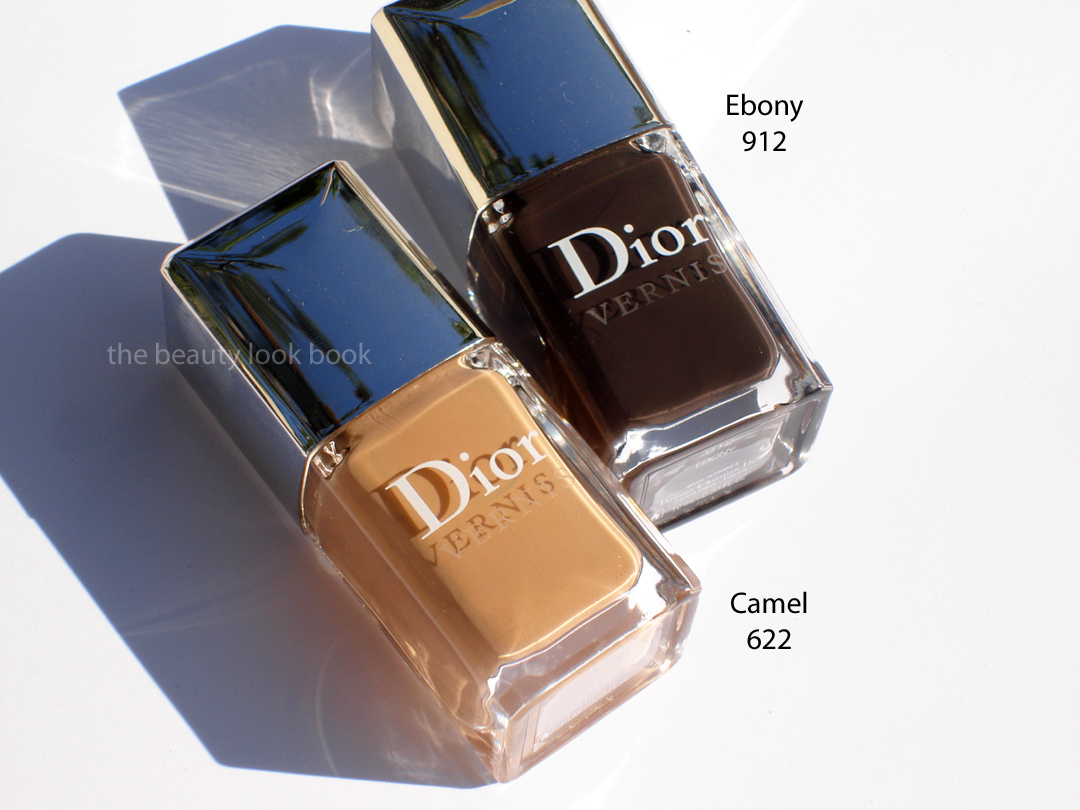
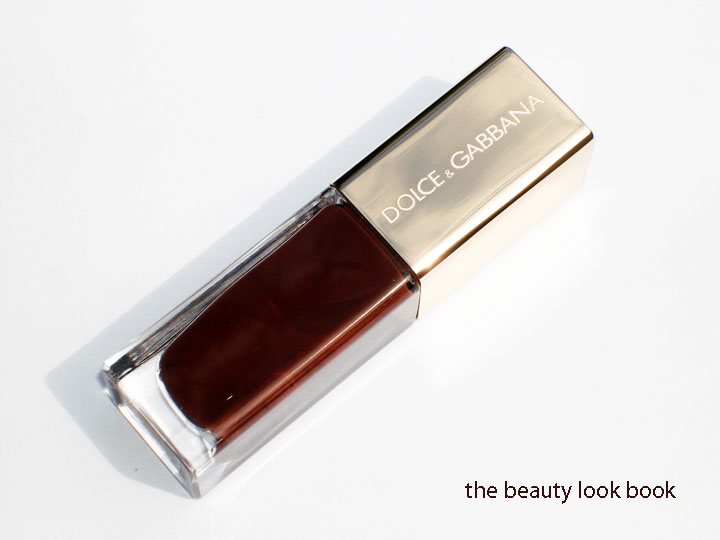
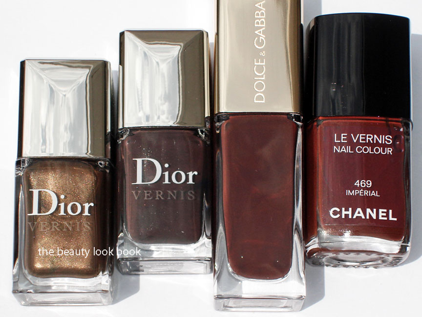
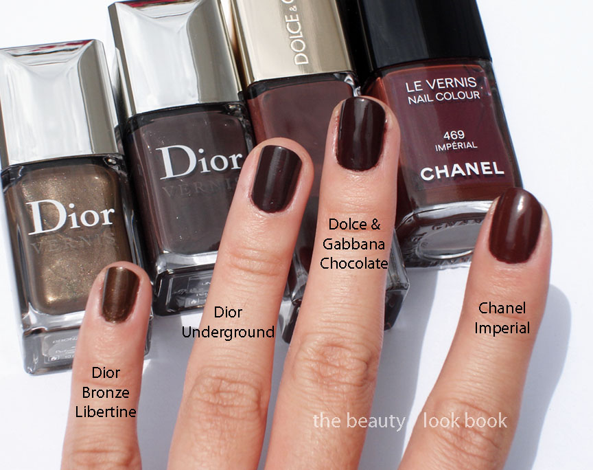
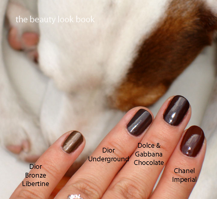
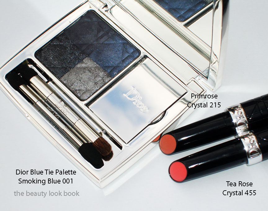
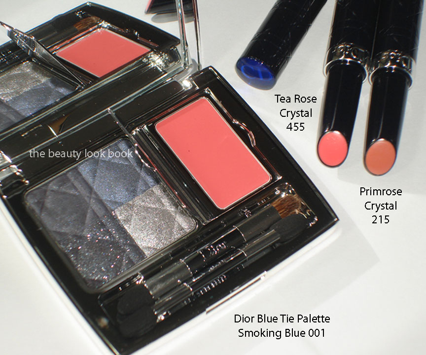
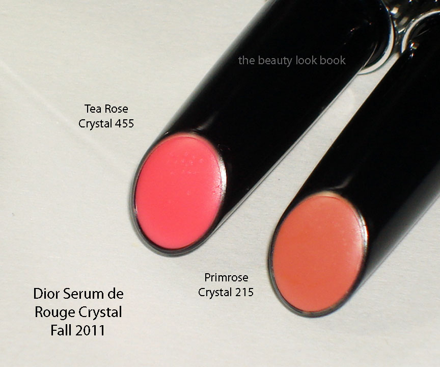
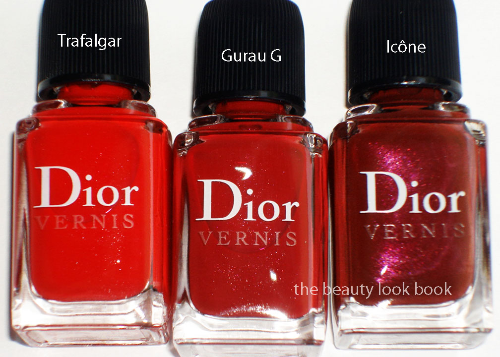
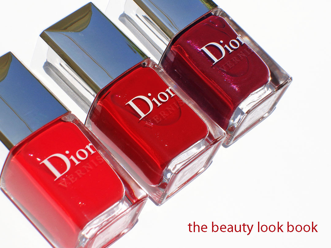
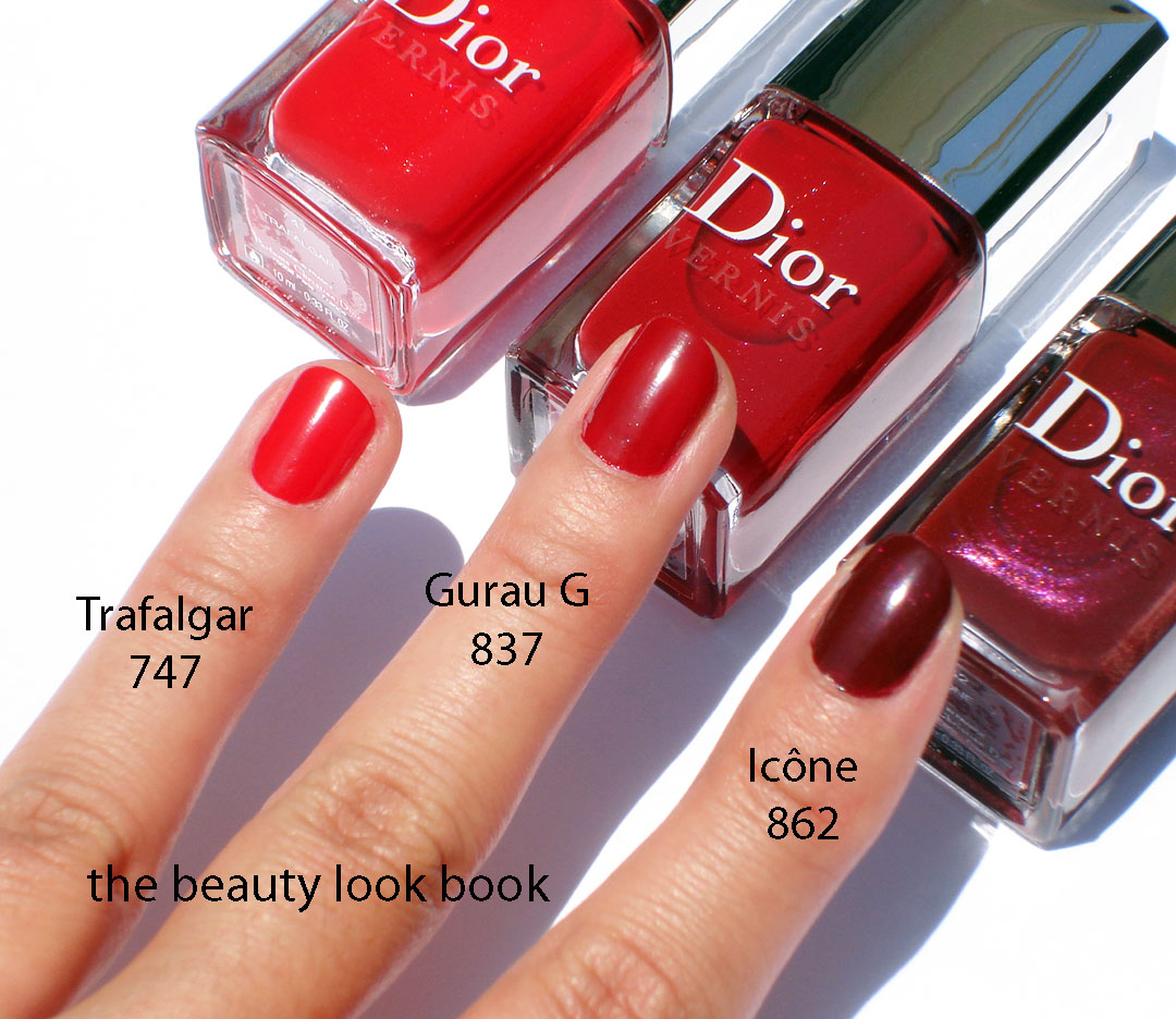
Camel and Ebony Nail Polishes ($22 each for 10 ml / 0.33 fl oz) are both opaque creams. I love this photo from Dior’s International Website. They apply beautifully with 2 coats and have a gorgeous glossy sheen on the nails.

Camel is a yellowed beige and Ebony is a deep cool brown. Both are pure love. I thought Camel might be too yellow but oddly once applied on the skin it just works. Might not be everyone’s cup of tea. This is one you have to see and test in person to really tell. I don’t think it photographs well on the fingers but in person I find it more flattering.

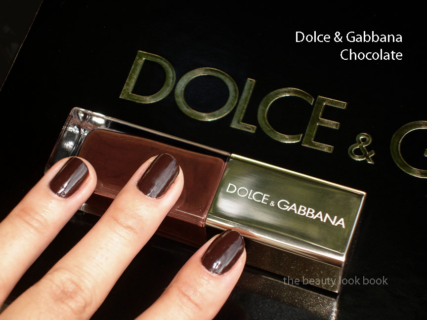
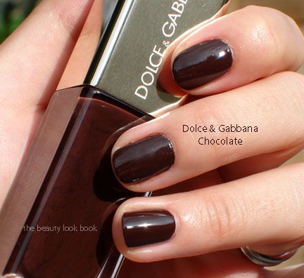
Ebony is a dark beautiful brown cream. It’s very similar to Underground which was released earlier this year. If you have Underground (slightly more purple undertone), you can safely skip Ebony (comparisons to come soon). These shades apply beautifully with 2 coats. The tapered brush makes application easier for those of use who have unsteady hands.

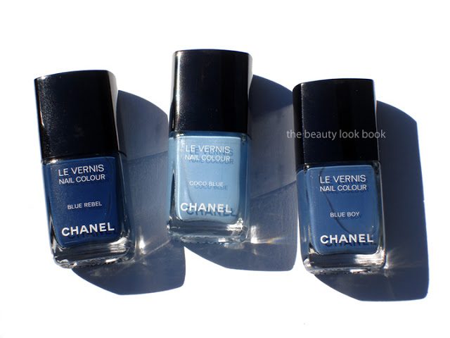
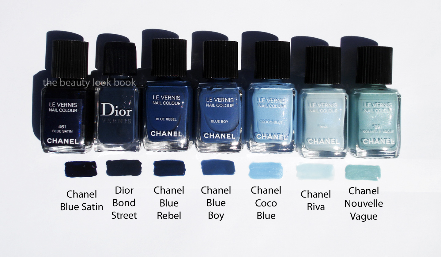
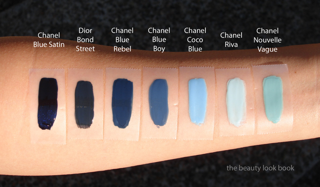
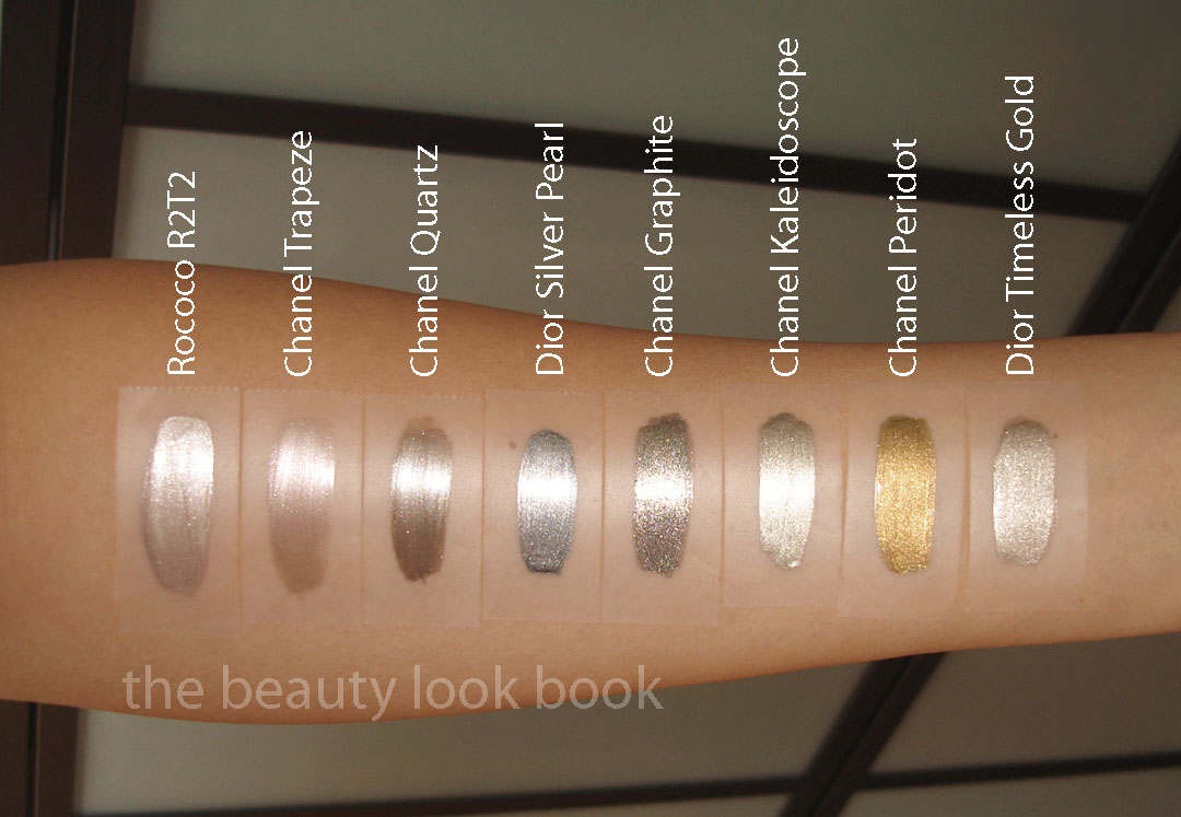
I highly recommend you check out additional swatches and reviews at Joey’space, Fashion Polish, and Café Makeup if you haven’t already. They have lovely comparisons and swatches.
Overall love. Bravo Dior! They did an excellent job creating a beautiful collections of neutrals with a kick. If you’re at all interested I recommend purchasing soon since all pieces are limited edition and exclusive to Sephora in the US. If you’re unsure about the quint because your coloring doesn’t do so well with warm shades, just use the middle shade with a very light hand. The other colors are very easy to wear and even on my warm skin worked just fine. At this time I won’t be reviewing the mascara I purchased. I have several tubes of other brands I have to use up. By the time I get around to opening up this one to test I’m afraid it will be sold out. At Sephora, the mascara tester looked like a dark brassy brown shimmer which I found intriguing.
I’ll be posting comparisons very soon in a separate post. Did you check out the Mitzah Collection at Sephora or elsewhere? What were your thoughts?


