

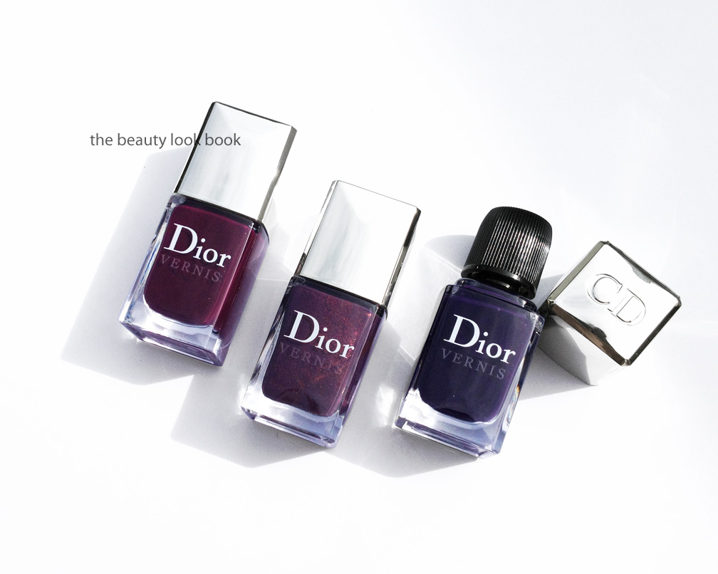
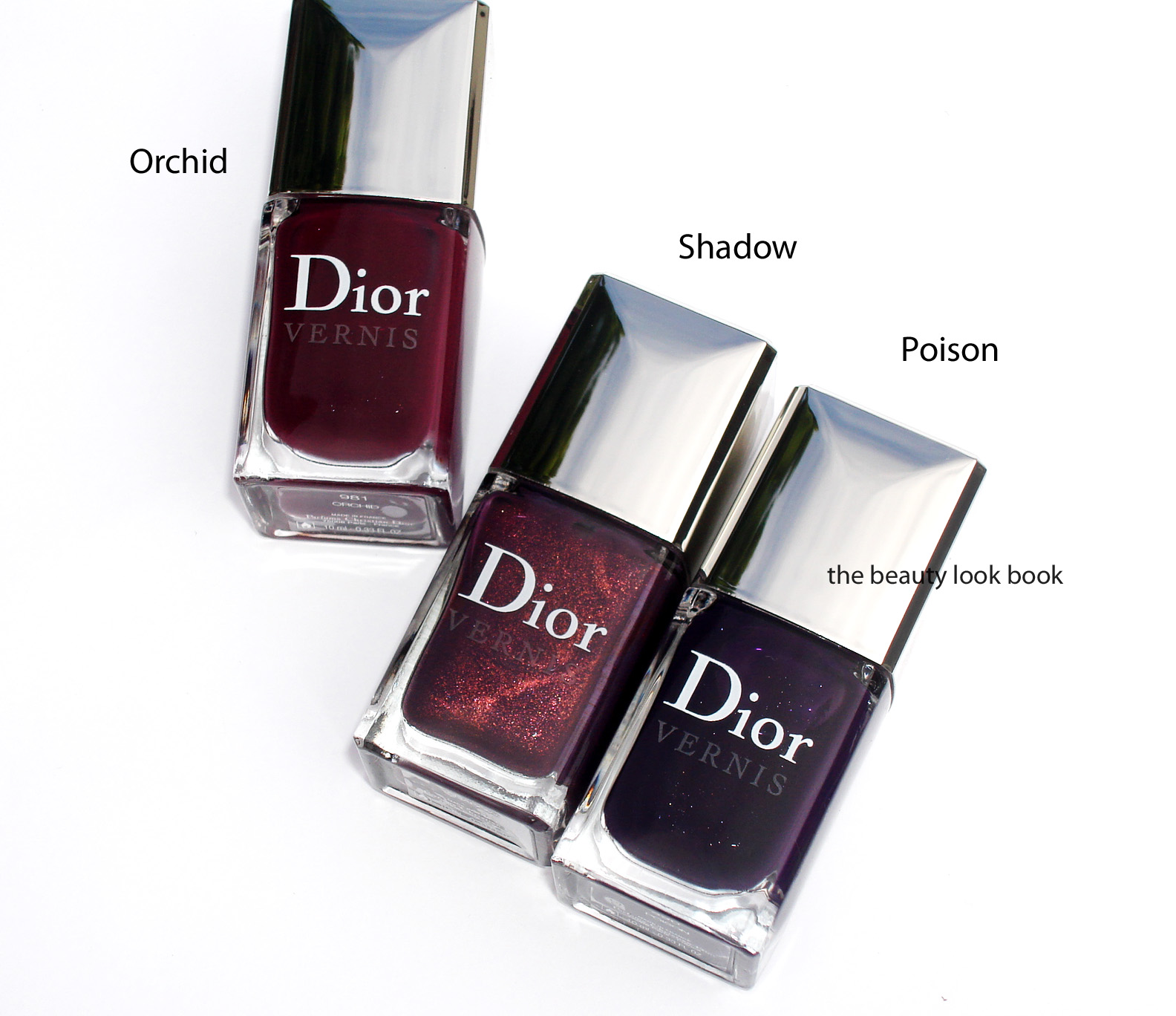
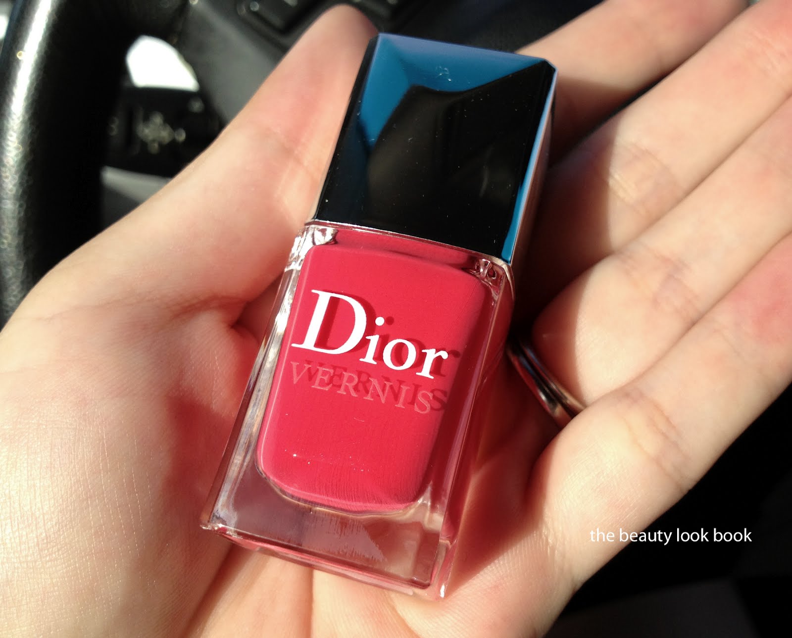
Dior’s Golden Jungle collection for fall has been out on counters in the US for about a month now with the exception of one nail color called Bengale #615 ($23 for 10 ml/0.33 fl oz). This shade is a medium brown cream and currently exclusive to Neiman Marcus and Dior.com in the US. It just arrived last week in stores at the Neimans counter near me. The coverage is smooth with a naturally glossy finish. If you look closely at the bottle under the light you will see tiny bits of silver shimmers suspended. Most of my non-shimmer Dior shades have the tiniest bit of micro shimmer infused in the colors. Unfortunately these aren’t visible on the nail but it does help give the colors a bit more depth. I had hoped Bengale would be a warm soft brown with pink tones like the promotional photos. In real life it’s a darker brown with the slightest hint of green undertones on my skin. It’s still lovely for fall, just not quite what I had expected.
Here you can see the sparkle:

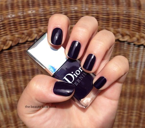
Here it is with two coats (no base or top coat):


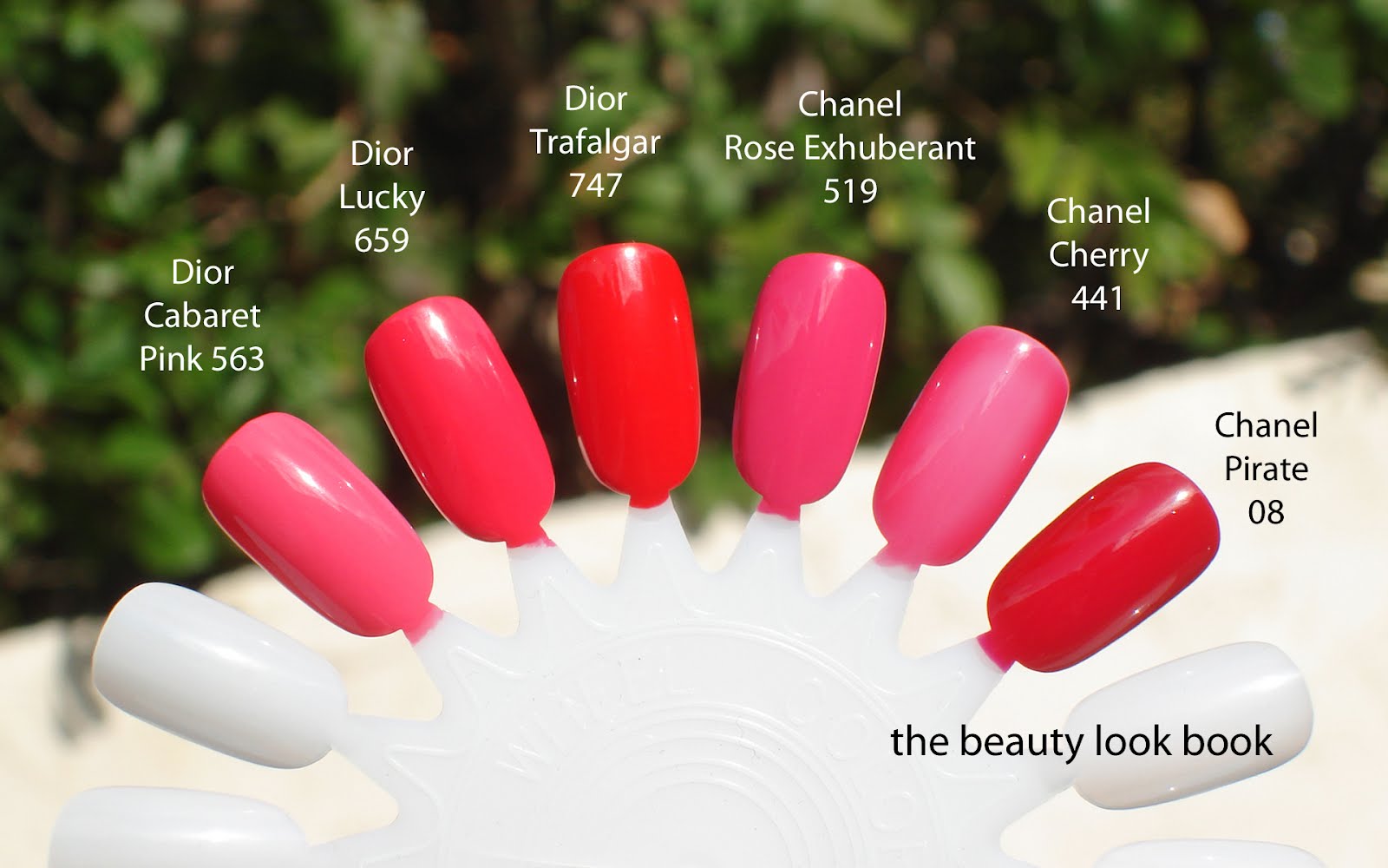
Many have been wondering how this compares to other browns such as Chanel Khaki Rose and Dior Underground. I’ve pulled out a few colors to swatch side by side: Chanel Particuliere, Chanel Khaki Rose, Chanel Khaki Brun and Dior Underground.


Although Dior Bengale wasn’t quite what I expected, I still find it very unique in the sense that it’s a true medium brown on me, something I was lacking in my collection. It gives a nicely polished look that can be easily incorporated into my work wardrobe for fall. It’s conservative, polished and neutral. Might not be everyone’s cup of tea but for me, I give it a thumbs up (although I can’t say I think it’s a must-have).
Did you check out anything from Dior Fall? Thoughts?


