Browsing Tag

Cream Eyeshadow

Uncategorized

Chanel Illusion d’Ombre for Fall 2011

June 21, 2011

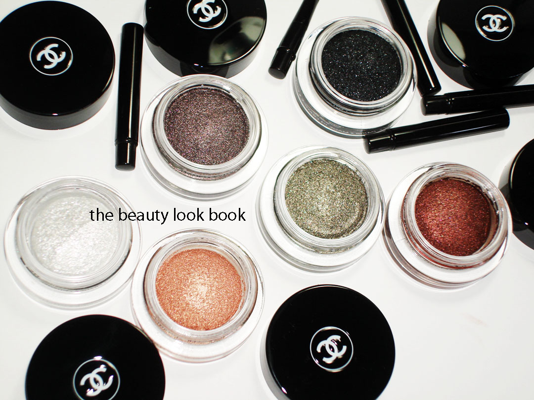
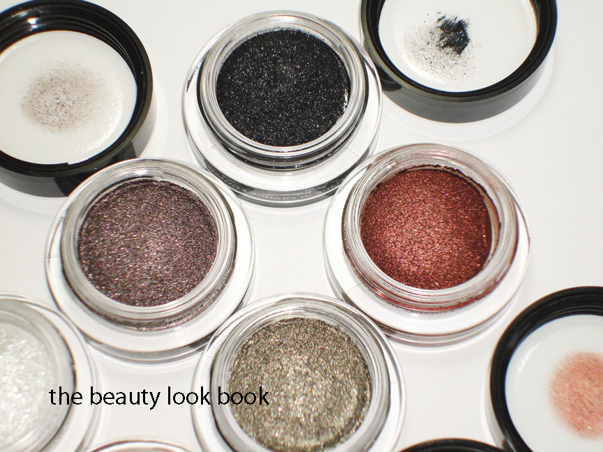
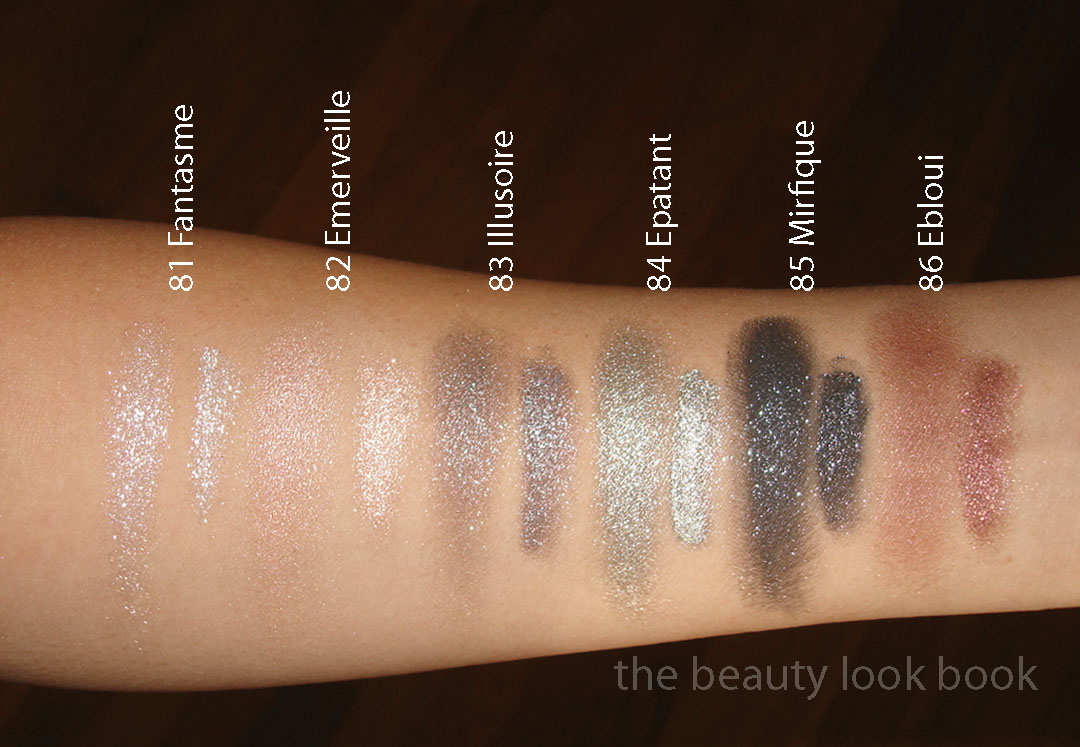
The makeup looks on the Chanel Fall 2011 runway designed by Peter Philips were amazing (see them here from Cafe Makeup). The highlight of his collection includes a new cream-gel eyeshadow called Illusion d’Ombre which comes in 6 shades this fall. These are small potted shadows with a twist-off lid and small capped angled brush. The shades are:

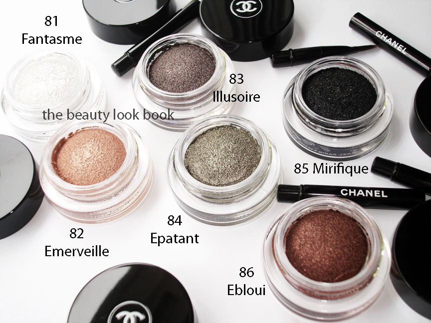
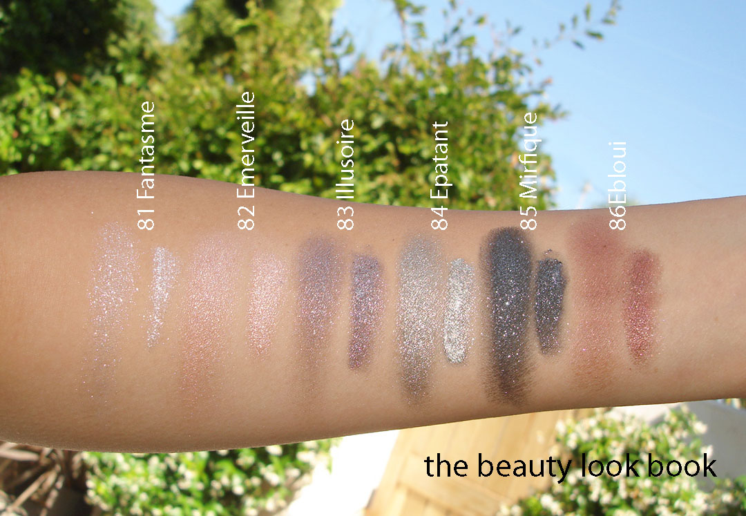
81 Fantasme – a frosted sparkly white
82 Emerveille – a soft shimmering nude peach
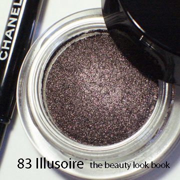
83 Illusoire – a complex purple shimmer
84 Epatant – a highly frosted khaki silvery shimmer
85 Mirifique – intense black with silver sparkle
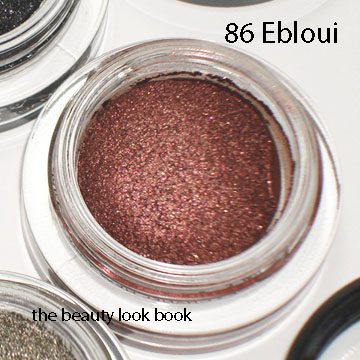
86 Ebloui – a reddish maroon with silver and plum sparkles

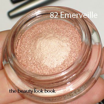
The shimmer: Each shade is complex with multi-dimensional sparkles. They are all intensely metallic and sparkly except for 82 Emerveille which is a soft luminous peach (still shimmery but the most natural). 81 is the most chunky in sparkle. 84 is the most frosty. 82 is the most natural. The others are somewhere in between.

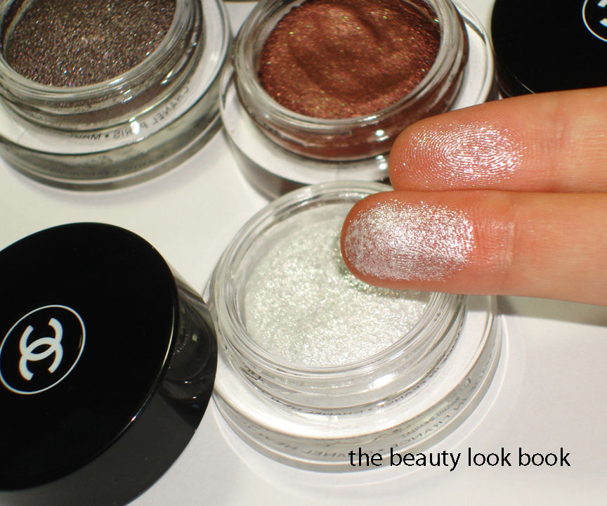
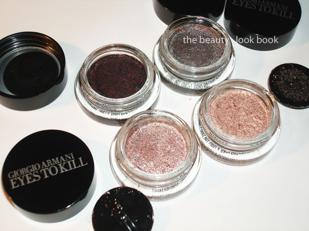
The texture: These are cream-gel like shadows. Compared to Armani Eyes To Kill Shadows, these come domed without an insert inside. These have a bit more bounce with a squishy texture. Almost like jello, but not as jiggly. The texture is smooth even though there is high shimmer with rich metallic flecks. Mine might have jiggled too much while in transit – the product was on the lids of some of mine.

Application: I tried these with fingers and with the brush. The brushes are surprisingly useful and help pick up the color for an intense application. They are perfectly designed to pick up the color in a way that allows for intense application. The first shade I tried was 86 Ebloui (the red one). I applied it with my fingers and the result was an absolute mess. Red-eye gone bad. I removed everything and started over, this time using the brush. The difference was amazing – rich pigmented and smokey. These definitely require experimentation. I think the lighter shades will be easier to apply with fingers. 82 Emerveille is the easiest for me to apply with the fingers (goof-proof color).

Lasting power: For this I still need to experiment more. I haven’t been able to wear these for a full day to test how long they wear. So far, no smudging for the short period of time I’ve worn them though.
Overall: Very shimmery, but intriguing texture. I find both Armani Eyes to Kill and Chanel Illusion d’Ombres highly metallic, just different in texture and finish. It’s difficult to describe, but although they are both metallic cremes, they are just very unique and different. The finish will be different depending on application technique and how much you apply. The Chanel are very fun to play with. I highly recommend going to the counters to try these out in person. Once they hit the west coast, I will for sure be running to the counter to get application ideas from my local Chanel artists.

A few other resources I found helpful (they have amazing swatches):

The bigger swatch is with the finger, the smaller swatch is with the brush blended out.

Uncategorized

Dear Chanel, You Make My Heart Sing!

June 18, 2011

Chanel Fall 2011, Illusions d’Ombre, has arrived online at Chanel.com and Bergdorf Goodman in NYC. See KarlaSugar for the lineup on an easy-to-read sheet with descriptions. Check online at Chanel.com for prices, product info, and the breakdown of the fall look. I suspect this will be launched in-store in the next few days and upcoming week – I’m on the West Coast and a few of my local Nordstroms have scheduled Chanel events the weekend of June 24th-26th which I assume were planned to coincide with the fall launch.
I have not yet had a chance to play with the items very much, although I have swiped a few of the new shadows on my eyes and the nail polishes on my nails. I have promised myself a break from my computer the entire weekend, so I can leave work at work and not be tempted, although I know many of you are anxious for the 411, so I will try my best to do full reviews this weekend. I don’t want to rush it though, I want to be thorough so no promises. In the meantime I snapped a few pictures and tried to beat the clouds that were rolling in for June gloom. Here is a sneak peek which I hope will satisfy your curiosity for the time being.

Rose Ecrin Blush, Prelude Quad & Khaki Platine Eyeliner

Quartz, Graphite, Peridot Le Vernis

Plumetis Rouge Coco, Coralline Lipliner, Pampille Glossimer, Braise Glossimer, Rose Cuivre Lipliner, Etole Rouge Coco

Illusion d’Ombres

Overall, everything looks amazing. Had I seen the lip items in person first, I probably would have skipped the lipliners and glossimer, but they are gorgeous nevertheless. Happy Friday everyone!

Uncategorized

Giorgio Armani Eyes To Kill Intense: 2, 4, 8 and 9

March 22, 2011

My picks from the new Armani Eyes to Kill Intense release: #2 Red Lust, #4 Pulp Fiction, #8 Champagne and #9 Rock Sand ($32 each). Armani has extended their color selection for the Eyes To Kill shadows from Holiday 2010 (#13 and #15 here). These are a hybrid powder-cream type of shadow with a lightweight almost sponge-like texture. They are highly metallic and richly pigmented with a long-lasting finish. To me these are high-performance eyeshadows – they deliver much more than the average shadow.

(click for large viewing of the beautiful multi-colored speckles)

Descriptions then thoughts: Each shade has a complex mixture of metallics. The resemble beautiful speckled eggs. #2 Red Lust is a blackened plum with red flecks, #4 Pulp Fiction is a highly metallic blueish grey with red and silver flecks, #8 Champagne is a silvery pink with flecks of metallic pink and silver, #9 Rock Sand is a champagne-peachy color with darker peach flecks and silver/gold sparkles.

I played with these over the past few days layering them on top of each other (two shades at the most, first the lighter shade then darker shade on top). Overall I’m extremely impressed with the lasting power. In terms of the colors, I prefer the darker ones for the eyes. The lighter shades are super metallic and frosty – a bit too much for my taste. I did mix a non-shimmer flesh shade (Bobbi Brown Shore) with a paler Armani ETK (#8) by mixing them together on the fingers which helped to minimize the frost. They are lovely colors and office appropriate – just not quite as finely milled as Chanel’s Ombrees de Perles from Spring {love and reviewed here}.

Close ups, swatches and one comparison set:

Close ups of 2, 8 and 9 (both 8 and 9 are similar, 8 is more pink while 9 is more peach):

New picks + last holiday’s shades arm-swatched with finger:

Comparisons of the silvery and lighter colors below. Bobbi Brown Galaxy is warmer and sheerer compared to #2 Pulp Fiction. For the lighter shades I recommend clicking below for larger viewing. MAC Vintage Selection is more pinkish/mauve, MAC Bare Study almost looks like a white gold compared to #8/#9, MUFE Aqua #13 is even more metallic and pigmented but lacks the complex multi-color sparkles the Armani have which makes it more of a silvery-champagne finish.

Are these must-haves? I think I am happier with the shades from Holiday mainly because I found them more wearable but there are quite a few lovely shades from this new collection. The shimmer/metallic/frost factor isn’t a deal-breaker (like Bobbi Brown Metallic Creams were for me) – I just think those iffy on high-metallic finish shadows should definitely try these on the eyes first (not just on the hand) before deciding whether or not to buy. The upside of these is that they are super long lasting. I had no fading or smudging on the days I’ve tried mine. I can’t report on the crease-factor as I have no crease in my lids.
Uncategorized

Quick Comparison: Eyes to Kill Intense 15, 5 and 6

March 17, 2011
After seeing those heart-stopping photos on Pink Sith of Eyes To Kill Intense #4 Pulp Fiction and a few others on Best Things in Beauty – I went to Neimans hoping they arrived on the west coast. They did! I picked up a few (to be reviewed soon, so much to review, so little time) and took note of a few other “maybes.” I had my eye on #5 Gold Blitz and #6 Khaki Pulse but they didn’t have the tester of #15 from holiday in store for me to compare. I left the store with hand swatches to do some testing at home.

Left to right: #15, #5 and then #6 (note the curved features of my hand made it difficult to photograph, but I hope this helps a bit)


The differences:
  • #15 is the most brassy, but very close to #6
  • #6 has the most khaki undertones
  • #5 is the warmest, most coppery-gold (reminds me of Edward Bess Escape Eyeshadow)
Does anyone need all three? I’ll leave that up to you to decide. The jury is still out on the must-have factor for me. Khaki tones tend to make me look tired and warm shades can turn orangey on me. They did have a lovely sparkle in the sunlight and are indeed super long lasting. I still have remnants on my hand this morning.
Uncategorized

MAC Chez Chez Lamé, Rosé Olé, Vintage Selection & Let Me Pop

December 29, 2010
I know what you’re thinking: Not another Cham Pale review! Even more so, MAC on this blog?* I realize you’ve seen this collection reviewed practically everywhere, but per request, here are my thoughts on the MAC Cham Pale collection and comparisons to other shimmer powders and paint pots.

Overall impression: I love the theme of shimmering pales (as seen in last month’s Loving Right Now: Shimmering Pales post). I’m all about the glowy and luminous but when I started seeing swatches and reviews on other blogs I was a bit let down. Everything looked so frosty! Still, curiosity got the best of me so I took a peek at the MAC counter the day after Christmas. I can report that my favorite bloggers did an amazing job in swatching with great accuracy. The colors are indeed very metallic in this collection, however I was able to find a few things that worked for me when applied with a lighter hand.

What I picked out, thoughts and descriptions:

Chez Chez Lamé Special Reserve Highlight Powder – This is a soft pale beige gold shimmer. I have a soft spot for MAC MSFs even though they tend to be overly frosty so I couldn’t resist these new highlighting powders. On my skin, the shimmer is more finely milled and less frosty. I also find these less frosty than Bobbi Brown Shimmer Bricks. I was pleasantly surprised! This is extremely pale however – if you’re a Chanel Shell or darker I would recommend using this with a super light hand to avoid super-frost.

Rosé Olé Special Reserve Highlight Powder – This is described as a soft pink with gold shimmer, on me it’s a peachy-rose, slightly bronzey. Same finely milled shimmer quality on the cheeks. I think this will look great on the eyes. Since it’s darker it’s not quite as contrasted on my skin. I recommend also applying with a lighter hand, I don’t think these will photograph well if applied heavily – you will most likely end up looking oily from the shimmer/shine.

Vintage Selection Paint Pot – I was the most anxious to see how the Paint Pots looked in real life. I thought I would pass on them all as they looked glittery and chunky. They are significantly more sparkly than any other paint pots I’ve seen, yet there were two that I liked blended out. Vintage Selection is a lovely light mauvey-pink sparkle. Those who don’t like micro-glitters may find this too over-the-top. Normally I avoid glitter like the plague, but this one is pretty blended out. Even though these are creams, for some reason I find MAC Paint Pots to be a bit hard to blend and need a bit of help from eye creams.

Let Me Pop Paint Pot – A unique coppery peach that is light enough for me to wear on the eyes without looking ill. This too has glittery chunks, so I recommend if you do venture to try this, try it on in small doses.

The comparisons of similar products with swatches, MAC Chez Chez Lamé:


The comparisons of similar products with swatches, MAC Rosé Olé:


MAC Paint Pots, MUFE Aqua Cream & Laura Mercier Metallic Creme Eye Color:


I found most of the Cham Pale colors original and different from others (with the exception of the repromotes). I don’t think this is a universal palette of colors. The paleness of everything will definitely not suit all skintones. The glittery frosty aspect of the lipglosses and paint pots will definitely be out of many women’s comfort zone. I personally don’t know who would wear those glittery lipgelees ever. But to each their own.

If you’re wondering how the shimmer highlighters compare to other high-end brands, well, I still have to tell you they just don’t. Even though these are finely milled and not-too-frosty, The Dior Skinshimmers and YSL Holiday Powder and Chanel just have a more natural glowy quality. Compred to the frost level of NARS Multiples, Blushes, and highlighters, the MAC is more subtle in my opinion.

I was surprised myself that I left the MAC counter with anything – you all know I’m not a huge fan of super-frost or glitter. I won’t say anything is a must-have, but I do recommend if you’re at all interested to explore this collection and check it out in person if you can. You might be surprised to find something fun and different.

* As an update to the rude commenter and others who like to throw insults on a regular basis – I did not mean to imply I am too good for MAC. I do like quite a few items from MAC, in fact a substantial percentage of my collection consists of MAC products, but mainly from older collections. Those who have actually read my blog for a while know I do not typically cover MAC collections by choice simply because it is a widely accessible brand that is well covered in blog reviews, message board reviews and videos. I blog about what I want to blog about and what I like. What I like is variety. If you are offended by luxury brands then this is not the blog for you to read.

Uncategorized

Loving Right Now: Shimmering Pales

November 10, 2010

L to R: Le Metier de Beaute Whisper & Armani Holiday 2010 Shimmer Powder (to be reviewed soon)


Top to bottom: Chanel Star Glossimer, Laura Mercier Pink Diamond, Trish Irresistible Nude, MAC Oyster Girl Lipglass, MAC Gel Lipstick (on tube #3), D&G Perfection Lipstick


L to R: Paul & Joe Pearl Powder #01, MAC Naked Pigment, NARS All About Eve Eyeshadow Duo


OPI Hollywood Blonde Nail Polish, MAC Bare Study Paint Pot


MAC Bare Study Paint Pot, Paul & Joe Pearl Powder #01, MAC Naked Pigment, OPI Hollywood Blonde Nail Polish, Le Metier de Beaute Whisper Highlighter, D&G Perfection Lipstick, MAC Oyster Girl Lipglass, NARS All About Eve Duo, Chanel Star Glossimer, Laura Mercier Pink Diamond Lip Glace, Trish Irresistible Nude, MAC Gel Lipstick

Uncategorized

Make Up For Ever Aqua Creams Warm Beige 13 & Taupe 15

July 2, 2010
It seems many of my recent purchases have been inspired by others. The new Make Up For Ever Aqua Creams $22 (from Sephora) are no different. This post I dedicate to Lakshmi. She had her eyes on these as soon as they came online and e-mailed me “gorgeous taupe eyeshadow alert!” the moment her Sephora received their shipment. I immediately went to Sephora the following week to check them out and my first try, I was not impressed. I’m not sure if it was just the questionable sanitary tester conditions, poor lighting, or use of my fingers that had me leaving empty handed. The first time I tried it, it didn’t blend well and looked extremely muddy on the eyes.

However, after getting more info from Lakshmi and reading Karla’s post about her swatch adventures with the MUFE Aqua Creams, I decided to try it once more. I have to say I agree with Karla that applying with fingers isn’t the best way to apply them. Spreading the color on the eye with my finger leaves an uneven application since it sets fast and doesn’t blend well. It applies much better when you use a brush. I used my MAC 242 and Bobbi Brown Cream Shadow Brush (one on each eye today) and I can definitely see a difference in the application.

Those not familiar with MUFE Aqua Creams – they are a new high pigmented cream shadow that is long-wearing and waterproof. I can’t attest to the waterproof part. I have tried their Aqua Lip Liner in 1C and I can’t say that it was longlasting. However the Aqua Creams do indeed last a long time without fading. Right now they are a Sephora Exclusive in the U.S. When I was at Sephora, the sales rep told me he recommended that I apply with a brush in thin layers. He said the pigmentation/texture of the cream was such that if you apply too much at first, you will get a cakey layer that will crack when dry. I’m not sure if this is true or not, but his input/advice did make sense.

I ended up coming home with #13 Warm Beige (which is a pale champagne pink) and #15 Taupe (a shimmery taupe):


I tried #2 Steel at Sephora with a Q-Tip applicator and it lasted from 1:00 pm to 9:00 pm without any smudging or fading. The only reason it came off was because I removed it in the shower. I passed on it at the store because it seemed similar to Bobbi Brown Galaxy (which I don’t find myself wearing frequently). I wasn’t able to compare it side by side, but knew I most likely wouldn’t use it a lot.

Those wondering, I swatch tested a few shades meant for cheeks. I personally didn’t see how it was possible to blend them on the cheeks since it’s a bit tricky for me to apply on the eyes. Some of the colors are stunning, but the texture seems too thick to be able to blend well for a natural blush.