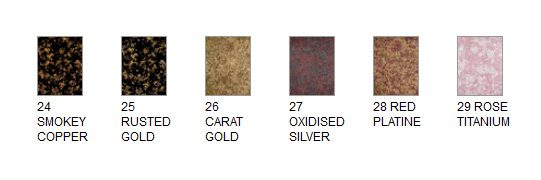
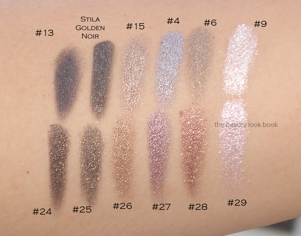
This summer Giorgio Armani has released a few mini collections focusing on lips and eyes. The new Gloss d’Armani shades from the Skin Lacquers Collection was featured last month here. The latest release is their Eyes to Kill Aqua collection featuring six new Eyes to Kill Intense shades, waterproof mascara and eyeliners. I ordered all six of the Eyes to Kill Intense shades from Saks sight unseen ($32 each for 4g/0.14 oz, all listed as limited edition, made in France). The colors looked amazing online and I am happy to report these indeed are stunners. The newest shades are #24, #25, #26, #27, #28 and #29. Some sources have actual names for these. For Armani, I always reference the numbers since the names are rarely printed on the box or packaging for shadows or lipsticks or glosses. Here is the lineup from Saks online and then one of my photos below. I have to give the thumbs up to Armani and Saks for improving their online swatches for these.
I’ve reviewed the Eyes to Kill Intense formula before, but to recap for those new to these shadows, Armani’s Eyes to Kill Intense are a potted hybrid cream/powder eyeshadow. The texture is spongy and almost-cream like but not quite. They are indeed intense in pigment and sparkle. Most contain a complex blend of colors almost like a kaleidoscope making them multidimensional. I like to think of them as a pumped up version of MAC’s MSFs but for the eyes and in a cream formula. Armani boasts that these are long-wearing shadows with 24 hour lasting power. I have never worn any type of makeup for 24 hours straight, but I do find the lasting power to be stronger than the typical shadow. If I don’t touch my eyes at all during the course of a regular day, I find that they last without fading.
The formulas are easy to blend and layer under and over shadows. I do find layering a powder over these will sometimes make the Armani cream shadow fade a bit. If you want to layer over these but still want to maintain the sparkle intensity, I recommend you pat. These aren’t emollient enough for me to be a base though.
Compared to Chanel’s Illusion d’Ombres, Armani’s Eye to Kill Intense last longer and have a less bouncy feel in texture. Although some are more sparkly, I find Armani’s easier to wear and pull off for everyday or for evening. Now onto the colors:
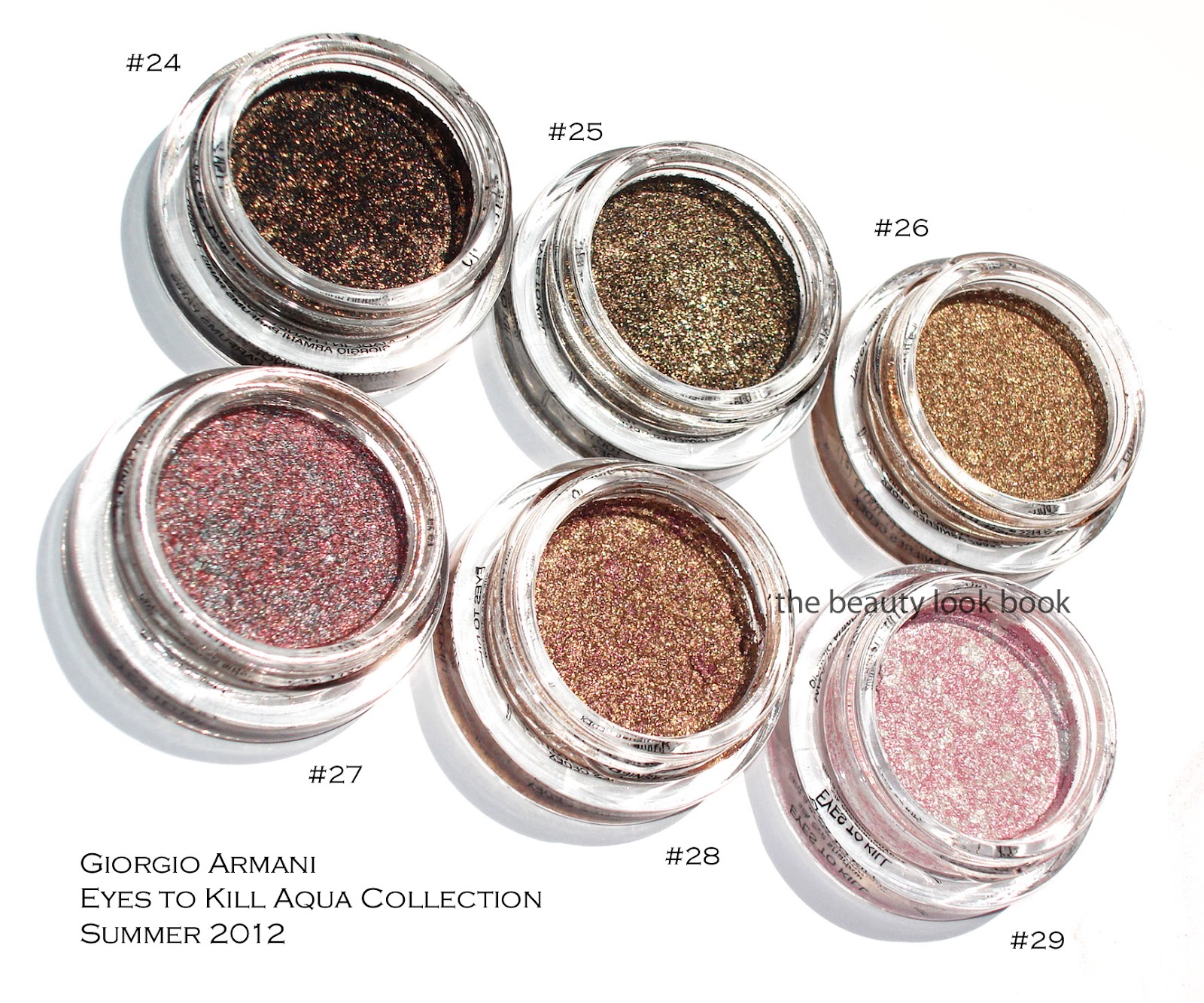
#24 is a blackened gold sparkle. It’s beautiful for a smokey liner or smokey eye. What I love about these is that they the pigment is easy to control by layering.
#25 is another black-gold sparkle but with more of a lighter khaki base. On me it pulls slightly olive because of the gold tones.
#26 is a beautiful warm gold. Some of you may wonder how close this is to #5, #6 and #15. It’s close but slightly less khaki and more golden/warm. I’ll show a few comparisons below.
#27 is a complex silver-taupe-red sparkle. I expected a silvery-taupe but mixed together it pulls more purple on my skin due to the red metallic streaks.
#28 is a gorgeous gold with burgandy/purple blend. It’s what I wanted NARS Kuala Lumpur to look like on me (which was way too warm/red). This has just the right amount of copper and burgandy blend to work for me.
#29 is a pale frosted pink-white pearl. I would say if you have either #8 or #9, this might be too similar to justify owning for you. I do find it’s brighter and whiter (even with the pink veins) so it’s a bit more contrasted on my skin (especially with a tan). This one and #28 arrived a bit cracked/separated from the container. If you search other reviews you will see the packaging comes with a black insert which you can use to press down the product. I used those to try and press down the shadows and fix the cracks a bit.
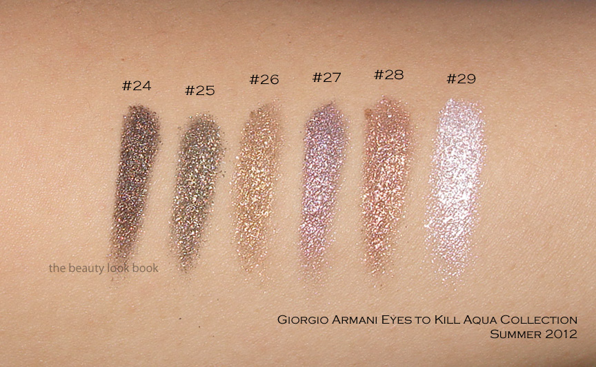
Now swatching these will definitely vary depending on what kind of brush or how much pressure you use. I’ve swatched these a few different ways and under different lighting to show the complexity. Messy Wands has swatched these on her skin (which I believe is lighter than mine), definitely check out her blog to see how they look on her.
Swatch set #1 on the arm:
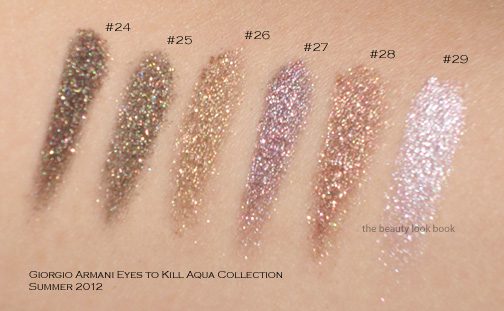
Swatch set #2 at an angle so you can see the sparkles shine in the sun:
Swatch set #3, bigger swatches blended:
These were all swatched without a base and with a variety of cream shadow brushes (from MAC, Bobbi Brown and Becca). Note that while these look uber-frosty and metallic, they are wearable on the eyes without being too frosty. At least on me. I only had time to swatch a few comparisons to other Armani shades, sorry my schedule can’t accommodate more comparisons right now. I do find these relatively unique compared to the existing Armani lineup. Two views below.
Overall a huge thumbs up. I do think #24 and #25 are very similar and you definitely don’t need both. I prefer #24 because it’s darker and more intense. Have you checked out the new Armani Eyes to Kill Intense shades yet? Thoughts? Did you pick anything up?
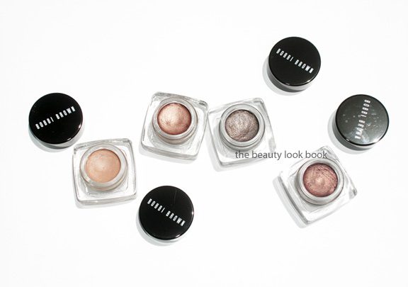
I’ve been a long-time fan of Bobbi Brown’s Long-Wear Cream Shadows (her regular version). Staples in my collection include easy-to-wear classics such as Ballet Pink, Sandy Gold, Sand Dollar and Sand Castle (now discontinued). They’re compact and have a soft velvety smooth texture that makes them easy to apply with fingers or her cream shadow brush. Recently, she released a number of new shades in her Long-Wear Eye Collection and Miami Collection. I picked out a few shades recently from both: Nude Beach, Bronze Sugar, Smoky Topaz and Velvet Plum ($24 each). All work well alone or as a base under powder shadows. Occasionally I will layer the darker shimmer shades with a powder shadow to help blend colors or intensify certain shades. They are extremely versatile and I like the quick and easy swipe-and-go application these offer. For me they last all day from morning to afternoon. Near the end of the day they do start to fade like most creams do, but I like that these don’t budge on my eyes.
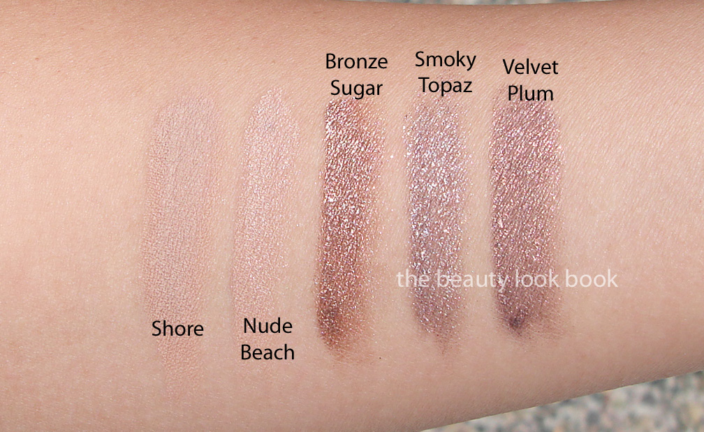
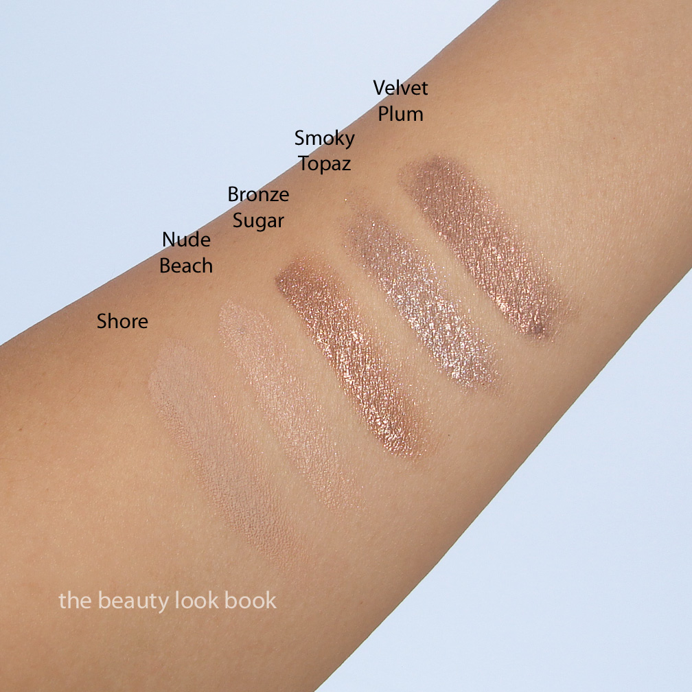
Nude Beach is my new holy grail perfect nude. It has a bit of shimmer and gives a luminous glow. It’s similar to Shore (which I have swatched below) but brighter and slightly less grey. I still adore Shore, but Nude Beach has the perfect amount of shimmer to prevent this from looking flat. It’s a medium-toned nude which matches my Chanel B30 skin exactly.
Bronze Sugar is a highly metallic warm bronze. Note that these new shimmery shades are her regular Long-Wear formula, not her Metallic Long-Wear formula (which I did not like at all). There is a silvery sheen to some of the shimmery particles making this sparkle. I found this one dried quickly on my lids so it required fast blending. Times I did not blend fast enough it dried on the lids and did not budge. If you have oily lids you will like these. If your lids are more normal or on the slightly dry side, you might want to apply a good dose of eye cream first.
Smoky Topaz is a taupe-lover’s dream come true. It’s a high-sparkle taupe/mauve/grey. Check out Karla Sugar’s swatches to see how it looks on different skintone and applied with a heavier hand. On her it appears more silvery, while on me it’s more taupe.
Velvet Plum is a bronzed-plum. It’s very similar to Bronze Sugar but dries with a plum finish. If I had thought about these longer, I would have opted for Velvet Plum and skipped Bronze Sugar.
Note that I applied these with Bobbi Brown’s Cream Eyeshadow Brush with medium intensity. You can definitely layer these easily for more pigment. The shimmery shades from the recent collections do have a bit more kick/sparkle than her other cream shadows, but I find them still very wearable for everyday. Bottom line gorgeous. Also, Best Things in Beauty has me wanting Candlelight.
I found mine at Neiman Marcus but these should be at all Bobbi Brown counters now.
This summer Giorgio Armani has released four Eyes to Kill Intense Eyeshadows in #20, 21, 22 and 23. There have been numerous amazing reviews from bloggers of all different skintones on all four shades. Some of my favorites include features from Rouge Deluxe, Temptalia, Messy Wands, Perilously Pale, Beauty Ops (just to name a few). The colors that stood out to me were 21 Obsidian Grey and 20 Obsidian Black ($32 each, limited edition).
Obsidian Grey #21 is a highly metallic medium grey in the pot. On the skin it has a silvery sheen, particularly on olive skin. As with most other Eyes to Kill Eyeshadows, the texture Obsidian Grey allows you to layer for a sheer wash or more pigmented intense application. I use a cream shadow brush or a small domed shape brush to apply and blend. Swiping on the back of my hand I expected a lot of fall out since the metallic particles seemed larger than most shimmery cream shadows. However this applied smoothly without any fallout problems for me.
Obsidian Black #20 is a blackened teal shimmer. This color was the one shade I just had to have. It’s stunning in the pot and swatched on the hand. On the eyes, at least for my olive medium skin, I found it didn’t work so well. My experience was similar to that of Temptalia. On my eyes, this lost a bit of lustre and intensity. In addition it made me look tired and a bit sallow. The teal in NARS Dogon has a very similar effect but for some reason works so much better for my olive skin.
Swatched, two views:
Comparisons to other Eyes to Kill Eyeshadows Pulp Fiction #4 and Black #13:
Overall I love Obsidian Grey #21, but personally prefer Pulp Fiction #4 more since it has a bit more taupe and less silver. Obsidian Black #20 is gorgeous as well but requires more work and layering with other shades for my skintone, I prefer #13 in Black from the initial release to Obsidian Black. The lasting power is excellent for me and last all day and well into the evening without smudging. Do note that many of the Eyes to Kill Intense Eyeshadows are indeed intense. Some are highly metallic which might be outside of your comfort zone. (For reference I found the holiday shades way too shimmery for my taste.) I find some to be more wearable than others for everyday. If you have some of the older shades I don’t think these two are must-haves.
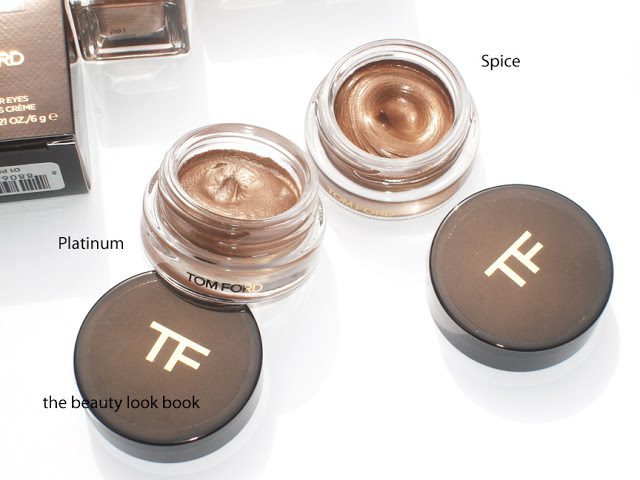
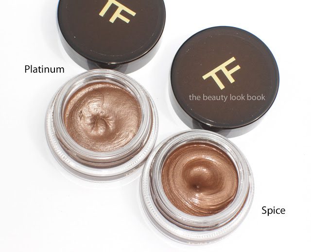
Tom Ford’s new Cream Color for Eyes come in four different warm metallic shades, $40 each. These come encased in a small round potted container similar to that of many other cream shadows. I purchased Platinum and Spice sight-unseen based on a few photos online, to me these seemed the most neutral-toned, the others appeared to be very warm in color.
Platinum is a warm taupe-nude-silver. It applies very sheer but is layerable. I’ve used it as a base all over the lid for a subtle contoured glow on the eyes. It looks very nude on my skin, partly because the formula is semi-sheer. Spice is a warm bronze, also sheer, but buildable. I find it very warm-toned, but not too reddish like some bronzes can be.
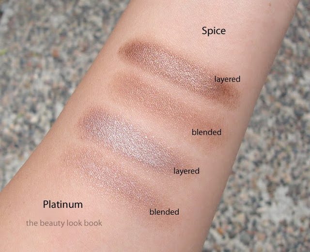
The texture of these are a soft almost mousse-like cream. They have a softness that is like Chanel’s Illusion d’Ombre but without that bounce you find when you press your fingers into the Chanel. The Tom Ford Cream Colors have a soft sheer but layerable texture. I found them most similar to Laura Mercier’s Metallic Crème Eye Colours in terms of how they apply and layer on the eyes.
The finish is smooth and very light-weight. Not quite a full cream, not like a liquid eye color, not like a gel. It feels like a mix between a cream and a mousse. Color applies smoothly and sheer with the fingers or a brush but is easily layerable. The colors are shimmery but not frosty. The finish just glows which I think is very pretty.
Lasting power seems fairly decent for a cream shadow … that is if you just don’t touch the eye area once applied. I wouldn’t say they are budge-proof if you touch your eye makeup. However, for me, they did help my makeup last longer throughout the day.
My first impressions were … well, luke warm. The colors were pretty, but at $40, I felt the packaging was a bit lacking. There is no applicator for the product and the actual packaging seems a bit cheap (the top has a sticker slapped on for the TF logo, most other brands at least have the brand name or logo embossed onto the actual lid). Still, the packaging is sturdy and functional. My first attempts at applying the product resulted in a barely-there look. No matter how I layered, it seemed that the color disappeared as soon as I did any sort of blending.
After playing with these for a week now I’ve grown to like them more. Particularly Platinum which works as a base or as a stand alone color. For me, the first layers have to be blended (either with a finger or brush) and the color does disappear, however, I’ve found that putting a second layer on top of the first helps the color show up better. Second layers are applied with a patting-motion rather than blending to help the color show up better.
I couldn’t find dupes for either of these shades. I did pull a few other cream shadows to help compare the finish/texture a bit.
L to R: Bobbi Brown Smoky Topaz Long-Wear Cream Shadow, Laura Mercier Platinum Metallic Crème Eye Colour, Tom Ford Platinum Cream Color for Eye, Tom Ford Spice Cream Color for Eye, Armani #4 Eyes to Kill Eye Shadow, Chanel Epatant Illusion D’Ombre, Bobbi Brown Sand Dollar Long-Wear Cream Shadow, MAC Constructivist Paint Pot.
Overall I’m pleased with the performance of Platinum. It’s a highly versatile cream shadow. Spice is a shade I still need to work with a bit more. The warm tones are suitable when layered with other colors, alone it’s a bit too warm for me right now. The are both rather pricey at $40 but you do get a lot of product. I probably would have preferred a powder shadow in these colors rather than a cream, but they are still very pretty.
Have you checked out the new collection from Tom Ford? What were your thoughts?
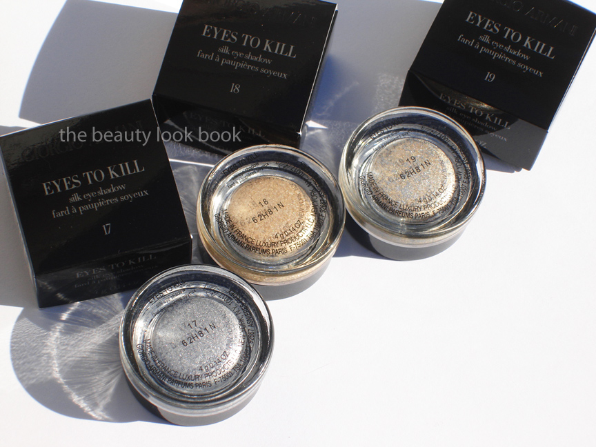
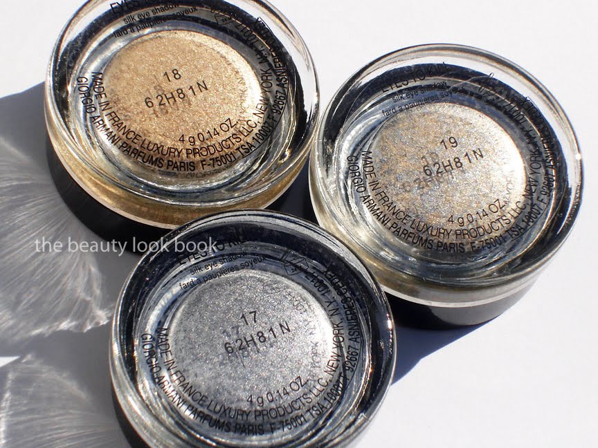
This year, the Eyes to Kill Silk Eyeshadows from Armani for holiday are all about the sparkle. Three new shades in the small twist-off cap pots are $32 each for 4 g/0.14 oz:
17 a highly metallic silver sparkle
18 an intense sparkling pale gold
19 hybrid silver-gold shimmer
I’ve been a huge fan of these cream-powder shadows and loved the other Eyes to Kill shades (see Holiday 2010 here and the March release here) and did not find them too intense with the sparkle factor on the eyes. The newest colors this year are much more sparkly and more appropriate for going out or holiday parties. For the other shades I own, I use both fingers and brushes to apply. With the new holiday shades, I found that regardless of how light I tried to apply, all the shades were extremely sparkly. Blending or patting softtly still resulted in sparkle overload.
In terms of colors, I found that #19 was the most wearable with a slightly more subtle shimmer (but still intense). I would not feel comfortable wearing any of the holiday shades to the office. Perhaps the Gold #18 if I muted the sparkle with a satiny shadow on top. (Note the finish isn’t creamy at all so I wouldn’t recommend using these as a base. The texture is slightly creamy but they act more like a powder.) If you’re looking for a subtle refined glow, I would recommend you opt for Laura Mercier’s Metallic Creme Shadows or Bobbi Brown’s Cream Shadows instead. Here are close ups of the shades plus swatches:
Swatches with two different views, these were all applied with a cream shadow brush (Bobbi Brown and Becca brushes were used to swatch):
Overall lovely and perfect for going out, but the shades are intensely sparkly and might be too much for some. For me, these definitely are not everyday products to wear. #8 looks chunky and loaded with sparkles in the swatches but for some reason it’s quite a bit easier for me to pull off compared to the new holiday shades. If I could only pick 1 shade it would be #19 because the mix of the silver and gold make it more wearable (less contrasted to the skin/eyes). I personally prefer the palettes that were released with the collection because they are more wearable. If you need intense sparkle that lasts, you will love these. The lasting power is very strong. If you’re not a huge fan of a super sparkly (borderline glittery) eye, then I would recommend you pass and opt for the MadrePerla palettes (reviewed here) or something like LM’s Metallic Eye Creams.
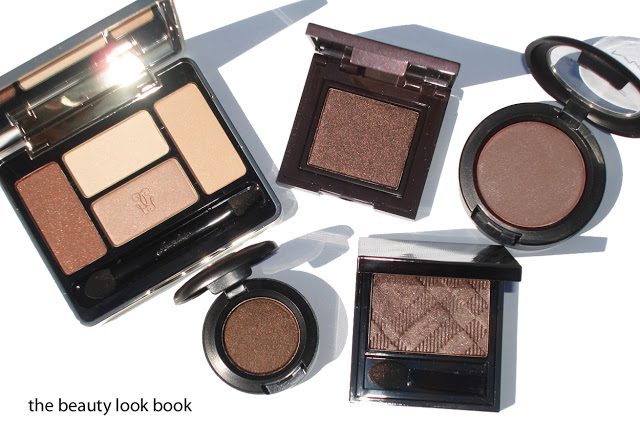
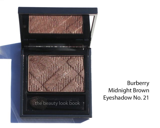
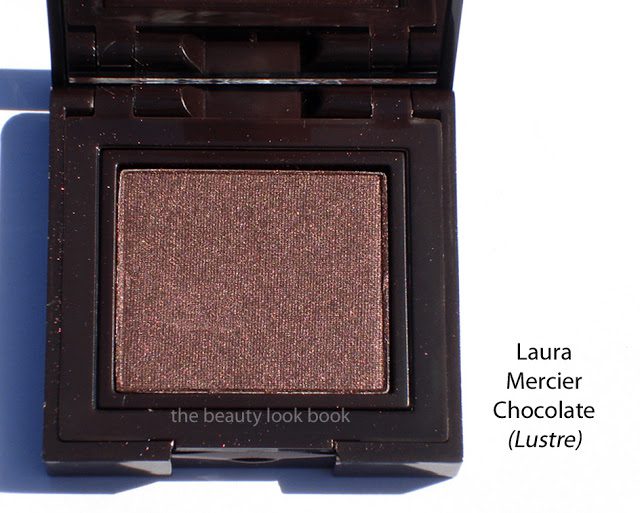
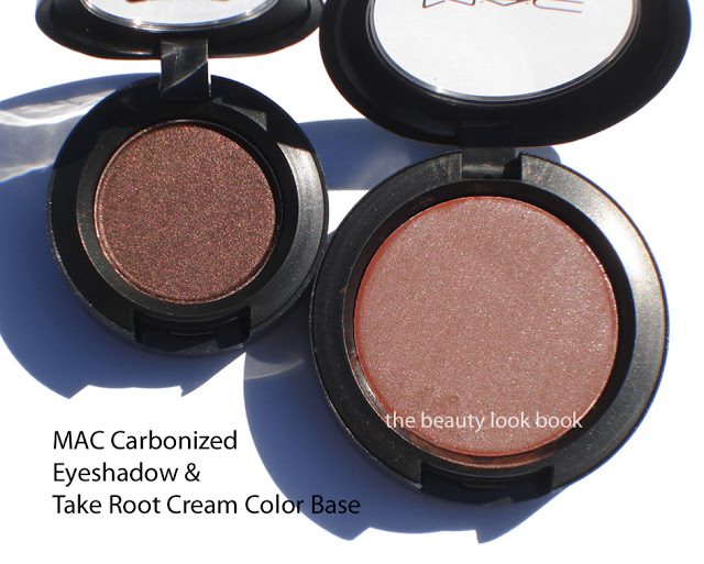
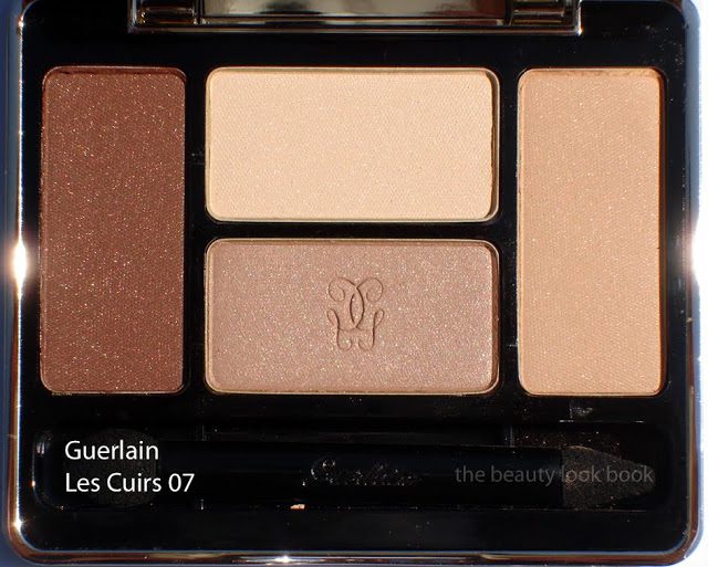
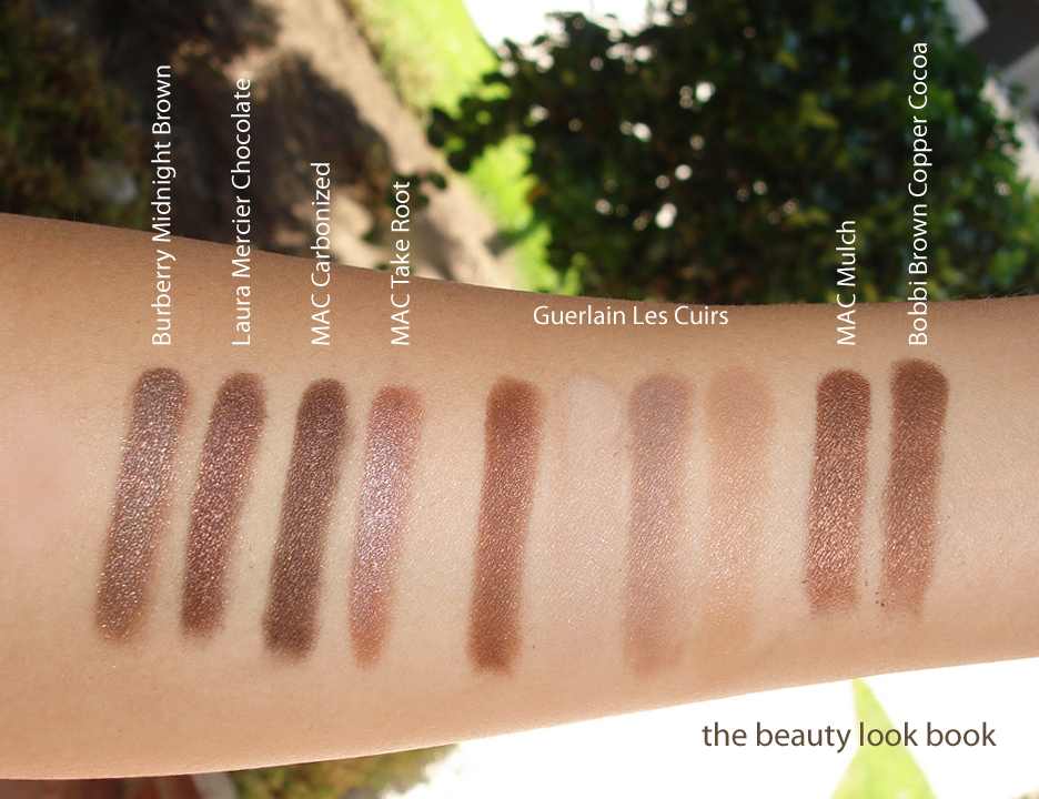
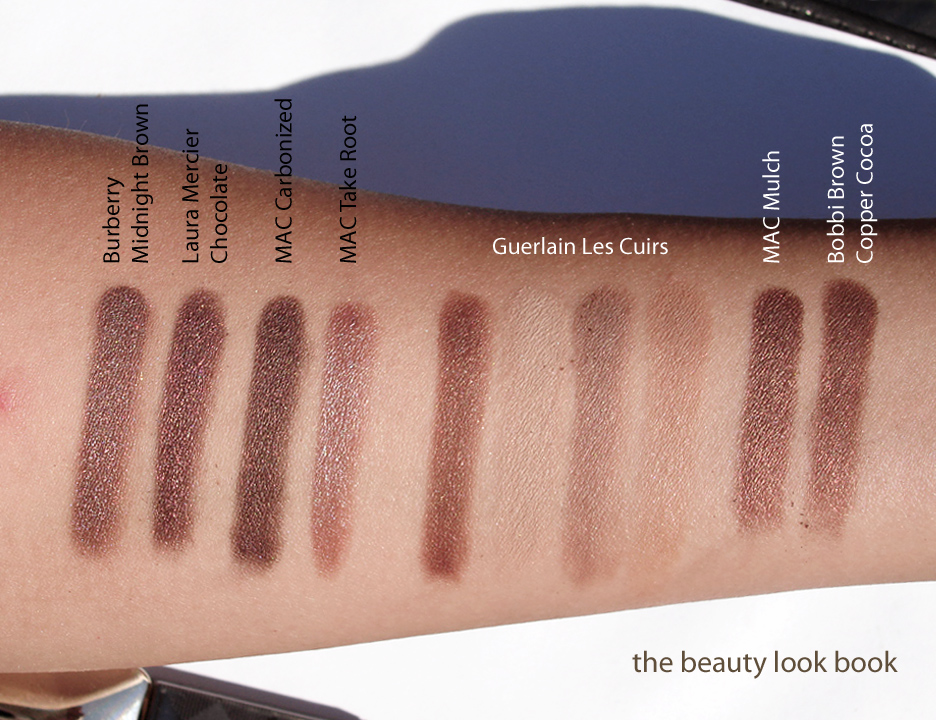
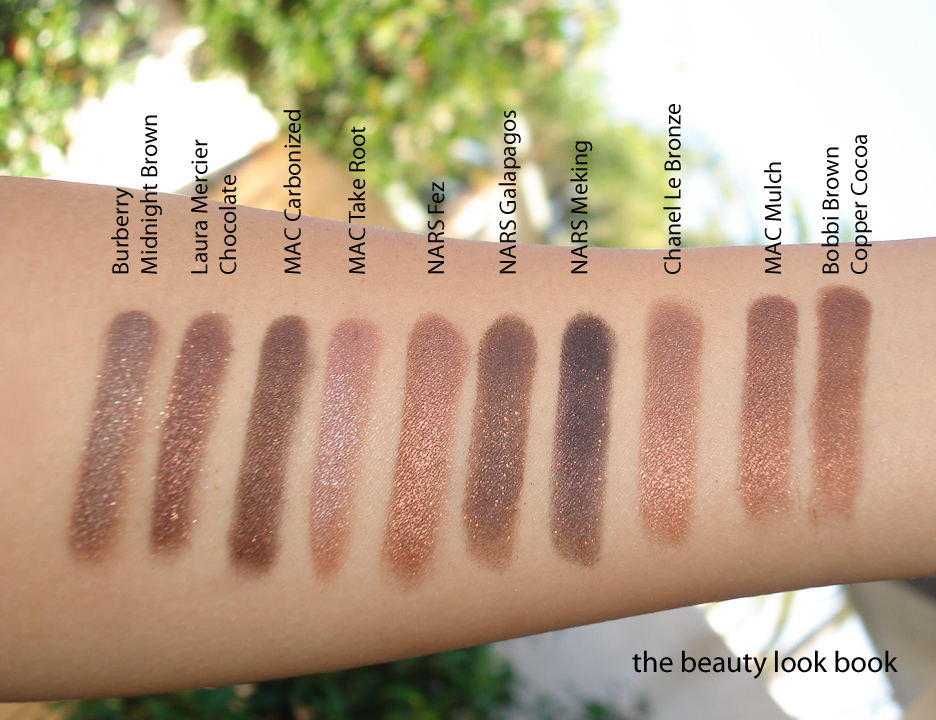
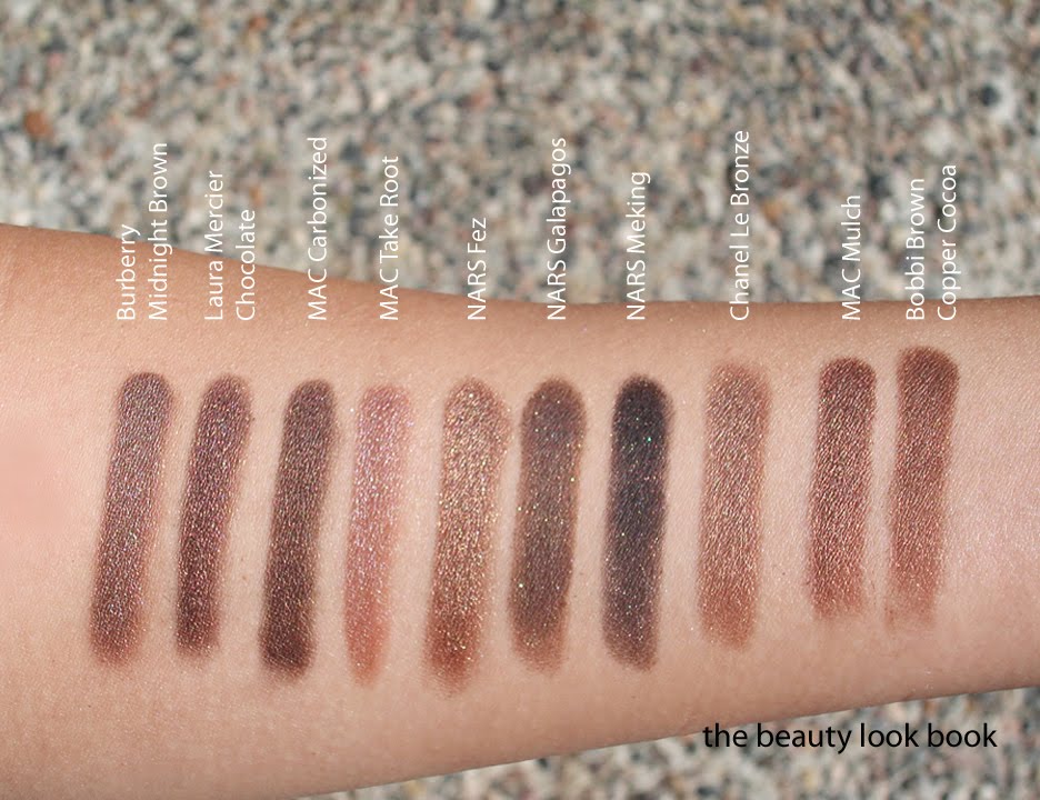
Shimmery brown eyeshadows haven’t been the focus of fall this year but I still managed to find a few new ones and eagerly grabbed them up. I was recently at a Burberry counter where the artist suggested a few non-brown shades commenting that women often gravitate towards the safety zone of Rosewood, Golden Trench, and Midnight Brown and said he didn’t quite understand it. How many brown eyeshadows can one possibly need to own? I smiled and said “guilty” fessing up to owning way too many browns. Long story short, I still love shimmery brown neutrals. The new shades for fall that caught my eye (clockwise from the left) are Guerlain Les Cuirs 07, Laura Mercier Chocolate Lustre Eye Colour, MAC Take Root Cream Colour Base, Burberry Midnight Brown No. 21 and MAC Carbonized Veluxe Pearl.
Burberry Midnight Brown ($29 for 2.5 g/ 0.088 oz) is my favorite out of all the new browns (possibly my favorite brown of all time) being the coolest toned (or most neutral) with silver/taupe shimmer. It has full rich pigment with a buttery soft texture that is so easy to blend and layer. See it reviewed here, also compared on lighter skin at Cafe Makeup.
Laura Mercier Chocolate ($22 for 2.60 g/0.09 oz) has the most red/plum undertones out of the new shades for fall. I believe this was a repromote from a holiday palette from last year. This is one of the darker shades which has quite a bit of intense & complex shimmer making it unique. Pigment is excellent with a medium-soft texture making it fairly easy to layer. Applying over liners intensifies the color. I wouldn’t recommend applying wet since a damp brush will ruin the surface texture. A slightly damp brush might work (with an emphasis on very light) to apply wet.
MAC Carbonized ($15.00 for 1.3 g/0.04 oz) is the deepest shade with a neutral dark bark-like bark base and soft warm brown metallic shimmers. I find it on the neutral-warm side compared to the others but looking at it alone, it appears to be a full on neutral. It comes in the veluxe pearl formula. I find the texture a bit hard but there is no problem with the pigmentation.
MAC Take Root ($17.50 for 3.2 g/0.12 oz) is an intriguing warm tan fawn color that I think is perfect for contouring the cheeks or eyes. It sheers out to a subtle finish that I think is perfect to use as a base for layering other eyeshadows or blushes. I think on fair skintones this will be too brown almost borderline reddish/orange. For NC30s to NC35s and darker I highly recommend you give it a try at the counter. Even if this isn’t really your color, you might be surprised. See both reviewed & swatched on KarlaSugar and Temptalia.
Guerlain Les Cuirs 07 ($59 for 7.2 g/0.25 oz) is a gorgeous palette of warm neutral browns and beiges. The pigment is very soft on these shades with a slightly harder texture compared to the other quads I’ve tried. The shades do pick up well with a dense brush. For the colors to show up on my eyes without looking too dry, I needed a base that is more emollient and creamy. I haven’t worn this for a full day so I can’t assess the long-wearability of this. The colors are a rich warm chocolate brown (chalky in texture so this one needs layering), a soft beige cream, a soft warm beige tan with shimmer, and a soft neutral beige with shimmer. I find this palette very basic but lovely for a super natural softly contoured eye. It is on the warm side but easy to pull off on all skintones. See it on Karla Sugar,Rouge Deluxe and Best Things in Beauty.
Swatched with a few comparisons (two sets of each variation). Descriptions by comparison:
MAC Mulch is a warmer and lighter shimmery brown
Bobbi Brown Copper Cocoa is similar to Mulch but slightly more golden
NARS Fez is the most coppery and shimmery
NARS Galapagos is the most neutral brown like dark milk chocolate
NARS Mekong blackened brown with gold flecks
Chanel Le Bronze is the lightest bronze
Set 1 with MAC Mulch & Bobbi Brown Copper Cocoa
Set 2 with NARS Fez, Galapagos, Mekong & Chanel Le Bronze
Did you pick up any brown eyeshadows this season or are you maxed out on neutrals? What are your favorite shimmery browns?
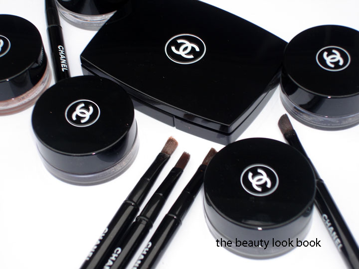
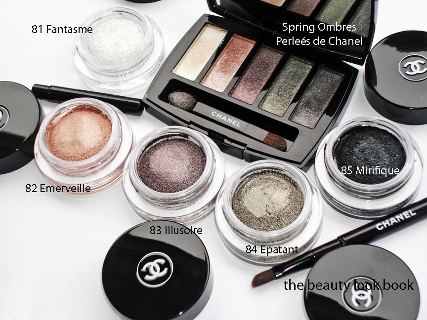
Thanks to Becca for the question: How do the Spring Ombres Perleés de Chanel compare to the new Illusion d’Ombres for Fall?
Price: The Spring Ombres Perleés de Chanel retailed for $65 (see my review here) and was packaged in a black mirrored compact. I searched online and it appears to no longer be available for sale anywhere. If you’re still looking for this I highly recommend searching instore to see if they still have stock. (Do it now before they are gone forever!) The Fall Illusion d’Ombres retail for $36 each and come with a capped angled brush.
Texture: The Spring Palette is softer and smoother in texture with a slightly powder feel. The Fall shadows are stickier in texture, mainly because of the jelly-gel like consistency. They are not sticky upon application though.
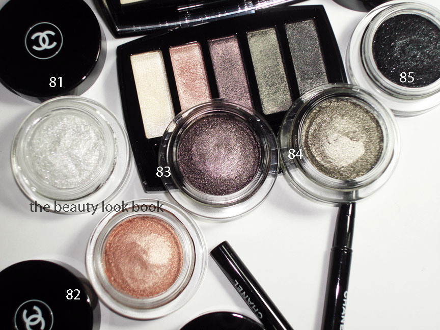
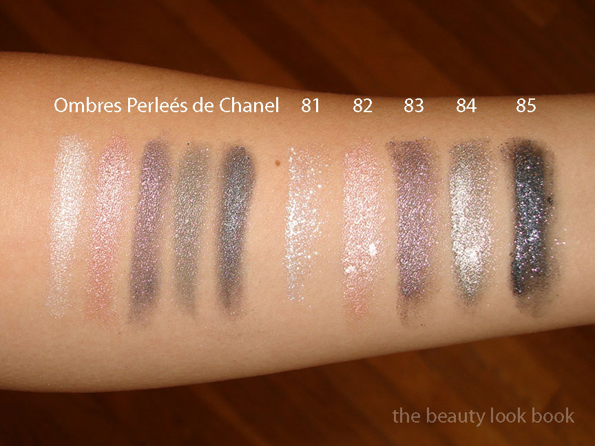
From what I see (might not translate to what you see on the computer screen):
Spring White is a pearly white, cool-toned
Fall 81 is a brighter white, even more cool, with glitter flecks/chunks
Spring Pink/Peach is a pearly frosted pink with a slight hint of peach
Fall 82 is a straight peach, but on my skin looks strikingly similar to Spring
Spring Purple is a complex fusion of purple, red, blue shimmers
Fall 83 is a straight purpley-grey shimmer, almost lilac, no red
Spring Green is a multichromatic green that flashes pink, dark green, light green (no silver)
Fall 84 is a khaki silver, no pink tones, more metallic, more silvery
Spring Blue-Grey is a blue-grey smokey shimmer, also complex
Fall 85 is a black with blueish tones and big silver chunks
Pigment and Shimmer: I found the Spring Palette to be high-shimmer, but is more finely milled and luminous. The Fall shadows are high-shimmer and highly metallic with visible flecks of sparkle. They are more chunky. Pigment of both are layerable and blendable for either a sheer or pigmented look. I would say the Fall Shadows have the ability to be layered for a more intense look though (emphasis on intense).
Lasting Power: As mentioned in my previous post, I have not yet had a chance to test lasting power of the fall shades. I found the lasting power of the Spring Palette to be medium-wear. It did not last the full day from 6 am to 8 pm, but it did last well into the afternoon.
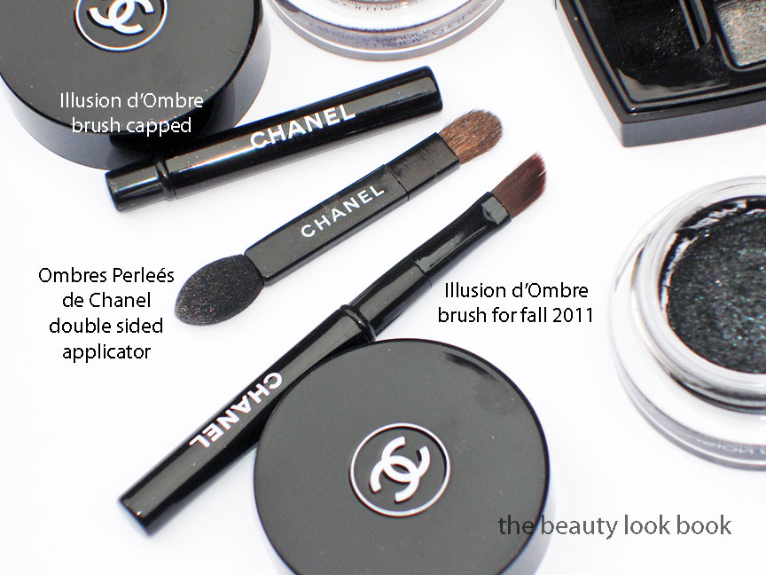
Application: I used fingers for the spring palette. For the fall shadows, I prefer the brush since it helps pick up more color and allows for more control.
Swatches in different lighting/angles/etc.
The colors: Are the colors the same? I would say no. They have similar undertones. The shimmer blinded my camera and when you add the cloudy lighting, it was hard to get an exact photo. The Spring Palette shimmers are multi-colored. The Fall shadows are metallic with different intensity of flecks and sparkles but not quite as multi-colored as Spring.
Overall: I personally prefer the Spring palette by far. While it might look untouched, I’ve actually used this palette on a regular basis with my fingers. (Finger application seems to smooth out the surface.) I had ordered everything from Fall sight unseen so I didn’t really know what to expect. I know these won’t make me look like the models on the Chanel runway, but I couldn’t help being completely blown away by the gorgeous looks Peter Philips created for the metallic smokey eyes. How could I resist trying these?
I will need to experiment more with the new Illusion d’Ombres to find an application technique that is wearable for me (as in not-too-metallic). I think they are definitely worth checking out. Even if they don’t seem to be “you” (they aren’t very “me”) it’s always nice to try something different once in a while, even if it’s just for fun.
Availability: I bought mine from Bergdorfs. The whole collection is on Chanel.com. I haven’t seen it anywhere in-store on the West Coast although I suspect any day now. Last year Fall hit stores on June 27th. (No, my memory isn’t that good, I just looked at my archives.) From what I heard last time I checked my local Nordstroms and Macys – all sales associates said “sometime in July.”
And to answer 1 more question: what camera do I use? See this post here.


