All Posts By

Sabrina

Uncategorized

Chanel Fall 2011 Glossimers and Rouge Double Intensite: Pampille, Braise and Rose Morganite for Lips

June 23, 2011
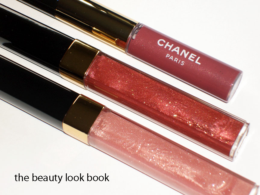
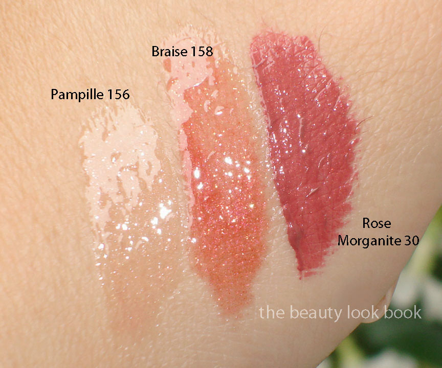
This fall there are two new Glossimer shades, Pampille 156 & Braise 158 and one new shade of Rouge Double Intensite Rose Morganite 30. (Giggle 46 Glossimer and Rose Quartz 04 Rouge Double Intensite are repromoted this year.) I purchased the new shades sight-unseen and when I first opened the package I was not entirely wowed. At first glance, while beautiful and classic, the colors just seemed like slightly different versions of past releases. They did not appear to be all that unique. However after playing with them a bit, I’ve changed my mind.
  • Rose Morganite is a plum-pink stain (there’s shimmer in the tube but it goes on a cream)
  • Pampille is a pale clearish pink with sheerish sparkles (goes on very smooth)
  • Braise is a sheer warm reddish shimmer with gold flecks

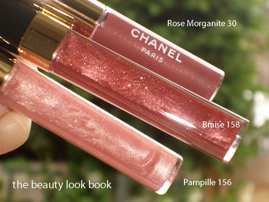
A little disclaimer before you evaluate my swatches: For some reason these applied very different on the hand compared to what went on my lips. The glossimers are both very sheer, but on my hand look completely different from what I see in the tube and what color I get when applied to the lips. As always, please take these with a grain of salt. I don’t know why I get orangey from Braise on the hands while on the lips it’s not orangey, but a warm reddish pink. I’m not sure if you can see the sparkle in my Pampille swatch – it’s there but I’m afraid it’s virtually impossible to detect in the photo below.

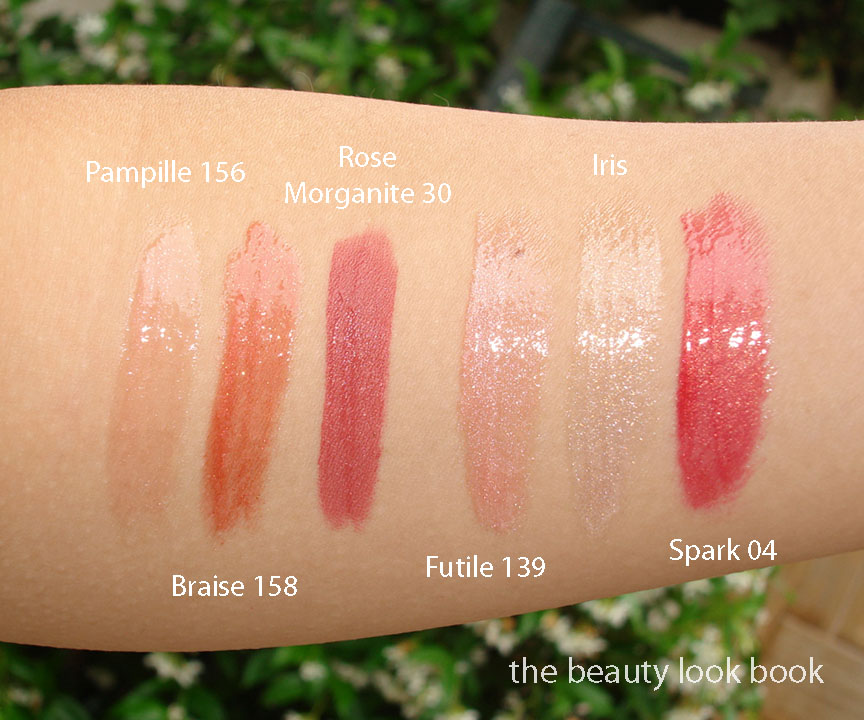
Comparisons to Chanel Spark, Futile and Iris:

Overall beautiful for fall, but really these colors will take you year-round. The glossimers make lovely layering colors to add a natural sheen to lipsticks. I have a few Rouge Double Intensites but I’m not really used to using them. Those who have tried them will know that the colors really do stay put! I prefer a traditional lipstick but from what I’ve heard – those who have tried these REALLY love them. I personally don’t think they are must-haves – mainly because I have similar colors that will achieve a similar effect on the lips. They are however beautiful and I don’t regret purchasing them. I know they will be frequently used in the seasons to come.
Uncategorized

Chanel Spring & Fall 2011: Ombres Perleés de Chanel versus Illusion d’Ombre

June 22, 2011
Thanks to Becca for the question: How do the Spring Ombres Perleés de Chanel compare to the new Illusion d’Ombres for Fall?
Price: The Spring Ombres Perleés de Chanel retailed for $65 (see my review here) and was packaged in a black mirrored compact. I searched online and it appears to no longer be available for sale anywhere. If you’re still looking for this I highly recommend searching instore to see if they still have stock. (Do it now before they are gone forever!) The Fall Illusion d’Ombres retail for $36 each and come with a capped angled brush.
Texture: The Spring Palette is softer and smoother in texture with a slightly powder feel. The Fall shadows are stickier in texture, mainly because of the jelly-gel like consistency. They are not sticky upon application though.

From what I see (might not translate to what you see on the computer screen):
Spring White is a pearly white, cool-toned
Fall 81 is a brighter white, even more cool, with glitter flecks/chunks
Spring Pink/Peach is a pearly frosted pink with a slight hint of peach
Fall 82 is a straight peach, but on my skin looks strikingly similar to Spring
Spring Purple is a complex fusion of purple, red, blue shimmers
Fall 83 is a straight purpley-grey shimmer, almost lilac, no red
Spring Green is a multichromatic green that flashes pink, dark green, light green (no silver)
Fall 84 is a khaki silver, no pink tones, more metallic, more silvery
Spring Blue-Grey is a blue-grey smokey shimmer, also complex
Fall 85 is a black with blueish tones and big silver chunks

Pigment and Shimmer: I found the Spring Palette to be high-shimmer, but is more finely milled and luminous. The Fall shadows are high-shimmer and highly metallic with visible flecks of sparkle. They are more chunky. Pigment of both are layerable and blendable for either a sheer or pigmented look. I would say the Fall Shadows have the ability to be layered for a more intense look though (emphasis on intense).

Lasting Power: As mentioned in my previous post, I have not yet had a chance to test lasting power of the fall shades. I found the lasting power of the Spring Palette to be medium-wear. It did not last the full day from 6 am to 8 pm, but it did last well into the afternoon.

Application: I used fingers for the spring palette. For the fall shadows, I prefer the brush since it helps pick up more color and allows for more control.

Swatches in different lighting/angles/etc.

The colors: Are the colors the same? I would say no. They have similar undertones. The shimmer blinded my camera and when you add the cloudy lighting, it was hard to get an exact photo. The Spring Palette shimmers are multi-colored. The Fall shadows are metallic with different intensity of flecks and sparkles but not quite as multi-colored as Spring.

Overall: I personally prefer the Spring palette by far. While it might look untouched, I’ve actually used this palette on a regular basis with my fingers. (Finger application seems to smooth out the surface.) I had ordered everything from Fall sight unseen so I didn’t really know what to expect. I know these won’t make me look like the models on the Chanel runway, but I couldn’t help being completely blown away by the gorgeous looks Peter Philips created for the metallic smokey eyes. How could I resist trying these?

I will need to experiment more with the new Illusion d’Ombres to find an application technique that is wearable for me (as in not-too-metallic). I think they are definitely worth checking out. Even if they don’t seem to be “you” (they aren’t very “me”) it’s always nice to try something different once in a while, even if it’s just for fun.

Availability: I bought mine from Bergdorfs. The whole collection is on Chanel.com. I haven’t seen it anywhere in-store on the West Coast although I suspect any day now. Last year Fall hit stores on June 27th. (No, my memory isn’t that good, I just looked at my archives.) From what I heard last time I checked my local Nordstroms and Macys – all sales associates said “sometime in July.”

And to answer 1 more question: what camera do I use? See this post here.

Uncategorized

Chanel Illusion d’Ombre for Fall 2011

June 21, 2011

The makeup looks on the Chanel Fall 2011 runway designed by Peter Philips were amazing (see them here from Cafe Makeup). The highlight of his collection includes a new cream-gel eyeshadow called Illusion d’Ombre which comes in 6 shades this fall. These are small potted shadows with a twist-off lid and small capped angled brush. The shades are:

81 Fantasme – a frosted sparkly white
82 Emerveille – a soft shimmering nude peach
83 Illusoire – a complex purple shimmer
84 Epatant – a highly frosted khaki silvery shimmer
85 Mirifique – intense black with silver sparkle
86 Ebloui – a reddish maroon with silver and plum sparkles

The shimmer: Each shade is complex with multi-dimensional sparkles. They are all intensely metallic and sparkly except for 82 Emerveille which is a soft luminous peach (still shimmery but the most natural). 81 is the most chunky in sparkle. 84 is the most frosty. 82 is the most natural. The others are somewhere in between.

The texture: These are cream-gel like shadows. Compared to Armani Eyes To Kill Shadows, these come domed without an insert inside. These have a bit more bounce with a squishy texture. Almost like jello, but not as jiggly. The texture is smooth even though there is high shimmer with rich metallic flecks. Mine might have jiggled too much while in transit – the product was on the lids of some of mine.

Application: I tried these with fingers and with the brush. The brushes are surprisingly useful and help pick up the color for an intense application. They are perfectly designed to pick up the color in a way that allows for intense application. The first shade I tried was 86 Ebloui (the red one). I applied it with my fingers and the result was an absolute mess. Red-eye gone bad. I removed everything and started over, this time using the brush. The difference was amazing – rich pigmented and smokey. These definitely require experimentation. I think the lighter shades will be easier to apply with fingers. 82 Emerveille is the easiest for me to apply with the fingers (goof-proof color).

Lasting power: For this I still need to experiment more. I haven’t been able to wear these for a full day to test how long they wear. So far, no smudging for the short period of time I’ve worn them though.
Overall: Very shimmery, but intriguing texture. I find both Armani Eyes to Kill and Chanel Illusion d’Ombres highly metallic, just different in texture and finish. It’s difficult to describe, but although they are both metallic cremes, they are just very unique and different. The finish will be different depending on application technique and how much you apply. The Chanel are very fun to play with. I highly recommend going to the counters to try these out in person. Once they hit the west coast, I will for sure be running to the counter to get application ideas from my local Chanel artists.

A few other resources I found helpful (they have amazing swatches):

The bigger swatch is with the finger, the smaller swatch is with the brush blended out.

Uncategorized

Chanel Rose Écrin Joues Contraste for Fall 2011

June 21, 2011

Chanel Rose Écrin #68 is a soft luminous pale rose pink. It’s a neutral-cool, leaning slightly more towards the cool side. The shimmer is finely milled (no frost). The texture is soft and there is noticeable rose scent which fades quickly. Pigment is soft but buildable. Lasting power is average as with most powder blushes.

UPDATE: A few have mentioned that Rose Écrin appears to have peachy tones from my photos, from what I see on my screen and in the pot it’s a true pink, no peach. If you see any other relevant reviews pop up of this blush, please link in the comments, thanks!

Compared to other Chanel pinks, it’s closest to Caprice (long discontinued). The difference is Caprice has more warmth and almost looks peachy. Rose Écrin is very similar but more pink/cool-toned. Note that I am doing a comparison of the US formulas. The Euro/Asia formulas of shades with the same name might be slightly different. This might be overkill, but here are the comparisons and swatches in different lighting. Compared to Caprice, Rose Dust, Rose Petale and Pink Explosion. As always, YMMV (your mileage may vary) per computer screen. I found the Chanel promotional photos to be fairly accurate this year, the promo photo is just slightly more dusty/pale than the actual product for the blush (see them on Cafe Makeup here also on Beauty Crazed in CA here).

With flash

Without flash

I’m working as fast as I can to swatch the lips and the new eyeshadows, but I’ve come down with a  bad cold 🙁 I’ve made it so long without getting sick and then all of a sudden bam. Sorry for the delay in getting all the reviews, swatches and photos/details etc. Thanks for your patience!
Uncategorized

Chanel Fall 2011 Prélude Quadra Eyeshadow & Precision Eye Definer Khaki Platine

June 20, 2011

Chanel Prélude Quad and Khaki Platine for fall this year are gorgeous neutrals. Prélude pulls more cool in the compact but depending on the light it looks more neutral-cool. This is one I think everyone needs to try on themselves. Last fall Taupe Grisé 87 pulled oddly warm on my skin while it looked blueish-cool on most everyone else. Khaki Platine is stunning and reminds me of Lancome Erika F in a liner form (less sparkly too).

Khaki Platine and Prélude in slightly different lighting, not sure if you can tell the difference but in this one it’s not as cool-toned


Les 4 Ombres Quadra Eye Shadow in Prélude #33 – In the compact, the colors are cool toned, on my skin, they pull more neutral. The colors are variations of beige, taupe, and plum. All have a luminous soft sheen. Scroll down below to see swatches and you’ll see that the colors are very subdued and neutral.

Le Crayon Yeux Precision Eye Definer in Khaki Platine #70 – a beautiful pigmented yet soft light khaki silver. The texture is soft making it easy to apply, but not too soft that it slips.

Here are a few other quads and liners to help you gauge the color depending on how your monitors show the colors differently to mine. Quads compared include Beiges de Chanel, Dunes, Stupendous and Dior Gris-Gris.

Eyeliners include D&G, Chanel Vert Bronze, MAC Dig It! and Chanel Rose Platine.

Swatches of the Fall Quad and Eye Liners on my arm:


Soft and beautiful. Lasting power, colors and pigment are typical of Chanel quads and liners – which I find to be of high quality, medium lasting power, highly versatile to coordinate with other colors for lips and cheeks.
Uncategorized

Chanel Fall 2011 Le Vernis Comparisons

June 19, 2011


No dupes to be found. Here are the shades Quartz, Graphite and Peridot compared to prior releases from Rococo Nail Apparel, Chanel and Dior.

The fall shades

Comparisons L to R: Rococo Nail Apparel R2T2, Chanel Trapeze, Chanel Quartz, Dior Silver Pearl, Chanel Graphite, Chanel Kaleidoscope, Chanel Peridot, Dior Timeless Gold


Swatches with 3 different views (since metallics look different depending on the light)


FYI: Polish Police has a comparison of Chanel Graphite to OPI Lucerne-tainly Look Marvelous. Those who think it’s a dupe will see from her blog that it’s really not 🙂
Uncategorized

Chanel Le Vernis for Fall 2011: Quartz, Graphite and Peridot

June 18, 2011

Chanel Fall 2011 has broken my blog break and has also eaten into my savings for a Chanel mini-flap. I am still highly ecstatic. My first feature on the Fall Collection will be on new Le Vernis shades ($25 each). The theme for nails is metallic where light plays a key role in the final result of what you see on the nails. The colors are slightly translucent in texture so you can build intensity with two or more coats. Each shade has a slightly different finish and quality making each color unique.

  • Quartz 525 is a frosted silvery brown taupe (I’d describe this as a smooth and soft metallic)
  • Graphite 529 is a highly metallic glittery silver-gunmetal (this one is intense, almost foiled-like, the tiny particles reflect light making this a multi-dimensional shade)
  • Peridot 531 reminds me of a scarab beetle, the color is complex with green, yellow, brown, blue I’m hard pressed to put a description on this (it’s almost duochrome, almost frost-like, but non-streaky and simply glows)
The photo at the very top shows the shades in natural light, no flash but with direct sun shining on the colors. The photo below is the same angle and also with natural light, but with an added high flash from the camera so you can see the other metallic qualities/colors.

Another angle reveals the complexity of these shades


Quartz

Graphite

Peridot

Each swatch has 2 coats. I love Quartz and Graphite. Peridot is such a unique color but I’m not loving it. Comparisons to other shades to come soon but for inquiring minds – these are all very unique and different from any previous Chanel or Dior release. These are very “fall” though. I personally adore virtually everything Chanel releases. However some of you might not be feeling in the mood to wear these for a couple months when the real fall season arrives. (FYI this is how I felt with Chanel Paradoxal last year when it came out end of June.)