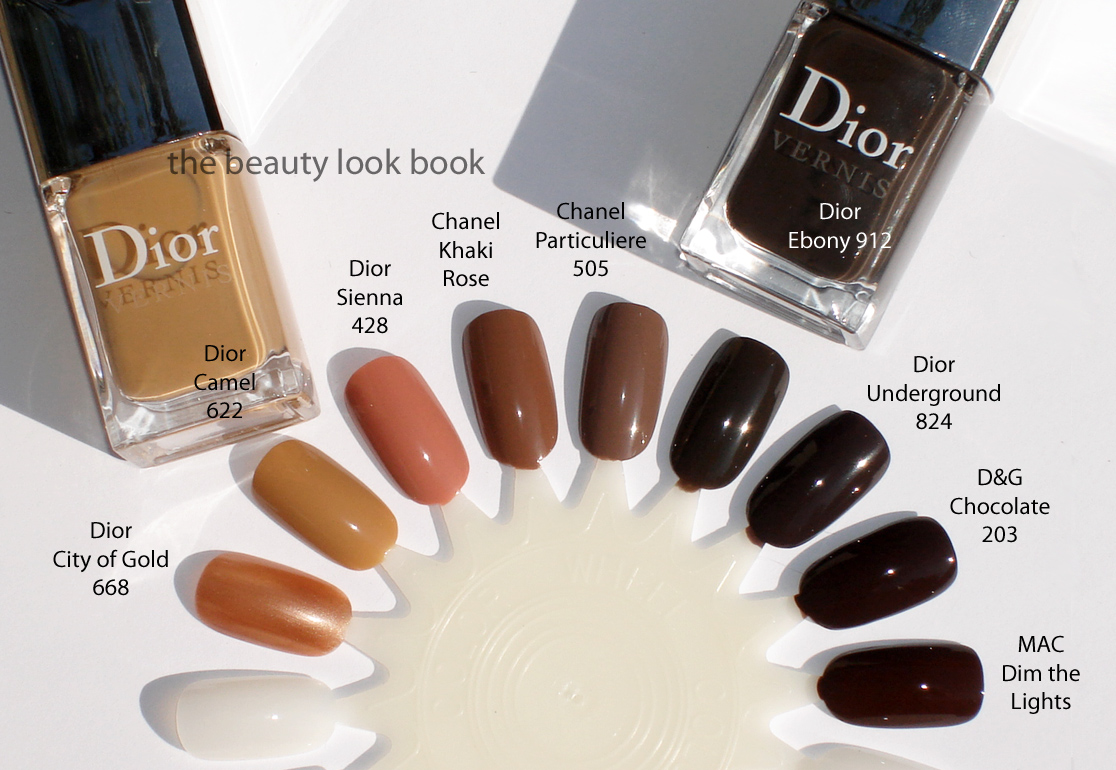
Dior Camel and Ebony are compared below to Dior City of Gold, Dior Sienna, Chanel Khaki Rose, Chanel Particuliere, Dior Underground, Dolce & Gabbana Chocolate and MAC Dim the Lights.
To see how Camel compares to neutral nudes, like Dior Nude Chic and Dolce & Gabbana Nude, scroll down two posts (linked here).
I found Dior Camel truly unique. There wasn’t a shade I owned similar to it at all. Granted I don’t typically gravitate towards yellow-based shades unless it’s a gold shimmer. Dior Ebony wasn’t exactly unique as I found it very similar to Underground. The two are practically identical except when you scroll down to the bottom photo, you might be able to see that Underground has a slightly purplish base while Ebony is more neutral black/brown. In real life you can only see the difference if you look very closely. In the photos I doubt you will be able to tell the two apart unless you tilt your head, squint and try to look for the difference.
I hope these comparisons help. I’m not sure I would classify these new Dior shades as must-haves as they are fairly neutral and not exactly knock out colors. Still they provide a polished subtle elegant look to the fingers which I really like. Quint/quad comparisons to come soon. I didn’t get good swatch comparisons from this weekend so I will have to redo them.
I’ve been eagerly waiting for the release of the Mitzah Collection to Sephora in the US. The collection was designed to commemorate Mitzah Bricard, Christian Dior’s legendary muse who was known for her love of leopard. The Mitzah Collection features pieces for eyes, face and nails in shades of camel, chocolate brown and beige in a jungle-print theme. While traveling in Paris last March, Café Makeup was lucky to find the collection early and shared beautiful photos of the palette and nail polishes. The collection has finally arrived in the US exclusively at Sephora and Sephora.com.
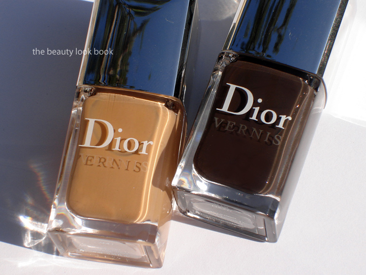
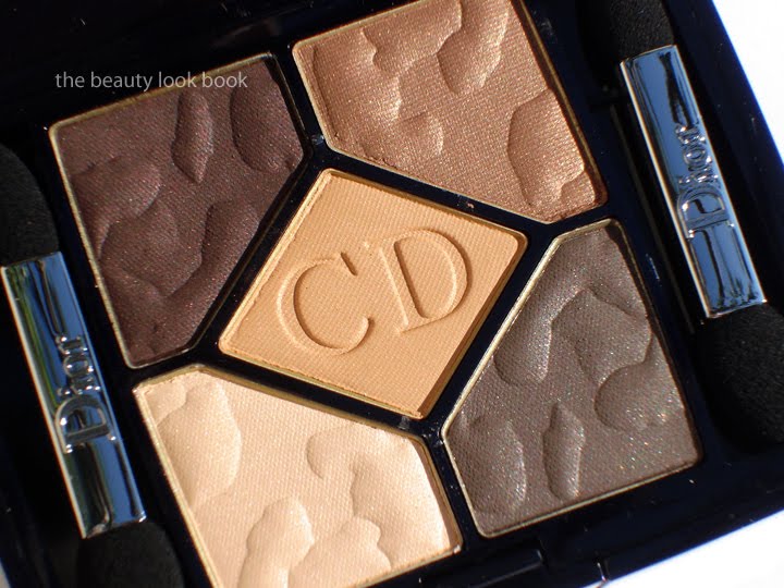
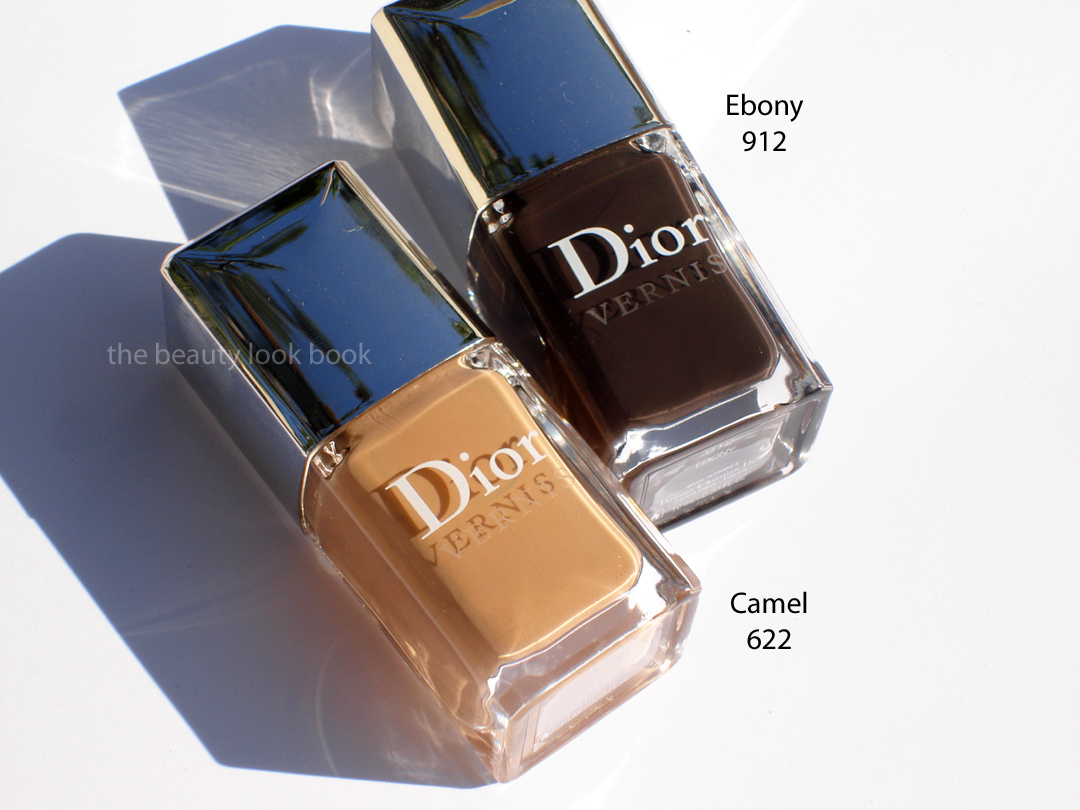
My picks included the new eyeshadow quint Mitzah #753, Camel Nail Polish #622, Ebony Nail Polish #912 and the new Golden Brown DiorShow Mascara #598 (not featured). All are currently exclusive to Sephora and are limited edition.
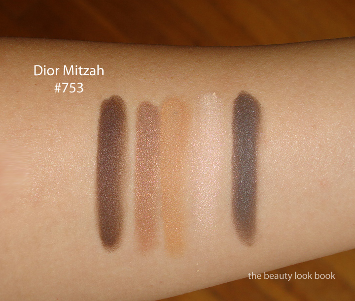
The Mitzah 5 Couleurs Eyeshadow Palette ($60 for 6 g / 0.21 oz) palette is a collection of neutrals with a slight kick. The four outer shades have an embossed animal print in the powder and have a very subtle finely milled shimmer. The shimmer is so slight the colors glow with a slight sheen. The colors in the palette include a dark aubergine-brown, a medium caramel brown, a soft camel with a light orangey tinge, a warm beige and a soft greyed-brown.
After seeing this swatched and reviewed on Beauty Moogle Zone, Café Makeup, Iron Spy I was worried it would be too warm for my olive skin. Still I could not resist the lovely descriptions of the satiny finish and when I tested the palette at Sephora I fell in love. The colors are very soft and refined. I find them a bit different from the traditional Dior palettes which typically have at least 1 high frost shade. This palette has a very subtle sheen in all shades and a very natural finish. If you’re looking for high impact or high shimmer, you might be disappointed with this one but I love it.
It’s usually difficult for me to use all 5 shades in Dior quints, however the Mitzah Quint has a wonderful layering quality and today I put all 5 shades on my eyes. I apologize I do not have photos to share, but for my application method, I started with MAC’s Cream Color Base in Seaside, applied the pale cream all over the lid, then followed with the bronzey top right about 1/2 way up the lid brushing the color back and forth into a soft gradient from the lashline upwards. I then took the bottom right greyish brown and smudged it right along the upper lashlines heavily. Next I took the upper left aubergine and applied it from outer corners about 1/4 way into the eye. Last step was to take the middle orange shade and lightly dip a soft fluffy brush and blend the two dark shades just to soften the edges.
Camel and Ebony Nail Polishes ($22 each for 10 ml / 0.33 fl oz) are both opaque creams. I love this photo from Dior’s International Website. They apply beautifully with 2 coats and have a gorgeous glossy sheen on the nails.
Camel is a yellowed beige and Ebony is a deep cool brown. Both are pure love. I thought Camel might be too yellow but oddly once applied on the skin it just works. Might not be everyone’s cup of tea. This is one you have to see and test in person to really tell. I don’t think it photographs well on the fingers but in person I find it more flattering.
Ebony is a dark beautiful brown cream. It’s very similar to Underground which was released earlier this year. If you have Underground (slightly more purple undertone), you can safely skip Ebony (comparisons to come soon). These shades apply beautifully with 2 coats. The tapered brush makes application easier for those of use who have unsteady hands.
I highly recommend you check out additional swatches and reviews at Joey’space, Fashion Polish, and Café Makeup if you haven’t already. They have lovely comparisons and swatches.
Overall love. Bravo Dior! They did an excellent job creating a beautiful collections of neutrals with a kick. If you’re at all interested I recommend purchasing soon since all pieces are limited edition and exclusive to Sephora in the US. If you’re unsure about the quint because your coloring doesn’t do so well with warm shades, just use the middle shade with a very light hand. The other colors are very easy to wear and even on my warm skin worked just fine. At this time I won’t be reviewing the mascara I purchased. I have several tubes of other brands I have to use up. By the time I get around to opening up this one to test I’m afraid it will be sold out. At Sephora, the mascara tester looked like a dark brassy brown shimmer which I found intriguing.
I’ll be posting comparisons very soon in a separate post. Did you check out the Mitzah Collection at Sephora or elsewhere? What were your thoughts?
Earlier this year A Model Recommends gave us all a preview/sneak peek of a new collection in the works from Rococo Nail Apparel called the Nude Wardrobe Collection. Six nude nail colors have finally been released to SpaceNK and select Bloomingdales SpaceNK stores in sheer gloss, satin and full pigmented cream finishes. These retail for $16.50 each for 14 ml / 0.5 fl oz.
Following a season of loud and proud nails, this autumn/winter takes a turn for the subtle with nude nails firmly back on the style agenda. Inspired by the catwalk collections Rococo Nail Apparel have created a wearable wardrobe of six nude nail colours each designed to perfect and flatter – whatever the outfit, skin tone or mood. Rococo Nail Apparel have been quietly building a cult underground following since the brand launched two years ago and today continues to predict trends rather than follow the crowd. Commenting on the Nude Wardrobe sisters and co-founders Ange and Vernice Walker say, “The aim was to create an I-want-them-all collection of nudes that each delivers a highly polished and chic finish. We definitely predict nude as the new black this autumn/winter.”
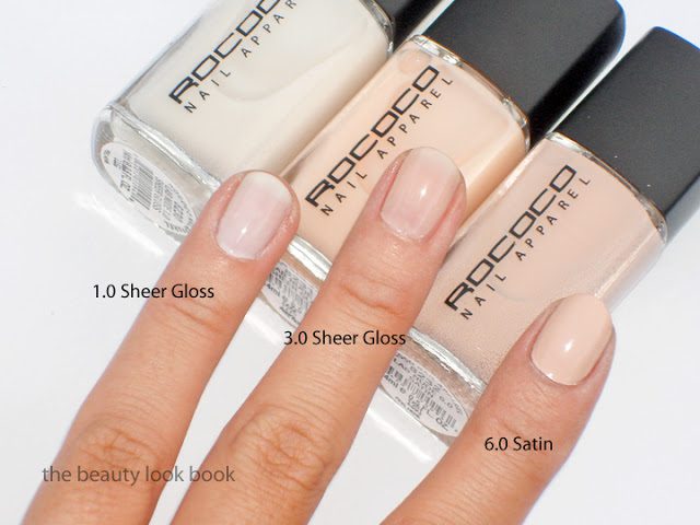
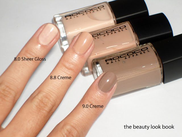
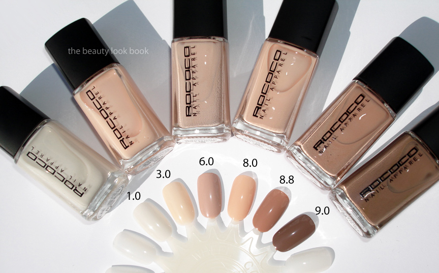
The Rococo Nail Apparel Nude Wardrobe collection includes the following shades (shown L to R below):
LAB Nude 1.0 Sheer Gloss – a sheer transparent white gloss
LAB Nude 3.0 Sheer Gloss – a sheer transparent cream nude beige, used backstage by Ange & Vernice Walker at the Roland Mouret A/W show during Paris Fashion Week
LAB Nude 6.0 Satin Crème – an opaque pale neutral mixture of pale pink & beige & grey
LAB Nude 8.8 Crème – a full pigment tan caramel nude beige
LAB Nude 9.0 Crème – a soft brown cream, it’s borderline taupe, but not quite
Rococo Nail Apparel succeeded in generating the “I want them all” bug. When I saw these at SpaceNK Bloomingdales in San Francisco I thought that they all looked divine. I’m a sucker for nudes and couldn’t wait to put these on. I’ve applied one on each finger all with 2 coats. The Sheer Gloss finish shades 1.0, 3.0 and 8.0 all seemed a bit streaky with my unsteady hand. Applying 3 coats evened everything out. At the nail salon, a perfect smooth application was achieved with only 2 coats (your mileage may vary) for 3.0.
Here are more swatches on nail wheels (thanks to Cafe Makeup who helped me find these). It was a bit of a challenge to have 1.0 (the sheer white) show up on a white nail wheel since it’s very sheer.
While 3.0 and 8.0 looked almost identical in the bottles, on the nails 3.0 is paler and 8.0 is more peachy. I had 3.0 applied early last week on the nails and the lasting power was amazing. It lasted a full week without any chipping or tipwear. If my nails hadn’t grown so fast I think I could have worn this past a full week. While the sheer beiges might not be extremely unique and easily dupeable, I found these to be easy to wear and naturally flattering and the quality excellent.
I can see myself getting regular use out of each and every shade. They are all beautiful and easy to incorporate into your weekly wardrobe since they are so neutral, it shouldn’t be hard to coordinate your look with your clothing. I love them all. 1.0 might be a bit of work, but sheer whites can be a challenge to wear on nails anyways. With so many options I can’t decide which one to wear next although I think I have my eye on 9.0 (it looks like a softer lighter version of Chanel’s Particuliere).
One more shot of the collection, all lined up:
Have you checked out the Rococo Nail Apparel new nude shades yet? Thoughts? Did you buy any or did you decide you already had similar shades in your stash? What’s your favorite “nude” nail polish? For a full list of availability, check out Space.NK.Apothecary.com.
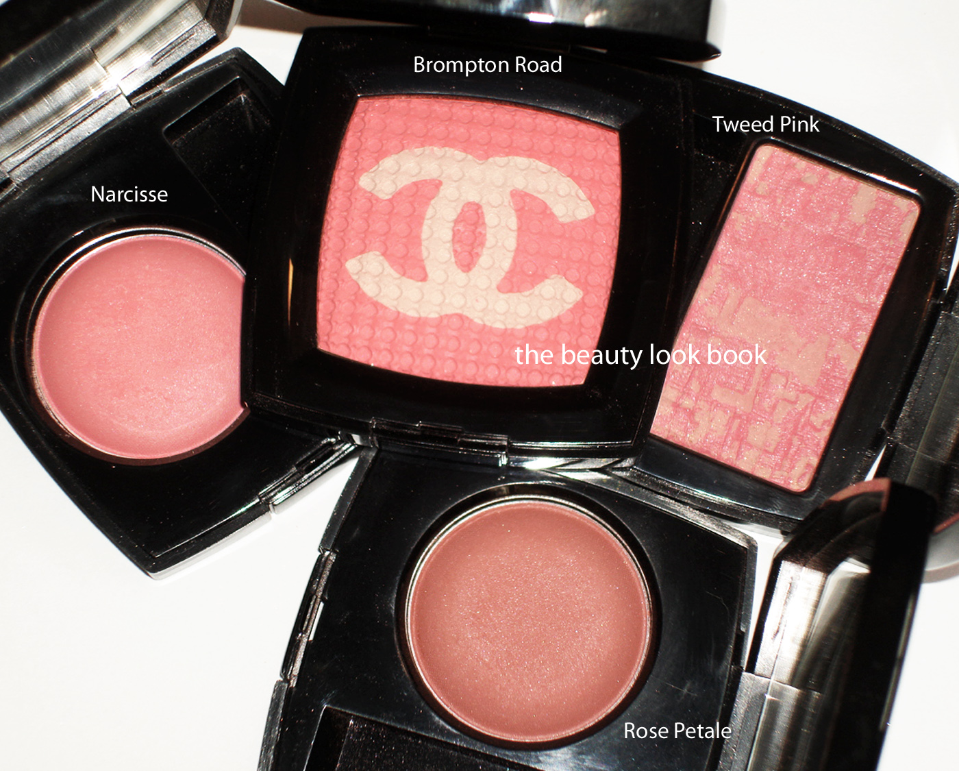
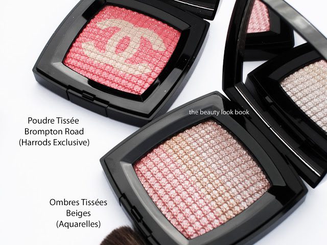
Here are some comparisons of Chanel’s Brompton Road (exclusive to Harrods) to a few other pinks by Chanel. Featured in this post are Poudre Tissée in Brompton Road, Joues Contraste in Narcisse & Rose Pétale, Les Tissages in Tweed Pink & Ombres Tissées Beiges. (Note that all the blushes are US versions.)
On the skin, Brompton Road goes on a baby soft pink with a slightly iridescent finish. It most closely resembles Narcisse but is paler. I tried this today over a liquid luminizer (one of Armani’s Fluid Sheers) and it still emphasized pores and bumps on my cheeks. I believe this is probably best used as a subtle highlighter rather than a full-on blush, at least for my olive toned skin which is slightly tanned. The texture is soft and finely milled very similar to the US Joues Contraste blushes by Chanel. While the Joues Contraste have a soft rose scent, the Brompton Road has none.
In comparing the finish of Brompton Road (for the face) compared to Beiges (intended for the eyes), I find the Beiges more shimmery while the Brompton Road more satiny.
While the finishes and intended purpose of all these are different, I prefer Beiges for a highlighter and Narcisse/Rose Petale for blushes over the new Brompton Road. I think it will perhaps suit fairer skintones better. For me it’s like but not love right now but as my skin lightens as we transition to fall/winter I think I will be able to get more use out of Brompton Road.
P.S. – USA girls, you can order this on Harrods.com, they ship internationally! Also, they deduct VAT so the shipping isn’t too bad. The checkout process can be a bit feisty, I recommend you create a profile and then go through the entire checkout process. Also, for some reason, I couldn’t process my order via Firefox, but Internet Explorer worked just fine.
*UPDATE Sunday, Sept 18* I applied Brompton Road over a dewy gel blush, NARS Cadaques Multiple Tint which helped provide a good base for the Chanel Highlighter. My skin has since improved after a week of healing (allergic reaction to a new product) and the Chanel no longer emphasizes the imperfections as much. I recommend that you apply to a well moisturized/prepped face before applying Brompton Road to the cheeks. Using a transparent slightly dewy liquid or gel base (something not pale) on top of foundation and under Brompton Road will help the application look much better on the skin. Finding the best application method for this powder will be trial and error for girls with medium-darker skin.
Chanel and Harrods partnered to create an exclusive makeup collection to celebrate the “Chanel at Harrods” exhibition. The pink-themed collection is called the Knightsbridge Collection which consists of:
Poudre Tissée in Brompton Road (£46.00 on Harrods.com)
Rouge Allures in Kensington, Hyde Park and Belgravia
Glossimer in Chelsea
The items are exclusive to Harrods for a limited time. Currently only the powder is available for purchase online. You can check out the coverage of the event on these resources:
Style Bubble has beautiful photos and a snapshot of the entire makeup collection
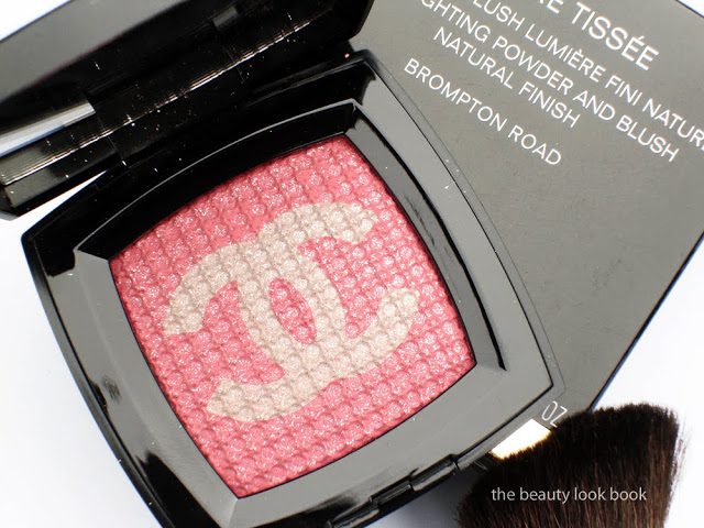
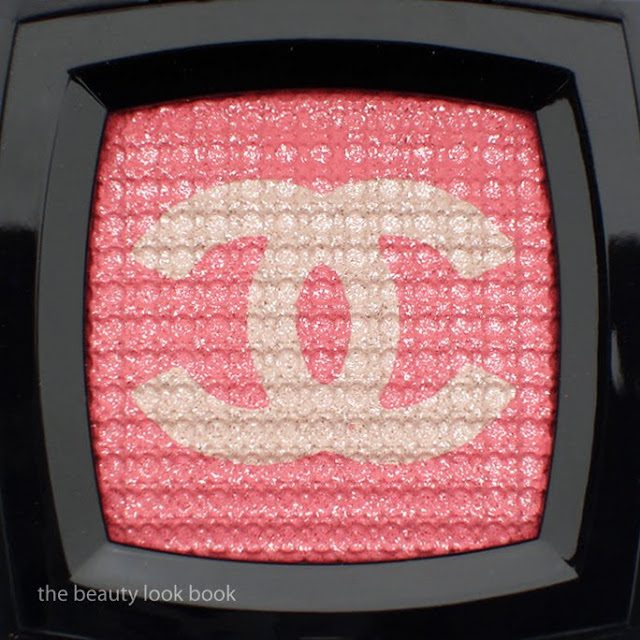
Combine the words “exclusive”, “Chanel” and “pink” and I was sold. I purchased the powder in Brompton Road (converted into approximately $72) online. It’s a satiny pink base with soft white-beige shimmery Cs that comes with an overspray of beautiful silver glitter. Per Harrods, “The Exclusive Creation POUDRE TISSÉE in Brompton Road, opens up to reveal a fabric-like effect, evocative of a fine, light and refined knit. The sheer, satiny powder enhances the radiance of the complexion while giving it a beautiful translucency. Brompton Road, a tender pink with golden shimmers, can be dabbed onto cheekbones to subtly brighten and freshen the face.”
With overspray:
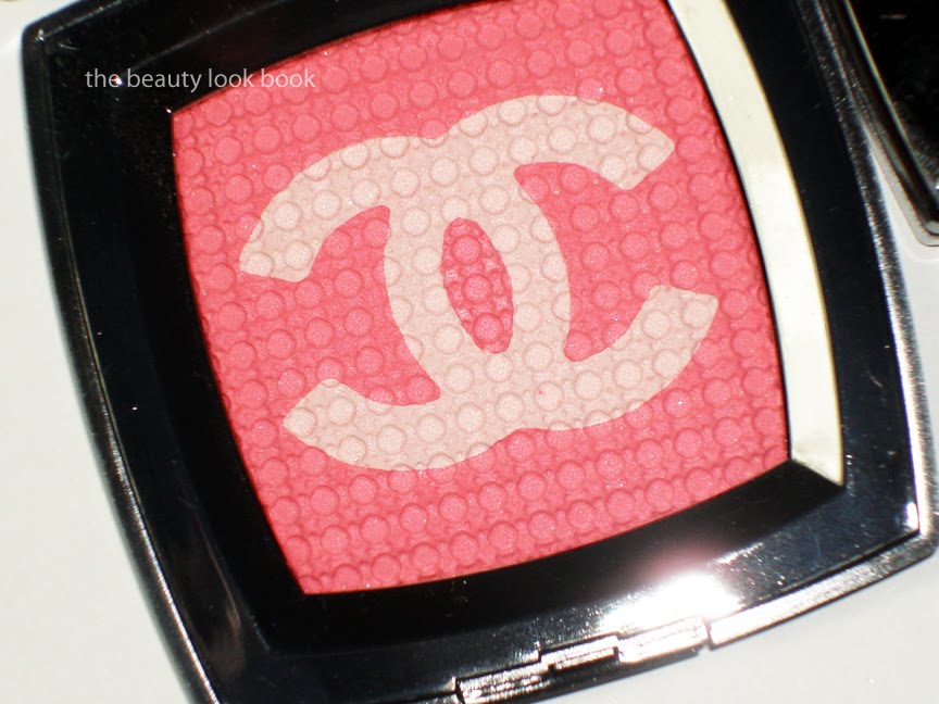
Without overspray:
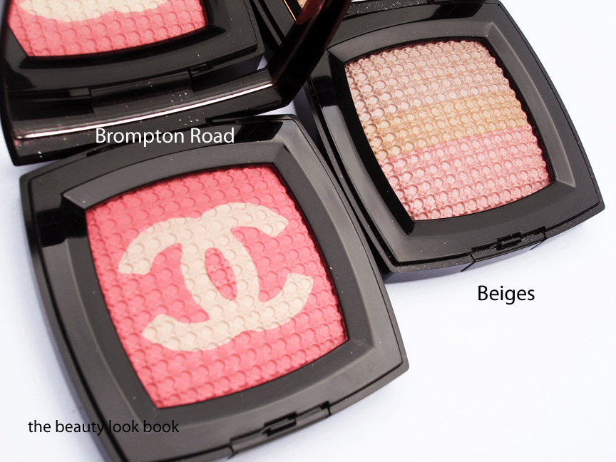
The powder comes in a similar format to the Ombres Tissées in Beiges from the Aquarelles Collection. Both compacts come with the same embossed quilted pattern covered in a beautiful oversprayed layer of sparking glitter. Both are made in Italy and have multiple colors in the compact which are intended to be swirled together to create a glow. The differences (aside from the colors) are in the intended use and finish:
Beiges has 13g / 0.46 oz and is labeled with the name Ombres Tissées – Iridescent Effects Eyes (although I’ve used this on the cheeks as well), this comes with three layers of iridescent pale beiges and pinks for a highlighting effect, it also comes with a sponge tipped applicator
Brompton Road has slightly more product with 15g / 0.50 oz and is labeled with the name Poudre Tissée – Highlighting Powder and Blush Natural Finish, this comes with two colors, a soft shimmering white-gold in double-crossed Cs and warm pink background that is more matte, the powder comes with a small angled brush
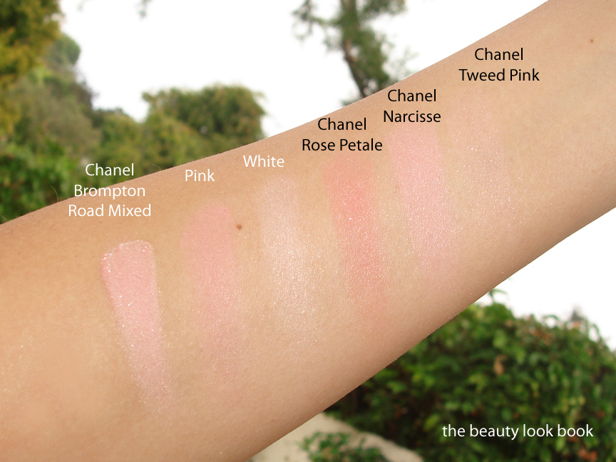
The top layer of glitter is easily removed to reveal a soft powdery mixture of pink and a soft beige-white shimmer. Combined they give a baby pink cheek without any detectable shimmer (at least from initial testing). The texture is a dry powder similar to the Beiges that almost feels creamy when you touch the compact with your fingers. It does not arm or hand-swatch well. As you can see below and from other blogs, it appears rather chalky on the hands. On the face it blends nicely to give a soft pink glow. Here it is swatched, L to R: both colors mixed, pink and white (these were finger swatched over bare skin).
I found this Hyde Park Rouge Allure feature to be lovely:
I’ll be posting a few comparisons and more thoughts later. I do believe you need to have fairly decent skin to wear this. The texture tends to emphasize any imperfections when applied to the face directly (over foundation and powder). Perhaps adding a luminzer underneath will help the application to appear more natural. It doesn’t appear chalky on the cheeks but the dry texture of the powder emphasized all my bumps and pores. Do note that my skin is recovering from an allergic reaction to trying a sample of Burberry’s Fresh Glow, so this is probably not the best time to make judgements about the finish. Compared to using my MAC blushes this past week, it appears the Chanel Highlighter emphasized bad spots while the MAC worked normally. That being said I’ll only be wearing this on good skin days.
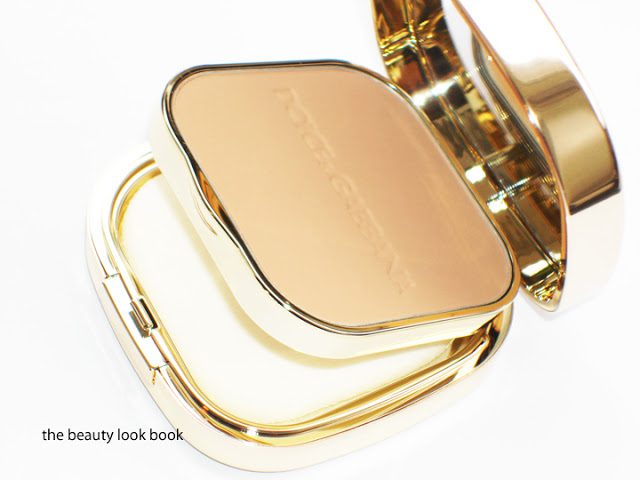
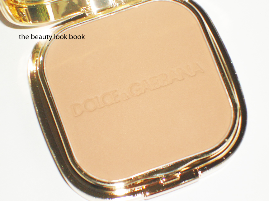
Dolce & Gabbana’s Powder Foundation has reached holy grail status for me ($59 for 15 g / 0.53 oz). When the line first launched in NYC mid-2009, I immediately e-mailed a few NY friends for their thoughts. It was only available at a select few counters (none near me) so I relied on several for their keen eye and exquisite taste. Two things that were constantly raved about included the Dolce & Gabbana mascara and powder foundation. Not having local access to the brand, I was hesitant to try this sight unseen. With the exception of the Dolce & Gabbana I have never purchased a foundation without testing it in person first. Many thanks to Nikki at Saks Houston who was kind enough to match me over the phone. I told her a few foundation shades I used, “Chanel Teint Innocence Liquid in Shell and I’m in between Armani’s Lasting Silk 5.5 and 6.5” and the kind soul that she is, she swiped the Chanel on her hand to find my perfect match to Tan #140. Since discovering this my skin has lightened a bit. When I Tan became too dark, I told her “I’m now 1.5 shades lighter, not quite a full two shades down, but almost.” She matched me perfectly again to Warm #100 (I’m not sure why there’s such a huge jump, but I suspect other shades in between either have more peach or pink or yellow).
The powder foundation comes in a gold double tiered mirrored compact. The bottom compartment will hold a square sponge for application but I prefer to apply with a brush. The texture is smooth and silky with full but natural coverage. It makes the skin look velvety smooth but not in an overdone way. The finish is truly flawless for me.
Dolce & Gabbana Warm Powder Foundation:
There’s no detectable scent. Applying with a sponge works well for touch-ups but I prefer to use a brush. Even though it’s a powder foundation and doesn’t require liquid foundation underneath, I like to use it as a setting powder. I tend to use sheerer lighter weight liquid foundations (which are more forgiving when the color isn’t a 100% exact match) and always layer with some kind of powder on top (loose, pressed or powder foundation). It lasts well into the afternoon without changing color as your skin gets oily. Touch ups are easy to do with a swipe of the sponge. With this powder, I rarely ever need concealer if I have redness.
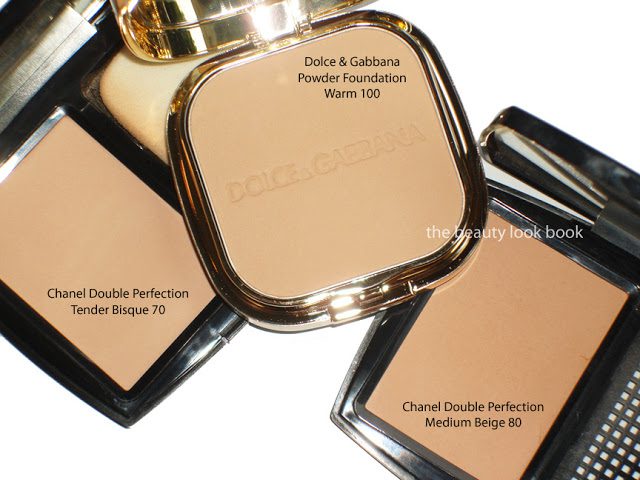
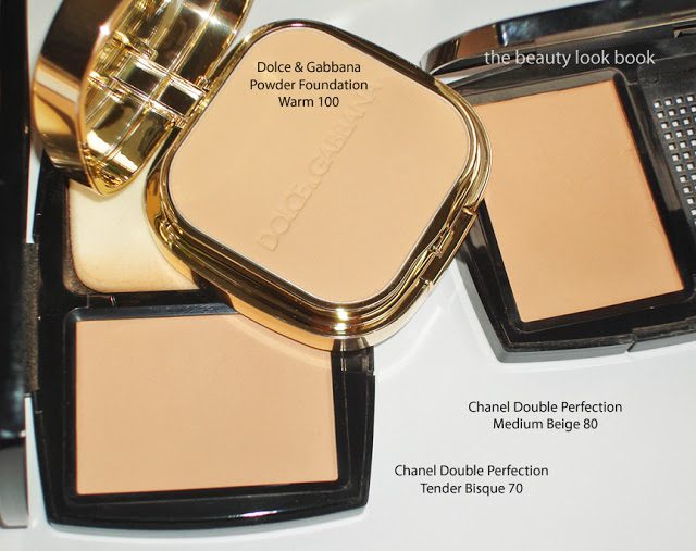
Chanel’s Double Perfection Powder Foundation ($50 for 13 g / .45 oz) has been a long time favorite of mine. Both have similar soft smooth textures with very similar coverage. I feel that the Dolce & Gabbana is slightly more versatile in the sense you can control coverage better, but both are similar in finish and quality. I can’t pick my favorite out of the two because I adore them both.
Swatching these on the arm seems futile since it will end up blending into my skin. I’ve featured it here compared to the Chanel shades I alternate between for Tender Bisque and Medium Beige. I hope this helps a bit. The Tender Bisque is close to Warm, the Chanel has slightly more peach while the Dolce & Gabbana has more yellow. Two views since it might be hard to tell how they compare from the lighting.
Overall I love this. I’ve used up two compacts already and this is my third. It’s pricey and while I had luck being matched over the phone, I don’t recommend trying the same. There’s no substitute for trying foundation on in person and I believe it’s one of the things you need an exact match for your undertone. Makeupalley does have some reviews which might help you guess what shade you are if you can’t get to a counter in person.
Have you tried Dolce & Gabbana’s powder foundation? What’s your current holy grail or are you still searching?
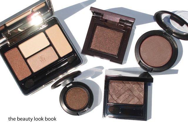
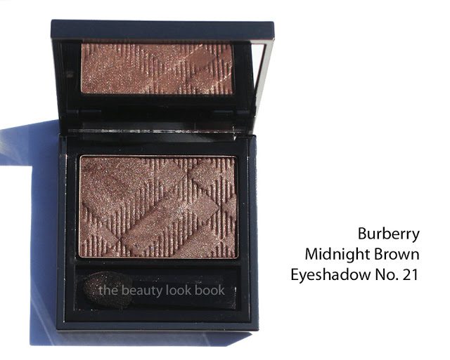
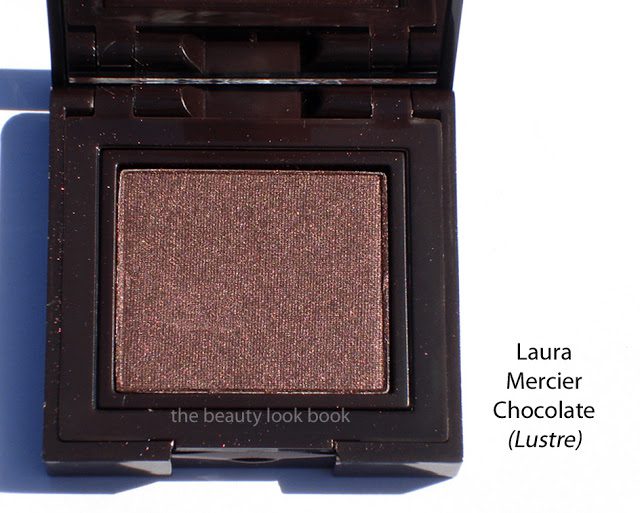
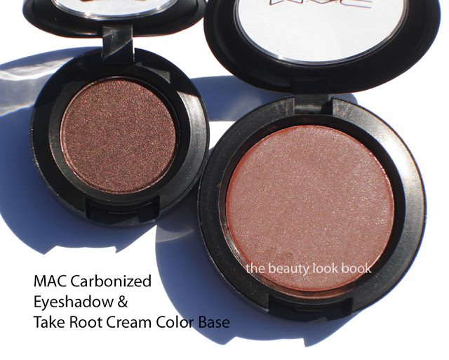
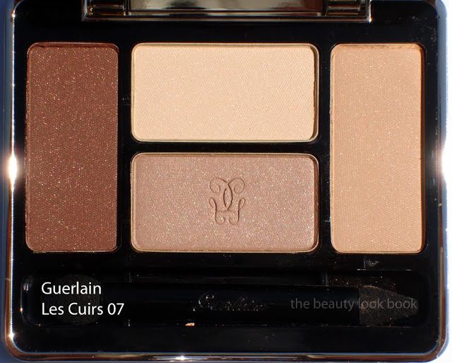
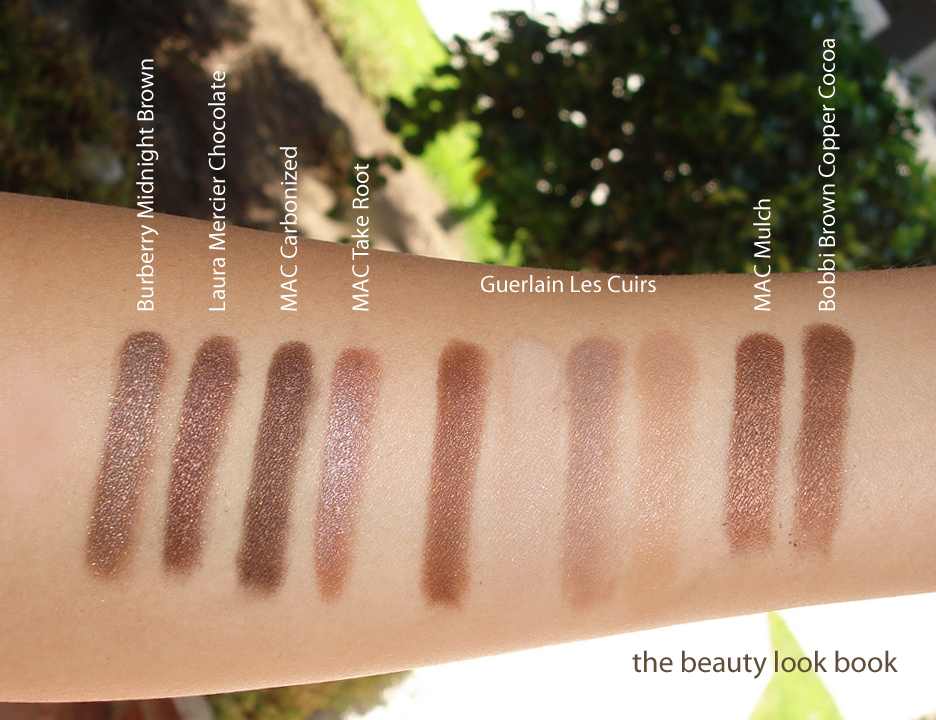
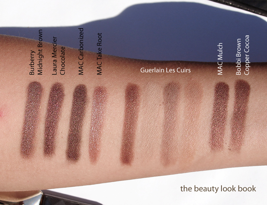
Shimmery brown eyeshadows haven’t been the focus of fall this year but I still managed to find a few new ones and eagerly grabbed them up. I was recently at a Burberry counter where the artist suggested a few non-brown shades commenting that women often gravitate towards the safety zone of Rosewood, Golden Trench, and Midnight Brown and said he didn’t quite understand it. How many brown eyeshadows can one possibly need to own? I smiled and said “guilty” fessing up to owning way too many browns. Long story short, I still love shimmery brown neutrals. The new shades for fall that caught my eye (clockwise from the left) are Guerlain Les Cuirs 07, Laura Mercier Chocolate Lustre Eye Colour, MAC Take Root Cream Colour Base, Burberry Midnight Brown No. 21 and MAC Carbonized Veluxe Pearl.
Burberry Midnight Brown ($29 for 2.5 g/ 0.088 oz) is my favorite out of all the new browns (possibly my favorite brown of all time) being the coolest toned (or most neutral) with silver/taupe shimmer. It has full rich pigment with a buttery soft texture that is so easy to blend and layer. See it reviewed here, also compared on lighter skin at Cafe Makeup.
Laura Mercier Chocolate ($22 for 2.60 g/0.09 oz) has the most red/plum undertones out of the new shades for fall. I believe this was a repromote from a holiday palette from last year. This is one of the darker shades which has quite a bit of intense & complex shimmer making it unique. Pigment is excellent with a medium-soft texture making it fairly easy to layer. Applying over liners intensifies the color. I wouldn’t recommend applying wet since a damp brush will ruin the surface texture. A slightly damp brush might work (with an emphasis on very light) to apply wet.
MAC Carbonized ($15.00 for 1.3 g/0.04 oz) is the deepest shade with a neutral dark bark-like bark base and soft warm brown metallic shimmers. I find it on the neutral-warm side compared to the others but looking at it alone, it appears to be a full on neutral. It comes in the veluxe pearl formula. I find the texture a bit hard but there is no problem with the pigmentation.
MAC Take Root ($17.50 for 3.2 g/0.12 oz) is an intriguing warm tan fawn color that I think is perfect for contouring the cheeks or eyes. It sheers out to a subtle finish that I think is perfect to use as a base for layering other eyeshadows or blushes. I think on fair skintones this will be too brown almost borderline reddish/orange. For NC30s to NC35s and darker I highly recommend you give it a try at the counter. Even if this isn’t really your color, you might be surprised. See both reviewed & swatched on KarlaSugar and Temptalia.
Guerlain Les Cuirs 07 ($59 for 7.2 g/0.25 oz) is a gorgeous palette of warm neutral browns and beiges. The pigment is very soft on these shades with a slightly harder texture compared to the other quads I’ve tried. The shades do pick up well with a dense brush. For the colors to show up on my eyes without looking too dry, I needed a base that is more emollient and creamy. I haven’t worn this for a full day so I can’t assess the long-wearability of this. The colors are a rich warm chocolate brown (chalky in texture so this one needs layering), a soft beige cream, a soft warm beige tan with shimmer, and a soft neutral beige with shimmer. I find this palette very basic but lovely for a super natural softly contoured eye. It is on the warm side but easy to pull off on all skintones. See it on Karla Sugar,Rouge Deluxe and Best Things in Beauty.
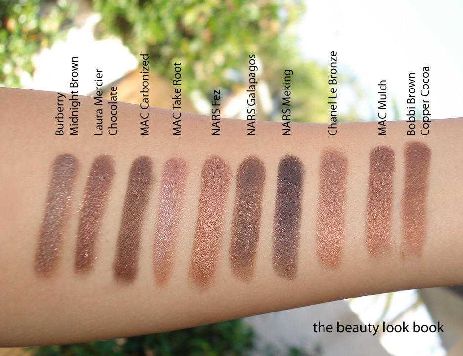
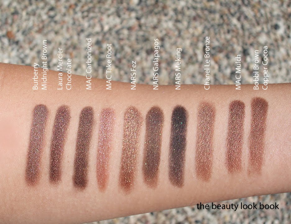
Swatched with a few comparisons (two sets of each variation). Descriptions by comparison:
MAC Mulch is a warmer and lighter shimmery brown
Bobbi Brown Copper Cocoa is similar to Mulch but slightly more golden
NARS Fez is the most coppery and shimmery
NARS Galapagos is the most neutral brown like dark milk chocolate
NARS Mekong blackened brown with gold flecks
Chanel Le Bronze is the lightest bronze
Set 1 with MAC Mulch & Bobbi Brown Copper Cocoa
Set 2 with NARS Fez, Galapagos, Mekong & Chanel Le Bronze
Did you pick up any brown eyeshadows this season or are you maxed out on neutrals? What are your favorite shimmery browns?