Monthly Archives

October 2010

Uncategorized

Inside My Marc Jacobs Large Single

October 15, 2010

Happy Friday everyone! I can’t believe another week has flown by. Some of you are probably wondering if I will ever get to responding to your comments on recent posts. It has been my intention to do so for the past week, but I’ve been short on time and sleep. I will do my best to catch up this weekend. This is kinda a lazy post but know many of you like to see what’s inside my bag. I was able to fit a ton of stuff inside my Marc Jacobs Large Single in Beige from last spring (see my grey one from this fall modeled here). Those wondering where you can find the beige one – it’s probably very hard to find at this point since it was released about a year ago. However there is some good news! The MJ Resort Collection has another beige version which seems less pink and more cream colored but I haven’t seen it so I can’t confirm. You can see it on The Purse Forum’s Marc Jacobs Resource section.


The Large Single is a lovely purse but I think I will have to stop using it for work. The handle is on the delicate side and while it is sturdy, it doesn’t seem to be designed to support a heavy bag. If I do use it for work I’ll have to carry a lighter load by limiting my makeup to a lipstick and powder, perhaps one more small compact. (If you scroll down you will see I have my Paul & Joe makeup bag crammed full with way too much stuff.)

What I fit inside:


I love how the Spring 2010 Beige version has the slightest hint of pink to it.


Have a great weekend everyone!
Uncategorized

NARS Full Metal Jacket + Rescue Beauty Lounge Stormy

October 13, 2010

I was in the mood for stormy blue greys this past week as I was anxiously waiting for NARS Full Metal Jacket to arrive in the mail. As soon as it came I put the NARS on the fingers and Rescue Beauty Lounge Stormy on the toes. I rarely ever wear blueish shades on the fingers but both are lovely and I definitely see myself getting regular use out of these colors.

NARS Full Metal Jacket is a recent release from their Vintage Collection of nail colors. I had never paid much attention to NARS nail polishes (except Chinatown and Jungle Red) so I don’t remember this one being released before. NARS Full Metal Jacket is a cool frosty grey-pearl with a blueish tinge. It definitely requires a very steady hand for application. I had my nails professionally done to get a smoother application. When I swatched it on my own it was clearly streaky although it’s not something you can notice easily. This color is more on the sheer side. I have this on with 2 coats. I would have preferred 3 though.


Rescue Beauty Lounge Stormy is a color I have long resisted. I never understood the appeal to grey toned nails, but Chanel Particuliere changed that for me and ever since I have been curious about all types of greys. Smooth finish. Not quite as impressive as Chanel’s recent cream-finish shades, but almost. With 2 coats it gives full coverage that is smooth and glossy.

If I were to do my mani/pedi over again, I would have used RBL Stormy on the hands and NARS Full Metal Jacket on the toes. Neither are exactly office appropriate for a conservative business environment but not too in-your-face that it’s completely inappropriate.

A few comparisons:


One last view:

Uncategorized

Guerlain Velours d’Or Ombre Éclat for Holiday 2010

October 11, 2010

I am usually able to resist Guerlain because of the hefty price tag but occasionally cave every now and then. One of my favorite Asian blogs Yuki’s Lazy Channel had a lovely preview of the quad & meteorites – I am always amazed at her excellent swatches and photographs. The holiday display was up at Nordstrom and both my mom and I were in total awe at the elegant packaging. She was convinced that I needed the pretty shimmer spray (if you see the packaging at the counter, you’ll see how fun it is to play with it), but I was able to convince her that I would never have an occasion to wear something like that. The Guerlain rep wasn’t there so the sales associates had a bit of difficulty locating where the holiday items were stashed. Luckily they found the quad and I left a happy camper.

Velours d’Or #410 ($59) is a gorgeous palette of gold mixed with contrasting darker colors in purple and charcoal. The gold resembles 24K gold but has a sparkling sheer finish instead of a solid metallic finish. The other shades aren’t completely matte in the compact but apply more like a matte on the skin (although if you look closely or apply over a cream base you may be able to get some shimmer to show). My mom fell in love with the deep purple and wished she could buy it on its own. The packaging has a cute embossed honeycomb bumble bee theme.


Swatched on bare skin by swiping my finger across the shadows and then onto my arm:


I personally don’t have many shades this dark because I don’t use them frequently. I pulled Dior’s Night Butterfly and Armani’s Eyes to Kill #3. As you can see they haven’t gotten much use yet although for this holiday season, previously released palettes seem more season appropriate than what is currently being released.

Rich in pigment and easy to blend. Beautiful to stare at. I’ve still managed to avoid caving on the $84 eyeshadow palettes. I still sneak a little peek everytime I stop by the Guerlain counter. I still can’t pull the trigger but at the same time I don’t know how much longer I can resist! $59 for a quad is still hard to swallow but is still significantly more justifiable than $84.


Have a great week everyone!

Uncategorized

Dior Holiday 2010: Endless Shine, Timeless Gold, Czarina Gold & Pink Stiletto

October 10, 2010
I spotted a preview of Dior’s Holiday Minaudiere from British Beauty Blogger back in July and have been dreaming about the holiday collection ever since then. The clutch-like compact they designed this year is beautiful! Kari from Fab Over Forty showed us the Saks grey version earlier last week and as soon as I saw it I ran to my Nordstrom to check out the pink version. I put it aside as a pre-sale item for an event but picked up a few other things from their holiday collection that they had in stock (hence the title “round one”).

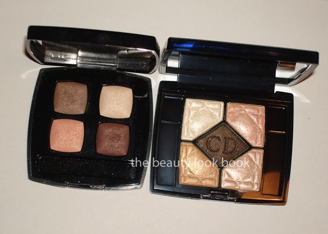
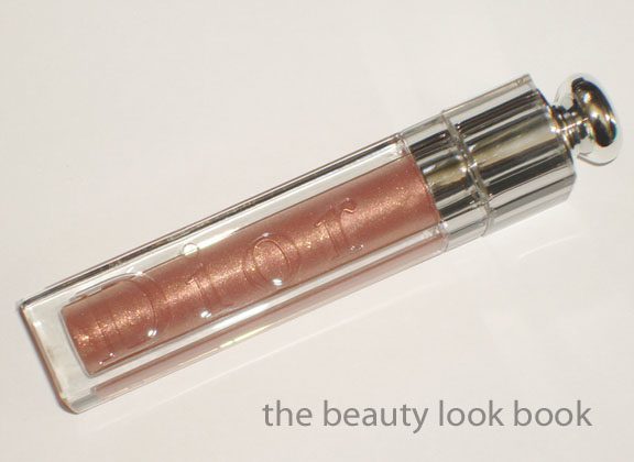
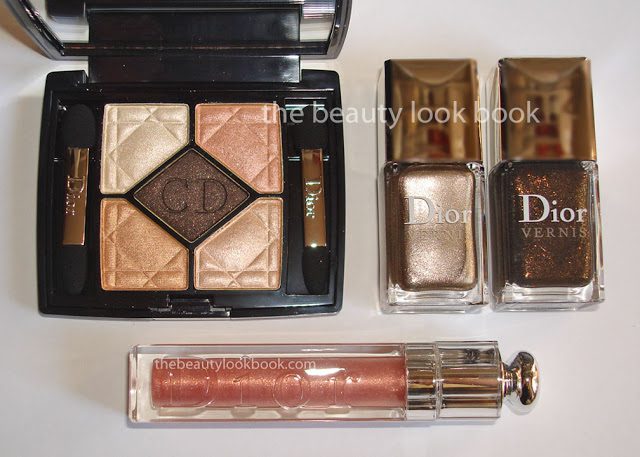
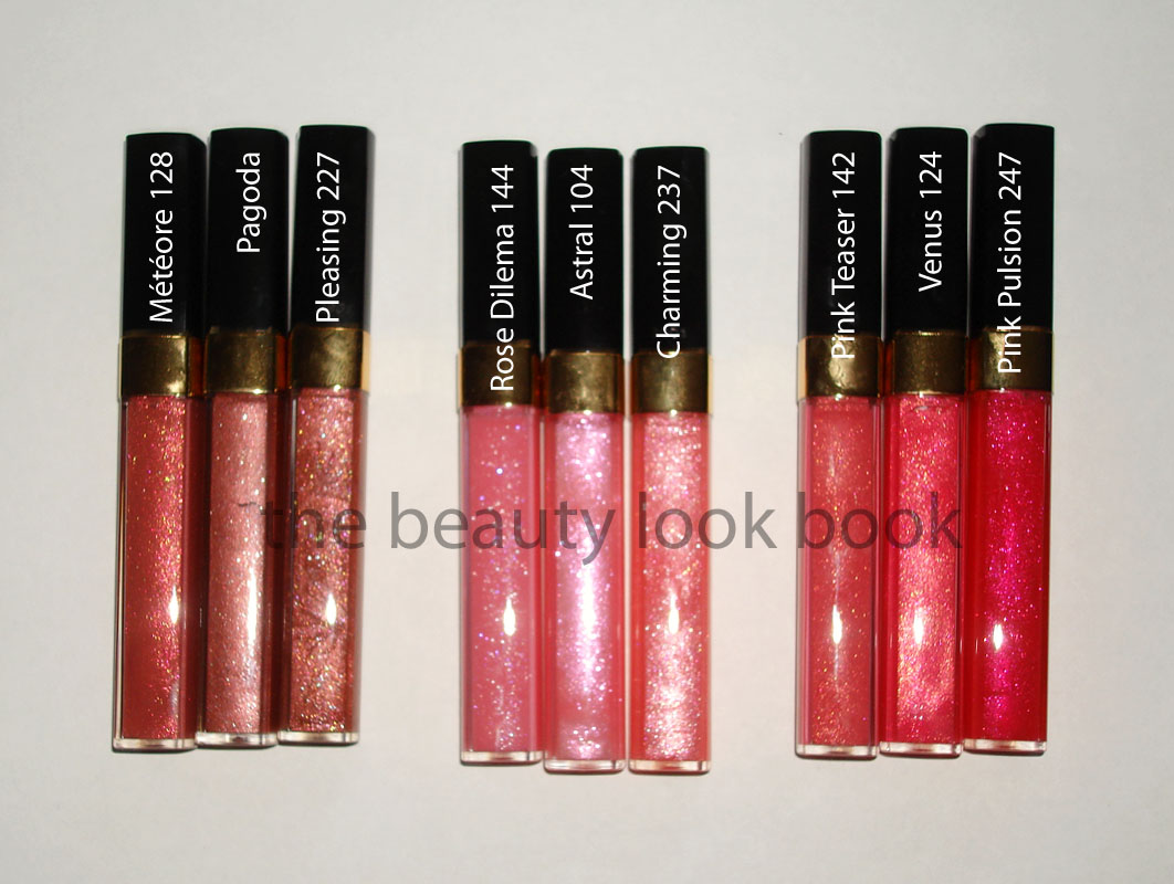
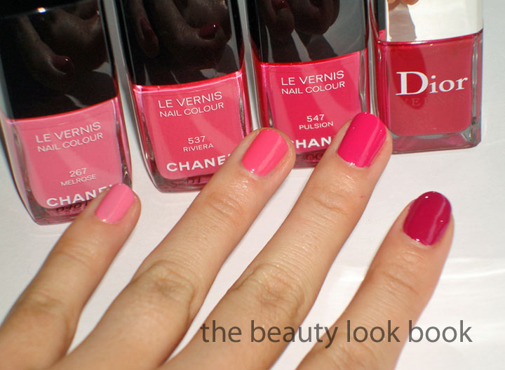
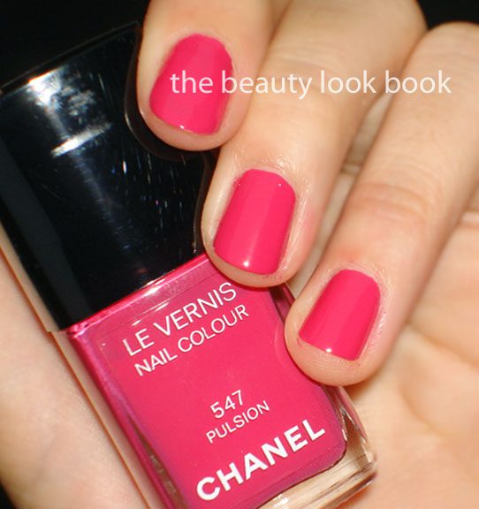
What I picked up: Pink Stiletto #234 Addict Lip Gloss, Endless Shine #529 Quint, Timeless Gold #226 Nail Polish & Czarina Gold #916 Nail Polish

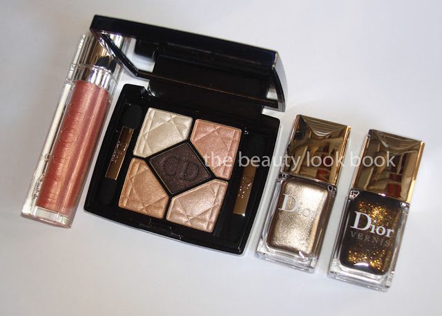
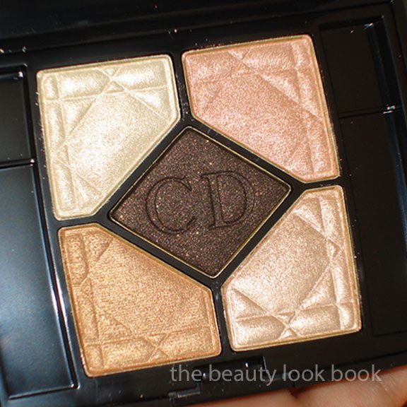
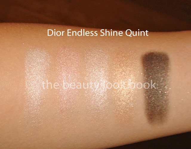
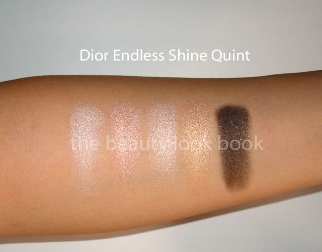
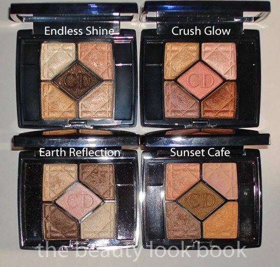
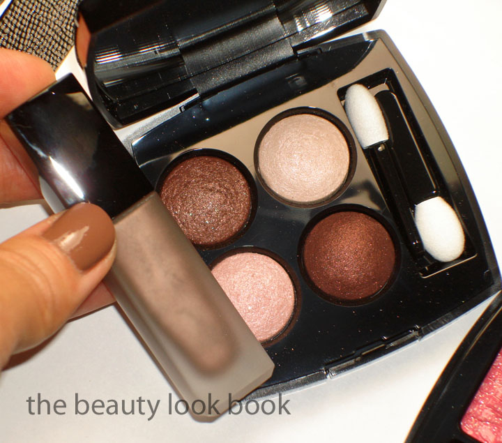
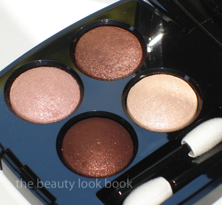
Endless Shine Quint – This one comes in the Iridescent formula and all shades have a high level of frost, much like Earth Reflection, Goldfever, Crush Glow, Ready to Glow etc. The colors are highly pigmented and smooth making them easy to blend. This quint seems better suited for spring or summer but is still neutral enough to pull off year round. It’s beautiful and much more wearable than the quints from the past few seasons (Misty Mauve, Crush Glow and Ready to Glow). I rarely wear all five shades at one time – there’s simply not enough space on my eyelids to fit all the colors. They do layer and blend together beautifully. Do I think it’s a must-have? Dior quints have beautiful pigmentation and complex colors that you can’t easily find elsewhere. However I think you can definitely find similar shades in other lines. I personally could not find any dupes – the closest quad I could find was Chanel’s Shimmering Dunes which is significantly less frosty and still different among all the colors.

In direct sunlight:

*Updated* better swatches than my original ones:


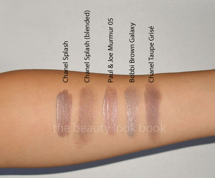
Chanel Shimmering Dunes versus Dior Endless Shine:


*Update* Comparisons to a few other quints so you can see how different Endless Shine is:


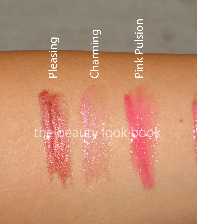
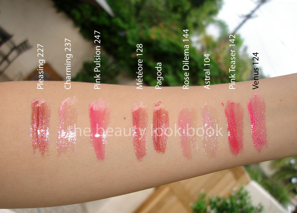
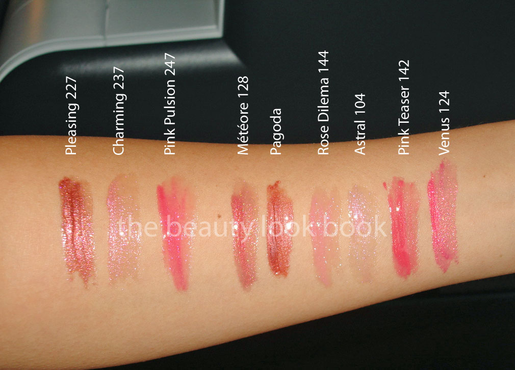
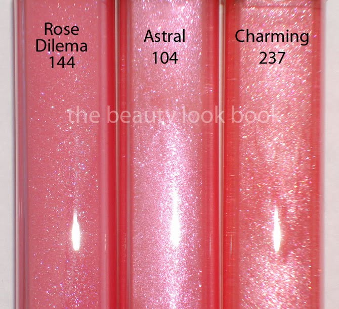
Pink Stiletto Lip Gloss – This is one of those colors that made my jaw drop. It’s a gorgeous light warm pink with gold flecks. Very sheer but just absolutely stunning in the tube. I couldn’t find anything similar – it’s like a pink version of Bobbi Brown’s Rose Gold Gloss but with gold flecks added. Simply stunning. From the photos you may think it resembles MAC’s Nymphette – but it’s very different. This is one you have to see in person to really see how beautiful it is. I haven’t noticed much of a difference between the original addict reflect gloss and the new formula except the packaging/tube size. These are still smooth with a high gloss finish. Lasting power is not the best.


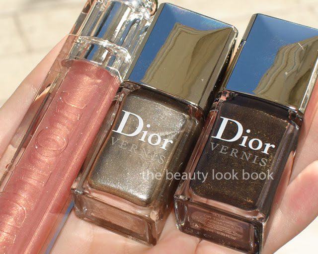
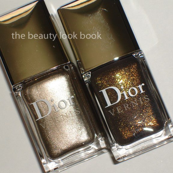
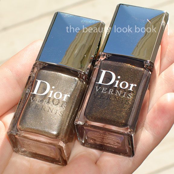
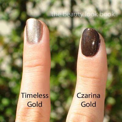
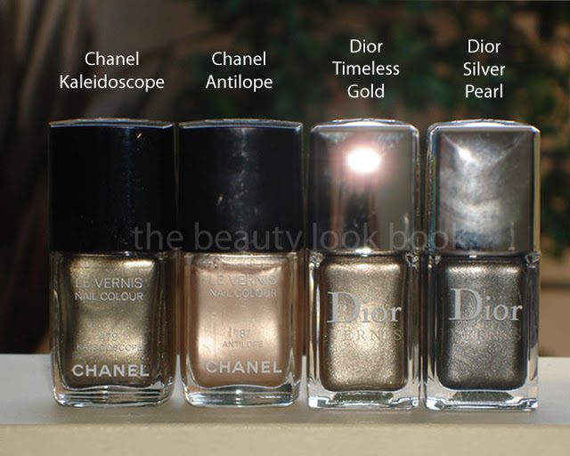
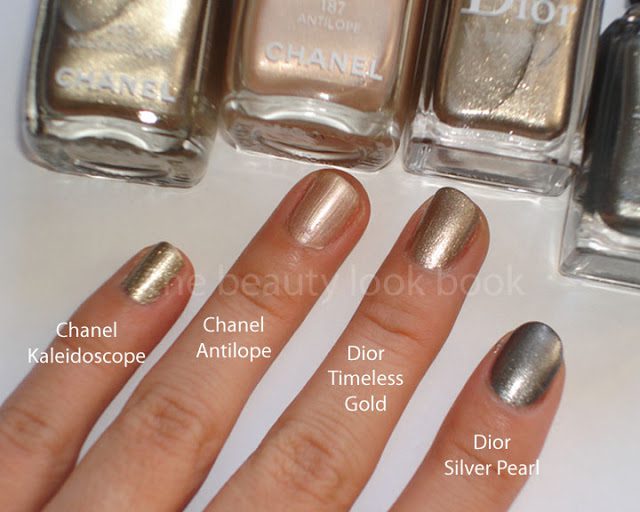
Timeless Gold & Czarina Gold Nail Polishes
– I was pleasantly surprised by both shades. There were no testers at the counter yet because they didn’t receive their display but I knew I had to have them both. Timeless Gold has a similar finish to 
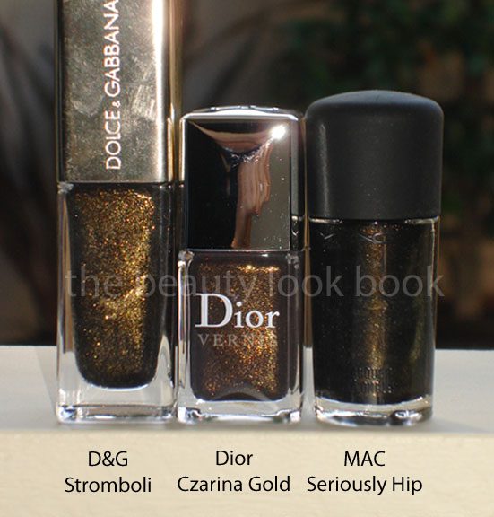
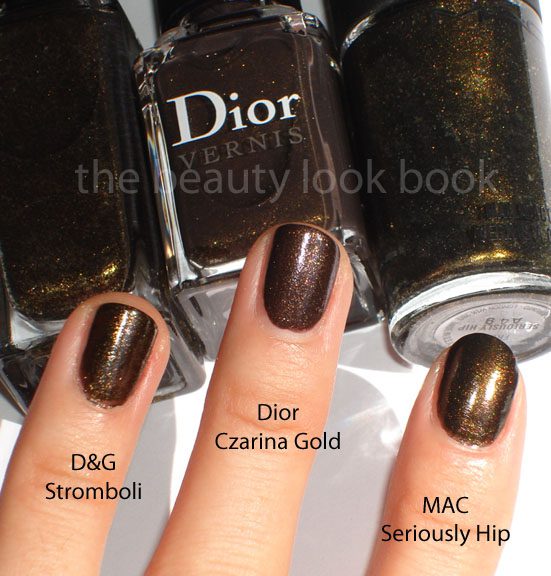
Silver Pearl from last spring. High frost, rich pigment, almost foiled-like finish but has a non-streaky finish. Czarina Gold is a black-gold with a somewhat sheer formula. You will need 3 thin coats for a full finish but it’s also stunning. When I first pulled my other black-golds I thought “oh no, I’ve wasted another $20-something on a color I already have dupes of.” I will say from arm’s length it looks similar to D&G Stromboli and MAC Seriously Hip, but the Czarina Gold is the best in my opinion because the base has the slightest hint of plum-brown which prevents it from looking greenish as some black-golds can look.

Left: Timeless Gold
Right: Czarina Gold


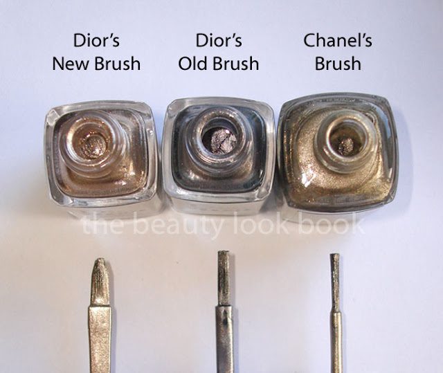
Another interesting detail I noticed – Dior has changed the brush this season to have a wider/flatter tip that is slightly chiseled and tapered. See below how it compares to the old version and also Chanel’s brush tip. I can’t say I like one over the other, although this new chiseled tip is very unique and had me ooohing and aaahing as I was swatching the colors.


Comparison shades:
I could not find a dupe for Dior Timeless Gold, although Chanel Kaleidoscope is strikingly similar. The differences are that the Dior is less streaky but it lacks that greenish/olive tinge that the Chanel has.


Czarina Gold comparisons: What you see in the bottles is slightly deceiving, scroll down for the swatches to see what I mean.


The collection is absolutely stunning. When I went to the counter they didn’t have the display unit up but my sales associate pulled everything for me to see. They didn’t have the Five Golds Quint for sale (although the tester is to die for) and the other gloss was way too glittery for my taste. I was surprised there wasn’t anything for the cheeks this season but was happy for my wallet. I passed on all their “sets” (minaudiere excluded) because I felt like the full sized individual items were better suited for my coloring.
Uncategorized

Chanel Holiday 2010: Glossimers in Pleasing, Charming & Pink Pulsion

October 7, 2010
It looks like this week will be all about Chanel’s Holiday collection. I apologize for being slow with the roll out of reviews. I need to figure out a way to manage my off-work time better. These days time just seems to fly at all hours of the day. Chanel, however, makes each part of the day better whether it’s having a pretty manicure, a gorgeous gloss to touch up with, or just having a sneak peek into your purse during break time and catching glimpse of that sleek black Chanel compact.

The new glossimers released this holiday include Pleasing 227 (complex cinnamon brown pink sparkle), Charming 237 (sparkling light pink) and Pink Pulsion 247 (sheer but sparkling hot pink). All are gorgeous and I think you’ll love these if you don’t mind shimmer. These are slightly-thick but not super sticky in typical Chanel style. I personally love glossimers and while these are very pretty I have noticed a few things that while slight, still have me thinking hmmmmm …


If you have ever looked at the bottom label of your glossimers you might notice some come with a black sticker label with a number while others come with a clear sticker with a word name. I was told by one of my Chanel specialists a few years ago that the black labels indicate “limited edition” or “European produced” while the clear labels with names were made in the US. I have not confirmed this with anyone else but I have noticed that the recent glossimer releases with the black labels have been slightly more glittery/sparkley than what I see in my older shimmer glossimers. It’s not that I don’t love the finish – I just remember loving glossimers like Pagoda, Spark and Twinkle for their lovely sophisticated shimmer. These days the color seem significantly more sparkley with tiny micro glitters. I find that they still apply beautifully, especially when layered over lipsticks. So what I’m trying to say is that while I find these newer glossimers different, different doesn’t mean bad. Different is just, well, different. They are still gorgeous, wearable, non-gritty and luxurious.

Anyhow – I found Pleasing very unique and pigmented. It’s simply stunning even though it’s more on the frosty side. Charming is gorgeous, but I prefer some of my other pink shades. Charming is very sheer and goes on practically clear on me. Pink Pulsion is hot though. Everyone knows I’m a huge neutral-makeup lover, but Pink Pulsion is absolutely stunning. I couldn’t find dupes for any of the colors but pulled some from my extensive Chanel stash to do some comparisons for you. Are they a must have? If you’re asking me this question I will say you’re asking the wrong person. If asked “is this Chanel product worth having?” 8.5 times out of 10 I will say yes. So if you’re looking for someone to talk you out of buying something from Chanel – don’t look at me.

Comparisons, swatches in different lighting plus close ups:


Note that the swatches are not in the same order as the photo above:


Close ups of the comparisons:


Chanel’s Holiday collection has also been swatched by the lovely Karla Sugar. Be sure to check out her post here if you haven’t already.

Also check out NaturalNChicMakeup for lovely swatches and you’ll see how different this collection looks on all three of us.

Uncategorized

Chanel Holiday Nails: Pulsion Le Vernis

October 6, 2010
Chanel Pulsion Le Vernis ($23) is a vibrant hot pink cream color that is cool-toned. I thought Riviera was bright but Pulsion is like Riviera electrified. It’s a few shades deeper and significantly brighter. I’m not sure I would really associate this with a winter/holiday color except maybe for a holiday party. Definitely too bright for a conservative office environment, perhaps ok for the toes.


Here it is compared to a few other pinks, left to right:
Chanel Melrose, Chanel Riviera, Chanel Pulsion, Dior Red Dahlia


One last view:

Uncategorized

Chanel Holiday 2010: Tentation Cuivrée Quadra Eyeshadow & Splash Fluid Iridescent Eyeshadow

October 4, 2010
I picked up the two new products released this holiday for Chanel: Tentation Cuivrée Quadra Eyeshadow ($56) & Splash Fluid Iridescent Eyeshadow ($32). In addition to these two, there are a few repromotes such as Cassis Eyeliner (reviewed here), Espresso Eyeliner and Misty-Soft Duo (reviewed here).

* left to right: wearing Khaki Rose, Splash, Tentation Cuivrée

Both are beautiful but not entirely unique. All of us Chanel lovers have been waiting holding our breath to see what the Holiday Quad in the Euro formula will look like. I’ve tried the round-pan formula at a few Chanel Studios (which carry import collections) and was never impressed. I found the pigment sheer and texture powdery. The Tentation Cuivrée quad is not quite as powdery as most I’ve tried and I was surprised to find out pigmented the colors were. You’ll see my swatches below without any base (it’s incredible in my opinion). However, after swatching this quad at home I saw how it was quite a bit more sparkley than I observed from swatching in-store. It must have been bad lighting. Still gorgeous but the colors have these uber tiny micro glitter particles and a higher level of shimmer (much like Paul & Joe’s lighter eyegloss shades reviewed here).

I’d describe the colors as light pink with gold sparkle, neutral ivory with sparkle, warm medium-light brown with gold sparkle, deep warm chocolate shimmer (love this last shade). There is a difference between the lighter shades, but on the eyes, they both look the same, at least on my skin.

I’ve compared it to single shades and a few other quads. I personally prefer the older square pan eyeshadow quads and current singles, all of which have a more sophisticated luminous glow (rather than super-sparkle). Take note I’m not claiming any are dupes, these are simply comparisons to help you get a better idea of what the quad looks like. The singles below have a more finely milled shimmer quality. Those who have Chanel Ivory and are familiar with MAC Pigments know that Chanel Ivory is a softer more wearable version of MAC Vanilla Pigment. Both have this lovely opalescent almost duochrome quality. The light shade in the quad is more basic in undertone, but more glitzy in sparkle. (Does that even make sense to anyone? I feel as though I’m not really communicating what I see properly.)

Note that Nomade didn’t swatch so well on my arm, but it applies so much better on the eyes. Trace is warmer and less red than the quad. For the bottom left shade in the quad I couldn’t find anything with the same undertone and deepness – all the other shades I looked at were lighter, less pigmented, or more red/purple/or darker.


Splash Fluid Iridescent Eyeshadow is like a liquid-and-slightly-warmer version of Taupe Grisé. I envisioned Splash to be a light silvery blue or a light greyish color. Instead it’s more of a medium taupe grey. These come in a glass tube with part clear liquid and part pigmented liquid eyeshadow. To apply, simply shake the tube, apply the sponge tip directly to the eye and then blend. I like to blend with my fingers. Since Splash is a darker shade, I find it takes more careful application on the eye compared to the other lighter colors like Source & Sand etc.


Overall thoughts: I prefer the older US Chanel quads. I find the holiday quad a stunner, but the shimmer level is a bit outside of my comfort zone. Still the pigment is amazing and shades are very blendable. The liquid eyeshadow is stunning, but if you already have Taupe Grise you might find it redundant to own both. Definitely check it out if you’re a taupe lover.