Browsing Tag

Spring 2012

Uncategorized

Burberry Beauty: Nude Rose & Hibiscus Lip Glow and Tulip Pink & Devon Sunset Lip Cover

January 8, 2012

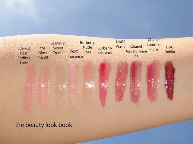
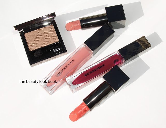
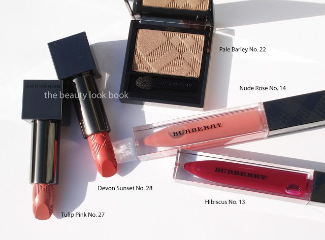
I finally found a moment to post the swatches and thoughts on my lip picks from Burberry Spring 2012. Thank you all for your patience, I know I’ve been very slow in getting the swatches up, these days I feel like I only have time to be a weekend blogger. Burberry has a beautiful mix of soft and bright for lips this season. There are a few neutrals for nude-makeup lovers (like myself). In addition Burberry has released some vibrant corals, pinks and plum for those craving more color. The colors I ordered sight unseen:
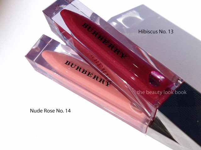
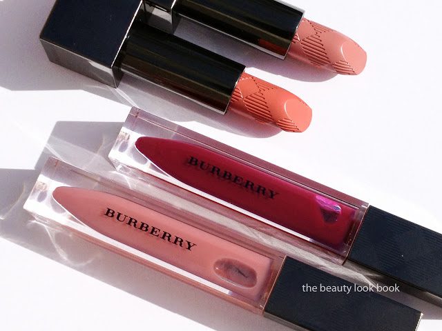
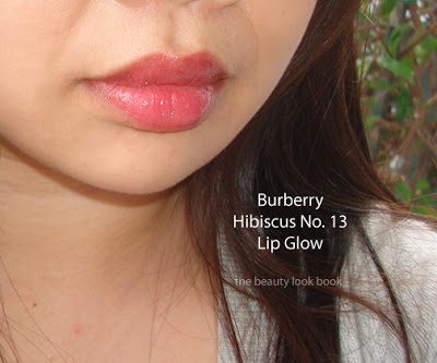
  • Hibiscus No.13 Lip Glow Natural Lip Gloss ($27) – a sheer bright plum with reddish tones
  • Nude Rose No. 14 Lip Glow Natural Lip Gloss ($27) – a sheer soft faded nude pink (very sheer)
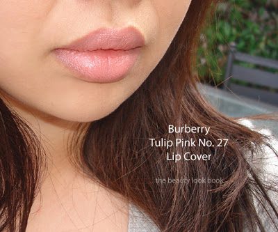
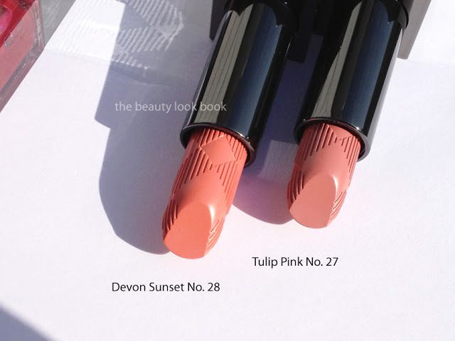
  • Tulip Pink No. 27 Lip Cover Satin Lipstick ($30) – a neutral nude pale pink cream
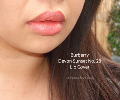
  • Devon Sunset No. 28 Lip Cover Satin Lipstick ($30) – a bright/healthy but natural peach-coral (brighter/deeper than Cameo No. 02)
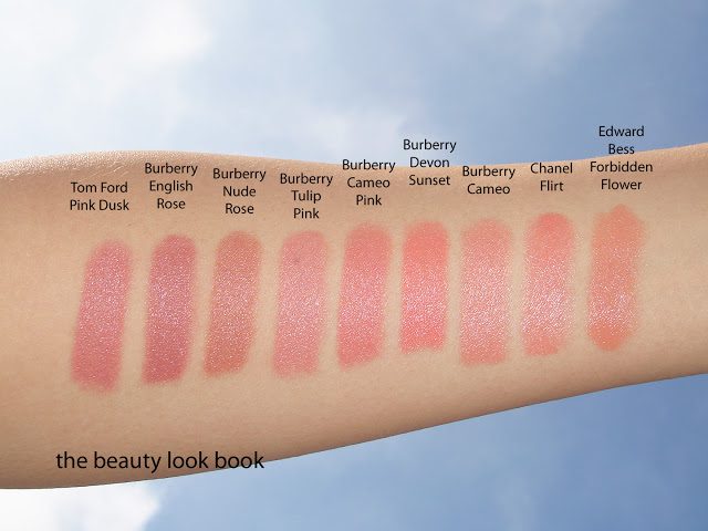
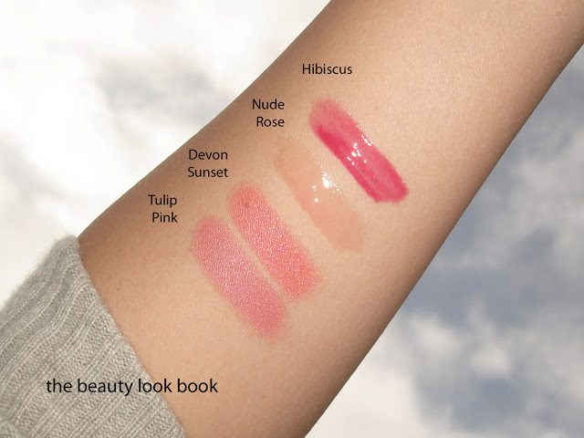
The swatches all together:

Close up shots of the lipglosses:

Close ups of the lipsticks:

Lip swatches of Hibiscus Gloss, Tulip Pink Lipstick and Devon Sunset Lipgloss. Nude Rose Lip Gloss went on fairly clear so I didn’t post the photos.
Swatch comparisons:

Thoughts on each shade:

  • I could have skipped the Nude Rose Lipgloss because I found it so sheer but it layers beautifully with Tulip Pink which can be a tad too pale by itself. It does go on fairly clear on my lips with a very slight pink tint. I think for the price I would have preferred something with more pigment, or at least with a bit of nude shimmer.
  • Tulip Pink Lipstick is on the pale side. It’s not quite as pale as Nude though so I still find it wearable. If you have other nude pink shades from Burberry I would say you can safely skip Tulip Pink unless you’re looking for something on the paler/lighter side. I personally prefer slightly darker pinks although this one is lovely when topped with a sheer gloss. The coverage is full but not too thick.
  • Devon Sunset Lipstick is a brighter version of Cameo. It reminds me of a softer more wearable version of Lancome’s Chris and Tell (which I gifted away). It has a similar effect but less of a garish finish. The coverage on this color is full as well. Compared to other corals it has a richer creamier finish.
  • Hibiscus Lipgloss is a lovely plum in the tube, on my lips it pulls more red (as most plums do). It’s a bit outside of my comfort zone but not too over the top. I don’t have similar shades but it seems to be a classic sort of reddish/plum so I am assuming Chanel and Bobbi Brown have something similar. The finish is sheer but color is noticeable on the lips.

Overall I think the items released for Burberry Spring-Summer are classic and gorgeous. The entire collection is available at select Nordstrom locations and Nordstrom.com now. Due to time constraints I don’t have the ability to do more comparisons right now. I hope the comparisons I have posted for Burberry Spring will give you an idea to help gauge the colors.

Uncategorized

Burberry Pale Barley No. 22 Sheer Eye Shadow

January 4, 2012

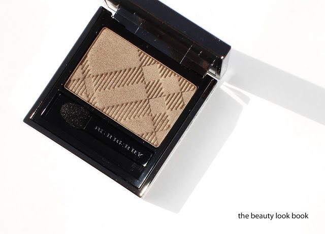
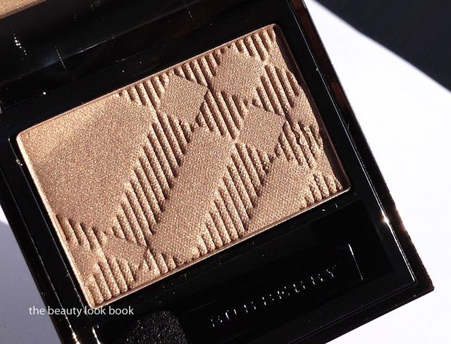
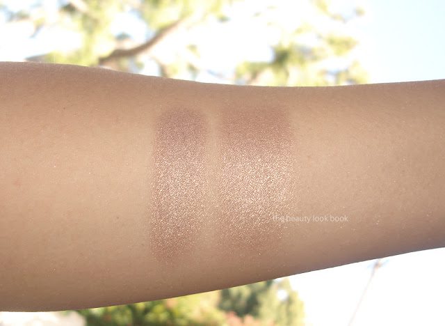
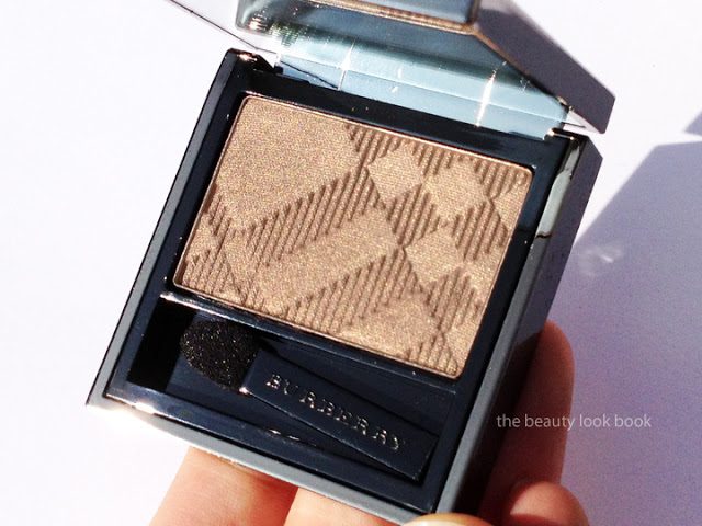
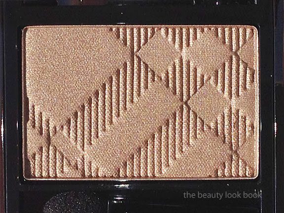
Burberry Pale Barley No. 22 Sheer Eyeshadow ($29) is a beautiful shimmery neutral sandy beige with a complex sheen. It glows with a mixture of warm gold and neutral taupe and champagne-opalescent sparkles. Over the phone, Pale Barley was described as a color that matches the classic Burberry Trench Coats with shimmer. It just might be the most beautiful neutral I’ve ever laid eyes on. The texture is soft and smooth and the pigment is anything but sheer. I do find that Burberry eye shadows are all soft and blendable for a soft sheer wash of color but the intensity of the pigment is quite good with the paler shades. The shimmer finish is similar to Rosewood with a soft luminous sheen. Lasting power by itself was less than satisfactory, however when Pale Barley is applied over a cream shadow, it lasts all day. I’ve experimented over the past few days and tried it three different ways: over Urban Decay Primer Potion in Sin, MAC Nubile Paint Pot and Laura Mercier Metallic Creme in Gold. Each one individually helped the color from the powder to stay put from morning to evening without changing the effect or color.
A few close up shots:

Left is with a heavy swatch, right is blended slightly, photos look frosty from the flash but the color is a luminous shimmer in real life:

At an angle, you can see the beautiful glowy sheen:

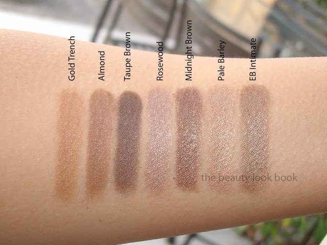
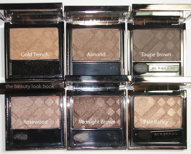
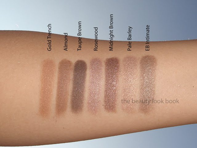
Creating a fresh unique neutral can be hard to do, but Burberry has pulled it off flawlessly. Pale Barley is different from anything they’ve released before and different from other neutrals I own from other brands. Here is one comparison set with Burberry Gold Trench, Almond, Taupe Brown, Rosewood, Midnight Brown and Edward Bess Intimate:

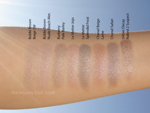
Compared to other brands I found Pale Barley unique as well. I wasn’t able to photograph the actual product in good light but did get swatches before the sun went down. Here is one more comparison set to Bobbi Brown Beige Shimmer Wash, Bobbi Brown Nude Beach Metallic, Le Metier Jojo, Le Metier Splendid Frost (taupe), Chanel Beige Lame, Chanel Safari and Urban Decay’s Naked2 Suspect.

I believe Pale Barley is a definite must-have. It’s beautiful, layerable, complex yet classic. It’s one of those shades you can wear alone (over a base that is) and just add mascara and have a finished eye look. I love that it’s a swipe-and-go type of shade that is goof-proof, fool-proof, and easy to incorporate into any look. For the woman who needs more than one color on the eyes, note that it layers well with other shades too. I purchased it sight-unseen and have no regrets. Pale Barley is a classic color and just absolute perfection on my skin. It’s a staple and I highly recommend it.
Uncategorized

Burberry Spring-Summer 2012 Picks

January 3, 2012

Burberry’s Spring-Summer for 2012 has just hit counters at select Nordstrom stores. To date, Burberry is limited to Nordstrom.com and only a handful of Nordstrom counters like South Coast Plaza, San Francisco & Chicago to name a few. Like many of my readers, I do not have easy access to Burberry Beauty so I rely on blog posts and tweets from my fellow bloggers to be my eyes and ears for the latest. Without them I would have no idea what to expect, although these days promotional stock/web photos are improving. My go-to resources for Burberry Spring include the following:
  • The full lineup is listed on Rouge Deluxe 
  • Pretty Addicted has featured her picks on her blog
  • Many thanks to Café Makeup for taking a few moments from her busy schedule to let me know the collection arrived at Nordstrom San Francisco (I called and ordered and I’m thrilled!)
  • Lipstick photos for spring were tweeted by @Nordstrombeauty which you can see here
  • NaturalNChicMakeup swatched all items on her hand
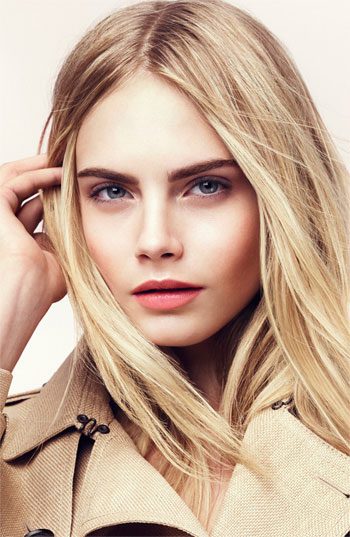
The collection has a mixture of neutrals and brights for lipsticks and glosses along with a neutral shimmery trench-coat color eyeshadow. The look is fresh but natural for this season. I don’t have the breakdown for the look but my guess is that the model appears to be wearing Devon Sunset Lipstick with Blossom Blush. {Via Nordstrom.com}

I ordered from the San Francisco Nordstrom store. All my experiences have been absolutely phenomenal. I really appreciate how well-trained and knowledgeable the Burberry artists are. They know their colors well and have always been able to help with comparisons in their own line. They also give excellent advice on how to coordinate colors. My picks: Pale Barley No. 22 Eyeshadow, Tulip Pink No. 27 Lipstick, Devon Sunset No. 28 Lipstick, Hibiscus No. 13 Lipgloss & Nude Rose No. 14 Lipgloss.
Swatches to come soon. I’ve only played with Pale Barley Eyeshadow and the Tulip Pink Lipstick so far but initial impressions are a huge thumbs up. The quality of Burberry’s eyeshadows is excellent with a buttery soft blendable texture that melts into the skin. Please hold your questions until I post individual reviews – I will say that Pale Barley is different from anything else in the Burberry Eyeshadow Collection. It looks similar to Gold Trench in the photos but it’s quite different when put together side by side.

Burberry Beauty is available in the US at a few select Nordstrom locations. The counters I know of include South Coast Plaza, San Francisco, Bellevue and Chicago. I believe there may be a few more. The entire collection is also available online at Nordstrom.com.
Uncategorized

Bobbi Brown Neon & Nudes Blushes for Spring 2012: Nude Peach and Nude Pink

January 1, 2012

This spring, Bobbi Brown has a created new twist on her classic nudes with a Neon & Nudes collection. Her spring color palette has a mixture of nudes with shocking brights. I of course was drawn to her nudes: the eye palette and blushes. I found the new Ultra Nude Eyeshadow Palette was very tempting. The colors seem goof-proof, naturally flattering and perfect for everyday wear. I was particularly impressed by the dual-ended brush. One side is angled and very dense and seemed to be of extremely good quality (an improvement in my opinion, the brushes in her palettes are hit or miss). However, given my recent purchases of Urban Decay Naked 2 and Burberry Pale Barley Eyeshadow, I decided to pass for now. I left the counter with her two new blushes in Nude Peach and Nude Pink. (Swatches of the entire collection is featured on Yuki’s Lazy Channel.)
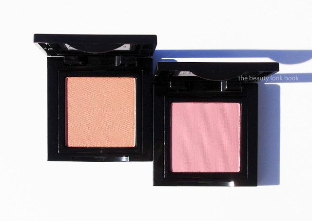
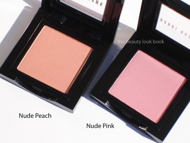
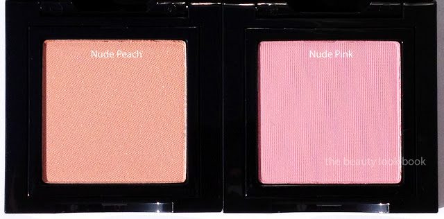
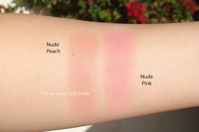
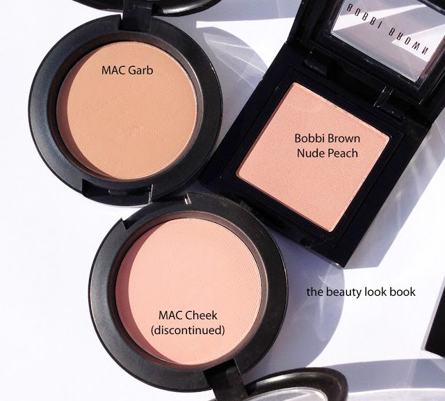
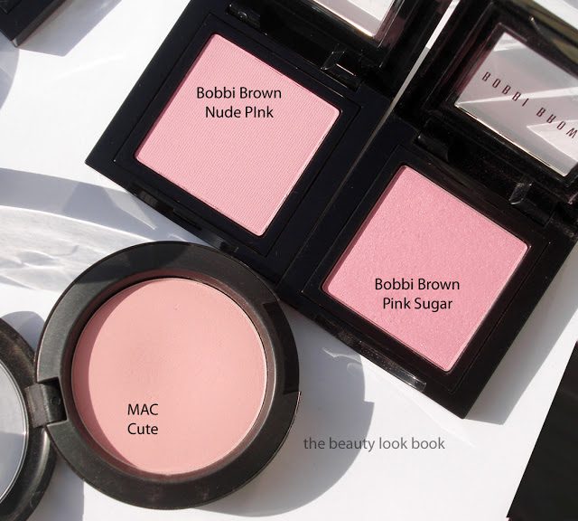
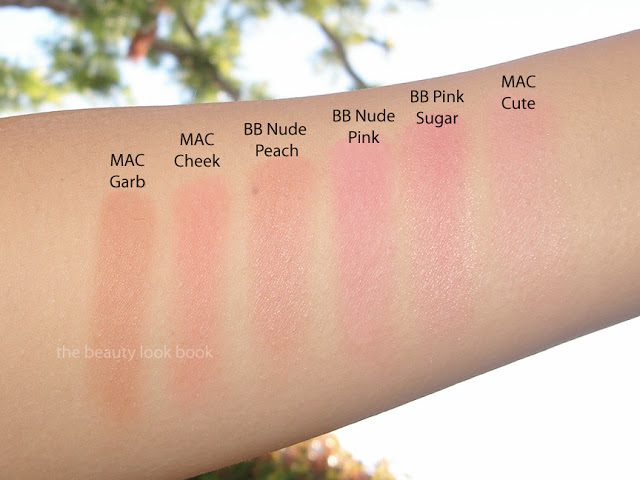
Nude Peach and Nude Pink ($24 each) are gorgeous classic neutrals true to Bobbi Brown’s style. Nude Peach is a soft peach with a hint of shimmer (although I can’t see any shimmer once applied on the skin). Nude Pink is a soft cool matte pale pink. Both colors fill in gaps in her current blush lineup for lighter neutrals. At the counter they swatched on the hand light, but do not let this deter you from trying them on the face. A good blush brush picks up the powder (which is easy to blend) to apply decent pigment to the face with just two swipes. Today I’ve layered the peach on top of the pink although you can wear both alone for a soft natural cheek. I was very pleased with the pigment and the colors do show up well on the skin.

Since neutral peaches and pinks are basic staples I’m sure there are dupes. I couldn’t find any among my MAC, Chanel, Burberry, Armani or Bobbi Brown shades (the blushes I use the most), but I didn’t spend a lot of time searching. I pulled a few other shades to compare for you though. Still I find these naturally flattering and light enough that they don’t pull brown from darkening as your skin warms up. I adore Bobbi Brown’s blushes but I find some of her neutrals with brownish tones like Slopes and Tawny darken on my skin and end up looking harsh when I’m paler.

Overall thoughts: Fresh and brightening and perfect for spring. Nude Peach and Nude Pink are colors that I envision will be very easy to incorporate into any look as they will naturally enhance your complexion to brighten the face and not overpower dramatic eyes or lips.
Uncategorized

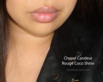
Chanel Spring 2012 Lipstick Picks: Flirt, Candeur, Charme & Superstition

December 29, 2011

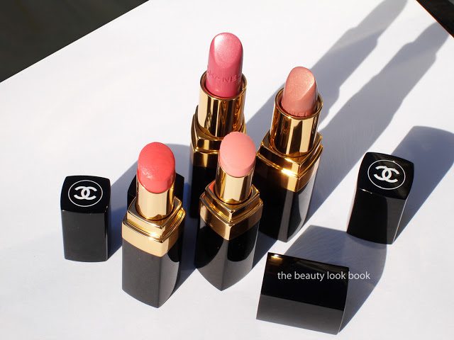
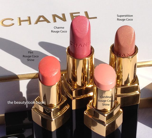
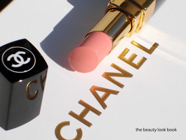
This year Chanel’s spring collection includes four Rouge Coco lipsticks (three new, one repromote), two new Rouge Coco Shines and one hydrating lip balm. When I placed my order over the phone I had not yet seen anything in person. I picked out four items based on descriptions given to me and ended up with both of the new Rouge Coco Shine Lipsticks in Flirt and Candeur and two Rouge Cocos Charme and Superstition.

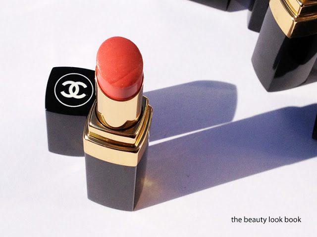
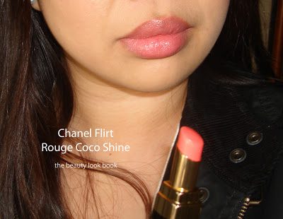
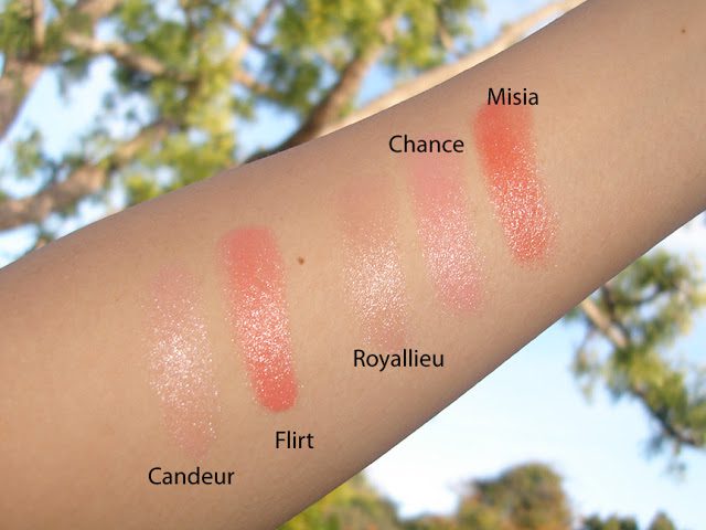
Flirt Rouge Coco Shine #69 is a bright but soft creamy peach. It looks bright in the tube but the sheerness of the color makes it go on softer than what you see in the tube. Compared to Misia #45 (a Neimans Exclusive from last April), Flirt is very similar but softer, milkier and creamier in color. The texture is smooth and moisturizing like all other Rouge Coco Shines. Lasting power is average for your typical sheer/glossy lipstick but Flirt is very pretty on the lips and brightens the face.

Candeur Rouge Coco Shine #68 is a soft pale pink and almost looks faded in the tube. There is a very very slight hint of sparkle. You can only see it when you hold it at an angle, on my lips it applies more like a sheer cream. It does show up on my lips but the contrast made it appear a bit streaky. I found it similar in paleness/sheerness to Royallieu which was released back in June. I prefer Royallieu.

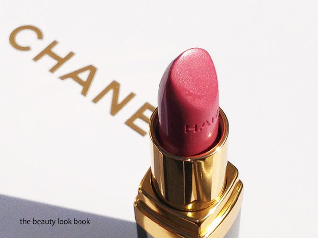
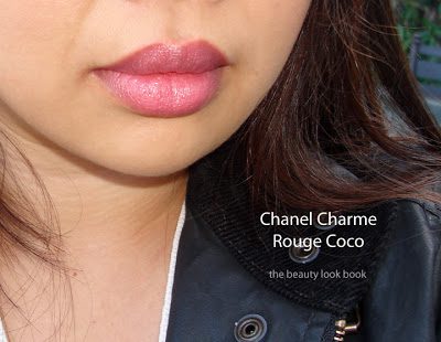
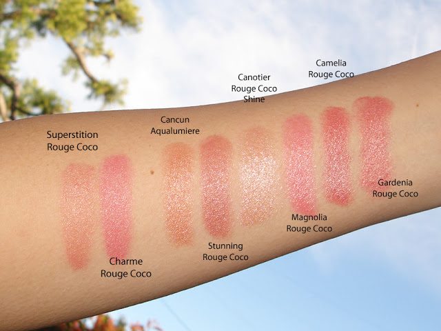
Charme Rouge Coco #40 is a gorgeous cool-toned pink rose shimmer. I thought it looked fairly unique compared to Chanel’s other Rouge Cocos in Camelia (more warm), Gardenia (more peach), Legende (significantly cooler) and Magnolia (has gold flecks), but when swatched on the arm and lips, I found the effect very similar to Magnolia. Charme is one of those colors that turns slightly fuschia on my lips (much like Magnolia does (reviewed here). I think Charme is slightly deeper with a hint more shimmer that is evenly dispersed. Magnolia is a bit brighter with a creamier base and gold flecks that make it slightly textured. For me Charme will require lots of tweaking to prevent it from turning fuschia/blue.

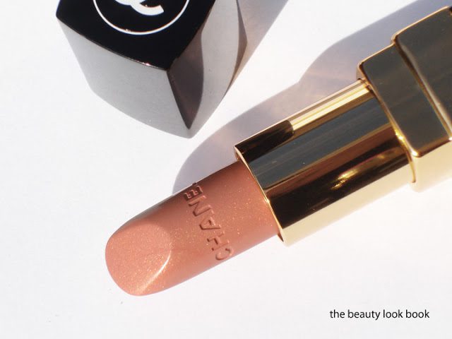
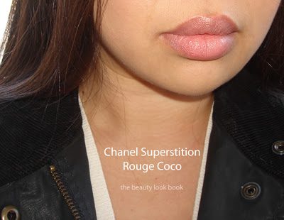
Superstition Rouge Coco #38 is a breathtaking nude gold shimmer. There’s a hint of peach and pink in the base to prevent it from looking too pale. Long-time Chanel fans might remember Baby Gold Hydrabase Lipstick. Superstition reminds me of less pale version of Baby Gold. Superstition is semi-sheer which allows your natural lip color to show through. I adore it. I think it will be stunning when topped with any sheer gloss.

Swatch comparisons for Flirt and Candeur Rouge Coco Shines – they’re all very sheer so the swatches aren’t showing up very well:

Swatch comparisons for Charme and Superstition Rouge Cocos, all swatched with a light hand:

I think Chanel released some beautiful colors for lips this season but for me they lacked that wow-factor. My top two picks are Flirt Rouge Coco Shine (the peach) and Superstition Rouge Coco (beige gold), but I don’t see them as being very unique. Next season I will wait to see everything in person or wait for other bloggers to compare the releases before buying.
Did you pick up any lip items from Chanel spring? What were your thoughts?
Uncategorized

Chanel Glossimers Bon Bon, Pétillant & Bagatelle for Spring 2012

December 19, 2011

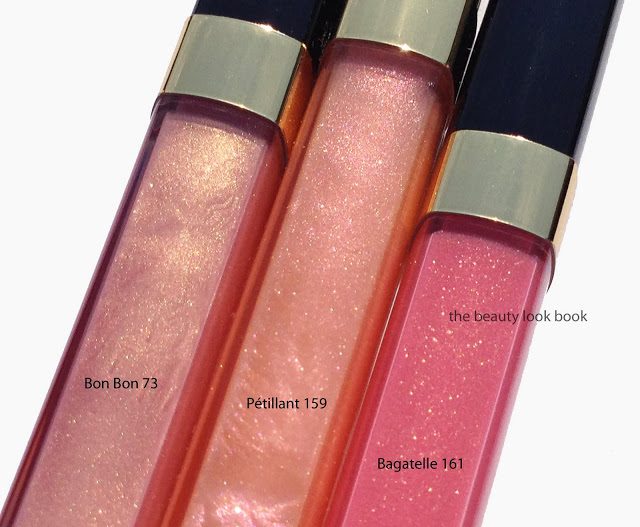
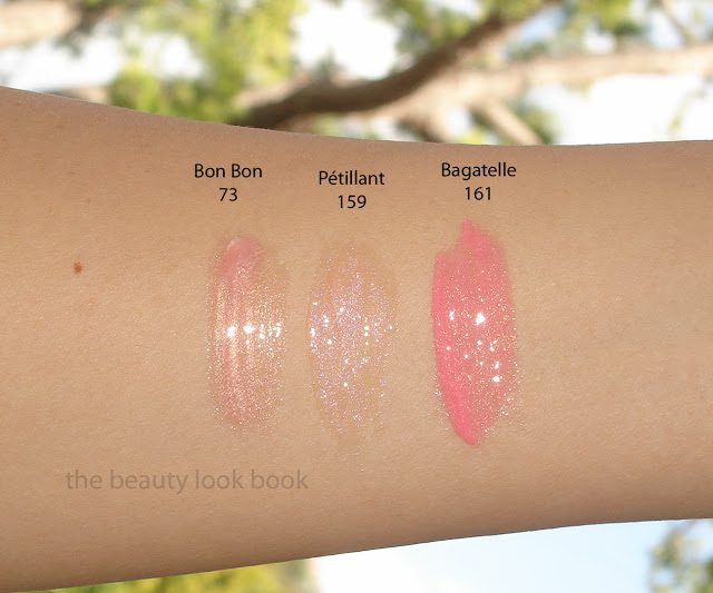
I have a weakness for Chanel Glossimers. The colors created by Chanel are always so gorgeous in the tubes with the prettiest shimmers and sparkles – they make my heart skip a beat. The newest colors for spring are Bon Bon 73, Pétillant 159 & Bagatelle 161. All the shades are light and shimmery but unfortunately not unique. I still love the newest items from spring but the colors are fairly sheer and seem like lazy rehashed from seasons past. Note my weakness overcame me and I still caved.
The colors:

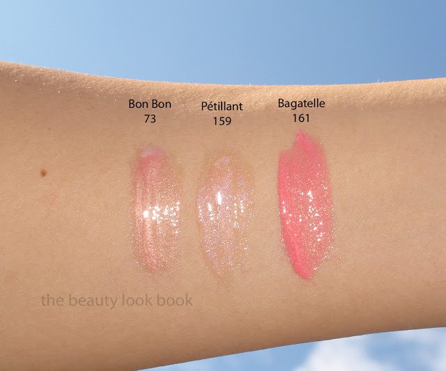
Bon Bon 73 is a pale pearly pink gold. It’s one of those luminous glowy glosses without glittery specks. The shimmer is very smooth and almost milky. Back in 2008, Chanel released a series of Aqualumiere Glosses, one was also called Bon Bon. I don’t have it anymore since used it up, but from my memory, the new Bon Bon Glossimer seems identical to what Bon Bon Aqualumiere Gloss looked like. It’s a paler version of Sundress. The color is very sheer and goes on clear on my lips. I suspect it will be best used as a layering color over a pigmented lipstick.
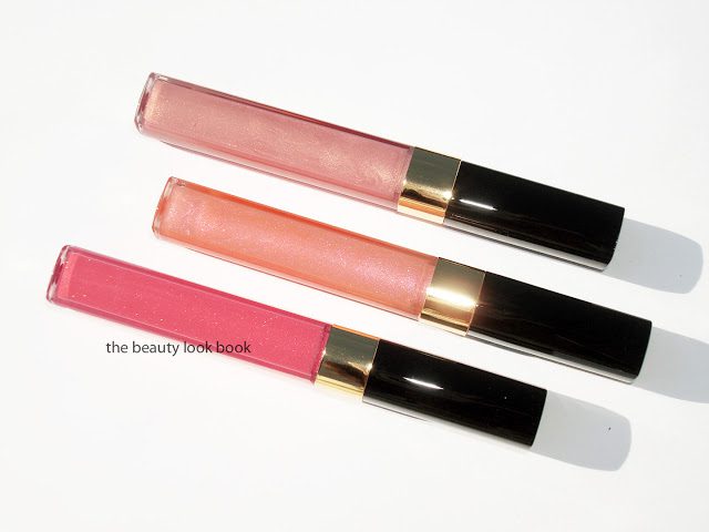
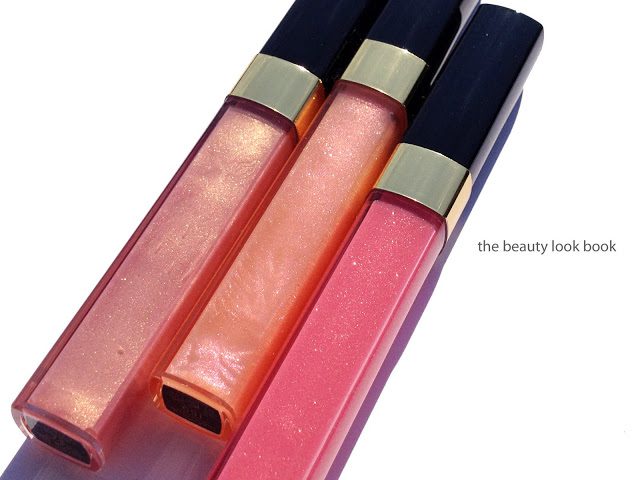
Pétillant 159 is a soft luminous peachy glow with an iridescent pinkish shimmer. On the hands and lips it goes on more of a clear pinkish shimmer for me. Odd right? I attribute this to the sheer silvery pale sparkles that show up more than the sheer peachy base. Do check out Best Things in Beauty for swatches in different light and skintone. I agree with her that I also could have skipped this too – it’s so sheer on me even the sparkles barely show up.

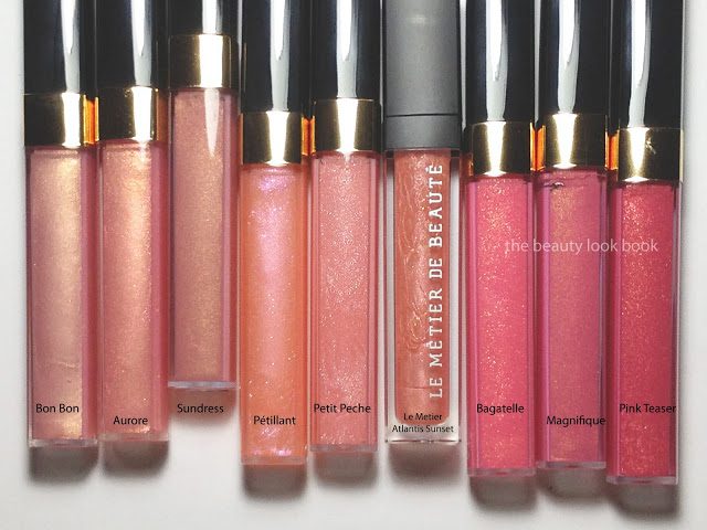
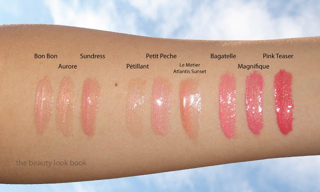
Bagatelle 161 is the most pigmented gloss in the collection. It’s a beautiful fresh salmon pink with gold shimmers. I found it to be a lighter fresher version of Magnifique. Years ago Chanel also released a color called Pink Oyster. I no longer have that either (used up) but Bagatelle reminds me of Pink Oyster. Scroll down to the bottom for comparisons. It’s more pigmented so this shows up on my lips but it’s still rather natural.

More close ups:

Comparisons below to other Chanels and one Le Metier gloss. The photo of the actual product was taken with my iPhone. I couldn’t get a decent shot with outdoor lighting – the sunlight and flash blurred all the pinks and corals together.

Have you seen the spring collection in person yet? What were your thoughts of the glossimers? I didn’t lip swatch them for this blog since they were so sheer it didn’t seem worth trying to post here. Thank you everyone for your patience as I slowly work my way through Chanel’s spring collection. November and December have proved to be very challenging months for me in my non-blogging life. The good thing with this collection is that Chanel scheduled the release very early this year so most of you have probably had the chance to go to the counters to play.
If you’ve seen the collection in person I’d love to hear your thoughts 🙂 Or even if you haven’t I’d love to hear your first impressions based on what you’ve seen online or read about.
Uncategorized

Chanel Éclosion Quadra Eyeshadow

December 14, 2011

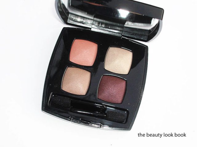
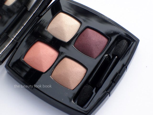
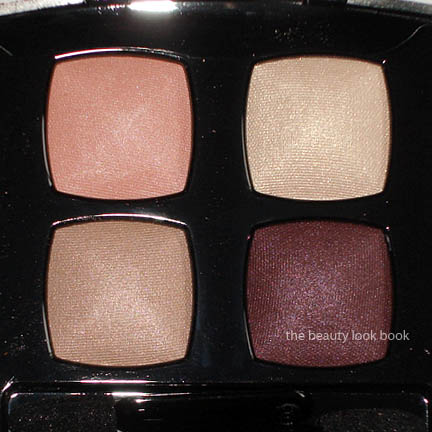
Chanel Éclosion Quadra Eyeshadow ($57 for 6.8 g/0.24 oz) is the a beautiful warm-neutral palette for spring. The shades have a beautiful refined shimmer – each color has a slightly different variation of sparkle. The colors are on the warmer side but not overly so. From the top left clockwise you have:
  • Soft satiny glowy pale peach
  • Sheer sparkly gold with slightly larger shimmer flecks
  • Rich shimmery reddish plum brown
  • Sandy gold-beige with a slightly multidimensional iridescent glow
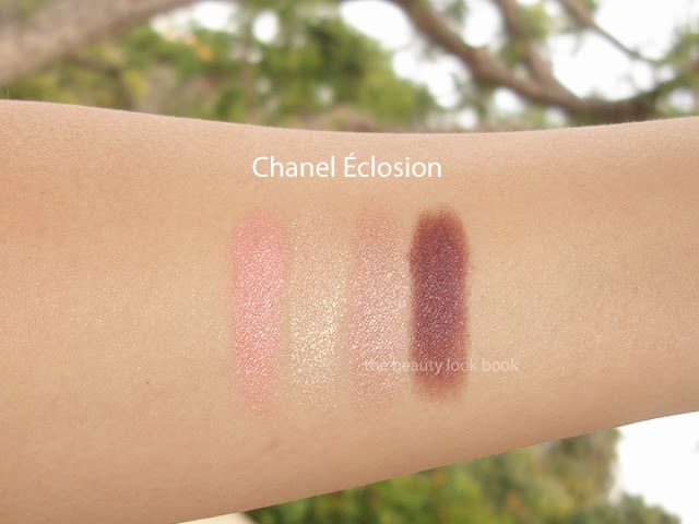
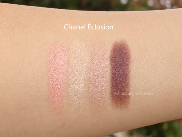
I applied this on the eyes from darkest to lightest in a layering method and it created a soft but defined glowy eye look. The overall effect was very warm with the plummy brown shade. It has gorgeous reddish tones without being too red. It works perfectly with the Blush Horizon de Chanel. Here are a few more shots and swatches, first without flash:

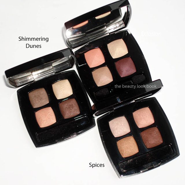
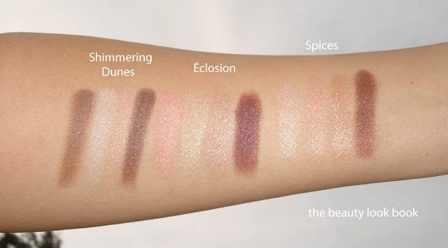
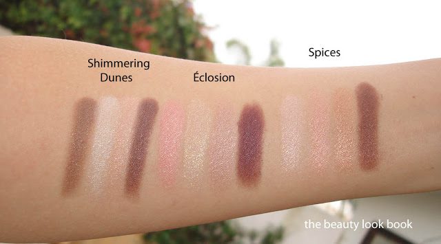
There is something familiar about Éclosion but I couldn’t find a dupe. Perhaps it’s just that I find each shade resembles something similar to other separate quads. Here it is compared to Shimmering Dunes and Spices:

Swatch comparisons below. A side note: for some reasons my swatches look more shimmery/frosty in the photos than these quads look in real life.

Bottom line worth every penny. It’s classic, flawless and stunning.