Browsing Tag

Spring 2012

Uncategorized

Laura Mercier Très Chic Nail Lacquers for Spring 2012

February 8, 2012
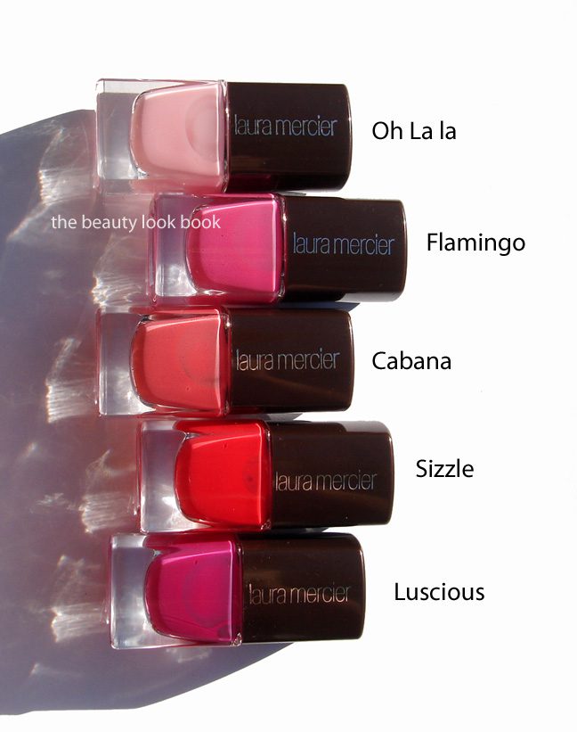
Laura Mercier’s new nail polishes from her Très Chic Collection this spring are the perfect mixture of bright and colorful but manage to be soft enough to be appropriate for work. I have a couple nail polishes from past limited collections and wish she would introduce a permanent line (or sprinkle a few more releases here and there for nails). There are 5 new shades for spring, all limited edition and $18 each. The colors come in a square bottle and a perfectly sized brush that is slightly flattened/wide for easy application.

The colors are all creams without shimmer:

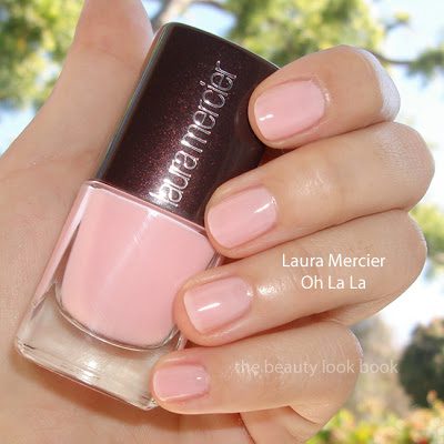
  • Oh La La is a soft pastel pink (sheer)
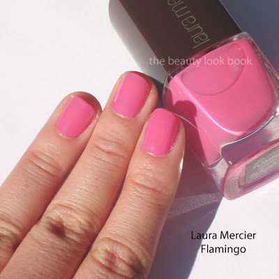
  • Flamingo is a bright pink
  • Cabana is coral-peach perfection with a soft cushy finish
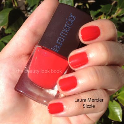
  • Sizzle is a hot coral red
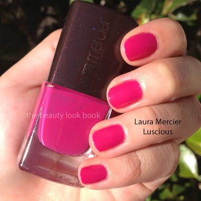
  • Luscious is a bright fuschia purple

The colors are bright and punchy and I love each of them. I could have passed on Oh La La which is the weakest shade, but I find sheer pale pinks weak in general. There are slight streaking problems with this color but evens out with 2 thick coats. The other shades have a decent formula which applies smoothly with 2 coats. I found Laura Mercier’s applied best over Deborah Lippmann’s Moisturizing Base Coat (thanks to Café Makeup for the recommendation, read her review here). I haven’t worn any for an extended period of time (over 2 days) but so far, the results are good. I’m still partial to the formula of OPI, Chanel, Dior and Rescue Beauty Lounge when it comes to nail polish formula, but the Laura Mercier comes quite close. With the proper base coat and a good glossy top coat, the result is smooth, rich and all out gorgeous.

Here are the shades swatched individually, 2 coats each over Deborah Lippmann’s Base Coat, but with no top coat:

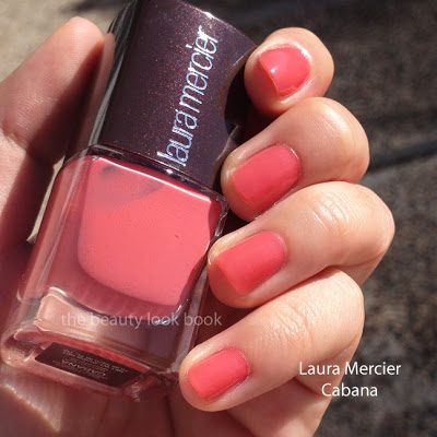
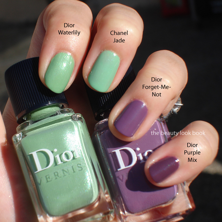
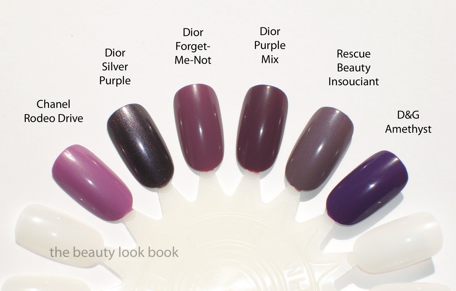
Comparisons were difficult to photograph because from my digital camera and iPhone, some of the brights look identical although in person there are distinct differences. As you might suspect with classic brights, there are definitely dupes out there. I personally liked Cabana the best as the perfect soft but bright peachy shade, although there are similar colors, Cabana has the right mixture of softness to prevent it from being too harsh or orangey. As you can see below, there are similar shades, but I really love each of the new ones from LM.

If you’re on a budget, I’m sure there are many OPI shades that will give you a similar effect. I’m personally looking forward to seeing the Holland Collection once it’s launched at Ulta. Still the Laura Mercier shades manage to look classic and polished for brights without looking cheap like some bright shades can.

My top 2 picks: Cabana and Luscious.

Uncategorized

Dior 5-Colour Eyeshadow in Royal Kaki 454

January 29, 2012

Dior Royal Kaki 454 is another quint that has been released as part of Dior’s New Look Collection. I purchased this sight unseen hoping it wouldn’t be too cool-toned. Some websites show this labeled as “Royal Khaki” but I looked at the compact, and it’s named “Royal Kaki.” The colors in the quint on my skin:

  • Sharp shimmery cool white
  • Yellow-tinged gold shimmer with slight olive tones
  • Khaki green (army green) matte with small flecks of sparkle
  • Matte black (applies a bit satiny, but leans more matte)
  • Cool gunmetal silver shimmer

In the compact, the combination of colors is beautiful, but odd. The white and black and khaki green are a bit harsh in my opinion making this quint a bit tricky to pull off. So far I’ve tried this 2 ways:

  • Method 1: Use the left shades + middle, gold shimmer + khaki green + black, I found this to work ok, but the gold in this quint plus the khaki are a bit too green for my olive skin and make my eyes look a bit tired.
  • Method 2: Use the right shades + middle, the white is too sharp for my medium skin, even when the other colors are layered on top.
More close ups and swatches below:

Right now I’m undecided about this one. I prefer Dior’s Smoky Khaki trio (reviewed here) by far, even though it has a khaki/greenish tinge, I find the trio easier to pull off than the new Royal Kaki Quint. I am scheduled to attend a Dior event soon at my local Nordstrom. Perhaps I will ask for tips on how to apply this, although I’m not sure that this will be one that is workable for my medium olive skintone. Lesson learned to wait for Dior items to arrive in store to try before buying. With so many successes with Dior I thought I would be safe!

Have you purchased/tried Royal Kaki? Did it work for you? Whether it did or did not, please share your thoughts and skintone.

A special note: Many have brought to my attention that the Numbers/Names on Sephora.com do not match my reviews and asked that I double check my labeling. I’ve added photos of the backs of my quints to show the corresponding number and name and believe I have them correct in each post, at least based on the packaging labels. At this time I believe that Sephora.com has the incorrect labeling but if you plan on only ordering 1, I suggest you contact their Customer Service if you’re at all unsure. Since I ordered both I figured I’d find out which was which once I received my package. As labeled on my quints:

Uncategorized

Dior 5-Colour Eyeshadow in Grège 734

January 29, 2012

Dior Grège 734 is a stunning soft satiny neutral quint. I think this is a must-have for any neutral lover, especially if you’re a fan of Dior eyeshadows. I found mine online at Sephora.com ($59 for 6 g/ 0.21 oz, made in France). It has a soft earthy feel with a mixture of shimmer and satiny shades. I personally find the combination of the colors unique, descriptions of each shade:
  • Soft warm tan camel brown (slight shimmer, satiny finish)
  • Pale greyed white frost (higher shimmer)
  • Pale mauve grey cream shimmer (high shimmer, but not frost)
  • Muted brown grey with mauvey tones (more matte, slight satin finish)
  • Shimmery blue grey with mauve tinge (shimmery)

Update: someone requested I confirm that I have the numbers of the quints correct b/c there is an inconsistency online at Sephora.com, here is the back of Grège to show the number is in fact 734:

The texture is similar to that of the Mitzah quint: soft, blendable with a soft shimmer finish. There is apparent shimmer in the compact, on the eyes it translates into a softer satiny look. The shimmer gives a subtle glow. The colors are layerable and easy to blend.

Swatches applied with a brush (I find that these apply better with a brush versus the sponge applicators that come in the compact):

I often find it difficult to wear all 5 shades at once with Dior quints but I do not think they are designed to all be worn at once. If you read the little pamphlets that come with the boxes you will find that Dior has helpful diagrams and tips. Dior suggests several different methods. One is to use any 3 shades that are touching, whether it is diagonal, the top + middle, or sides + middle. Pardon the poor quality of the snapshot, but the paper is so thin, scanning shows both sides of the ink. Hopefully these diagrams will help you if you haven’t seen them before.

How does this compare to other palettes? I’m sure individually you could find similar shades, but palette-wise, I found Grège to be unique. I didn’t look for dupes this time but I did pull Chanel Stupendous and the classic Dior Incognito (older version) to compare. Grège is an amped-up version of Incognito. While Grège is soft, the contrast of the colors in this palette are sharper than Incognito making it easier to wear (in my opinion). I only swatched the diors side by side.

Grège 734 is a lovely wearable neutral. Today I managed to wear all 5 shades on the eyes by layering them, medium tan shade first, soft lighter colors on top to blend the edges, then darkest shades along lash line and outer corners blended. I can easily see myself wearing this on a regular basis for everyday. For a base I used a combination of Urban Decay’s Primer Potion and Laura Mercier’s Metallic Cream Shadow in Platinum. It lasted all afternoon. I give it a big thumbs up.
The Dior New Look Collection is already out online at Sephora and also should be in store at Nordstrom now.
Uncategorized

Dior New Look Collection 5-Colour Eyeshadows: Grège 734 and Royal Kaki 454

January 29, 2012

Dior’s latest release is a New Look Collection which includes a new formula of DiorShow Mascara and four new quints. If you don’t follow Rouge Deluxe already, I highly recommend you do. I found out about this upcoming release on her blog. My love for shimmery neutrals is still going strong and I ordered the neutral options in Grège 734 and Royal Kaki 454 from Sephora.com last week (gotta love their samples and super fast shipping). Here is a quick peek at both palettes side by side. A detailed post with better swatches on each quint to follow.

Uncategorized

Bobbi Brown Shimmer Bricks in Wild Rose and Rose Gold

January 24, 2012

Bobbi Brown has released two new limited-edition Shimmer Bricks in Wild Rose and Rose Gold ($39 each for .4 oz/10.3 g, hand made in Italy). I first saw the preview on Rouge Deluxe and having a weakness for all things shimmery, immediately ordered these once they arrived on Nordstrom.com. Wild Rose is a soft pinkish rose with high shimmer (on the left) and Rose Gold is a shimmery beige warm pink gold (on the right). Bobbi Brown’s Shimmer Bricks can be extremely shimmery and are easy to overdo because they are rich in pigment. I apply with a very light hand and a super fluffy brush in soft layers to avoid that overly-frosted finish. Below are a few shots in direct sunlight where you can see the complex shimmery glow.

Wild Rose is a stunner. It’s a romantic palette of shimmery roses and pinks. I tried swatching each color individually but with the high frost and flash, they all looked the same swatched on my arm. It pulls a bit warmer and darker than Bobbi Brown’s Rose Shimmer Brick (which has pale white strips). After swiping on my fingers and arms I was really worried it would be way too frosty. Today I applied this over NARS G-Spot Multiple and MAC Golden Bronzer as a pink highlight. I was pleasantly surprised how the shimmer softened after the skin warmed up.

Rose Gold is a soft pale rose gold with strips of soft iridescent peach, sandy beige, rose and seashell pinks. Sometimes I feel like designers and artists create rose golds to be extremely rich and almost coppery-like. This Rose Gold Shimmer Brick is a pleasant surprise to be softer and more flesh toned with a hint of rose and gold mixed together. This is lovely as a highlighter. Do not let the swatches below deter you. I would caution you do use with a lighter hand though. I like Bobbi Brown’s blender brushes or MAC’s skunk brushes to apply.

A BIG DISCLAIMER: these were swatched with a very heavy hand. I’m not sure they will be helpful at all because nobody really applies face products with this much intensity. At least not for everyday wear. Do check out reviews on other blogs to get a better idea if you can’t get to a counter to play in person.

A few comparisons for you:

Are these must-haves? As usual, I think it depends. Do you like shimmery pink highlighters? Then yes! If you’re one who doesn’t like any hint of frost then these might be too over the top for you. I do find Bobbi Brown’s Shimmer Bricks versatile though. To get that soft glow make sure you use a loose fluffy brush. Try to apply softly in layers by swiping the face in a large sweeping motion rather than packing on the color.

How do they compare to other shades? Swirled all together, I would say Wild Rose is close to Rose and Rose Gold is close to Pink Quartz. The difference is subtle, I’m not sure that it’s all that noticeable on the face, perhaps it depends on skintone. I personally am very pleased.

Uncategorized

Le Métier de Beauté Resort 2012: Jet Set Sheer Brilliance Glosses in HibisKiss and Orange Juiced

January 12, 2012

This spring Le Métier de Beauté and Ken Downing of Neiman Marcus have created bold and bright lip and cheek colors for Resort 2012 with their Jet Set Collection. There are two new Sheer Brilliance Glosses ($32 each) that come in two juicy shades: Orange Juiced, a hot golden orange glow, and HibisKiss, a sheer but bright fuschia red. Both come in that classic sheer Le Métier glow infused with subtle shimmer and have a high-shine finish. The colors look shockingly bright in the tubes but luckily for me, they apply on the lips with a sheer wash of color. More photos and swatches below.

Another view of the swatches plus the 2 shades mixed. I love mixing and layering Le Métier shades. The colors are layerable over other Le Métier lipsticks and work well over other brands too. Here you can see that HibisKiss dominates when you mix equal portions of both colors:

Extra close shot so you can see how fine/subtle the shimmer is in the tubes. They glow!

HibisKiss goes on a warm fuschia red, which is odd because I usually associate “fuschia” with blueish-cool tones. This one is more of a neutral red leaning slightly towards the warm side. It has a sophisticated subtle shimmery glow. I found it too bright for me alone. It is definitely outside of my comfort zone although it does photograph well. In real life/in person it’s a bit too bright for right now. Perhaps I will feel more comfortable with color once the weather warms up and once I get my tan back.

Oranged Juiced was a pleasant surprise for me. In the tube it’s a borderline neon golden orange. It looked extremely unflattering at first glance but the shimmer looked beautiful and having fallen in love with other LMdB glosses I tried it with an open mind. It swatched on the hand orange but on the lips it sheered out to give a soft warm golden glow. There are neon tones in this gloss so it doesn’t always photograph well with a digital camera. The photo below was the best I could get. Sometimes neon shades tend to look, well, extra-neon-like with a camera.

Overall beautiful high quality shades. Those who like an extra punch of color will fall in love. I personally feel it’s a bit too early in the year to be completely won over right now. Even with year-round perfect weather in Southern California I’m just starting to get into spring mode and I’m more into the softer shades right now for this time of year. I do think I will pull these out for more use in a few months, although Orange Juiced seems to be versatile enough for layering and warming up other colors. These days I’m lemming their oh-so-hard-to-find exclusives like their Blush Kaleidoscope and Jan’s Jewel Lip Creme hoping they will eventually make their appearance at all Le Métier counters (one can wish).

I highly recommend reviews by Best Things in Beauty and Messy Wands for extra thoughts, photos and swatches on the glosses. These lovely ladies also have reviews of the 3 new nail lacquers on their blogs as well (equally shocking and bold as the glosses, if not more).
Le Métier de Beauté’s Resort Jet Set Collection will be out this month exclusively at Neiman Marcus and Bergdorf Goodman and online at both retailers as well. Have you spotted these yet in store? What are your thoughts?
These were provided courtesy of Le Métier de Beauté for review.
Uncategorized

Dior Garden Party Spring 2012: Waterlily and Forget-Me-Not

January 9, 2012

Dior’s Spring Garden Party Collection has a romantic and youthful palette of greens, purples and pinks. This season Dior has released two rose-scented nail polishes for spring in Waterlily 504, a soft iridescent pale green shimmer and Forget-Me-Not 694, a lilac purple cream ($23 each). Both are limited edition.

Dior Waterlily 504 is a soft pastel mint green with subtle shimmer that is fun and youthful. The texture is slightly thicker than other Dior nail polishes I own, but still applies with smooth full coverage. I find Waterlily very similar to Chanel’s epic Jade, but the Dior is slightly more leaf-green while Chanel has a bit more mint. There is something oddly irresistible about a soft minty-green shimmer even though it is anything but office-appropriate (in my mind). I agree with Café Makeup that the finish is more satiny with the Dior for this particular shade. If you want the classic high-shine finish you will need a top coat. Below I’ve swatched Waterlily with 2 coats and no top coat:

Dior Forget-Me-Not 694 is a lilac purple cream with a very slight hint of silver microsparkle. It applies more like a cream and the shimmer is only detectable if you look at the bottles closely. Forget-Me-Not applies smoothly with 2 coats. It’s a lighter version of Dior’s Purple Mix.

I pulled my greens and purples to swatch comparisons. I picked the closest shades to finger swatch here:

A more comprehensive comparison set:

When the promotional photos came out of Dior’s Spring Collection, my initial thoughts were “pass.” The collection has some of the most exquisite detailing with the design and gorgeous spring-like colors, but everything seemed a bit too pastel for my taste. However as photos of the nail polishes popped up on blogs I could not resist. I wore Forget-Me-Not all week and it lasted quite well without any chipping. While this is a brighter non-neutral purple, I still felt comfortable wearing this to the office on the fingers. The rose scent is very subtle and only noticeable when I hold my fingers close to my nose. Here are a few other resources I recommend (not comprehensive but just a few of my favorites):
If you’re considering these at all I suggest you act fast since they are limited edition. My local Nordstrom only had one of each shade left in the store by the time I called. Did you pick anything up from Dior Spring? What were your thoughts?