Browsing Tag

Spring 2011

Uncategorized

Chanel Spring 2011 Continued – The Lips

December 23, 2010
For Chanel Spring 2011, I’ve reviewed my eye-makeup picks (here), the nail polishes (here) and featured a detailed review on Black Pearl (here). Up next are my lip picks, top to bottom: Peregrina Rouge Coco, Jersey Rose Rouge Coco, Cristal Rose Rouge Double Intensité, Aragonite Glossimer and Nakkar Glossimer.

*UPDATE* I’ve once again added more comparisons. See all the way at the bottom.


The colors are fresh and brightening and the options this spring are great for both neutral and bright-color lovers alike. I, of course, picked out the most neutrals. If you’re into brighter colors like Lancome Chris & Tell check out the 2 new Rouge Allures (which I passed on).

Swatched on bare skin:


The Rouge Cocos at first glance seemed like your basic and unoriginal pink and peach. Swatched on the hands they were pretty, but didn’t have that wow factor. Let me tell you – you MUST try these on the lips! They are just beautiful for spring. Jersey Rose is a bright healthy pink on the lips. Peregrina is a healthy but neutral coral. Both are neutral enough for my comfort yet have enough color to brighten the face. If you look at the tube close up you see the slightest sheen, almost shimmer! But on the lips, I don’t see any shimmer at all. I like them both layered with the sparkly glossimer, Aragonite, for a glistening shine. Here are close ups of both colors, plus lip swatches.


The glossimers are fun this spring. Nakkar is a warm reddish pinky-peachy color with gold flecks. For once Chanel has released a nice warm reddish color that isn’t orange or deep red. Yay! It sheers out so a bit but definitely shows color. On the lips I don’t really see the shimmer. Aragonite is a pretty sparkly clear multi-colored gloss. The micro sparkles are highly visible in this one, similar to MAC Dazzleglasses. It’s different from Galactic in the sense that Galactic flashes blue-opal, Aragonite is more neutral and less blue. There’s a new Rouge Double Intensite this spring in a color different than anything they’ve done before. Those familiar with Chanel’s Rouge Double probably expect a rich opaque thick flat color. Cristal Rose goes against all Rouge Double traditions in the sense that it’s light, shimmery and sheer. I’m not sure how I feel about this one, it’s so sheer it barely shows up on me, but it’s gorgeous in the tube.


I couldn’t get good lip swatches of the glossimers tonight, so the arm swatches will have to suffice.

Overall: LOVE! Healthy colors that are fresh and flattering to the skin in a natural way that brightens the complexion. Aragonite is an unexpected favorite because of it’s versatility. It’s great for layering over lipsticks without altering the color like some multi-colored sparkly glosses can do.

FYI, check out Amy’s reviews of the Chanel Spring lips on Café Makeup. She’s my Chanel twin but lighter in skintone! If you see my swatches and think “what?! they look off” check out her blog, she has amazing pics and great lip swatches on her daughter there, who is also lighter in complexion.

* UPDATE STARTS HERE *

Here are more comparisons to other Rouge Cocos and one other Glossimer. Note the differences are very subtle and hard to capture. The difference you see is mainly on the lips. The Spring 2011 colors are warmer in undertone.


Jersey Rose & Peregrina from Spring 2011
Chintz & Rose Dentelle from Fall 2010
Magnolia from Holiday 2010

* On the nails: Chanel Rouge Fatal (reviewed here & here)

In the tubes, Aragonite & Galactic look identical. On the hand/lips, the difference is subtle. Galactic flashes blue while Aragonite flashes more pink.


Uncategorized

Chanel Spring 2011: Ombres Perleés de Chanel, Regard Perlé & Gris Scintillant

December 19, 2010

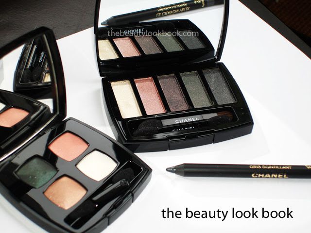
The palettes for eyes this spring from Chanel are beautiful. I’m glad the look for the Collection Les Perles de Chanel for Spring 2011 is lighter and less dramatic than what we saw on the runways (gorgeous but simply too dark and vampy for everyday wear). The theme this spring seems to be all about that pearl finish. The new items from the collection include:
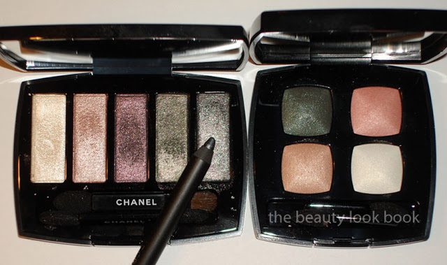
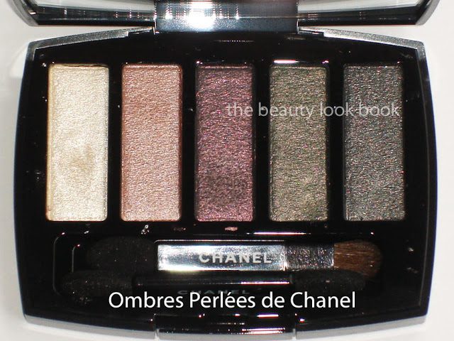
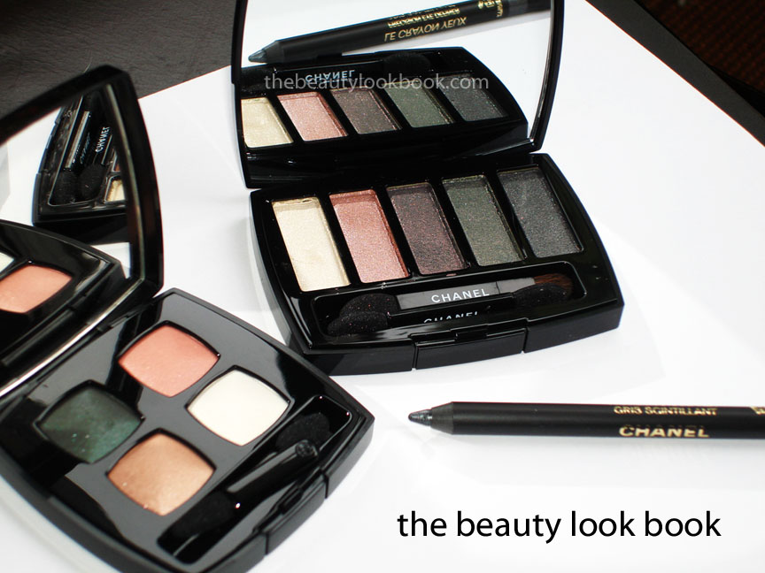
  • Ombres Perleés de Chanel Eyeshadow Palette – A beautiful palette of 5 high-shine pearl finish colors I would describe as white cream, pink shell, violet, seaweed and blueish-gray, all have a complex mixture of multi-colored shimmers. The texture is a soft almost creamy-like powder, but not quite cream. These are high-shimmer colors, I have to play around with this more, but I think this will work best when layered over regular shadows for a luminous effect.
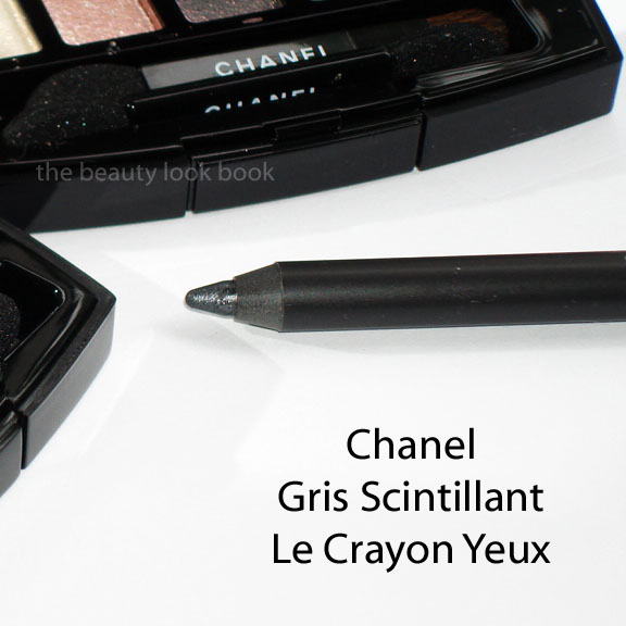
  • Gris Scintillant Precision Eye Definer – A sparkly cool grey with silver flecks that looks more blueish-purple on my skin rather than gray, this is probably the most sparkly eyeliner I own.
  • Regard Perlé Quadra Eye Shadow Palette – A soft buttery-textured combination of white-gold, peach, pink and forest green. All have a soft luminous shimmer quality (not frosty). The palette isn’t all that unique in the sense that you can probably find similar shades elsewhere, but Chanel always has a way of creating colors with a the most beautiful luxurious finish. It’s perfect for an everyday look. I can’t express my excitement that the US formula is back! To me this is a more wearable neutral version of Garden Party (from fall 2007) that I passed on.
More photos, swatches and comparisons below:

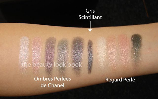
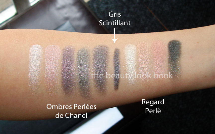
Swatched on bare skin, note these are a bit washed out, the pearl finishes had me cursing while photographing these. The colors are fairly accurate (at least on my screen), but they just aren’t as washed out as these appear below. I find the palette sheer, but buildable. Click to enlarge for better viewing of the shimmer particles, perhaps you’ll be able to see the complexity of the colors in a larger view.

With flash:

In natural light:

Details and close up of the Pearl Palette (if you have this, tell me how you’re wearing it!):

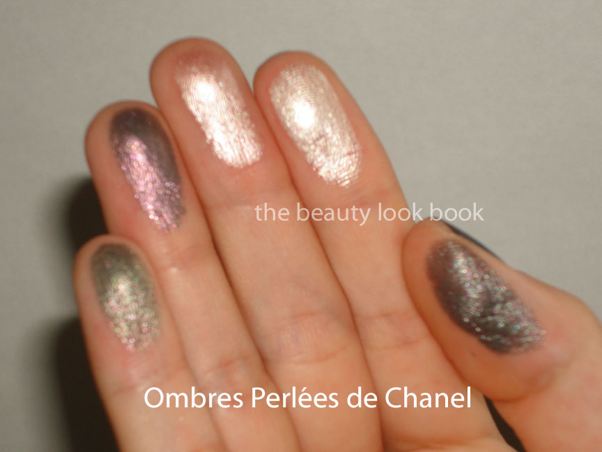
This is what the shades look like swatched on the fingers. Sorry for the blur, but the shimmer/pearls were difficult to photograph for some reason. I’m sure other bloggers will have better luck with their photos, I can’t wait to read other reviews. This shows how the pigment can be heavier with a high-frost finish when applied with a heavier hand, but can be blended out (like on the arm photos above) for a luminous glow.

Details of Regard Perlé Quad:


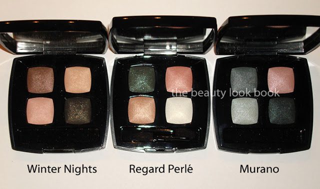
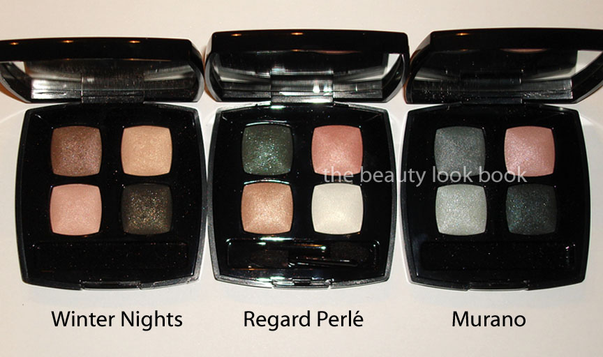
I couldn’t find a dupe, but some wanted to know how it compared to a few other quads by Chanel. I didn’t have time to swatch them, but the textures/finishes are typical of the usual Chanel quads: soft, silky smooth, medium pigment, soft shimmer, beautiful sparkle. Here is Regard Perlé next to Winter Nights and Murano. To me, the runway looks from the Spring 2011 show seemed more like Murano on the eyes rather than Regard Perlé.

Last, but not least, Gris Scintillant Precision Eye Definer. It’s beautiful with those silver flecks, but on the softer side. Those who like a more dramatic defined eye will probably find this too soft/sheer. I think it would be a beautiful cream shadow. Note that it pulls very blue on me. It might be more neutral/grey on you depending on your undertones.


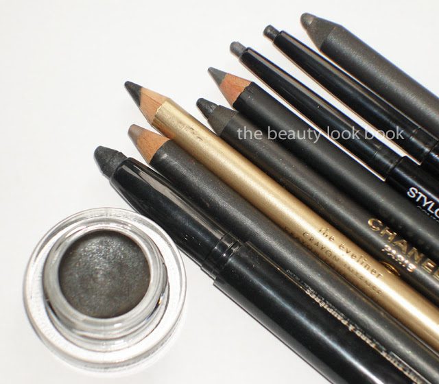
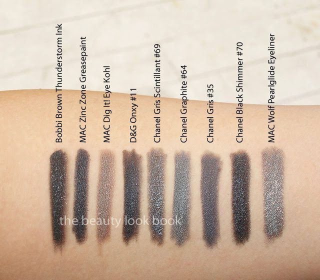
Eyeliner comparisons, L to R:

  • Bobbi Brown Thunderstorm Ink (reviewed here, Bloomies exclusive)
  • MAC Zinc Zone Greasepaint Stick
  • MAC Dig It! Eye Kohl
  • D&G Onxy #11 Eyeliner (reviewed here, D&G Fall 2010)
  • Chanel Gris Scintillant #69 Precision Eye Definer
  • Chanel Graphite #64 Intense Eye Pencil
  • Chanel Gris #35 Stylo Yeux (reviewed here)
  • Chanel Black Shimmer #70 Stylo Yeux
  • MAC Wolf Pearlglide Eyeliner


Overall thoughts: Beautiful, especially for our first look at spring. The Perleés de Chanel palette is the winner for me. The other two are items I adore but don’t know that others will share the same love as I do for soft wearable natural makeup. If you’re looking for a good everyday eyeshadow palette that isn’t your basic boring black or brown, then Regard Perlé is a great option. It has enough color to brighten the face without being too basic. However, those who prefer something more colorful will probably be let down a bit. I feel like the colors in this quad have been done before, yet when I searched my stash, I couldn’t find anything quite like it.

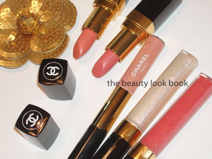
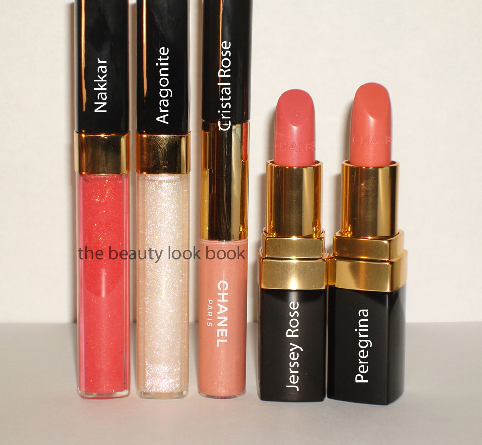
Chanel Spring 2011 is starting to trickle in stores. The first sightings were just a few days ago. I expect most counters in the US to have this within the next week. Cheeks and lips to be reviewed soon.

Uncategorized

A Closer Look at Chanel Black Pearl #513 Le Vernis

December 18, 2010

A few readers wanted to know how Chanel Black Pearl 513 compared to other shades such as Chanel Steel and NARS Full Metal Jacket. Due to differences on computer screens it may be hard to tell. I hope these close ups will give you a better idea of what this looks like. To me, Chanel Black Pearl is a dark greyed-teal shimmer. It has a pearly finish with a bit of silver veining which makes the color look different depending on what angle and lighting you see this in. I had my nails done today with this color and keep getting distracted by the pretty color. It’s a darker dramatic color, but the soft pearl gives it a soft glow that prevents it from being too sharp.

Balenciaga fans, if you’re familiar with the Anthracite colors you know how it’s evolved over the years with each new seasonal release. The first generation of Anthra was a murky dark greenish teal. (You can see all the variations from Anthra fans at The Purse Forum: Balenciaga Clubhouse.) I compared it to Lancome Pop Petrol back in February (see here). You can see Chanel Black Pearl is better matched to the 2007 Anthra Balenciaga. The Lancome is sharper, deeper and more contrasted in color.

Here is Chanel Black Pearl swatched next to my Balenciaga First – Anthracite from 2007

Next to my Ocean Le Creuset (if you think this is nuts, you’re not the only one, but I have limited teal in my house).

Close up from the side, looks a bit more blue-ish rather than greenish:


I already did some comparisons yesterday but here are more. I hope this helps you! On my screen, Chanel Black Pearl has that greenish sheen that NARS Full Metal Jacket and Chanel Steel lack.

NARS Full Metal Jacket, Chanel Steel, Chanel Black Pearl, Laura Mercier Caviar Dreams, Lancome Pop Petrol, OPI Cuckoo For This Color shown below

*UPDATE* I hope this doesn’t confuse you even more, but people keep asking for more comparisons! I dug up a review from the past that has Deborah Lippman’s Don’t Tell Mama, China Glaze Gussied Up Green and Hard Candy Envy and Laura Mercier Caviar Dreams. It was from last January (Color Focus: Teal Eyes & Nails Inspired by . . .) – I decided to do one last set of comparisons for you. I can’t believe how many greens I have. I didn’t think green was really my color.

Comparison Set #2 with China Glaze, Hard Candy & Deborah Lippmann


Bottom line: GET THE CHANEL BLACK PEARL. It’s unique. It’s gorgeous. It’s different enough to justify owning. There is no comparison.