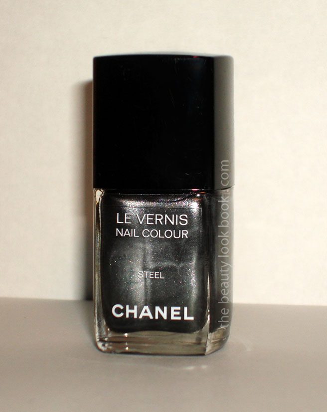
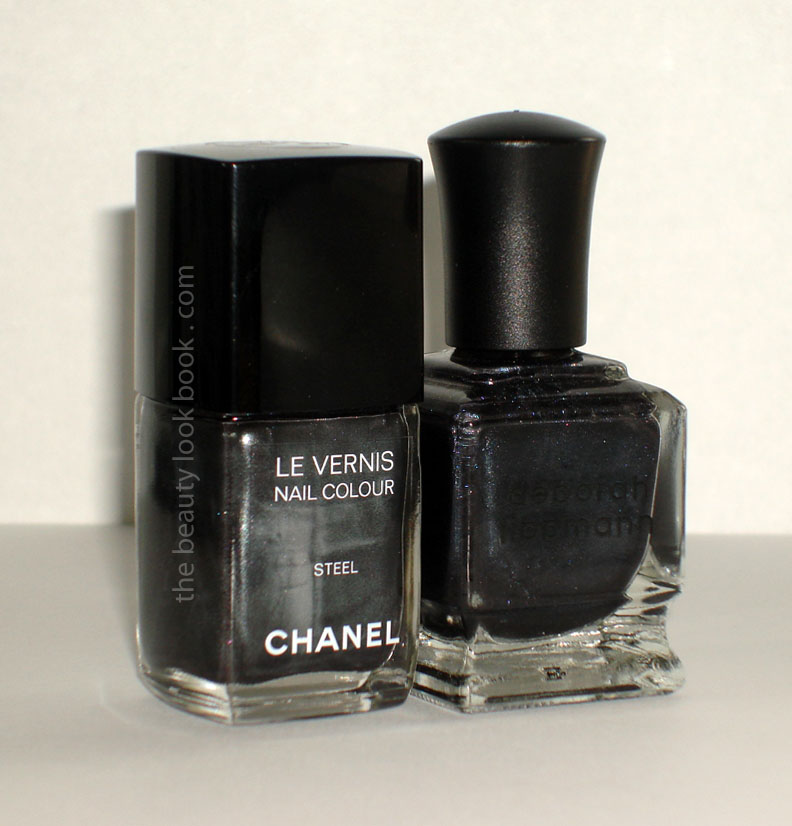
Might be a bit too early in the year for a dark manicure but Chanel Steel is one shade that I just couldn’t wait to put on. I swatched the Soho Le Vernis in Steel & Strong last week and decided to go with Steel first. I find these shades typical of certain shimmery Chanel Le Vernis shades like Jade Rose, Paradoxal, Vendetta etc. in that what you see in the bottle isn’t exactly what you get on the nails. In this case, what you see in the bottle is a deep grey laced with silver pearly streaks. What you get on the nails is more of a deep midnight steel blue-black.
Here are a few close up shots and further below it’s on a full manicure (2 coats although 1 would have been sufficient) in different lighting so you can see the full effect.
Outdoors, natural light, this is what it looks like with a bit of sun shining:
This is what you see without direct sunlight or flash:
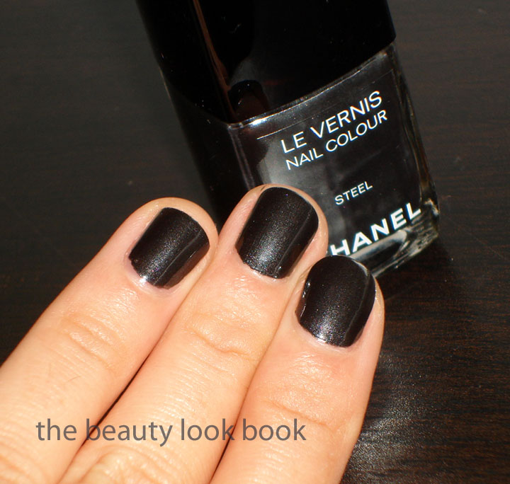
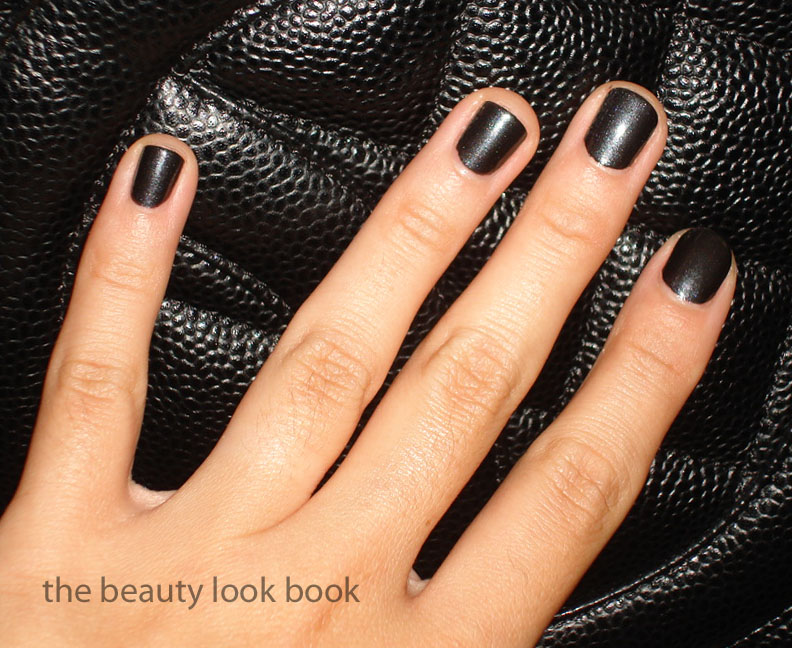
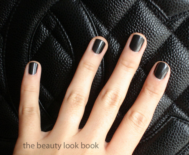
Photographed with high flash against Black Caviar Leather (you can see the blue sheen):
Also against Black Caviar Leather, but without direct flash (the color on the nails is dark but not a pure black):
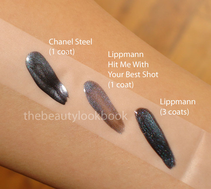
I compared it in my previous post to a few other shades, Chanel Noir Ceramic and Essie Over The Top (see last week’s post). In looking at my other colors again, I thought it might be similar to Lippmann’s Hit Me With Your Best Shot, but I find the quality of the Chanel superior as you only need 1 coat while for the other you need at least 3 to get a rich opaque finish. The Lippmann shade has a more steely-blue cast, but if you have this color and don’t mind applying more coats then I think they are similar enough that you don’t need the Chanel.
Chanel Steel vs. Lippmann Hit Me With Your Best Shot
Next to Bobbi Brown Black Sparkle – you can see the blueish tones:
It’s perfect for fall. Not too black and has a rich opaque finish (as you can see with just one coat swatched). I find it a tad thicker than most Chanel nail polishes (Strong as well) so you may want to adjust your application slightly with that in mind. Worth every penny.
The Chanel Soho Story Collection is one of the few collections where I have ended up loving every single item featured. I am happy the colors exceeded my expectations as I found the collection a slight headache to make sense of. Details about this release were extremely confusing with conflicting information on a number of websites. A few of us Chanel fans exchanged tweets, e-mails, texts and called stores all around the US to find out exactly when and where these would be available. We could only could confirm that the items would be available at the Soho Boutique on FNO and also on Chanel.com. I purchased mine from Chanel.com not wanting to miss out. Even today I am not 100% sure where else these would be released. It’s been rumored to be available at other boutiques around the country in October, but none of us have been able to confirm.
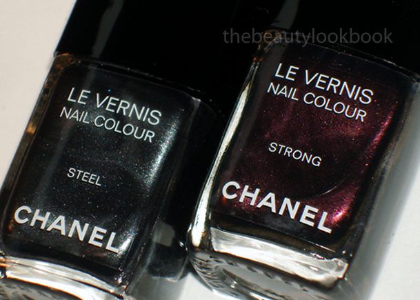
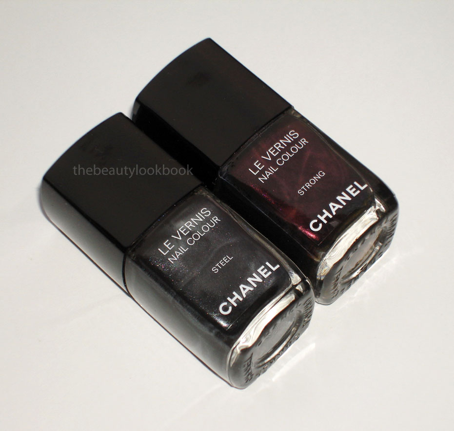
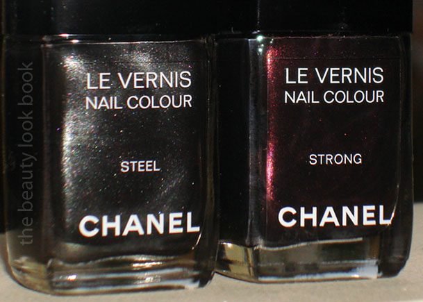
First up are the new Le Vernis shades, Steel and Strong.
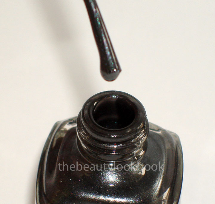
Steel is a beautiful dark grey steel pearl. It has a frost finish in the bottle but applies very smooth for a frost type color (no noticeable streaks). The texture is amazing and applies well with just one coat. I pulled out a few other shades I thought were similar: Chanel Noir Ceramic (d/c) and Essie Over The Top. You’ll notice how much sheerer the Essie is. The difference in color is slight. Chanel Noir Ceramic is the darkest and most black, also the silver sparkles are more visible. Chanel Steel is the middle shade, it’s got a slight blue cast (very slight) and is not completely black on the nails. Essie is the lightest but is very similar to Steel when you apply 3 thick coats.
One coat each shade:
Two coats with Chanels, three coats with Essie:
Strong is a dark vampy purple. Lovely as well, but much like Estelle (see her review on Karla Sugar)- I prefer Chanel’s Feu de Russie which has more visible red flecks, but they seem very similar from arm’s length. Here is Strong compared to FdR and Vendetta. Chanel Strong is one of those colors that pulls red in the bottle depending on the angle you hold it at. The flash brings out the reddish tones as well. However, it applies as a dark purple. Strong applies well with 2 coats but is slightly more thick than most of my other Chanels which makes this one a bit more difficult to apply smoothly. It’s not significantly different from other dark shades from Chanel, but I did notice a slightly goopy finish. This however doesn’t really affect the application too much if you get 2 thin coats.
Two coats each shade:
All the comparison shades:
One last view:
Beautiful and stunning. I personally prefer Steel over Strong but if you missed out on Feu de Russie, I definitely think Strong is the next closest thing.
Chanel has been on quite a roll with a number of product releases this summer and fall – so much so, I can barely keep up, but I like what I see so far. The Rouge Allure Extrait de Gloss collection is beautiful with a diverse range of pinks and reds – I think everyone can find at least one item to suit their coloring. The collection is both classic and modern at the same time. I’m not sure if these items have hit all counters yet. I got mine from Chanel.com and I believe Saks has an exclusive to release the collection first. If you haven’t seen these yet, they will probably be on counters soon.
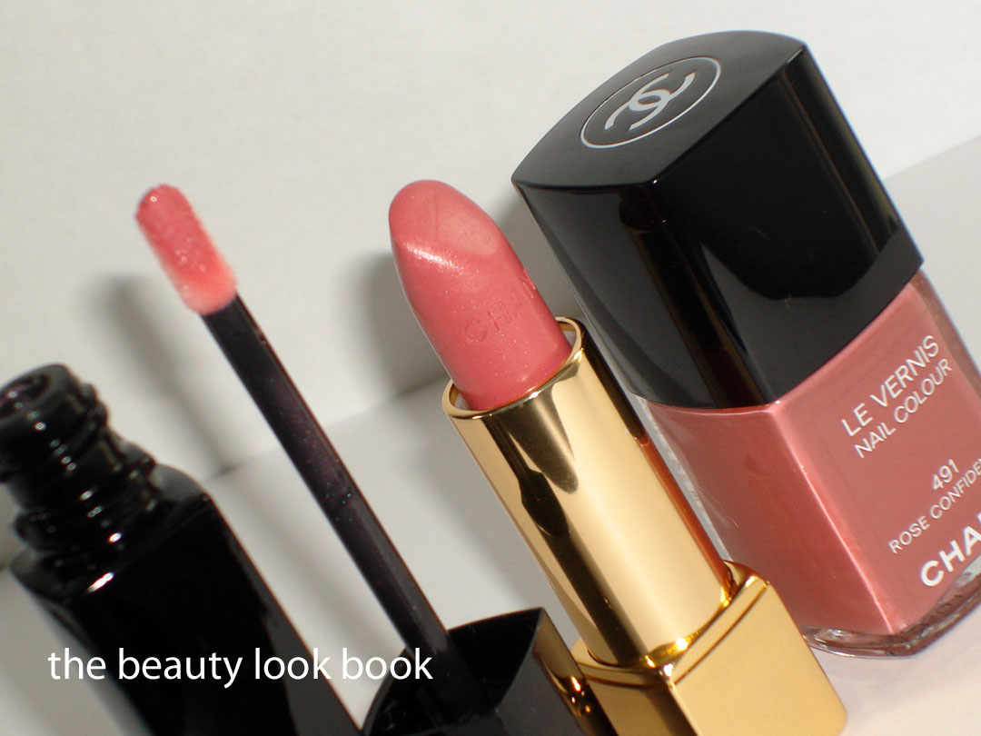
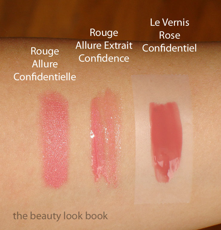
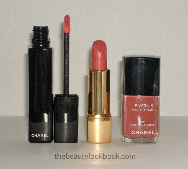
I knew I had to get all three Le Vernis shades even before I saw them in person. Amy from Café Makeup did an amazing preview of the glosses which helped me tremendously. While I was in San Francisco I went to Saks to see the whole set in person, bought a new rouge allure and another set of all three Le Vernis shades for my sister (she immediately applied Rose Insolent on her toes). My personal three favorites in the collection are of the same color theme. Each have similar names (which can be a bit confusing) and all are soft but noticeable pinks:
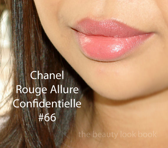
Rouge Allure Extrait de Gloss in Confidence #55 Rouge Allure in Confidentielle #66 Le Vernis in Rose Confidentiel #491
What I love about these pinks is that they are natural but with a slight kick. They aren’t your barely-there pinks. They have just the right amount of pigment, brightness and depth to be noticeable when applied yet are natural enough that you don’t have to worry about it being too bright. I do find that the lipgloss and lipstick brighten the face (read on below for more info).
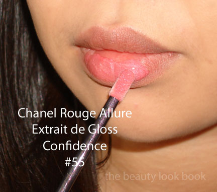
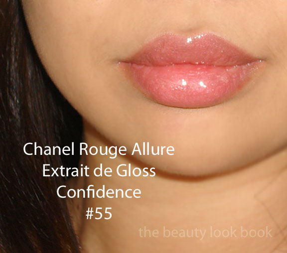
The Rouge Allure Extrait de Gloss in Confidence is a semi-sheer, semi-bright and semi-natural pink gloss with a slight iridescence. I find it applies with enough pigment to wear by itself even even though it’s slightly sheer. The Rouge Allure Extrait de Gloss is a new gloss formula with a similar packaging to the Rouge Allure Laques. The difference is that the RAEs have longer tubes, a sheerer and glossier finish and a new wedged shaped applicator. I would describe the pigment as being in between a glossimer and rouge allure laque. These are on the thick side, not exactly sticky but not slippery either – somewhere in between. I’m not a fan of the new applicator – I find the shape difficult to use as it is more flexible requiring more pressure to apply. Also applying straight from the tube will result in getting the tip discolored if you apply over a lipstick. I find it best to apply on the back of my hand and then apply the product on the lips with a brush. I will need to do more experimenting with these. I do like the finish but it feels a bit thick. I’m normally a lipgloss girl, but these days I feel more and more like just wearing a lipstick + liner without the gloss.
Applying to the bottom lip (so you can see the contrast between my natural lip color and the color of the gloss):
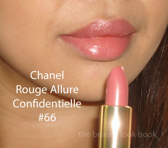
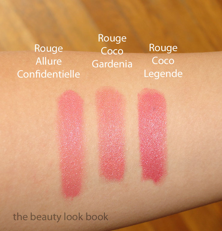
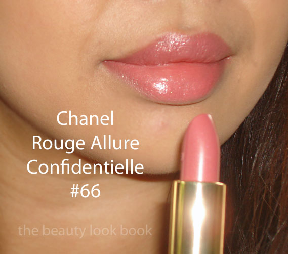
The Rouge Allure in Confidentielle is also a natural but brighter pink. It goes well with the gloss. It’s definitely brighter than what I normally wear. Creamy and smooth like all the Rouge Allure lipsticks with full coverage. Those wondering how it compares to other shades, I found it to be in between Rouge Coco in Gardenia and Legende. If you didn’t like Gardenia because of the shimmer or don’t like Legende because you found it too cool or if you don’t like the Rouge Coco formula, Confidentielle is the solution for you. Here it is swatched on my lips but blended with a lip brush for a softer finish.
* Note – I realize my lip swatch photos are odd because I always manage to angle the camera in a way that focuses on my hair rather than my lips, also my hair is black except when the sunlight shines on it (directly or indirectly) which is why you see the red in some shots. These are definitely a work in progress.
Note, these may all look the same on your screen. Legende is a mini sample that I have and the most blue-toned. I found it too cool for me and have not purchased it. Gardenia is more frosty. Confidentielle is in between the shades and the most creamy.
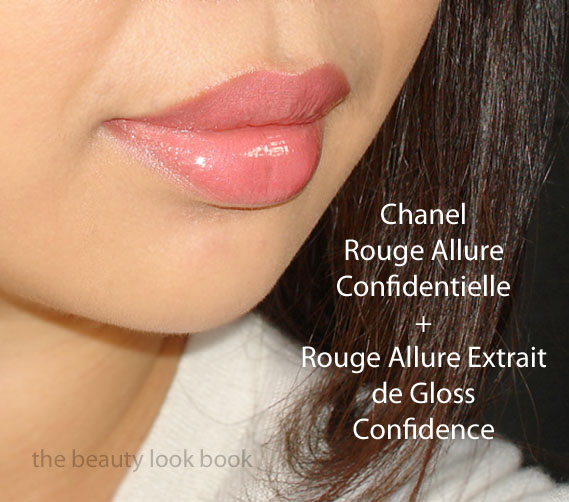
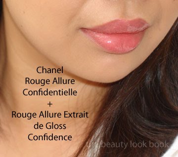
The Gloss in Confidence over the Lipstick in Confidentielle: Layering the two gets you a rich and luscious lip look. Almost too luscious for my taste. Perhaps more suitable for a date night. The result with both is really glossy and opaque. Right now I like these with only 1 applied at a time, although experimenting with less gloss will probably work better for me.
One more view:
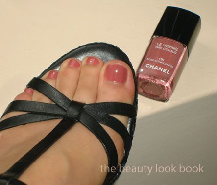
The new Le Vernis in Rose Confidentiel is another gorgeous classic rose pink shade. Smooth and rich in pigment, this applies very well with 2 coats. I wouldn’t say it matches Confidence and Confidentielle exactly, but it does go well with the colors. Compared to the lips, I would say the nail polish is less bright, a bit deeper, and more of a classic dusty rose. Great for fall and perfect for year round. I’ve reviewed it in my Rouge Fatal, Rose Insolent & Rose Confidentiel post here. I’ve also compared it to a couple other shades in my Chanel Les Khakis de Chanel post here. Here it is on a pedi, 2 coats.
One last view:
Hope everyone is enjoying the last bits of their weekend!
The highly anticipated Les Khakis de Chanel nail polishes for Fashion’s Night Out have finally arrived ($25 each). These are exclusive to select boutiques in the US so you won’t be seeing these at your local department store counters, unless they have a Chanel Studio that carries exclusives or imports collections. I’ve been anxious to see what these look like in real life as each swatch photo I’ve seen looks different. These are some other websites I’ve seen pictures on:
All the Khaki shades have a smooth cream finish with no detectable shimmer, even in the bottles. They apply with absolute perfection – creamy & opaque with 2 coats. The colors are so not me – but I still caved. Curiosity got the best of me because it’s Chanel. My descriptions:
Khaki Vert – forest khaki green cream (my favorite one)
Khaki Rose – warm brown taupe, there’s nothing “rose” about this once it’s on the fingers (only looks slightly pink next to Khaki Brun)
Khaki Brun – deep brownish green, resembles green pea soup
Outdoor lighting, no flash:
Four sets of swatches in different lighting, Khaki Rose looks slightly pinkish here only because it’s next to a green and a brown, but scroll down below for the comparison set to see how un-pink it really is. All with 2 coats, no base coat or top coat (hand swatched by me, so excuse the messy finish and unclean cuticles).
High flash and natural sunlight definitely bring out the color, but I find the above photos are more accurate.
From the promotional images I had wondered how these compared to existing shades. While I should have known what to expect with the khaki military colored theme – I kept thinking in my mind, “maybe they’ll be more wearable than they sound.” Right now I’m undecided. My favorite in the bunch is Khaki Vert. While the following comparisons are not exactly dupes, I hope they will give you a better idea of what the shades are like. I don’t own many medium browns or greens for nails.
Rescue Beauty Lounge Om, Chanel Rose Confidentiel (here too), Chanel Khaki Rose
* Funny how pink Rose Confidentiel looks next to the brown, when by itself, it’s not all that bright of a pink
*Update* Someone commented how close Particuliere looked to Khaki Rose. Upon reviewing my swatches/photos I saw how it might be misleading so I did another proper comparison set. Here is Particuliere v Khaki Rose v Khaki Brun. Interesting how Particuliere almost looks purple now.
Overall thoughts: I have gone way outside of my comfort zone in buying these colors. My favorite color in the trio is Khaki Vert. I normally think Chanel does it best with the nail colors, but in this case I much prefer RBL Diddy Mow to Khaki Vert. (I bought Diddy Mow because it looked so good on Cafe Makeup – see her swatch/review linked.)
I can definitely see myself wearing Khaki Vert and Khaki Rose. The Brun shade – I’m not sure. It has me going “hmmmmmm …” I think if I had seen and tried it in person myself I would not have purchased it. Still, I have to give kudos to Chanel – only they can manage to capture my attention and $$$ with these odd shades for the nails.
All shades purchased by me. These are available at select Chanel boutiques around the US and is rumored to be online starting 09/10/10 for Fashion’s Night Out.
Content is copyrighted, please do not republish without permission.
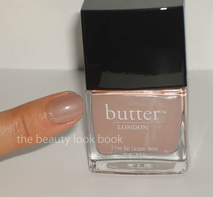
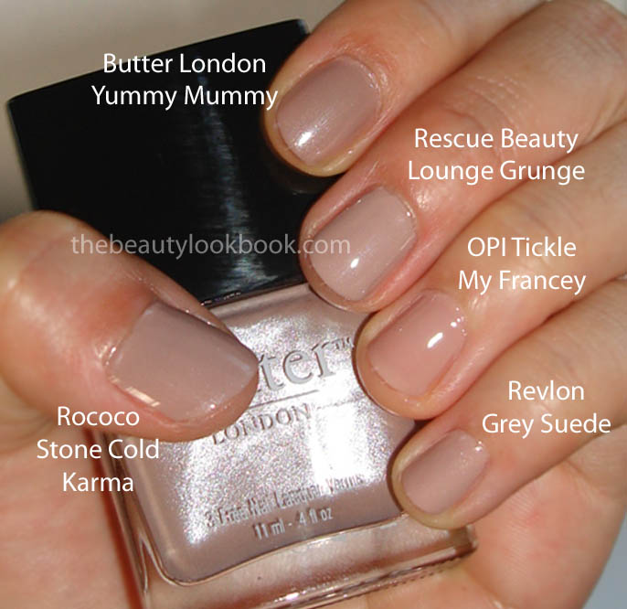
Butter London Yummy Mummy is described as a magical shade that flatters every skin color. It’s one of those shades I have been intrigued by for quite a while but have never really been able to figure out from online photos and reviews. Is it a beige? Nude? Nude-mauve? Brown? Taupe? I think that’s the “magic” of this color. It looks different in every review and swatch due to different skintones. In the bottle I would describe it as a greige beigey fawn with silver shimmer. On the nails the color is different depending on what angle I look at it. Sometimes it looks mauvey. Sometimes it looks like a nude beige tan. Other times it looks like a mushroom. It’s odd how it changes color depending on the light.
Overall it applies smoothly without streaks but I find it very sheer, much like Tea With the Queen that I reviewed a few days ago. I had to apply 3 coats to get it to show up, with each progressive coat thicker than the previous. It did dry pretty fast however which is a plus. It has the slightest bit of pearl to it which makes it so it’s not completely flat. It’s not really shimmery, but the shimmer is definitely more noticeable than that of Chanel Jade Rose or Paradoxal.
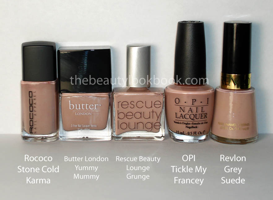
I pulled all the shades that I had envisioned as possibly being a dupe – this was BEFORE I actually purchased this shade. Then I pulled all the shades that were ACTUALLY in the same color family. As you can see in Set 1, my original estimates were completely off.
Comparison Set 1: What Sabrina thought were dupes
Comparison Set 2: Actual comparable shades
In terms of dupes none have the exact finish like Yummy Mummy. It’s most similar to Rococo Stone Cold Karma. RBL Grunge is similar – just paler and without shimmer. Revlon Grey Suede is similar from arm’s length but is more pinkish.
Butter London’s Tea With the Queen nail lacquer is neutral, understated and polished. Retails for $14 and described perfectly on ButterLondon.com as being “on the pink side of tan, very neutral.” It’s a sheer cream that applies smoothly without streaks. Being on the sheer side, it’s slightly transparent, but not so sheer that the color is invisible. The manicure below is with 2 coats. It’s like a tinted nude pink tan. It goes well my Pink Little Stam and matches my favorite flavor of Izze in Sparkling Grapefruit.
In natural outdoor light, no flash, it was slightly cloudy today:
Here it is with 3 coats versus 2 coats, the different is subtle but in real life it looks richer and more opaque with the extra coat:
Compared to a few other pink nudes, no swatches, but I do have swatches of Jade Rose and Inattendu on other posts. These all apply true to what you see in the bottle.
For the fall collections, Chanel seems to be releasing quite a few more products than usual with a series of mini collections focusing on eyes and lips. Seasonal collections are being released earlier and earlier each year. Perhaps the reason why they have launched a few mini collections to keep us Chanel fanatics satisfied once the real fall season comes around. Chanel had just released their Eyeshadow Duos only a few weeks ago (I ended up with Taupe-Délicat 20, Misty-Soft 40 and Gris 35) and now another collection has been released called Rouge Allure Extrait de Gloss which has a new lipgloss, new rouge allure lipsticks, rouge allure laque repromotes and three new nail polishes.
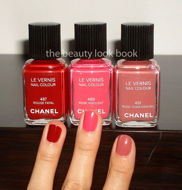
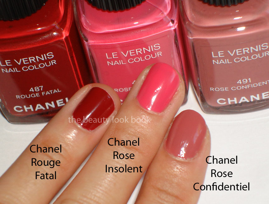
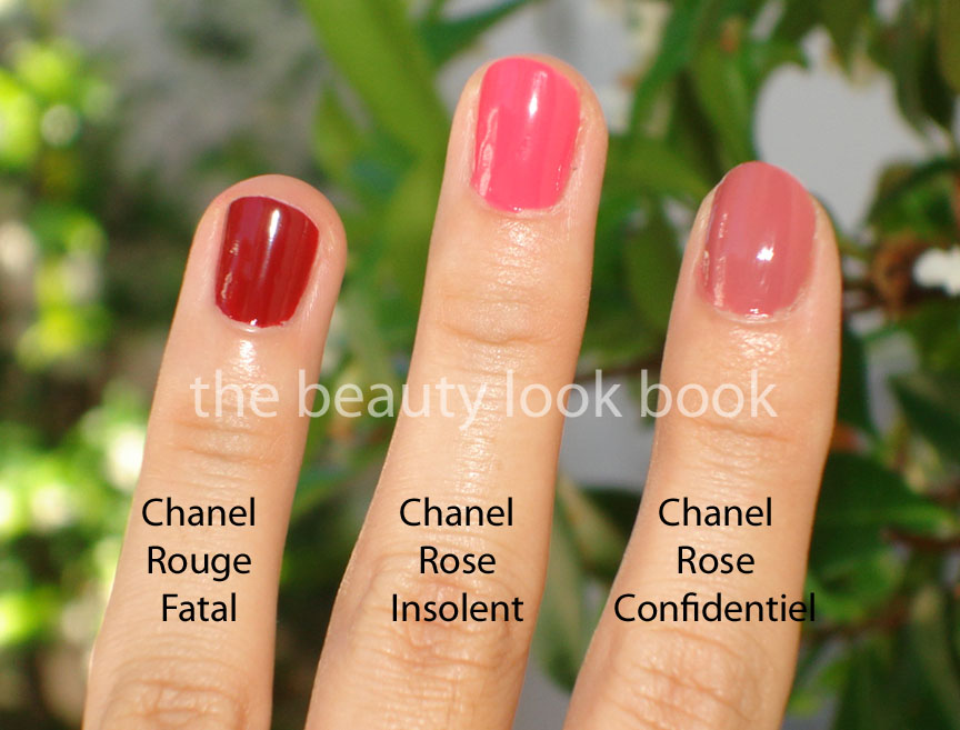
Amy from Café Makeup has done an amazing series of reviews on the Extrait de Gloss shades she picked out. Her reviews helped me immensely and I just received my package today. I have not yet had a chance to try out the glosses but I immediately dove into the new Le Vernis shades: Rouge Fatal 487, Rose Insolent 489 and Rose Confidentiel 491.
All classic colors, cream finish, rich in pigment, insanely gorgeous:
Rouge Fatal – dark burgandy red
Rose Insolent – vibrant candy pink
Rose Confidentiel – nude rose-brown-caramel-like pink
The swatches, descriptions, comparisons, more swatches and thoughts (swatched with 2 coats, no base coat or top coat added):
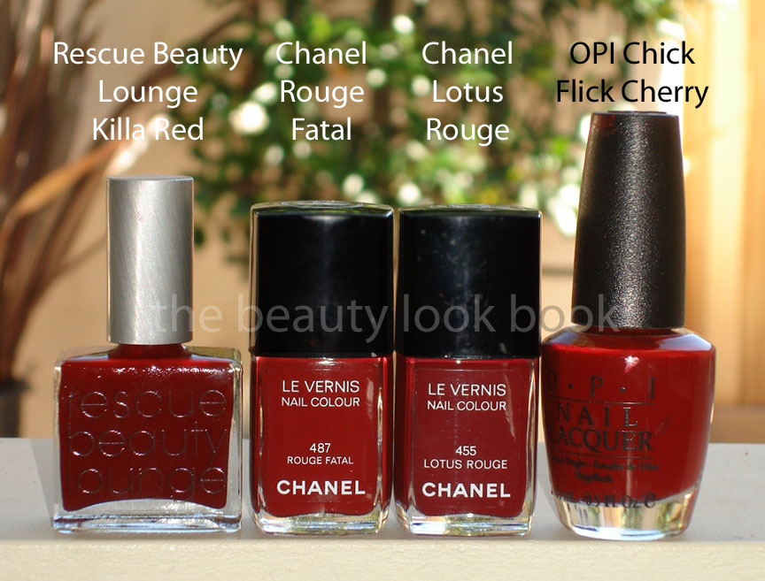
Rouge Fatal 487 is a deep burgandy vampy wine red. Chanel always does an amazing job with their reds and I was the most curious about this. I pulled out some similar shades and the closest ones I could find were Rescue Beauty Lounge Killa Red, Chanel Lotus Rouge and OPI Chick Flick Cherry. Note it was extremely difficult to capture the difference between these with the camera, so I will supplement with my descriptions. They are all indeed very similar here is how they differ:
RBL Killa Red – more of a true red, brighter
Chanel Rouge Fatal – most brownish
Chanel Lotus Rouge – my Holy Grail burgandy red, this is similar, but has more blue, no brown tones
OPI Chick Flick Cherry – brighter, redder, more like a cross between a cherry/red apple
* Please read the descriptions rather than going off my swatches for Rouge Fatal, the swatches are deceivingly similar
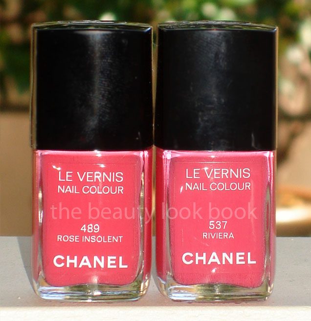
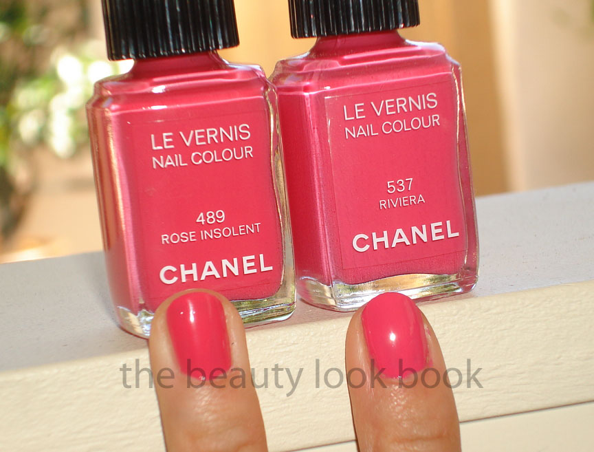
Rose Insolent 489 is a bright pink with warm fuschia tones. Those who missed out on Riviera from the summer collection will be happy to know this one is virtually identical to Riviera (see my review on Riviera here and here). I have to say their pick for Rose Insolent is odd for fall, even more odd that they released one so similar to a previous collection. The difference is that Rose Insolent is warmer and a bit deeper – but it’s very very slight.
Rose Confidentiel 491 is a brown rose caramel pink. On the boring side in the bottle, but I think this one is my favorite out of the 3 shades. I don’t have anything like it in my stash – often times these brown-nude-pinks tend to look like mud with my skintone. This one is a pretty neutral which is definitely office/work appropriate. I’m thinking it might be similar to Rescue Beauty Lounge Om (which I don’t have yet) but more pink, perhaps more neutral?
(No dupe from my end)
Other thoughts: Someone e-mailed me asking if I noticed a difference in the formula for Chanel’s darker newer shades. She had mentioned that hers seemed goopy and thick which did not apply well. She thought it might be her base coat. I did not have a good answer for her because I have not noticed a difference, but then I usually don’t do my own manicures. Today with the swatching, I noticed a few goopy-clumping issues with all my reds (Chanel, RBL and OPI) which I attribute to the following (after a few tries):
One is that you might not have enough varnish on your brush, if you have too little, you won’t get a good coat, but then you don’t want too much
The other is that, it’s possible you’re not letting your first coat dry long enough
The formula is definitely still superb. If you’re having application troubles, it might be your application technique. If the first coat isn’t perfect, it’s ok, the second coat should smooth things out as long as the first coat is dry enough and you have enough product on your brush. (Disclaimer – I’m not an expert at application, this is just what I noticed while swatching my nail polishes today.)
Overall thoughts: The formula and application of these are typical of Chanel in my opinion. The shades aren’t the most unique and I know there are definitely dupes in other lines in addition to what I have posted. If you missed out on Riviera you will be excited about Rose Insolent. Unless you’re a die-hard Chanel fan or don’t have a lot of nail polishes in your stash, you might be left wanting more with these. I personally would have loved some shimmer, a little more kick, or something more unique – but I have 3 more weeks of freedom until it’s back to the grind, so at least I know I have some non-nude colors that I can wear to work and not feel self-conscious or out of place. On another note, Chanel does a wonderful job on the classic shades – these are perfect in true Chanel style (even if I was hoping for something a bit more unique).
I think they are worth every penny.
I don’t think these have hit stores or counters yet since the duos were just launched. I ordered mine from Chanel.com. These currently retail for $23 each in the US.


