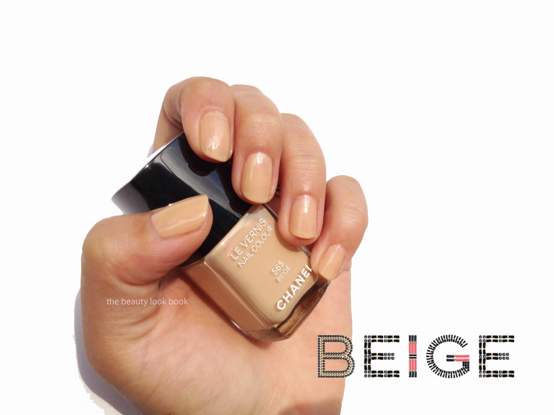
Here are some finger swatches of Chanel Beige #565. Two coats achieve a semi-transparent finish. The results from application (myself and professionally) were both a bit uneven. I personally think the coverage could be more even with three coats instead. It’s clearly a beige tinged with yellow undertones. The pearly pink flashes prevent this from looking sallow on my hands. Depending on the light sometimes I love it, other times I’m meh. It’s a nice-to-have shade, but not a must-have. It is indeed unique in my collection of neutrals and beiges though. Someone in the prior post asked if this was a repeat/repromoted shade. I believe this is new, but I’m not 100% sure. I do know early when I started noticing Chanel (in the mid-90s) that there were several variations of a “beige” shade. Le Beige, Natural Beige, Beige de Chanel or something along those lines seem familiar names, but I don’t believe any of them had any iridescent quality.
Chanel.com’s exclusive Le Vernis shade in Beige 565 just arrived yesterday ($26 each). Here’s a quick look at the color plus comparisons. I couldn’t get good nail swatch photos before the sun went down. Hopefully I’ll be able to post better photos this week. Chanel Beige 565 is a true beige. I was hoping it would be a pearly beige with pinkish/pearl tones like the promotional photos online. It does have a luminous pink glow that flashes (much like Jade Rose, Rose Cache, Distraction) but it’s more of a nude-yellowish beige. I personally find it flattering and polished looking, although I’m not sure that fairer skins will like this. It might have too much yellow. Initial impressions are that this has decent coverage but it doesn’t apply flawlessly like Dragon, Riviera, Blue Boy etc. It’s not quite as difficult as say Mimosa or Riva to apply though. More thoughts to come later, but I’m happy I purchased this one.
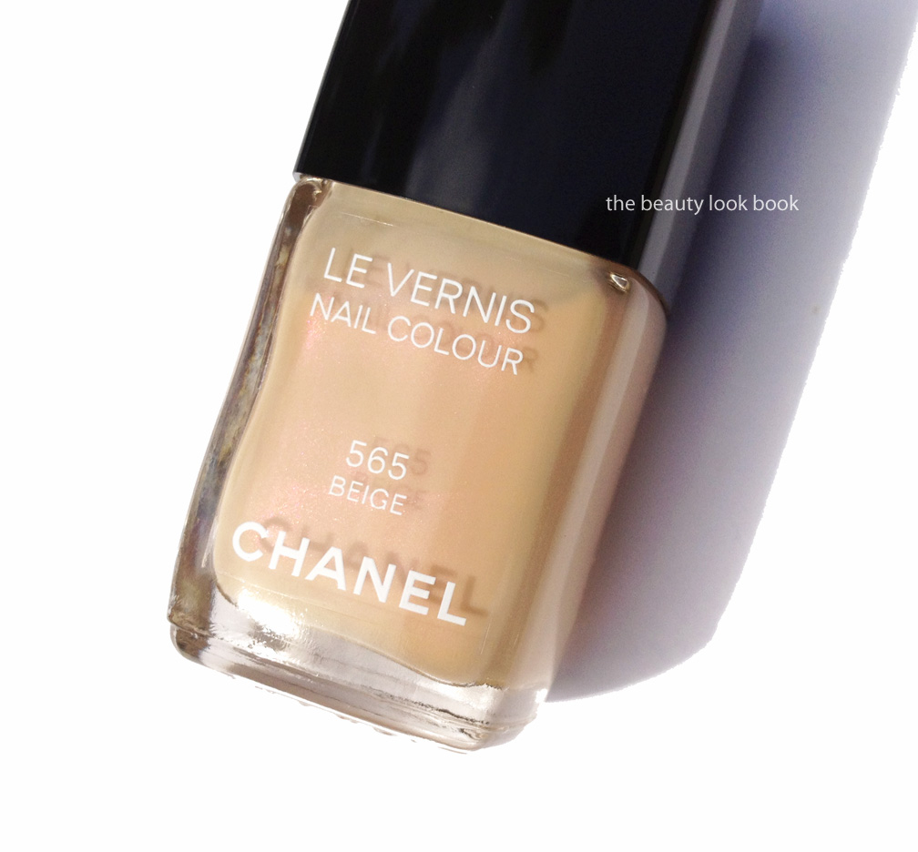
You can see the shimmer when you hold the bottle at an angle in direct sunlight.
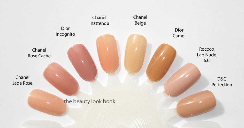
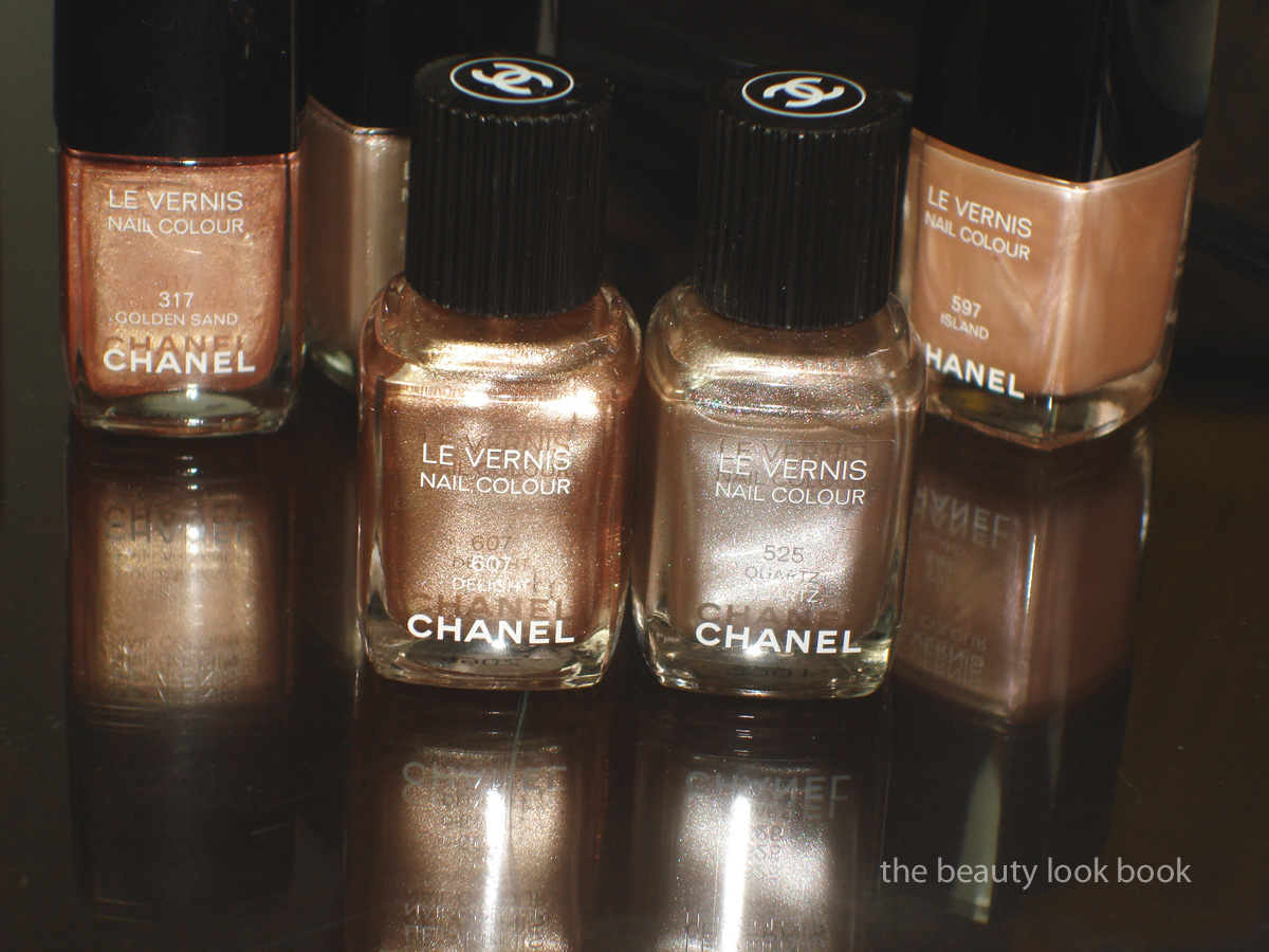
Comparisons to other beige-nudes below. Note that Chanel Beige Petale was not swatched because it’s so sheer. You can see it reviewed here though. I believe most of the other shades swatched have been reviewed in the past (use the search bar to find more detailed reviews and swatches). You can see that Chanel Beige is fairly unique and more of a beige-yellow nude. All photos by me. Kindly respect the copyright and do not republish without permission.
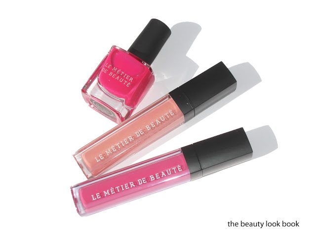
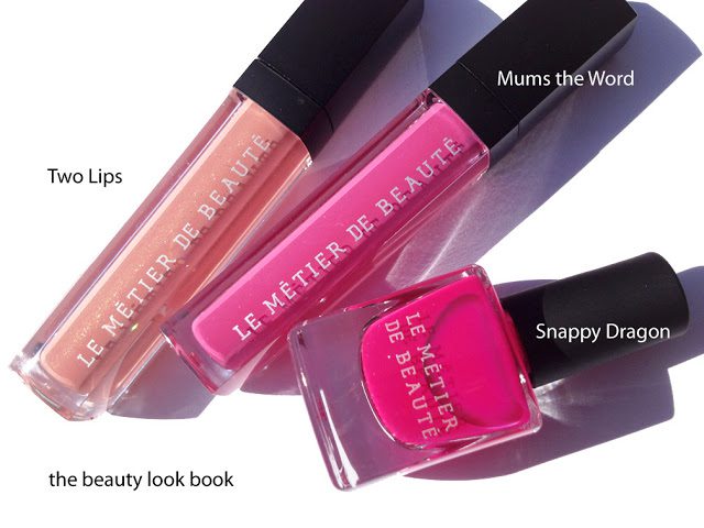
Thanks to Best Things in Beauty for keeping us up-to-date on the latest releases from Le Métier de Beauté. Among all the store exclusives, my favorite collection includes the latest design by Ken Downing: the Haute House Hues Collection which includes a Lip Crème Lip Gloss Duo ($65) in Mum’s the Word and Two Lips and the new Snappy Dragon Nail Lacquer ($18).
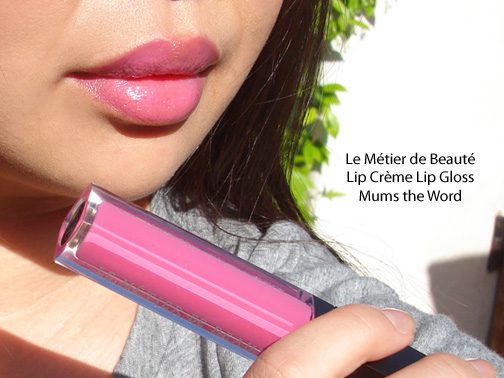
The Lip Crème Lip Glosses are perfect for spring. Mum’s the Word is a bright pink with cool undertones. When I saw it featured on twitter I was a bit scared. My counter did not have testers of the items when they arrived but I am glad I purchased. The Lip Crèmes are a highly pigmented liquid creme gloss. They aren’t high shine but aren’t fully matte or satiny either. More of a hybrid lipstick/gloss. Mum’s the Word can be applied heavily or sheer for a soft tint. I was surprised at how wearable it is. If it’s too bright for you, you can always mix it with other glosses to sheer out the color.
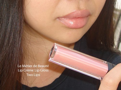
Two Lips is a slightly shimmery nude pale peach. The texture applies a bit dry and emphasizes the lines in the lips, but let it sit for a minute and it warms up nicely to apply more evenly. The pigment is quite opaque and covers the entire lip. It gives me a nude-peach lip look which I think will go nicely with a smokey eye.
Here are comparisons to a few other shades:
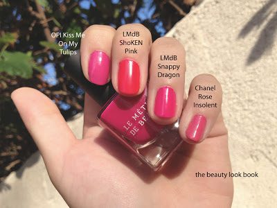
Snappy Dragon Nail Polish is a shocking bright pink. It’s VERY bright, almost fuschia. There is a neon quality to this shade so it was a bit difficult to photograph. The finish is a satiny semi-matte. Two coats and you get full rich coverage. I’m still partial to the high-gloss finish nail polishes, but this one you can easily just add a clear top coat to achieve the shine.
Compared to the ShoKen Pink from spring/resort, Snappy Dragon is more fuschia/rose with blue tones. ShoKen Pink almost looks orange next to it because it has so much neon in it.
Overall perfect for spring to summer. The colors are fresh and naturally flattering. The lip cremes go perfectly with a simple bronzer or the latest Blush Kaleidoscope kit. To date I believe the collection is limited edition and exclusive to Neiman Marcus.
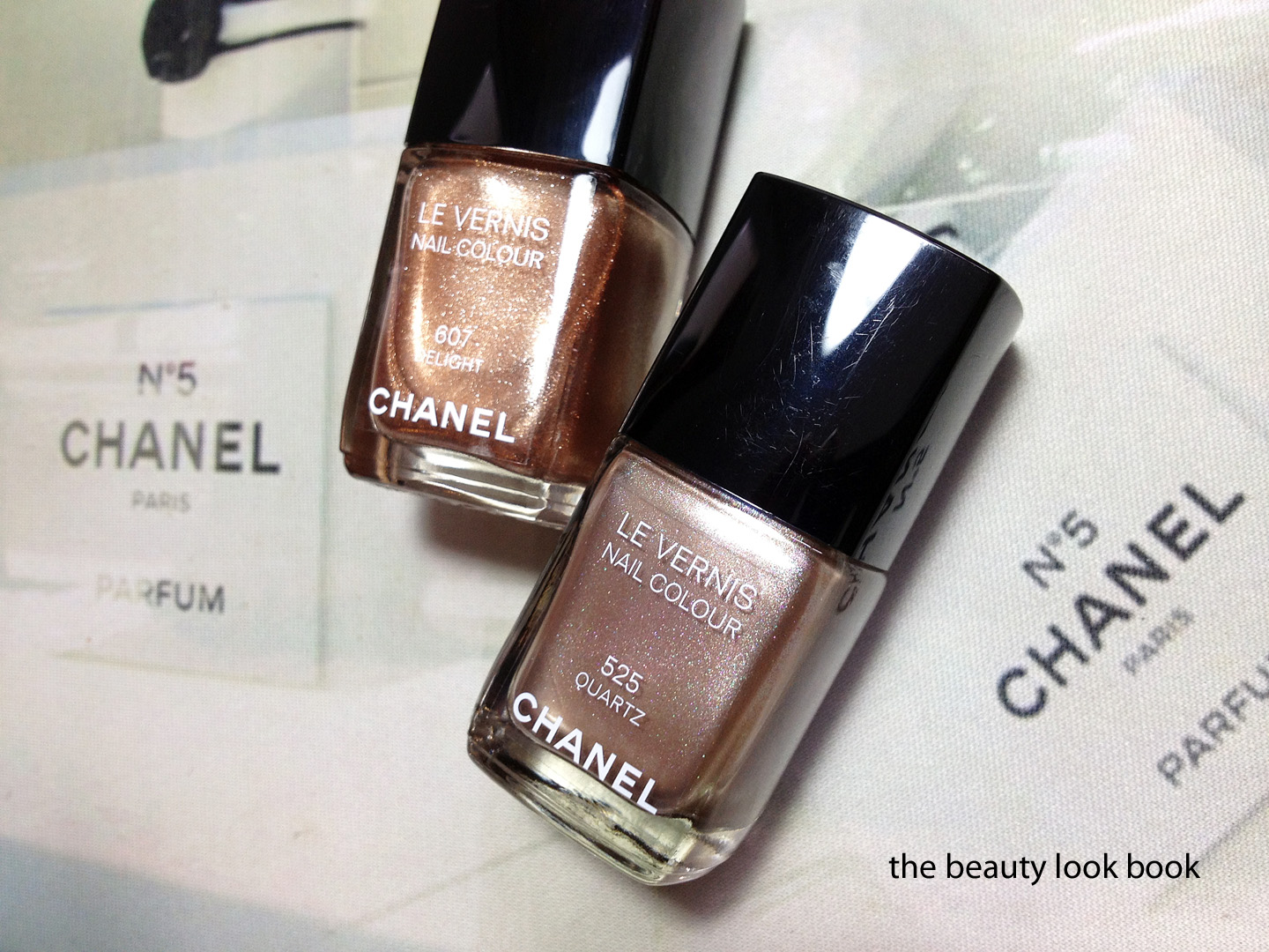
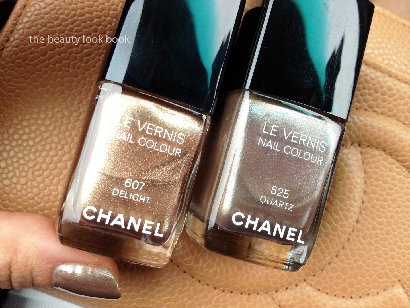
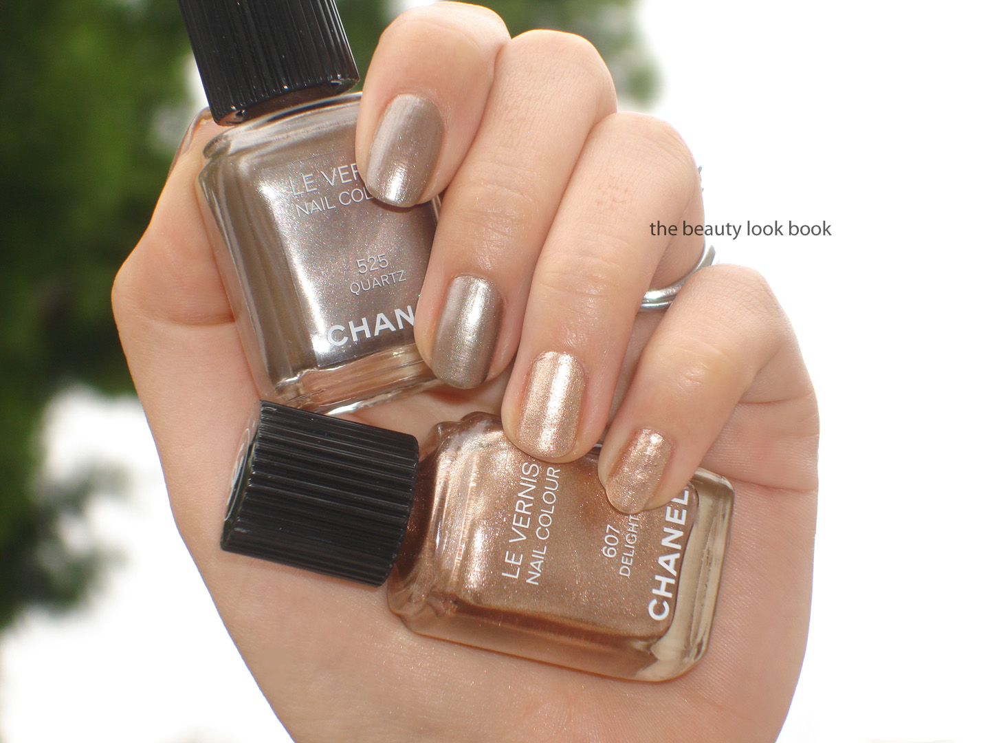
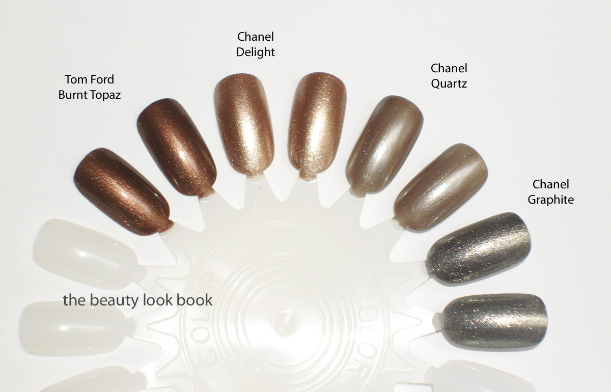
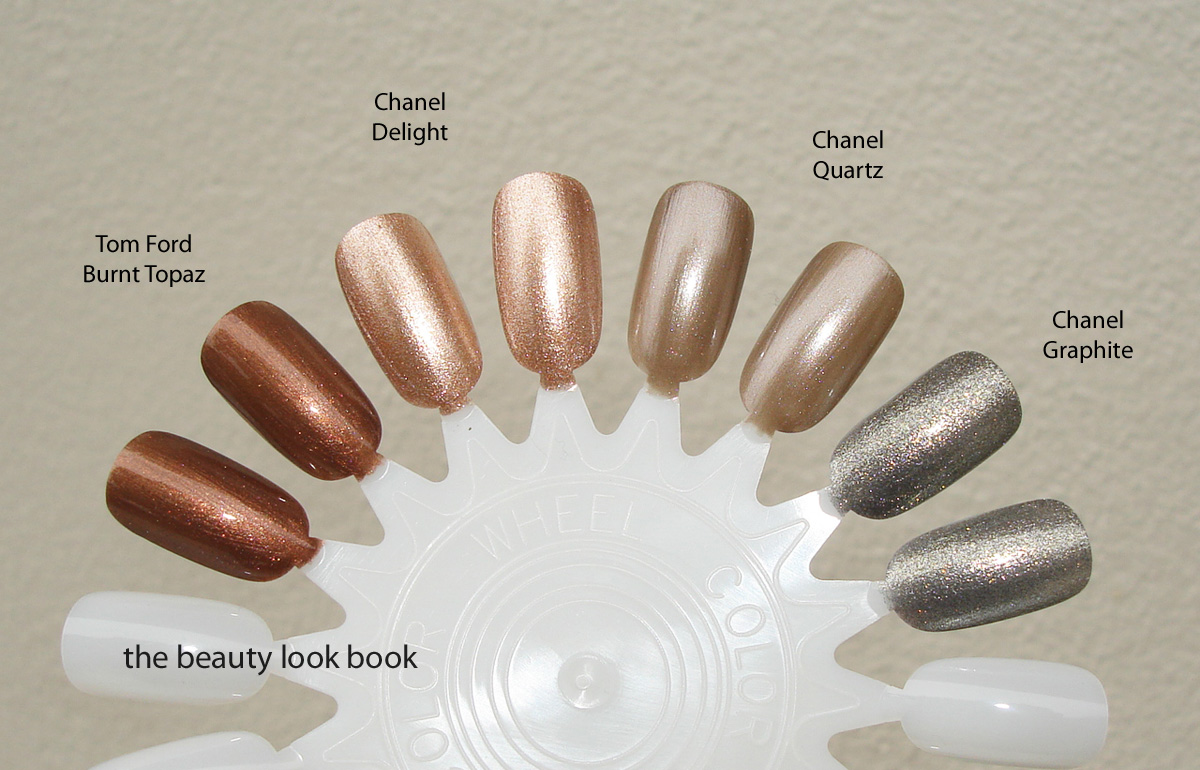
Several have asked how the newly released Delight nail polish compares to Quartz from last fall stating they appear to look very similar. When I first saw Delight at the counters, I thought the exact same thing even though this shade was described as “bronzey”. I thought perhaps the department store lighting is playing tricks on my eyes. Once I got home, I put them together side-by-side and I found they were quite different which is why I didn’t include Quartz in my original comparison. I do strive for color accuracy for this blog, but varying monitors and differing light conditions can make it hard to tell what a color really looks like, even with numerous comparisons to other brands/shades. To answer those who have asked, this is what I found:
Delight is more golden, highly metallic/sparkley and warmer in tone
Quartz is not as frosty, has more silver/taupe/grey tones, and applies with a more subtle shimmer finish
Both shades contain multi-colored particles which makes these difficult to photograph. Quartz has those gorgeous teal flecks of micro-shimmer that you can only see at certain angles. Delight also has quite a few variations of metallic shimmers which is why it looks bronzey in the bottle but more lighter and more golden on the fingers. Multiple views below under different lights and at different angles. Note that I had no direct sunlight today, the weekend has been cloudy. I drove about 20 minutes away from the coast looking for a cloudless area (and an excuse to pick up one more sprinkles cupcake), but no luck finding sunshine today.
Swatched on the fingers, two coats for each shade:
And one last nail wheel comparison to Tom Ford Burnt Topaz (so you can see that Delight isn’t quite as bronzey, but more golden), Quartz (is one of those shades that looks different in every photograph), and Graphite (to show how Delight has a similar sparkley finish):
I hope this extra comparison post helps compare Delight vs Quartz! I personally really loved Quartz, but I think due to the taupe-ness, it can look a bit drab on some skintones sometimes (mine included). Delight has more glitz and warmth which makes me think this will be a bigger hit with a wider variety of skintones. It’s easier to wear in my opinion, even though it’s highly metallic, it’s still work friendly but has enough omph to wear on a nice evening out.
Also, for those who asked about the rest of the collection, I did purchase quite a bit from the Chanel Summer 2012 release, but most likely won’t be reviewing them due to time constraints. Some quick thoughts:
Bronzers are softer than last year’s and less brownish (at least on me) with a more finely milled shimmer. If I could only pick 1 it would be the Sable Beige. I don’t think they are must-haves, but that is just my opinion. I still bought both.
Sable-Emouvant Duo is gorgeous. It’s a pumped up version of the Taupe-Delicat, definitely a must-have, although probably very similar to other bronzey-coppers and beige shimmers from other brands. The pigment is excellent and the shimmer isn’t overly-frosty. Stunning and very easy to wear.
Sirocco or Calypso Glossimers aren’t must-haves if you have a lot of Chanel Glossimers already. The golden-beige is very sheer and virtually transparent. I found the coral is a bit different from other orangey glosses Chanel has released, but still very close.
En Vogue Rouge Coco Shine applies with a pinkish sheen rather than the orange it appears to be in the tube, different enough from Flirt to justify owning.
Empreinte Rouge Coco Shine looked really pretty in the tube, I haven’t tried it on the lips yet, I assume it will barely show up on my lips.
Brun Intense eyeliner was a pass since it was a basic matte brown (I already love and adore BB’s Gel Eyeliners).
Peach Cuivre eyeliner is an intriguing metallic peach that I could not resist. I have no idea how I’m going to wear it though. I suspect it’s similar in concept to those metallic eyeliners from Armani but I don’t know how they compare (I never checked out the spring collection in close detail).
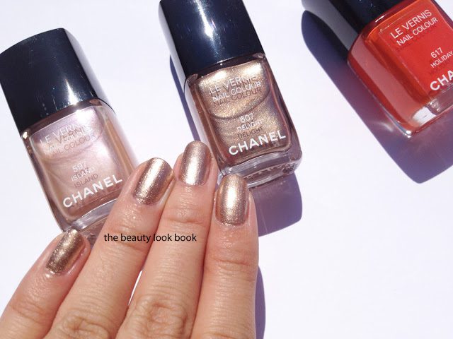
My top 5 picks from the collection include the nail polishes in Island and Delight, Peach Cuivre Eyeliner, Sable Beige Bronzer and the Sable-Emouvant Duo. For more details/discussion, I found the Chanel Summer 2012 forum on Specktra helpful with descriptions, extra photos, swatches and all those extra tidbits of awesome info from Chanel lovers around the world.
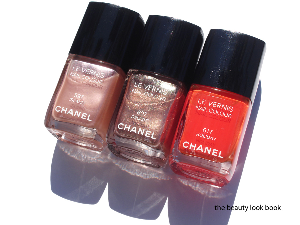
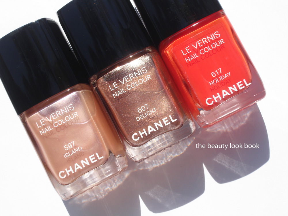
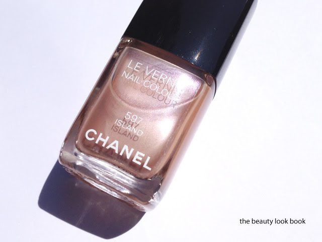
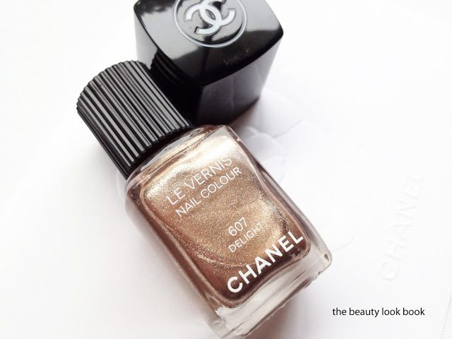
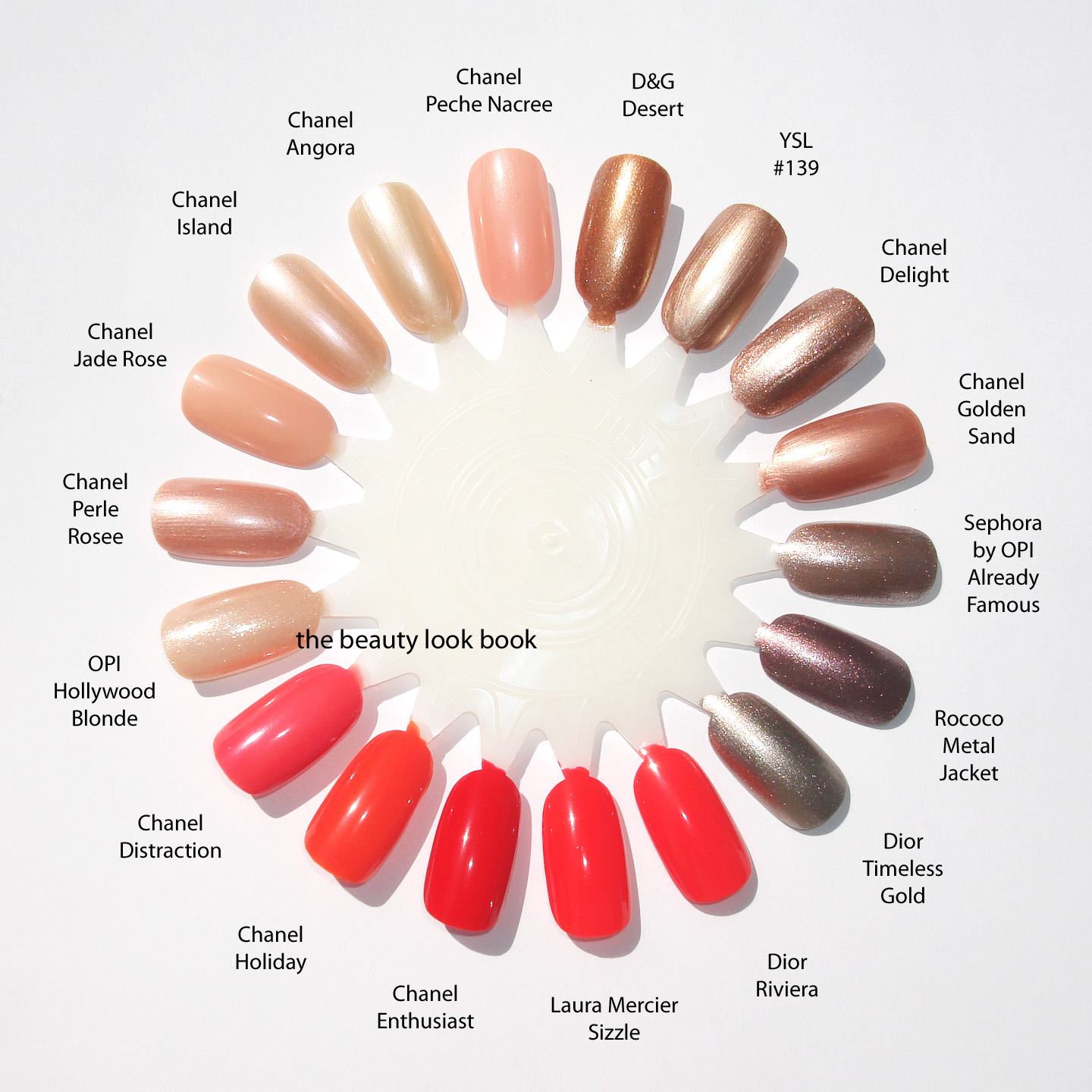
Chanel Summer 2012 has started to trickle in at counters. I’ve found the summer items at Macy’s in Southern California (I hear Nordstrom Seattle has it as well and Bloomingdales in NYC) I think you can expect to see these at all Chanel counters in the upcoming week. Late Friday evening I came home with the three new nail polishes in Island 597, Delight 607 and Holiday 617 ($26 each). They are perfect for right now and for the upcoming summer season. I found it nice to see a little variation from the recent releases we’ve seen from other brands this spring.
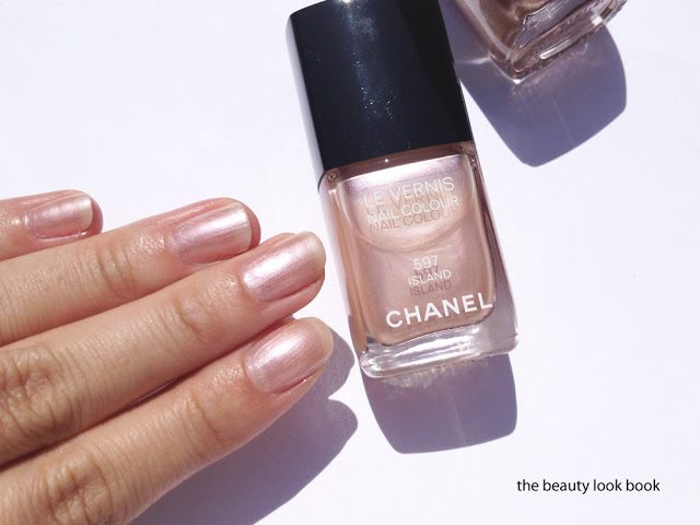
Chanel Island #597 is a soft opalescent pearly beige that flashes some seashell pink. It has a sheer see-through finish, but glides on smoothly and evenly with 2 coats. It reminded me of an older nail polish Angora, but when I swatched them side-by-side, I found Island to be more pinkish. This color makes the fingers glow with a subtle but natural sheen. It’s reminiscent of the long-discontinued Island single eyeshadow (which I wish they would bring back). If you’re looking for a gloss to match this perfectly, it seems Seashell would be a close match.
Chanel Delight #607 is the color I was anticipating the most. It’s a high-sparkle complex bronzey-gold. I found that it has a similar finish to that of Graphite (sheerish base loaded with sparkles and highly metallic). However, the first coat is much much more pigmented than Graphite or even Gold Fingers. On the nails the pale-neutral-gold shimmers stand out. For me, it looks like a pale gold rather than a bronze on the fingertips. I’m sure there are similar shades from OPI (I’m thinking something from the Muppets collection or a warmer version of Glitzerland, possible close to China Glaze Swing Baby), but I usually miss out on most of the limited edition OPI colors. The finish is smooth with full coverage using 2 coats. There is no gritty feeling even with all the sparkles. It’s nothing like anything else Chanel has released. In the bottle it looks warm, on the fingers it’s a neutral-warm metallic. (Note the color changes depending on the angle and the way the light hits the metallic particles in bottle, sometimes it looks more bronze, other times more golden.)
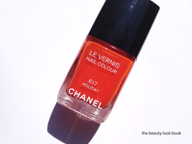
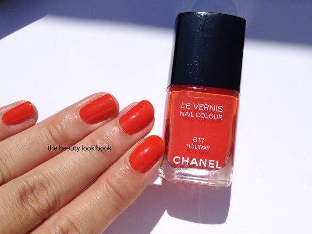
Chanel Holiday #617 is an orange-coral. Coral is a hot shade this year and with so many brands releasing coral shades, many have asked me, “how is this one similar/different?” I would say it’s close to last year’s Dior Aloha, but minus the jelly finish. Compared to this year’s releases, Chanel Holiday is predominantly orange. Most of the other corals have pink or red undertones. There is still some red in Holiday, but I’d say it’s more of a burnt-orange/coral blend. The first coat is sheerish but it applies smoothly and gives full coverage with 2 coats. I thought this might be similar to Enthusiast, but Holiday is quite a bit more orange.
Comparisons on the nail wheel:
I love these new colors from Chanel. I think they are all must-haves. They are wearable for work and everyday but edgy enough to not be boring or too neutral. I think these will sell out really fast, so if you’re considering these, I highly recommend you call your local counters sooner than later to see if they’ve received the summer items.
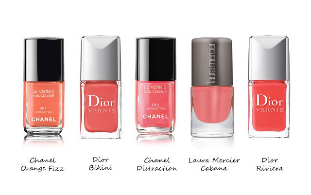
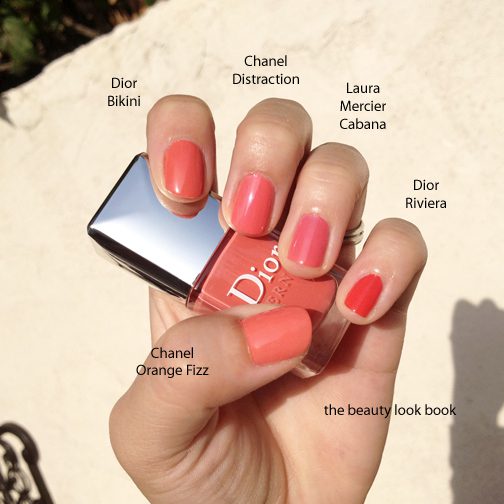
Coral seems to be all the craze this year for spring and summer nail polishes. My peachy-coral obsession for blushes has now transitioned into nails. I’ve already reviewed a number of new peachy corals this year: Chanel June, Laura Mercier Cabana, Dior Riviera and Chanel Distraction. Many have asked about the newest from Dior Bikini. From promo photos it can be difficult to identify differences between so many similar shades. I gathered what I could find online, here they are lined up:
In real life, here is what I see below, they are all more similar than promotional digitized photos appear to be. (Many thanks to my Twitter friends who let me know Dior Bikini arrived online at Sephora.com.) Here is the verdict, left to right:
Chanel Orange Fizz – is the lightest and brightest, it’s more orangey than all the rest
Dior Bikini – has the best coverage, it’s more of a true peach, with slight reddish tones, slightly darker
Chanel Distraction – semi-sheer medium jelly finish with the subtle iridescence
Laura Mercier Cabana – most jelly-like, slightly more pink undertones
Dior Riviera – most vibrant coral red
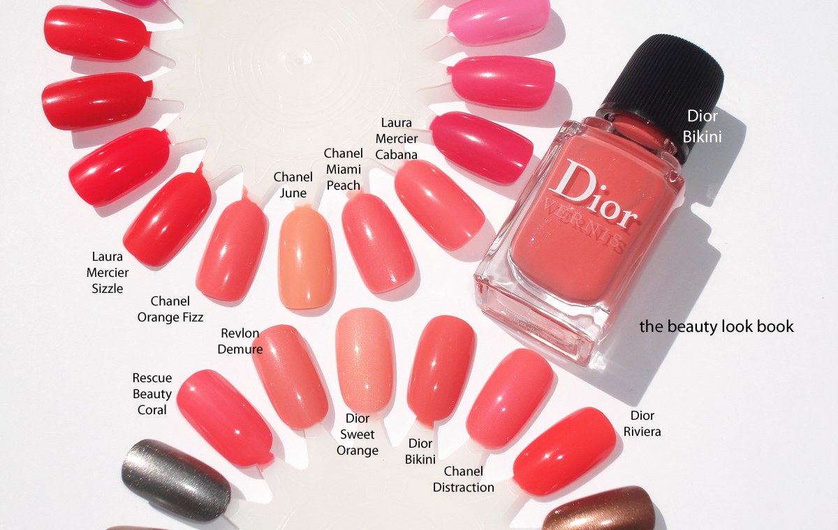
A few more swatches to other oranges, peaches and corals: Rescue Beauty Lounge Coral, Revlon Demure, Dior Sweet Orange 334, Dior Bikini 231, Chanel Distraction, Dior Riviera 537, Laura Mercier Sizzle, Chanel Orange Fizz, Chanel June, Chanel Miami Peach, Laura Mercier Cabana.
Overall, if you have Chanel Distraction or Laura Mercier, you do not need Dior Bikini. I do believe Dior Bikini has the best formula and richest coverage. I really do love it (even though it’s almost identical to other corals) and it would be my vote for the season’s best coral. At this time I haven’t seen Dior summer anywhere on counter on the West Coast (Southern California), although it has just arrived online at Sephora.com and Nordstrom.com as well. I suspect it will arrive any day in store.
Have you checked out any corals for nails this summer? What is your favorite? Or do you have a classic coral in your collection that you’re loving right now?
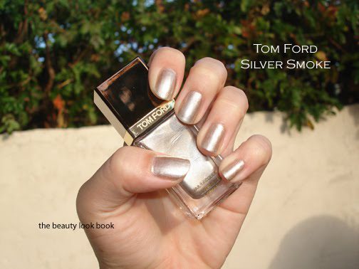
Tom Ford’s Spring 2012 Collection includes four new metallic nail polishes and I purchased three from Saks.com in Burnt Topaz, Gold Haze and Silver Smoke ($30 each). Tom Ford initially launched sixteen non-shimmer cream shades of nail polish when the complete beauty line was rolled out to select Neiman Marcus and Saks stores. I purchased two shades sight unseen online (African Violet and Pink Crush) and was less than impressed with the color and formula for the price. I did not feel compelled to review them. The formula was difficult to apply smoothly and I felt the colors were unoriginal. Upon professional application I did find the formula extremely long lasting without chips or peeling, but still the formula wasn’t so great. Several months later I was able to see the entire line in store at Neiman Marcus but the poor lighting conditions of the displays combined with the messy leaking lids on the testers prevented me from looking further.
When previews of the new spring collection surfaced, I saw nothing but raves. I thought perhaps the metallic shimmer formula is better to work with. Plus the colors looked really gorgeous. Unfortunately, I personally found the metallic formula just as difficult to work with as the non-shimmers. Application does improve with a good base coat (I tried it with Le Metier’s and Deborah Lippmann’s on several swatching occasions). However, I’m spoiled by the smooth flawless formulas of Dior, Chanel and OPI. I personally find that the Tom Ford doesn’t apply smoothly or evenly with ease. It does even out after two coats. Note this is my personal experience … others might not have experienced the same.
My personal issues with the formula aside, I do find the metallic colors striking. Just not well suited for spring. I know there are no rules when it comes to seasonal makeup … often times colors are timeless and can be worn year-round. I just feel that these are more inline with a fall mood rather than spring or summer.
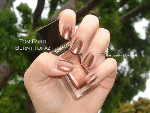
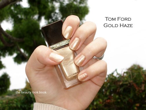
The colors, swatches and comparisons. Left to right: Burnt Topaz, Gold Haze & Silver Smoke:
For those of you who haven’t seen these in person, the Tom Ford Nail Polishes come in a square bottle with tops that come off. Underneath is a twist-cap (which I find are prone to leaking, at least mine were):
The brush is a good length and size for precise application, if only the formula would glide onto the nail better. There are really good brush comparisons to other brands on Edelich.com – Tom Ford Nail Polish #08 African Violet.
Swatches:
Burnt Topaz is a coppery metallic warm brown. The shimmer is complex and beautiful. Streaking doesn’t show up too bad which is nice for a metallic.
Gold Haze is a pale gold metallic. It leans slightly warm on me. It’s not as yellow as Chanel Gold Fingers and has a softer finish/feel to it.
Silver Smoke appears to be a warm silver in the bottle but on my olive skin shows up as more of a cool-toned silver. It’s also highly metallic.
Comparisons below (you can click for larger viewing):
Overall I think the colors are lovely, but for the high price I expected better formulas. I’m not completely disappointed though. The colors are striking even if they are not my cup of tea for right now. I don’t have a lot of these shades from less expensive brands like OPI, Essie or Zoya, but I do suspect that these are very easy to dupe. The colors unfortunately don’t appear to be all that unique. Still, if you are lucky to be near or happen to visit a store with a Tom Ford counter I still think you should have a look. It’s definitely worth while to stop and play. I still think his lipsticks are the best part of his makeup line, with the blushes as a close second.
Have you tried Tom Ford Nail Lacquers? What were your thoughts?


