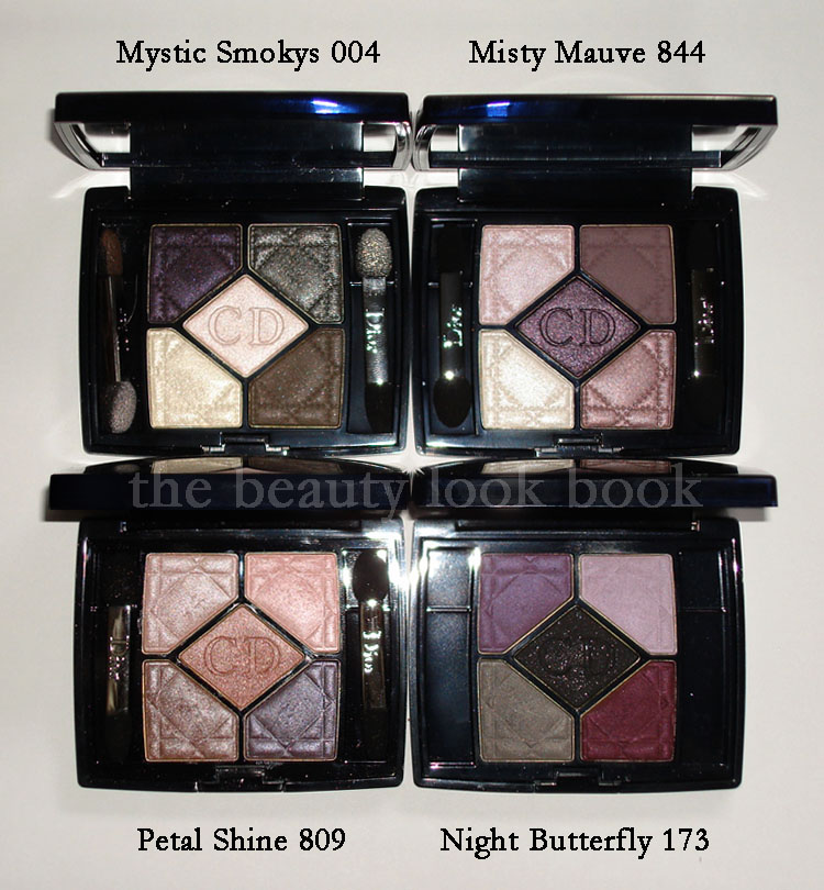
Dior Fall 2010 has arrived in Nordstroms although the full tester unit wasn’t up yet, the counter did have the testers scattered in the regular tester unit. I picked up the Misty Mauve Quint $58 and Tailored Mauve Lipgloss $26.50 – both stunning colors for fall. I probably won’t be wearing this for a few months until fall arrives, they seem a bit too cool-toned for summer wear.
In direct sunlight:
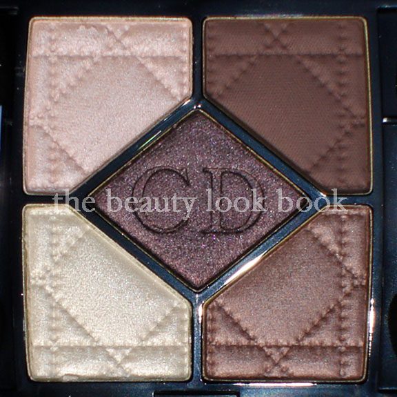
The Misty Mauve quint has a good mix of mauve shades which will allow you to achieve a diverse range of looks from neutral to smokey. It does appear more mauve and a bit more subdued compared to the promotional photos released by Dior, but is still pretty in my opinion. While the colors in this palette might not be the most original, I love the texture and finish of these particular shades and they are well coordinated. As a lover of neutral shades, I think this is a good palette for those who want something smokey but not too dramatic. I call it a natural-smokey eye palette with a bit of attitude.
I’ve had a little debate with a fellow makeup fan of mine about this new quint. She thought it unoriginal and something Dior has done a million times before. It’s possibly similar to the purple palette Nordstrom released last year for their anniversary sale (which I do not have), but in terms of the quints I own, it seems quite different. I will say the lighter shades definitely seem familiar. Looking back on past quints, it appears that I have neglected them. I need to use these more often. In the past year I find myself using Chanel, Edward Bess, D&G and Paul & Joe more frequently.
Per reader request from the comments, you can see it’s very different from Chanel Kaska Beige. Here it is also compared to Chanel Enigma.
Dior Addict Ultra-Gloss in Tailored Mauve 692:
Tailored Mauve is a pretty purple-pink gloss. I was worried it would be too purple on the lips and I normally don’t try out tester glosses on my lips, but my SA pulled out a brand new tester so I felt safe trying it out. It was surprisingly wearable and I normally can’t pull off purpley shades. I need a smidge of pink or red in my purple-tones. This will look good with a classic smokey bronze eye (like NARS Cordura) or even a classic smokey eye (like Chanel Enigma or Mystic Eyes). I find that it goes extremely well with the Misty Mauve quint and isn’t overly purple when worn together. It’s semi-sheer to medium with a lovely glossy finish. No detectable scent. Lasting power isn’t the greatest, but I don’t mind reapplying lipgloss regularly throughout the day.
L to R: Chanel Imaginaire, MAC Cultured, Dior Tailored Mauve,
Laura Mercier Violet, Chanel Delight
I checked out the other items. There are a number of new gorgeous Serum de Rouge shades in bright pinks, plums and mauves. Nordstrom is doing a GWP for their Anniversary Sale, so I had my sales associate put aside a couple to qualify for the gift later in the month. I’m also testing out samples of their new Hydra Life skincare line. So far, so good and it’s surprisingly well priced. Will be writing a review once I feel I’ve tested it long enough to get a good feel for how it works on my skin.
Swatches of my Dior Fall Picks (Serum de Rouges not included b/c they are being held for the Anniversary Sale):
*FYI, this swatch photo looks a tad washed out,
the lipstick is the slightest bit brighter in real life
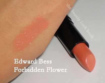
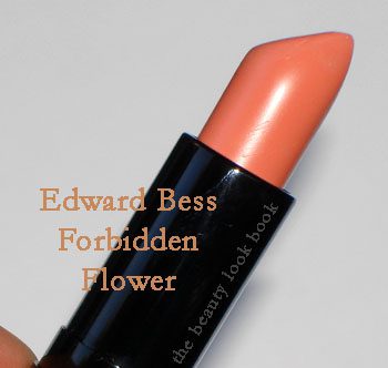
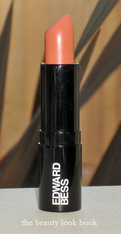
Forbidden Flower is a peachy cream color. It’s rich and creamy with a soft fig scent. It looks orangey in the tube sometimes, but doesn’t go on orangey at all. It’s a soft peachy-coral. I find it works best when applied from the tube directly on the lips, blotted, then reapplied. Otherwise it can look a bit streaky. Blending with a lip brush helps too. Still love it. I got mine from Bergdorf Goodman in NY. The ladies there are fabulous and very helpful. So is Edward 🙂
See my other Edward Bess Lipsticks here. I’ve done a few other lip swatches with Pure Impulse + Soft Whisper, Bare Rose Lipgloss and Forever Yours. You can get a better idea of my skintone by checking my foundation swatches (see sidebar). I’m a Chanel Shell Teint Innocence in the liquid formula.
Edward Bess products can also be purchased on EdwardBess.com.
It seems many of my recent purchases have been inspired by others. The new Make Up For Ever Aqua Creams $22 (from Sephora) are no different. This post I dedicate to Lakshmi. She had her eyes on these as soon as they came online and e-mailed me “gorgeous taupe eyeshadow alert!” the moment her Sephora received their shipment. I immediately went to Sephora the following week to check them out and my first try, I was not impressed. I’m not sure if it was just the questionable sanitary tester conditions, poor lighting, or use of my fingers that had me leaving empty handed. The first time I tried it, it didn’t blend well and looked extremely muddy on the eyes.
However, after getting more info from Lakshmi and reading Karla’s post about her swatch adventures with the MUFE Aqua Creams, I decided to try it once more. I have to say I agree with Karla that applying with fingers isn’t the best way to apply them. Spreading the color on the eye with my finger leaves an uneven application since it sets fast and doesn’t blend well. It applies much better when you use a brush. I used my MAC 242 and Bobbi Brown Cream Shadow Brush (one on each eye today) and I can definitely see a difference in the application.
Those not familiar with MUFE Aqua Creams – they are a new high pigmented cream shadow that is long-wearing and waterproof. I can’t attest to the waterproof part. I have tried their Aqua Lip Liner in 1C and I can’t say that it was longlasting. However the Aqua Creams do indeed last a long time without fading. Right now they are a Sephora Exclusive in the U.S. When I was at Sephora, the sales rep told me he recommended that I apply with a brush in thin layers. He said the pigmentation/texture of the cream was such that if you apply too much at first, you will get a cakey layer that will crack when dry. I’m not sure if this is true or not, but his input/advice did make sense.
I ended up coming home with #13 Warm Beige (which is a pale champagne pink) and #15 Taupe (a shimmery taupe):
I tried #2 Steel at Sephora with a Q-Tip applicator and it lasted from 1:00 pm to 9:00 pm without any smudging or fading. The only reason it came off was because I removed it in the shower. I passed on it at the store because it seemed similar to Bobbi Brown Galaxy (which I don’t find myself wearing frequently). I wasn’t able to compare it side by side, but knew I most likely wouldn’t use it a lot.
Those wondering, I swatch tested a few shades meant for cheeks. I personally didn’t see how it was possible to blend them on the cheeks since it’s a bit tricky for me to apply on the eyes. Some of the colors are stunning, but the texture seems too thick to be able to blend well for a natural blush.
I’ve been eyeing the Paul & Joe Eye Glosses for over a year and finally decided to purchase them to try them out. Another lemming-inspired purchase influenced by bloggers I adore and trust. I am a skeptic by nature and for me reviews are sometimes hard to decipher. We all have different tastes, opinions, and preferences, so what works for some might not be my cup of tea. I don’t have immediate access to Paul & Joe in person, so these reviews gave me a good idea of what to expect. Each have their own unique style, but there are multiple items they’ve reviewed on occasion that I love, so I found their perspective and descriptions extremely helpful. Check out their reviews:
Lotus Palace’s review of Halo 04 + eye swatch here
Josie’s review of Celestial 01 and Murmur 05 + swatches here
Gaia’s review of Moonlight 03 and Murmur 05 + swatches here
The Eye Glosses retail for $24 each and come in a tube with a sponge tipped application with a whipped gel type of formula. My picks from Beautyhabit (online) & Bergdorfs (instore) in 01 Celestial (sparkling pale gold), 04 Halo (light frosted cool pink), and 05 Murmur (shimmering grey-taupe) are shown below:
The first one I played with was Murmur 05, a shimmering grey-taupe. It took some experimenting before I could get the application right. My first tries left me with either a finish that was too sheer or lop-sided (because they dry pretty fast). I found this one works best when applied in light layers. They dry and set pretty fast once brushed onto the eyelid, so I had to use my cream eyeshadow brush to apply in quick strokes blending fast. I like this one just by itself with mascara.
Next, I tried Celestial 01, a super sparkly pale gold. When it comes to shimmer, we all have our own personal preference for how much shimmer we feel comfortable with. I have to say this one is a lovely shade of pale gold, but the sparkle factor is extremely intense! Gaia from The Non-Blonde described it perfectly when she says it’s more for date night. We have similar tastes in brands and products, just typically pick colors on different ends of the spectrum. I’m all about shimmer, but I’m pushing 30 and this seems a bit over the top for conservative-me. It’s borderline glittery. Gorgeous, but it’s definitely out of my comfort zone.
Halo 04 was the last one I tried out, a cool pale pink shimmer. It’s sparkly as well, but the finish is less glittery than Celestial. This one blends to a lovely pink shimmer wash.
So the verdict – I like the packaging and the lasting power. They dry fast, but once they are set, they stay put. Murmur is lovely when layered properly on the eye and is subtle enough for everyday wear. Halo and Celestial are a few notches up in the shimmer factor. I think these are better suited for going out. I could possibly wear Halo (the pink one) for every day, but only when applied with a light hand.
If you’ve tried these – what are your thoughts? Are there any other colors you feel are must-haves or must-try-outs? If you’ve reviewed it feel free to link in the comments below 🙂
Or if you have any suggestions on what you coordinate with these I’m all ears!
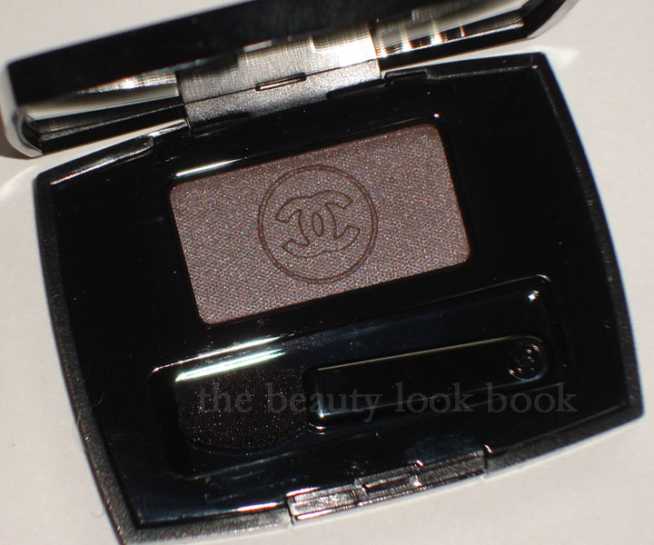
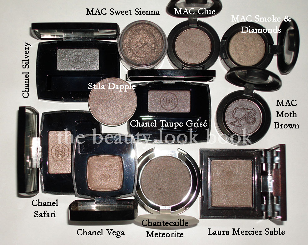
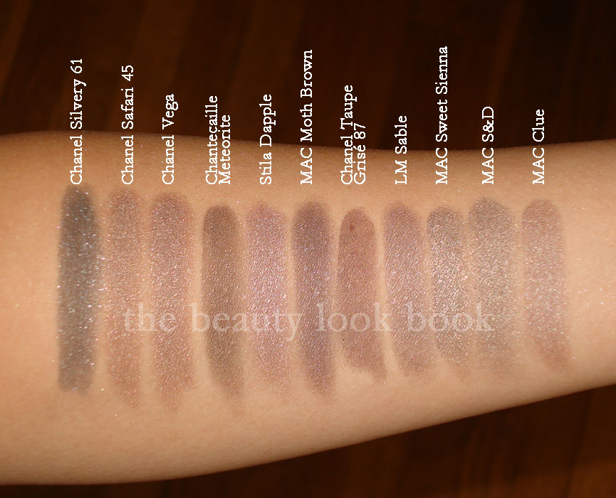
Taupe + Shimmer + Chanel = must buy. If there’s a taupe Chanel makes, it’s instantly a must have for me. I am taupe-obsessed much like Elvira and Josie, and there’s no stopping us, ever. Taupe Grisé 87 is the newest taupe released by Chanel for their Fall 2010 collection. My makeup-twin Amy at Café Makeup has given a lovely review here (I call her my twin because we love the same things, although she has fairer skintone = Chanel Cameo/NC15 while I am Chanel Shell/NC30-35).
There a number of other great reviews, photos and swatches out there so the focus of this post will be on comparisons to similar shades.
There are a million other taupes out there (click on the Taupe Label below this post to see the other ones I have obsessed over) but I picked out the ones in my mind I thought, “Could this one be a dupe?” I personally could not find a dupe for this lovely color. There are similar shades, but from what I have, no dupe.
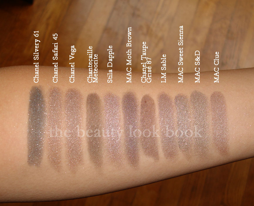
Compared to: Chanel Silvery, Chanel Safari, Chanel Vega (d/c), MAC Moth Brown (l/e), MAC Sweet Sienna (l/e), MAC Smoke & Diamonds (l/e), MAC Clue (l/e), Stila Dapple (d/c), Chanetcaille Meteorite, Laura Mercier Sable
In natural light (still cloudy weather):
Swatched over bare skin:
One more view with different lighting:
Is it a must-have? For me it was being a Chanel fan and a taupe fan. I have no willpower when it comes to Chanel. I played around with it on the eyes today, it works better when applied over a cream base, otherwise it just ended up looking bruisey on my eyes. I would describe it as having a subtle sheen. It looks shimmery in the container but when applied on the eyes, it looks more satin-matte rather than shimmery.
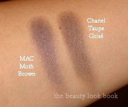
*Update* Upon reviewing my swatches and those on other websites, I thought Taupe Grise looked extremely brown on me compared to other girls. Much more brown than it appears in the container. I swatched it again alone, and then next to MAC Moth Brown to see if perhaps I made a mistake – but no. For some reason, it looks cool in the container, but on my skin, it’s not quite as cool. Here is another swatch comparison. Note that I have olive medium skin. This may look different on you. It’s still a cool colored taupe in my opinion, but next to Moth Brown it just looks warm perhaps because Moth Brown is overwhelmingly cool with an almost blueish sheen.
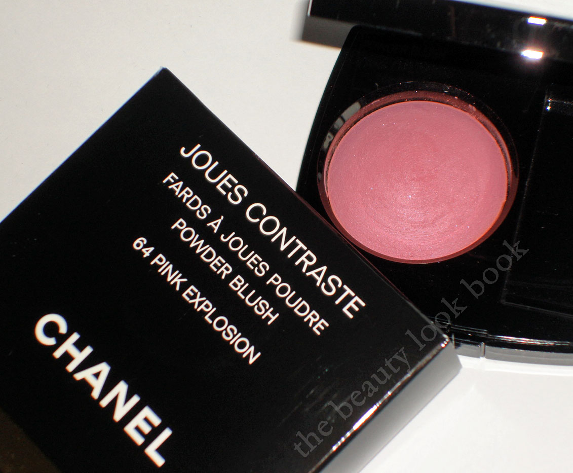
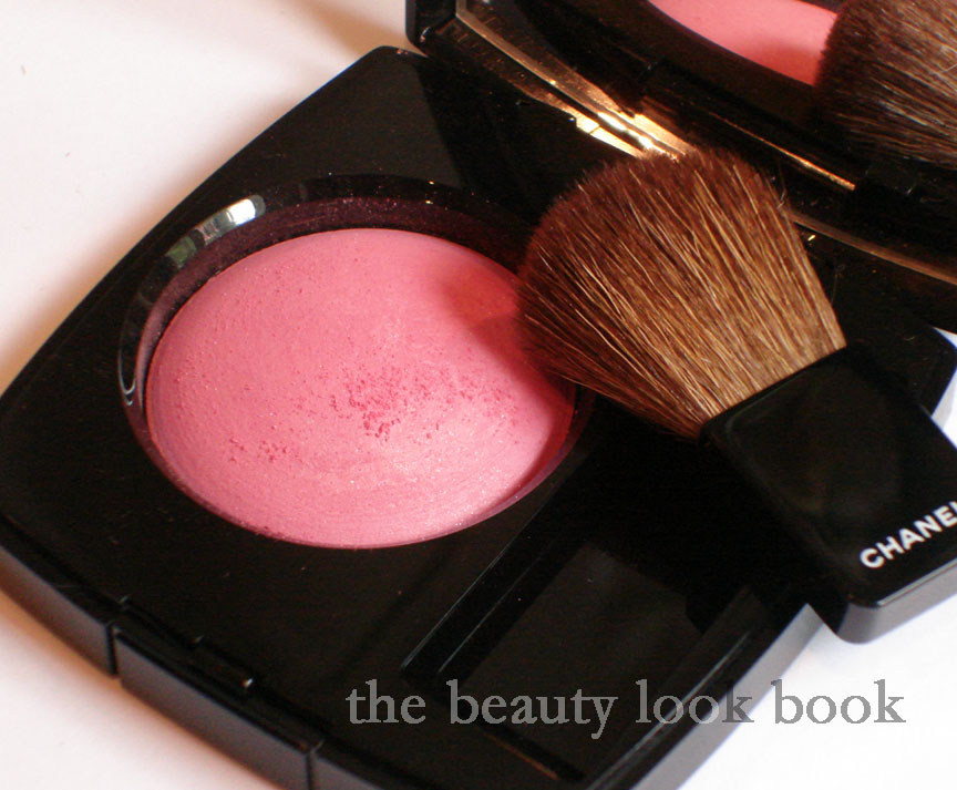
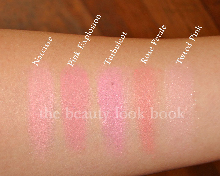
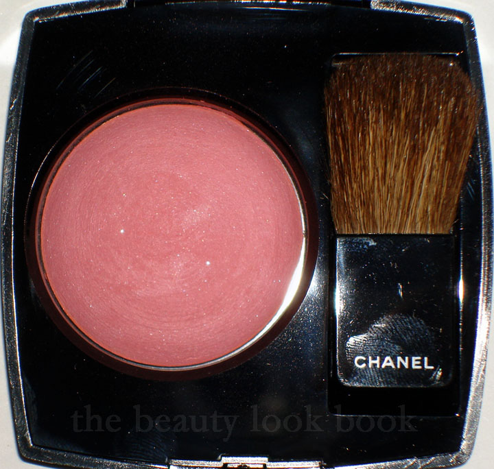
Another one of my picks from Chanel Fall 2010, Pink Explosion Powder Blush, a dusty cool pink with tiny bits of silver sparkle. It’s a lovely shade of pink, but I bring my first less-than-satisfactory review for Chanel. I normally love the color products Chanel makes – the formula, texture, finish are all divine and I feel the higher price tag justifies the purchase because of the higher quality. The items I don’t like are typically just because the color isn’t me, but I am usually able to find at least one thing that I like with each collection. This fall, Chanel has released the blushes in the Asia/Euro baked version and I am slightly disappointed.
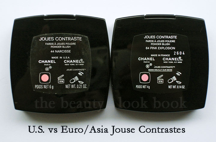
Chanel has two types of product batches they produce (as far as I know): U.S. versions and Euro/Asia/Canada versions. The difference is in the product names and finish (why many like the number reference so they know which overseas products to compare). Euro/Asia eyeshadows and blushes come in a baked formula with round pans and have a more powdery-like finish. I will say up front, I am not a fan of the Euro/Asia formulas at all. I have a couple Euro blushes from custom purchases (Candy and Tea Rose) and I only purchased them because I was interested in the color. The formula has left me wanting for more. Both definitely show up, but the finish is not the same as the U.S. – they are sheerer, more powdery, and just sit on the skin rather than blending into the skin like a natural blush does.
The labeling shows Made In U.S.A. versus Made in France:
That being said, I decided to give Pink Explosion a try. The verdict is still out. The color is pretty, but I’m less than thrilled with the finish – one swipe and you get a powdery mess. I find the formula too soft. Also there’s the glitter. Granted, it’s extremely fine and tiny. But still, I love Chanel for their finely milled shimmers, not glitter. Hence the less-than-satisfactory review. I know I would have loved this one had it been in the US formula.
Here you can see the powdery crumbly debris,
(natural light, no flash but cloudy weather):
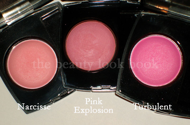
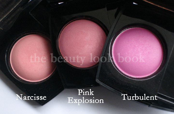
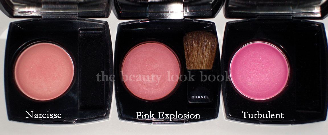
If you own other Chanel blushes, you may be wondering how it compares to other pinks. Here it is compared to Narcisse and Turbulent (both discontinued):
No flash, in natural light (cloudy weather light though):
Swatch comparisons to other Chanel Pinks:
Narcisse, Pink Explosion, Turbulent,
Rose Petale, Tweed Pink
So all in all, I think it’s a nice blush. Just not the usual quality I find for Chanel. The clouds have me slightly off my game – photography wise. I’d suggest checking out other blogs to see how Pink Explosion looks photographed in different lighting. It will give you a better idea of how it looks. I’m in between a MAC NC30-35.
Check it out on darker skintone on Karen at Makeup and Beauty Blog here.
Also check it out on lighter skintone like Christine’s from Temptalia here.
I’d say my skintone is probably somewhere in between those two 🙂 If you have this photographed or swatched, please feel free to link to your blog in the comments.
US girls who have purchased Chanel blushes in the past – what are your thoughts about the Asia/Euro formula for blushes?
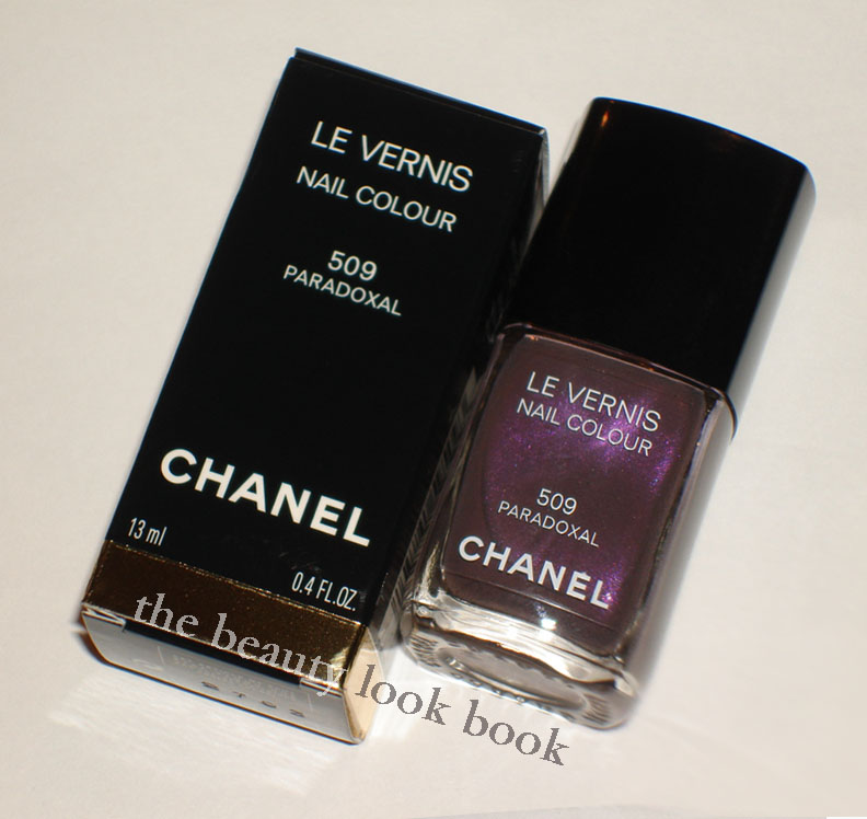
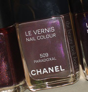
The Chanel Fall 2010 collection is trickling in stores and finally arrived at a Neimans near me. Among the things I picked up, the most anticipated item for me was the new Paradoxal 509 Nail Polish. I saw it featured by Jen at Beauty Moogle and fellow Chanel fan Leslieal sent me pics of it swatched on her. It’s an odd shade because it looks so different depending on what lighting your fingers are in making it a bit difficult to tell what it really looks like. If you’ve seen the photos on the web you may be wondering, “so which photo is the most accurate?” My answer is: they all seem to be accurate, it just depends on what light you’re in.
In the bottle Paradoxal is a greyed mauve plum with visible purple shimmer. On the nails, the shimmer disappears, much like Vendetta (Spring 2009) and Jade Rose (featured here) which has been repromoted with the fall collection. In the sunlight there is a subtle sheen to the polish but from arm’s length, it appears to be a flat-cream finish. The formula and finish on this shade is pretty good. I was able to get a full color application with 2 coats. While I would have liked the shimmer to be more visible, I did like that it applied smoothly without streaks. I took a number of photos in different lighting:
Swatches all applied with 2 coats, no topcoat:
Photo with high flash:
Photographed in artificial light:
This is what the color looks like in natural light:
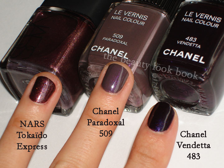
Compared to NARS Tokaïdo Express & Chanel Vendetta 483:
Artificial light (shimmer is not as visible):
With high flash (shimmers visible here):
Outdoors, natural light:
I found the collection at Neimans, but I’ve also heard reports that it’s available at Macy’s. My Nordstrom and Macy’s both said they weren’t expecting the shipment until right before July 4th. So those still trying to hunt the collection down – it will most likely be in store near you within the next week.