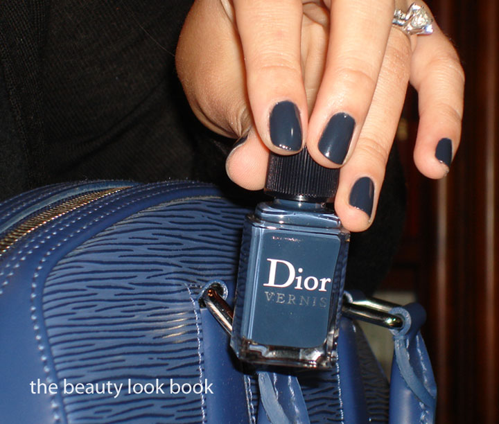
A few weeks ago in my Nail Polish Styling post a few of you asked “what’s that Dior Nude with the Chanel Khaki Vert?” It’s Dior’s Nude Chic which was released three springs ago (I think). I don’t think they make it anymore, but I have noticed Dior has been going through a nail polish revamp. Perhaps it will be re-released? Who knows. I had it applied yesterday afternoon for a much-needed manicure and picked Bond Street for the toes. Boring but work appropriate.
Bond Street has previously been reviewed in detail. This is one of three limited edition shades released in NY and on Dior.com as part of the Gris City Collection. Refer to my Gris City Collection post here and here for more comparisons.
For those of you who like the look of Nude Chic but can’t get your hands on it, comparisons are shown below (scroll down to the bottom).
* This photo below is republished from my previous review for your reference
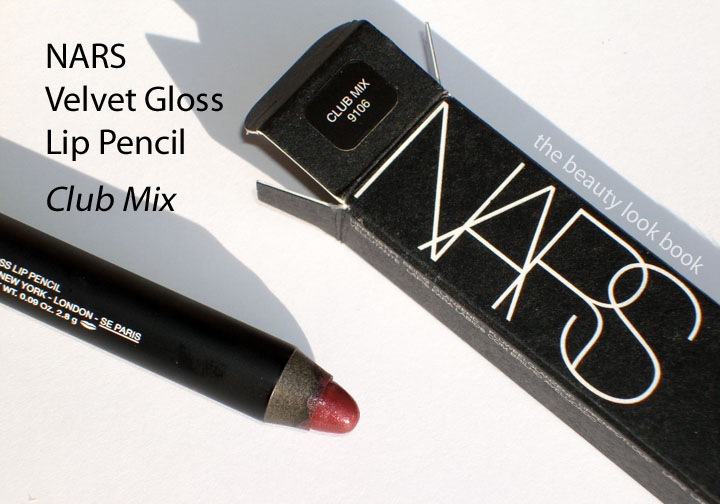
The last Velvet Gloss Pencil I have to swatch on the lips for you is NARS Club Mix. It is plum-grape perfection. I love it. A good plummy-grape is hard for me to find since many are either too red or too blue for my skintone. NARS has the best selection of plums that I’ve seen including Damage & Klute which I’ve used since my college days.
Club Mix is a deep plum with slight iridescent shimmer. It has a glossy finish like all the other glossy pencils. Being darker requires a precise application, which can be hard to achieve with the large tip. I had to blend the edges with a lip brush because the product kinda went all over the outside of the lip where I had not applied slowly. I recommend lining your lips with a plum liner like NARS Marnie or MAC Beurre first, blot and blend for an even finish, then apply Club Mix. It will help the color last longer and when it fades the stain from the lipliners will at least help to keep your lips looking even.
Here it is compared to a few NARS Lipsticks: Shrinagar, Damage, Klute
Overall thoughts on all the pencils: LOVE! I was pleasantly surprised about the color payoff. Reason I’m surprised? You have to try the pencils in person to feel the texture to understand. They have a glossy finish and when swatched on my hand the colors with one swipe were sheer. After layering with a few swipes you really see the color show through.
The texture feels nice and moisturizing, although I can’t really confirm whether or not they are in fact moisturizing. These feel like the NARS Lip Lacquers (pot glosses) in a tube form without the icky smell. I do still love the lip lacquers – I actually prefer them for pigment, finish and lasting power. I hope NARS does not discontinue them – although I have noticed more and more colors are getting discontinued. If they could reformulate to change the scent the Lip Lacquers would be perfect and I think more people would buy them.
It’s also interesting to see how these apply on the lips. For me, the color really showed through even brighter than what I see in the pencils. I love the vibrant colors and feel like NARS released a diverse range of shades which is nice. I do find it interesting that the colors Baroque, New Lover and Club Mix make me look paler due to the contrast. I’m in desperate need of a tan.
My top 2 picks: Club Mix (plum) and Happy Days (peach).
Any rants? Yes, $24 is steep, especially given the size, formula and lack of sharpener. I feel like they will get used up really quickly.
But overall thumbs up, definitely worth checking out.
Edited Sunday 7:45 AM: I just had one of those “oh no!” moments realizing I mislabeled the lip swatch colors. I have corrected the labeling errors and included three colors instead of two.
After more testing & swatching I have to say these new Velvet Gloss Pencils from NARS are an enigma to me. They’re totally different than what I expected on the lips. Has anyone else experienced the same results? Maybe there is something with my natural lip tone and skin type causing them to change with my body chemistry? They apply on the lips a lot more vibrant than what I see in the tube or swatched on the hand. Here are lip swatches of Hopi (brownish peachy nude), Happy Days (bright peach) and New Lover (raspberry gold).
Hopi (brownish peach) in daylight:
Hopi at night:
Happy Days (peachy) take lip swatched at dusk:
New Lover (raspberry gold) swatched with 1/2 my lip in direct sunlight:
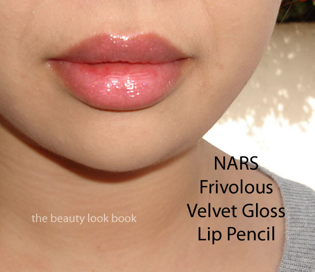
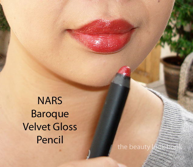
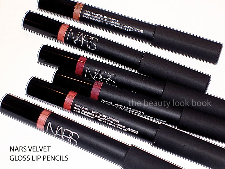
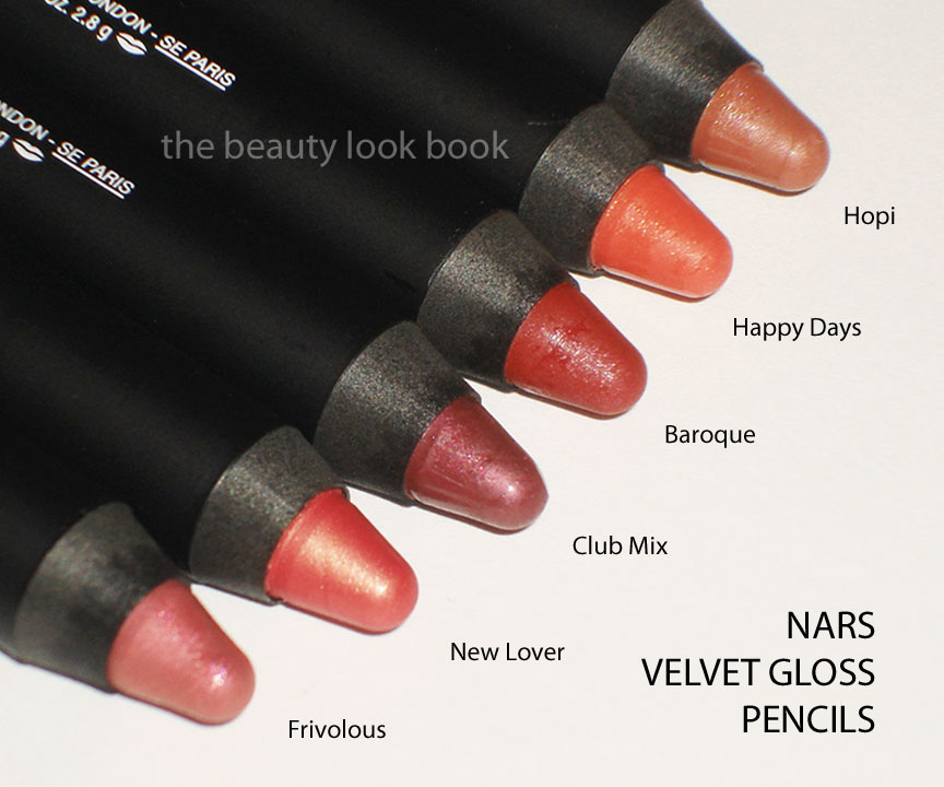
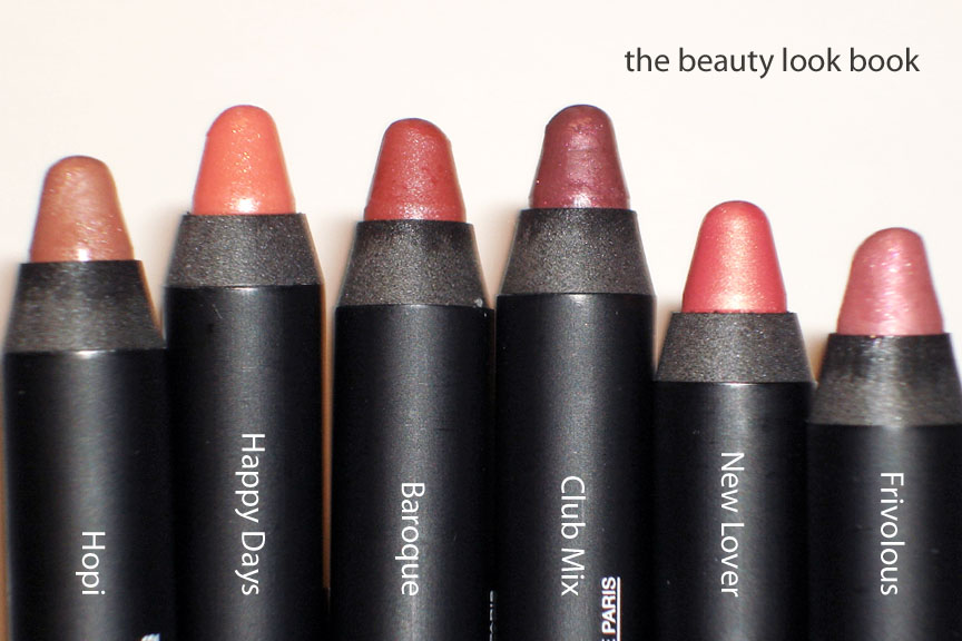
There are 6 Velvet Gloss Pencils from NARS which I arm-swatched a few days ago. I’m going to split up my lip swatches into three parts because my lips turn really pink after removing product. First up are Frivolous (sheer iridescent blue-pink) and Baroque (brick red with silver sparkle). I’ve been playing around with these for a few days and find it interesting how different these look on the lips compared to what you see on the hand.
I’ve included two sets, one taken during the day, one taken at night so you can see the difference based on lighting. I’ve noticed that I get 4 applications before these wear down to the point you need to re-sharpen. There is a noticeable plastic smell when you apply these but once your application is finished, you no longer smell chemicals. I sniffed my pencil a bit more and decided it’s not the actual lip product that smells but the pencil part.
Lasting power is like any regular glossy lipstick. The finish is glossy and beautiful but I do find you need to either use a regular lipliner or apply these with detailed accuracy or else you will end up with lopsided lips. Applying a regular liner first and blending will help make the edges appear seamless and more natural.
These are sheer but show up better on the lips. I do find your lip needs to be clean or evened out with your underneath color. Any overlap of foundation will show through since these have a semi-transparent finish, even for the darker ones.
So here are Frivolous and Baroque swatched on my hand. You can see all the colors lined up here.
Frivolous is a gorgeous pink in the tube but goes on clearish on the hands and lips. Layering is required to get it to show up on the lips. It’s very subtle. It might not show up on everyone. I wish it was just the slightest bit more pigmented but I’ve worn it several times since getting it already because it’s so naturally pretty. You definitely need a fully-cleaned lip or a darker pink lipliner beneath to make the most out of this. Here it is in daylight, without anything underneath.
Here it is at night, with a flash:
Bad blurry pic but you can see the glossy finish:
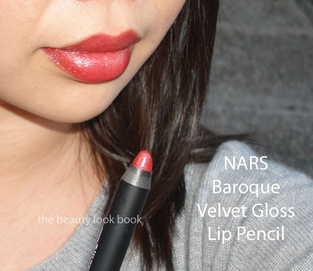
Baroque was a surprise for me. It looked really sheer on the arm and more brown. On the lips it turns into a vibrant red without any hints of brown. I’m not sure if it’s just me or if there’s something about how this pencil reacts with warmth from my skin? I highly recommend you try this out before judging the color. Again, I can’t emphasize how much of surprise this one was. You definitely do not get on the lips what you see in the tube. Here it is on me, again on bare lips, no liner or foundation underneath. In daylight:
There’s something irresistible about a shimmery palette of neutral eyeshadows for me. I immediately jumped on board for the Calanque shadow trio and Hollywoodland soft touch shadow pencil from the NARS Spring 2011 collection. Perhaps I jumped a bit too soon for the trio, although I do love the new shadow pencil.
Calanque Trio Eyeshadow $45: To date, NARS has released 2 eyeshadow trios, this is the first one I’ve tried. I bought the Calanque Trio sight unseen – my Nordstrom NARS SA was out for the whole week so I used the Order Online Pickup Instore option since there was no tester unit in sight nor were there any NARS reps available. The colors in the palette are:
Pale soft champagne chunky sparkle
Neutral camel fawn with a satin finish
High shimmer bronze
I used this today over NARS Corfu Cream Shadow applying the powders on the eyes in layers with fingers. Step 1: Apply Corfu, Step 2: apply lightest sparkle first, camel second, Step 3: Apply a smudgy bronze liner, Step 4: Apply bronze with finger smudged and blended over the liner.
Thumbs up for the middle and darker shades. The camel color is soft and almost buttery like and blends easily. The darker shade is borderline khaki but has enough brown to be a beautiful unique shade. If you’re looking for that true minimalist look this is lovely.
Thumbs down for the poor layering quality. These colors really need to be layered over creams (cream base, cream shadow or smudgy liner). The powders in this trio do not layer well over each other. I normally layer and blend over creams anyways – these just take a bit more work. I recommend using a denser thicker brush to apply the colors by patting and softly blending. Thumbs down for the price as well (at least for the size and amount of product you get). The cons for me exceed the pros.
Amy from Café Makeup has a lovely review of Calanque for lighter skin. Her photos are phenomenal!
Hollywoodland Soft Touch Shadow Pencil ($24) is a gorgeous shimmery warm beige-gold. I have these pencils in Goddess (soft pink champagne) and Aigle Noir (black with gold sparkle) and like the lighter colors better. They are pretty when applied all over the lid alone, as a base, or just combined with a liner. Lasting power is medium for the lighter shades and non-existent for the darker ones (at least in my experience). Do they crease? I wish I could answer – the only cream product I have had crease on my monolids is NARS’s Eyeshadow Base (and yes I know it has no color, but it still showed crease lines on me). This pencil is gorgeous and right up my alley.
Calanque Comparisons (all swatched over UDPP, neutrals don’t show up well on my arm):
Hollywoodland Comparisons (over bare arm):
Overall – love the pencil, but I could have passed on the trio. I think the texture of Edie and Abyssinia singles are far superior to the Calanque trio. The colors are hard to dupe but not must-haves in my opinion. Perhaps it will take more experimenting for me to really like it. Surprise for those of you who think I’m way too obsessed with neutrals! I have found a neutral palette that is too neutral for me.
Applying with the fingers worked just fine this morning and lasted all day over the cream shadow, but it’s not ideal as the oils from my fingers are bound to ruin the surface texture. I thought I loved it earlier this morning when I applied it, I really liked the result, but after playing around with it more at home this evening with brushes I’ve become less in love, especially after comparing it to the soft texture of the NARS singles and duos. Again, I know this is supposed to give a minimalist effect – but All About Eve, Edie, Silk Road, Abyssinia & Nepal are all minimalist neutrals but give a better payoff enhancing the eyes much better with natural glowy highlights.
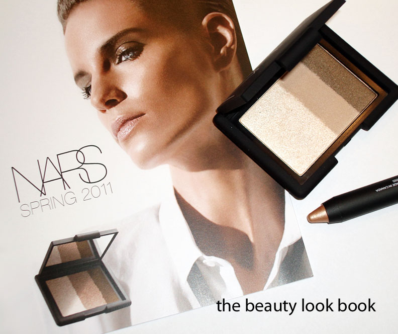
On the upside for NARS – you can see they are doing much better in their promotional campaigns with accurate photos! I received a spring flyer in the mail and you can see their photos are pretty darn good. Yay for better presentation to help us get a more realistic idea of what to expect before we get to see the real live product =)
The newest items from NARS: Velvet Gloss Lip Pencils, $24 each. All photos my own. I loved all the colors so much I had to get one of each. The finish is similar to those MAC Lipglass Pencils from the In 3D collection back in 2007. I have on Club Mix today and it’s a lovely plum with a pretty sheen. With the exception of the two lightest shades, Hopi and Frivolous, the other colors have decent pigment. They do have a natural finish so if you’re expecting a high impact type of pay off you might be disappointed. The texture is smooth with a soft gloss finish. I have yet to try Hopi/Frivolous on the lips. I am hoping to do lip swatches this weekend with a more detailed review. In my excitement I didn’t double check the boxes to see if these came with sharpeners. I know NARS Lip Pencils usually do not, however at $24 each it would have been nice, especially for a chubby stick. I’m not in love with the price but the formula and finish is lovely and the colors are just beautiful.
* On the nails, Chanel Rose Paradise Le Vernis (has been reviewed here)
I have mixed feelings about NARS Multiples. They have consistently received glowing rave reviews year after year by beauty editors as the ultimate multi-tasker. I like the idea of a multi-use product but find these too emollient to wear on the eyes. I find these need a bit of work layering either over or under powder to extend the lasting power. I know it seems odd that one would apply a cream product over powder, but the creamy consistency allows easy blending to create a highlight glow.
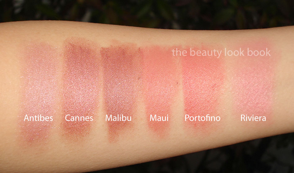
My first NARS multiples were Malibu (a dusty brown pink) & Copacabana (a pale white frost). I loved combining them using the pink brown on the apples of my cheeks and the pale white dabbed on top blended up towards the temples for a dewy glow. Today there are 3 variations of the Multiple Stick: the regular Multiple, the Multiple Bronzer and Multiple Tint.
Discontinued shades include Waikiki (dark bronze), Ibiza (yellow), Sumatra (dark purple), Mauritius (deep brick red), Cannes (gorgeous plum mauve frost) and Antibes (shimmery pale lilac).
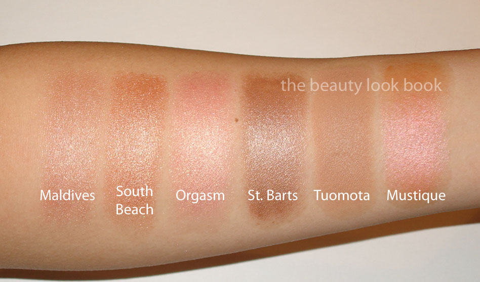
Shades that I have include: Antibes, Cannes, Malibu, Maui, Portofino, Riviera, Maldives, South Beach, Orgasm, St. Barts, Tuomota (Bronzer), Mustique, Copacabana, Luxor, Turks & Caicos Tint, Cadaques Tint & Beverly Hills Tint. I wear all on the cheeks or temples. I have used Luxor and Copacabana on the eyes before as a subtle highlight but prefer regular cream shadows.
The Regular Multiples: These are hit or miss with the creamy texture. I find Maui/Riviera/Orgasm to be drier in texture making them a bit harder to see the color. I have recently replaced a few shades that were near use-up (yes, it is possible to use one up) and it seems that the scent is slightly different but I cannot confirm if the formula has changed. My top 5 favorites are Antibes, Cannes, Mustique, South Beach and Portofino. The colors are visibly shimmery. I wouldn’t recommend them for oily skins.
The Multiple Bronzers: Being a huge fan of Laguna bronzer, I was excited to try the Bronzer Multiples. These however were a disappointment. The flat color makes my skin look ashy and fake.
The Multiple Tints: LOVE these! I reviewed each shade previously before and still love using them. My past reviews are linked here Beverly Hills and Cadaques and Turks & Caicos. I believe these were Limited Edition – I’m not sure if you can still find these instore?
Here are the shades I own plus swatches:
Overall like, but the lasting power is not always the best for the regular formulas need work with layering/combining of powders to make them not disappear by lunchtime. Believe it or not I’ve used up an entire Malibu and South Beach =)


