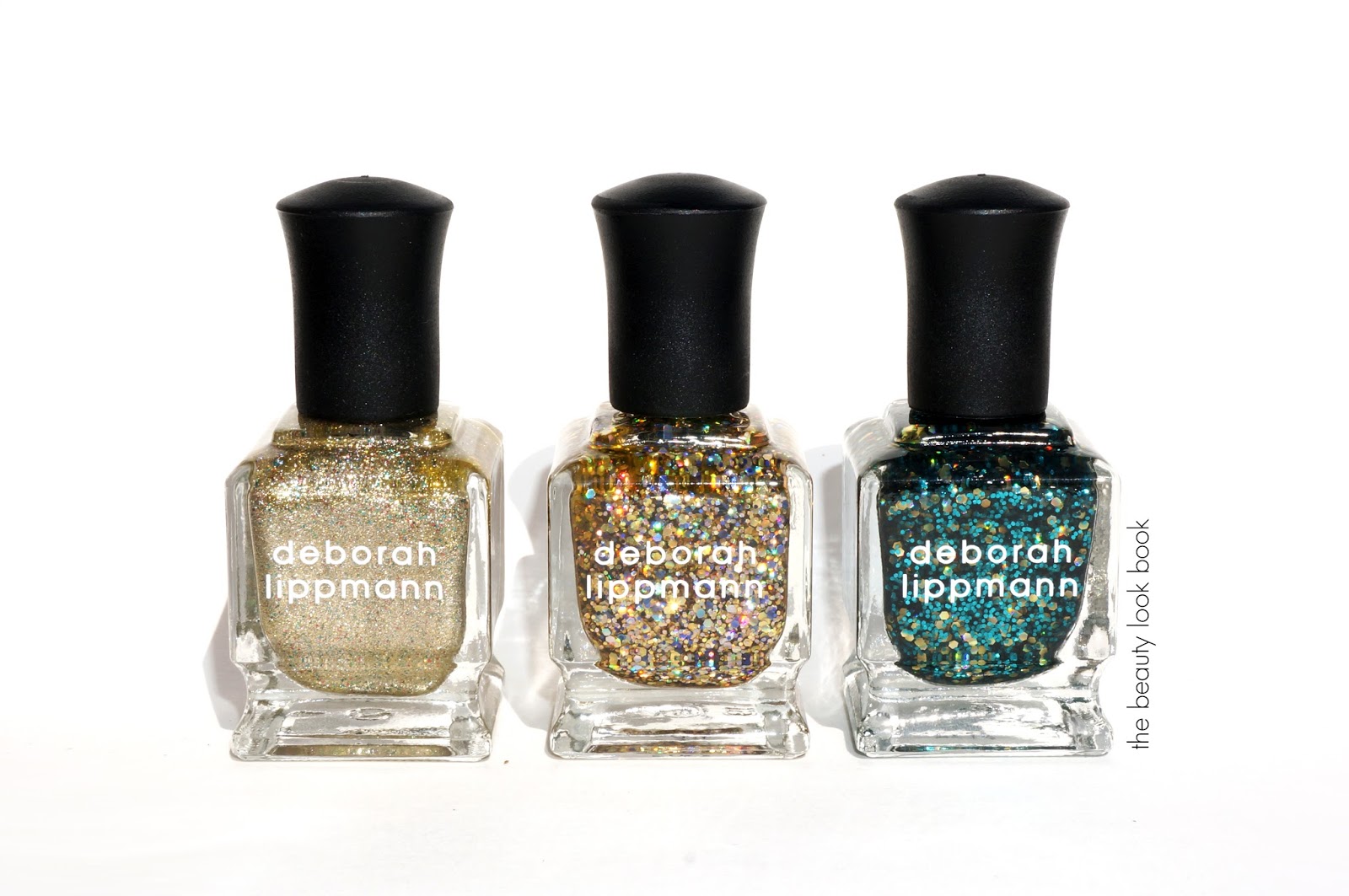
Deborah Lippmann makes the best glitters. Her line is one of the few that catches my eye enough to brave the glitzy chunky glitters even though I’m very conservative when it comes to makeup and nail polish. Her fall Jewel Heist collection has some beautiful glitzy shades. I was really surprised with myself for caving on Fake It Til You Make It ($17), Glitter and Be Gay along with Shake Your Money Maker (glitters $19 each). Every now and then I’ll try something way out of my comfort zone, determined to make the items work for me. These colors were just so stunning in the bottles I couldn’t pass, but after testing I found these to be extremely glitzy. I’m not sure exactly when I’ll find the right occasion to wear these since I work full-time in a conservative corporate environment. (I’m testing the glitters on the toes this weekend.)
Fake It Til You Make It is a glitzy textured gold-platinum infused with red, green and silver micro glitters. Two coats give a rich super metallic look. It’s the only one of the three I feel comfortable wearing on my fingers but still a bit too glitzy for me to wear to work.
Glitter and Be Gay is a mesmerizing gold glitter infused with smaller chunks of multi-colored sparkles. Like many other glitters, this one requires careful application to get glitter on the nail. Two rounds of dabbing and then brushing get the nail covered evenly with still a bit of the bare nail showing through underneath. It looks pretty layered on top of a red or another gold. Extremely glitzy though.
Shake Your Money Maker has a sheer transparent green base, large chunks of gold glitter and then smaller chunks of green glitter. It has a festive holiday feel. I love the color but still have no idea when I’ll actually be able to wear it.
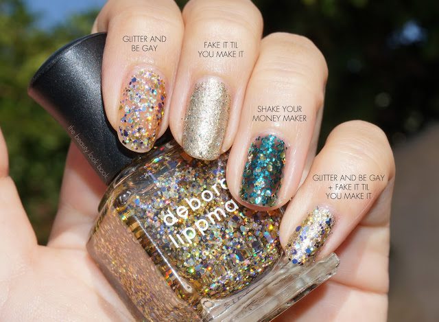
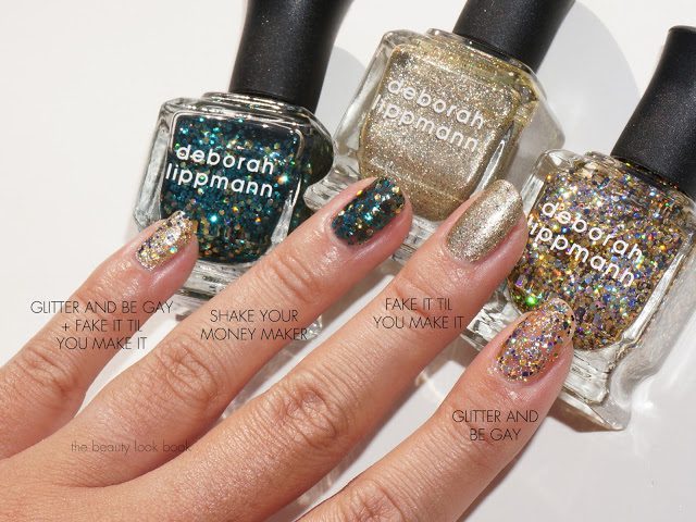
Here they are swatched, two coats each:
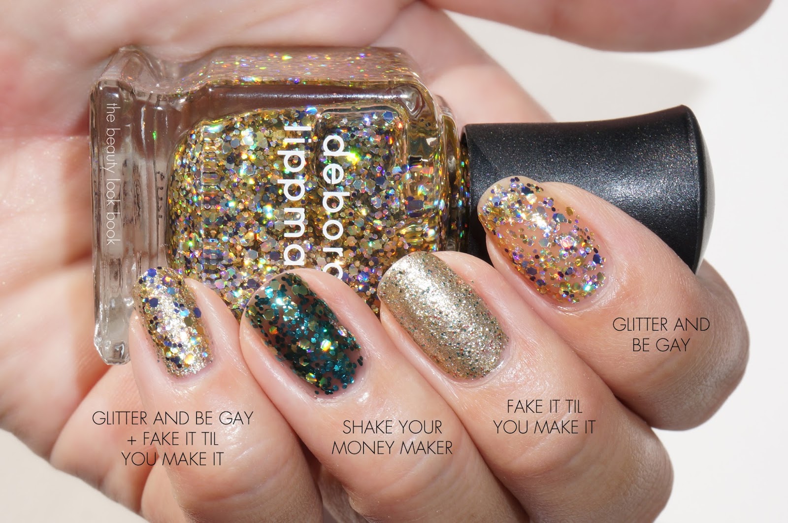
Fake It Til You Make It is the only one I’ve tested so far for a full manicure. Here it is swatched and another set with comparisons to prior limited-edition shades (unfortunately no longer available):
Definitely out of my comfort zone but irresistibly gorgeous. I can’t stop staring at the bottles! As a business/financial analyst – I don’t think I can pull these off at work (call me boring but I just can’t do it). Do you like glitters for nails? Can you wear them easily or are you more on the conservative side for nails?
I spotted Dior Nuit 1947 ($24 for 10 ml/0.33 fl oz) on This That Beauty’s Instagram here and here and fell in love. I ordered it as soon as it popped up online. Dior Nuit 1947 #970 is a dark vamp with a jelly finish. The texture makes it on the sheer side. It applies with a see-through finish that can be a bit streaky with two coats. Applying a third coat seemed to be a must for me to achieve a rich dark even finish.
If you look closely at the bottle you will see very subtle shimmers. It’s not really visible on the nail except at certain angles.
Here it is swatched with two coats:
Here it is with three coats:
More with three coats:
I’m out of nail wheels so I wasn’t able to do a lot of comparisons. Among the vamps I pulled I did find Dior Nuit 1947 to be the deepest richest vamp with three coats. The look is very similar to many other vamps though. Unless you have direct sunlight shining on your nails, most of the vamps look identical in natural light. Here are a few comparisons I pulled to Chanel Diabolic (d/c), Chanel Western Light (limited), Chanel Rouge Noir (d/c) and Chanel Strong (d/c).
With flash:
No flash, under artificial light:
I really like Dior Nuit 1947. It is a bit high maintenance since it definitely needs three coats. The finish is rich and glossy though. If you have a lot of vamps I don’t think the new Dior is a must-have. It’s very similar to other classic vampy nail colors.
Armani has released a new formula of lipstick called Rouge Ecstasy ($34 each for 4.2 ml/4g). There are 36 different shades encased in a drop-dead gorgeous bright red magnetic-capped tube. I was drawn to all the peaches the first time I tested these. The first color I picked up was Heat #304 a bright coral-pink. The Rouge Ecstasy lipsticks are thick in texture with a slight tacky feel when you apply. They don’t glide on easily but they don’t really tug at the lips either. The texture makes the color adhere well to the lips helping it last longer than most Armani lipsticks. The color is easily layerable. Swipe the tubes on the lips a few times, allow to sit and then press the lips together to blend the color and the lipstick then feels weightless but moist. There is a very soft lipstick rose scent – it’s not noticeable when you apply though.
Heat #304 is a bright coral-pink. There is a slight transparent quality since there is a glossy finish to the shade. There is a bit of shimmer in the tube which is on the subtle side. It’s noticeable but very very subtle. It adds dimension and brightens the color. I love how you can adjust the look with the color. One even swipe gives a healthy glow. Multiple swipes brightens the color to a vibrant coral.
Here it is swatched, on the lips it pulls more pink on me:
For lips I have tons of nudes and peaches. Often times corals and peaches look the same in the tubes or swatched but apply differently on the lips depending on undertone, pigment and shimmer. I found Heat #304 most similar to Chanel Mystique. I prefer the Armani since it’s not quite as dry and appears a bit more natural on the lips due to the subtle sheen. More comparisons below to NARS Lodhi, Tom Ford Insidious (swatched here), YSL Rouge Volupte #30, MAC Coral Bliss, Chanel Mystique (reviewed here), Chanel Flirt (reviewed here) and Edward Bess Forbidden Flower.
I’m overall very pleased with Heat #304. I just picked up a few more of the nudes which I’ll be testing this week. The Armani Rouge Ecstasy Lipsticks have a very nice moist feel on the lips without being too moist. I like that the texture is thick but still a bit shiny. The lasting power is quite good considering most of my other Armani lipsticks tend to fade quickly due to the sheerness. All Armani counters should have received the testers and product for sale. I found mine at Neiman Marcus. You can also find them online now at Nordstrom, Neiman Marcus and GiorgioArmaniBeauty-USA.com.
Tom Ford Orchid Haze Eye Color Quad ($78 for .35 oz/10g, made in Italy) is my favorite new release for eyes from Tom Ford. It’s a beautiful palette neutrals with rich smooth pigment. There are three shimmery shades in a frosted ivory, shimmery tan, and shimmery mauve pink. The fourth shade is a matte in a deep plum brown. Orchid Haze is a must-have for any neutral lover. The shimmers are very shimmery in the frosted finish. It’s not over the top though and the colors are naturally flattering.
After the preview I posted on Instagram, many requested it be compared to Chanel Raffinement (reviewed here). I didn’t think it would be similar but pulled it by request anyways. Below I’ve compared it to NARS Kalahari, Guerlain Les Fumes (reviewed here) and Giorgio Armani Quad #2 (swatched here).
Compared to most other neutral palettes Tom Ford Orchid Haze is the winner in my book. The pigment is incredibly smooth and rich with excellent lasting power. Definitely worth the splurge and a good excuse for you to visit your nearest Tom Ford Beauty counter to try in person. Tom Ford Orchid Haze is available now in stores at Tom Ford counters. Also online at Neiman Marcus.
Tom Ford Seductive Rose Eye Color Quad ($78 for .35 oz/10g, made in Italy) is new to the US but already released in Asia. The quad is a stunning palette with two textured sparkles and two finely milled shimmers. I am usually not a fan of sheer glitter sparkles and when I swatched this palette on the arm, I was disappointed to see how sheer the rose and purple were. Layering the sparkles resulted in simply more sparkle (versus color). The other colors swatched perfectly: a soft pink shimmer and a aubergine/plum shimmer. Even though hand/arm swatches were a let down, the good news with this palette looks much better on the eyes than on the hands or arm. The colors apply on the eye beautifully. The trick is to layer the glittery shades on last by softly pressing and then blending gently. The sparkles in this palette coordinate and layer beautifully with the shimmer colors. If you’re normally not a shimmer kind of person when it comes to makeup you will find this over the top. I like to wear shimmers, occasionally frosts, rarely do I wear high-sparkle shadows, but I fell completely in love with Seductive Rose. It’s one of those palettes you have to try in person on the eyes to see just how lovely it is.
A closer look at the beautiful textures:
Here it is swatched, you can see that the glitters apply very sheer:
I couldn’t find anything like Seductive Rose. When I saw photos when this was released in Asia I suspected this was a more sparkly version of Enchanted (limited-edition from the fall 2012 jardin noir collection). Swatching the two side by side show that the two are very different.
The sparkles in Seductive Rose seemed similar to those in the Tom Ford trios for this season. A comparison to She Wolf and In the Pink are below. The colors are similar in concept and sheerness, but I prefer the sparkles in the Seductive Rose quad – I find them a bit more wearable.
Swatched without flash:
Swatched with flash:
I think Seductive Rose is a must-have for me. It’s a definite splurge but the colors are unique and I love the way the colors look on the eyes. Even though it’s on the glitzy side I still find it wearable for everyday if the glitters are applied with a soft hand. At this time I’m not sure if it’s limited or permanent. I am happy it was released in the US. Seductive Rose should have arrived at all Tom Ford Beauty counters by now. You can find it online at Neiman Marcus, Bergdorf Goodman and Saks.
Tom Ford Lavender Lust Eye Color Quad ($78 each for .35 oz/10g, made in Italy) is a new release in the US. The color theme is pink and lavender in this palette with one glittery powder pink, a soft duo-chrome opal/oyster, a soft lavender frost and a purple with iridescent sparkles. The colors are well pigmented with beautiful textures. Each shade applies very well over a good base (I like Edward Bess Illuminating Eye Base). The top left shade is a sparkle/glitter. The trick to using this one is to apply on top of the other colors by patting for added shine. If you apply this one first, layering other colors will cause the glitter to fall off the eyes and all over the face. I still had a little fall-out when using this as a top layering shade but only from brush debris. As beautiful as this palette is, the colors combined were just too pink and pastel for my skin. Purples and soft pinks can be difficult to pull off for my skintone. It gives me a slight pink-eye look.
Swatches below:
This quad probably has quite a few single shades that are very similar from MAC and Urban Decay. The colors look very familiar. In terms of a palette, I don’t have very many purple-pinks but I did pull Dior Pearly Lilac (limited from 2009) and Dolce & Gabbana Petal to compare.
Tom Ford Lavender Lust can be found at Tom Ford Beauty counters now. Beauty week is just around the corner for instore and online at Neiman Marcus. Also online at Bergdorf Goodman and Saks.
Tom Ford Beauty has released several new Eye Color Quads to the US in Lavender Lust, Seductive Rose and Orchid Haze ($78 each for .35 oz/10g, made in Italy). This is a quick preview with swatches. I’ll be posting detailed reviews on each quad later this afternoon and tomorrow. So far my favorite is Orchid Haze mainly because it doesn’t have any glitter shades. Seductive Rose is a close second. I’m not thrilled with Lavender Lust because it pulls very pastel on my skin. Pastel lavenders/pinks are hard for me to pull off (I purchased it sight unseen).