Monthly Archives

April 2011

Uncategorized

Giorgio Armani Mediterranean Eye Palette Summer 2011

April 28, 2011

Armani has established a long standing tradition of releasing a collection in their Bronze Mania/Mediterranean theme for summer each year. Armani has released their latest edition of the Mediterranean Palette in a four-pan eyeshadow quad for Summer 2011 ($59).

Going back as far as I can remember, Armani has released different variations of double-decker palettes for summer usually a bronzer and eyeshadow combination. I am excited this year they have released a full sized quad. Even more excited that this summer is one of the first seasons I’ve seen something appears to be something truly Armani. Something gorgeous, glowing and gloriously neutral. You might find these links interesting to see the history of Bronze Mania in the following awesome reviews:

The Summer 2011 Mediterranean Eye Palette has four shimmery summery shades. From top to bottom I would describe them as:
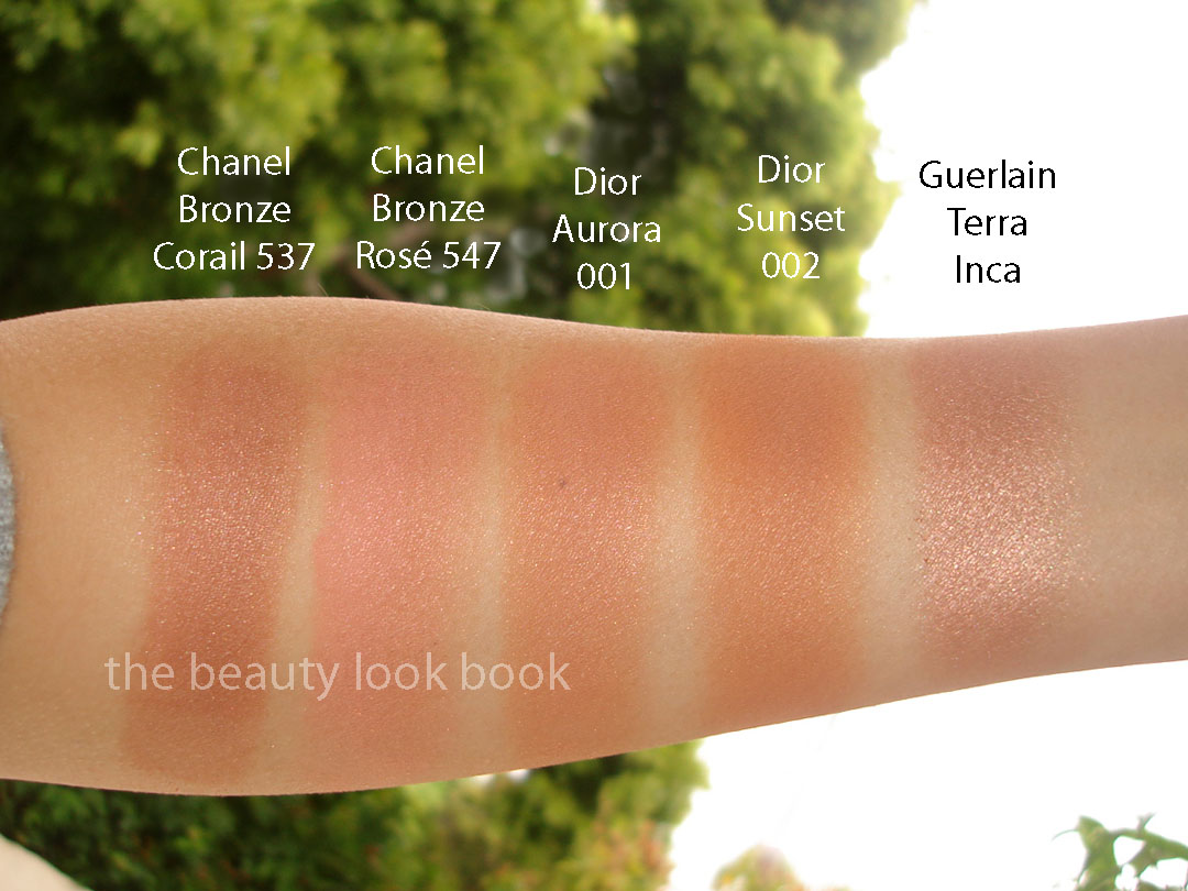
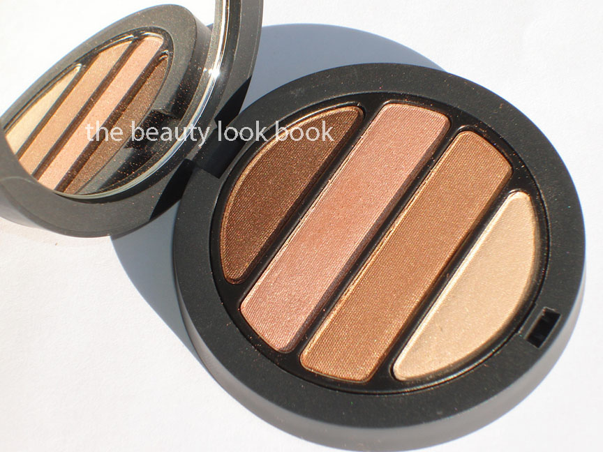
  • warm shimmery deep bronze
  • complex apricot champagne infused with a warm gold shimmer
  • warm coppery gold frost
  • warm champagne cream glow
The texture is soft. Pigment is rich. The colors are easily blendable. It’s stunning in the compact and on the back of the hand. The shades are amazing when you pick them up with your fingertips. There is a little instruction card that comes with the palette to give you ideas on how to create a day or night look. The verdict? I don’t think it’s a must-have. I’ll explain why below. First, here are the photos in direct sunlight and with a high flash:


Instructional card with helpful diagrams:

Swatched on a slightly moisturized arm, although no base was really needed to pick up the color:

Closer swatches so you can see the sheen:

So why am I not raving like crazy about this one? For some reason, warm shades like the ones in this palette simply blend together and melt into my skin so you can’t really see much. I need a good moist base and a slightly damp brush to apply wet for them to show up on my olive skin. Plus, I can only use 3 shades at most for these colors. Another thing – I noticed it looked very familiar and went through my quads in search of a dupe. I found it virtually identical to Chanel Spices. The Armani is more intense and more pigmented, but the effect is strikingly similar.

The differences are noticeable, but subtle:

I just know on my eyes, both quads will look identical. If you have pinkish undertones or fair skin, I think this will be *the perfect* combination of colors for you. I envision it will be stunning on blue-eyed and green-eyed girls. As much as I love neutrals, it doesn’t really show up on my eyes. Your mileage may vary. I worry when some really take to heart when I say I’m not in love with something. I don’t want you to write something off simply because I do. As other bloggers have noted in their reviews, this is a beautiful palette. Indeed it is. Due to the vastness of my stash, I knew there was a likely chance that I would have something similar.

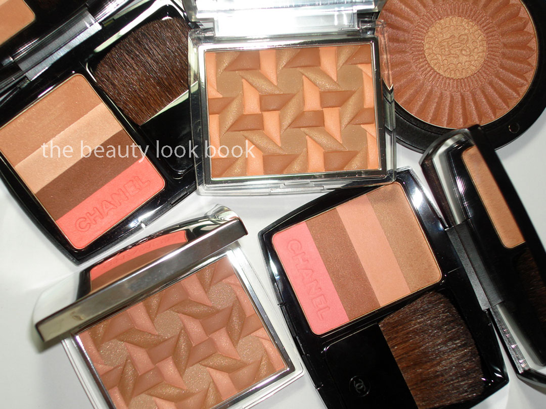
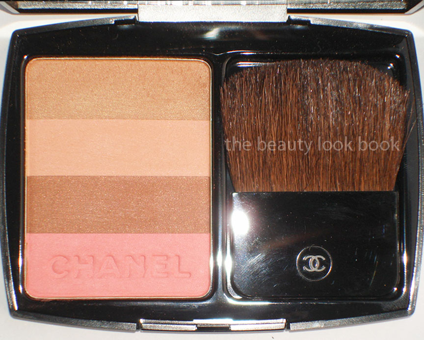
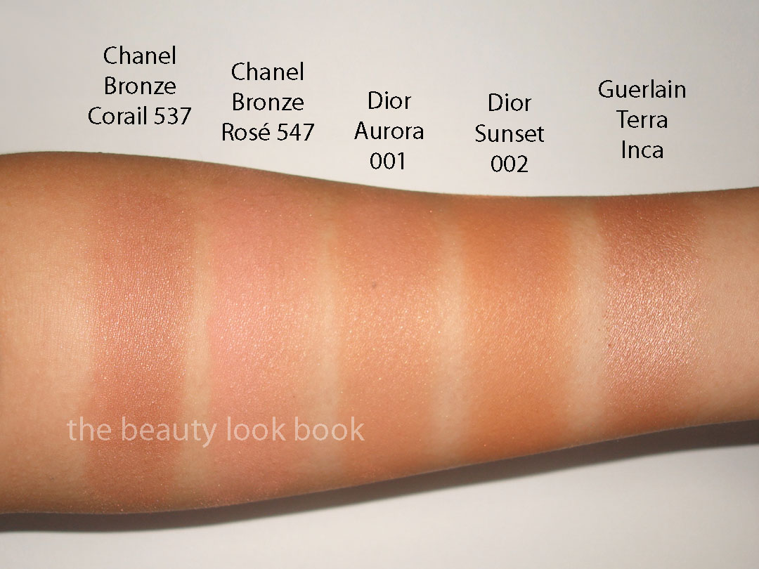
If you liked the colors in Chanel Spices but don’t like Chanel quads, this Armani is the one for you. The texture is more blendable than the Chanel and more visible on the skin so it will stand out more on most of you (even if it just blends away into nothingness on me). Armani is more pigmented/intensified so it’s slightly better for the wear.

All in all the quality is still amazing. The pigment is surprisingly good. The texture is to die for. I’ll figure out a way to play with the colors and layer them to make them show up better. I already have ideas of layering these with a few of those powder/cream Eyes to Kill Hybrids that I think will be interesting.

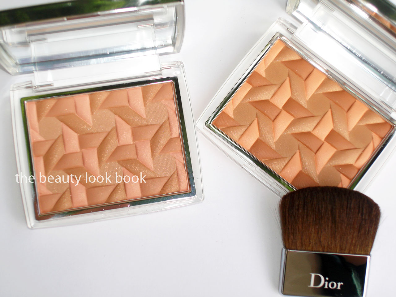
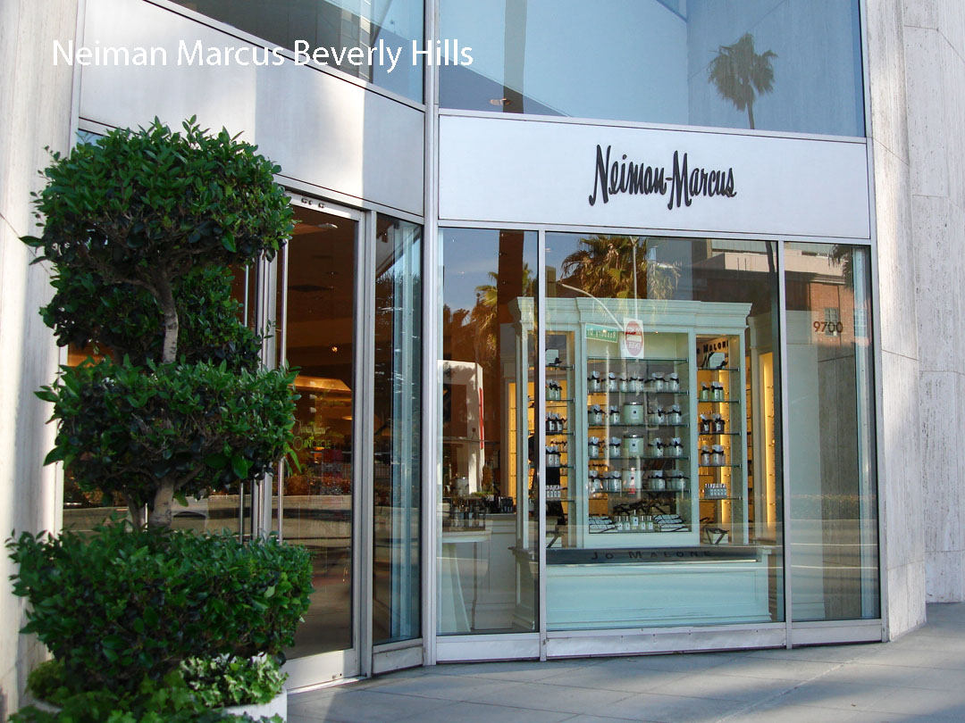
At the time of this post, I don’t think it’s online yet. I found mine at Neiman Marcus instore. I did not check out the other items in the collection so I can’t comment on those. I’m still smitten with Chanel and Dior. More on the Dior quints soon. If you have an Armani counter near you GO and play with this to decide for yourself 🙂

Uncategorized

A Few Questions Answered

April 27, 2011
What kind of camera do you use? I use a Sony Cyber-Shot Carl Zeiss 8.1 Mega Pixel digital camera, I’m not sure of the exact model but the top says DSC-N1. The lense says 2,8-5,4/7,9-23,7. It was given to me as a gift around 2005. Update – all photos are taken with either the auto or forced flash settings. Photoshop is used for all photo editing. As many have noted, you don’t need a super expensive camera to take decent photos! Play with lighting, angles, zooming – the fun is in the experimentation.

What’s your favorite brand? I don’t have one favorite, but these are my current top picks: Chanel, Dior, Edward Bess, NARS.

Can you post pictures of your eye makeup? I’ve tried numerous times and they just don’t turn out so great. So, no, sorry.

Have you written your update on Chanel Vitalumière Aqua? Yes. See it here. It’s no replacement for Teint Innocence, but it’s the next best thing in my opinion. I am still crying over the discontinuation of Chanel’s Teint Innocence Liquid Foundation. I’ve stocked up on 4 back up bottles.

How do you find the right nail polish for your skintone? My answer is two-fold. 1) I don’t think there is a right or wrong color for skintone, it’s just a matter of personal preference 2) My personal preference is subject to occasion, mood and mostly a matter of being brave to try almost anything (except certain green, blue and yellow). But then I could be completely wrong in what I like. I’ve definitely had occasions I’ve fallen in love with a color to be told by close ones I trust, “that’s not good with your skintone.”

How do you like Edward Bess Daydream Bronzer? I feel like a broken record saying this yet again, but it is my holy grail of bronzers. If you do a blog search, you will find a number of features, swatches and reviews on this beauty. Note I am a Southern California girl who loves the sun and always prefers to be tan. My personal style is natural but for bronzer I will do anything from a soft to a dramatic bronzer. I don’t stick to one look for anything, bronzer included. The Edward Bess bronzers are extremely versatile and layerable.

Is the EB Daydream better than the new bronzers from Chanel or Dior? I cannot say whether I think one is better than the other – they are all unique and different in their own way. I find EB Daydream is my go-to staple (my personal current favorite) but the Chanel and Dior are equally gorgeous. I do personally believe the Daydream is more universally flattering for fair to medium skintones. Everyone has a different preference for what they envision the perfect bronze to look like, I cannot tell what will look best on you, I only know Edward Bess’ Daydream looks good on everyone I’ve seen it on (I’ve probably observed it on about 10 different faces). This is not to say the EB Daydream is better or the best. I think there are a number of other great bronzers out there. I lived on NARS Laguna through my college days and still love it. MAC Golden and Bronze are fabulous natural looking bronzers that are soft and glowy (and very affordable). Armani has great bronzers. Right now my favorite is the Edward Bess.

Can you link my blog and/or website or can I write a guest post for you? At this time I do not take guest posts and I like to keep my blog advertising free other than consumer to consumer. I will link outside of my blog when I feel it is relevant to what I am writing about. I do not appreciate aggressive bloggers who pressure me to link them. This is one reason why I do not publish comments with spam links.

Do you receive special perks or treatment for being a blogger? No, I do not. I’ve only told a very small handful of people who I am (literally less than I can count on my fingers). They kindly respect my privacy. For PR lists, I think I’m on a total of only 4, which may be surprising to many of you. I have not actively requested to be added to PR lists. I’ve been invited to a small select few and of those few, I am very selective (you will note if you search hard through my blog I have only featured 2 items that were sent for review).

I’m a new blogger, can you check out my blog and tell me what to change and how to get more traffic? First, welcome to the blogging world! Second I think all of us always wonder about hits and web traffic. I’m not one who has really figured it out. Patience is key and I will say if you’re mostly concerned about traffic you’re starting off on the wrong foot. Third, I’m flattered you would ask for my opinion about your blog – but I believe blogging is a personal process you need to discover on your own. Even after a couple months, many are impatient wanting to get it perfect right away. Appreciate that you are doing something creative on your own and be original. Don’t try to mimic someone else. Almost 2 years later, I’m still developing my own blogging style.

Can you show more pictures of your dogs? It’s hard to get both my JRTs to sit still together in one spot. I would love more photos of my pups, but I tend to get pictures of only one at a time. They just have way too much excitement! Here’s one with their baby from several years ago. His first baby steps.

Uncategorized

Summer 2011 Bronzers: Chanel, Dior & Guerlain

April 25, 2011

Chanel, Dior and Guerlain have all designed stunning bronzers for this summer – the most beautiful I think I’ve ever seen. I splurged on five and featured Chanel Bronze Corail & Bronze Rosé here and Dior Aurora and Sunset here. I have not yet featured Guerlain but several have asked for comparisons asking which one is best. Others have asked if I could compare Chanel to other summer collections such as Lancome, Estee Lauder, MAC.

I have a sizeable bronzer stash (I always want to be tan) so this summer I decided to go for the ones that seemed the most unique – namely Chanel, Dior and Guerlain. I have not checked out the other brands this year and most likely won’t since I already splurged on five pricey ones all before May/June when the real summer season begins. I definitely could go the rest of my life without buying another bronzer (or another piece of makeup for that matter).

Here are all five lined up plus swatches and further down, my thoughts and comparisons on Chanel Bronze Rosé, Chanel Bronze Corail, Guerlain Terra Inca, Dior Aurora and Dior Sunset.

Chanel Bronze Rosé

Chanel Bronze Corail

Guerlain Terra Inca

Dior Aurora

Dior Sunset

Swatched in different lighting, all with a very heavy hand:


I’m currently working my way to a NC40/Chanel Beige but I’m not quite NC35 yet. I am back to a Chanel Shell Teint Innocence and my Vitalumiere Aqua B20 is now too light. My thoughts on bronzer is that I’m open to anything. Orangey, brown, gold, pink, peach – I’ll wear and try almost anything. Note that I don’t love ones that look orangey but I don’t hate them either. If you pushed me to pick just one of the new summer shades I would probably be very upset. I like options. But here is what I’ve observed on each. Do note these were swatched with a heavy hand and that what you see on the arm is definitely not what you would see on the face.

Chanel Bronze Rosé 537 ($50) & Chanel Bronze Corail 547 ($50) – These are luminous and glowy but not frosty. I’ve taken a soft powder brush and swiped these up and down to blend/mix and then apply on the apples of the cheeks. If you’re the type of person who is afraid of bronzer or find most are too dark/muddy on you – Chanel’s are the perfect hybrid between bronzer and blush. The fact that there are 4 stripes in each compact allow you to get something that shows dimension without looking like a true bronzed-bronzer. The texture is so soft and glows. Pigment is soft to medium but totally layerable. It’s the goof-proof bronzer. I don’t think you can overdo it. So easy to use, apply and coordinate with virtually any eye or lip look.

Guerlain Terra Inca ($70) – Gorgeous but oh so pricey. I found this to be more of a highlighter. It’s not as frosty as some previous Guerlain Limited Edition Bronzers. If you remember Orient Sun, Terra Inca is a lighter softer less frosty version of Orient Sun. It’s like a softer more luminous MAC MSF. It’s absolutely beautiful but after applying it on my face, I could tell it’s not for everyone – the shimmer factor might be a deal breaker. It’s not as frosty as Bobbi Brown Shimmer Bricks – but you can definitely see it on the skin. The compact is magnetic which I find different. The packaging and design are absolutely stunning but not the most easy to use and must be used with care.

Dior Aurora ($46) & Dior Sunset ($46) – These are the least shimmery but still very luminous on the face. I prefer these for the most beautiful design and functional packaging. They give the best bang for your buck and I love that the brush is stored in a separate pouch instead of being inside the compact (does anyone ever use those dinky brushes anyways?). I will say these are very warm-toned. Aurora doesn’t go on orangey but the warmth might not work on everyone. Will this work on NC40’s? I can’t say for sure, but my Dior sales rep is around NC40-45ish and she was wearing Aurora beautifully when I purchased mine. That being said, test it out yourself first to check. Sunset is swatched with a SUPER HEAVY hand and looks orangey on my arm but on the face it is not orangey unless you pack it on. I wore it yesterday for Sunday Brunch and it gave a healthy warm tanned glow.

So which one is best? That is a tough pick. You definitely don’t need all of these, but I’m obsessed with bronzer like I’m obsessed with peach blushes and taupe eyeshadow. If I could only pick 2 – it would be Chanel’s Bronze Rosé and Dior’s Aurora, although Sunset by Dior is gorgeous as well.

I hope this helps you see a side-by-side comparison. There is no substitute for trying these on in person. If you go to the counter, I highly recommend you try these on the face and not just on your arm or hand. A good brush makes all the difference (versus your fingers).

Uncategorized

Dior Electric Tropics Catwalk Duos: Aloha 638 & Paradise 558

April 25, 2011

This is a quick post to show you the two new nail shades from Dior in the Electric Tropic Duos in Aloha and Paradise, each $26 including a top coat. These colors are vibrant. I’m sure you could spot them from a mile away. They are that bright.

Aloha 638 was featured earlier (see one post down). My Dior Paradise 558 photo attempts = total fail. The neon simply does not do well with my camera. In this post are the comparison pictures of the two shades in the bottles and a few shots of Paradise. To quote Café Makeup, “Paradise is within an entirely different species of nail polish” – INDEED! I do have a couple Paradise swatches below. Note that I am not being modest when I say the photos below are extremely poor in quality and accuracy. Paradise is a jelly neon pink that dries to a matte finish. The texture is so interesting – just like jelly shoes. I highly recommend these sources for better swatches:

A few more pictures:

In real life Paradise is a hot sheer cool pink, it doesn’t glow like this in person, but this is the best I could do – see how it kinda blinds my camera:


One last shot:


Aloha (shown one post below) photographed much better! It’s my favorite of the two.

Uncategorized

Dior Electric Tropics Catwalk Duo: Aloha 638

April 24, 2011
Dior and Chanel have both released hot colors for nails this summer. Dior’s Electric Tropics Nail Duos are the winners for representing a “true summer” resort theme with Aloha and Paradise. Chanel’s Mimosa, Morning Rose and Beige Petale, while absolutely stunning, seem more “spring” to me, but I feel both collections are wearable for year round – especially for us Southern California girls.

There are two color options for the Electric Tropics Catwalk Nail Duos ($26 each, on Dior.com, personally spotted at Nordstrom and Saks) which consist of a bright neon jelly-finish nail color paired with a quick-dry top coat. Aloha is an electified tangerine and Paradise is a glowing neon pink. The fact that both Aloha and Paradise are fluorescent made these incredibly difficult for me to photograph accurately. My camera doesn’t do so well with neons. Aloha photographed better so I decided to feature this one first.

The duos each retail for $26 which seem incredibly reasonable in price considering full sized nail polishes retail for $21. Aloha 638 is a hot orange that looks incredibly bright when any bit of light hits the nail color. In real life the shade it looks a bit more reddish – like a burnt orange color. Regardless of the lighting though, Aloha glows. The texture is smooth and slightly transparent due to the almost jelly like finish but goes on with full rich color in two coats. It dries to a soft semi matte finish but there is still shine. (Paradise on the other hand dries to a non-shiny finish.) These are officially THE brightest shades I own.

There is a little instruction card that comes with each duo:

Here it is in direct sunlight – electric! Two coats Aloha, 1 coat Top Coat:

In different lighting, not direct sunlight, but with flash – still neon (note, in real life, it’s more reddish):

At an angle you can see how it’s slightly transparent/see through near the tips of the nails:

No matter what lighting – it looks fiercely fluorescent, like a super bright orange electrified. In real life you can see more of a reddish hint to it so it’s not a pure orange on me, but more of a tangerine bright.

I thought Chanel Orange Fizz (here) and RBL Coral (here) were bright. Nothing compares to the Dior. Next to Chanel Coromandel (here) the Dior Vernis Aloha looks like it has no red, but it really does.


Overall Dior is the winner for summer brights. My bright nails combined with the beachy coconut smell of Jo Malone’s Sweet Milk Cologne make me feel like it’s summer. I personally prefer the Aloha far more than Paradise. It will go with a crisp white shirt, a silk navy blouse, a white and black printed button down – the versatility is amazing considering it’s such a vibrant in-your-face bright.

So far the top coat seems to be like a winner. Smooth coverage and my nails are shiny. No shrinkage of bubbling (huge plus). The texture seems thinner than most top coats so it’s not quite as shiny as some others. I’m really impressed so far but I’ll have to see how it wears in the next few days to really decide.

I liked these other reviews of Dior Aloha which I think you’ll find helpful:

Happy Easter everyone!

Uncategorized

Diorskin Nude Glow – Healthy Glow Summer Powder in Aurora 001 and Sunset 002

April 22, 2011

The summer collections this year have some of the most beautiful bronzers I have ever seen. I’ve been trying to find Aurora and Sunset everywhere – it appears Saks received their items first in the US and finally Nordstrom just received them this week. (On Saturday Aurora and Nude Tan Quint were both sold out already.) Being the bronzer-obsessive woman that I am, I jumped on both bronzing powders, Aurora 001 and Sunset 002.

The Diorskin Nude Glow Healthy Glow Summer Powder couldn’t be better named. They both give a warm healthy glow. Each shade has a beautiful woven pattern with four different shades in each. Both have visible shimmer and if you swipe your finger into the palette you will see a highly pigmented frost. On the skin, however, the shimmer tones down and you get a beautiful glow. The shimmer, to me, is barely detectable on the face.

Aurora 001 is the lighter softer version with soft peach and different shades of brown and tan. It’s fairly warm, not quite peach, not quite brown, but a peachy-brown hybrid.

Sunset 002 is darker, warmer, deeper and it was borderline orangey when applied with a heavy hand – but I have gotten a bit of color so I think this will be gorgeous on Chanel Beiges/NC35’s (not quite there yet, but almost!). A bit of blending out and it looks just fine on me but I don’t mind a strong bronzer. I always want to be more tan, and unfortunately I’m really fair right now!

Side by side, blurry but hope you can see the undertone:

I couldn’t find any dupes. The woven pattern makes this easy to mix and blend all the colors together so you don’t end up with stripes on the face. Plus the combination of colors makes both of these unique.

Comparison Set 1: MAC Shooting Star MSF, MAC So Ceylon MSF, Dior Sunset 002, Dior Aurora 001, MAC Sunny By Nature MSF, MAC Warmed MSF, MAC Gold Deposit MSF


Comparison Set 2: Le Metier Maldives Magic, MAC Refined Matte Suntan, Dior Sunset 002, Dior Aurora 001, MAC Refined Golden, NARS Irresistiblement


Lucky girl Café Makeup has been able to play with Dior Summer for a few weeks since she found them in Paris. Definitely check out her series to see what Aurora looks like on Liz and Amy’s arm (both are lighter and cooler toned than me).

Overall I love both. I think once I get to be at NC35 I will be able to wear the Aurora 001 and have it show up. Sunset 002 is darker and more orangey but not too orangey for me. If you’re fair like Chanel Cameo or MAC NC30 – it may too much for you.

For reference, I’m currently Chanel Shell Teint Innocence, in between MAC NC30-35. My arm underneath is probably closer to a NC30 because the sun does not hit that area.

Uncategorized

Meeting Edward Bess

April 21, 2011

I’ve been enamored with Edward Bess since 2009 (first posts here and here) but I had never met Edward Bess or seen any of his products in person at Bergdorf Goodman. Everything I’ve fallen in love with has been ordered sight-unseen. From my first phone call (long before they knew I had a blog), I’ve been thoroughly impressed by their excellent customer service, spot-on descriptions and never ending patience with my questions about the colors, depth, pigment and texture of their products.

I’ve been dying to go to NY to see everything in person but my school and work schedules have not allowed me much travel freedom in the past 3 years. I have relied heavily on Susan from Bergdorf Goodman and Krista (no longer at BG) with their over-the-phone descriptions. They have always given me a good idea of what to expect and the products usually exceed my expectations. I was thrilled to learn that his brand recently expanded to a new location at Neiman Marcus Beverly Hills and was ecstatic to learn he would be making an appearance the same weekend I had planned to be in LA.


Meeting Edward Bess was surreal. Those who have had the pleasure of working with him know how wonderful, charming and beautiful he is both over the phone and in person. My friend of Jonesy and I were delighted to meet two of his artists, Leah and Jaime – both insanely gorgeous (inside and out) and talented makeup artists (trained from the best)! While I was at the counter, I observed at least 5 other women of all different ages and skintone who had their makeup done with Edward Bess products – each left glowing. The products enhanced their natural beauty in a way that was nothing short of radiant perfection.

Even though I was captivated by Edward, I tried to take note of what was being used on others. A darker skinned woman looked glowing with Deep Lust lipstick and Night Eyeshadow. A fairer skinned girl looked gorgeous with Blush Allure Lipstick topped with Sweet Dreams Gloss combined with Island Rose Compact Rouge on the cheeks. Another was wearing what I assume had to be his Midnight Bloom lipstick, a touch of bronzer and a classic simple eyeliner. All gorgeous!

Edward Bess:


I could go on and on gushing but I know everyone has been dying to know what Edward used when he did my makeup (yes, the highlight of my day!!). I was so caught up chatting with him I barely noticed he was applying my makeup. His makeup skills are phenomenal – have you checked out his video tutorials yet? (See them on EdwardBess.com.) What he used on me:

Skin:
Sheer Satin Foundation in Beige
All Over Seduction in Sunlight to highlight here
Ultra Luminous Bronzer in Daydream here, here
(everyone wanted this applied on them!)
Blush Imperiale in Soft Orchid here and here

Eyes:
Eyebase in the lightest shade (not yet released, to be named soon)
Ultra Luminous Eyeshadow in Storm on lids here
Ultra Luminous Eyeshadow in Mirage to highlight here
Defining Eyeliner in Deep Black (not shown)
Bess-Lash Mascara in Deep Black (not shown)

Lips:
Deep Shine Lip Gloss in Nude Satin here

I believe I’ve reviewed most of the listed items before – it will require a bit of searching through the archives if you want more details but below are pictures and swatches of the items that he used on me – only of the items I own. Disclosure: all items have been purchased by me. Brushes and foundation are new, they will be reviewed at a later date. I do not have the eye base, black eyeliner or black mascara so I supplemented the swatch with Urban Decay’s Zero. The foundation has been swatched in the corner to show you it’s not quite as dark as an untouched compact looks.

Three views of the swatches:


I left with great ideas on how to coordinate his products in ways I hadn’t thought of before. Hours later when I arrived back at home, my husband said he loved the makeup Edward used on me – a huge compliment as he typically says “they used too much” after most makeovers. The look was husband-approved all the way 🙂

Having his entire line in front of me for the first time, I should have played with more but in my excitement I forgot to try his concealer and the lipsticks and glosses I do not own. I will have to save them for my next visit, hopefully at the Bergdorfs counter in NYC. Women were swooning over the counter and all his products eager to try each and every item and his bronzer was selling like crazy. I believe it has reached holy grail status for more than just myself – and rightly so.

I had so many questions I wanted to ask Edward – unfortunately they all went right out the window. I was simply too caught up in the excitement speaking with him and his staff, seeing his line in person for the first time was overwhelmingly fun. I forgot all the things I wanted to ask him. I was floored when he told me practically everyone who visits his counter in NY mentions my blog and that even UK bloggers at his Zuneta launch event were buzzing about my small Beauty Look Book blog. Thank you to my readers for your support!


To Edward, Leah and Jaime – thank you so much for your kindness and help! Laura and I were thrilled to meet each of you and were happily noted your counter was the busiest at Neimans! It’s fabulous the Edward Bess brand is doing so well in Beverly Hills and we wish you all the best and are eagerly looking for your eye bases to be released very soon 🙂

Have you met Edward Bess? Please share!