Browsing Tag

Fall 2012

Uncategorized

Chanel Lumière d’Artifices Beiges – Fall 2012

June 24, 2012

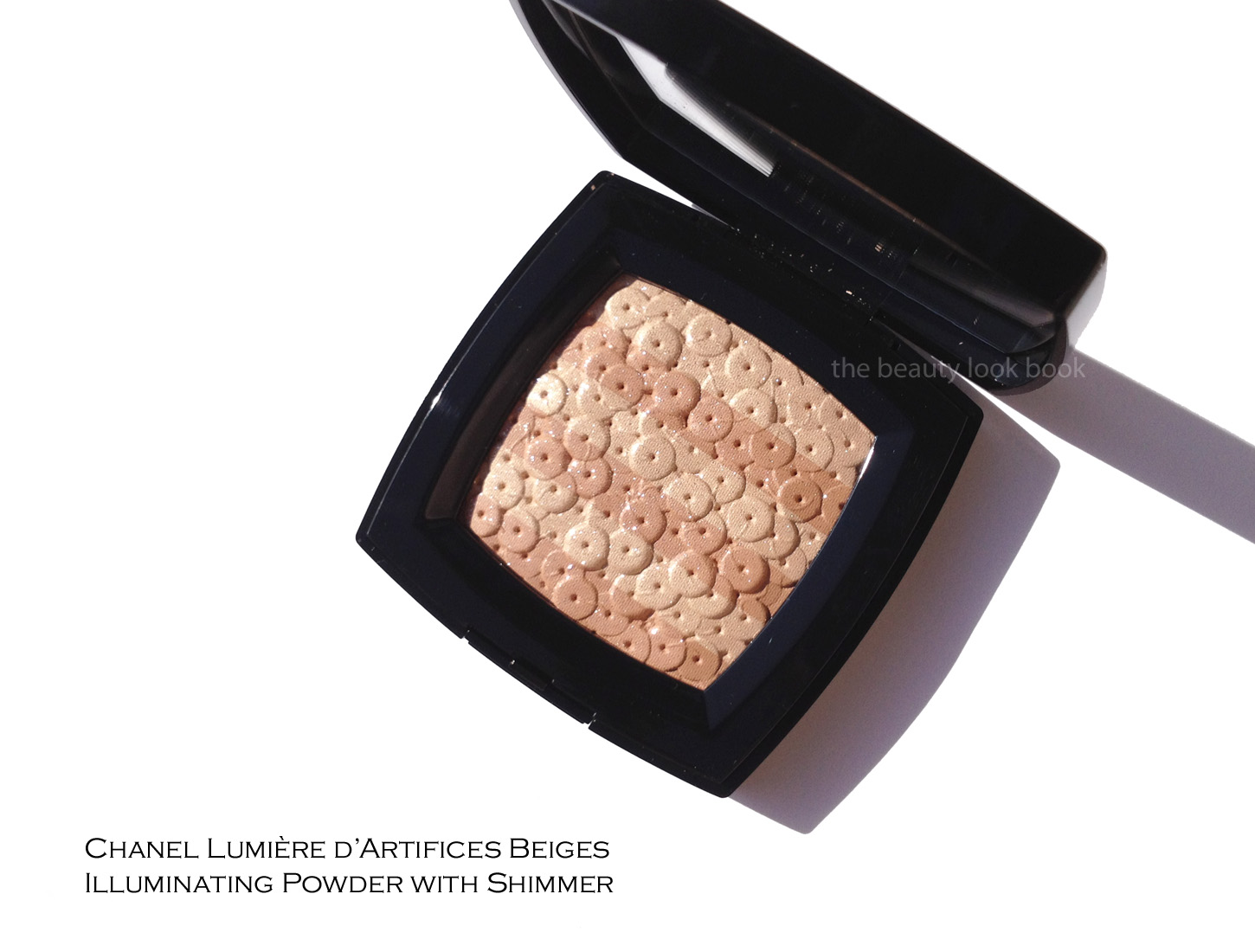
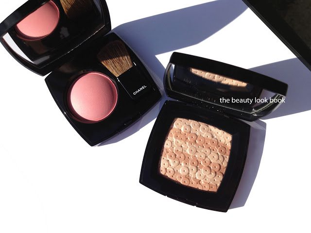
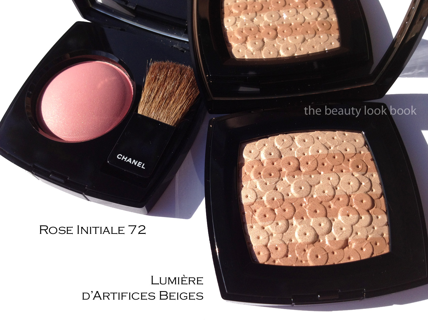
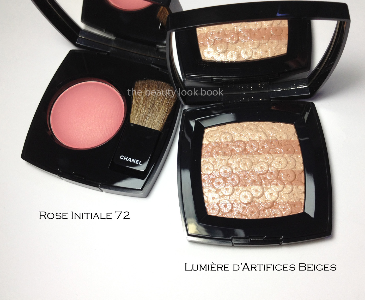
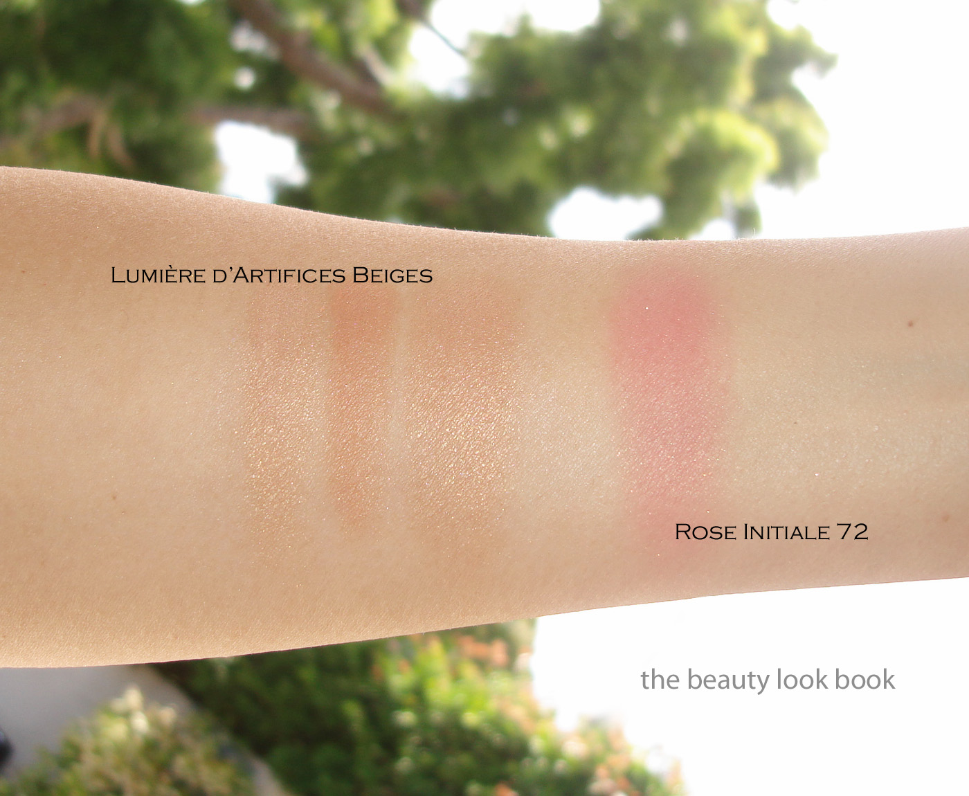
Chanel’s star product this season is their Illuminating Powder with Shimmer called Lumière d’Artifices Beiges (18 g/ 0.63 oz, made in Italy). It’s an exquisite face powder embossed with round circles that look like overlapped pieces of sequins. The powder itself is dusted with a silvery glitter overspray. Underneath there are stripes of soft golden beige and soft beige-rose. The powder in the compact itself looks more like a light pink/rose. On the skin this translated into a more golden-beige finish for me with only very slight undertones of pink/rose.

The sparkles were difficult to capture with the camera. At an angle the shimmer/sparkle overspray is easier to see:

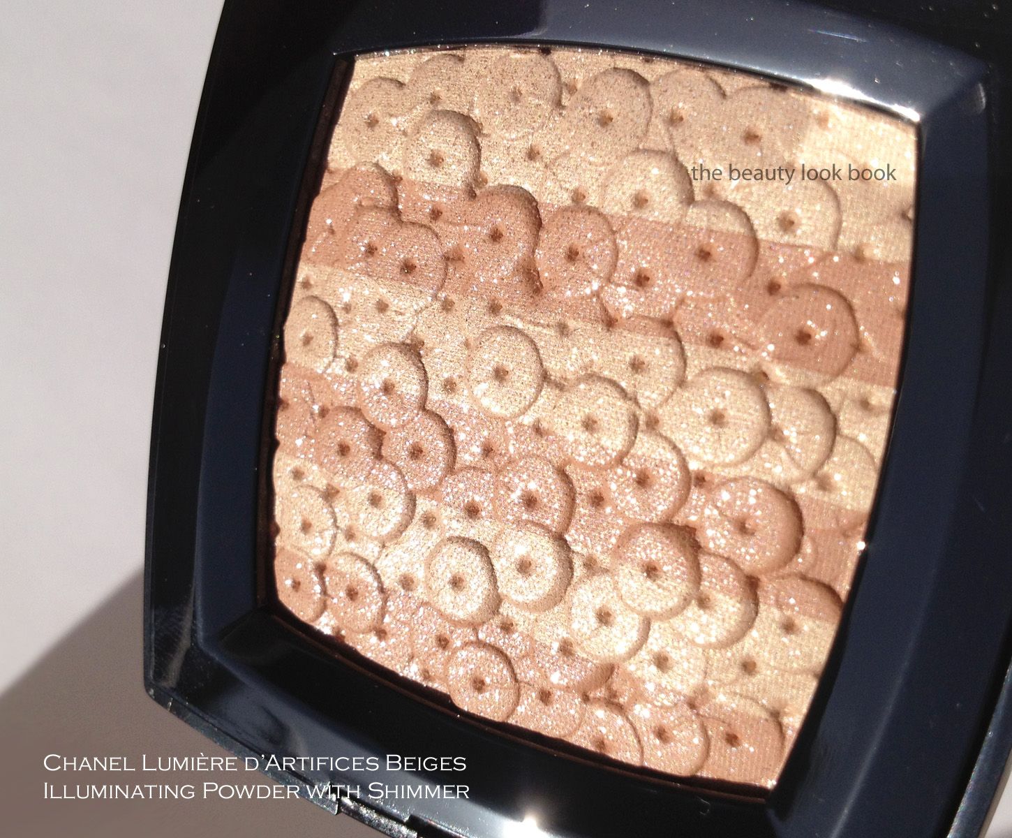
Under artificial light, you can see the shimmer: 

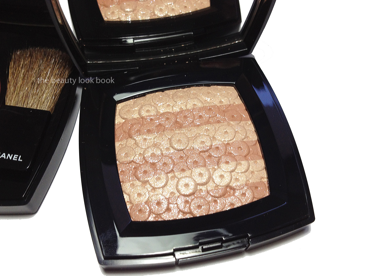
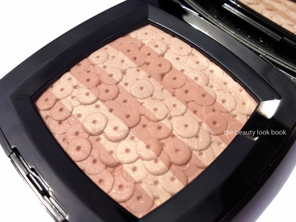
Here is the powder with the overspray removed. I’ve photographed it at an angle hoping you will be able to see the sheen of the powder. It’s really beautiful in person:

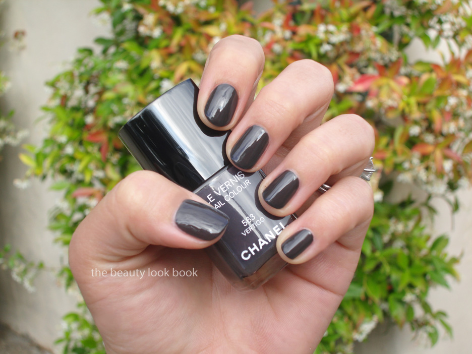
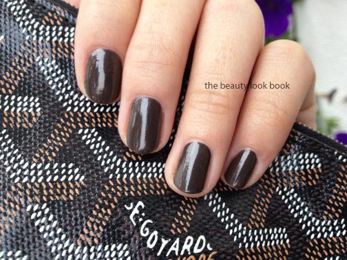
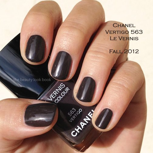
Swatched, this pulls warmer and more beige on me than what I see in the compact:

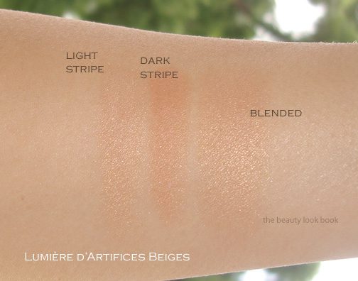
This is truly stunning on the skin. After the overspray was removed I thought it might be too boring but the color is just really lovely as a highlighter. It’s not too pale and not too dark – it’s perfect for Chanel B30 skin and I suspect it will be lovely on other skintones as well. The pigment is medium but visible and the shimmer just glows on the skin. The texture of this is velvety soft making it easy to blend and layer.

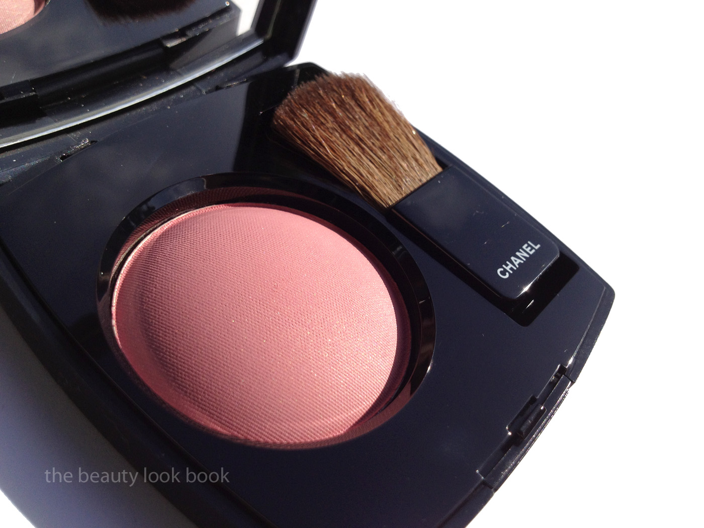
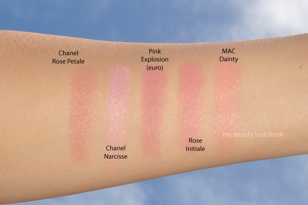
I pulled a small sample of other Chanel powders to compare. Ombres Tissées in Beiges from last August is significantly lighter and more frosty. This summer’s Soleil Tan de Chanel Bronzers have a similar luminous glow, but I would say the Fall 2012 Lumière d’Artifices Beiges has more pigment and a slightly more glowy quality. You might find it too similar to Sable Beige to justify owning both.

I believe this is a limited-edition product. Unfortunately I can’t recall the price – I suspect it was in the $60ish range which I found reasonable given the fact that some other limited edition powders such as Lucky Stripes and Ombres Tissèes Beiges and Route de Indes de Chanel have been upwards of $75 to $95 each.

I personally adore this powder. I do think it’s a must-have for me, but that is simply my own opinion.

Uncategorized

Chanel Rose Initiale Powder Blush #72 – Fall 2012

June 24, 2012
Chanel Rose Initiale Powder Blush #72 ($43 for 6 g/ 0.21 oz) is a dainty rose pink with a beautiful subtle gold and pink shimmer. It’s absolute perfection for a pretty pink glow and definitely a must-have. I like that this has very little brown/rose tones in it. There are a number of gorgeous rose, browns, peaches and bright pinks that exist among Chanel’s blushes, this is a nice addition to their lineup for something in different along the lines of Narcisse/Rose Petale but still different (more on this below). Rose Initiale in the US formula has a wonderfully pigmented texture that is easy to blend. I tried this using blush brushes from MAC and Chanel (the newer ones). I prefer MAC’s for this one since I like to use fluffier brushes for the blushes that have more pigment. For me it helps the color go on more evenly in sheer layers and allows more control
Rose Initiale has a gorgeous petal pink base with finely milled shimmers. The shimmer isn’t visible on my skin though, but it does give this color depth:

Under artificial light the gold shimmer is more visible, can you see the slight glimmer?

Best Things in Beauty has wonderful swatches of this on fairer skin. I recommend you check out her review. Here it is swatched on mine (Chanel B30):

There are most likely similar colors out there to this new beauty, but in my opinion, there are few other brands that have blushes with the finely milled beautiful quality that Chanel does. Don’t get me wrong, I adore many other brands for blushes (NARS, MAC, Armani, Burberry etc.) but I really do love Chanel’s. Many of the blushes have a gorgeous glow. The shimmer is subdued and visible but not over-the-top. In Chanel’s exisiting lineup, I found Rose Initiale unique. My thoughts on a few other pinks by comparison:
  • Rose Petale used to be my favorite pink by Chanel. I find it has some brown tones while Rose Initiale is more of a pure pink.
  • Narcisse is significantly more cool-toned and has more visible shimmer.
  • Pink Explosion (euro formula) has more rose tones and darkens on the skin.
  • MAC Dainty is a color I thought was similar. It is, but on the skin shows up quite a bit more frosty and warmer with more peach.

Overall love love LOVE! I want to wear this one everyday now. I think it is suitable for most skin tones. Definitely check this one out. Blush swatches on the arm never do justice to what these really look like on the face. Many have asked where Fall is available. None of the counters near me have it yet (as of Saturday) in Southern California. I’ve heard Nordstrom Seattle has it, various Neiman Marcus stores and Bergdorf Goodman in NY. Some have reported it arriving in Saks. I suspect most counters in the US will have it by the end of this week. At this time I am not sure if it’s limited or not.
Uncategorized

Chanel Rose Initiale Powder Blush #72 and Lumière d’Artifices Beiges – Fall 2012

June 23, 2012

A quick peek at the new blush and highlighter from Chanel’s fall 2012 collection: Rose Initiale #72 Powder Blush and Lumière d’Artifices Beiges. A more detailed review on each item to come soon.

In natural sunlight:

Under artificial light you can see the sheen of both a bit better:

Swatched (I’m a Chanel B30):
the Beiges Highlighter first has the pale beige
then medium rose-beige swatched
followed by both shades mixed

Uncategorized

Chanel Premier Regard #38 Quadra Eye Shadow – Fall 2012

June 22, 2012
For the eyes this fall, Chanel has released one quad, two eyeliners and a number of single shadows. First up is Chanel Premier Regard #38 Quadra Eye Shadow ($58 for 6.8 g/0.24 oz). This is a subtle, soft and understated palette of sheer warm taupe-brown shimmer, pale dusty satiny pink, pale satiny peach-champagne and a muted black-grey matte. In the compact there appears to be a mix of satiny-shimmers and soft mattes, on the eyes these appeared mostly matte for me.
This quad took me three tries to get a decent application. By itself with only 1 base (I used Edward Bess’s eye primer), this was a disappointment for me. The colors were too sheer and the only color that had good pigment was the black-grey. I felt like the colors went on chalky and too sheer. The third time I finally found a good method of application. Note this quad needs a bit of extra work to show up (at least on my olive Chanel B30 skin).
Step 1: Prep with a good dose of eye cream on the lids and then apply your usual cream base/primer (I used Cle de Peau and Edward Bess).
Step 2: Mix the pink and peach together and blend over lids to soften the skin (this will be sheer but you can apply with a heavier hand if you want them to show up more).
Step 3: Use some kind of a tan/taupe/light cream shadow and blend along lashline and upwards (this serves as the base for the taupe shade, so apply the cream where you want the powder to go, I used Tom Ford’s Platinum Eye Shadow)
Step 4: Take the taupe-tan shade of the quad and dust over the cream eyeshadow (the cream eyeshadow helps the color adhere and blend well, using just a regular base was too dry for me to get any blendability out of the color)
Step 5: Apply the grey-black as a smokey liner (or as a crease shade, or wherever you prefer!)

Under different lighting:

Swatched, three views:

Right now, I only had time to pull two comparisons. When I first saw the promo photos of Premier Regard, I thought it looked strikingly similar to Winter Nights and possibly Dreams (I think both are discontinued in the US now?). The overall effect/theme is similar but the quads are still different. Here they are below.

Overall lovely and understated. At a glance, this seems to be a quad that is goof-proof and easy to apply. I was disappointed in the pigment by itself. The pink and peach look identical on my skin and borderline dusty. I need a moisturized eye base to prevent them from looking chalky on my eyes. A bit of tweaking and this worked better for me. I will definitely need to experiment more.

Have you checked out Premier Regard? How do you use it?

Uncategorized

Chanel Suspicious #561 Le Vernis – Fall 2012

June 22, 2012

Chanel Suspicious #561 ($26 for 13 ml/0.4 fl oz) is a dark raspberry red cream. The coverage on this shade is amazing and finish is flawless with high pigment and high shine. The color itself is perfect for the fall season and yet still appropriate for right now in the summer, however it’s just not quite as unique as I had hoped for. I still like this color a lot, but have quite a few other shades similar to this one. 

Here it is on with two coats. Sometimes this looks borderline more reddish than raspberry/fuchsia. Next to a pure red, like Chanel Dragon, you can see that Chanel Suspicious is really more pinkish. Unfortunately, my Chanel Dragon is missing in action so I didn’t compare it. I did pull some other fuchsia/raspberry colors to compare below.
First, Suspicious #561, swatched with 2 coats:

Comparisons, left to right: Chanel Riviera, NARS Anardana, Chanel Suspicious, Chanel Pulsion, Chanel Splendeur, Chanel Tentation.

All the colors swatched with 2 coats (except Riviera because I ran out of fingers to swatch them on in one photo):

Overall pretty, rich and lovely for fall. Not quite as unique as some other Chanel shades, but still a classic.

Uncategorized

Chanel Vertigo #563 Le Vernis – Fall 2012

June 20, 2012

Chanel Vertigo #563 is a dark murky color that I find a bit hard to describe. In the bottle the base is a blackened-brown-grey-plum. The color is infused with that signature Chanel subtle shimmer which is visible in the bottle but not so apparent on the nail. Holding the bottle at an angle to the light shows flashes of red, plum and gold in the frost. Due to the complex nature of this shade, sometimes the bottle will look like a dusty faded plum-brown, others a rich dark plum with red shimmer, and other times a flat cool grey-brown with blue tones.
When news first surfaced that Chanel would release a nail color called “Vertigo” this fall, many of us wondered if it would be a re-promote of an older Chanel shade. Good news to long-time collectors: this season’s Vertigo is completely different. See the original Chanel Vertigo on Cafe Makeup (scroll to the bottom) and Caramel Frappe. (I still wish I could get my hands on the original!)

Coverage on Vertigo #563 is rich and smooth. Application is nearly flawless with two thin coats. This gives a high shine finish which doesn’t really a top coat (in my opinion). More close ups below.

Close up of the shimmers:

Below swatches in different lighting show this sometimes looks flat, other times looks warm, and yet other times looks cool-toned.

At first glance, I thought this looked identical to Dior’s Underground and Rescue Beauty Lounge’s Recherche. Comparing them on the nails proved they are different. Chanel has mixed up a color that I find truly unique and different, even if there are other colors that are similar in the same color family. In seeing the photos above it might have you wondering: Is Vertigo plum? Brown? Gray? Black? I hope the two sets of comparisons below help answer this question. My answer is that it’s a mix of all of the above.

First, left to right: Dior Underground (warmer and brown), Chanel Paradoxal (lighter and brighter), Chanel Vertigo, Chanel Strong and Chanel Vamp.

Second, left to right: Dior Aztec Chocolate, Dior Perfecto, Chanel Vertigo, Chanel Black Satin, Rescue Beauty Lounge Recherche

Will you be picking up Chanel Vertigo this season?

Uncategorized

Chanel Frenzy #559 Le Vernis – Fall 2012

June 19, 2012

Chanel Frenzy #559 Le Vernis ($26 US) is one of three new nail lacquers in the Chanel Fall 2012 collection. Previews had been seen earlier this year on the runway (as seen on Cafe Makeup) as being an ultra-light flesh-toned grey. Frenzy is indeed a very pale cool-toned grey with a hint of lilac. In the bottle it looks more greige with a hint of beige. On the nails for my olive skin tone, the color turns cooler and pulls a slight pale lilac. Coverage is very good with two thin coats. Application is easy. Formula has medium coverage. Definitely not sheer but also not full coverage. For me pigment was rich enough to cover entire nail (no white showing underneath).

I pulled a few comparisons for reference. When you compare Frenzy to other shades that might be similar, the color in the bottles for most of these look different. However on the nails, they look similar, there are just slight variations in undertone but it could be my olive skin. I found Chanel Frenzy to be very similar to RBL Grunge (slightly warmer and pinker) and Le Metier de Beaute Faraday (slightly more lilac with shimmer). Comparisons show this might be somewhere in between Rescue Beauty Lounge’s Grunge and Jane. (I do not yet own Jane, but see comparisons on All Lacquered Up and Cafe Makeup.) I was only able to swatch a few on the fingers, I’ve run out of nail wheels. Comparisons below show some true beige nudes like Chanel Beige and some lavendars to show that Chanel Frenzy is more of a cool-toned pale grey with a bit of lavendar, but also has slight beige tones mixed in.

Bottom line I love it. Even though it’s not quite entirely unique and doesn’t have the dazzle that Black Pearl, Graphite or Delight possess, Frenzy is elegant, polished and subdued.