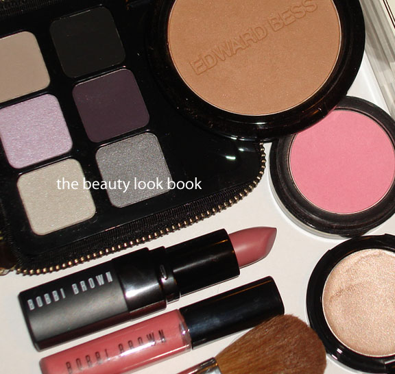
I’ve prepped for tomorrow (the night before) so I can get a few extra minutes of sleep in the morning. Here’s what I’m wearing on Tuesday plus what’s inside my Balenciaga First in Anthracite from S/S 2007 (everything except the Jo Malone Colognes fit):
Edward Bess Daydream Bronzer, Sunlight Highlighter
Bobbi Brown Pale Pink Blush (her original packaging), Python & Peony Palette, Lilac Rich Lip Color, Pale Peony Rich Color Gloss
Laura Mercier Lilac Lip Glace
Chanel Cassis Eyeliner, Star Glossimer, Tender Bisque Powder Foundation
Mini Brushes, iPhone, Wallet, Jo Malone Vitamin E Lip Balm sample
The items I’ll wear tomorrow
(look replicated from this past weekend):
Reviews on Bobbi Brown Python & Peony Palette along with the Pale Peony Rich Color Lip Gloss to come soon. Lilac has been previously swatched here.
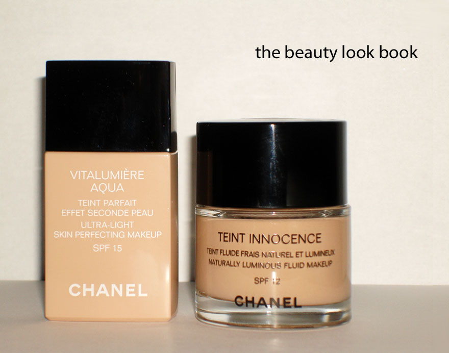
Chanel has officially released the new Vitalumière Aqua Ultra-Light Skin Perfecting Makeup SPF 15 ($45) in the US to replace their Teint Innocence Naturally Luminous Fluid Makeup SPF 12 ($47). Long-time readers know that Teint Innocence is my holy grail of foundations and much to my dismay, I discovered it was soon to be discontinued earlier this year.
I completed an extensive foundation review last month in search for a holy grail replacement (linked below at the bottom of this post). After testing a few sample packets of the Vitalumière Aqua, I crowned it as one of my holy grail replacements, but did not have an update on my color selection since counters did not yet have the product in stock. After further testing, here are my thoughts:
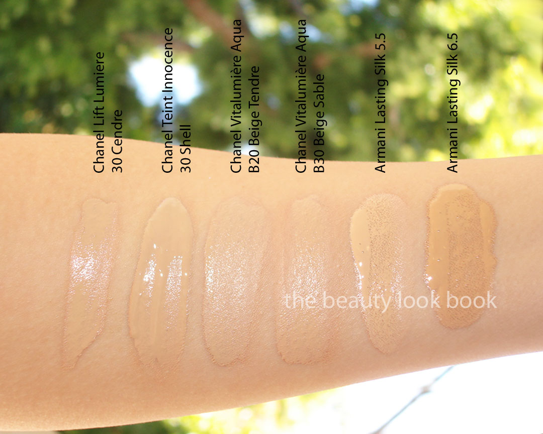
Color Selection – I am normally a Chanel Shell 30 in Teint Innocence but am slightly lighter in skin color, although not quite fair enough to be a Cameo 1.0. My best match right now is Chanel’s Lift Lumiere in Cendre 30 (which runs a bit lighter than Teint Innocence). For the Vitalumière Aqua, I tested B20 Beige Tendre and B30 Beige Sable. I could have gone with either shade, but decided on the B20 Beige Tendre shade. The colors with BR have more pink, while the B shades have yellow undertones. I’ve swatched the shades I use below, note that while they are all different swatched heavily, the different formulas blend differently on the skin. Also note, I mix the two Armani shades to get a custom-matched color (so many times I’m in between shades).
* Also note, my forearm is paler than the rest of my sun-exposed areas
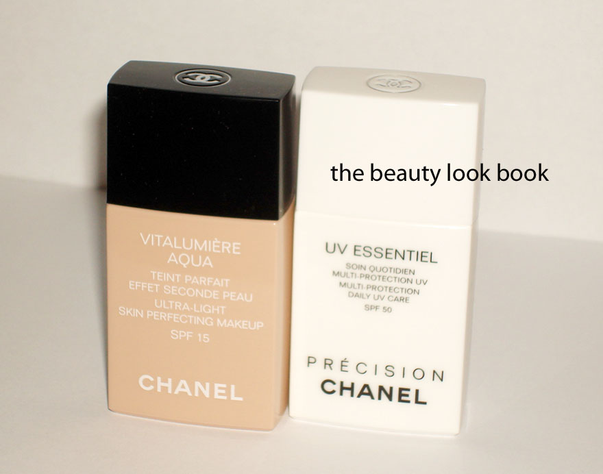
Texture – Vitalumière Aqua is thinner and more liquidy while the Teint Innocence is thicker but still very fluid. It is recommended that you always shake your Vitalumière Aqua bottle just like the Base Lumière (also by Chanel).
Product Packaging, Amount, Size – The packaging is a bit deceiving because at first glance, one would assume that Teint Innocence contains a lot more product. However, both contain the same amount of 30 ml/1 fl oz. Vitalumière Aqua comes in a plastic container that requires shaking. The difference can be seen below. I do believe ALL the Vitalumière Aqua shades have the same beige color for the packaging – at the counter, I could not see any difference in the plastic container for the lighter or darker shades (but it could have been something I just did not notice). While the Vitalumière Aqua is more compact and sleek, I prefer the Teint Innocence glass bottle.
Finish – Vitalumière Aqua has a quick setting formula with a slightly matte finish. I find that it needs to be blended with short quick strokes because it dries quickly and can darken in spots if not blended evenly. Teint Innocence is more dewy and more moisturizing.
Coverage – Both have super natural but noticeable coverage, however I find the Teint Innocence more forgiving and a bit more transparent with a more natural look. Neither are as sheer as a tinted moisturizer and both provide decent coverage. I like to apply both with a sponge (just my personal preference). I always set with a powder.
Overall Thoughts – Chanel’s Vitalumière Aqua is a beautiful foundation, but it’s still no replacement for Teint Innocence which will always have my heart. I have purchased 3 back up bottles, although I don’t know the exact shelf life of an unopened bottle of foundation. I know my sister has several back ups accumulated by now. About a dozen women have e-mailed me with cries of despair that their favorite holy grail foundation is now gone. To sum up my thoughts: Vitalumière Aqua is thinner and has a semi-matte finish that’s less see thru, Teint Innocence is not as thin and more dewy with a slightly transparent finish. If you liked TI you will most likely like VA.
Recommendations – If you’re still pining over Teint Innocence, BACK UP NOW! My local Nordstroms only carry two shades at the counters now, all others have been pulled and sent back to who-knows-where. If you’re interested in Vitalumière Aqua and are exact match to Chanel Shell 30, I think your match will be B30 Beige Sable. If you’re slightly lighter than Shell but not quite Cameo, B20 Beige Tendre will be a good match. I do recommend getting a few sample packets to test if you can (Nordstrom counters should have plenty now) and let it sit on the skin to see how it wears after a few minutes. If you’ve tried this foundation and it looks ashy on you, you’ve been matched to the wrong color!
Amy from Café Makeup and Karlasugar have swatched the colors on their skin, both are lighter than me, and I believe I am more olive/yellow than both of them.
Recap & links for your reference below …
Foundation Search Part 1: Bobbi Brown Natural Finish Long Lasting Foundation SPF 15, Burberry Sheer Luminous Fluid Foundation, Chanel Mat Lumiere Long Lasting Luminous Matte Fluid Makeup, Guerlain Lingerie de Peau Invisible Skin Foundation
Foundation Search Part 2: Chanel Pro Lumiere, Diorskin Nude Natural Glow Hydrating Makeup SPF 10, Dolce & Gabbana Powder Foundation, Laura Mercier Crème Smooth, Le Metier de Beaute Peau Vierge Anti-Aging Complexe Tinted Treatment, Make Up Forever Face & Body Liquid Makeup & Chanel Vitalumière Aqua
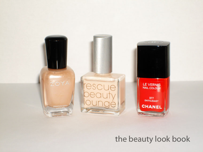
On the fingers = 1 coat of Zoya Naomi + 1 coat of Rescue Beauty Lounge Pink Shimmer on top
On the toes = 2 coats of Chanel Enthusiast
Yesterday I featured Zoya Naomi and mentioned how I felt it was a bit too warm for my olive-beige skintone. I experimented layering different sheer and glittery shades on top to see what different effects I could make and decided adding a coat of a sheer white-opal-pink shimmer created a nice neutral. The winner was adding one coat of Rescue Beauty Lounge Pink Shimmer (previously reviewed here). Here is the final result:
I decided to go super bright on the toes with Chanel Enthusiast 377 (Part of the London Madness mini collection from Summer 2009 & a Neimans Exclusive). It was a limited edition shade but extremely close to Chanel Coromandel, previously reviewed here (scroll down for comparisons). The difference is that Enthusiast is more vibrant, more orange, and has no shimmer.
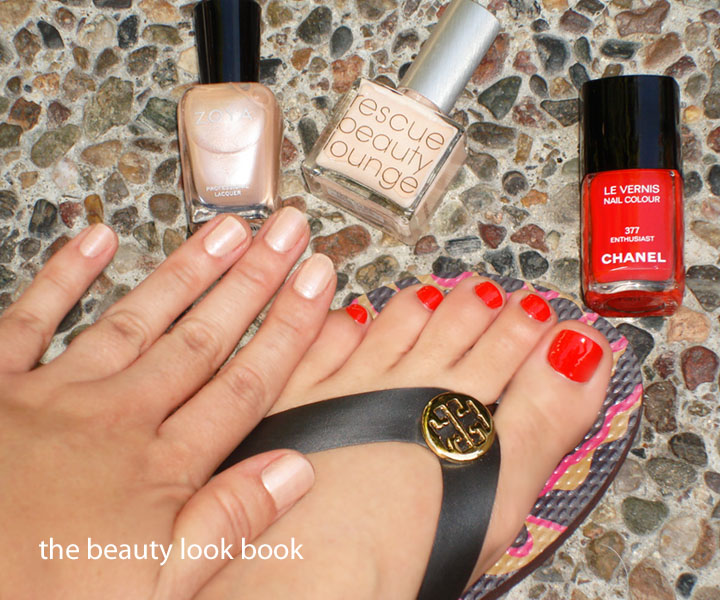
The mani & pedi combo:
L to R comparisons: Rescue Beauty Lounge Ani, Zoya Naomi, Rescue Beauty Lounge Pink Shimmer, the mixed shades, Chanel Enthusiast, Chanel Dragon, Chanel Coromandel
I sometimes get off the wall comments – just an FYI, I’m in Southern California where wearing sandals this time of year is do-able. We’ve had on and off rain, but the sun peeked out enough for me to slip on the flip flops and not freeze my toes off.
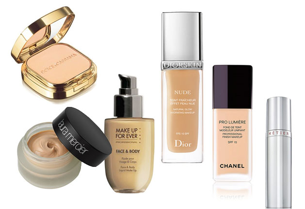
My foundation sampling experiences Part 2 with Chanel Pro Lumiere, Diorskin Nude Natural Glow Hydrating Makeup SPF 10, Dolce & Gabbana Powder Foundation, Laura Mercier Crème Smooth, Le Metier de Beaute Peau Vierge Anti-Aging Complexe Tinted Treatment, Make Up Forever Face & Body Liquid Makeup & Chanel Vitalumiere Aqua. Click read more to see the details on each.
Chanel Pro Lumiere Professional Finish Makeup SPF 15 ($54) This is an oil-free liquid foundation that provides a medium-to-full coverage with a semi-matte finish. I was matched best to Beige 40.
Pros: The texture is a slightly thicker than normal liquid foundation. Comes with a pump. I have gone through a full bottle but couldn’t remember why I never repurchased. I got another sample recently to see if I could figure why. The upside is you can easily control coverage depending on how much you layer. The finish is just as described “semi-matte” but you do need to set with powder.
Cons: I found this heavily scented, can’t quite put my finger on the smell, but it’s sweet which is something I wasn’t a huge fan of. Although this is described as medium to full, I found it more on the full side. I also found it a bit too heavy on the skin. If you have medium to dry with fuller coverage then I think this is a formula you will like. I found it too full and a bit fake looking even after blending it out with a sponge.
Diorskin Nude Natural Glow Hydrating Makeup SPF 10 ($46) Described on Dior.com containing, “40% Active Mineralized water, this fluid foundation offers a fresh and hydrating finish.” I’ve heard non-stop raves about this one so I decided I had to try it.
Pros: Lightweight, flawless finish, nice liquid texture, lasts all day. No allergic reaction. Blends easily to cover the skin naturally. Feels amazing. Softly scented but not overpowering. Keeps skin non-oily. What’s not to love?
Cons: Color selection is odd. I’ve tried 20, 21 and 30 – all of which are slightly off. The benefit of the natural coverage is that I’ve been able to get away with both 20 and 21 – but I think my perfect match would be if I custom blended 20+21+30 (and not in equal proportions). I love everything except the color selection. I’ve found this typical of other Dior Tinted Moisturizers and Foundations. Perhaps I just need to sit down with my artist and try all the shades.
Dolce & Gabbana Powder Foundation ($59) I do not have immediate in person access to Dolce & Gabbana. Those who have read my Dolce & Gabbana posts know I can’t rave enough about Nikki from Saks Houston. She matched me over the phone when I told her my Chanel shade. PERFECT match! I used 140 Tan in the summer and currently use 100 Warm.
Pros: Full but natural velvety coverage. It’s truly versatile. I apply with the sponge (dry) over foundation or with a brush to set my liquid foundation. I can apply alone over my serum/primer. I can use for touchups during the day. Long lasting and no detectable scent. Comes with a separate bottom compartment to store the sponge. This is my new holy grail powder foundation twin to Chanel’s DPF.
Cons: Hard to find any, but the price tag of $59 is pretty steep. The gold packaging gets fingerprints and can get messy looking easily but it’s sturdy and after a while it’s not something I notice.
Laura Mercier Crème Smooth ($50) I received a sample at a Nordstrom Trend Show in Sunny Beige and Vanilla Beige. They were featuring this one with a hard sell describing it as the perfect lightweight cream that has full coverage “without visibly settling into fine lines”(quoted lauramercier.com exactly!) The model looked flawless so practically EVERYONE in the crowd was intrigued (screaming with excitement is a better description).
Pros: Great color selection. I tried several and there were several shades I could have gone with. Provides natural finish and looks great … for 1 hour. It has a nice texture and blends well on the skin. I wish I could have loved this one. It’s thicker and creamy like in a pot. The amount of product you get for the price seems generous in my opinion.
Cons: I equate this to Armani’s Luminous Silk Foundation which looks great right after the application. Makes me look glowing and flawless but after 1-2 hours, I end up a greasey mess. It did settle into the fine lines in my face (and I don’t have many wrinkles yet). Definitely not long lasting. Perhaps just too heavy for my skin type. I know many have raved about it. If you like Chantecaille’s Future Skin (which I did not) then try this LM out.
Le Metier de Beaute Peau Vierge Anti-Aging Complexe Tinted Treatment ($125) This is perhaps one of the most raved about miracle-workers for tinted moisturizers/face treatments. I was eager to try this out as I have not read a single bad review. I tried this in both shades on numerous occasions (in early July, mid-July, early September, and November).
Pros: The only upside I could find is that it has a luminous finish which gives an all over glow. Oh, it also comes with a pump. The packaging isn’t bad either.
Cons: I may be the only one who hasn’t liked this. Everyone I’ve spoken to loves this, but it made my skin worse. The texture dried to a thick uneven finish. It didn’t blend well on my face. I found the luminous quality too luminous and sparkly. Gave me reddish areas on the face with bumps around the hairline. Felt really difficult to clean off – it’s the type of product I had to slather cleansing oil all over, wash, then use my regular cleanser +rinse twice, and then use my toner to really feel clean. Perhaps it’s just not made for 29-year old normal-sensitive skin. Anyone else try this? Please share your experiences!
Make Up Forever Face & Body Liquid Makeup ($38) Another much-raved-about foundation. I loved the MAC Face & Body Foundation finish (so lovely) but within 2 days I developed cystic acne. I decided to try the MUFE version from Sephora. I was matched by a Sephora rep and I am disappointed to say I feel like I was unprofessionally matched. She just grabbed a random shade and said, “This looks good.” I asked her if she knew what the difference was between MUFE’s foundations and she said “they’re all matte, but this one is the most matte, I just LOVE this foundation.” Say what? How could this be the most matte when there is another one called Mat Velvet? I’ll keep my negative thoughts about Sephora reps to myself. There are definitely plenty of good things about Sephora.
Pros: Natural gel like finish. The one she used on me looked liquidy and felt a little like jelly. I wasn’t sure if it was just the tester or the real product, but it felt nice on the skin. It looked natural and felt slightly dewy.
Cons: I found the coverage too sheer and this foundation is simply too heavily scented for me. I couldn’t stand the smell. My skin developed a bumpy rash (odd because there was no red, just lots of bumps) within 30 minutes. I tried this several times at home to see if perhaps I didn’t have properly prepped skin. No luck. Don’t write this off – if you can try it at Sephora, I still recommend looking into it. They have a wide color selection. Chances are you’ll have to find a good match on your own though.
Chanel Vitalumiere Aqua (to be released in March in the US) I was lucky to get a couple sample packets included in Japanese magazines. This is supposed to replace the Teint Innocence Liquid. I was a bit skeptical but I did have a little bit of faith in Chanel. With the discontinuation of Teint Innocence Liquid (big mistake in my mind), this will be the THIRD time Chanel has discontinued my Holy Grail Foundation (Teint Fluide Universel and the original DPF powder have both been long discontinued).
Pros: Thin texture allows a little to go a long way. This is less dewy than Teint Innocence but gives a similar flawless naturally soft finish. Coverage is sheer to medium (more on the medium side). I think I have found my new Holy Grail!!! It’s like if Lift Lumiere and Teint Innocence had a baby with a slightly thinner texture. Coverage is perfect in my opinion. I’ve set with powder but I think you could get away without using powder on top. LOVE!!!
Cons: Not sure if I can find any. I got samples of #20 which I found a tad too light, but still looked pretty good in undertone. I hope it’s not too pricey (as in please be under $50). I’m still very VERY VERY sad Teint Innocence is being pulled from their product lineup.
If you’ve tried any of these – please chime in with your experiences! I will be doing a comprehensive review of the brands and formulas I’ve tried in Part 3. I would like to kindly ask if you have a suggestion for something that I didn’t list above – please save it for Part 3. I think it will help readers (and myself) sort through your suggestions, thoughts and experiences if they are all in one spot. Thanks 🙂
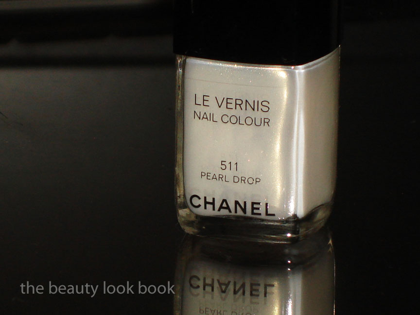
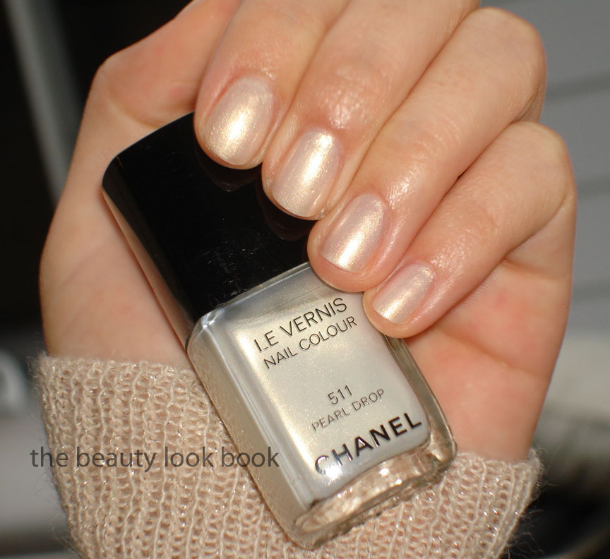
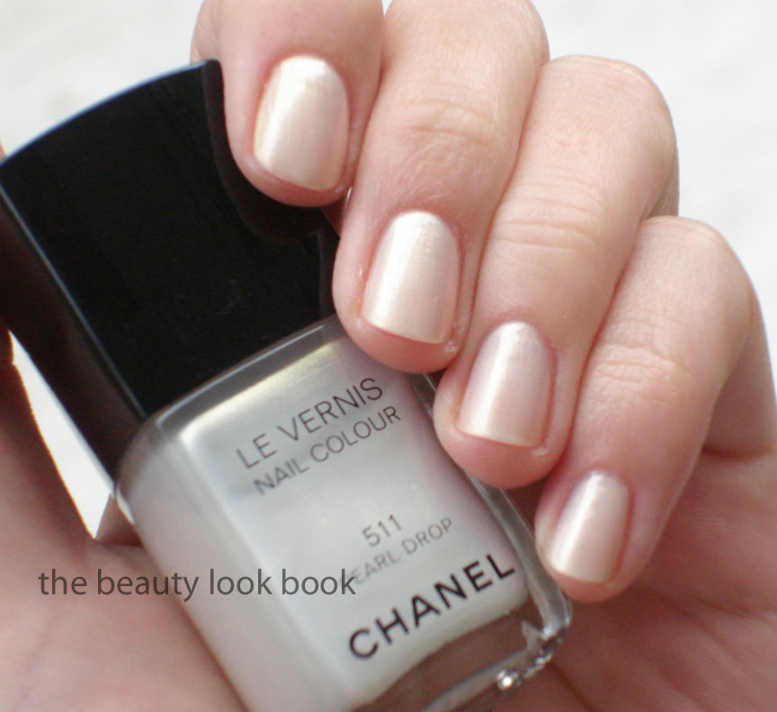
I had a girls’-day-out with my mother and sister the other day and we all treated ourselves to a mani/pedi together. My sister texted me earlier in the day, “can you bring a light red for mom?” so I brought 3 different shades of Chanel red for her to pick from. She ended up picking Dragon (one of my favorites). I decided to go light and give Chanel’s Pearl Drop #511 Le Vernis a try even though it is my least favorite color out of all the spring shades (see review and comparisonshere). After trying it out on a full manicure with 2 professionally applied coats, my heart softened a little for this color – but only in the slightest bit.
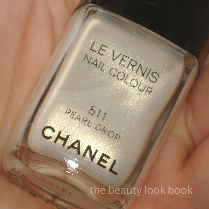
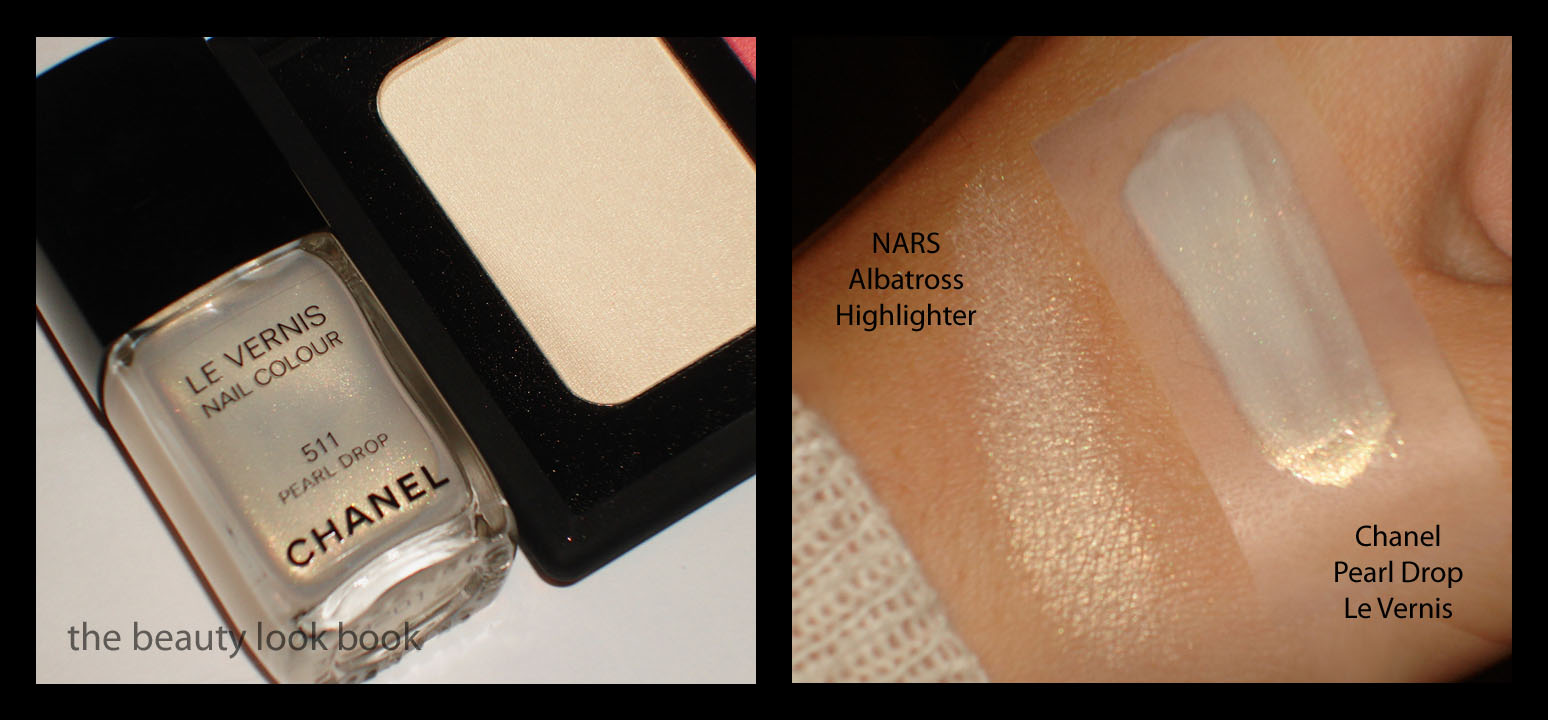
Chanel Pearl Drop #511 is a frost-finish white gold shimmer. The base is mostly white with a bit of pink and the shimmer is golden. It’s not the easiest shade to apply – the frost in this makes it easy to streak if not applied with a steady hand. Also, the gold shimmer makes this yellow, much like NARS Albatross Highlighting Powder. I already have yellow undertones being Asian so I feel like yellowy-golds aren’t the most flattering for my skintone. (If you’re wondering why I have Albatross even though I don’t like it, the compact was received as a gift.)
Now that I’ve ranted enough about it, you might wonder: is there anything good about this color? The answer is yes. I actually like this color in brighter lighting or natural light because it appears less yellow and more pearly. The coverage is decent, but you definitely need 2 coats with this color. It’s definitely a brightening color because it’s on the lighter side. Compared to actual pearls, Chanel’s Pearl Drop flashes more yellow-gold than most pearls do.
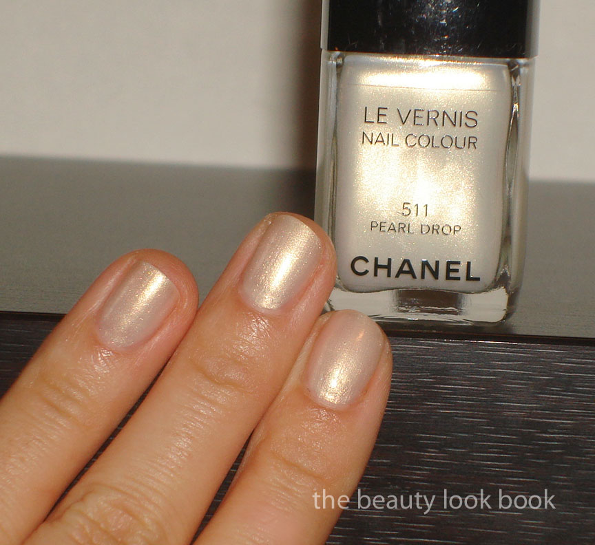
With flash:
Outdoors without flash:
My mom and sister were wowed by this color. Their comments were, “it matches your outfit perfectly!” So don’t write this off just because I’m not so wowed by it. Overall I think I am just picky when it comes to lighter colors. If you try this on at the counter, definitely try and apply 2 coats, not just one. My heart still belongs to Black Pearl (reviewed here).
I think it’s pretty but I don’t think it’s a must-have. You can probably get a similar effect with other colors but most will be more gold or more white. The streaks aren’t too visible at arm’s length. At this time I do not know if this is limited edition or not. I found mine at Nordstrom. By this time, most counters in the US should have the spring collection available for sale.
I scanned these from Maquia’s February 2011 issue. A few sneak peeks of what’s to come. Note, I cannot translate this so I won’t be able to answer questions about the products, your guess is as good as mine is. However, there are number indicators on some of the products which help me try to figure out the coordinating product number to name. Also note Maquia is a Japanese publication so I don’t know if the US will get all the items featured, I know in years past we haven’t, but I’m not sure about this year.
For more previews, check out Rouge Deluxe for her preview scans/photos from Biteki’s February 2011 publication. She’s great at finding out new information and has a number of sneak peek and links to previews of stuff coming out this spring.
At the moment I have no information about what else is coming out or when items will be released except for Chanel, MAC and Bobbi Brown: I do know the Bobbi Brown Pretty Powerful palettes have been released, I saw them at Nordstrom this morning but passed since they combine creams and powders in the same level for the palette – a BIG NO-NO for me.
Please do not republish these on message boards, blogs, websites or anywhere else as it took me some time to scan each in and format them to fit this blog. Thank you.
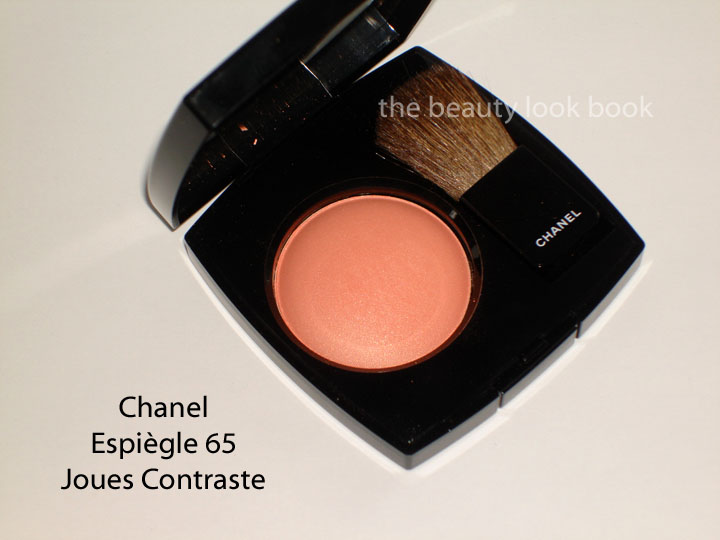
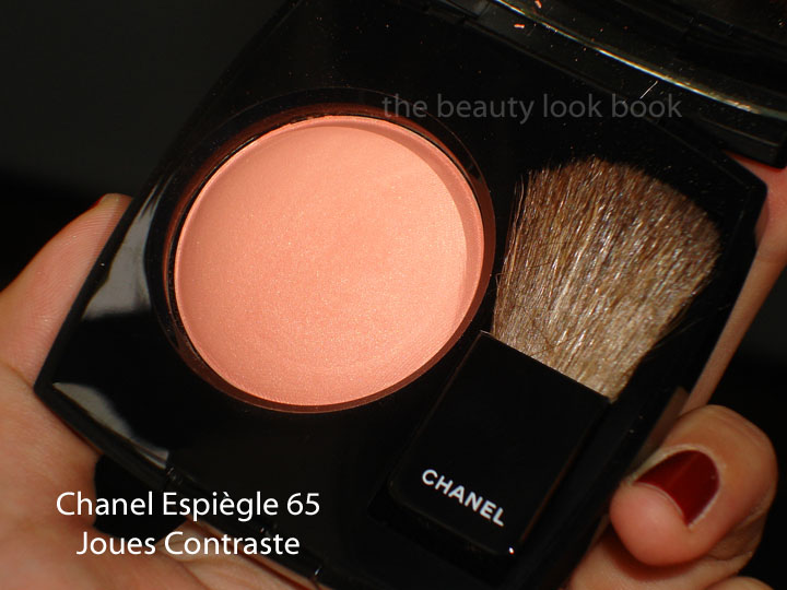
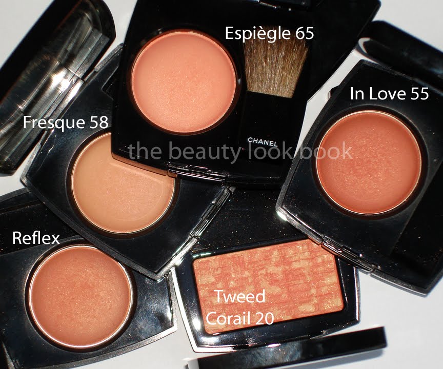
Chanel Joues Contraste in Espiègle #65 ($42) is a soft luminous light peach with gold shimmer and the slightest hint of pink. It gives a pretty soft peach glow and in the US is made in the regular US formula (instead of the Euro Baked style). What I like about this color is that it simply glows. It’s not a full matte – the shimmer is finely milled so it’s not frosty on the skin. I find it more wearable than In Love and Fresque – both of which I like, but find difficult to get just the right amount of color. Both end up looking either too sheer or too orangey if applied with one-too-many brush swipes.
* On the nails, still Chanel Rouge Fatal
If you have a lot of peaches, you might find this one unoriginal. It looks a bit boring in the pan and swiped on the fingers, but if you have a Chanel counter near you, give this a chance and try it on the face with a blush brush. I love that it brightens the face with a soft peachy glow and also like that it has a bit of pink to it to prevent it from looking orangey. I personally think it’s a must-have for any peach-blush lover. It’s naturally flattering that gives a beautiful glow without looking overly frosty or too gold like some peachy-golds are.
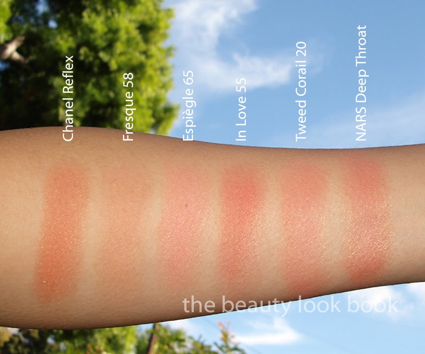
I have two sets of comparisons for you. I wasn’t planning on doing any comparisons but everytime I leave them out, I always get asked to do some. The first set shows Chanel Reflex, Fresque, In Love and Tweed Corail.
* Nars Deep Throat was added in the swatch above, but the product wasn’t photographed
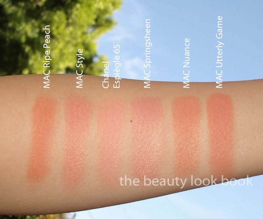
The second set compares the new Chanel Spring 2011 blush to MAC Ripe Peach, Nuance, Style, Springsheen, Utterly Game. Note that all the MAC shades are quite a bit more frosty and shimmery than the Chanel which has a nice glow. These were applied with a heavy hand.
One last view:
Overall: I love this, but I don’t think it’s a must-have. Still it has a beautiful finish that isn’t easily replicated in other brands or colors. It definitely leans towards peach but has just the right amount of pink to balance out the warm tones making it not-too-warm. Chanel.com currently does not have the “limited edition” indicator on their website for Espiègle #65 but I’m not 100% sure that I ever really trust any response on the LE factor.
If you don’t have many peaches in your collection, this is a great one to start with. Otherwise, if you already have a lot of peach – reshop your stash and wait for summer collections later in the year. Yes, I know spring isn’t even here and I’m already talking about summer. However, I’ve seen a sneak peek of what’s to come for spring and the blush colors seem to be blah this year for spring.


