Browsing Tag

Blush

Uncategorized

Tom Ford Illuminating Cheek Color in Blush Guilt and Bronzed Amber

May 7, 2013

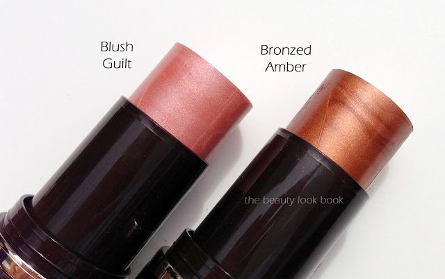
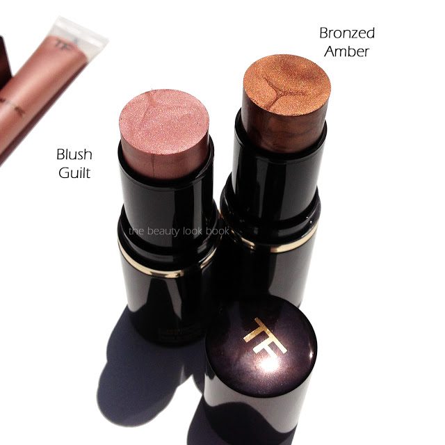
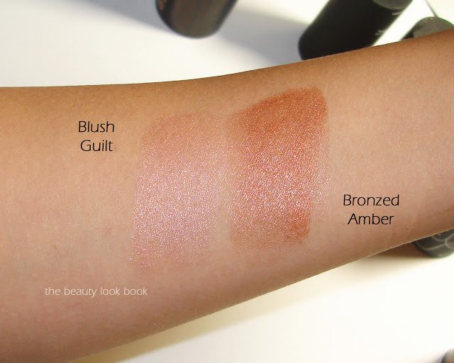
Tom Ford Illuminating Cheek Color is new for summer and comes in two limited-edition shades Blush Guilt 01 and Bronzed Amber 02 ($58 each for .42 oz/12g). Both are packaged in a convenient twist-up stick very much like his stick foundation. Blush Guilt is a sheer pale seashell pink shimmer. It’s a dreamy glimmering pink that goes on very sheer on my skin. It does show up pink but the effect is extremely natural on me – even more natural than the Fire Lust Liquid Skin Illuminator. Bronzed Amber is a warm darker bronze shimmer that sheers out to a beautiful warm bronzed glow. It looks deep and dramatic when swatched but blends out to a beautiful natural bronze.

Both shades have a dewy texture with a sheer finish. They can be layered for more color but are still fairly natural shades. I was surprised how much I fell in love with Bronzed Amber. I expected Blush Guilt to be my favorite, but once blended out the color is borderline too light for my skin to wear alone. It’s a color that needs a bit of extra work with layering of bronzer or blush. Although the shimmering quality is just beyond gorgeous on the skin.
Swatches were a bit difficult to capture due to the dewy nature, light keeps reflecting off each shade. I recommend seeing swatches on The RaeViewer and Best Things in Beauty for a better idea of what they look like on the skin.


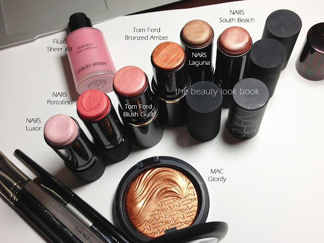
The Tom Ford Illuminating Cheek Colors are quite emollient but they do stay put a surprisingly long time for such a dewy product. On me I don’t end up getting greasy as fast as with some other cream blushes, but by afternoon, I can definitely feel that my face feels moist from these cream blushes. I wouldn’t recommend them for oily skin, although they can be set with a powder. Compared to NARS Multiples, the Tom Ford is dewier and sheerer. I personally prefer the finish of the Tom Ford sticks because the transparent quality gives you a more natural luminous glow. On the other hand I prefer the pigment of the NARS sticks because they offer more color without any added blush/bronzer needed.
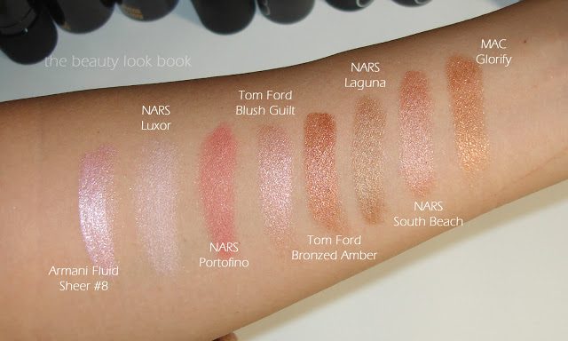
Here are some of the shades compared below to Armani, NARS and MAC. You can see that the colors of Tom Ford Blush Guilt and Bronzed Amber are quite unique.

All shades swatched with a heavy hand below:

I think Bronzed Amber is a must-have, but Blush Guilt is definitely the hit shade of summer. There’s something irresistible about a shimmering seashell pink blush.
Tom Ford Illuminating Cheek Colors ($58 each) are limited-edition. Right now both Bronzed Amber and Blush Guilt is still available online at Saks. Bronzed Amber is still available online at Neiman Marcus. If you’re interested act fast, the Tom Ford Summer items are selling out very quickly. (Tom Ford locations posted in the Fire Lust post a few posts below).
Shop the items at Saks:

This post contains affiliate links, for more info see the About/FAQ section.
Uncategorized

Burberry Siren Red Light Glow Blushes – Coral Pink No. 9 and Hydrangea Pink No. 10

February 2, 2013
Affiliate Links        

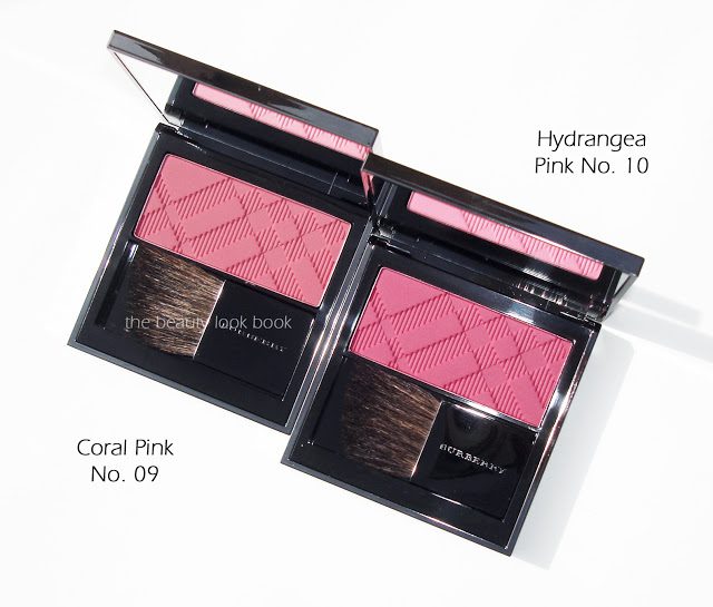
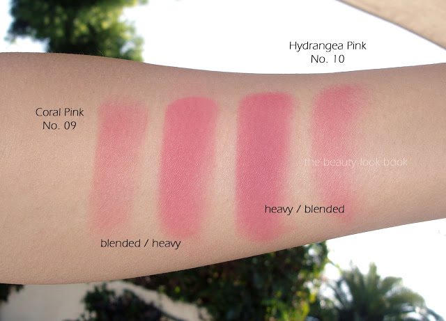
Burberry’s Spring 2013 Siren Red Collection brings us two bright blushes with rich pigment. The two shades are Coral Pink No. 09 and Hydrangea Pink No. 10 ($42 each for 7g.0.24 oz, available on Nordstrom.com). Both shades are quite pigmented and due to the intensity of these shades I find they need a bit of extra work to apply. Each shade requires careful application with lots of blending. I found that no matter what brush I used, all applications required a lot of blending. I found layering over a soft powder highlighter to diffuse the intensity a bit.


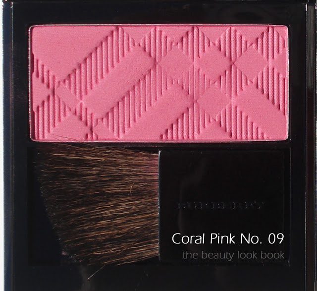
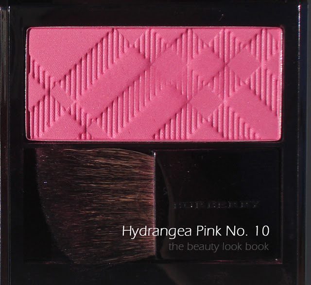
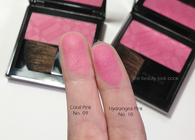
Coral Pink No. 09 is deep warm rose pink with a very slight hint of coral. In the compact and on the skin, Coral Pink pulls more rose. Hydrangea Pink No. 10 is it’s deeper more intense sister with a slightly dustier-looking finish on the skin. Both shades go on matte but have a subtle satiny shimmer in the compact.
I tested each shade (one on each side) to compare. On the skin they have a very similar effect. If I had to pick one, I would say Coral Pink No. 09 wins my heart. The hint of coral in it brightens the face and makes my olive skin come to life. Hydrangea Pink No. 10 is a bit darker and dustier-looking on my skintone (but not muddy). The colors are indeed very intense. I’m all about bright colors for cheeks but the intensity of these these might make them outside your comfort zone. These are among the most intense blushes I’ve tried. I found the colors unique compared to others that I own. Scroll down for a few comparisons.
Coral Pink No. 09:
Hydrangea Pink No. 10:
Swatched side by side:
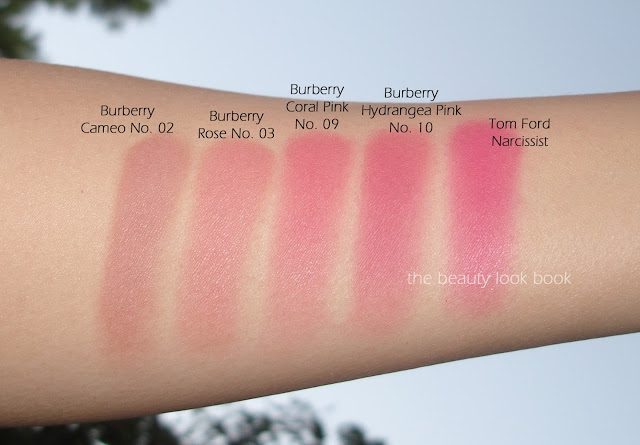
Swatches were difficult for me to capture accurately, in my photos I would say they pull a bit warmer than what you would see in real life. I recommend checking out blogs for swatches like Café Makeup and Lola’s Secret Beauty Blog.

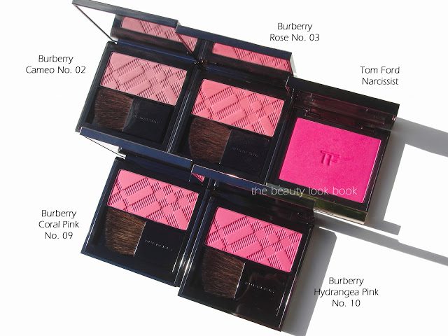
Per request, I compared these to a few other blushes. Below: Burberry Cameo No. 02, Rose No. 03, Tom Ford Narcissist.

Bottom line: lovely, unique and fresh. To recap, if I had to pick one, I personally would go for Coral Pink No. 09, but they are both very pretty. I do think they are different enough to justify purchasing both though. They are bright and intense, but blendable and don’t appear muddy on the skin like some intense blushes can be. There is a very very slight rose scent but it disappears after a few minutes. I have a super sensitive nose and it does not bother me at all.
These Burberry Beauty can be found at select Nordstrom counters and online at Nordstrom – Burberry Siren Red Light Glow Natural Blush.

A few references:

  • Nordstrom Burberry Counter Locations listed here.
  • Burberry Blushes (all) photographed and swatched here.
Did you check out the spring collection from Burberry? What were your thoughts?
This review contains affiliate links. For more information, please refer to the About/FAQ section.
Uncategorized

Chanel Star Dust #73 Powder Blush – Holiday 2012

November 4, 2012

Chanel’s new blush for the holiday is Star Dust #73 ($43 for 6g/0.21 oz). I found this blush to be more of a glimmering highlighter rather than a regular blush. It has a sheer soft pink base loaded with tiny micro sparkles in shades of pink, silver and platinum. It’s quite stunning in the compact. In testing this, I found that I need some kind of a cream highlighter or blush on the cheeks to make this show up (I experimented with NARS Luxor, a few other NARS Multiples, Edward Bess Sunlight and a couple Armani fluid sheers). Alone over foundation and powder (like a regular blush) resulted in a barely noticeable powdery pink cheek. When layered over a cream product, it goes on a soft pink loaded with sparkles. The effect is similar MAC Silver Dusk or Laura Mercier’s Star Dust powder but even more sparkly with a pink base (versus silvery/champagne). Overall the name Star Dust fits the product performance – it gives a sparkle effect to the cheeks. I can only see myself wearing this for evenings out – for me it’s too sparkly for everyday wear.

Close up:

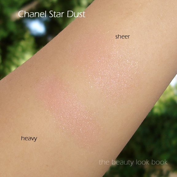
Swatched you can see it’s very sheer. Even with heavy layering, it’s a soft warm sheer pink:

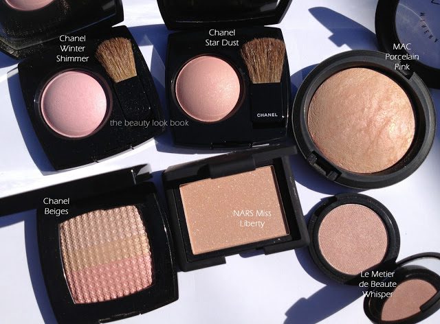
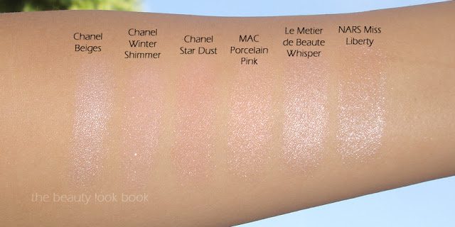
Star Dust is a warmer pink when compared to other soft pink shades, but it’s still clearly pink (not a peachy pink). I pulled a few comparisons to show, I couldn’t find a dupe in my Chanel or MAC collection. Here are a few views to show the shimmer and undertones. First in direct sunlight: Chanel Ombres Tissees in Beiges (limited-edition from August 2011), Chanel Winter Shimmer (discontinued), MAC Porcelain Pink MSF, NARS Miss Liberty, Le Metier de Beaute Whisper:

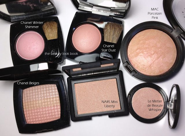
Comparisons under artificial light (same set of colors):

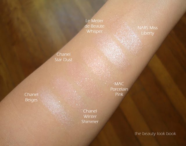
Swatches, two views:

I’m not completely in love with Star Dust mainly because it didn’t apply on the face like I expected it to. Based on what I saw in the compact and what I’m used to for Chanel blushes, I expected something more pigmented and not as sheer. I’m usually a die-hard Chanel blush fan but this one was just ok for me – the lightness of the color can look a bit chalky for my skintone and emphasize pores if not applied with a super light hand. Still, as a highlighter it’s very pretty and nice for evenings to add that extra sparkle. It’s unique enough compared to other highlighters in the sense that the shimmer/sparkle isn’t your standard silver or champagne. It’s subtle but makes the skin have a really pretty glow as long as you have a dewy base first.
Did you try Star Dust? What were your thoughts? If you’re interested in this I suggest you check your counters soon to try it. Three counters near me were already sold out – although I think it will be easy to find online for a while.
Uncategorized

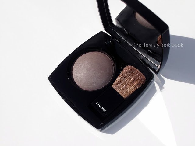
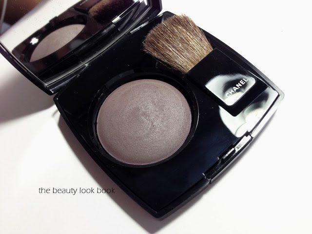
Chanel Notorious Ombre Contraste

October 24, 2012

Chanel Notorious Ombre Contraste – Sculpting Veil for Eyes and Cheeks ($43 for 4g/0.14 oz) is a new limited-edition release from the Contrastes Essentielles Collection. We first saw a glimpse of this back in March as seen on Café Makeup’s Chanel Runway Report. It finally arrived on counter just a few weeks ago. I purchased mine from Saks NY, it is available at select Chanel counters and right now on Chanel.com.

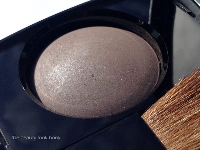
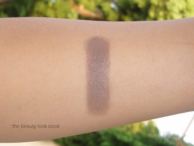
Chanel Notorious is a multi-purpose contouring product for both eyes and cheeks. The description “mauve-taupe” suits the product perfectly. On me it’s more taupe with a hint of mauve-grey. It has a satiny finish – glowy but very subtle on the shimmer factor. The texture is soft and blendable – based on the pan, it doesn’t resemble the European/Asian baked formula, but it doesn’t quite resemble the US formula either. I suspect since this is more for eyes and cheeks it has a completely different consistency than the Joues Contraste blushes.

Based on the runway previews I expected a pigmented grey that was layerable for a strong contoured effect. It does layer well for a more intense effect, but I found the formula rather sheer. For me, the color didn’t show up well on the face – I suspect it’s my medium-tan skintone that prevents it from showing up well. I tried a number of techniques with different brushes, no luck. A number of others have shown this to be a success on the face – I suspect they are lighter in skintone than I am.
On the eyes however, I absolutely loved it. Notorious provides a wonderful contour. It’s one of those magical shades that is so versatile. It layers well over metallic creams or sheer shimmers, it looks amazing layered with other colors, it’s a wonder-product to help blend out harsh edges for a smokey eye. The sheerness and layer-ability helps contour the eye to create a soft gradient. It’s a much-needed shade in my collection. In the compact it’s the same color as what I envision a space-rock to look like.

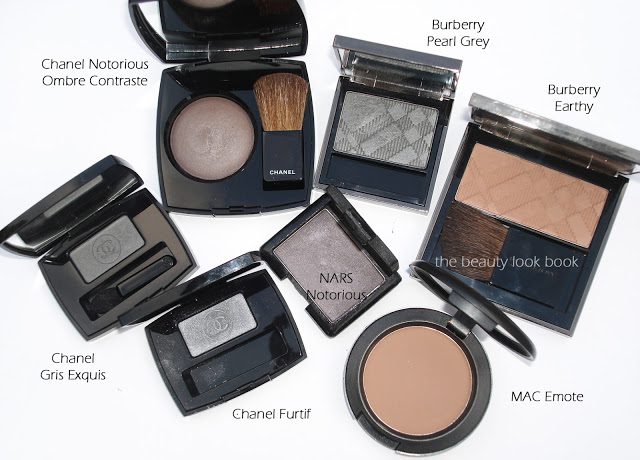
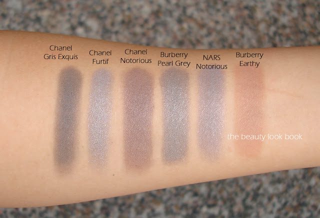
I pulled a few other greys and contouring shades to compare: Chanel Furtif, Gris Exquis, Burberry Pearl Grey, Burberry Earthy, MAC Emote and NARS Notorious (discontinued). I found Chanel Notorious to have enough warmth to suit my olive skintone as the perfect contour – other greys tend to be quite a bit more silver/blue-based (which is nice, but more sharply contrasted with my skintone).

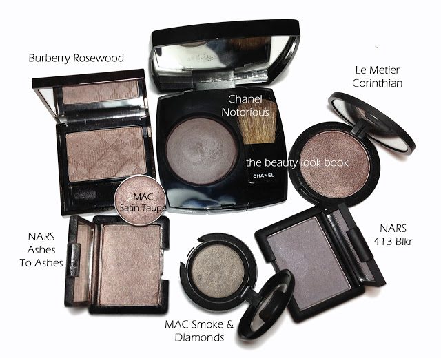
Update: I’ve added one more comparison photo below. Some have commented it resembles Burberry Rosewood. It’s in the same family, but I feel quite different. I apologize I don’t have time to swatch these but I hope this helps as a reference guide. It’s definitely likely there are dupes – in doing a quick search I couldn’t find any, but I didn’t search for all the possibilities. Below: Burberry Rosewood, Le Metier Corinthian, NARS 413 BLKR, MAC Satin Taupe, MAC Smoke & Diamonds, NARS Ashes to Ashes.

I really like Chanel Notorious. I didn’t like it as a blush/contour, but I love it on the eyes. Perhaps it will take more experimenting for it to show up on my face. For reference on other skins, see it swatched on Blondy Candy, Messy Wands, Best Things in Beauty and Indigo-Kir-Royale. As an update, a darker-skinned follower tweeted me an additional look at Notorious on darker skin at Adventures In Makeup.

If you’re considering this, I recommend you order soon. It’s limited-edition. Did you try or buy Chanel Notorious? What were your thoughts? If you tried it – can you share your skintone too for my other readers below?

Uncategorized

Tom Ford Fall 2012 Blush: Narcissist

September 6, 2012
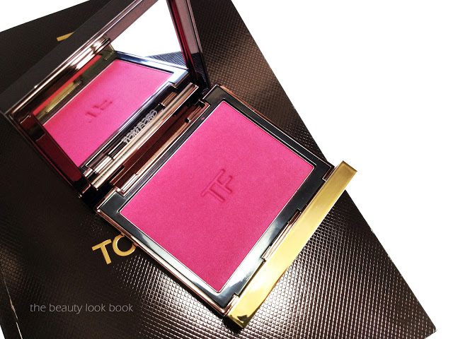
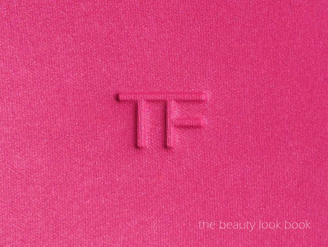
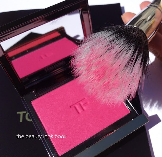
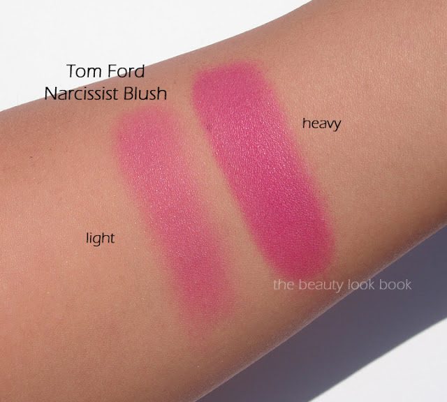
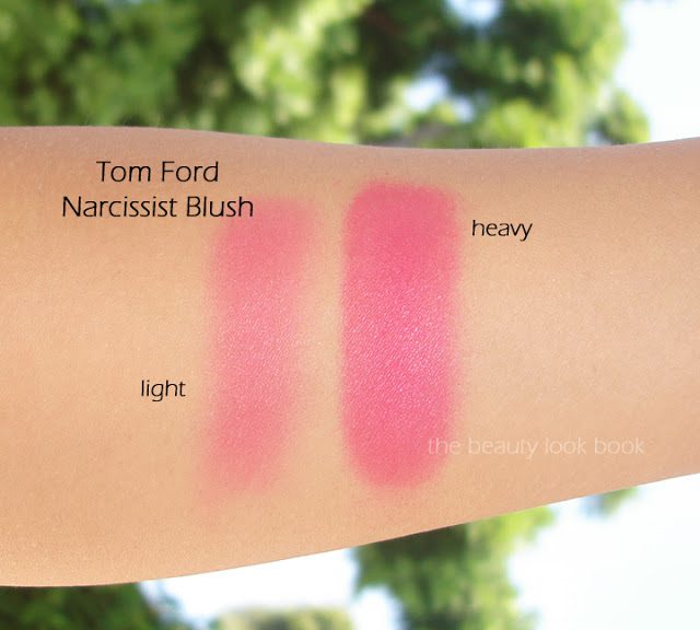
Tom Ford has released a new blush for fall, a vibrant hot pink satin called Narcissist ($55 for .28 oz/8 g). The pigment is rich and intense but easily blendable with a soft loose brush (I’ve used MAC’s skunk brush to apply). It is indeed very bright on the skin/face (probably the brightest blush I own) but if applied and blended, it gives a lovely healthy pink flush. There is a soft satiny texture to the color – those familiar with Tom Ford Blushes know the texture is phenomenal. Although these are probably the most expensive blushes on the market, I think they are among the best in texture, pigment, and color. Some of his blushes have a more visible shimmer (like Ravish and Wicked, see them all swatched on Karla Sugar). Narcissist does have shimmer but it’s so subtle it’s not really apparent on the face. I like that it has shimmer because it prevents the color from being flat. Narcissist Blush and the two nail polishes, Minx and Dominatrix are the only items I purchased from the fall collection (sight unseen). The high price points make me unwilling to splurge without testing first. Also, the fall collection seems to be a mixture of intense bright colors I usually don’t wear (not really me, but still pretty). Rouge Deluxe has all the new items swatched.

My Tom Ford Fall 2012 picks:

Lightly tapped into MAC’s skunk brush, you see a lot of pigment:

Without a flash:

With flash:

Tom Ford Narcissist is the brightest pink I own. Here are a few others for comparison:

Overall I really adore Tom Ford Narcissist. The color is gorgeous, pigmented, blendable and looks beautiful on the skin. I can’t say I think it’s a must have though, simply because the price is so high. At this time I don’t know whether the fall items are permanent or limited, but I purchased mine from Saks.
Uncategorized

Burberry Beauty Light Glow Natural Blushes

July 13, 2012
This month marks the two year anniversary since Burberry launched their Beauty Line at select Nordstrom counters. To celebrate, Nordstrom is offering a limited-edition set of Lip Glows featuring the top 3 sellers for their Anniversary Sale this year in Rosewood, Blush and Nude Beige. The glosses are all full-sized and will retail for $65. In addition, Nordstrom San Francisco is offering a special gift with a $125 purchase which includes a black Burberry cosmetic bag, mirrored compact, mini lipstick and mini Body fragrance (see the details and photos on Cafe Makeup). You can ask for Adina at the Burberry Counter at Nordstrom San Francisco (415) 243-8500 ext. 1422.

Those who are fortunate enough to have visited a Burberry Beauty counter in person know first hand that everything in the line is of extremely high quality. The products are very well made and the packaging is heavy-weight and sturdy. The blushes, lip colors and glosses are lightly scented with a soft floral scent, but it’s something I find subtle for my sensitive nose. I’ve reviewed a number of Burberry items before, but since the brand is still rather exclusive to a select few counters, many have asked for a comprehensive post on all the blushes. Up until this month, I had purchased all except two of the blushes. Burberry kindly sent me two for review.

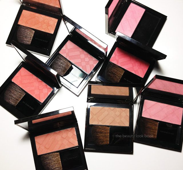
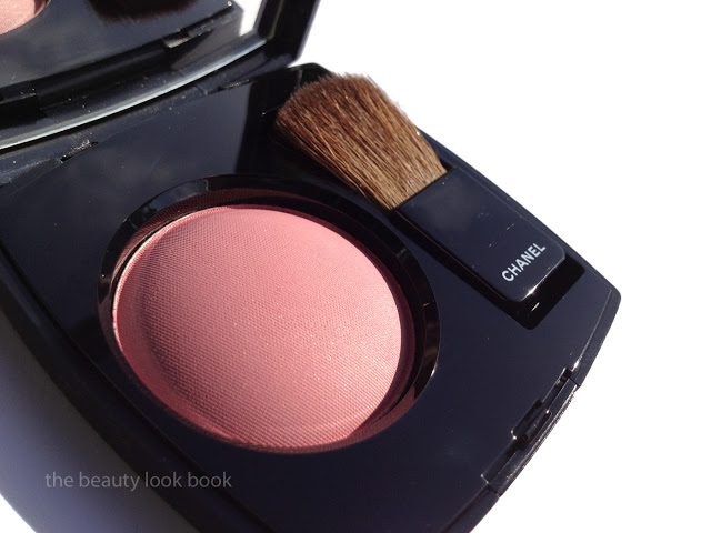
To recap: Burberry’s blushes are called Light Glow Natural Blushes. They retail for $42 each for 7g/0.24 oz. and are made in Italy. Each blush comes in a mirrored square compact and small angled brush. The quality and shape/cut of the bristles is very good the brush is big enough to contour the cheek. I personally prefer a full-sized brush, but the ones in the compact work for when you need a touch-up. Each blush comes with an embossed pattern in the signature Burberry check pattern. The texture of these is finely milled, almost powdery to the touch. When you swipe these with a finger or a brush, the texture looks so lightweight it appears they might apply chalky. Not the case at all.

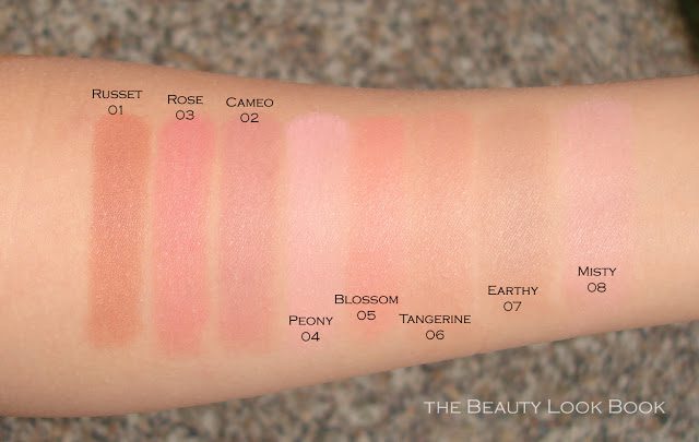
At first glance, I did a quick pass-over all the blushes. In the compacts they looked so dark and when swatched on the hand it appeared they would be almost drab on the skin. I must advise you to have one of the counter artists apply this on your face. The application of these is absolutely flawless and the colors are easily layerable to control the intensity. These are among my favorites for blushes. I’ve already hit pan on Earthy and Peony (I’m on my second for each). Most of these have a matte finish on the skin but not flat. There are a couple shades that have some shimmer but it doesn’t really show up.

The description of the colors plus other resources (hope this isn’t too link-heavy):

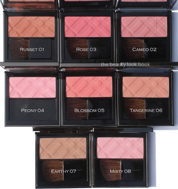
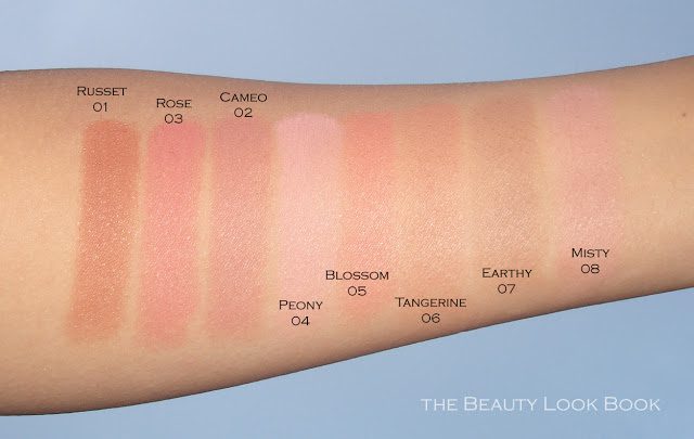
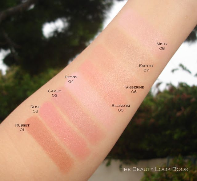
  • Russet 01 is a medium reddish burnt orange color with subtle shimmer. I thought this would be an unflattering color and too orangey but it’s surprisingly flattering. Much like Chanel Tempting Beige and NARS Lovejoy. This one provides a gorgeous contour. See it here, on Cafe Makeup, on Orange2LA and Temptalia.
  • Rose 03 is a deeper warm pink rose. There is tiny bit of shimmer to this. Again, even though it’s on the darker side, it’s still very wearable and makes a lovely flushed pink blush. This color is very pigmented so I prefer a looser brush (versus a dense one) to apply. See Rose also featured on Cafe Makeup and crystalis007.
  • Cameo 02 is a dusty classic rose. This was the first blush I tried from the line and thought it would be too dark. I don’t recommend this one for oily skin as it did darken slightly. Make sure your cheek area is well powdered (not too heavy but just well-covered) to help the color be truer to what you see in the compact. This one seemed similar to other Bobbi Brown blushes (like Blushed and Desert Rose) but what I love about Burberry Cameo is that even if it did darken a little on some occasions, it doesn’t turn muddy or brownish. See Cameo on Temptalia and Blush is the New Black.
  • Peony 04 is a light pink in the compact that looks powdery. On the skin it’s more of a neutral medium angelic pink. It looks a lot better on the face than in the compact and swatched, but still it’s true to color when applied with a brush (sounds confusing but it’s a beautiful shade). This is one of my favorites. It’s easy to wear everyday or coordinate with a stronger lip. See this one on Lisa Eldridge, Fruity Lashes and a Touch of Blusher.
  • Blossom 05 is bright coral shimmer. This is a stunning color on the cheeks. Another very pigmented shade but still easy to wear and layer. See this beauty on The Non-Blonde, The Ultimate Makeup and Orange2LA.
  • Tangerine 06 is a soft browned-peach. Not quite what I’d envision “tangerine” to be, but more of a faded peachy brown. This is a gorgeous shade on fairer skintones but is still dark enough for medium-tan skintones. I think it’s particularly stunning on Liz at Cafe Makeup and Christine from Temptalia. It’s a classic.
  • Earthy 07 is a matte taupe. When I first saw it I found it looked like death. On the skin it works wonderfully as a contour. Some might find it wears better when layered with a warmer color (such as Russet, Tangerine or Blossom). I think adding pinks personally makes it look chalky and more grey. Adding something with warmth creates a natural contour. Some have told me they use this as an eyeshadow, I personally haven’t tried it that way though. See the natural contours on Messy Wands, comparisons on Cafe Makeup and also on a look at Orange2LA.
  • Misty 08 light powder blue pink. It’s very similar to Peony, just a few shades lighter and more blue-based. I prefer Peony only because I have medium-toned skin. You can see it definitely shows up on Delicate Hummingbird. On Makeup and Beauty Blog it’s more subtle. For me, I’m somewhere in between.
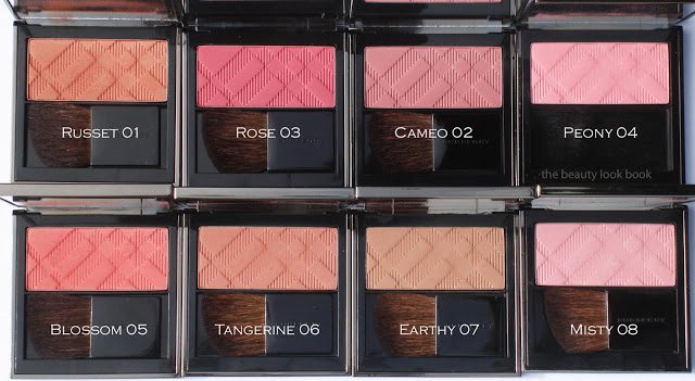
Swatches:

I personally really like Burberry Beauty blushes. Yes, there are many other brands that offer similar neutrals, but I like the texture of these blushes and the fact that they don’t turn muddy or brownish on my skin (like some neutrals can like MAC Prism/Cubic, Bobbi Brown Tawny/Blushed/Sand Pink etc.). $42 is steep for a blush but Burberry has made these very high quality and well worth the price in my opinion. Burberry Beauty can be found at select Nordstrom counters and also at a few Saks stores. It’s also available online at both retailers. Note that Nordstrom.com appears to only offer a few of the shades. This appears to be a glitch. My suggestion would be to order through a counter to take advantage of the gift with purchase offerings.

Those who want to shop the sale and take advantage of the gift, click on the Burberry tag below to search for prior Burberry reviews. Nude-pink lip lovers will find a diverse range of neutral lipsticks in the line. My personal top ten picks (all featured on this blog):

Peony Blush, Russet Blush, Blossom Blush
Cameo Pink Lip Stick, Rosewood Lipstick
Nude Beige Lip Gloss, Blush Lip Gloss
Rosewood Eyeshadow, Midnight Brown Eyeshadow, Pale Barely Eyeshadow

Have you tried any Burberry Beauty blushes? Thoughts? Favorites? For those who have tried other things in the line, what are the items you love?

Russet, Peony, Blossom, Tangerine, Earthy and Misty were all purchased by me.
Two shades in Rose and Cameo were provided for review.
Uncategorized

Chanel Rose Initiale Powder Blush #72 – Fall 2012

June 24, 2012
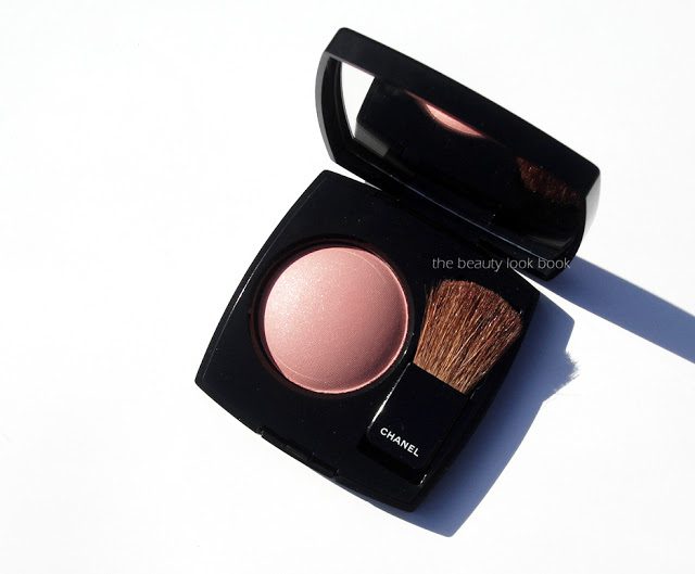
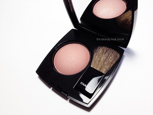
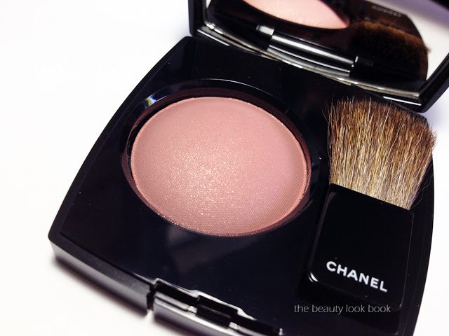
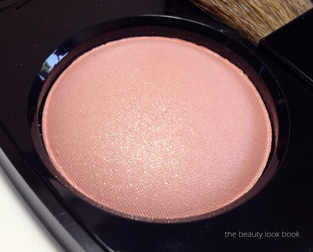
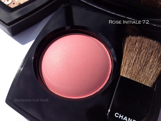
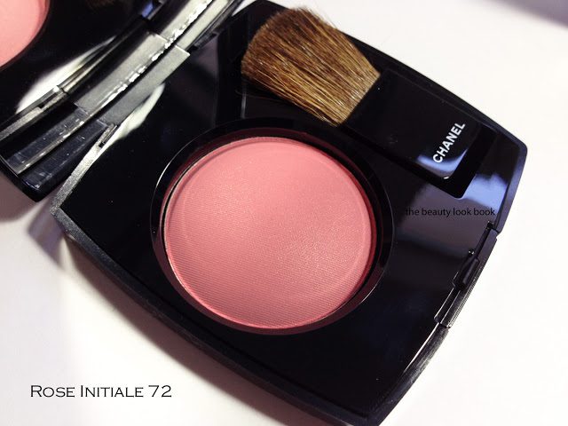
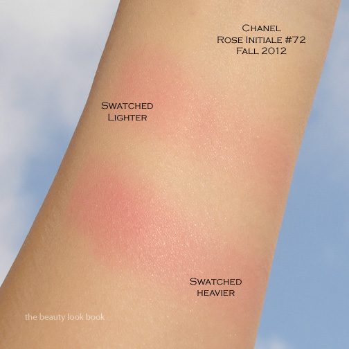
Chanel Rose Initiale Powder Blush #72 ($43 for 6 g/ 0.21 oz) is a dainty rose pink with a beautiful subtle gold and pink shimmer. It’s absolute perfection for a pretty pink glow and definitely a must-have. I like that this has very little brown/rose tones in it. There are a number of gorgeous rose, browns, peaches and bright pinks that exist among Chanel’s blushes, this is a nice addition to their lineup for something in different along the lines of Narcisse/Rose Petale but still different (more on this below). Rose Initiale in the US formula has a wonderfully pigmented texture that is easy to blend. I tried this using blush brushes from MAC and Chanel (the newer ones). I prefer MAC’s for this one since I like to use fluffier brushes for the blushes that have more pigment. For me it helps the color go on more evenly in sheer layers and allows more control
Rose Initiale has a gorgeous petal pink base with finely milled shimmers. The shimmer isn’t visible on my skin though, but it does give this color depth:

Under artificial light the gold shimmer is more visible, can you see the slight glimmer?

Best Things in Beauty has wonderful swatches of this on fairer skin. I recommend you check out her review. Here it is swatched on mine (Chanel B30):
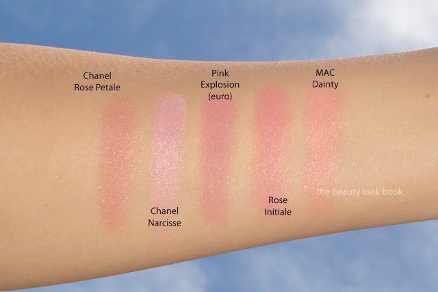
There are most likely similar colors out there to this new beauty, but in my opinion, there are few other brands that have blushes with the finely milled beautiful quality that Chanel does. Don’t get me wrong, I adore many other brands for blushes (NARS, MAC, Armani, Burberry etc.) but I really do love Chanel’s. Many of the blushes have a gorgeous glow. The shimmer is subdued and visible but not over-the-top. In Chanel’s exisiting lineup, I found Rose Initiale unique. My thoughts on a few other pinks by comparison:
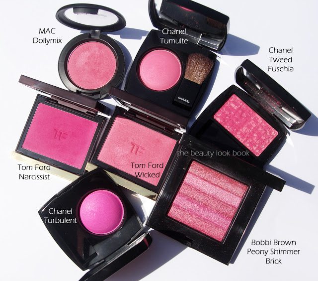
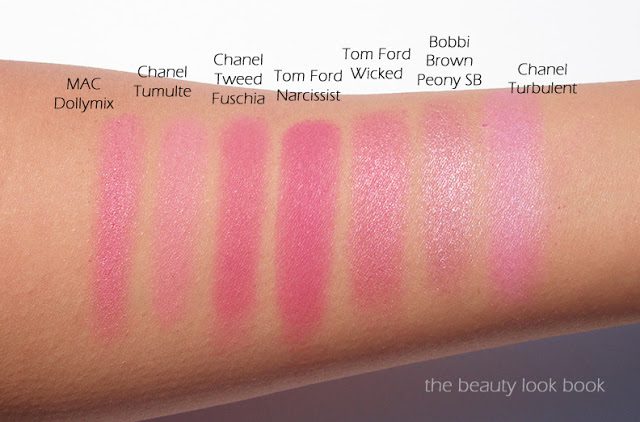
  • Rose Petale used to be my favorite pink by Chanel. I find it has some brown tones while Rose Initiale is more of a pure pink.
  • Narcisse is significantly more cool-toned and has more visible shimmer.
  • Pink Explosion (euro formula) has more rose tones and darkens on the skin.
  • MAC Dainty is a color I thought was similar. It is, but on the skin shows up quite a bit more frosty and warmer with more peach.

Overall love love LOVE! I want to wear this one everyday now. I think it is suitable for most skin tones. Definitely check this one out. Blush swatches on the arm never do justice to what these really look like on the face. Many have asked where Fall is available. None of the counters near me have it yet (as of Saturday) in Southern California. I’ve heard Nordstrom Seattle has it, various Neiman Marcus stores and Bergdorf Goodman in NY. Some have reported it arriving in Saks. I suspect most counters in the US will have it by the end of this week. At this time I am not sure if it’s limited or not.