Browsing Category

Uncategorized

Uncategorized

Sunday Riley at Barneys New York Beverly Hills

January 20, 2012

It was the week before Christmas when I had a gift card burning a hole in my pocket. I was browsing Barneys.com when I came across a new brand of eyeshadow, by Sunday Riley. I instantly searched for reviews and more information and The Non-Blonde perfectly timed her review of Blushing Blush by Sunday Riley. When she raves, I listen. I was instantly intrigued but couldn’t bring myself to buy the shadows or blushes sight unseen. (The gift card instead went to a Byredo purchase.) Thankfully I was able to satisfy my curiosity and check out Sunday Riley at Barneys in Beverly Hills. The counter is located where Koh Gen Do was formerly (KGD has been shifted over to another spot in the same bay). So far for color items they only have eyeshadows and blushes. I was able to sneak a photo of the shadow display. I was told Glosses and Lipsticks are expected to arrive in a month or so.

For those new to Sunday Riley (like myself), I highly recommend you read more about her on her website SundayRiley.com. She is known for her skincare line. I am still learning more about her and as I find out more I will share what I find. Locations are on her website.

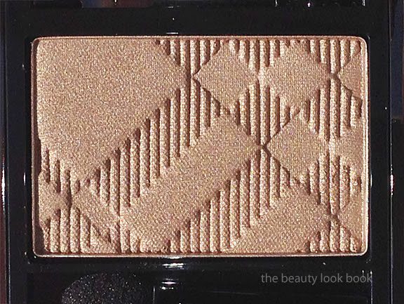
I picked 4 eyeshadows and 2 blushes. I will include swatches and descriptions in a more detailed post soon, but here is a sneak peek. Left to right: Lady Godiva, Fool’s Gold, Leprechaun and Burnt Eggplant.

First impressions are a thumbs up. Right now, I can’t always find the eyeshadows on Barneys.com. Sometimes if I google the phrase “Sunday Riley Eyeshadow Barneys” I will find the link. Sometimes it will say no page exists. Perhaps they are updating their website as the line rolls out.

Have you tried her cosmetics line yet? I’m all ears! (Better photos to come soon, these were taken at sunset so there is a slight cast due to lighting issues.)

Uncategorized

Latest: Edward Bess Now Available on Sephora.com

January 18, 2012
I have great news for everyone! Edward Bess is now available on Sephora.com! The latest from the Edward Bess team …

“Following huge success in Bergdorf Goodman and Neiman Marcus, Edward Bess is expanding into Sephora, launching on Sephora.com this January 2012 and will debut in store in early May 2012. As the Edward Bess brand extends its reach, Edward is excited to continue to share his vision with the brand’s legion of devoted followers and introduce the edited range to Sephora customers. “It has been a dream of mine to share my beauty philosophy with women everywhere and I am especially excited to partner with Sephora.”

Edward Bess quickly became the name on every woman’s lips since his debut collection of revolutionary lip colors took the world of beauty by storm. Coveted by Hollywood starlets and everyday women alike, Edward Bess is synonymous with refined style, exquisite luxury, and innovation. Edward perfects the art of understated sophistication time and time again, harnessing his extraordinary creative force with exceptional attention to detail in the creation of his edited neutral makeup colors and cutting-edge skincare. His paired-down, “less is more” approach allows each woman’s natural beauty to shine through while putting her Bess face forward.”

Happy shopping! Be sure to check out Edward Bess on Facebook for the latest updates =)
Uncategorized

Edward Bess Quad Royale in Monte Carlo 02

January 16, 2012

This past weekend I had a much needed girls’-day-out in LA. On our list was a stop at Neiman Marcus Beverly Hills to check out the newly launched Tom Ford beauty line and of course our favorite girls at the Edward Bess counter. I didn’t expect to see anything new from his line (although I’ve been eagerly waiting for his eye bases to be released) but spotted a new Quad Royale in Monte Carlo 02 a beautiful highlighter quad of peachy goodness ($45 for 0.25 oz/7g). Being the peach fanatic and EB fan that I am, I snapped one up immediately without even trying it at the counter (I had other blushes on that I was testing from another brand).

Monte Carlo 02 is the third Quad Royale face highlighter Edward Bess has released. It has four colors in a black mirrored compact, all different variations and intensities of peach shimmer. The lightest shade is a pale champagne but the others are darker and more pigmented. I previously featured Summer in Capri 03 and South of France 01 in prior months and love layering them over his Daydream Bronzer or other blushes to add a soft glow. I find they are perfect for my medium skintone to add a subtle highlight to brighten the face. Monte Carlo is also a highlighter but I find the colors darker so this could also work as a blush. I do find it more pigmented and more shimmery than the others but in a beautiful sense (it’s not overly frosted). The texture is similar to that of the other quad royales: smooth, finely milled shimmer and easy to blend on the face for a natural glow. I do find it a bit harder in texture compared to his original version of the Daydream bronzer which is the one I have featured in the past. The Quad Royale still applies smoothly and easily on the skin. Monte Carlo has no detectable scent. I love the brush that comes in the compact – it’s a step up from most compacts other brands have and is usable to dust the cheeks evenly with color. Here are all 3 of Edward’s face quads plus a few more close up shots:

Outdoors, cloudy lighting, no flash:

Ingredient listing (clickable for larger viewing):

On the face it applies shimmery. I have worn this as a blush alone but prefer this layered over another semi-matte to fully-matte product (whether it is blush or bronzer). I was hoping for sun this weekend but it was overcast. Here are the best swatches I could manage:

A few comparisons to other peachy blushes and bronzers. There are others I could have pulled but right now I am limited on time so I pulled a small sample to help give you an idea of the color. Please note that right now I do not have time to accommodate extra comparison or dupe requests.

Swatched left to right: Bobbi Brown Nectar Shimmerbrick, Dior Aurora, Edward Bess Summer in Capri, Edward Bess Monte Carlo, MAC Ripe Peach

Bottom line: love. It gives a natural peachy glow with a subtle refined shimmer. Pigment is sheer but noticeable on the skin with one swipe and it is also layerable for more color. If you have Summer in Capri, do you need Monte Carlo? They are similar in color but the Summer in Capri has bigger portions of lighter shades while Monte Carlo has more peach. I think they are different enough to justify both. Is Monte Carlo a must-have? In my opinion yes, even with the dozens of peachy shimmers I already own, yes.
As of this past weekend I was not able to find this anywhere online for sale. I do know the Beverly Hills Neiman Marcus counter has this. I highly recommend you call them to order if you’re interested. I have not yet checked with the Bergdorfs counter.
Uncategorized

Le Métier de Beauté Resort 2012: Jet Set Sheer Brilliance Glosses in HibisKiss and Orange Juiced

January 12, 2012

This spring Le Métier de Beauté and Ken Downing of Neiman Marcus have created bold and bright lip and cheek colors for Resort 2012 with their Jet Set Collection. There are two new Sheer Brilliance Glosses ($32 each) that come in two juicy shades: Orange Juiced, a hot golden orange glow, and HibisKiss, a sheer but bright fuschia red. Both come in that classic sheer Le Métier glow infused with subtle shimmer and have a high-shine finish. The colors look shockingly bright in the tubes but luckily for me, they apply on the lips with a sheer wash of color. More photos and swatches below.

Another view of the swatches plus the 2 shades mixed. I love mixing and layering Le Métier shades. The colors are layerable over other Le Métier lipsticks and work well over other brands too. Here you can see that HibisKiss dominates when you mix equal portions of both colors:

Extra close shot so you can see how fine/subtle the shimmer is in the tubes. They glow!

HibisKiss goes on a warm fuschia red, which is odd because I usually associate “fuschia” with blueish-cool tones. This one is more of a neutral red leaning slightly towards the warm side. It has a sophisticated subtle shimmery glow. I found it too bright for me alone. It is definitely outside of my comfort zone although it does photograph well. In real life/in person it’s a bit too bright for right now. Perhaps I will feel more comfortable with color once the weather warms up and once I get my tan back.

Oranged Juiced was a pleasant surprise for me. In the tube it’s a borderline neon golden orange. It looked extremely unflattering at first glance but the shimmer looked beautiful and having fallen in love with other LMdB glosses I tried it with an open mind. It swatched on the hand orange but on the lips it sheered out to give a soft warm golden glow. There are neon tones in this gloss so it doesn’t always photograph well with a digital camera. The photo below was the best I could get. Sometimes neon shades tend to look, well, extra-neon-like with a camera.

Overall beautiful high quality shades. Those who like an extra punch of color will fall in love. I personally feel it’s a bit too early in the year to be completely won over right now. Even with year-round perfect weather in Southern California I’m just starting to get into spring mode and I’m more into the softer shades right now for this time of year. I do think I will pull these out for more use in a few months, although Orange Juiced seems to be versatile enough for layering and warming up other colors. These days I’m lemming their oh-so-hard-to-find exclusives like their Blush Kaleidoscope and Jan’s Jewel Lip Creme hoping they will eventually make their appearance at all Le Métier counters (one can wish).

I highly recommend reviews by Best Things in Beauty and Messy Wands for extra thoughts, photos and swatches on the glosses. These lovely ladies also have reviews of the 3 new nail lacquers on their blogs as well (equally shocking and bold as the glosses, if not more).
Le Métier de Beauté’s Resort Jet Set Collection will be out this month exclusively at Neiman Marcus and Bergdorf Goodman and online at both retailers as well. Have you spotted these yet in store? What are your thoughts?
These were provided courtesy of Le Métier de Beauté for review.
Uncategorized

Dior Garden Party Spring 2012: Waterlily and Forget-Me-Not

January 9, 2012

Dior’s Spring Garden Party Collection has a romantic and youthful palette of greens, purples and pinks. This season Dior has released two rose-scented nail polishes for spring in Waterlily 504, a soft iridescent pale green shimmer and Forget-Me-Not 694, a lilac purple cream ($23 each). Both are limited edition.

Dior Waterlily 504 is a soft pastel mint green with subtle shimmer that is fun and youthful. The texture is slightly thicker than other Dior nail polishes I own, but still applies with smooth full coverage. I find Waterlily very similar to Chanel’s epic Jade, but the Dior is slightly more leaf-green while Chanel has a bit more mint. There is something oddly irresistible about a soft minty-green shimmer even though it is anything but office-appropriate (in my mind). I agree with Café Makeup that the finish is more satiny with the Dior for this particular shade. If you want the classic high-shine finish you will need a top coat. Below I’ve swatched Waterlily with 2 coats and no top coat:

Dior Forget-Me-Not 694 is a lilac purple cream with a very slight hint of silver microsparkle. It applies more like a cream and the shimmer is only detectable if you look at the bottles closely. Forget-Me-Not applies smoothly with 2 coats. It’s a lighter version of Dior’s Purple Mix.

I pulled my greens and purples to swatch comparisons. I picked the closest shades to finger swatch here:

A more comprehensive comparison set:

When the promotional photos came out of Dior’s Spring Collection, my initial thoughts were “pass.” The collection has some of the most exquisite detailing with the design and gorgeous spring-like colors, but everything seemed a bit too pastel for my taste. However as photos of the nail polishes popped up on blogs I could not resist. I wore Forget-Me-Not all week and it lasted quite well without any chipping. While this is a brighter non-neutral purple, I still felt comfortable wearing this to the office on the fingers. The rose scent is very subtle and only noticeable when I hold my fingers close to my nose. Here are a few other resources I recommend (not comprehensive but just a few of my favorites):
If you’re considering these at all I suggest you act fast since they are limited edition. My local Nordstrom only had one of each shade left in the store by the time I called. Did you pick anything up from Dior Spring? What were your thoughts?
Uncategorized

Burberry Beauty: Nude Rose & Hibiscus Lip Glow and Tulip Pink & Devon Sunset Lip Cover

January 8, 2012

I finally found a moment to post the swatches and thoughts on my lip picks from Burberry Spring 2012. Thank you all for your patience, I know I’ve been very slow in getting the swatches up, these days I feel like I only have time to be a weekend blogger. Burberry has a beautiful mix of soft and bright for lips this season. There are a few neutrals for nude-makeup lovers (like myself). In addition Burberry has released some vibrant corals, pinks and plum for those craving more color. The colors I ordered sight unseen:
  • Hibiscus No.13 Lip Glow Natural Lip Gloss ($27) – a sheer bright plum with reddish tones
  • Nude Rose No. 14 Lip Glow Natural Lip Gloss ($27) – a sheer soft faded nude pink (very sheer)
  • Tulip Pink No. 27 Lip Cover Satin Lipstick ($30) – a neutral nude pale pink cream
  • Devon Sunset No. 28 Lip Cover Satin Lipstick ($30) – a bright/healthy but natural peach-coral (brighter/deeper than Cameo No. 02)
The swatches all together:

Close up shots of the lipglosses:

Close ups of the lipsticks:

Lip swatches of Hibiscus Gloss, Tulip Pink Lipstick and Devon Sunset Lipgloss. Nude Rose Lip Gloss went on fairly clear so I didn’t post the photos.

Swatch comparisons:

Thoughts on each shade:

  • I could have skipped the Nude Rose Lipgloss because I found it so sheer but it layers beautifully with Tulip Pink which can be a tad too pale by itself. It does go on fairly clear on my lips with a very slight pink tint. I think for the price I would have preferred something with more pigment, or at least with a bit of nude shimmer.
  • Tulip Pink Lipstick is on the pale side. It’s not quite as pale as Nude though so I still find it wearable. If you have other nude pink shades from Burberry I would say you can safely skip Tulip Pink unless you’re looking for something on the paler/lighter side. I personally prefer slightly darker pinks although this one is lovely when topped with a sheer gloss. The coverage is full but not too thick.
  • Devon Sunset Lipstick is a brighter version of Cameo. It reminds me of a softer more wearable version of Lancome’s Chris and Tell (which I gifted away). It has a similar effect but less of a garish finish. The coverage on this color is full as well. Compared to other corals it has a richer creamier finish.
  • Hibiscus Lipgloss is a lovely plum in the tube, on my lips it pulls more red (as most plums do). It’s a bit outside of my comfort zone but not too over the top. I don’t have similar shades but it seems to be a classic sort of reddish/plum so I am assuming Chanel and Bobbi Brown have something similar. The finish is sheer but color is noticeable on the lips.

Overall I think the items released for Burberry Spring-Summer are classic and gorgeous. The entire collection is available at select Nordstrom locations and Nordstrom.com now. Due to time constraints I don’t have the ability to do more comparisons right now. I hope the comparisons I have posted for Burberry Spring will give you an idea to help gauge the colors.

Uncategorized

Burberry Pale Barley No. 22 Sheer Eye Shadow

January 4, 2012

Burberry Pale Barley No. 22 Sheer Eyeshadow ($29) is a beautiful shimmery neutral sandy beige with a complex sheen. It glows with a mixture of warm gold and neutral taupe and champagne-opalescent sparkles. Over the phone, Pale Barley was described as a color that matches the classic Burberry Trench Coats with shimmer. It just might be the most beautiful neutral I’ve ever laid eyes on. The texture is soft and smooth and the pigment is anything but sheer. I do find that Burberry eye shadows are all soft and blendable for a soft sheer wash of color but the intensity of the pigment is quite good with the paler shades. The shimmer finish is similar to Rosewood with a soft luminous sheen. Lasting power by itself was less than satisfactory, however when Pale Barley is applied over a cream shadow, it lasts all day. I’ve experimented over the past few days and tried it three different ways: over Urban Decay Primer Potion in Sin, MAC Nubile Paint Pot and Laura Mercier Metallic Creme in Gold. Each one individually helped the color from the powder to stay put from morning to evening without changing the effect or color.
A few close up shots:

Left is with a heavy swatch, right is blended slightly, photos look frosty from the flash but the color is a luminous shimmer in real life:

At an angle, you can see the beautiful glowy sheen:

Creating a fresh unique neutral can be hard to do, but Burberry has pulled it off flawlessly. Pale Barley is different from anything they’ve released before and different from other neutrals I own from other brands. Here is one comparison set with Burberry Gold Trench, Almond, Taupe Brown, Rosewood, Midnight Brown and Edward Bess Intimate:

Compared to other brands I found Pale Barley unique as well. I wasn’t able to photograph the actual product in good light but did get swatches before the sun went down. Here is one more comparison set to Bobbi Brown Beige Shimmer Wash, Bobbi Brown Nude Beach Metallic, Le Metier Jojo, Le Metier Splendid Frost (taupe), Chanel Beige Lame, Chanel Safari and Urban Decay’s Naked2 Suspect.

I believe Pale Barley is a definite must-have. It’s beautiful, layerable, complex yet classic. It’s one of those shades you can wear alone (over a base that is) and just add mascara and have a finished eye look. I love that it’s a swipe-and-go type of shade that is goof-proof, fool-proof, and easy to incorporate into any look. For the woman who needs more than one color on the eyes, note that it layers well with other shades too. I purchased it sight-unseen and have no regrets. Pale Barley is a classic color and just absolute perfection on my skin. It’s a staple and I highly recommend it.