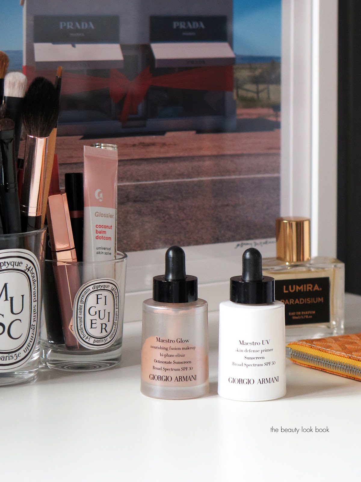
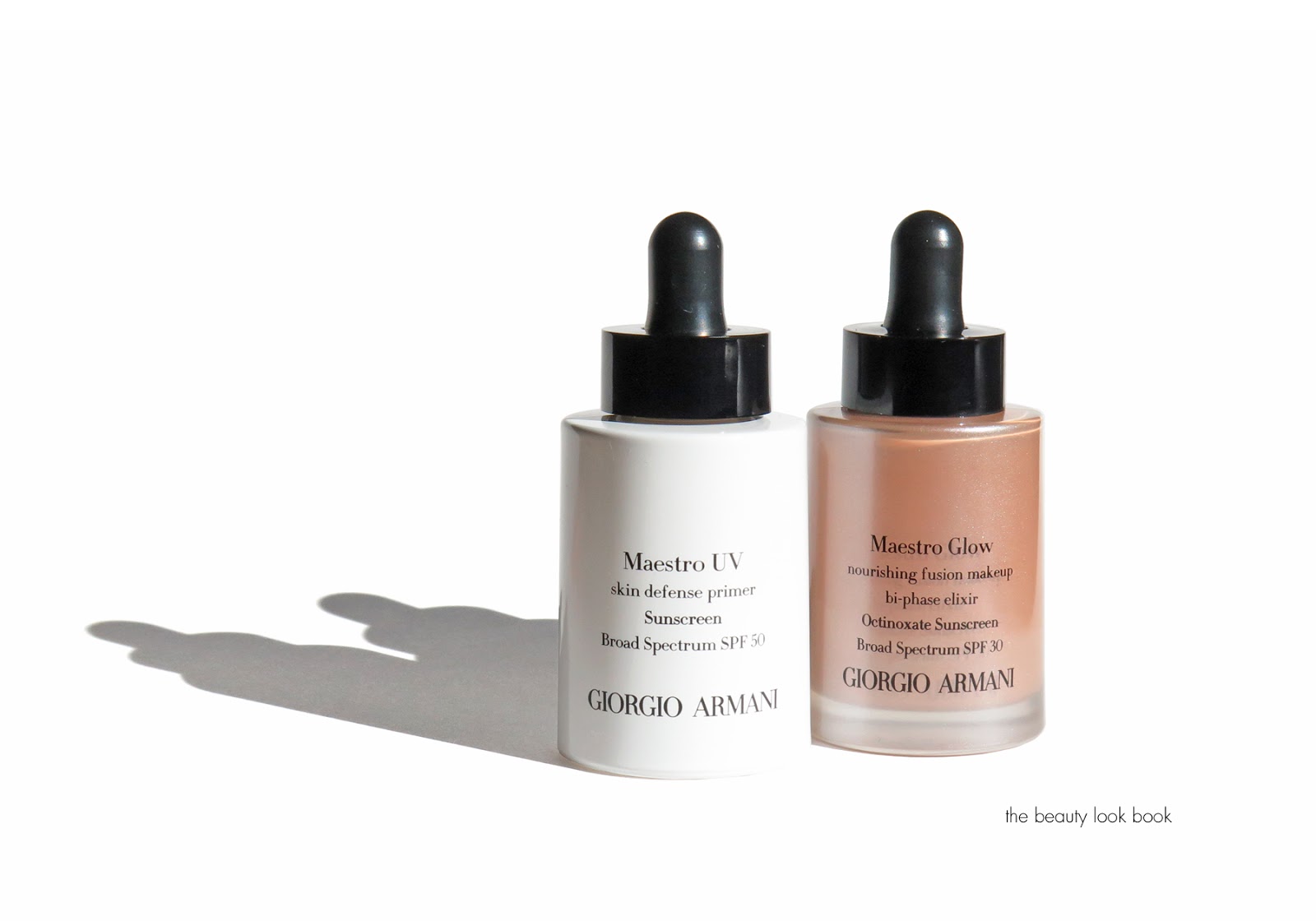
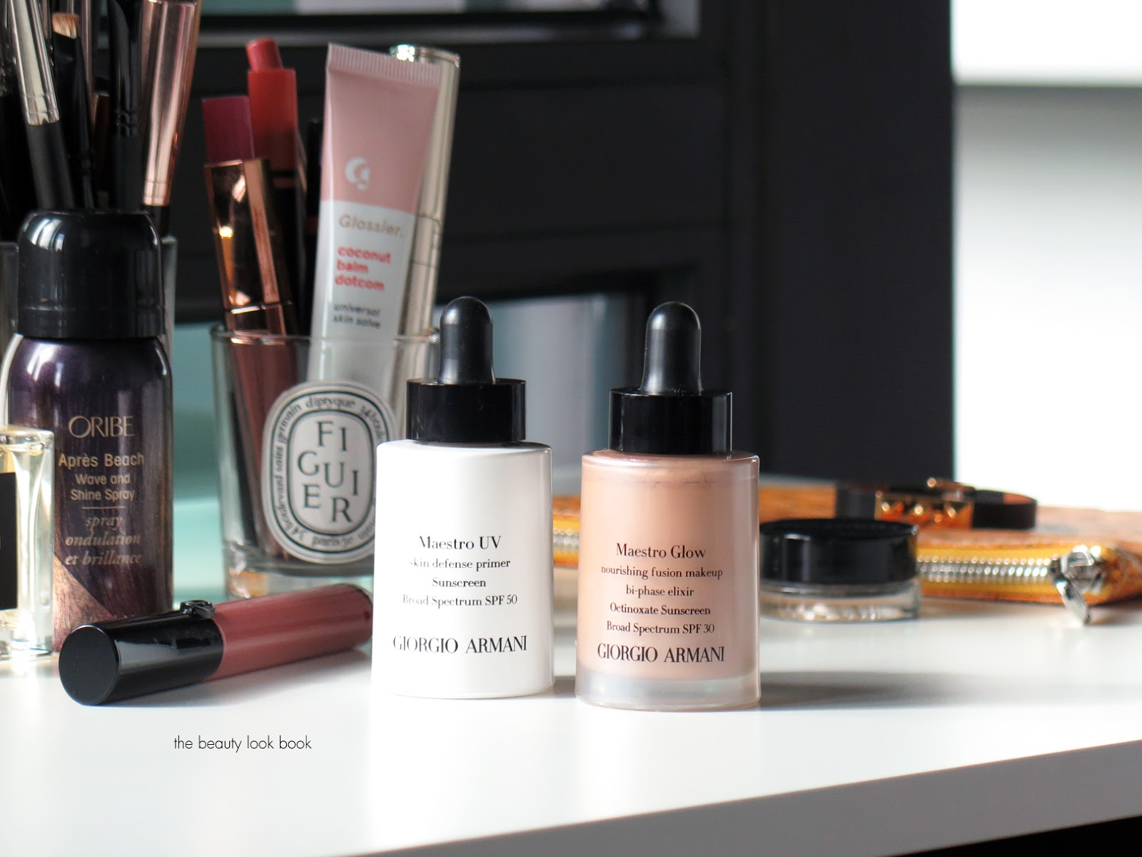
This is the season of glow foundations and many of you have been anxiously waiting for my review on the new Armani Maestro Glow Nourishing Fusion Makeup Foundation SPF 30 ($64 for 30 ml/1 fl oz) and the Maestro UV Skin Defense Primer ($64 for 30 ml/1 fl oz). I’ve been putting these to the test for a few months now – I appreciate your patience as it has taken me a long time to post this review. I had very high hopes for both as I’ve been a fan of a few Armani foundation formulas. The description of the Glow Foundation seemed absolutely perfect described as a bi-phase foundation that gives a rich glow with a thin silky texture. It’s infused with oils and pure pigmented to nourish the skin. As soon as I saw it launched, I stopped by my local Nordstrom for a shade match, after trying a few shades I found 5.5 was the best for me. At the counter the artist also applied the Maestro UV Skin Defense Primer which has Broad Spectrum SPF 50. I explained my hesitation with white sunscreens because they almost always leave a white cast on my skin. She assured me this one did not have any residue or white cast and she was right.
The combination of both resulted in a very natural luminous glowy look. The formula of the Maestro Glow is very sheer but it evened out the skin to a soft dewy glow. Even with powder foundation set on top, it looked natural and glowy without being too greasy. Coverage-wise it’s too sheer for my personal taste, but it still evens out the skin. By the time I got home I saw tiny little red bumps surface on my face. I thought it was possible the cleanser and toner she used to remove my makeup caused it (it’s often something I react to). So I let my skin clear up for a week before I tested the new foundation and primer just to make sure.
Quick thoughts on the Maestro UV Primer – it disappears completely on the skin but makes the foundation apply better and smoother. Not just the Maestro Glow but a number of other formulas as well. Unfortunately both the primer and foundation caused a really bad allergic reaction on my super sensitive skin. Tiny little red dots and bumps form along my cheeks and forehead. I tested both on my face for 4 days to make sure and my skin just got worse. After that I took another week break from both to let my skin heal and tried the foundation separately, hoping perhaps I was just allergic to the primer. No luck. I’m allergic to both formulas – so for these I have to give them a thumbs down which is a shame because the finish and look of both is really really good. It looks like skin but better and even though these are very hydrating and moisturizing I found the formula wasn’t too rich for my normal combination skin and the lasting power was pretty good. I haven’t tried every Armani foundation formula, but the ones I have tried didn’t cause any allergic reactions – however it’s probably been at least 4-5 years since I’ve tried one of the regular foundations and since I haven’t kept up on new launches I don’t know if the formulas of any have changed.
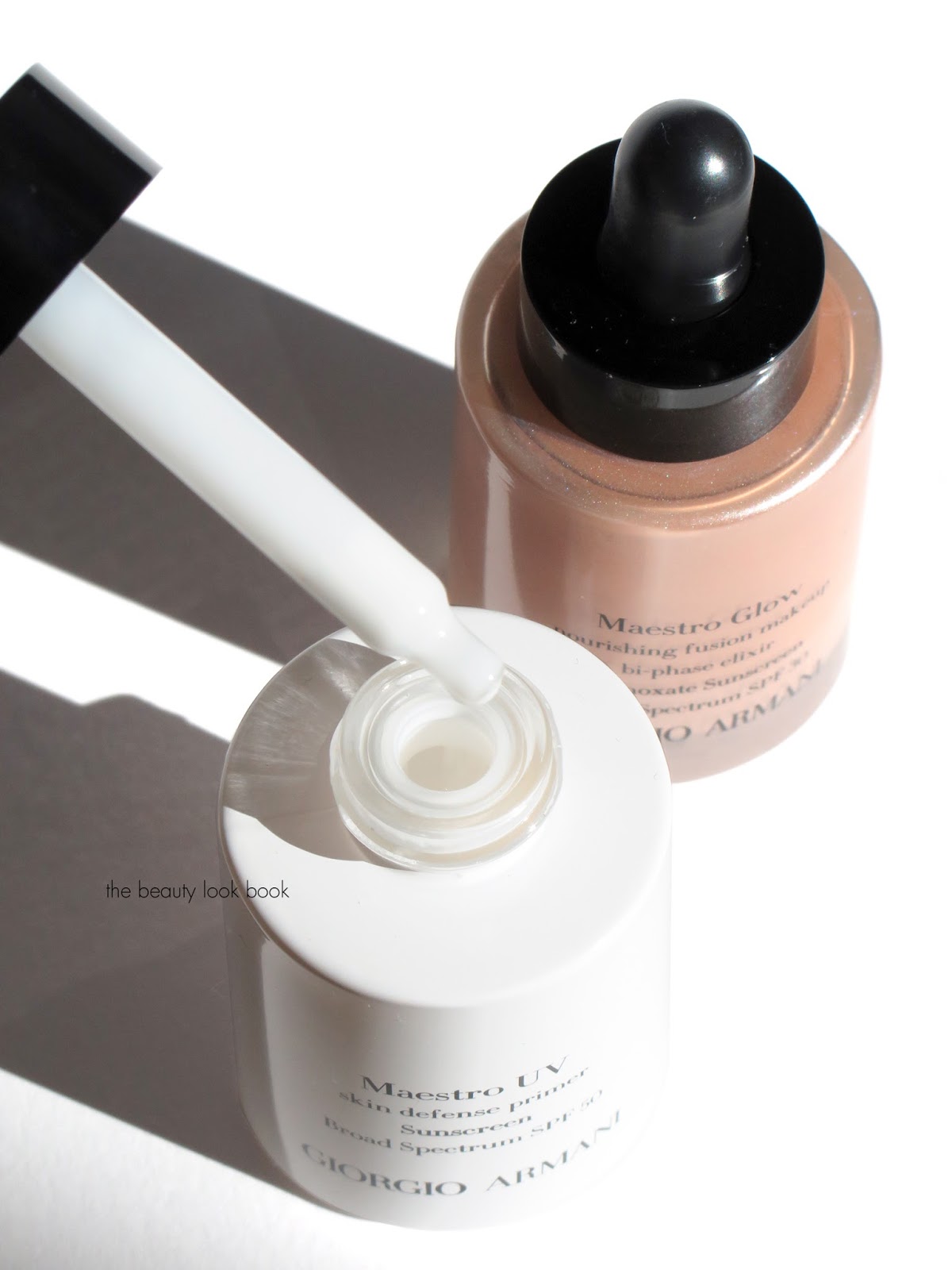
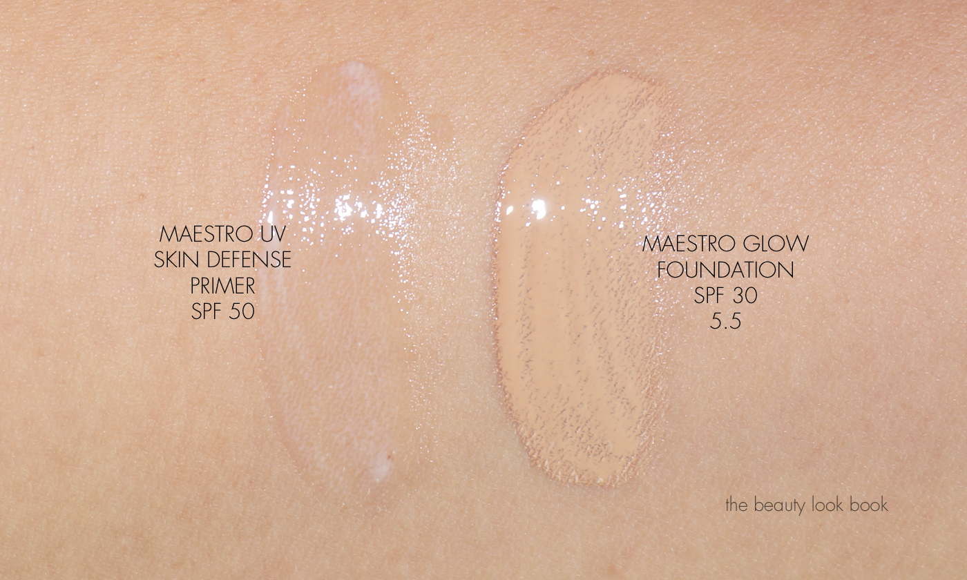
In case you still want to check these out a closer look at both and swatches. For the Maestro Glow foundation since it’s bi-phase you have to shake it up to mix the oil and pigment:
Because the formulas don’t work for my skin, I can’t give these a positive review. In testing these I tried application with a beautyblender sponge which I found was better than any foundation brush. After the last round of testing it took my skin around 2-3 weeks to heal completely and for the bumps to disappear. If you have very sensitive skin you may want to do a patch test first. I do recommend you read other reviews though because this new formula has worked on a number of other people. Depending on your specific skin type your mileage may vary. Allergic reaction aside, if my skin didn’t get bumps I still would give this a lukewarm review – I personally need coverage for foundations. I don’t need 100% full coverage but something that can be built up to medium is what I look for. The Maestro Glow is sheer – it’s not transparent, but just a tiny bit too sheer for my taste.
Have you tried either of these yet? Do you have a favorite Armani foundation formula? I purchased both of these from Nordstrom but you can also find these at all Armani retailers now. I’m undecided whether or not to return these even though Nordstrom has a good return policy. One of my friends has super dry skin and loves all the Armani formulas, I’m going to ask her if she want to give these a try.
I made a quick stop to Barneys a couple weekends ago and picked up up the two new By Terry Baume de Rose Nutri-Couleurs in Coral Stellar 7 and Mauve Moon 8 ($56 each for 7g/0.24 oz). I intended to take a quick peek, but it was love at first swatch for both shades and I could not resist the smooth lush texture and pretty colors that made me go “ooooohhh.” According to my rep at the counter, Mauve Moon is a limited-edition shade, but she wasn’t sure about Coral Stellar. She suggested I wait for the Love Yourself Beauty Gift Event coming up just around the corner (starts March 8, details soon), but I decided to go for it and am beyond thrilled with both. Each shade comes with a steep price tag, but the formula does not disappoint. I’ve reviewed and featured a number of other colors before which I will link at the bottom of this post. These are very expensive for a tinted lip balm. Anything over the $40 mark for lip products in general is pretty hard for me to justify, but there are a few brands where I’m willing to splurge and By Terry is one of them. The formula, colors and texture make it worth the splurge to me.
Coral Stellar is a stunning soft iridescent peach and Mauve Moon is a unique lilac color that flashes violet, pink and blue. By Terry now has eight shades of her tinted lip treatment, these are the first ones that have any shimmer in them. The shimmer is luminous and glowy and not frosted.
The texture is smooth and creamy with a lush thick finish. They glide on the lips and have the signature By Terry rose scent. The formula does have some added skincare elements designed to nourish, smooth and help regenerate the lip. It’s also described as having Shea Butter, Essential Rose Wax, Vitamin E, Filling Spheres. I’ve used a number of lip balms and treatments (most recent lipbalm roundup here). The By Terry is one of the most lush formulas I’ve tried. For tinted balms, hers are among the best. A closer look at both shades with swatches at different angles to show the luminous glow these have:
Coral Stellar is a lush peachy shimmer. It has a deeper brighter orange base which makes it look bright, but it has a pretty soft shimmer to it which lightens the color and gives the lips the most luscious soft peachy glow. It is on the sheer side but it’s not so sheer that it’s invisible on my pigmented lips. If you love the color and aren’t focused so much on the treatment aspect, I’ve swatched a few gloss colors that I think have a similar effect.
Mauve Moon is a stunning violet lilac shimmer. It’s a color I’ve always been obsessed with for lips. If you used Trish McEvoy in the 90’s or early 2000’s you might remember she had a gloss called Lilac. It was a straight up soft purple in the tube but on the lips it was the prettiest soft cool pink ever. This reminds me of the color.
Not sure if you can tell the difference between the two swatches on your screen, but the first one is swatched sheered out a bit. It has a soft pinky lilac glow.
Here it is a little heavier where the blue undertones are more visible.
Some swatch comparisons below to some similar colors:
Featured above from left to right:
MAC Cremesheen Glass in Imperial Light
Marc Jacobs Enamored Hi-Shine Lip Lacquer in Uproar (swatched here) MAC Lustreglass in Love Nectar
Marc Jacobs Enamored Hi-Shine Lip Lacquer in Pink Steam (swatched here)
MAC Lipglass in Cultured
Buxom Full-On Lip Creme in Purple Haze (lip swatches here)
Both are stunning colors and I’m smitten with both shades. The pots have a pretty decent amount of product which will make these last a long time. I think they are both worth checking out although the high price tags will put these into the luxurious treat category versus a must-have. There are a couple events you might want to look into if you have these on your list. Barneys New York Love Yourself Event happens 3/8 to 3/12 (details soon). Space NK Discover promotion starts tomorrow on 3/3 thru 3/9 where you can save $20 off orders $100+ online with code EXPLORE16 at checkout.
Other By Terry Baume de Rose Nutri-Couleur swatches linked below:
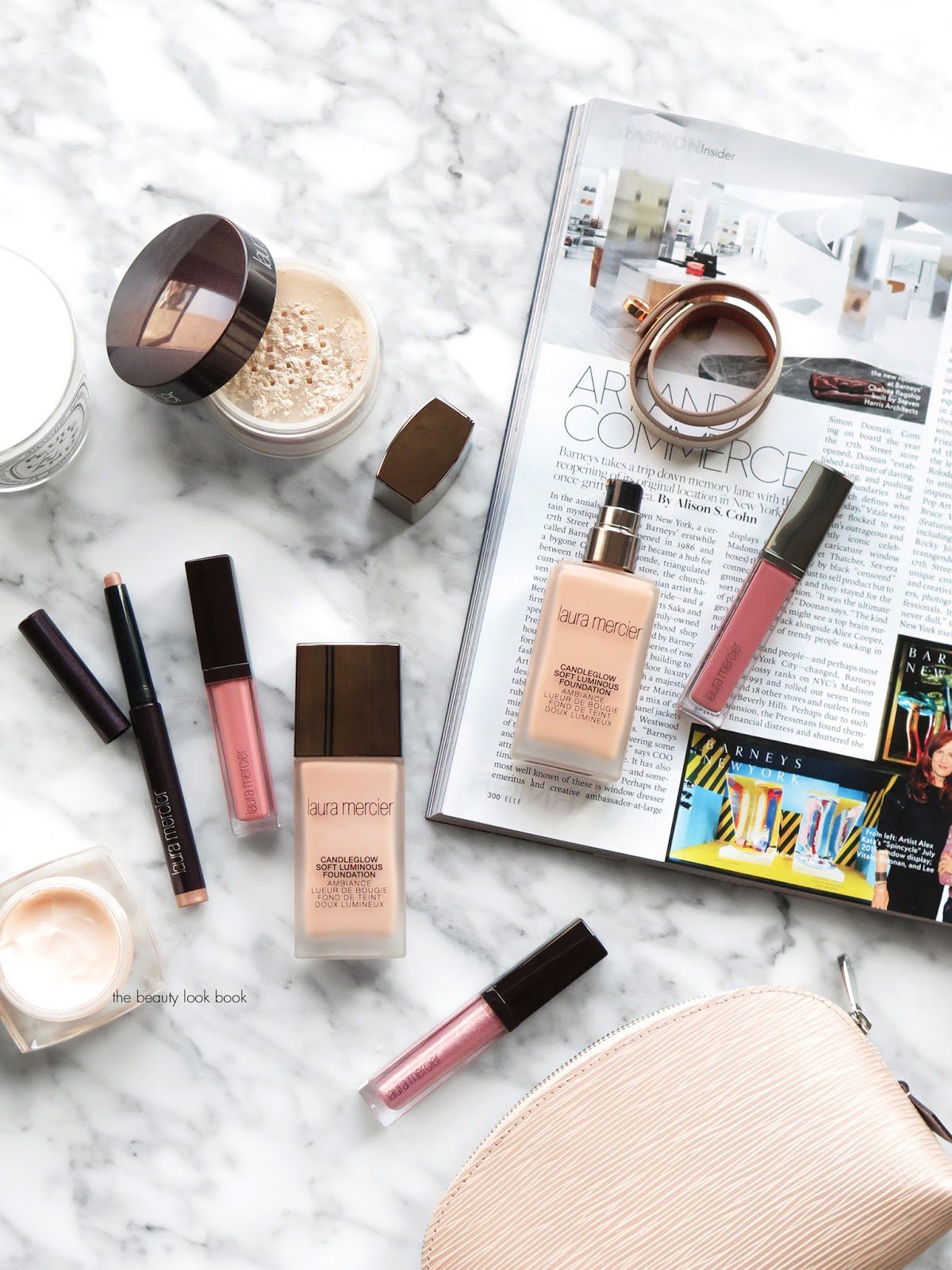
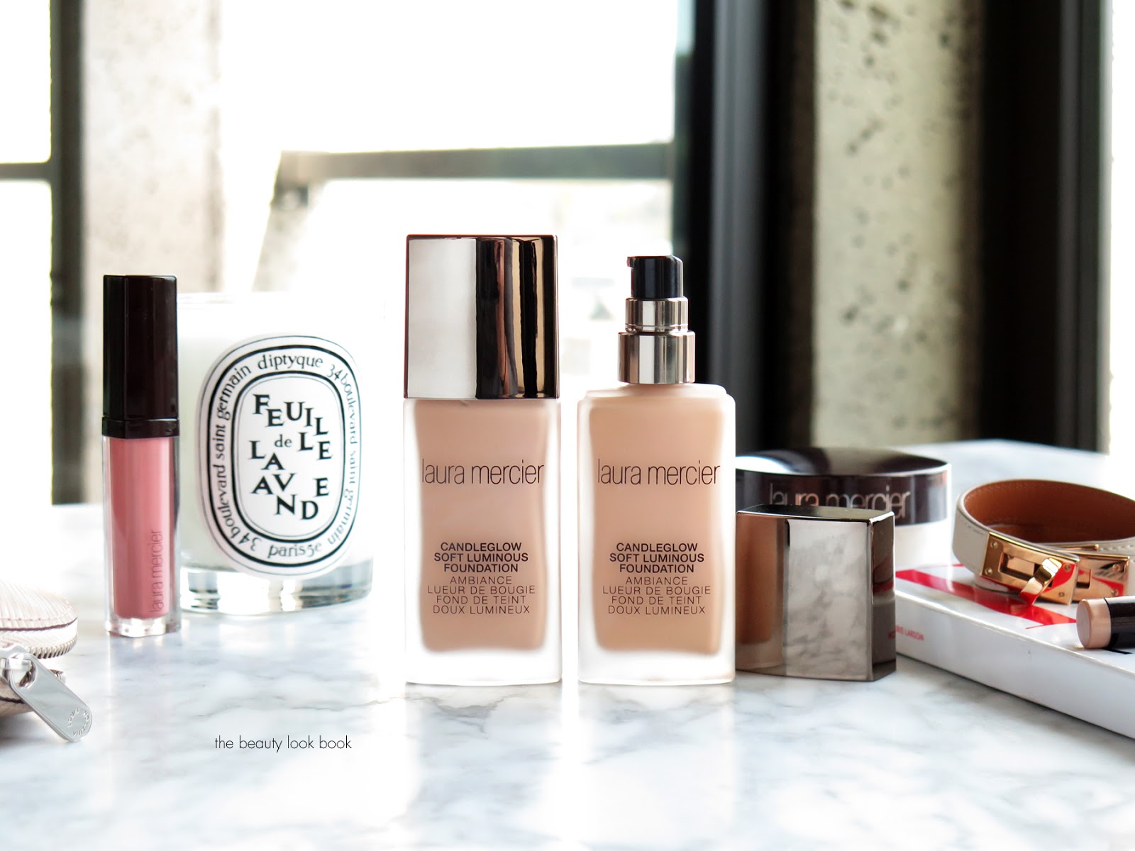
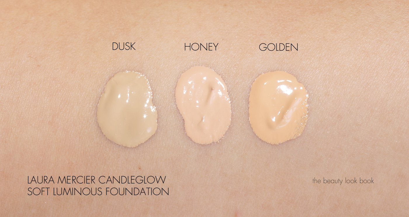
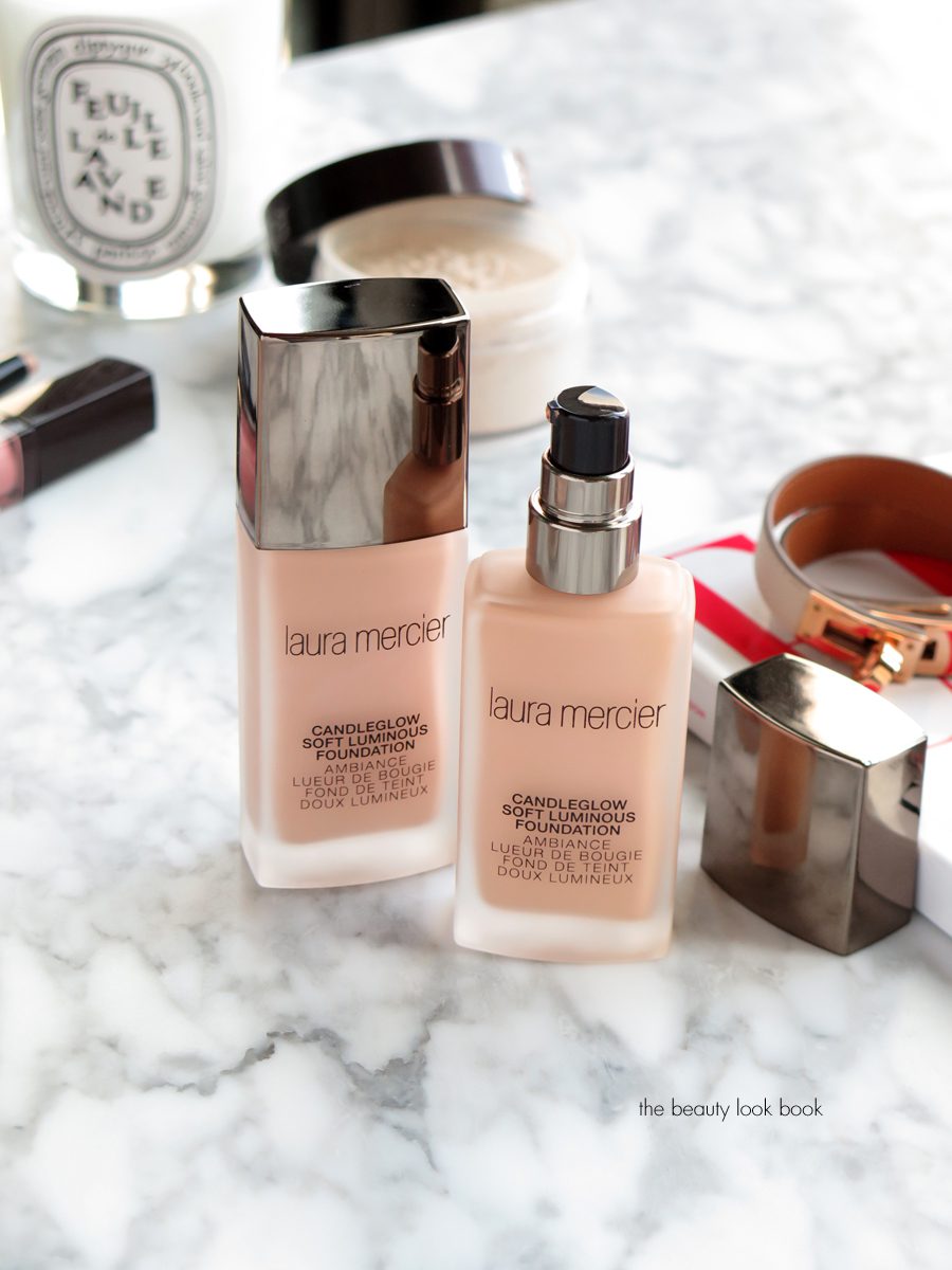
Laura Mercier launched a new foundation formula earlier this year called the Candleglow Soft Luminous Foundation ($48 for 30 ml/1 fl oz). I’ve been playing with this formula for a few months now, testing a few shades over different bases and trying to see how it wears compared to other glow foundation formulas and I’ve found that it is one of the most luminous foundations I’ve ever tried. The Candleglow Foundation comes in 24 shades and is described as having a sheer to medium finish with buildable coverage. I find it to be on the sheer side with a noticeably dewy finish. I love a good glow, but for me the foundation finish is a bit too dewy on its own and needs a soft powder to set. It’s dewy but not greasy looking. Unfortunately once you add any kind of powder, the dewy glow disappears which kinda defeats the purpose of the product, but you still get a natural looking finish. (I’ve been setting with the Translucent Loose Setting Powder.) The formula is described as a hydrating formula – I did find it to have a hydrating feel but it’s a very lightweight formula and doesn’t feel heavy.
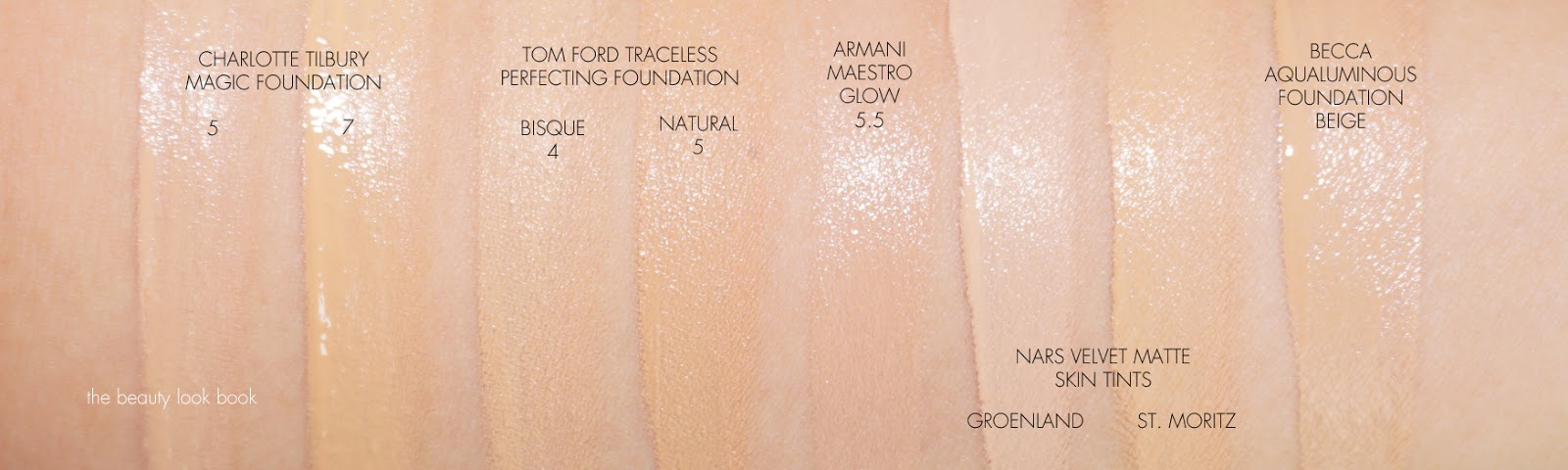
Comparing it to other formulas, the new Candleglow Foundation is not quite as sheer as the Laura Mercier Tinted Moisturizer, but definitely sheerer than the Flawless Fluide and Silk Creme Oil Free Formula. The packaging of the new foundation is well designed – I think it’s the best one yet from Laura Mercier. It comes in a sleek glass bottle and a very well designed pump dispenser. It’s very sturdy and has a nice simple streamlined look which I really like for an easy to use no-fuss kind of look. For me, I need three pumps of product to have enough to apply for my whole face. I like using the Sephora Pro Full Coverage Airbrush #53 brush with this formula, but you can use fingers or a sponge too. It glides on smoothly and evens out the skin in a very sheer natural kind of way. I couldn’t detect any scent which is a plus for those with sensitive noses.
Since the formula is on the sheer side, it makes the colors more forgiving so you don’t need a 100% exact match which is exactly what I need with this line. When it comes to Laura Mercier foundation shades, matching is always so incredibly tricky for me. I’ve made several visits to the counter to get matched for past formulas. Every single time I’ve been to a counter, I’ve been matched to a different shade. My Flawless Fluide match was Honey when I was last matched and it’s worked for quite some time. If you recall my original review, you might remember my surprise since it’s very pink in undertone. I have olive/yellow skin and Honey should be too pink, but somehow when it is blended out on my skin, it is an exact match. For the new Candleglow Foundation formula, Honey works well on my skin, but Dusk also works too. Dusk by comparison is more olive and cool-toned but it oxidizes on my skin so it adjusts to match my neck exactly. Golden worked on me a couple of months ago when I was a bit darker, but I’m losing my tan so it’s just a tad bit too dark for me. My perfect match happens when I mix all three shades, but I find myself reaching for either Honey or Dusk most. The formula is pretty forgiving. If you know what your shade is in the Flawless Fluide formula, your Candleglow shade should probably be the same.
I would say for a natural glowy foundation/base, my favorite is still the NARS Pure Radiant Tinted Moisturizer because it’s not like a traditional tinted moisturizer, but has that lightweight feel. For me the NARS gives me just the right amount of natural coverage on days I only need a light base. It lasts all day without getting too dewy or greasy looking. Comparing the NARS to the Laura Mercier Candleglow, I prefer the NARS by far. The NARS wears better for my normal/combination skin. I’m in between colors, but the colors match my skintone better. The NARS also lasts longer and doesn’t get as dewy as the one from Laura Mercier.
I’ve also been testing the Armani Maestro Glow Foundation and Becca Aqua Luminous Perfecting Foundation (both of which I’ll review soon). I’ll have a more detailed comparison in the following posts, but I will say right now out of all the newest glowy foundation launches this year, my favorite is the Becca, followed by Laura Mercier. The one from Armani unfortunately has been a fail for me (details soon).
If you like sheer to medium coverage with a dewy finish I think you’ll like this one. It works for my normal combination skin but I think it would be better suited for those with normal to dry skin. Overall I found it held up very well considering how dewy/glowy it was. I did get a little shiny in the Tzone by 1-2pm – but it was easy to fix with a bit of a touch up. It’s sheerer than I prefer right now because I have spots I like to cover up – but you can fix those with a spot concealer (some of my favorites in this post here). If you’re one who doesn’t like a glow because you find formulas tend to get too dewy by late afternoon, you will probably be better off checking out the Flawless Fluide formula from Laura Mercier or the NARS Velvet Matte Skin Tint. A huge plus for me with the new Candleglow formula is that it didn’t cause any irritation or breakouts for my super sensitive skin (many foundations clog my pores or cause tiny little bumps all over the face). You can probably experiment with different primers or bases to see how it lasts or wears. I found that primer didn’t make much of a difference in application or lasting power. It works just as well over a regular moisturizer.
Bottom line I the Laura Mercier Candleglow Foundation a solid performer – but may be too dewy in finish for some. Given the sheer coverage and the non-perfect state of my complexion, I do find I need to add something on top of certain areas to give me the coverage I need, but it’s definitely worth checking out for those who want a natural looking glow.
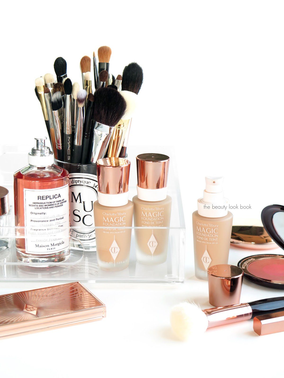
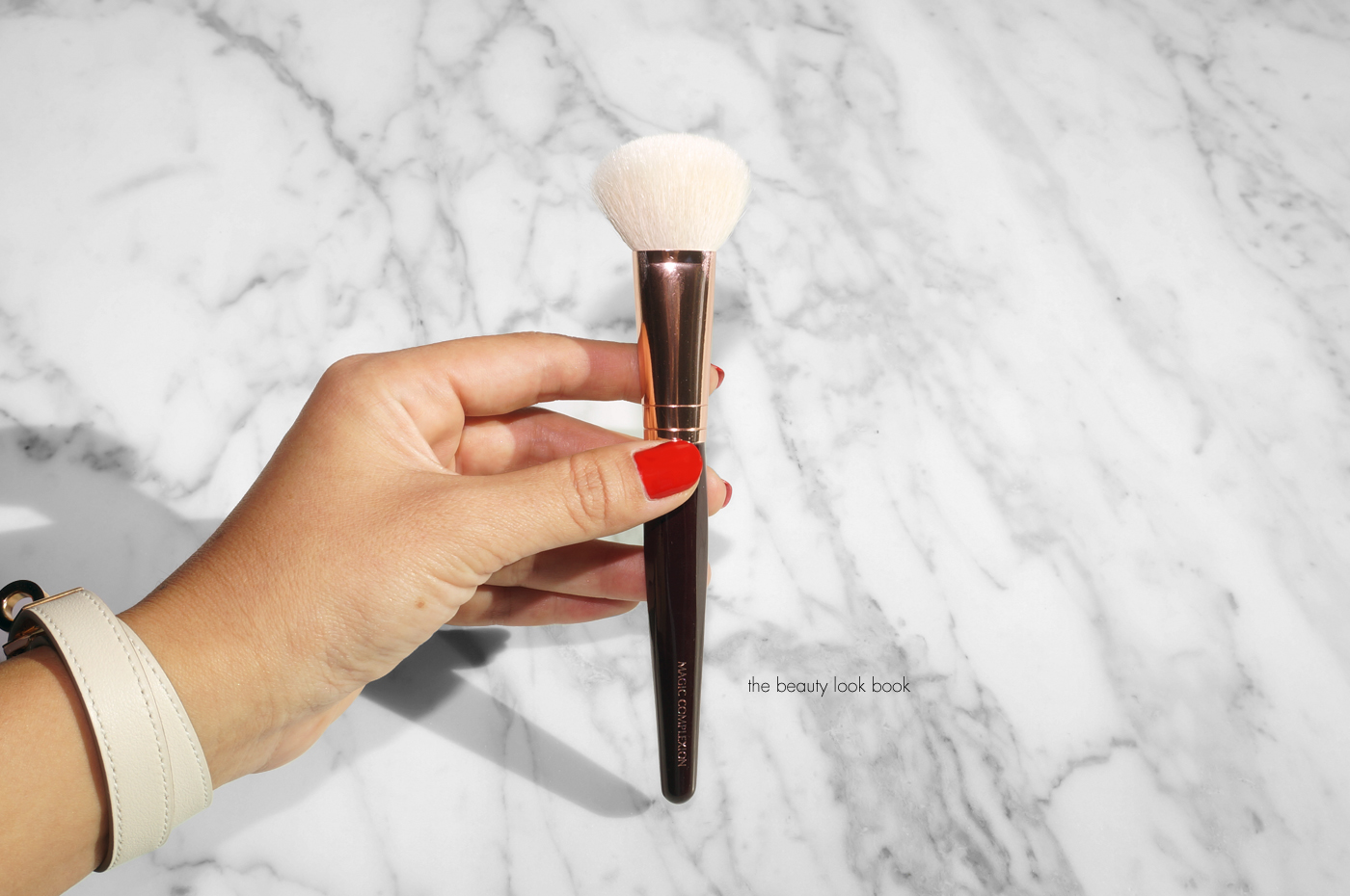
There are a number of new foundation launches this year and I’ve been working my way through testing several different formulas and brands. One of the formulas that I’ve been most excited about is the Charlotte Tilbury Magic Foundation ($44 for 30 ml/1.0 fl oz, made in Italy). This is described as a long-lasting foundation with flawless poreless coverage. It does indeed minimize the look of pores, covers dark circles and gives the skin a more brightened look. There is a new brush that launched called the Magic Complexion Foundation Brush ($55) which I’ve also been playing with. Thoughts on this one in this post as well.
The Charlotte Tilbury Magic Foundation comes in 15 shades and has an SPF 15. It’s packaged in a glass bottle with a plastic pump dispenser. I find two pumps sufficient to cover the entire face. There are a number of glowy foundation formulas on the market this season – I’m all about the glow, but for foundations I prefer a finish that isn’t too dewy because I have normal combination skin. What I like the best about the new foundation from Charlotte Tilbury is the formula brightens my skin, has enough coverage to covers imperfections and dark spots, and has a natural luminous look without being too dewy. I still need to set with powder, I’ve been using either the Laura Mercier Translucent Loose Powder or the Charlotte Tilbury Airbrush Flawless Finish Skin Perfecting Powder #2. With either one I get long-lasting wear, it lasts all day long well into the afternoon with minimal touch ups needed (just a tiny blot on the nose for me).
It’s recommended that you use the new foundation in conjunction with the other
Charlotte Tilbury face products such as the Magic Cream, Mini Miracle Eye Wand and Magic Complexion Foundation Brush for the best looking
skin, but I find you can use it over a wide range of moisturizers or
combine it with other concealers. It’s a pretty versatile formula that
offers medium to full coverage. It evens out the skin and offers smooth
flawless coverage.
In terms of color and formula, many know that I had a hard time finding a good match in the Light Wonder Foundation Formula. My closest match winter match was either 4 or 5, but I found I had to mix colors. During the summer I got a lot darker and found 7 to be my best match. Right now for the Magic Foundation formula, I can get away with either 5 or 6. The color adjusts and warms up slightly on the skin after it sets. It doesn’t oxidize too much which is good, but it will warm up a tiny bit.
Some swatch comparisons below. The corresponding shades for the Light Wonder vs Magic are pretty similar. I find the Magic Foundation 5 to be slightly less pink than the Light Wonder 5.
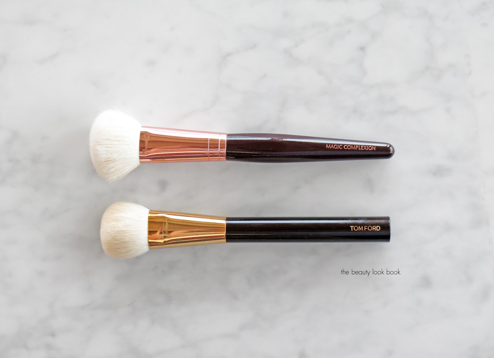
Next up are some thoughts on the new Magic Complexion Foundation Brush.
I had high expectations for the Charlotte Tilbury Magic Complexion Foundation Brush as it seemed very similar to the Tom Ford Cream Foundation Brush but priced at a much more affordable price. When I opened the box I was disappointed to see loose hairs flying everywhere. It shed like crazy however after I washed it, the shedding stopped. The ends of the brush look like they have been machine cut. Comparing this to the Tom Ford, the Tom Ford Brush is significantly softer, better made, and seems to be of better quality overall. That being said, the Charlotte Tilbury Magic Complexion brush does perform just as well as the Tom Ford. It buffs the foundation into the skin for a streak-free flawless finish. If you’re looking for a foundation brush that’s soft and will buff in product to a smooth finish, I think it’s something worth looking into. The one from Charlotte Tilbury has a looser fluffier feel that isn’t quite as dense which I find makes it easier to smooth over the larger areas of the face in a circular motion. Here’s a look at both after they’ve both been washed and dried.
In terms of how to apply the Magic Foundation, I think you can use fingers, a beautyblender sponge, or any foundation brush. In the week I’ve been testing this formula, I’ve been using the new Magic Complexion Brush and it’s been working well (that is once I washed it).
Overall I give the new Magic Foundation formula a huge thumbs up. For me I don’t detect any noticeable scent which is a plus. It has sunscreen but doesn’t irritate my super sensitive skin. It has enough coverage to even out the skin and cover my under eye area so I don’t need concealer (but I still use it). Lasting power is good. Finish is more on the natural matte side and looks like your skin but better. I really love the formula of the Magic Foundation – even more so than the Light Wonder and as someone who likes decent coverage but want something that still looks like skin, I’m thrilled with this one. The Magic Complexion Foundation Brush is nice to have, but for me it’s not a must. I do really like the way it performs and I was relieved that the shedding stopped once I washed it. You can use the tools in your current beauty kit to get similar results.
You can find both the Charlotte Tilbury Magic Foundation ($44) and Magic Complexion Brush ($55) online at Charlotte Tilbury now (expected to launch at other retailers soon). Right now Charlotte Tilbury’s website has an exclusive set called the Magic Foundation Kit ($110) which has the brush, foundation of your choice and a mini magic cream.
Have you tried either of these new launches yet? If yes, what did you think? I’d be curious to know what color you’re matched to if you have!
Both the Charlotte Tilbury Magic Foundations and Magic Complexion Brush were sent courtesy of Charlotte Tilbury for review consideration.
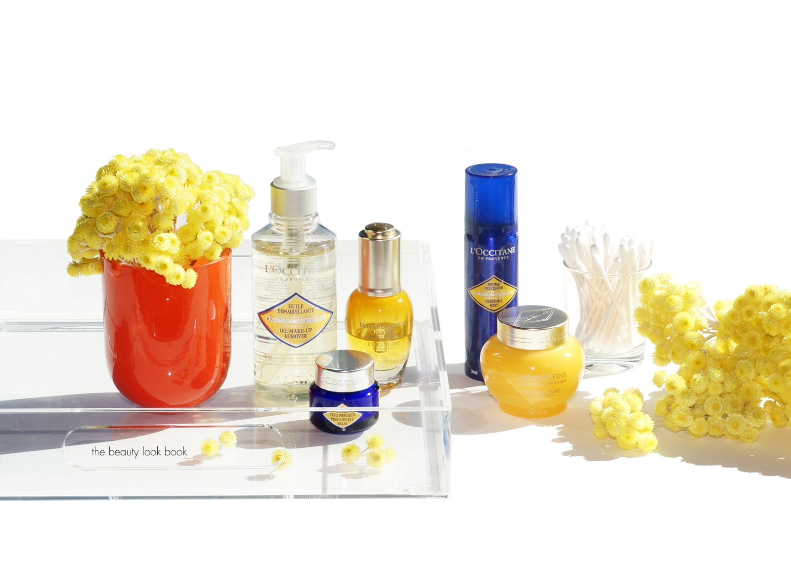
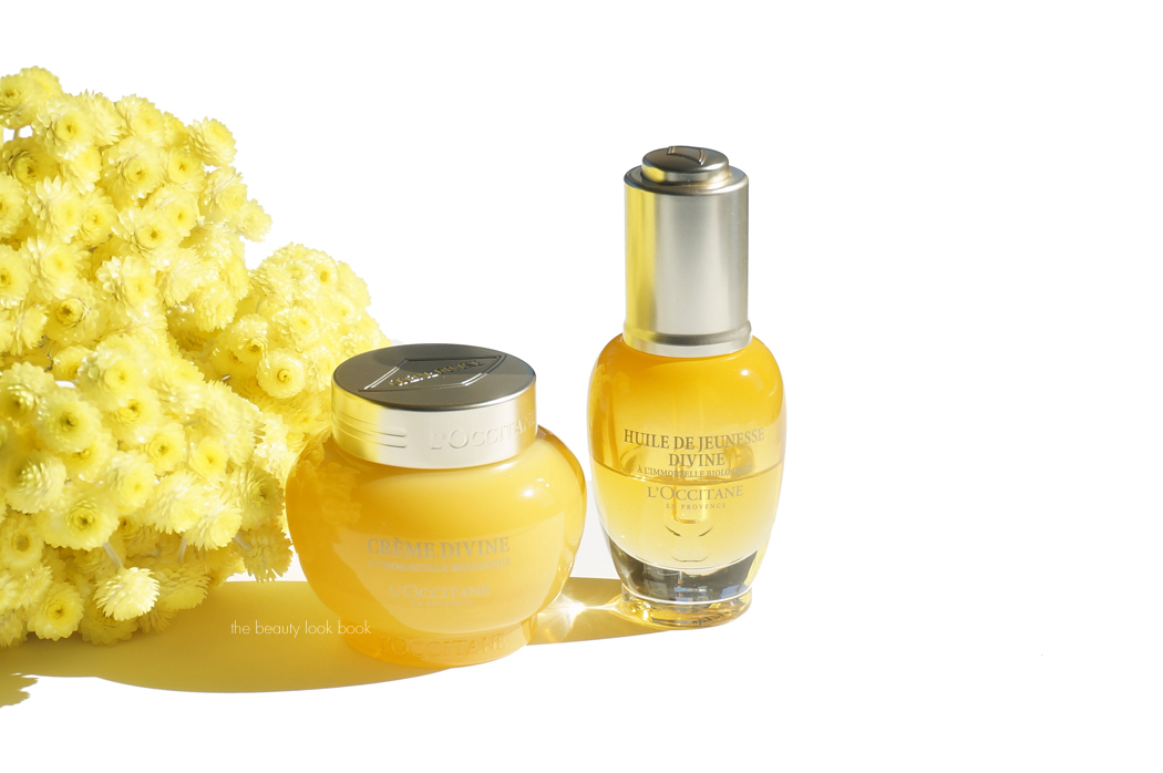
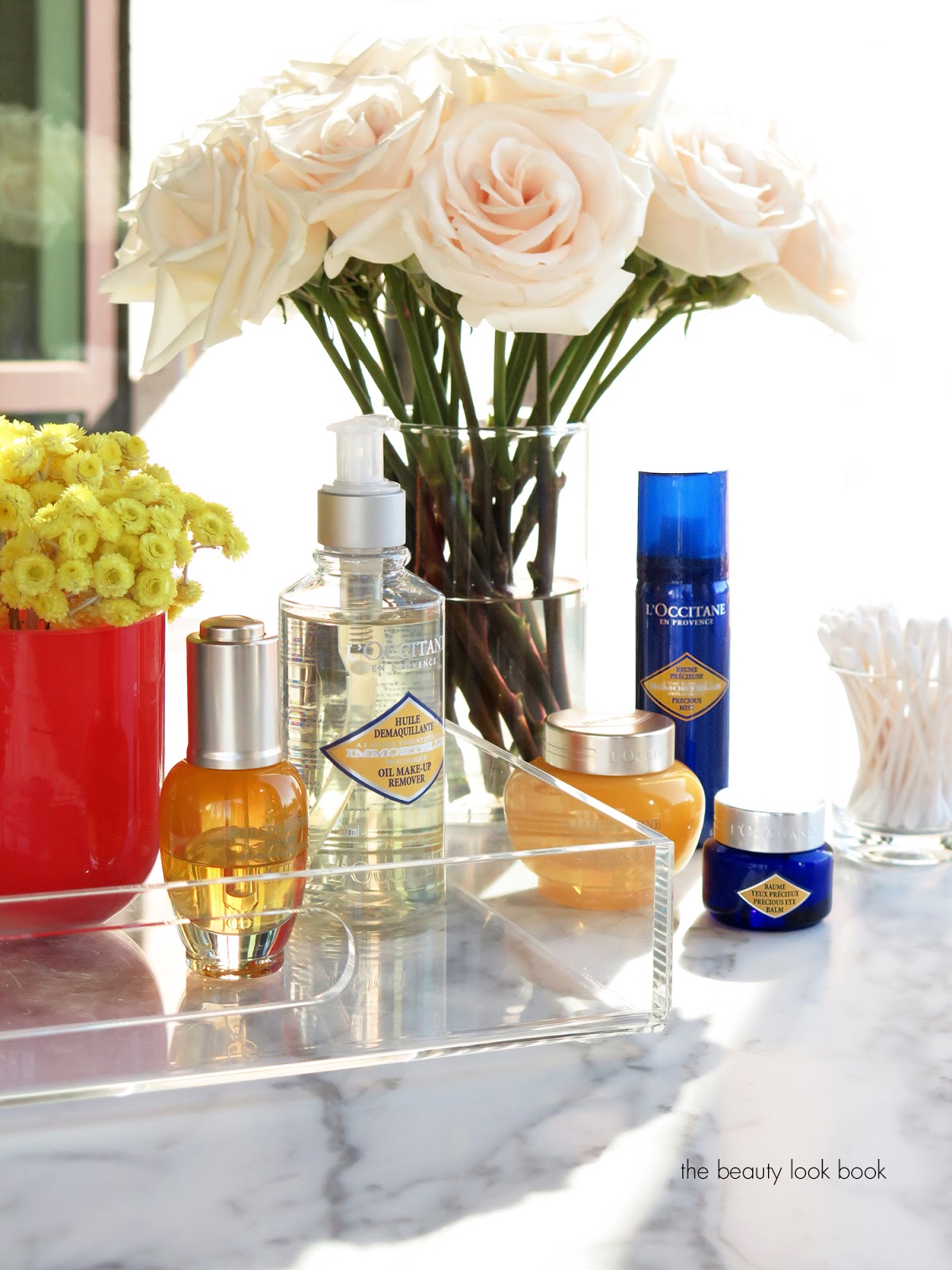
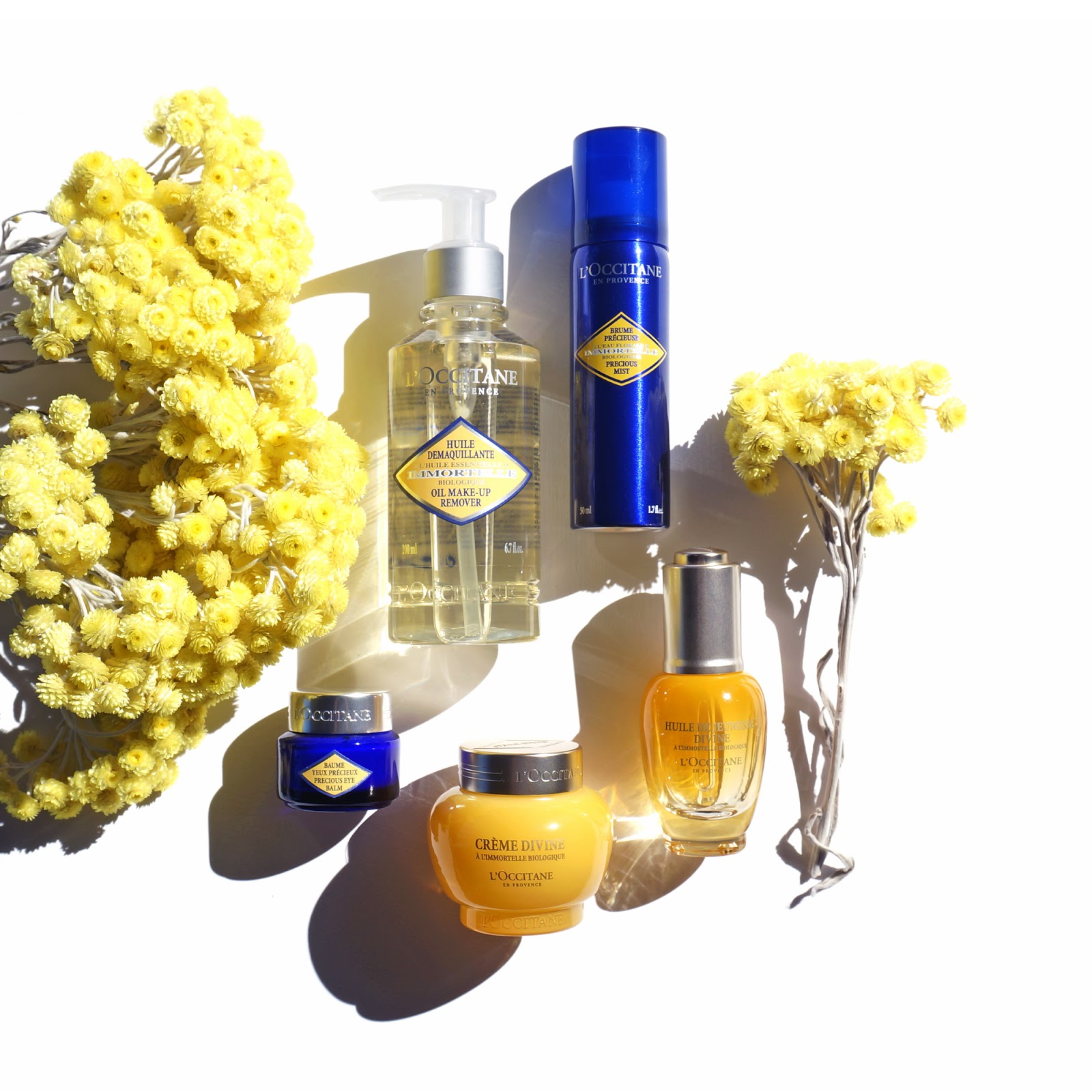
When it comes to daily skincare, my main focus is on finding items that are anti-aging and that will help maintain the skin’s natural glow. Keeping the skin smooth and healthy looking are my primary concerns and I’ve been loving the Divine Collection and Immortelle Skincare lines from L’Occitane to keep my skin glowing. My current skincare routine has included a mix of their beauty oils, creams and balms that I find perfect to add just the right amount of hydration while smoothing the skin and improving the complexion. The Divine Cream and Divine Youth Oil are really good at helping transform the overall texture of the skin. With regular use these both have been instrumental at restoring my skin’s natural radiance. The Immortelle items such as the Immortelle Precious Mist and Immortelle Precious Eye Balm are more preventative in treatment for emerging wrinkles. Both also are really good for revitalizing and refreshing the skin.
Items I’ve been loving and incorporating daily:
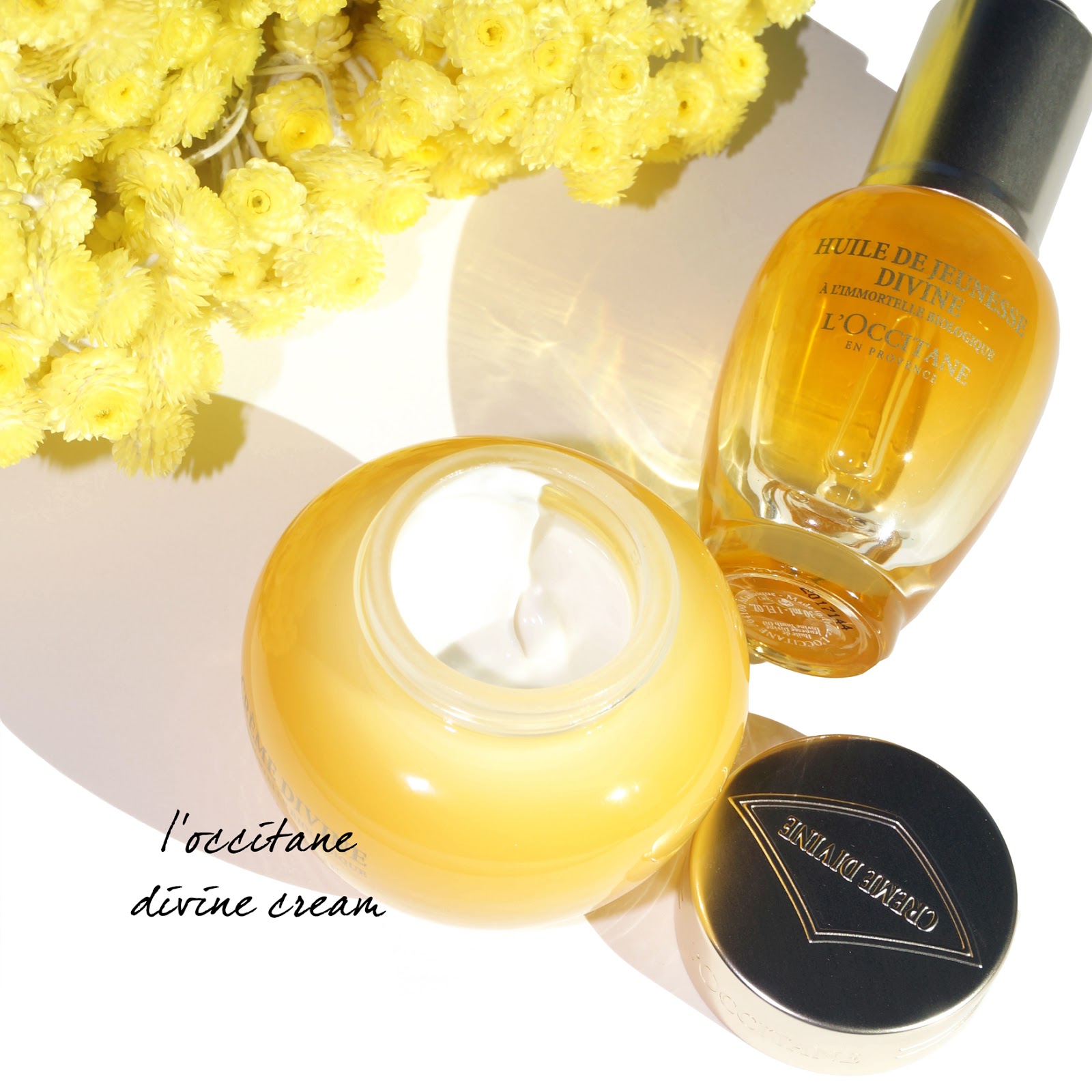
Divine Cream is a lightweight cream moisturizer and has been my daily go-to for months now. It has a smooth texture and very natural light scent to it (it smells like very soft flowers). Each jar contains nearly a hundred Immortelle flowers and the oils give my skin a natural radiant youthful glow. The cream is an anti-aging formula and designed to reduce the appearance of wrinkles, leaving skin smooth and luminous. I have normal combination skin that needs just a little bit of moisture for day to day. This one is just perfect in terms of texture and it’s non-irritating. It absorbs quickly but has enough moisture to make the skin feel well hydrated. Regular use of this has helped balance the skin and smooth texture. I like that it works well with a wide range of foundations – it won’t break down your makeup but still keeps the skin feeling moisturized and healthy throughout the day.
The Divine Youth Oil is something I’ve been using for over a year and it’s one of my top three favorite facial oils of all time. A little goes a very long way and as someone who usually finds beauty oils too rich, this one is perfect in texture. It’s not too light and not too rich. I like to use this anytime I’m feeling tightness in the skin or I start to feel the
slightest bit of irritation. It works wonders to calm the skin and restore moisture. When I use it at night, the next morning my skin glows with a noticeably brighter look and firmer feel. It helps reduce the look of fine lines that creep in when my skin gets dry. It definitely feels like youth in a bottle to me, I love that it hydrates the skin and has an almost velvety finish. Lasts all day without getting too dewy.
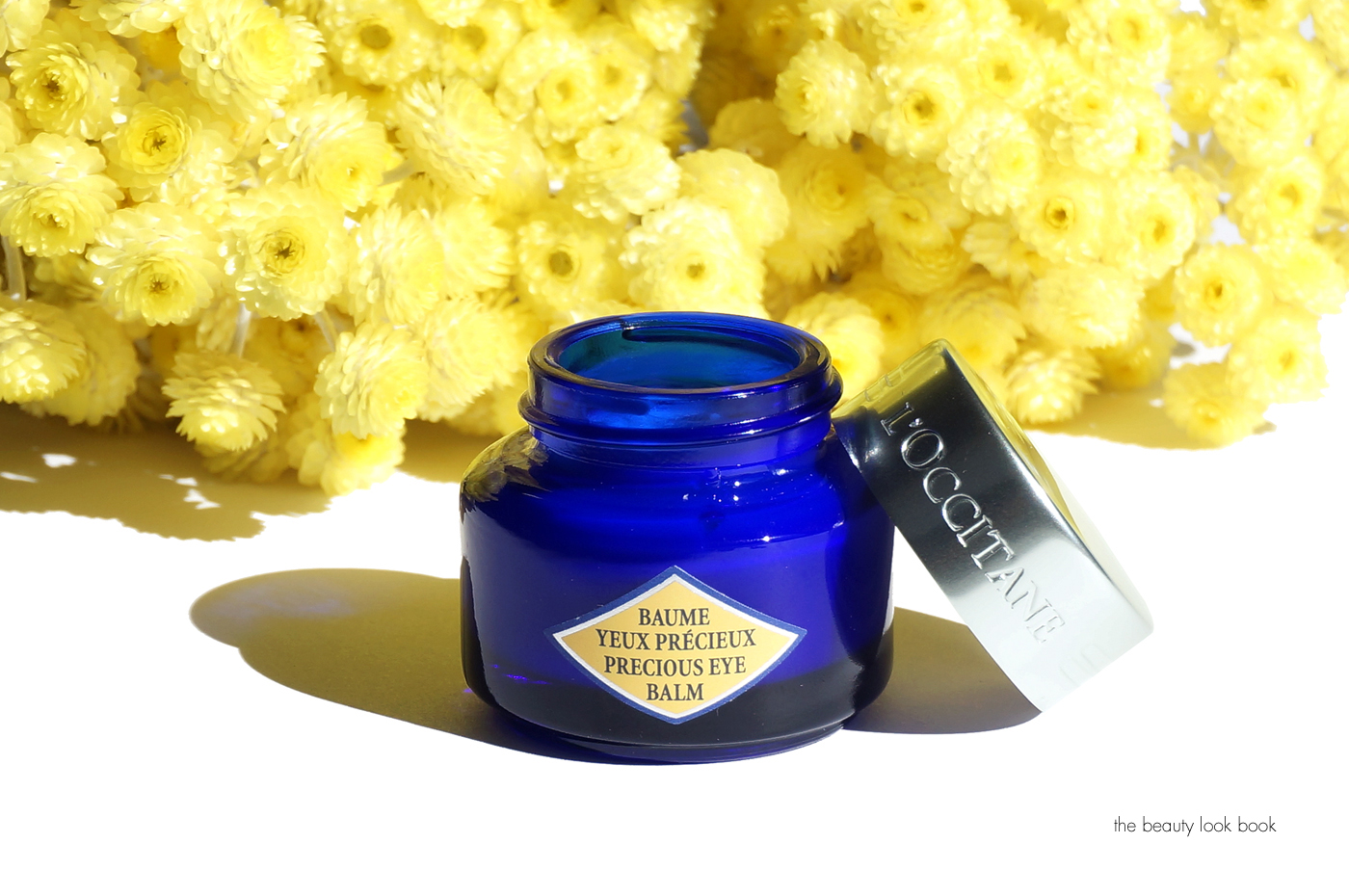
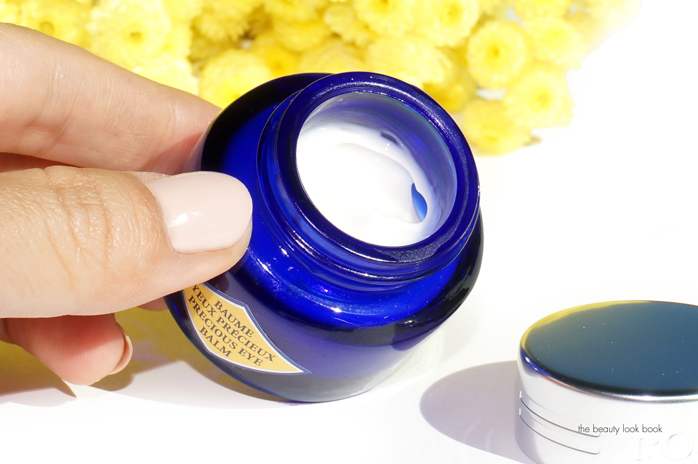
Immortelle Precious Eye Balm is probably the most impressive skincare item I’ve tried from L’Occitane. I’m in my mid-30’s and don’t have under eye wrinkles yet, but I know using preventive skincare is key. The Immortelle Precious Eye Balm is hands down the most impressive eye treatment I’ve used. It gives the skin an instant brightened look and provides an immediate refreshing awakened feel. It has that same effect that eye masks have in terms of giving your eyes a little spa treatment, but in a balm form. The texture is creamy and almost gel-like. It absorbs quickly and feels incredible – for me it had an instant wow factor from the very first time I tested it out. If you try one thing new from L’Occitane, definitely check out this Eye Balm. It gives life to the skin.
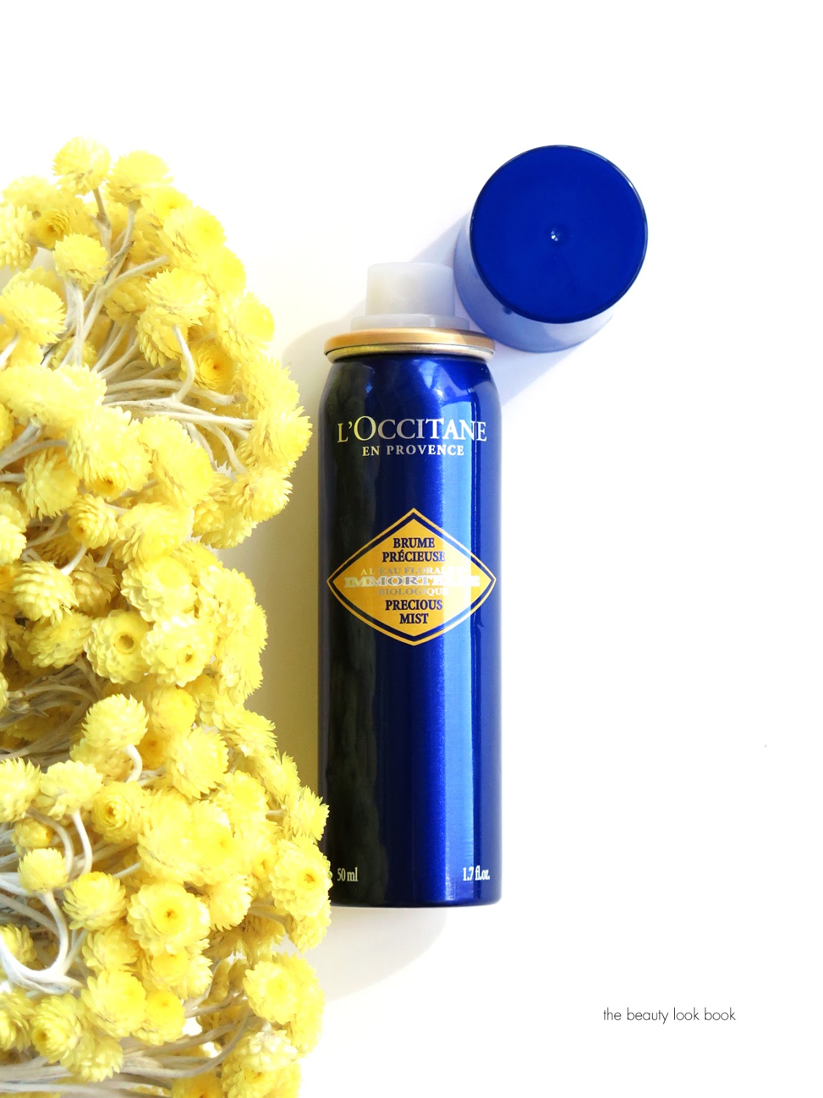
Another favorite that has been featured on the before is the Immortelle Precious Mist. I love a good face mist and this one is one of my favorites because it’s refreshing and hydrating. I like that the mister dispenses an ultra fine mist evenly across the face. This one has the same soothing soft floral scent as other Immortelle products. I love how gentle it is and it’s one of the best facial pick-me-up for mid-day that I’ve tried.
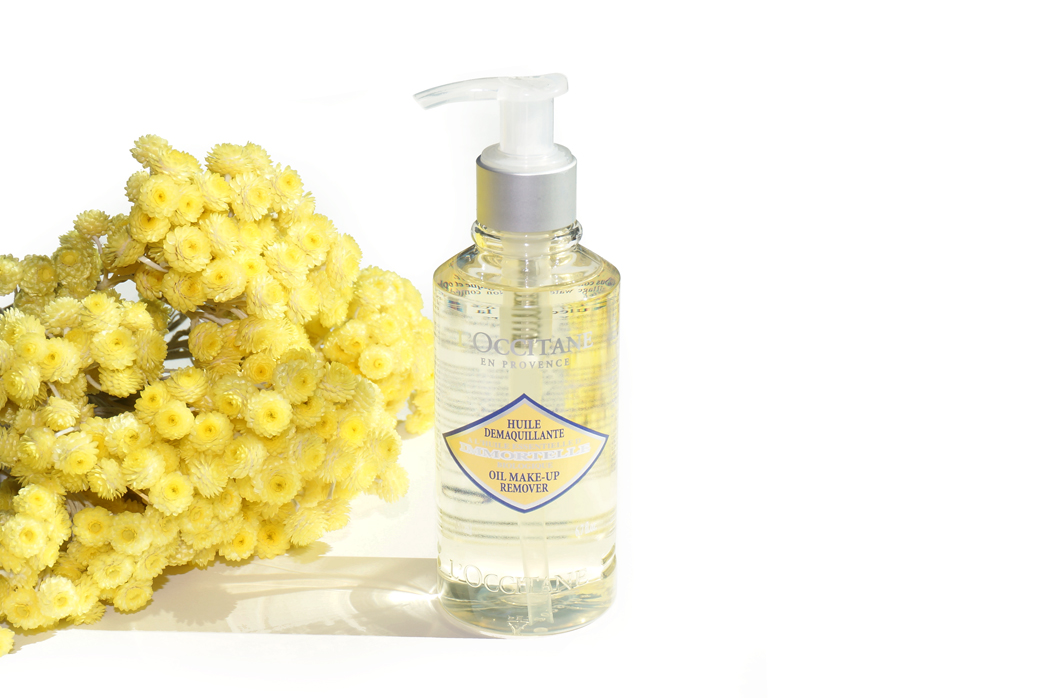
Last but not least, if you’re into the double cleansing routine and are looking for a cleansing oil that is gentle and hydrating, the Immortelle Oil-Makeup Remover is one I think you should try. I find one pump is enough for the entire face. It has a smooth velvety texture that emulsifies really well with warm water. It will remove waterproof eyeliner and cream shadows, although I still prefer to remove eye makeup separately (it’s just easier for me). After rinsing I find it removes all traces of foundation, powder, concealer and blush without stripping the skin.
If you’re looking for something to add some radiance and glow to your skincare routine, I highly recommend you check out some of the items from the L’Occitane Immortelle range. If you’re like me and use a wide range of brands for skincare, I found the L’Occitane items easy to incorporate and mix into my daily routine. The items are gentle but effective at reducing emerging signs of wrinkles and in particular helping restore and maintain a youthful glow. My top two favorites right now are the Divine Cream and Immortelle Precious Eye Balm.
You can find all the items right now at L’Occitane stores and online at usa.loccitane.com.
What’s your skincare routine like right now? As always I’d love to hear about what you’re loving or testing out right now. Do you have any go-to’s to maintain a natural youthful glow?
This post was sponsored by L’Occitane, but as always, all opinions my own.
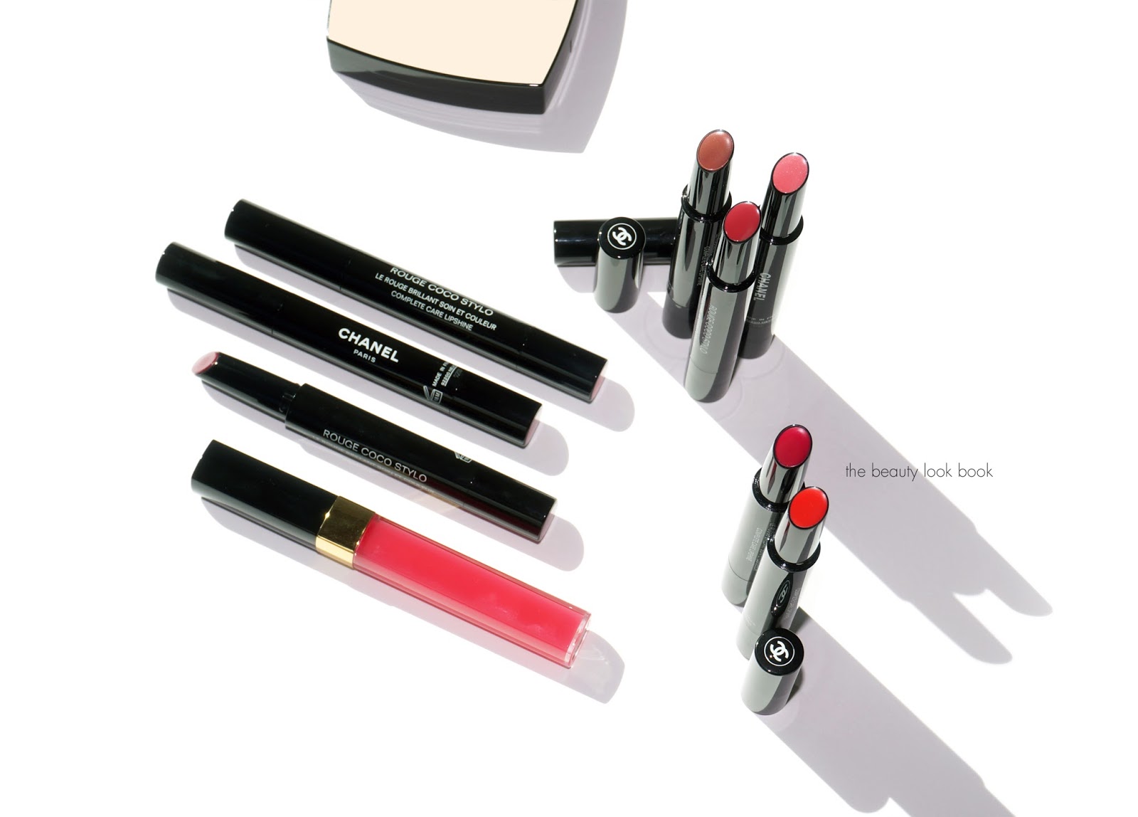
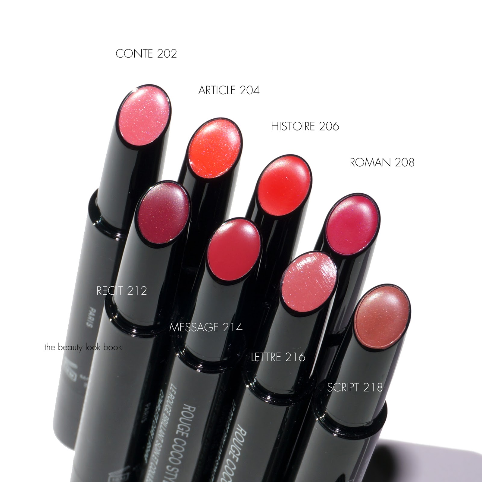
There’s a new lipstick formula from Chanel called the Rouge Coco Stylo ($37 each for 2 g/0.07 oz) which comes in a slim twist-up tube that’s described as having “the intensity of a lipstick, the shine of a lipgloss and comfort of a lip balm.” It truly is a three-in-one kind of lipstick. These have medium to full pigment – coverage is a lot better than the Rouge Coco Shines and just as much pigment as the Rouge Coco Lipsticks. Out of all the Chanel lipstick formulas I’ve tried the new Rouge Coco Stylos are definitely the most creamy in texture and most hydrating in feel. There is a soft floral scent to these similar to the Rouge Coco lipsticks. The formula is quite amazing and all the colors are knock out beautiful. There’s a tiny bit of shimmer in the tubes, but on the lips it’s very subtle. You mostly see color and shine.
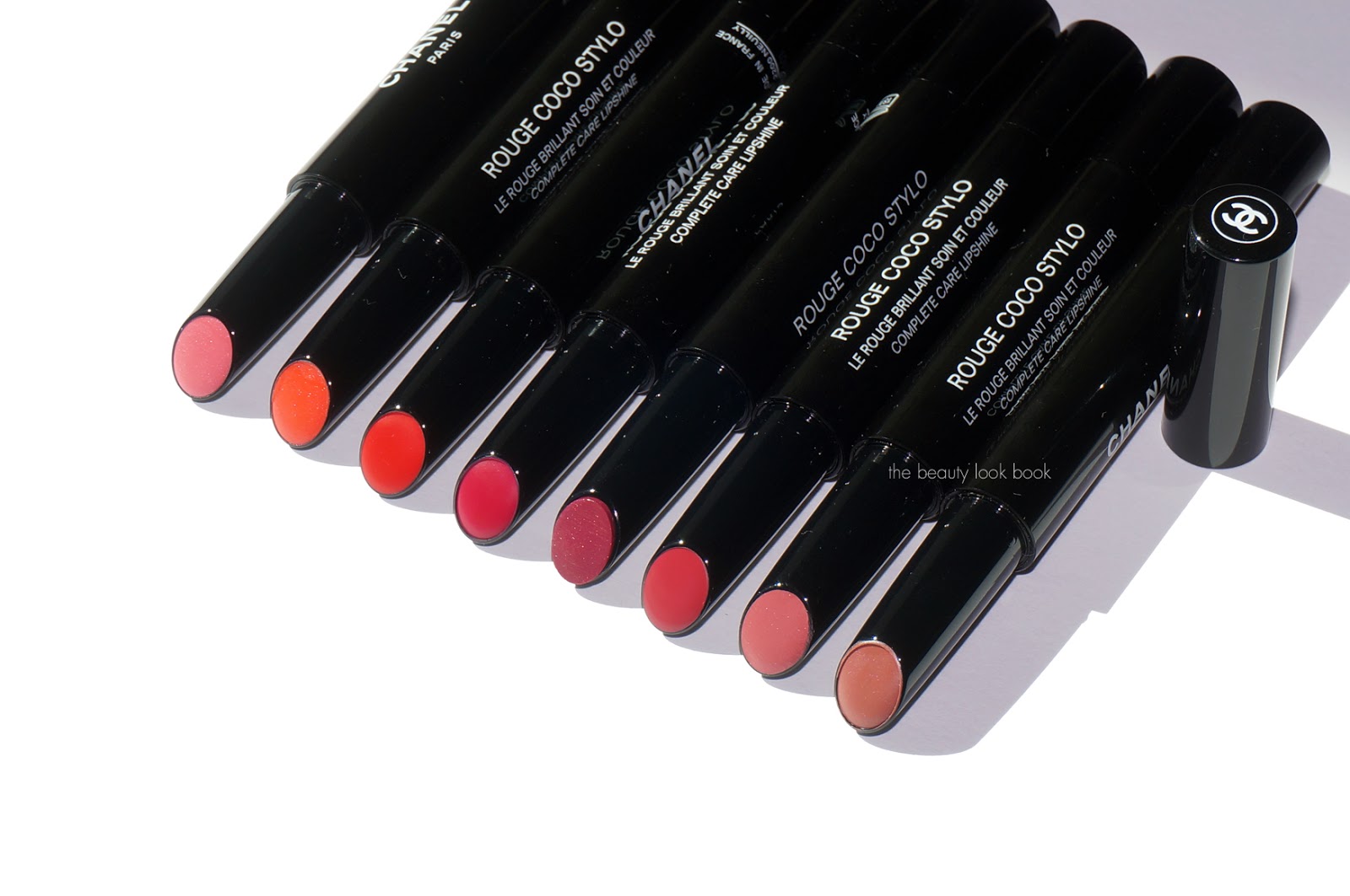
There are neutral and bright colors in the mix, there are eight shades total:
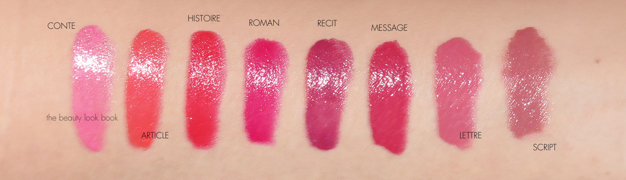
Conte 202 is a baby pink with golden shimmer
Article 204 is a bright warm tangerine with a vibrant finish
Histoire 206 is a bright coral shade, on me it pulls red
Roman 208 is bright fuchsia pink
Recit 212 is a plum shade with gold flecks
Message 214 is a warm watermelon pink
Lettre 216 is a medium soft rose pink
Script 218 is a beige nude pink-brown
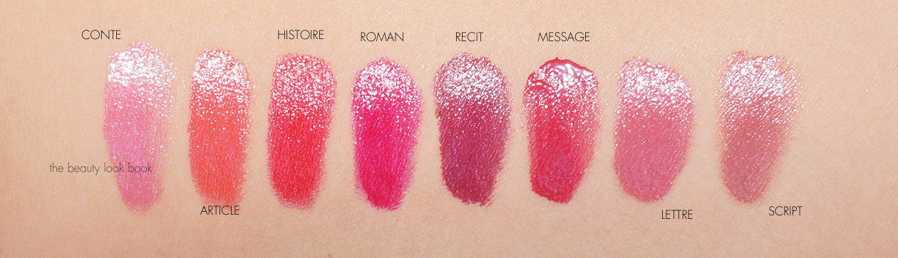
Lip swatches with the Rouge Coco Stylos alone on bare lips (no liner or other added colors, I have naturally pigmented lips so sometimes the lip shows through around the edges):
In terms of lasting power I found they lasted a lot longer than the Rouge Coco Shines, about the same amount of time as Rouge Allures or Rouge Cocos. They stay put on the lips and adhere well for a glossy finish lip product. Colors will fade or transfer with snacks or drinks, but as long as you don’t touch the lips to any food, straws or cups they stay on long. I give the formula an overwhelmingly positive thumbs up. The only downside I see is the price seems high given the amount of product in each tube, but the formula performs well, looks good, makes the lips look and feel well hydrated and healthy. Bottom line is you need at least one.
You can find the Rouge Coco Stylos for $37 each now at Chanel.com. I also spotted them in store and online at Nordstrom but they should be arriving at all Chanel counters now.
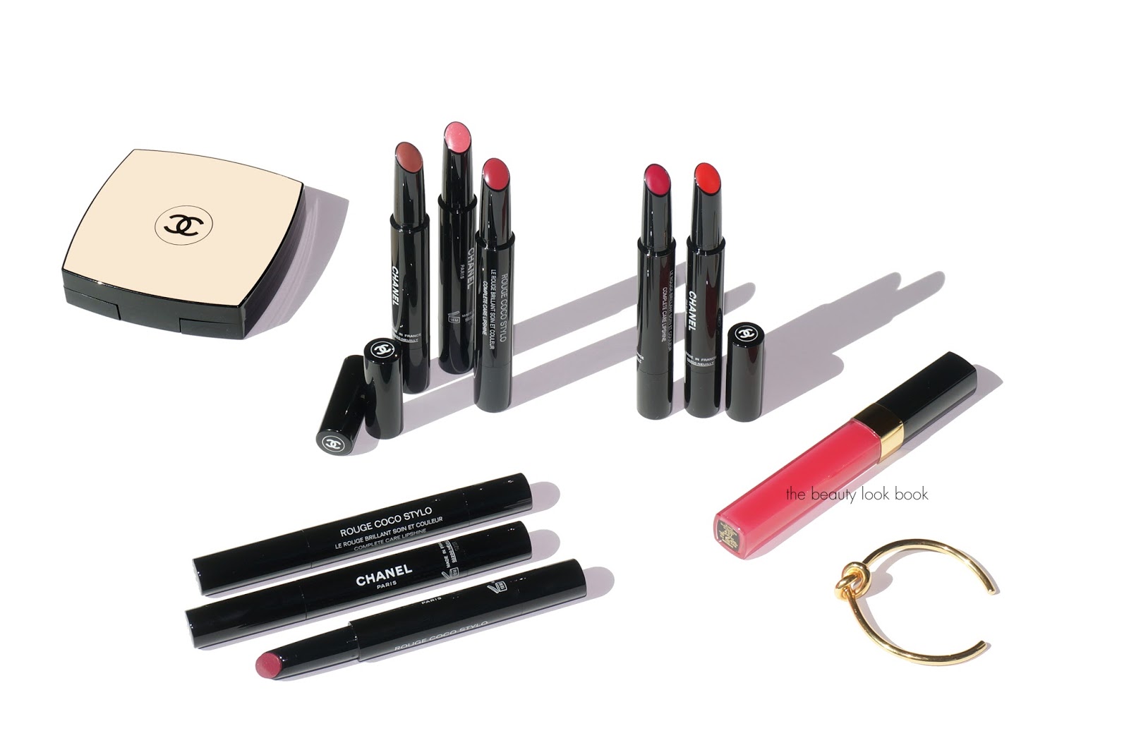
Three shades provided courtesy of Chanel, the remaining five purchased by me.
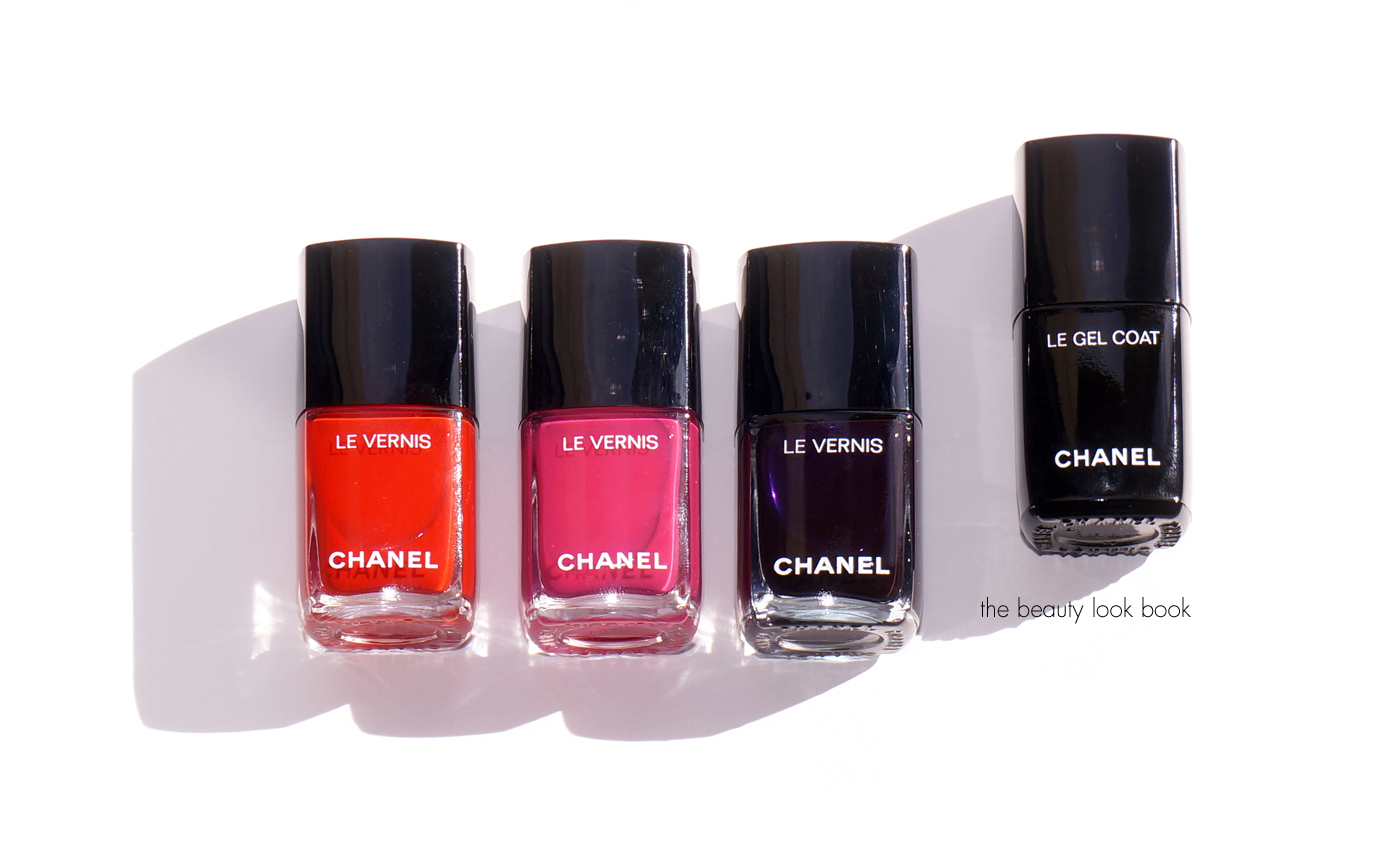
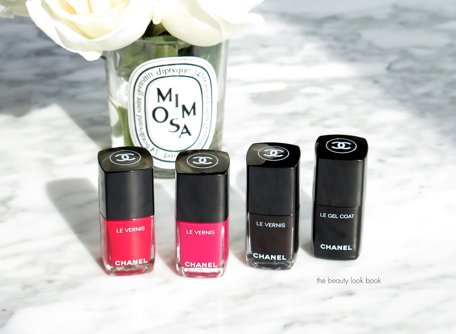
Chanel has reformulated all of their nail colors into a newer longer lasting formula called Le Vernis Longwear Nail Colour ($28 each for 13 ml/0.4 fl oz, made in France). There are 15 shades in this new launch, there are a few from the original line that have been re-launched in Particuliere, Ballerina, Pirate, Vamp, and Rouge Noir. I haven’t yet had the chance to check out the new ones in person yet to compare the original to new shades, so I’m not sure if the new vs old colors are identical (if you have let me know!). The Chanel team sent 3 colors for me to try out along with the new Le Gel Coat Longwear Top Coat ($28 for 13 ml/0.4 fl oz), I’ve been putting these to the test for almost two weeks now. The formula is definitely a huge improvement in terms of lasting power.
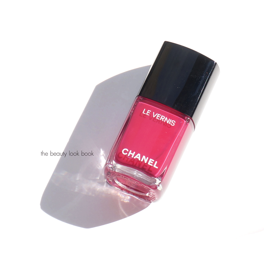
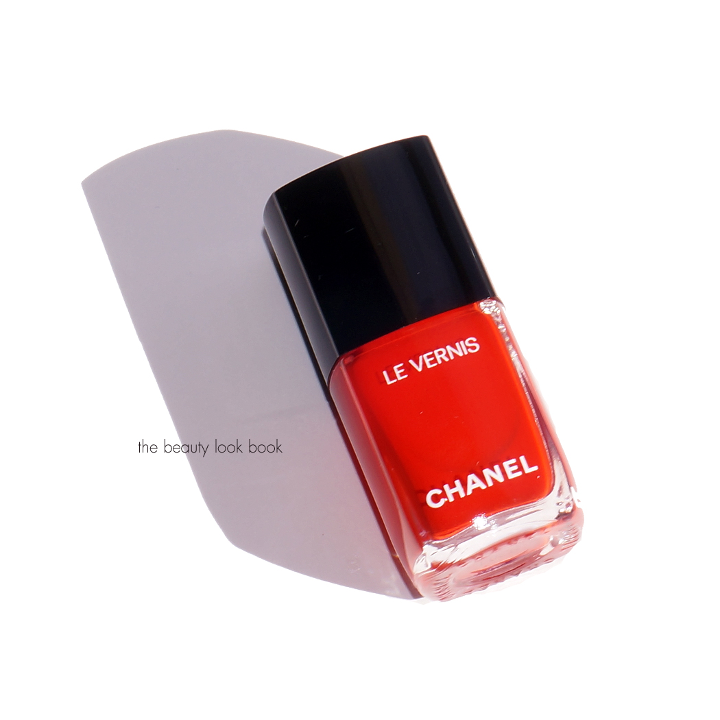
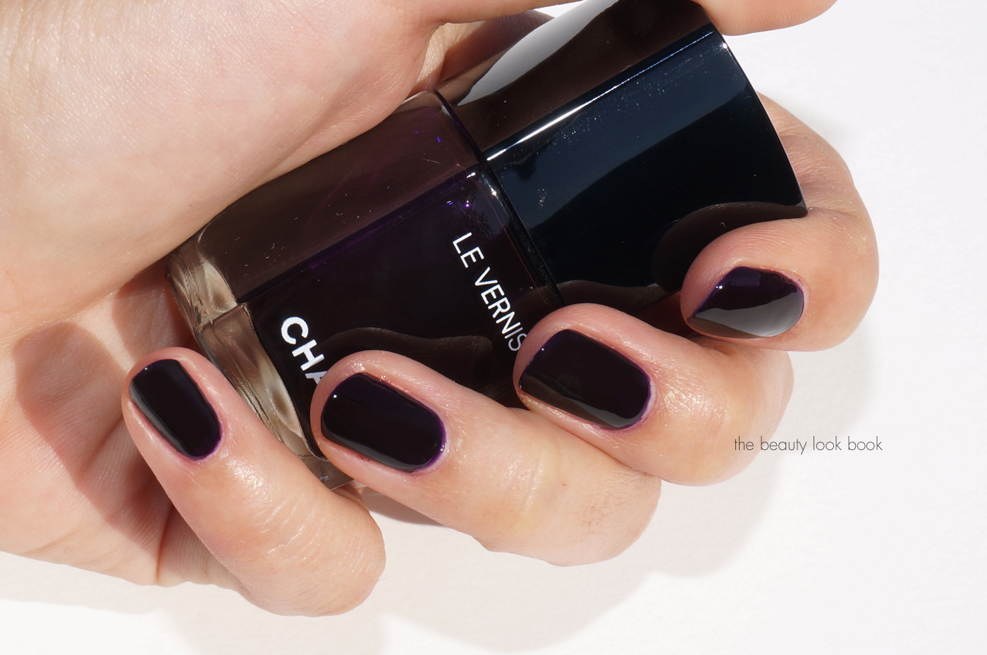
The three shades I have to share are Camélia 506, Gitane 510 and Roubachka 514. These are all creams with insanely rich pigment. Camélia and Gitane are one-coat wonders, one coat offers full coverage, although I still prefer two for an ultra rich, ultra glossy, slightly cushiony look. These seem to be similar in texture compared to the more pigmented Chanel creams like Dragon. They glide on smoothly and easily. Camélia is a rich deep peony pink kind of color, it’s got a cool-toned base but has a bright undertone which adds warmth. Gitane is an electric warm red. Roubachka is definitely a two-coater, the formula in this one is almost like a pigmented jelly. It’s a deep purple color but looks almost black on the nails. It’s what I wanted Tom Ford Viper to be (which I’ve tested in store many times but found the formula just too sheer and streaky).
Above left to right is Gitane, Camelia, Roubachka and the Le Gel Coat. They’ve changed the packaging a bit this launch. The names are no longer printed on the front of the bottles. Names are now on the back for the colors. The formula remains 5-free.
Another change they’ve made is to the brush. I was a huge huge fan of the original brush. It was thin and dense which allowed for precise application. The newer brush is a bit thicker and fans out the slightest bit at the edges. Length of brush is about the same. Initially the fanning out worried me because I thought it would be harder to control and paint the nails evenly along the cuticles. I found no issue with application. At this time I still prefer the original brush – but when you have something that you fall in love with, getting used to something different can just take time. Here’s a look at the brushes for the new formula.
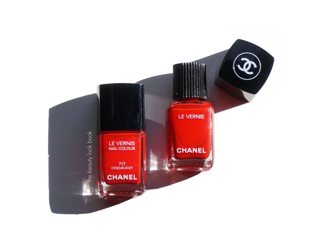
For comparison, here’s a look at Gitane vs Coquelicot, packaging size is identical in product amount and bottle size. Brushes are the same length, there’s just a slight difference in the shape:
Onto the swatches, all of these have 2 coats of the Le Vernis applied with one coat of the Le Gel Coat on top:
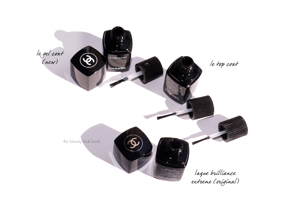
A few quick thoughts on the Le Gel Coat is that it’s amazing. When Chanel discontinued the Laque Brilliance Extreme I was heartbroken. I found the new Le Top Coat Quick Dry top coat to be decent, but nowhere near as good as the original top coat. The Le Top Coat was very thin and runny and I found I had to load up the brush to get enough product on it to apply to the nail, but often loaded up either too little or too much.
The new Le Gel Coat is a thicker glossy kind of top coat. It has a wider brush compared to the other top coats. I tested this over Essie Barefoot and Topless because no matter what kind of top coat I use on Essie, I get tipwear the very same day I apply it. I know many others like the formula, I think it’s one of the worst that I’ve tried in terms of lasting power. I figured if the new Chanel Top Coat could make Essie polish last, then it gets my approval. The Chanel Le Gel Coat made the manicure last until Day 5 with no signs of tip wear or chipping. I only took it off so I could test other colors.
The Le Gel Coat is described as, “Specially created to enhance the new nail colour, LE GEL COAT Longwear Top Coat extends the wear for up to seven days. Activated by natural light, the innovative, clear top coat bonds to LE VERNIS for flexibility, strength and unprecedented wear. The result: an ultra-glossy, gel-like look without the UV lamp.”
It did indeed make one of the manicures last very long. In addition to the Essie, I tested Chanel Camelia with the new Le Gel Coat Top Coat and saw no signs of chipping or tip wear by Day 8. It has a cushiony glossy look. The formula is on the thicker side, but still fluid enough compared to other gel top coats so it feels like it won’t dry out or thicken like other brands. I give this a thumbs up.
A look at the original, vs Le Top vs Le Gel:
First impressions are very good from my end. The new reformulation has definitely improved the lasting power of the polish although I’ve always had good experiences with the formula in general since I’ve started collecting Chanel nail polishes. The reformulation reminds me somewhat of when Dior reformulated and relaunched their polish – they changed the packaging, changed the brush, improved the formula and pigment and also launched colors primarily in the classic/safe zone to start with a couple of more edgy shades.
I haven’t had a chance to pull comparisons or look at the other shades in the new formula, with the exception of the one above with Gitane vs Coquelicot – they look identical to me with Gitane being the slightest bit warmer. Camélia is a classic deep but bright cool pink shade, it’s deeper than colors like Fracas, Rose Exhuberant or Pulsion. It has a similar vibe to April, but Camelia is a lot brighter and not muted like April. It’s bright but deep. If I were to compare the effect of Roubachka to another shade I would say it’s similar to Tom Ford Black Cherry. I am sad to see the other shades go, but to date I’ve only used up a couple polish colors and the shades I do have last a very long time (some I have are 5+ years old and the formula is still good).
You can find the new Chanel Le Vernis formula online at Chanel.com. I’ve spotted the colors online and in store at Nordstrom and Neiman Marcus although neither of them have Rouge Noir (at least not yet).
Have you checked out the new formula yet? What do you think?
Le Vernis polishes featured above provided courtesy of Chanel for review.


