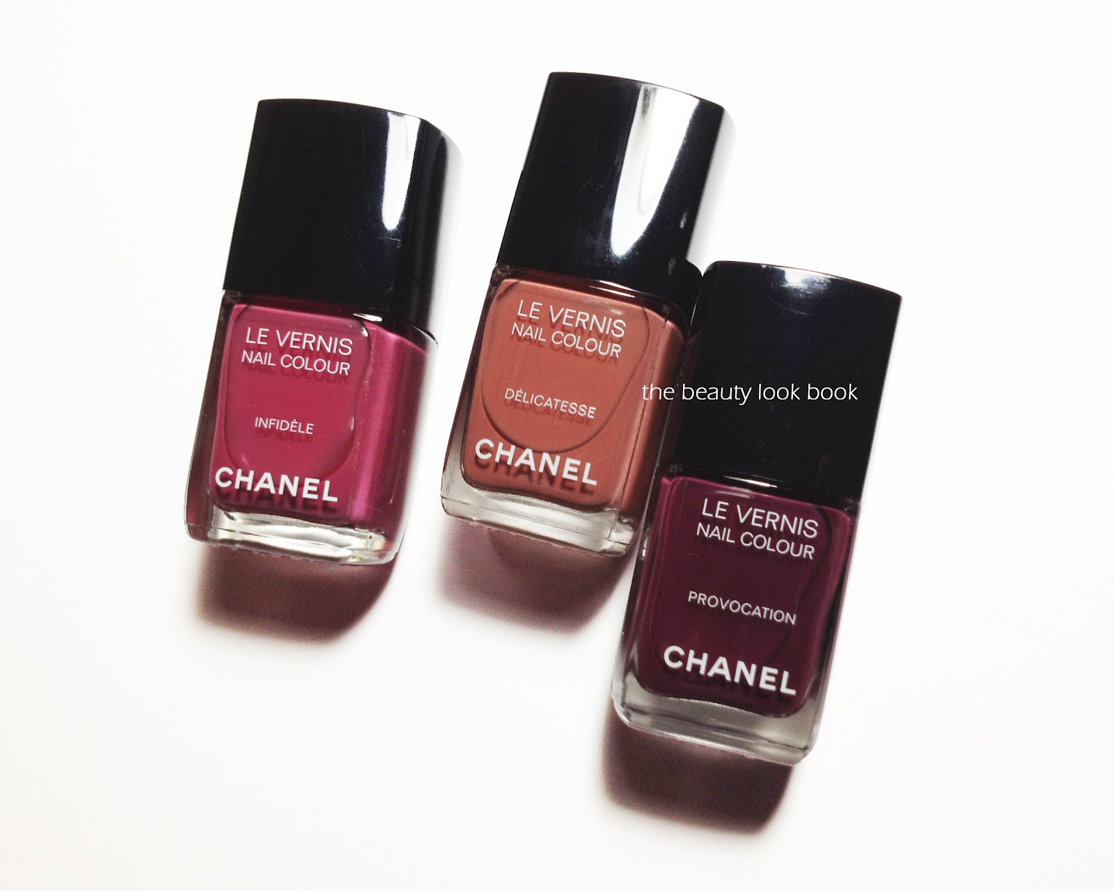
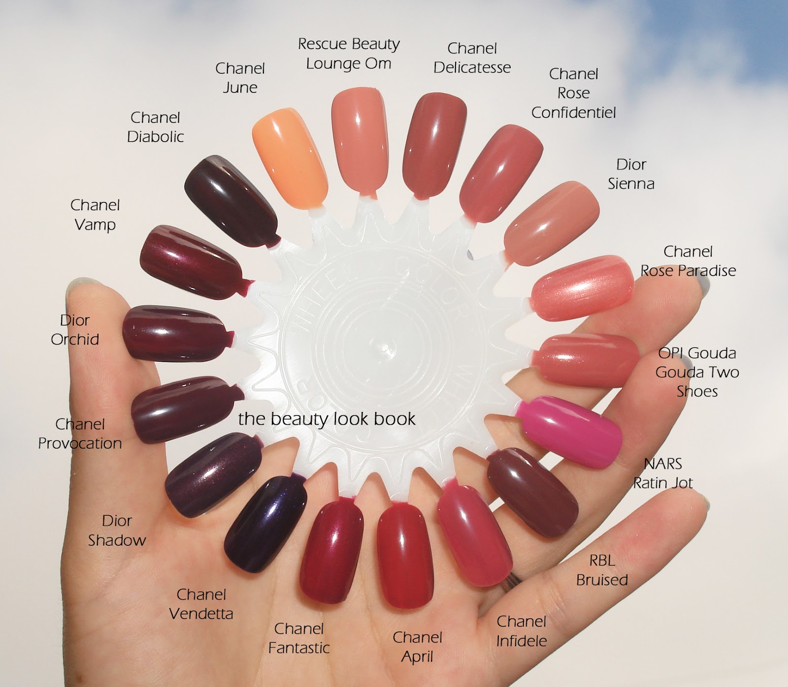
Chanel Délicatesse, Provocation and Infidèle ($26 each, limited-edition for Fashion’s Night Out 2012) just arrived last night from Chanel.com. I’m still playing with each of the shades but so far, I’m extremely impressed. I think each shade is gorgeous and perfect for fall. More swatches to come soon, but for now some comparisons. I thought Khaki Rose might be similar but as you can see above it’s quite different (so it didn’t make the swatch wheel).
Comparisons swatched below (same set, just two different views): Chanel June, Rescue Beauty Lounge Om, Chanel Rose Confidentiel, Dior Sienna, Chanel Rose Paradise, OPI Gouda Gouda Two Shoes, NARS Ratin Jot, Rescue Beauty Lounge Bruised, Chanel April, Chanel Fantastic, Chanel Vendetta, Dior Shadow, Dior Orchid, Chanel Vamp and Chanel Diabolic.
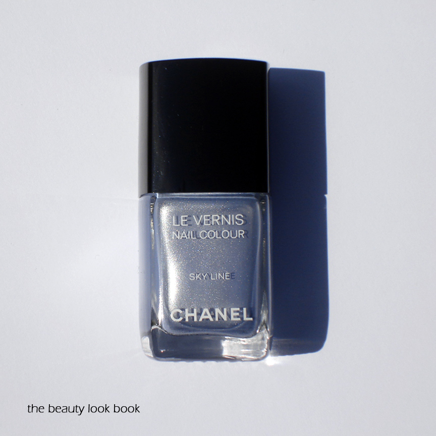
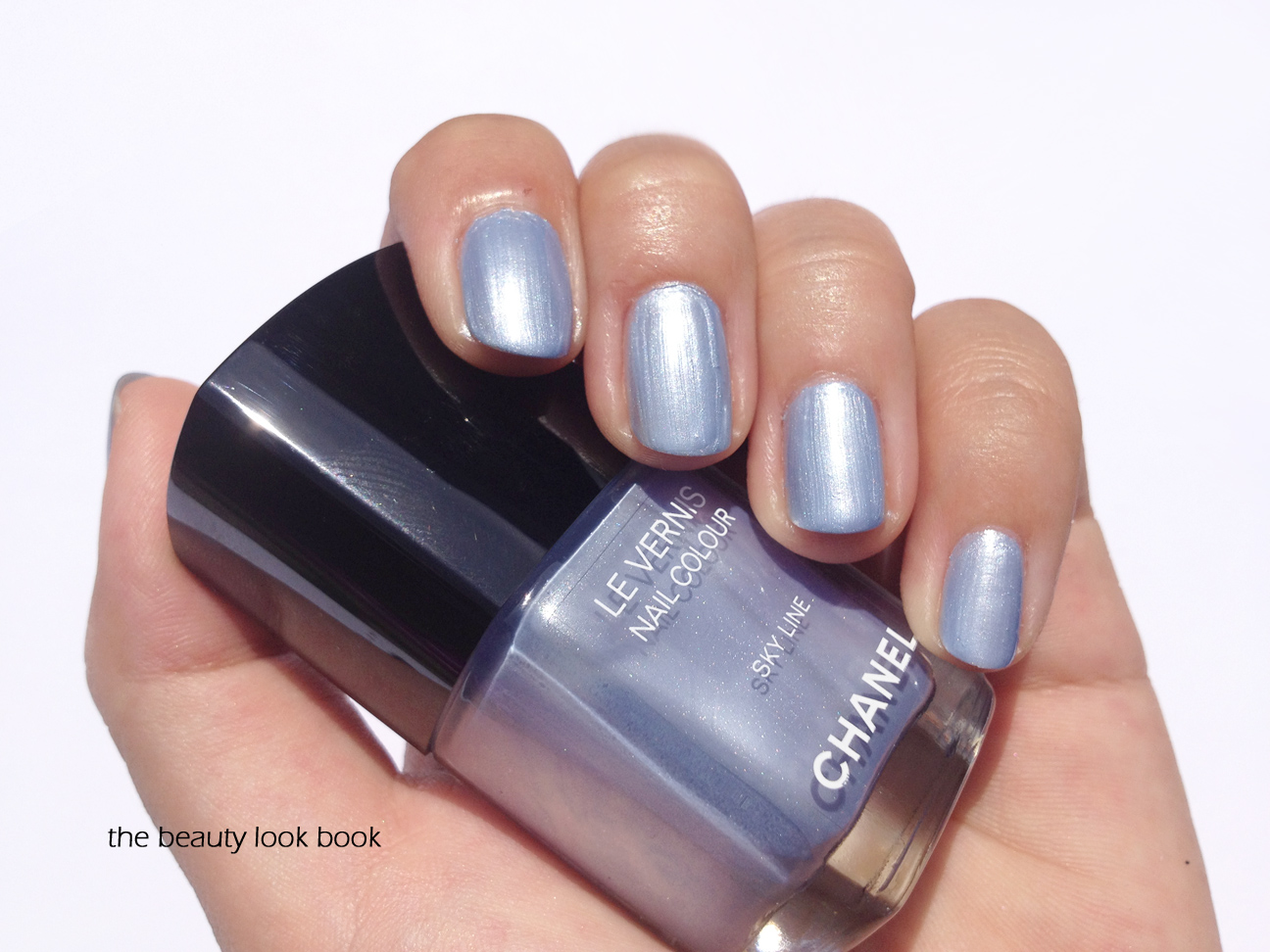
US Chanel fans have been eagerly waiting for Skyline to be released. It first appeared on the runways at the Spring-Summer 2012 Haute Couture show back in January. It has finally arrived on Chanel.com for $30 (limited-edition) along with the other Blue Illusion de Chanel items. I’ve heard it is expected to arrive soon at select Chanel Boutiques and Studios (such as the one at Nordstrom Seattle). When I first saw swatches and photos from European bloggers, I thought I would be able to pass. It appeared a bit too frosty for my taste. Who was I kidding? Of course I could not resist. After testing this for the past three days, my feelings are mixed.
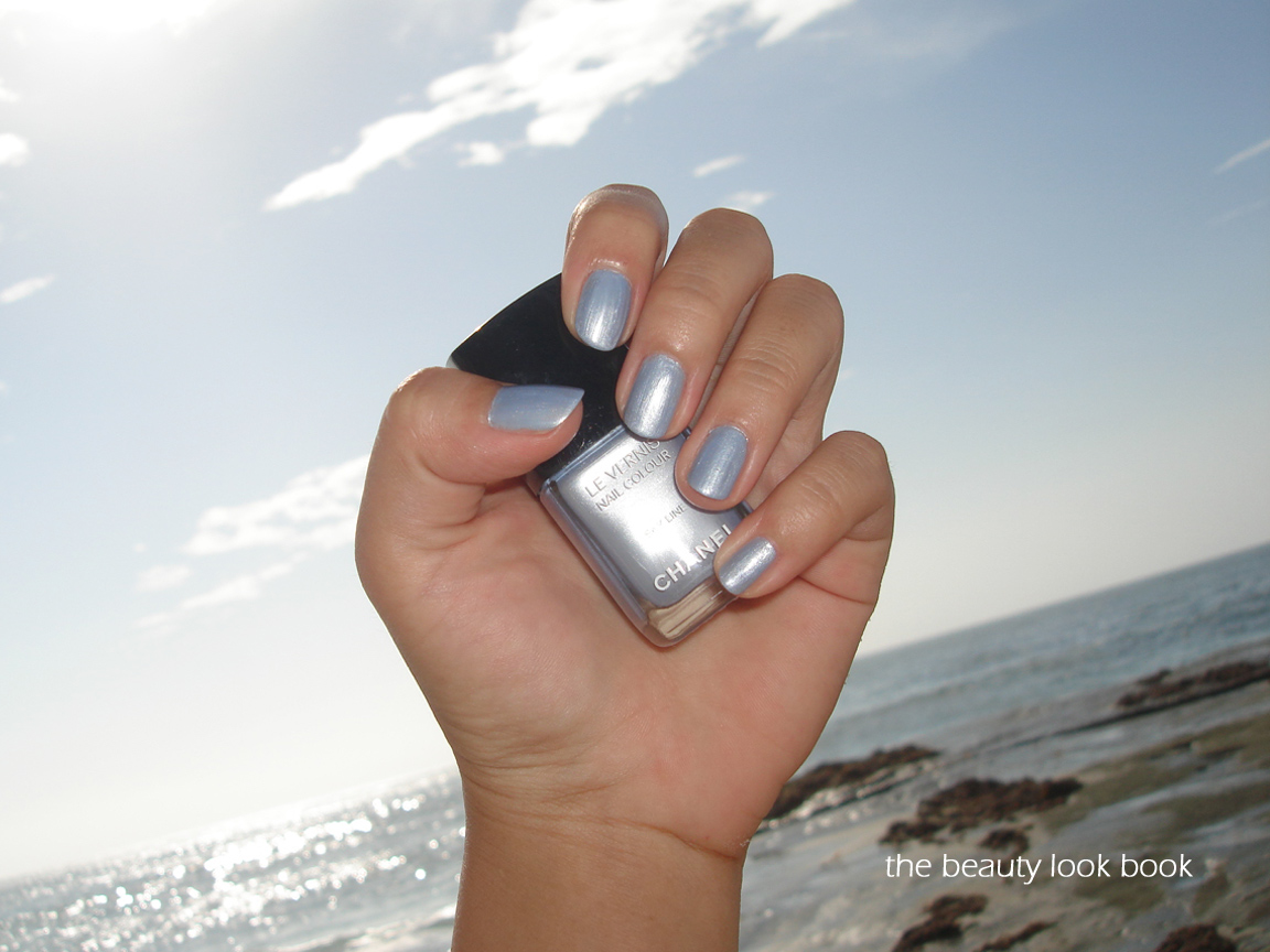
Chanel Skyline is a gorgeous periwinkle metallic blue. On Polish Police, A Lipstick a Day, and The Make-Up Blogette, Skyline glows and looks smooth without streaks or bubbles. I had high hopes for this color. As soon as I received it, I went for a much-needed professional manicure. I brought my own Chanel base and top coats to use with Skyline. The result was non-streaky and smooth in color, but it had serious bubbling issues (my husband even noticed before I said anything). I removed it within a few hours and decided to try with a different base coat (Deborah Lippmann’s) and still had bubbling issues. My third try, I used it on bare nails – still with the same result. My fourth try, I finally succeeded. The formula on Skyline seems thicker than most of my other Chanel polishes which makes metallic finish prone to visible brush strokes. It’s not quite as bad as Attraction, but the thickness makes Skyline a bit tricky to apply. I’ve never had so much trouble applying a nail polish before and I’m not entirely sure why. My tips:
Make sure you don’t shake the bottle, roll gently if you feel the color needs to be mixed in the bottle
Be sure your bottle isn’t warm (room temperature is ok, but this one works better if applied at cooler temperatures)
Allow the first coat to dry completely (100% dry) before attempting a second coat
Apply the second coat very slowly and make sure it’s not too thick
Some more photos, swatches and comparisons:
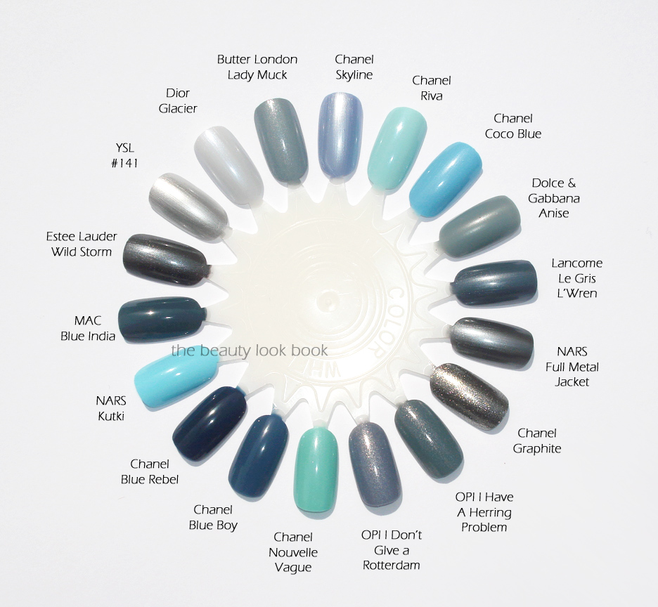
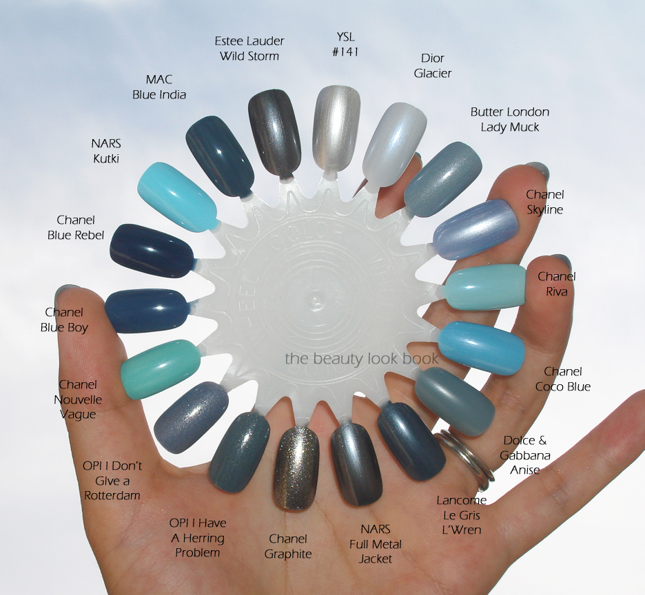
I pulled out quite a few blues to see if Skyline was similar in tone to any other colors I own. I found it quite unique. Skyline is most similar to OPI’s I Don’t Give a Rotterdam. I couldn’t find a dupe and most other blues lacked the luminosity that Skyline does. On the fingers it simply glows.
Swatches below include: YSL #141, Dior Glacier, Butter London Lady Muck, Chanel Riva, Chanel Coco Blue, Dolce & Gabbana Anise, Lancome Le Gris L’Wren, NARS Full Metal Jacket, Chanel Graphite, OPI I Have a Herring Problem, OPI I Don’t Give a Rotterdam, Chanel Nouvelle Vague, Chanel Blue Boy, Chanel Blue Rebel, NARS Kutki, MAC Blue India and Estee Lauder’s Wild Storm.
I love the color of Skyline on the fingers. It’s a beautiful glowy blue shimmer that is unique. The formula issues have me at I’m not 100% in love. The higher price tag of $30 just had me expecting something flawless in terms of application. I feel Chanel has improved the nail polish formula over the past years. They make my favorite nail polishes today. Skyline’s formula seems to be a step backwards (based on my experience). I’m not sure if others have had the same application issues – most that I’ve seen seem to report no issues. To anyone who has bought and tried Skyline, I’d love to hear your application experiences and tips/tricks. I did succeed in a decent application on my fourth/fifth tries – but it wasn’t easy. I’ve debated whether or not to add a thinner to this, but I’m worried about altering the formula.
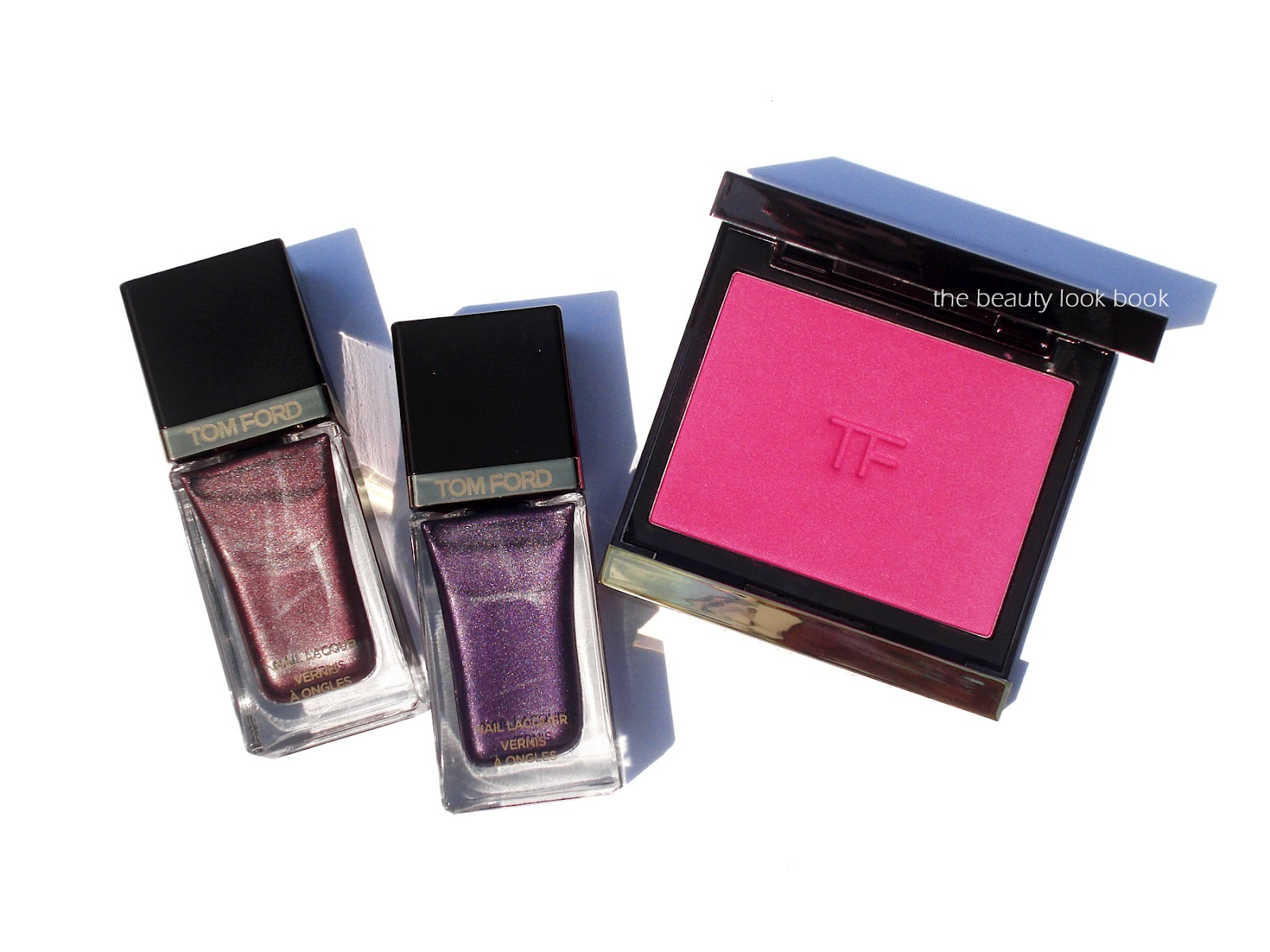
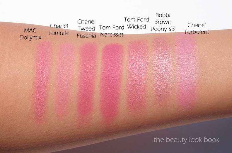
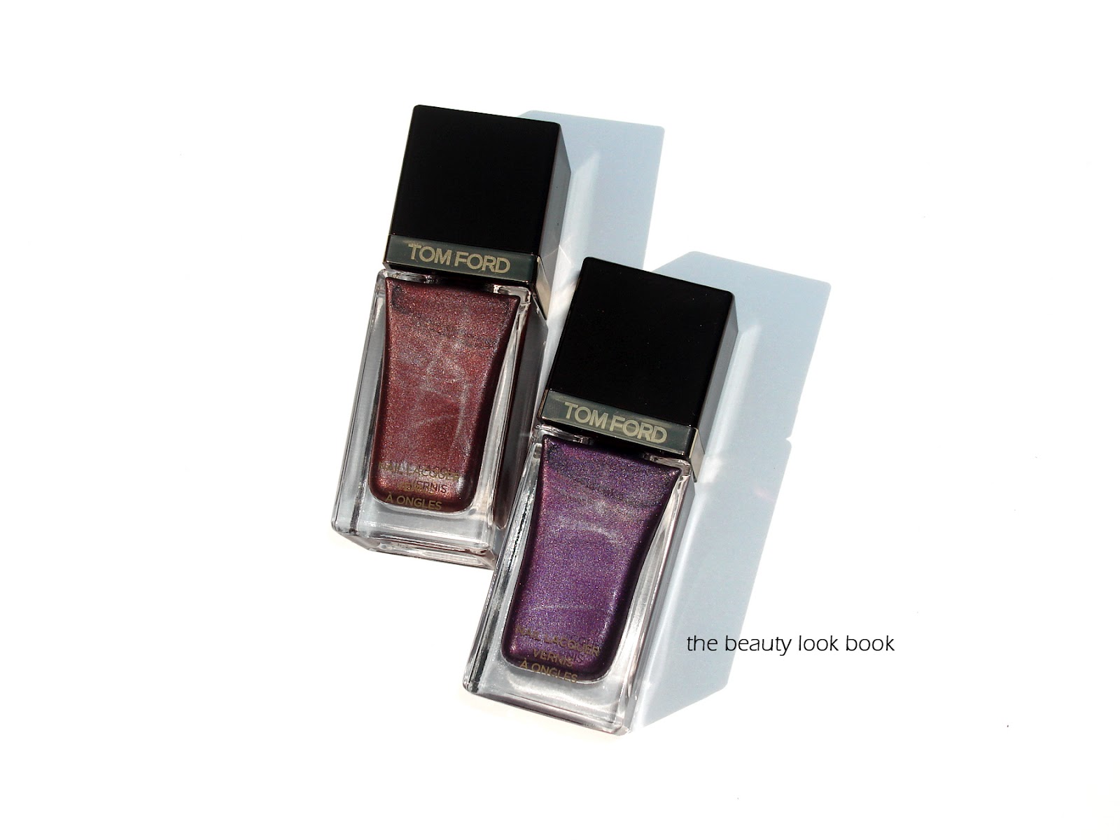
Tom Ford has released a new blush for fall, a vibrant hot pink satin called Narcissist ($55 for .28 oz/8 g). The pigment is rich and intense but easily blendable with a soft loose brush (I’ve used MAC’s skunk brush to apply). It is indeed very bright on the skin/face (probably the brightest blush I own) but if applied and blended, it gives a lovely healthy pink flush. There is a soft satiny texture to the color – those familiar with Tom Ford Blushes know the texture is phenomenal. Although these are probably the most expensive blushes on the market, I think they are among the best in texture, pigment, and color. Some of his blushes have a more visible shimmer (like Ravish and Wicked, see them all swatched on Karla Sugar). Narcissist does have shimmer but it’s so subtle it’s not really apparent on the face. I like that it has shimmer because it prevents the color from being flat. Narcissist Blush and the two nail polishes, Minx and Dominatrix are the only items I purchased from the fall collection (sight unseen). The high price points make me unwilling to splurge without testing first. Also, the fall collection seems to be a mixture of intense bright colors I usually don’t wear (not really me, but still pretty). Rouge Deluxe has all the new items swatched.
My Tom Ford Fall 2012 picks:
Lightly tapped into MAC’s skunk brush, you see a lot of pigment:
Without a flash:
With flash:
Tom Ford Narcissist is the brightest pink I own. Here are a few others for comparison:
Overall I really adore Tom Ford Narcissist. The color is gorgeous, pigmented, blendable and looks beautiful on the skin. I can’t say I think it’s a must have though, simply because the price is so high. At this time I don’t know whether the fall items are permanent or limited, but I purchased mine from Saks.
This fall, Tom Ford has released two new shimmery metallic for nails: Minx, a complex metallic warm wine-brown, and Dominatrix, a medium-deep but bright metallic purple ($30 each, both limited-edition). My experiences with Tom Ford’s nail lacquers have been mixed. I have a few of the creams and some of the metallic from last spring (see review/swatches here) and felt the formula was just ok. Still, I decided to give the new shades from fall a try since the promotional photos looked stunning. I’m glad I did. The new polishes for fall are exquisite with excellent smooth coverage. The colors are edgy and dramatic but still wearable for every day. They are perfect for fall and unique compared to other releases we’ve seen this season.
Both shades are highly metallic and shimmery, but in a refined way. The texture is rather sheer and transparent with one coat, but the color goes on with full coverage when you add the second. I like that the colors are visibly shimmery but don’t show brush strokes or streak (like Chanel Attraction). I was particularly impressed by the high-shine finish that both of these polishes have (without a top coat).
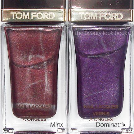
Minx is a deep burgundy-wine-brown metallic. It’s quite unique in my collection. It has more brown and less wine compared to other vampy shades.
Dominatrix is an intense medium bright purple. Out of the purples I have it is most similar to Dolce and Gabbana’s Midnight, but the Tom Ford is deeper and more intense while the DG is a bit lighter and flashes blue shimmers. More photos and swatches below. Swatches are done with two coats.
Minx swatched with two coats, a gorgeous metallic wine/brown:
Dominatrix swatched with two coats, it’s a medium-purple with some brightness:
In terms of duplicates, I couldn’t find any in my collection. I don’t have Tom Ford’s Burnished Rouge to compare, but from seeing swatches elsewhere, I suspect that Minx is less red.
Comparisons swatched below, same set, two views: Tom Ford Minx, Tom Ford Dominatrix, Dior Silver Purple, Chanel Vendetta, Dior Shadow, OPI Dutch’Ya Just Love OPI?, Dolce and Gabbana Amethyst, Dolce and Gabbana Midnight, Dolce and Gabbana Royal, Dior Icone, OPI Holiday Glow, Dior Aztec Chocolate, Dior Apparat, Dolce and Gabbana Dahlia, Chanel Strong, Chanel Rouge Noir, Chanel Cosmic Violine, Tom Ford Burnt Topaz (most of these have been reviewed/swatched in the past, sorry I didn’t have time to link each color, but try the google search function on the sidebar)
I personally am really pleased with both shades. I do think they are must-haves for the season, even with the high price tag (which I wasn’t too keen about). I purchased both from Saks NY. The collection should be arriving in stores soon at select counters. As far as I know, both are limited-edition.
Have you checked out Tom Ford fall? Thoughts? (The fall blush review to follow soon.)
Given my new loves for these, I must go re-try my older shades. Perhaps it was the application method that I need to work on.
I have yet to see or test the entire line of Passion Duo Gloss Fusion Lipsticks in person, but I’ve found quite a few favorites. Here are the neutrals I have lined up side by side. There’s no substitute for testing in person but I hope this helps. For those looking for a good Dolce and Gabbana artist to work with, I highly recommend Nikki from Saks Houston. She’s been such a valuable resource to me. She matched me over the phone (perfectly) to their powder foundation and cream foundation. She e-mails swatches when she can of new products. She’s amazing at describing colors and textures and gives great ideas on how to coordinate different products. Not to mention her store has great gift with purchases. The minimum purchase amounts tend to be on the high side, but the gifts are very good (often includes at least one full-sized item).
Back to the lipstick comparisons, here are my neutrals swatched left to right: Natural, Sensation, Darling, Feminine, Desireable and Rose.
Dolce & Gabbana Passion Duo Gloss Fusion Lipsticks are $34 each and can be found at select Saks stores and online at Saks.com.
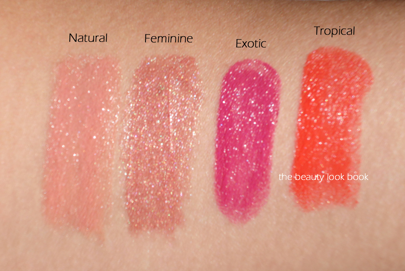
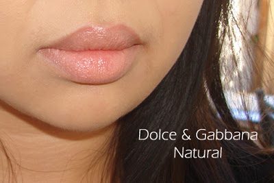
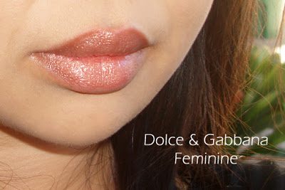
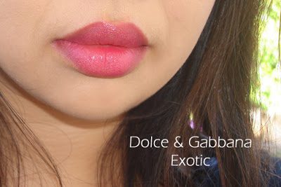
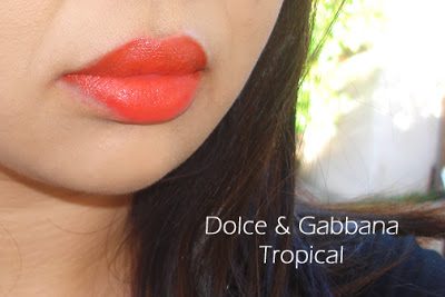
This summer, Dolce & Gabbana has released eight new shades of their best selling item: Passion Duo Gloss Fusion Lipsticks ($34 each, available at select Saks counters and Saks.com). These are a gloss-lipstick hybrid and come in a wide range of shades and finishes including reds, plums, pinks, beiges, nudes, bronzes, shimmers, creams, golds etc. (See prior reviews and swatches here and here.) I’ve been a huge fan of the formula and couldn’t wait to see the new releases. I purchased Natural and Feminine from Saks Houston and PR provided Exotic and Tropical for review. Here are four of the new shades, left to right: Natural, Feminine, Exotic and Tropical:
Close ups of the shades with some matching nail polish suggestions:
Dolce & Gabbana Natural goes well with Chanel Rose Paradise
Natural is a soft shimmery light peachy-pink. It’s similar to Darling, but Natural is darker and a tad more peach. It has a glossy finish with a subtle shimmer (not frost).
Feminine is a frosted neutral pink-tan. It’s very similar to Desireable. Feminine is just a tad more brown.
Exotic is a bright purple-orchid-pink. The color is extremely intense. I tried to blot it to tone it down a little, but it still looks very bright.
Tropical is a hot neon orange-red. This is also intensely pigmented and not an easy shade to pull off for me.
Overall, I’ve been extremely impressed with the colors I’ve tried in the Passion Duo Gloss Fusion Lipstick formula. All the shades I purchased sight unseen are neutrals. The two I received for review were on the opposite end of the color spectrum for intensity/brightness. While the texture, quality and finish of Exotic and Tropical are superb, the colors just aren’t me.
Bottom line, I see a trip to the Saks counter in the near future to check out the entire line. Have you tried Dolce & Gabbana’s Passion Duo Gloss Fusion Lipsticks?
Passion Duo Gloss Fusion Lipsticks are available at select Saks counters in the US for $34 each. I’ve seen/ordered from Houston (my favorite), NYC, Beverly Hills and San Francisco. See the new shades swatched on The Non-Blonde, Makeup and Beauty Blog and NY Mag – The Cut.
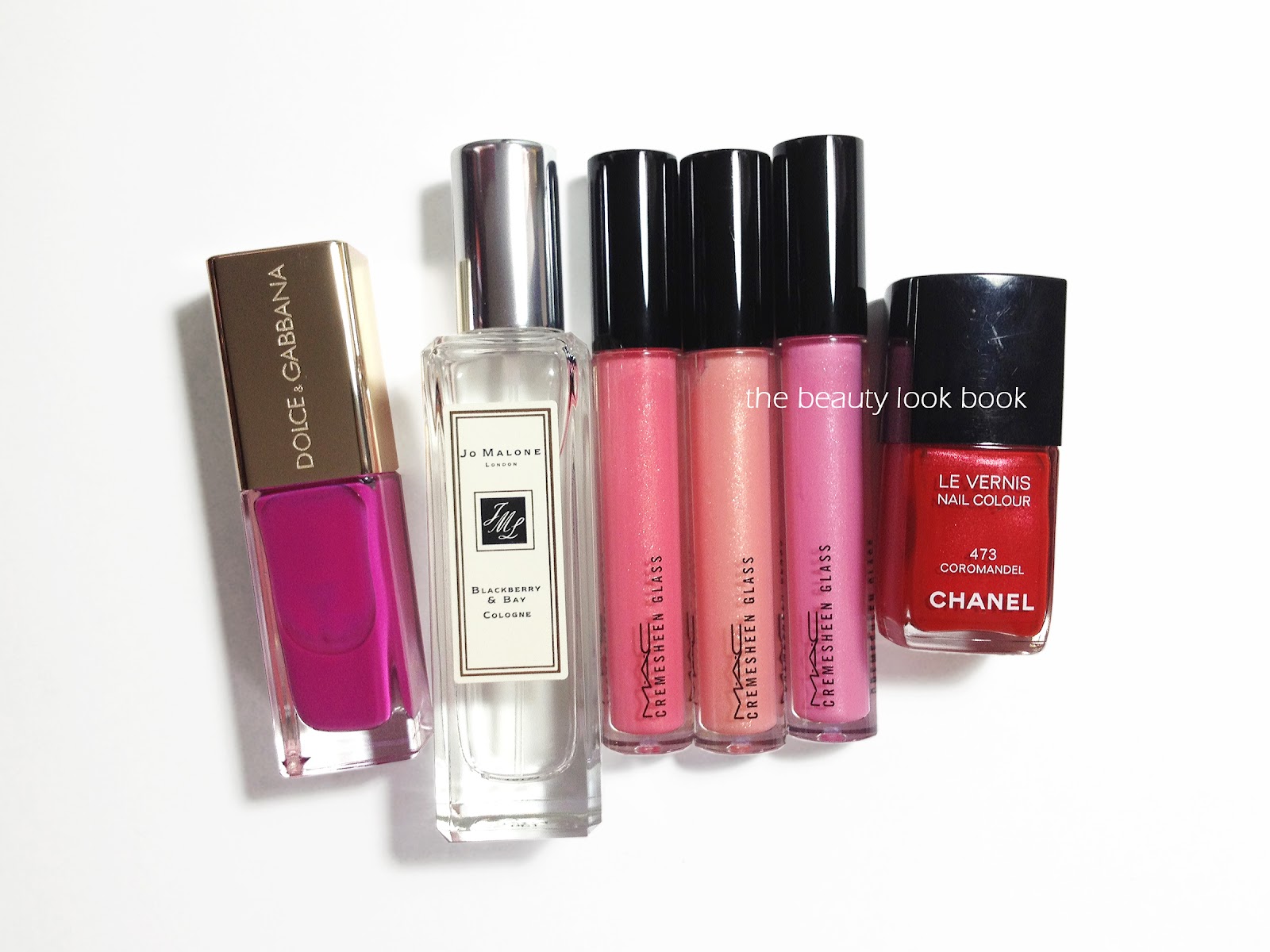
Dolce & Gabbana Passione Nail Lacquer is the perfect mauve-pink-fuschia cream (here)
Jo Malone Blackberry and Bay is my latest fragrance love, fresh, sweet but not too sweet
MAC Cremesheen + Pearl has to be one of the prettiest collection of neutral pinks, peaches and corals I’ve ever seen! I had to get one of each shade but my favorites are the Cremesheen Glass lipglosses in Floating Lotus, Paper Lantern, and Pagoda (the swatches on Temptalia are phenomenal)
Chanel Coromandel Le Vernis is a classic rich warm bright red (here), it was discontinued a while ago but it’s now re-released on Chanel.com


