Yearly Archives

2012

Uncategorized

Loving Right Now

May 31, 2012
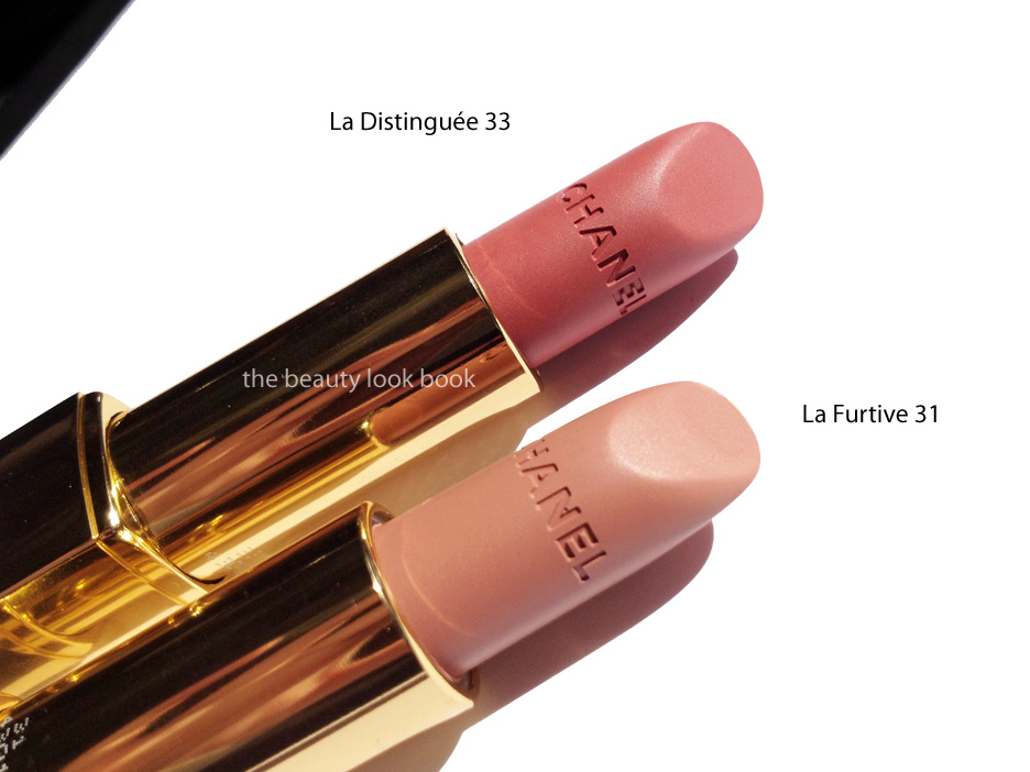
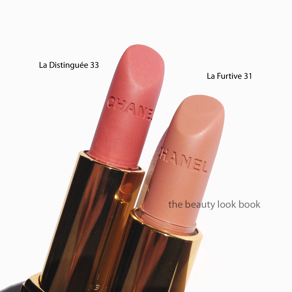
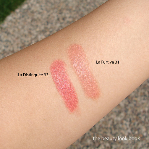
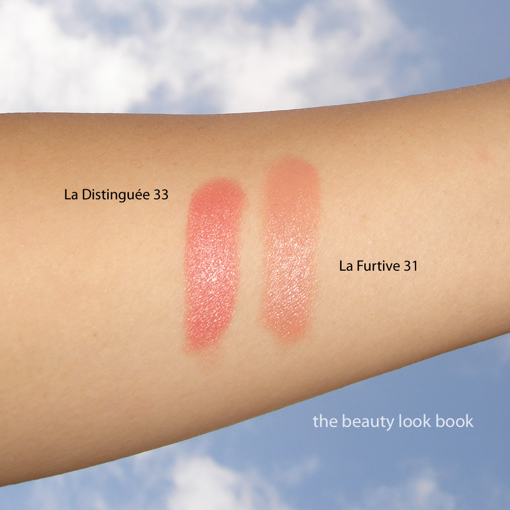
I’m always drawn to matched lip and nail collections. I loved the Chanel Extrait de Gloss Collection (from 2010, see summary on Karla Sugar) and the recent MAC Fashion Sets, in particular Angel and Please Me (see lineup on Temptalia here, here and here). Right now I’m loving something that’s a little more mixed lip/nail combination and something a little less matched, but still in the same color family. Here are a few mixed and matched combination sets I’m loving right now. Swatches below as well.

Glowing neutrals
Left to right: YSL Golden Sand #54 Gloss
YSL Golden Shell #51 Gloss
Chanel Island #597 Le Vernis
Chanel Pêche Nacrée #515 Le Vernis

Corals and golds
Left to right: Chanel Nakkar #149 Glossimer
Dior Brown Panama #432 Addict Ultra Gloss
Chanel Holiday #617 Le Vernis
Chanel Delight #607 Le Vernis

Snapshot of jewelry from J.Crew’s Published June Style Guide and online at J.Crew here (I need one of those bracelets!) (Online versions of the J.Crew catalog are published on their website, currently May’s Style Guide is available to browse, I suspect June’s will be uploaded soon)

Pink lavenders
Left to right: Laura Mercier Nude Lilac Lip Glace
Dolce and Gabbana Lilac Nail Polish
Dolce and Gabbana Raspberry Lip Gloss
NARS Ratin Jot Nail Polish

What are lip and nail combinations are you loving right now?
Uncategorized

Chanel Rouge Allure Velvet La Distinguée 33 and La Furtive 31

May 27, 2012

Chanel’s Rouge Allure Velvet formula was released last fall (see swatches on Karla Sugar, Messy Wands and Rouge Deluxe). Being a huge fan of the luxurious feel of the regular Rouge Allures, I was excited to try the new Velvet formula, however the two shades that caught my eye were not available to the US. Since the initial release, Chanel has released La Distinguée 33 and La Furtive 31 exclusively on Chanel.com for a limited time ($32.50 each). Unfortunately it appears that La Furtive (released online last November) is no longer available on their website. I’m not sure if they will bring it back or not. I hope they do.

Rouge Allure Velvets come in the same packaging as the regular Rouge
Allures. I love the pop-up feature of the packaging and the sleek simple
black tube. The coverage is full on me and the lipstick adheres well to the lips. To me these are like a velvet/cashmere blend for the lips. Even though these are described as matte, there is still a slight sheen to these and the texture is soft/smooth. They glide on the lips without any tugging. Lasting power is medium. Finish is rich but natural coverage. Texture settles in to mimic the feel of your natural lip.
  • La Distinguée 33 is a peach-pink with a velvet matte finish. There is a slightly luminous mixture of peach and pink in the color which gives it depth and a soft glow, even with the matte finish. La Distinguée goes on my lips a brightened peach tinged with pink. On my lips it leans more towards the warm/peach side. It glows and definitely brightens the face without looking too bright.
  • La Furtive 31 is a satiny peachy nude. This shade was featured on the runway at the 2011/2012 Fall/Winter show (as seen on La Chanelphile and Café Makeup). This color is borderline too nude alone. It doesn’t make me look completely washed out, but almost. I think this one would look best with a slightly deeper liner blended over the lip first. While I feel the color can be easily duped by other neutral nudes (MAC, Bobbi Brown come to mind), I think the formula is absolutely to die for in terms of application and feel. I really hope Chanel brings this back online.

Photos and swatches below.

La Distinguée 33:

La Furtive 31:

Overall, a huge thumbs up for both shades. If I had to decide between the two, I would highly recommend La Distinguée 33. US girls note this is limited edition on Chanel.com, if you are contemplating this shade, order soon!
Uncategorized

Chanel Beige 565 Swatched

May 23, 2012

Here are some finger swatches of Chanel Beige #565. Two coats achieve a semi-transparent finish. The results from application (myself and professionally) were both a bit uneven. I personally think the coverage could be more even with three coats instead. It’s clearly a beige tinged with yellow undertones. The pearly pink flashes prevent this from looking sallow on my hands. Depending on the light sometimes I love it, other times I’m meh. It’s a nice-to-have shade, but not a must-have. It is indeed unique in my collection of neutrals and beiges though. Someone in the prior post asked if this was a repeat/repromoted shade. I believe this is new, but I’m not 100% sure. I do know early when I started noticing Chanel (in the mid-90s) that there were several variations of a “beige” shade. Le Beige, Natural Beige, Beige de Chanel or something along those lines seem familiar names, but I don’t believe any of them had any iridescent quality.

One at night:

Uncategorized

Chanel Beige 565 Le Vernis – First Look

May 22, 2012

Chanel.com’s exclusive Le Vernis shade in Beige 565 just arrived yesterday ($26 each). Here’s a quick look at the color plus comparisons. I couldn’t get good nail swatch photos before the sun went down. Hopefully I’ll be able to post better photos this week. Chanel Beige 565 is a true beige. I was hoping it would be a pearly beige with pinkish/pearl tones like the promotional photos online. It does have a luminous pink glow that flashes (much like Jade Rose, Rose Cache, Distraction) but it’s more of a nude-yellowish beige. I personally find it flattering and polished looking, although I’m not sure that fairer skins will like this. It might have too much yellow. Initial impressions are that this has decent coverage but it doesn’t apply flawlessly like Dragon, Riviera, Blue Boy etc. It’s not quite as difficult as say Mimosa or Riva to apply though. More thoughts to come later, but I’m happy I purchased this one.
You can see the shimmer when you hold the bottle at an angle in direct sunlight.

Comparisons to other beige-nudes below. Note that Chanel Beige Petale was not swatched because it’s so sheer. You can see it reviewed here though. I believe most of the other shades swatched have been reviewed in the past (use the search bar to find more detailed reviews and swatches). You can see that Chanel Beige is fairly unique and more of a beige-yellow nude. All photos by me. Kindly respect the copyright and do not republish without permission.
Uncategorized

Loving Right Now

May 20, 2012

Right now I’m loving soft baby blue nail polishes. In particular these colors shown below: Deborah Lippmann Glitter in the Air, NARS Kutki, Dior Glacier, Dolce & Gabbana Anise and OPI My Pointe Exactly. All photos by me.

Loving this week:

  • Chanel Illusion D’Ombre Rivière, a soft seafoam green shimmer as seen on Cafe Makeup and The Non-Blonde (I heard rumors that the latest Asia Le Blanc Release will be available at Nordstrom for their Anniversary Sale) 
  • Cupcakes and Cashmere has the most creative beauty storage ideas
  • The Coveteur covers Jessica Stam’s look, Hair and Make-Up Courtesy of Jen Atkin and Lauren Andersen
  • Rouge Deluxe reports six new Armani Eyes to Kill shades will be released soon
  • Into the Gloss has an awesome video of WAH Nails in NYC
  • MAC Hey, Sailor! reviews and swatches can be seen on Temptalia and Yuki’s Lazy Channel
Also, The Beauty Look Book just turned 3! It all started with a guest post at Makeup and Beauty Blog. Thanks from the bottom of my heart to Karen at MBB, Karla Sugar, The Non-Blonde, London Makeup Girl and Rouge Deluxe – you were all my inspiration when I first started. Special thanks to Cafe Makeup for also keeping me going, in particular this past year.

Three years, 7.2 million hits, 3,200+ google followers and a Twitter account later, I still feel like I’m just getting started. I am forever grateful to everyone for their support, comments, tweets, sweet e-mails and for reading my blog each week. I’ve made new friends, discovered new brands, started getting into perfumes, learned new techniques, figured out how to paint my own nails properly, and have learned so much from so many of you. Thank you for your support!

Uncategorized

Bobbi Brown Long-Wear Cream Shadows

May 20, 2012

I’ve been a long-time fan of Bobbi Brown’s Long-Wear Cream Shadows (her regular version). Staples in my collection include easy-to-wear classics such as Ballet Pink, Sandy Gold, Sand Dollar and Sand Castle (now discontinued). They’re compact and have a soft velvety smooth texture that makes them easy to apply with fingers or her cream shadow brush. Recently, she released a number of new shades in her Long-Wear Eye Collection and Miami Collection. I picked out a few shades recently from both: Nude Beach, Bronze Sugar, Smoky Topaz and Velvet Plum ($24 each). All work well alone or as a base under powder shadows. Occasionally I will layer the darker shimmer shades with a powder shadow to help blend colors or intensify certain shades. They are extremely versatile and I like the quick and easy swipe-and-go application these offer. For me they last all day from morning to afternoon. Near the end of the day they do start to fade like most creams do, but I like that these don’t budge on my eyes.
  • Nude Beach is my new holy grail perfect nude. It has a bit of shimmer and gives a luminous glow. It’s similar to Shore (which I have swatched below) but brighter and slightly less grey. I still adore Shore, but Nude Beach has the perfect amount of shimmer to prevent this from looking flat. It’s a medium-toned nude which matches my Chanel B30 skin exactly.
  • Bronze Sugar is a highly metallic warm bronze. Note that these new shimmery shades are her regular Long-Wear formula, not her Metallic Long-Wear formula (which I did not like at all). There is a silvery sheen to some of the shimmery particles making this sparkle. I found this one dried quickly on my lids so it required fast blending. Times I did not blend fast enough it dried on the lids and did not budge. If you have oily lids you will like these. If your lids are more normal or on the slightly dry side, you might want to apply a good dose of eye cream first.
  • Smoky Topaz is a taupe-lover’s dream come true. It’s a high-sparkle taupe/mauve/grey. Check out Karla Sugar’s swatches to see how it looks on different skintone and applied with a heavier hand. On her it appears more silvery, while on me it’s more taupe.
  • Velvet Plum is a bronzed-plum. It’s very similar to Bronze Sugar but dries with a plum finish. If I had thought about these longer, I would have opted for Velvet Plum and skipped Bronze Sugar.

Note that I applied these with Bobbi Brown’s Cream Eyeshadow Brush with medium intensity. You can definitely layer these easily for more pigment. The shimmery shades from the recent collections do have a bit more kick/sparkle than her other cream shadows, but I find them still very wearable for everyday. Bottom line gorgeous. Also, Best Things in Beauty has me wanting Candlelight.
I found mine at Neiman Marcus but these should be at all Bobbi Brown counters now.
Uncategorized

Giorgio Armani Eyes to Kill Intense in 21 Obsidian Grey and 20 Obsidian Black

May 19, 2012

This summer Giorgio Armani has released four Eyes to Kill Intense Eyeshadows in #20, 21, 22 and 23. There have been numerous amazing reviews from bloggers of all different skintones on all four shades. Some of my favorites include features from Rouge Deluxe, Temptalia, Messy Wands, Perilously Pale, Beauty Ops (just to name a few). The colors that stood out to me were 21 Obsidian Grey and 20 Obsidian Black ($32 each, limited edition).

Obsidian Grey #21 is a highly metallic medium grey in the pot. On the skin it has a silvery sheen, particularly on olive skin. As with most other Eyes to Kill Eyeshadows, the texture Obsidian Grey allows you to layer for a sheer wash or more pigmented intense application. I use a cream shadow brush or a small domed shape brush to apply and blend. Swiping on the back of my hand I expected a lot of fall out since the metallic particles seemed larger than most shimmery cream shadows. However this applied smoothly without any fallout problems for me.

Obsidian Black #20 is a blackened teal shimmer. This color was the one shade I just had to have. It’s stunning in the pot and swatched on the hand. On the eyes, at least for my olive medium skin, I found it didn’t work so well. My experience was similar to that of Temptalia. On my eyes, this lost a bit of lustre and intensity. In addition it made me look tired and a bit sallow. The teal in NARS Dogon has a very similar effect but for some reason works so much better for my olive skin.

Swatched, two views:

Comparisons to other Eyes to Kill Eyeshadows Pulp Fiction #4 and Black #13:

Overall I love Obsidian Grey #21, but personally prefer Pulp Fiction #4 more since it has a bit more taupe and less silver. Obsidian Black #20 is gorgeous as well but requires more work and layering with other shades for my skintone, I prefer #13 in Black from the initial release to Obsidian Black. The lasting power is excellent for me and last all day and well into the evening without smudging. Do note that many of the Eyes to Kill Intense Eyeshadows are indeed intense. Some are highly metallic which might be outside of your comfort zone. (For reference I found the holiday shades way too shimmery for my taste.) I find some to be more wearable than others for everyday. If you have some of the older shades I don’t think these two are must-haves.