Browsing Tag

Spring 2013

Uncategorized

OPI – A Butterfly Moment

January 18, 2013

Mariah Carey and OPI have partnered to release some beautiful shades this month. As soon as I spotted A Butterfly Moment on DSK Steph, I knew I had to have it. I literally ran to my local Ulta and was ecstatic to find all shades available. A Butterfly Moment is a frosted nude-pink shimmer. On me it’s fairly nude in the sense that it’s close to my natural skintone. I found it a bit too neutral for me – although I suspect it would look a lot prettier on either paler or darker skintones. Still it’s a good work-friendly neutral and the pearly pink shade is just so pretty in the bottle. I found the formula to be a little on the thick side – I recommend you let your first coat dry completely before applying a second. Two coats were definitely needed for smooth even coverage.

Swatches – depending on the light you can see some of the golden glow:

A few comparisons to Chanel Perle Rosee (discontinued), Chanel Rose Cache, Chanel Rose de Vents (discontinued) and OPI Gouda Gouda Two Shoes:

Did you pick up any of the OPI Mariah Carey shades? I already can’t wait for the Oz collection to be released in stores 🙂

Uncategorized

YSL Bronze Pyrite #35 La Laque Couture

January 12, 2013

Last year YSL reformulated and repackaged their nail lacquers into their La Laque Couture. I haven’t had a chance to play much with the new formulas (although I do own three). They come in a lovely square-shaped bottle with a removable cap. The brush is wider than most brands, but also skinny (flat). I normally prefer brushes that are not quite as wide, but the YSL applies very easily with the shape of the brush. Bronze Pyrite #35 is the first YSL nail lacquer (in the new formula) that I’ve tried and so far I’m impressed. It’s part of the spring 2013 line ($25 for 0.34 fl oz./10 ml).
As you can see Bronze Pyrite is a beautiful metallic. It’s a true metallic in the sense that it goes on with a metal finish (rather than sparkle or shimmer). There is a lot of color mixed in. On the nails I would describe it as a pewter. Depending on the lighting, sometimes there is a very slight khaki/greenish glimmer. I was pleased that it applied with minimal visible brush strokes. The pigment is rich and only needed one coat, however 2 coats was best for me.

At an angle you can see a bit of the khaki glow:

Here are a few views of the packaging and brush: 

Here it is swatched on me:

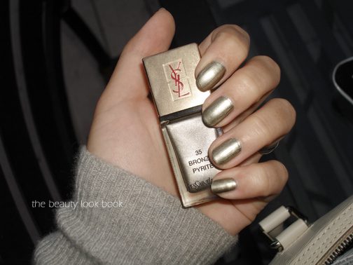
Compared to other metallic/high shimmers, YSL Bronze Pyrite is the most foiled/metallic looking compared to other similar metallics. Chanel’s Graphite has a more complex finish with larger sparkles, Tom Ford’s Silver Smoke is lighter and more neutral with a finely milled shimmer, Dior Timeless Gold has a more sophisticated shimmer and Chanel Diwali has more dimension.

Overall a huge thumbs up. I did get some tip wear on day 3, and on day 5 it started to chip a little. I found it lasted quite well throughout the week.
There is one more shade from YSL spring, a gorgeous seafoam green called Jade Imperial #34. I passed since it seemed so similar to one of the shades from last year’s OPI Holland collection but I didn’t try them side by side to compare.
I purchased mine from Nordstrom.
Uncategorized

Chanel Or Rose, Santal and Beryl Stylo Yeux Waterproof

December 27, 2012

Chanel has released three new eyeliners in the Stylo Yeux Waterproof formula for spring ($30 each, made in Italy). The three shades are Or Rose #89 (a luminous sparkly champagne), Santal #100 (a neutral shimmering brown) and Beryl #102 (a pale lavendar). Currently, only Beryl is listed as limited-edition on Chanel.com. The Stylo Yeux Waterproof pencils come in a twist-up packaging with a hidden built-in sharpener at the end of the pencil (see example from Karen at Makeup and Beauty Blog for close up). They are designed to be a long-wear pencil and I find them to be among my longest lasting eyeliners. For me they stay put all day.
The new shades for spring performed just as well as others in the same formula. Shimmery champagnes like Or Rose are good for lining the inner corners or lower waterline. I’m still experimenting with Beryl – it’s such an unusual shade for a liner! Santal is a pretty classic warm brown shimmer. Chanel does lovely neutrals and Santal works perfectly with the Raffinement quad that was released for spring.

Swatches: Or Rose pulls a bit peachy on my skin.

In terms of dupes, I couldn’t find any. Some comparisons are featured below. Or Rose is a lighter version of Peche Cuivre. Shown next to other champagnes you can see Or Rose is definitely on the peachy side. Santal is quite unique and warmer than other brown neutrals. I didn’t compare Beryl to anything since I don’t own any lavendar-colored eyeliners.

Based on my preferences and normal makeup routine, I like Santal the best. Or Rose is gorgeous but I would prefer it as an eyeshadow instead. Same with Beryl. I occasionally use champagne eyeliners but not frequently. They are both stunning though.

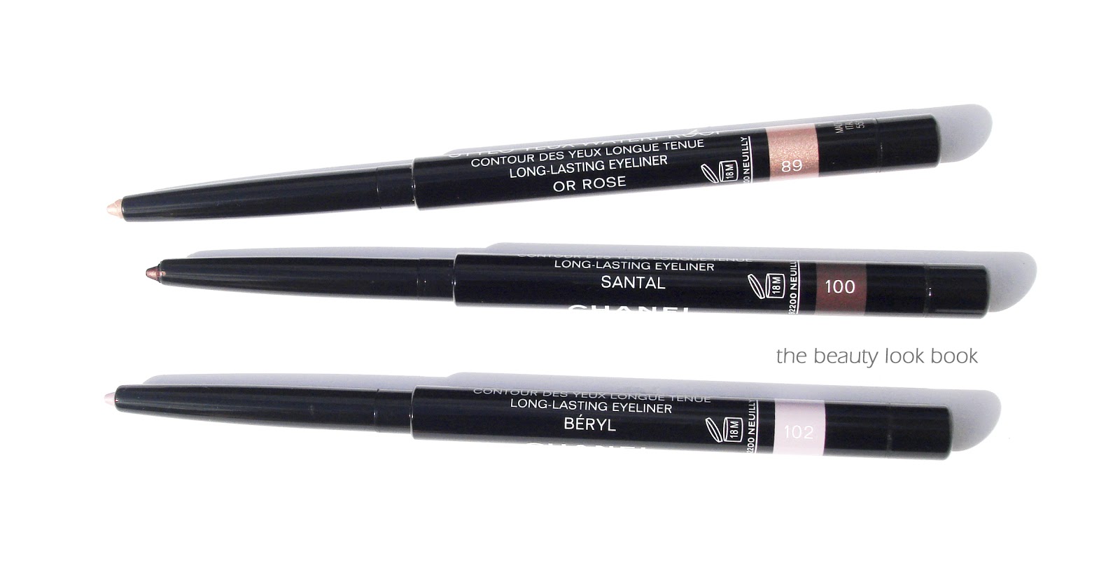
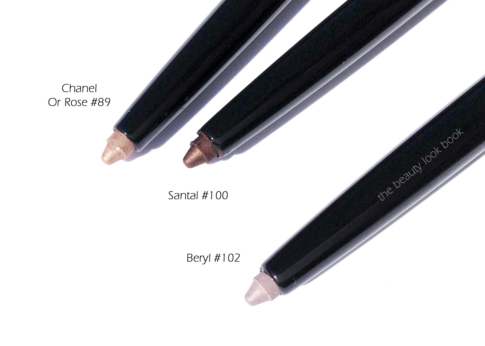
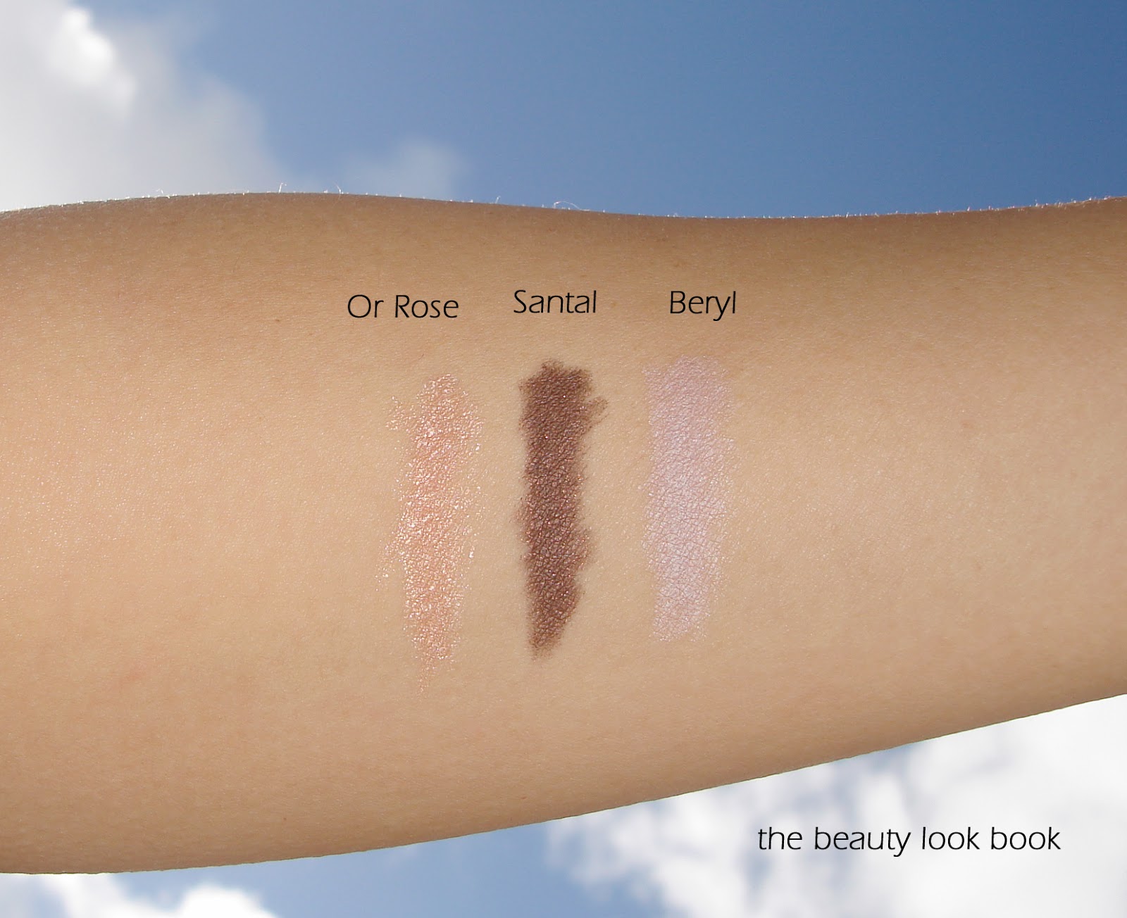
Did you pick up any of the spring eyeliners?

Uncategorized

Chanel Raffinement #39 Quadra Eye Shadow – Spring 2013

December 24, 2012

The winter-to-spring season brings quite a few lovely neutral palettes from Armani, Burberry, Edward Bess and Chanel. The Printemps Precieux de Chanel brings us Raffinement #39 Quadra Eye Shadow ($58 for 6.8g/0.24 oz) which is every neutral-lover’s dream. The quad has a mixture of three shimmery earthy warm neutrals and a dark warm matte brown. This is hands down my favorite neutral of all the recent releases. The pigment is excellent, much better than most Chanel palettes in my opinion. The texture is soft and easy to blend. The shimmer is visible but not over the top. It’s a definite must-have.


Here it is swatched, on me it pulls very warm:

Chanel recently discontinued Kaska Beige (which I found to be a good staple, I had to get backups) so I thought that Raffinement would be very similar. However looking at them side by side you can see how they are very different. The color/finish of Raffinement is similar to Armani’s #6 Boudoir. The difference is that Armani has 2 light shimmer/2 mattes while Chanel’s has 3 shimmers/1 matte. If I had to pick one, it would be the Chanel. I added Prelude below to show the undertones.

I could only fit three sets on my arm, so I picked the ones that were most similar, Armani #6 and Chanel Kaska Beige. There are two views below with different lighting. Right now I’m a Chanel B30.

Overall love. Raffinement is a gorgeous palette. The quality and pigment are excellent. Did you pick up Raffinement? Or anything else from Chanel spring?
Uncategorized

Comparisons for Chanel Emprise, Fracas and Accessoire Le Vernis

December 18, 2012

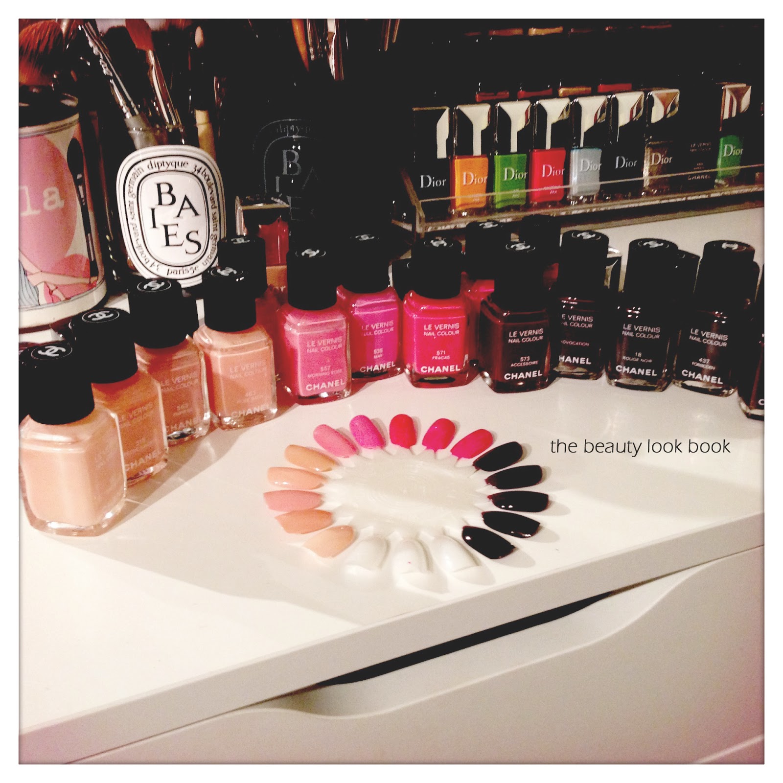
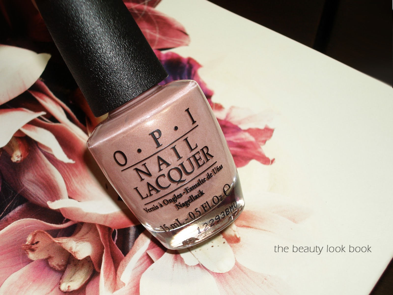
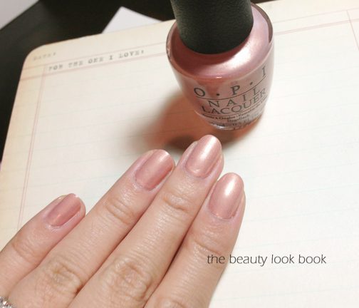
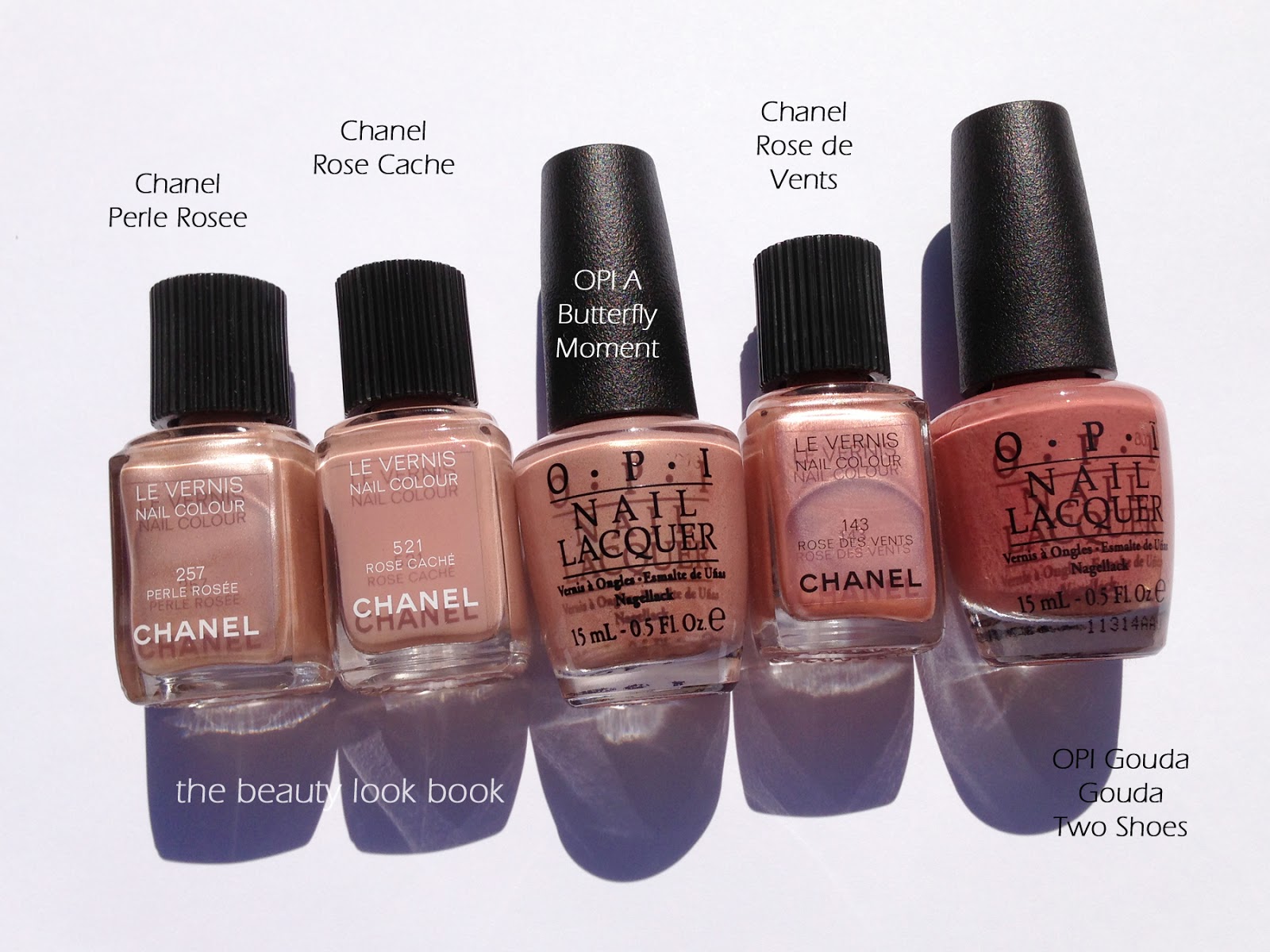
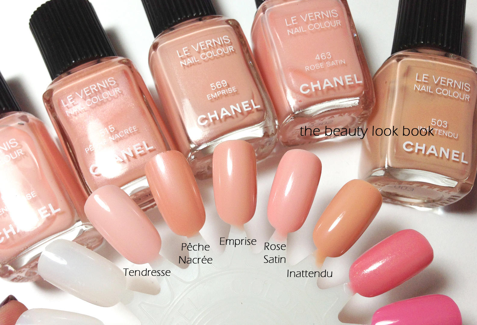
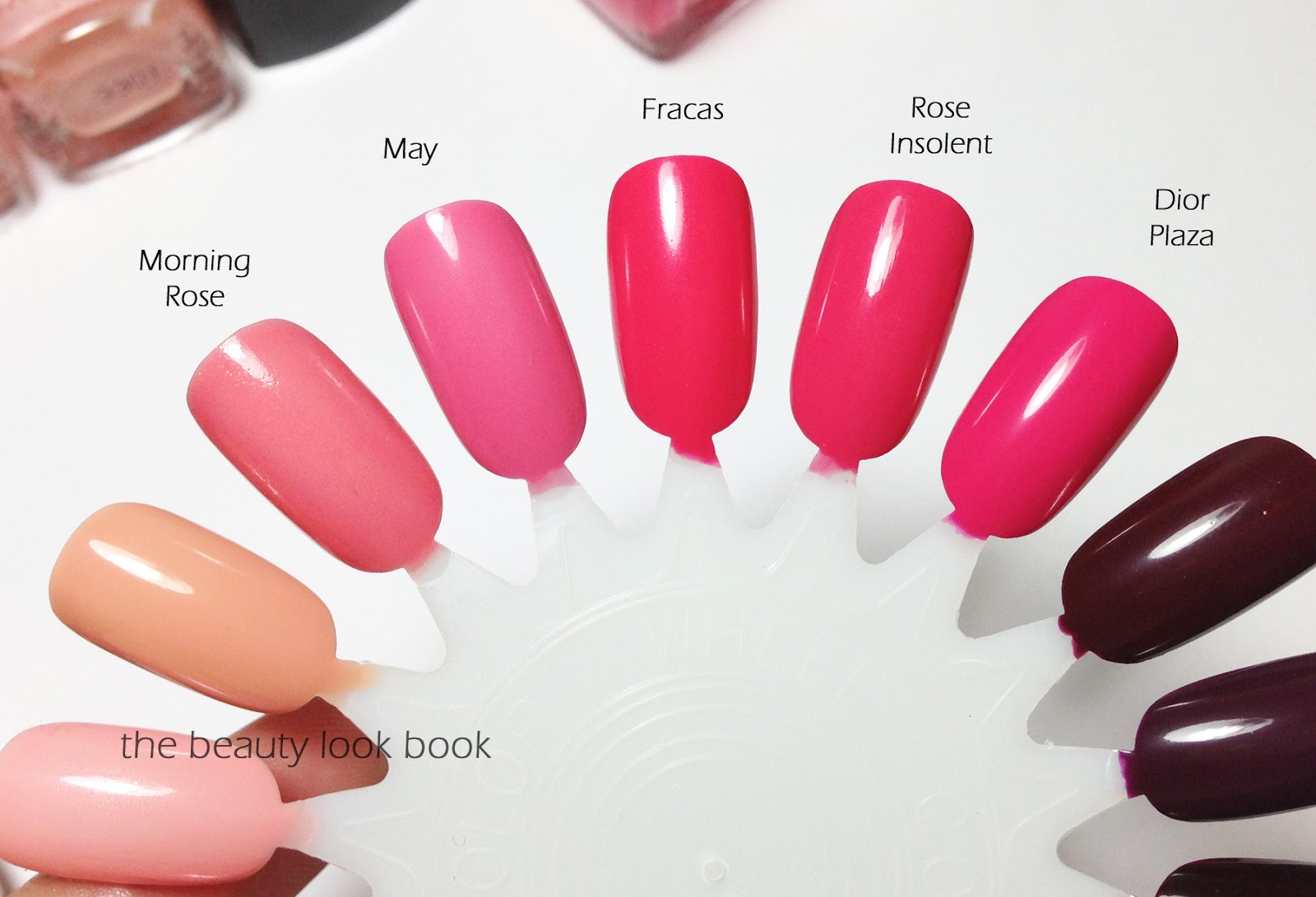
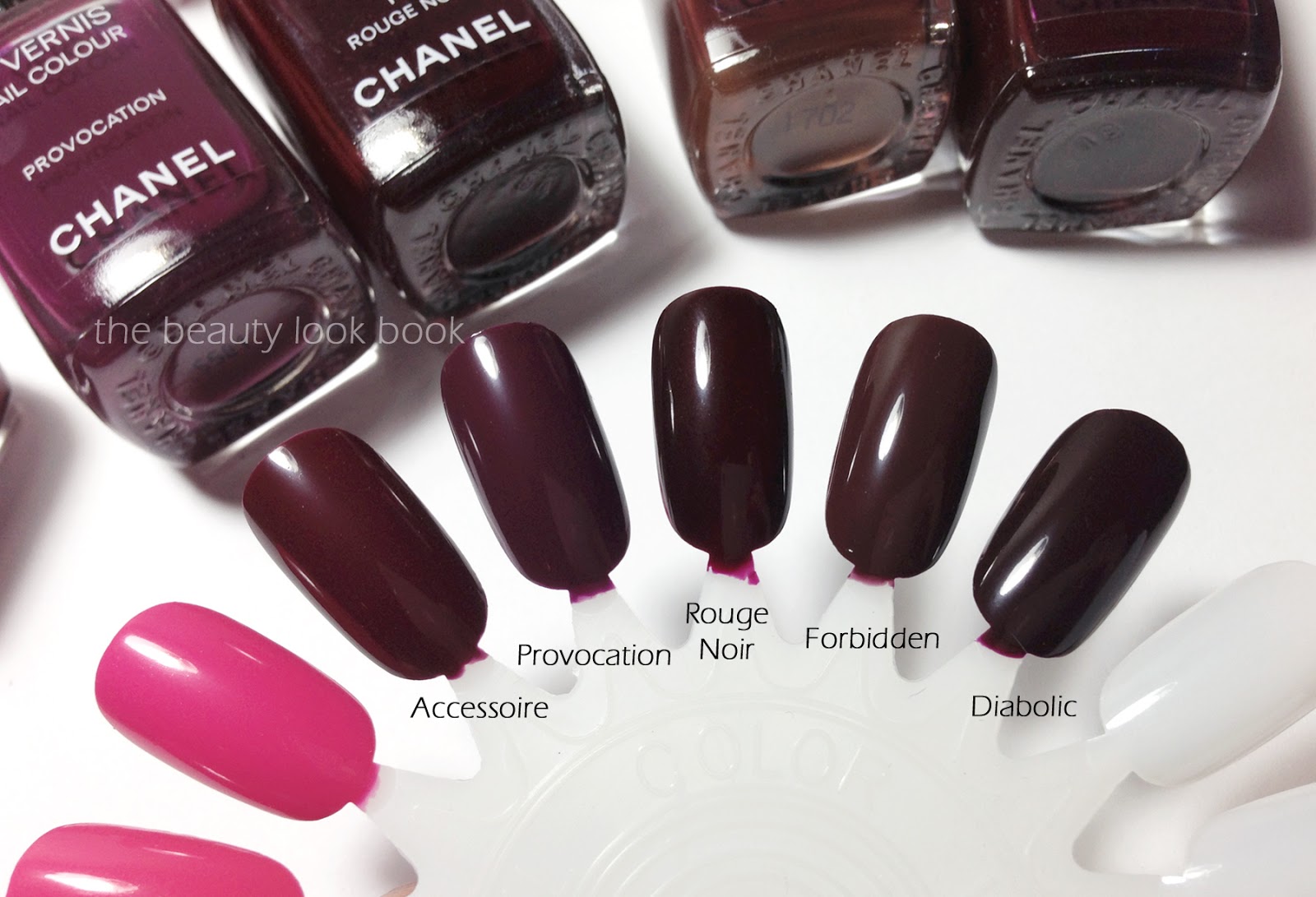
After swatching some shades from my Chanel Le Vernis collection, this is the verdict on dupes/similar colors:

  • Emprise seems to be most similar to Pêche Nacrée, but Emprise is more opaque and pinkish on the skin while Pêche Nacrée is more pearly/peachy. I thought Emprise would resemble Django but it’s quite a bit darker and more peachy. Compared to Rose Satin, Emprise is similar but more opaque and peach. I thought Emprise would be most similar to Inattendu, but swatched side by side, Inattendu almost looks tan.
  • Fracas is a warmer and more vibrant version of Rose Insolent. Compared to other pinks, Fracas makes May look pastel. Fracas has a hint of melon when compared to Dior Plaza, but Fracas is still clearly pink. On the nails on my skin, I feel it’s almost identical in finish to Rose Insolent.
  • Accessoire is a lighter version of Rouge Noir. Compared to others, Accessoire is warmer/redder than Provocation (more purple/plum), more plum-red than Forbidden (most brown), and lighter and redder than Diabolic (the darkest one I have). On the nails, it’s hard to distinguish the difference between shades.

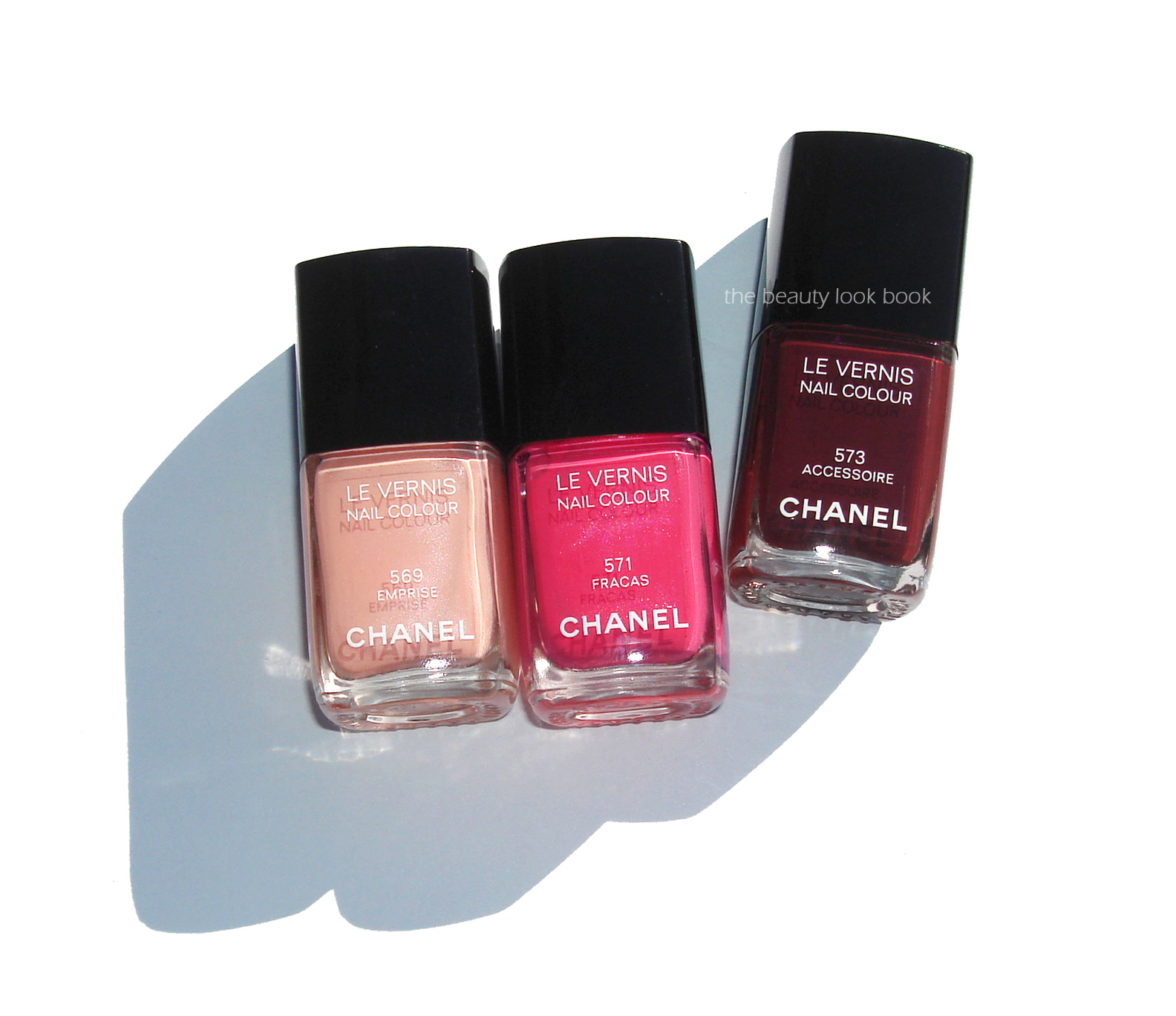
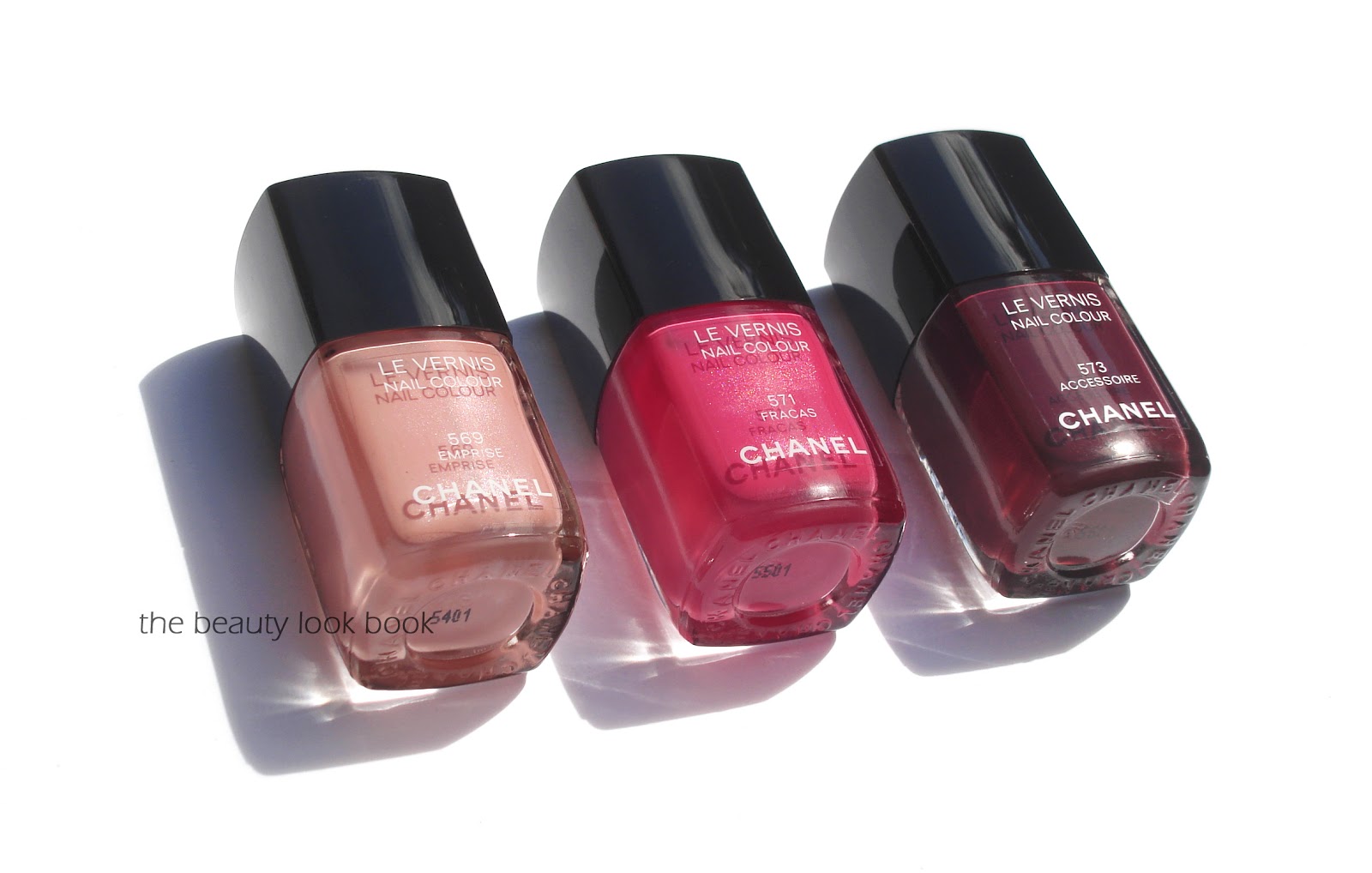
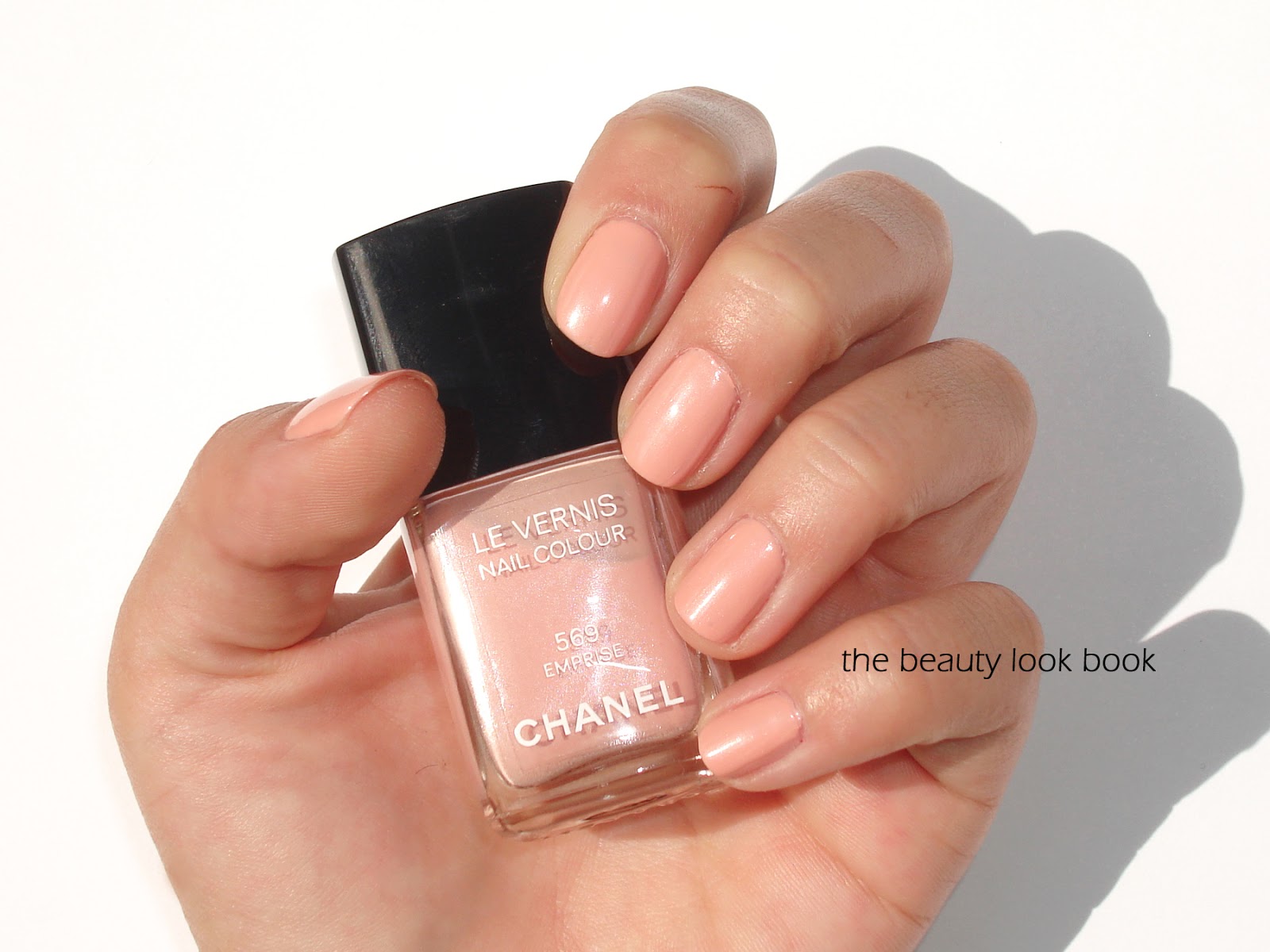
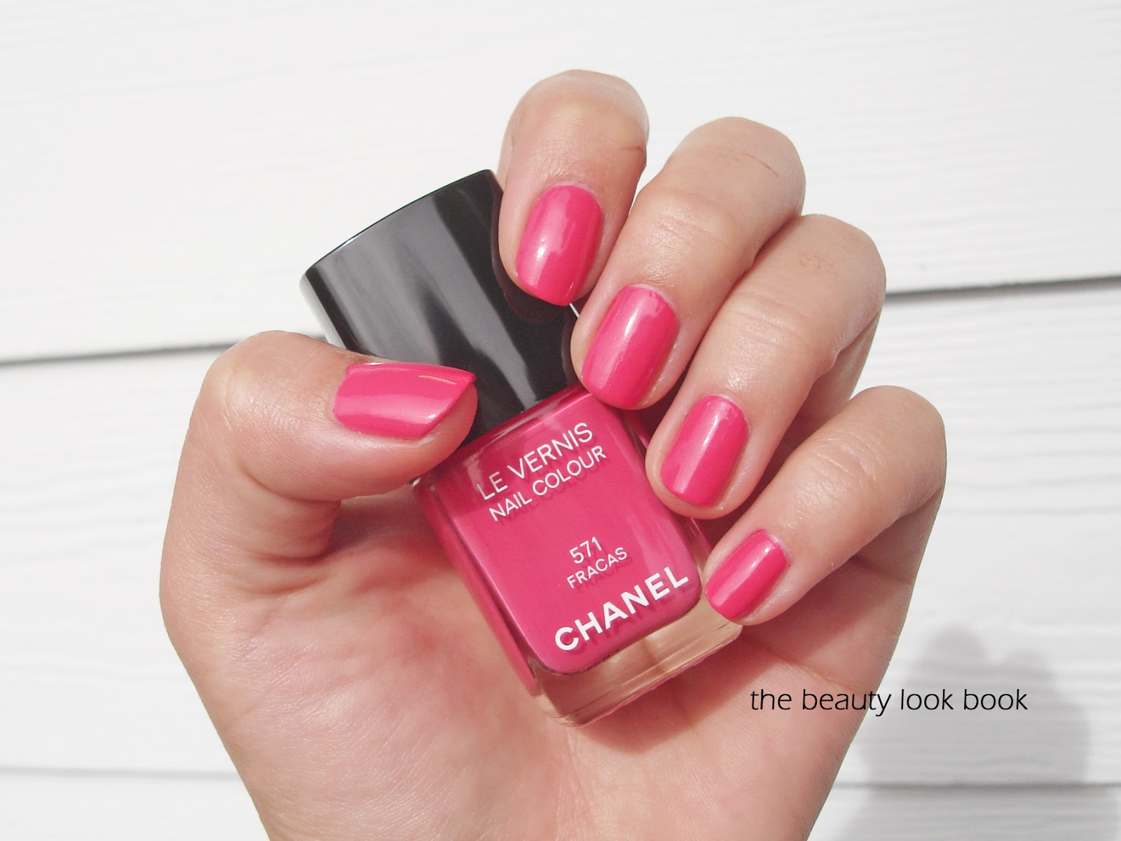
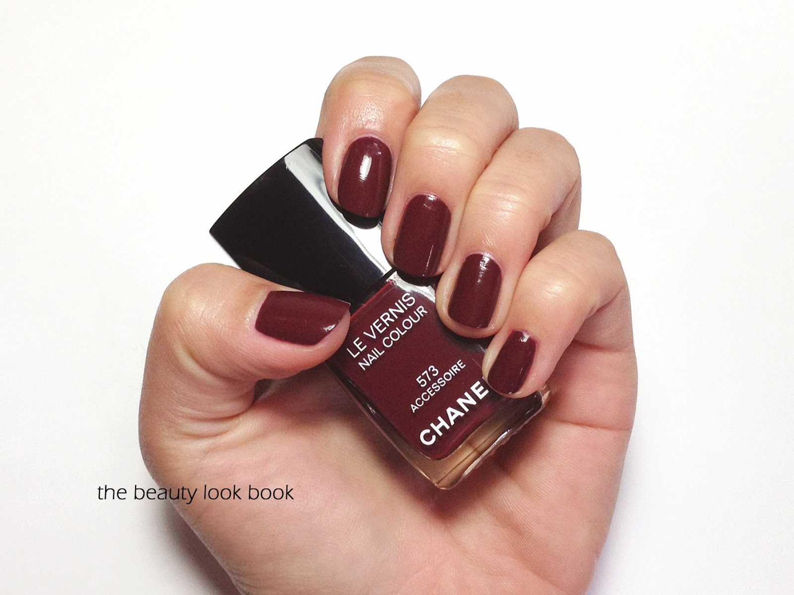
On the nail wheels: Tendresse, Pêche Nacrée, Emprise, Rose Satin, Inattendu, Morning Rose, May, Fracas, Rose Insolent, Dior Plaza, Accessoire, Provocation, Rouge Noir, Forbidden and Diabolic.

Some photos under artificial light, I hope this alternate view will give you a better idea of comparisons:

Although the spring shades from Chanel are very similar to existing colors, I still think they are beautiful options for the season. Perhaps not the most unique, but they are very flattering. My personal favorite is Accessoire even though I do not need another vamp in my stash.
Have you tried Chanel spring yet? What were your thoughts?
Uncategorized

Chanel Emprise, Fracas and Accessoire Le Vernis for Spring 2013

December 16, 2012
Chanel’s spring 2013 makeup collection Printemps Precieux de Chanel offers some beautiful colors this year. I ordered my items sight-unseen from Bergdorfs and have been very pleased with everything so far. First up are the three new Le Vernis shades in Emprise 569, Fracas 571 and Accessoire 573 ($26 each for 13 ml/0.4 fl oz, made in France). I found the shades from Chanel spring to be fairly similar to prior
releases, but think they are still beautiful options for spring. The
colors are solid staples that I think everyone should have in their nail
wardrobe. However, if you have a lot of Chanel or Dior nail polishes, you may want to shop your own stash or test these in
person before buying. The shades this season:
  • Emprise 569 is a soft peachy shade with a hint of pink, there is a subtle pearly shimmer infused in the bottle but the color goes on a cream, finish was semi-sheer, I found it needed three coats for even coverage
  • Fracas 571 is a hot pink melon fuschia, this shade also has that shimmery pearl in the bottle (like Distraction) but doesn’t quite show up on the nail, the shimmers made this one difficult to photograph, in some photos it appears more melon, but it goes on very similar to Rose Insolent, pigment and coverage is excellent
  • Accessoire 573 is a rich plum-brown cream that applies flawlessly with two coats, it’s very similar to other Chanel vampy shades, I was a bit surprised Chanel decided to release something so similar to Vamp, Diabolic, Provocation etc.
Below you can see in direct sunlight that Emprise and Fracas are infused with beautiful shimmer. I wish the shimmer was more visible when applied on the nails!
Close ups and swatches below, Emprise 569:

Fracas 571, note colors may vary per screen, this was really hard to photograph for me, I recommend checking Loulou17 and Blondy Candy for other swatches/photos:

Accessoire 573:

I’m working on comparisons now. Follow up post to come soon!