

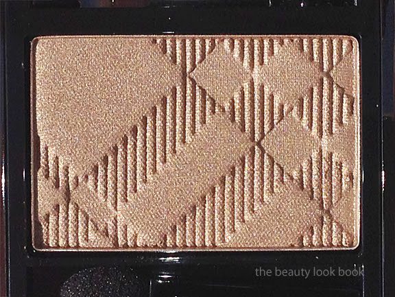
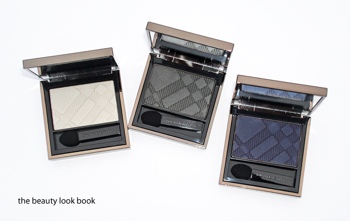
Burberry Pale Barley No. 22 Sheer Eyeshadow ($29) is a beautiful shimmery neutral sandy beige with a complex sheen. It glows with a mixture of warm gold and neutral taupe and champagne-opalescent sparkles. Over the phone, Pale Barley was described as a color that matches the classic Burberry Trench Coats with shimmer. It just might be the most beautiful neutral I’ve ever laid eyes on. The texture is soft and smooth and the pigment is anything but sheer. I do find that Burberry eye shadows are all soft and blendable for a soft sheer wash of color but the intensity of the pigment is quite good with the paler shades. The shimmer finish is similar to Rosewood with a soft luminous sheen. Lasting power by itself was less than satisfactory, however when Pale Barley is applied over a cream shadow, it lasts all day. I’ve experimented over the past few days and tried it three different ways: over Urban Decay Primer Potion in Sin, MAC Nubile Paint Pot and Laura Mercier Metallic Creme in Gold. Each one individually helped the color from the powder to stay put from morning to evening without changing the effect or color.
A few close up shots:

Left is with a heavy swatch, right is blended slightly, photos look frosty from the flash but the color is a luminous shimmer in real life:

At an angle, you can see the beautiful glowy sheen:

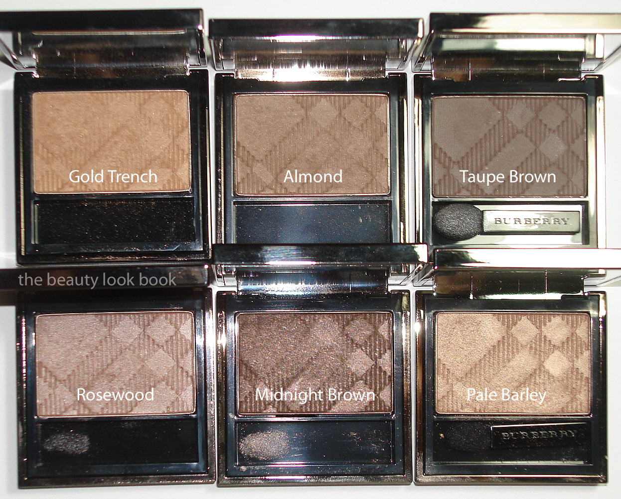
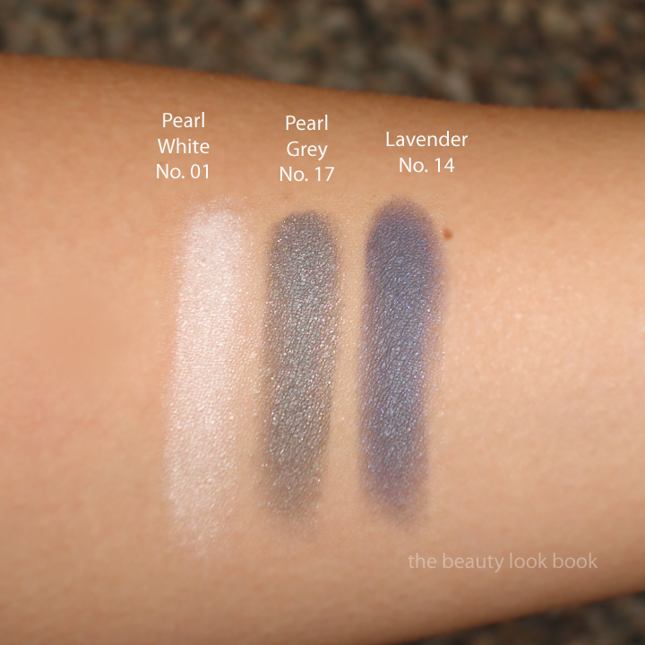
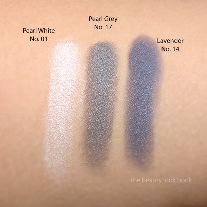
Creating a fresh unique neutral can be hard to do, but Burberry has pulled it off flawlessly. Pale Barley is different from anything they’ve released before and different from other neutrals I own from other brands. Here is one comparison set with Burberry Gold Trench, Almond, Taupe Brown, Rosewood, Midnight Brown and Edward Bess Intimate:


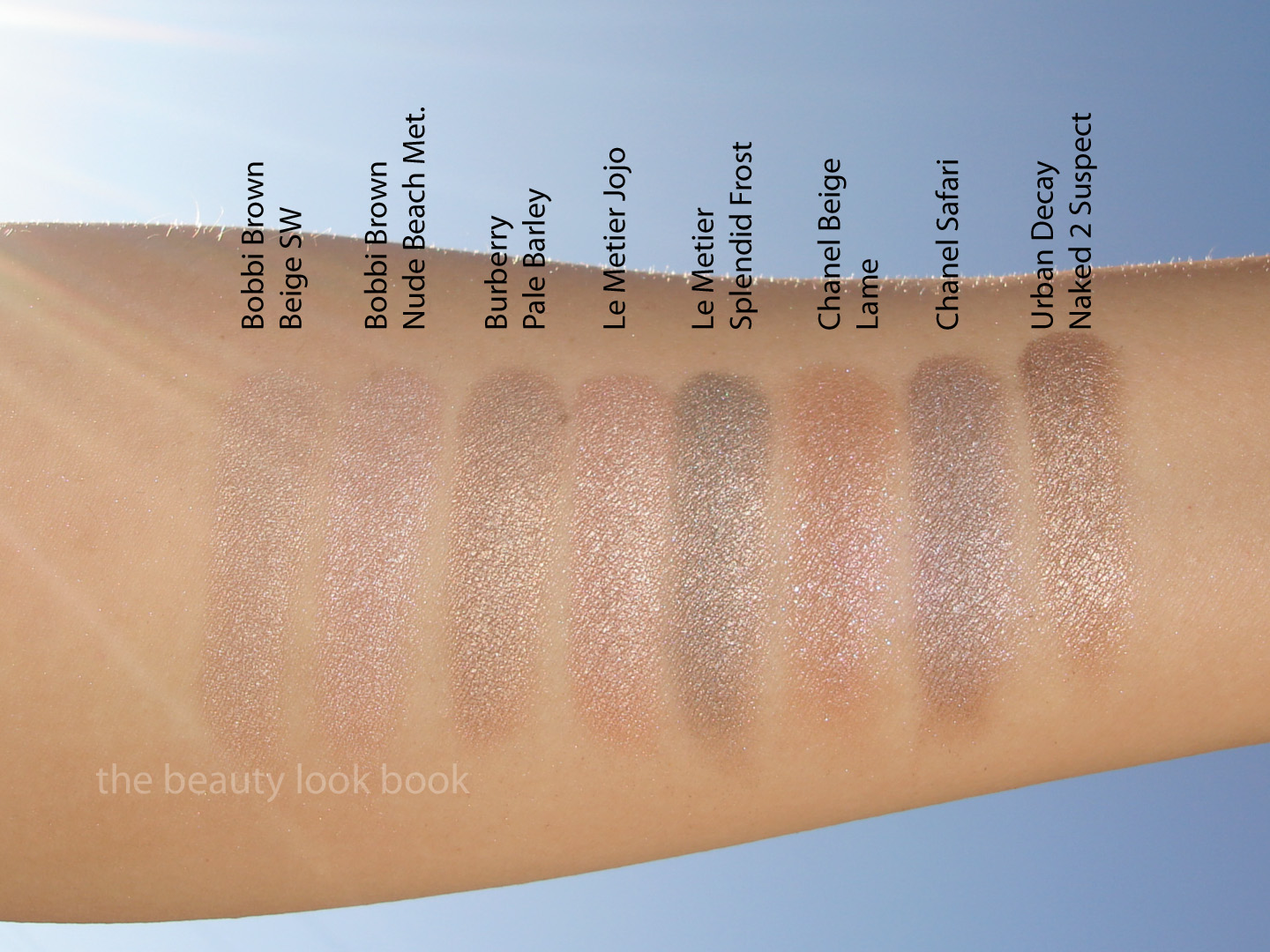
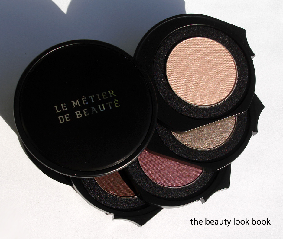
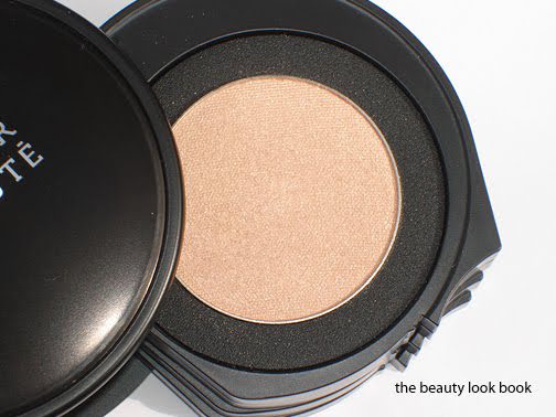
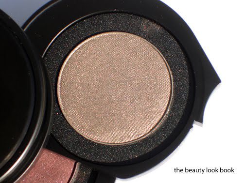
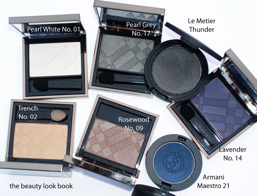
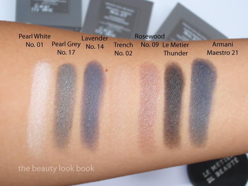
Compared to other brands I found Pale Barley unique as well. I wasn’t able to photograph the actual product in good light but did get swatches before the sun went down. Here is one more comparison set to Bobbi Brown Beige Shimmer Wash, Bobbi Brown Nude Beach Metallic, Le Metier Jojo, Le Metier Splendid Frost (taupe), Chanel Beige Lame, Chanel Safari and Urban Decay’s Naked2 Suspect.
I believe Pale Barley is a definite must-have. It’s beautiful, layerable, complex yet classic. It’s one of those shades you can wear alone (over a base that is) and just add mascara and have a finished eye look. I love that it’s a swipe-and-go type of shade that is goof-proof, fool-proof, and easy to incorporate into any look. For the woman who needs more than one color on the eyes, note that it layers well with other shades too. I purchased it sight-unseen and have no regrets. Pale Barley is a classic color and just absolute perfection on my skin. It’s a staple and I highly recommend it.


