Browsing Tag

Nail Polish

Uncategorized

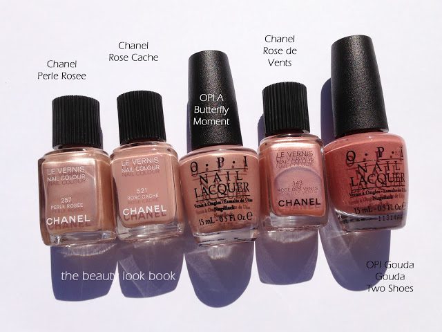
OPI – A Butterfly Moment

January 18, 2013

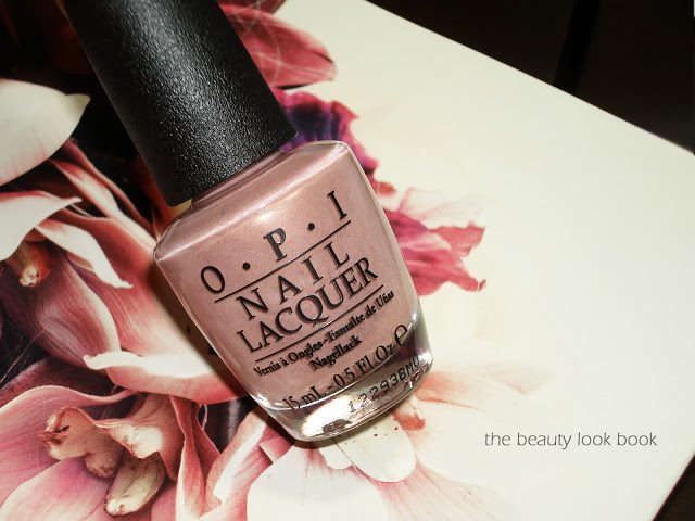
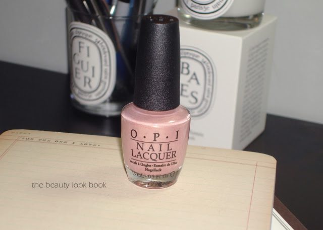
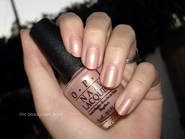
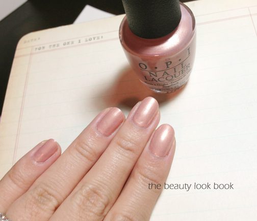
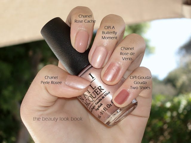
Mariah Carey and OPI have partnered to release some beautiful shades this month. As soon as I spotted A Butterfly Moment on DSK Steph, I knew I had to have it. I literally ran to my local Ulta and was ecstatic to find all shades available. A Butterfly Moment is a frosted nude-pink shimmer. On me it’s fairly nude in the sense that it’s close to my natural skintone. I found it a bit too neutral for me – although I suspect it would look a lot prettier on either paler or darker skintones. Still it’s a good work-friendly neutral and the pearly pink shade is just so pretty in the bottle. I found the formula to be a little on the thick side – I recommend you let your first coat dry completely before applying a second. Two coats were definitely needed for smooth even coverage.

Swatches – depending on the light you can see some of the golden glow:

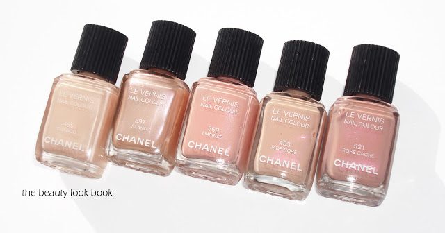
A few comparisons to Chanel Perle Rosee (discontinued), Chanel Rose Cache, Chanel Rose de Vents (discontinued) and OPI Gouda Gouda Two Shoes:

Did you pick up any of the OPI Mariah Carey shades? I already can’t wait for the Oz collection to be released in stores 🙂

Uncategorized

YSL Bronze Pyrite #35 La Laque Couture

January 12, 2013

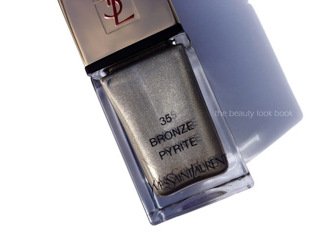
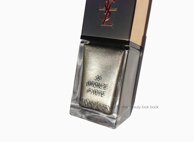
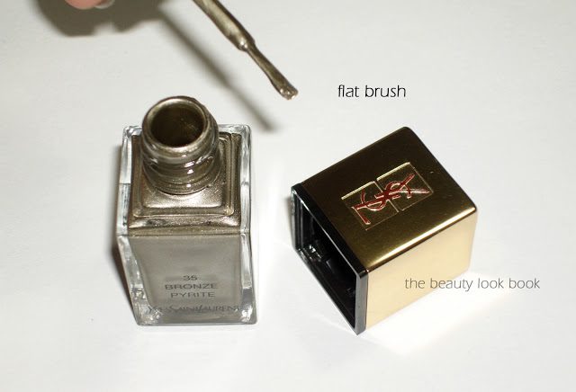
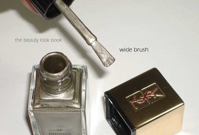
Last year YSL reformulated and repackaged their nail lacquers into their La Laque Couture. I haven’t had a chance to play much with the new formulas (although I do own three). They come in a lovely square-shaped bottle with a removable cap. The brush is wider than most brands, but also skinny (flat). I normally prefer brushes that are not quite as wide, but the YSL applies very easily with the shape of the brush. Bronze Pyrite #35 is the first YSL nail lacquer (in the new formula) that I’ve tried and so far I’m impressed. It’s part of the spring 2013 line ($25 for 0.34 fl oz./10 ml).
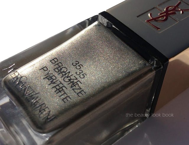
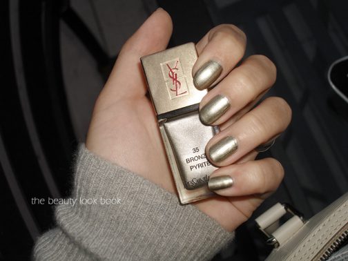
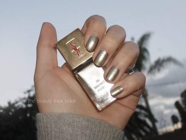
As you can see Bronze Pyrite is a beautiful metallic. It’s a true metallic in the sense that it goes on with a metal finish (rather than sparkle or shimmer). There is a lot of color mixed in. On the nails I would describe it as a pewter. Depending on the lighting, sometimes there is a very slight khaki/greenish glimmer. I was pleased that it applied with minimal visible brush strokes. The pigment is rich and only needed one coat, however 2 coats was best for me.

At an angle you can see a bit of the khaki glow:

Here are a few views of the packaging and brush: 

Here it is swatched on me:

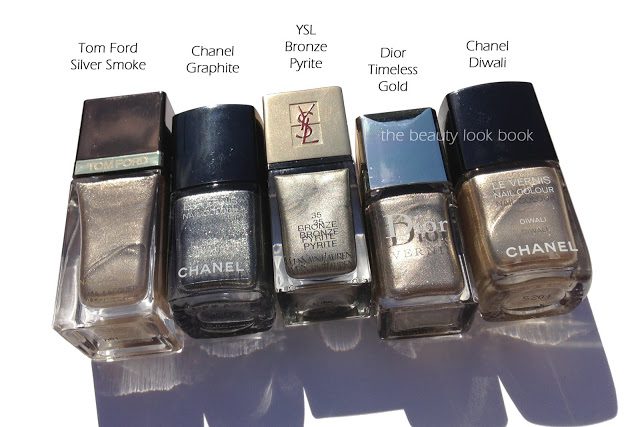
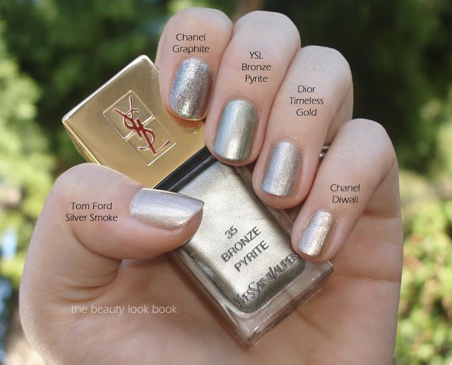
Compared to other metallic/high shimmers, YSL Bronze Pyrite is the most foiled/metallic looking compared to other similar metallics. Chanel’s Graphite has a more complex finish with larger sparkles, Tom Ford’s Silver Smoke is lighter and more neutral with a finely milled shimmer, Dior Timeless Gold has a more sophisticated shimmer and Chanel Diwali has more dimension.

Overall a huge thumbs up. I did get some tip wear on day 3, and on day 5 it started to chip a little. I found it lasted quite well throughout the week.
There is one more shade from YSL spring, a gorgeous seafoam green called Jade Imperial #34. I passed since it seemed so similar to one of the shades from last year’s OPI Holland collection but I didn’t try them side by side to compare.
I purchased mine from Nordstrom.
Uncategorized

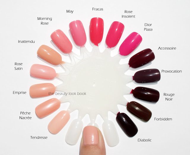
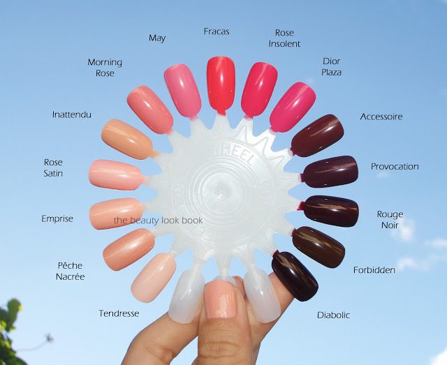
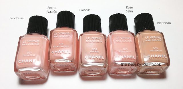
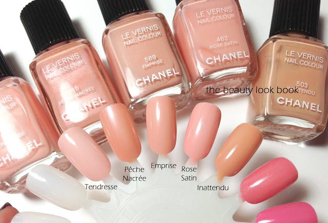
Comparisons for Chanel Emprise, Fracas and Accessoire Le Vernis

December 18, 2012

After swatching some shades from my Chanel Le Vernis collection, this is the verdict on dupes/similar colors:

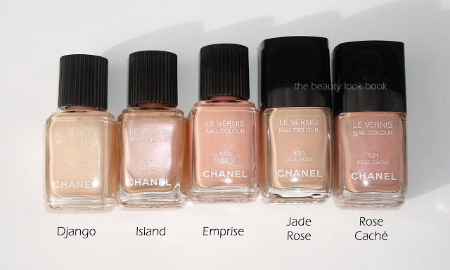
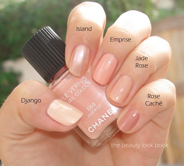
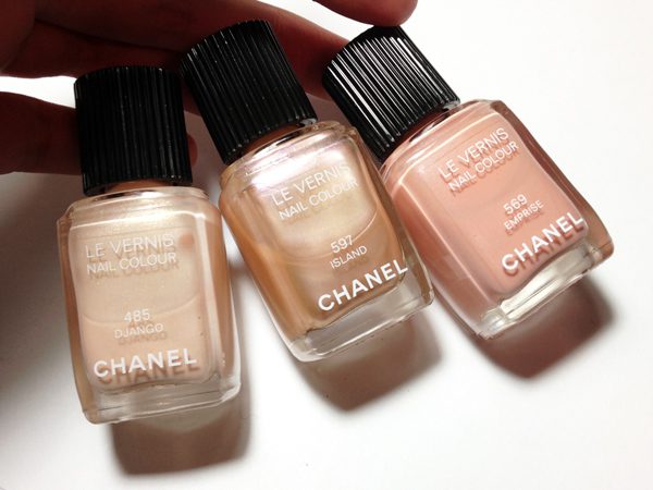
  • Emprise seems to be most similar to Pêche Nacrée, but Emprise is more opaque and pinkish on the skin while Pêche Nacrée is more pearly/peachy. I thought Emprise would resemble Django but it’s quite a bit darker and more peachy. Compared to Rose Satin, Emprise is similar but more opaque and peach. I thought Emprise would be most similar to Inattendu, but swatched side by side, Inattendu almost looks tan.
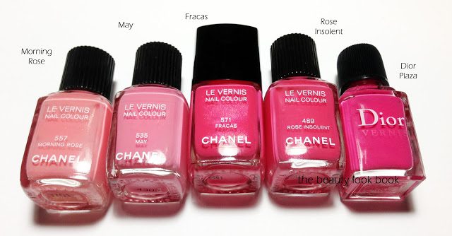
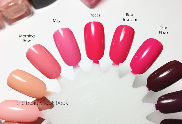
  • Fracas is a warmer and more vibrant version of Rose Insolent. Compared to other pinks, Fracas makes May look pastel. Fracas has a hint of melon when compared to Dior Plaza, but Fracas is still clearly pink. On the nails on my skin, I feel it’s almost identical in finish to Rose Insolent.
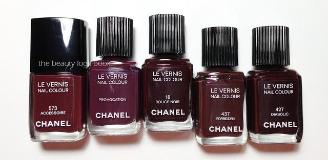
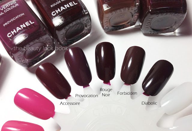
  • Accessoire is a lighter version of Rouge Noir. Compared to others, Accessoire is warmer/redder than Provocation (more purple/plum), more plum-red than Forbidden (most brown), and lighter and redder than Diabolic (the darkest one I have). On the nails, it’s hard to distinguish the difference between shades.

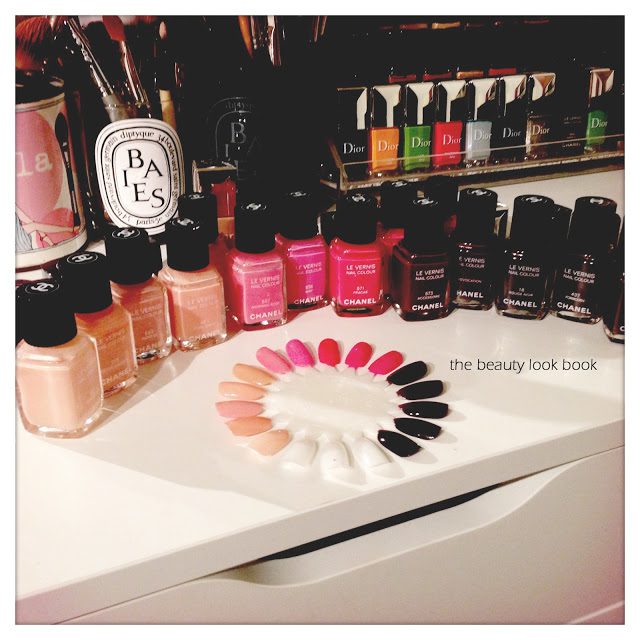
On the nail wheels: Tendresse, Pêche Nacrée, Emprise, Rose Satin, Inattendu, Morning Rose, May, Fracas, Rose Insolent, Dior Plaza, Accessoire, Provocation, Rouge Noir, Forbidden and Diabolic.

Some photos under artificial light, I hope this alternate view will give you a better idea of comparisons:

Although the spring shades from Chanel are very similar to existing colors, I still think they are beautiful options for the season. Perhaps not the most unique, but they are very flattering. My personal favorite is Accessoire even though I do not need another vamp in my stash.
Have you tried Chanel spring yet? What were your thoughts?
Uncategorized

Chanel Emprise, Fracas and Accessoire Le Vernis for Spring 2013

December 16, 2012
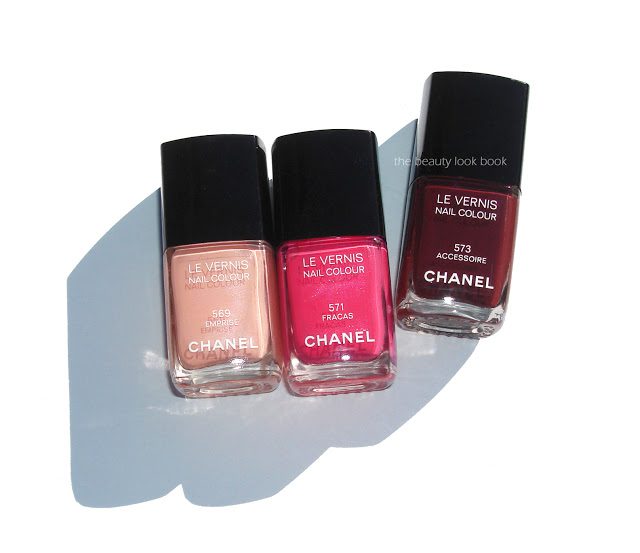
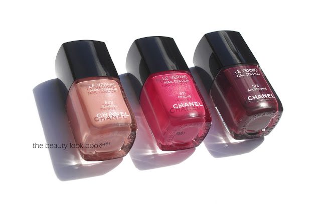
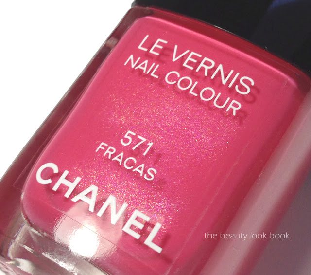
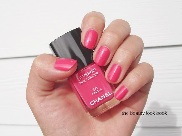
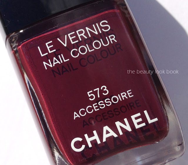
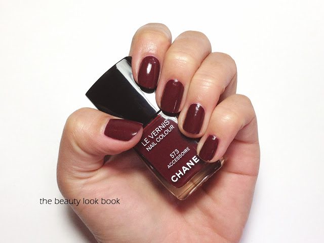
Chanel’s spring 2013 makeup collection Printemps Precieux de Chanel offers some beautiful colors this year. I ordered my items sight-unseen from Bergdorfs and have been very pleased with everything so far. First up are the three new Le Vernis shades in Emprise 569, Fracas 571 and Accessoire 573 ($26 each for 13 ml/0.4 fl oz, made in France). I found the shades from Chanel spring to be fairly similar to prior
releases, but think they are still beautiful options for spring. The
colors are solid staples that I think everyone should have in their nail
wardrobe. However, if you have a lot of Chanel or Dior nail polishes, you may want to shop your own stash or test these in
person before buying. The shades this season:
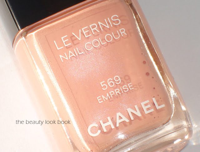
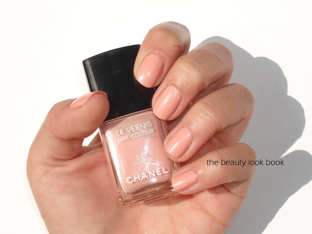
  • Emprise 569 is a soft peachy shade with a hint of pink, there is a subtle pearly shimmer infused in the bottle but the color goes on a cream, finish was semi-sheer, I found it needed three coats for even coverage
  • Fracas 571 is a hot pink melon fuschia, this shade also has that shimmery pearl in the bottle (like Distraction) but doesn’t quite show up on the nail, the shimmers made this one difficult to photograph, in some photos it appears more melon, but it goes on very similar to Rose Insolent, pigment and coverage is excellent
  • Accessoire 573 is a rich plum-brown cream that applies flawlessly with two coats, it’s very similar to other Chanel vampy shades, I was a bit surprised Chanel decided to release something so similar to Vamp, Diabolic, Provocation etc.
Below you can see in direct sunlight that Emprise and Fracas are infused with beautiful shimmer. I wish the shimmer was more visible when applied on the nails!
Close ups and swatches below, Emprise 569:

Fracas 571, note colors may vary per screen, this was really hard to photograph for me, I recommend checking Loulou17 and Blondy Candy for other swatches/photos:

Accessoire 573:

I’m working on comparisons now. Follow up post to come soon!
Uncategorized

JINsoon Nostalgia, Auspicious, Debonair, Rhaspody and Charade

December 12, 2012
Here’s a quick post showing some nail swatches of JINsoon Nail Lacquers. I’m still working my way through swatching so the feature will be split into two parts. Part 1 includes Nostalgia, Auspicious, Debonair, Rhaspody and Charade.

Nostalgia – two thin coats gives full coverage
Auspicious – extremely sheer, needs three coats for full coverage, below is shown with two
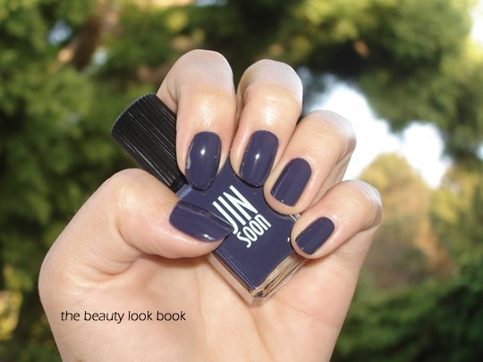
Debonair – sheer jelly cream finish requires three coats for full coverage
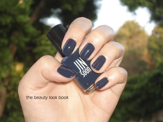
Rhaspody – semi-sheer, shown with two coats
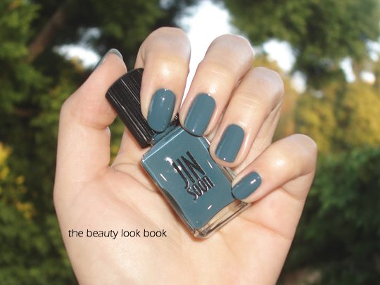
Charade – full coverage with two coats
Uncategorized

JINsoon Nail Lacquers

December 10, 2012

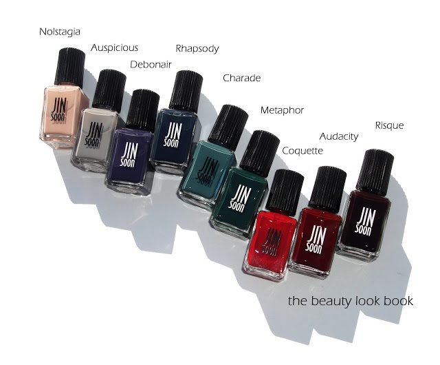
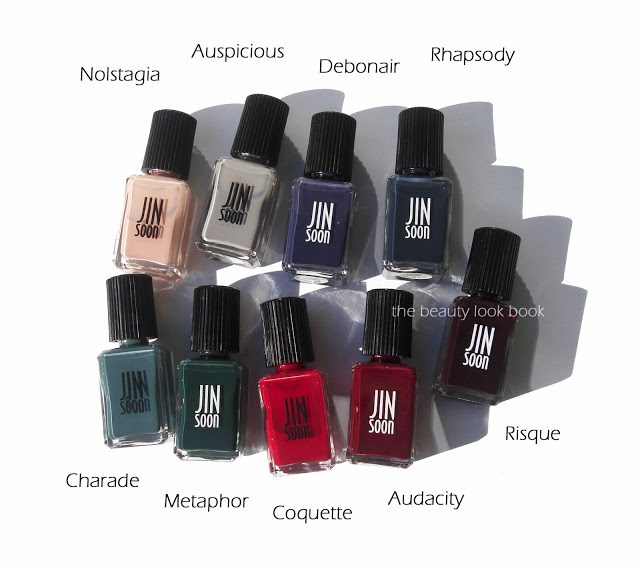
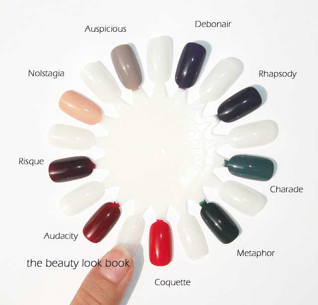
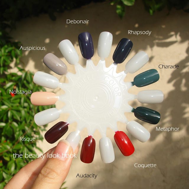
A gorgeous feature of JINsoon Auspicious from Messy Wands prompted me to order some JINsoon shades sight unseen from Sephora. In October, I featured JINsoon Coquette, a gorgeous sheer jelly red. Since then, I’ve had a few months to play with some more of the JINsoon nail lacquers that I ordered online from Sephora.com. They retail for $18 each and come with a black pull-off cap. (I’ve photographed them without the caps.) The past few months Sephora has had some amazing promotional codes for various discounts and gift-with-purchase sample packs. I found the offers hard to resist and I ended up ordering 9 different shades: Nostalgia, Auspicious, Debonair, Rhapsody, Charade, Metaphor, Coquette, Audacity and Risque. This is a preliminary review/swatch post with a few comparisons (scroll down to the end). Actual finger swatches to come in a separate post soon.
I found the bottle swatches online to be very true to the actual product. All the shades are creams (no shimmer). The pigment varies from a jelly finish to a full-coverage cream. Sheerer shades like Auspicious, Debonair and Coquette require three coats for full even coverage. The others are good with two coats. I found lasting power to be quite good with around 4-5 days without tip wear or chipping.
  • Nostalgia is a pretty full-coverage peachy nude with a tinge of pink
  • Auspicious is a lovely gray-lavendar with a jelly-transparent finish (3 coater)
  • Debonair is a sharp purple cream with a semi-jelly (3 coats needed)
  • Rhapsody is a dark navy blue, semi-sheer finish (2 coats needed)
  • Charade is a full-coverage gorgeous green teal
  • Metaphor is a dark forest green with full coverage
  • Audacity is a sheer aubergine
  • Risque is a sheer vampy color with a jelly finish
  • Coquette is a bright sheer red

Swatches below are with three coats:

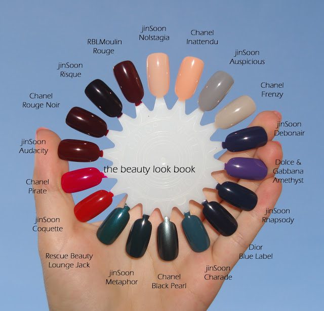
The colors look like basic creams. For the most part I think these are very likely dupeable. I searched through my Chanel, Dior and RBLs to see what I could find. Half the shades are unique while the other half are very close to existing colors. I pulled one shade to compare to each of the JINsoon polishes I bought. Thoughts:
  • Nostalgia is more neutral than Chanel Inattendu but has enough pink to not look like death
  • Auspicious is darker and more lavendar than most greys, it’s darker than Chanel Frenzy
  • Debonair is a unique dark purple (at least in my stash), it’s dark but not so dark it looks black
  • Rhapsody is very similar to other navys like Dior Blue Rebel
  • Charade is a gorgeous teal green, I found this quite unique, it’s very wearable for a green
  • Metaphor is a dark forest green cream, I don’t have a lot of greens to compare
  • Coquette is warmer than Chanel Pirate
  • Audacity is very similar to other vampy shades, it’s a sheerer version of RBL Moulin Rouge (very close)
  • Risque is a dark vamp, it’s darker than Chanel Rouge Noir
Overall I’ve found that the JINsoon nail polishes have performed well. The shades are flattering on my skin and are good classic shades. For me they were worth the price I paid (about $14-$16ish for each shade from using a 10% discount or 20% discount code for VIB). Some of the shades have a jelly finish which require more coats unfortunately, but the good thing  is that these dry relatively fast. Some might ask how the JINsoon compare to my other favorite brands. Long time readers know that I’m a die-hard Chanel, Dior and Rescue Beauty Lounge nail polish fan. My heart still belongs to those brands for color/pigment even though they are higher in price. I would say that JINsoon performs similar to NARS/Dolce & Gabbana, better than Sephora for OPI, but not quite as good as RBL, Chanel or Dior (at least in my experience).
Have you tried any of the JINsoon nail polishes? Thoughts?