Browsing Tag

Highlighter

Uncategorized

Chanel Rose Initiale Powder Blush #72 and Lumière d’Artifices Beiges – Fall 2012

June 23, 2012

A quick peek at the new blush and highlighter from Chanel’s fall 2012 collection: Rose Initiale #72 Powder Blush and Lumière d’Artifices Beiges. A more detailed review on each item to come soon.

In natural sunlight:

Under artificial light you can see the sheen of both a bit better:

Swatched (I’m a Chanel B30):
the Beiges Highlighter first has the pale beige
then medium rose-beige swatched
followed by both shades mixed

Uncategorized

Burberry Iconic Nudes Summer 2012: Sheer Summer Glow & New Lip Mists

May 8, 2012

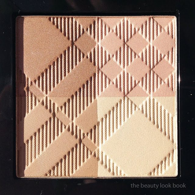
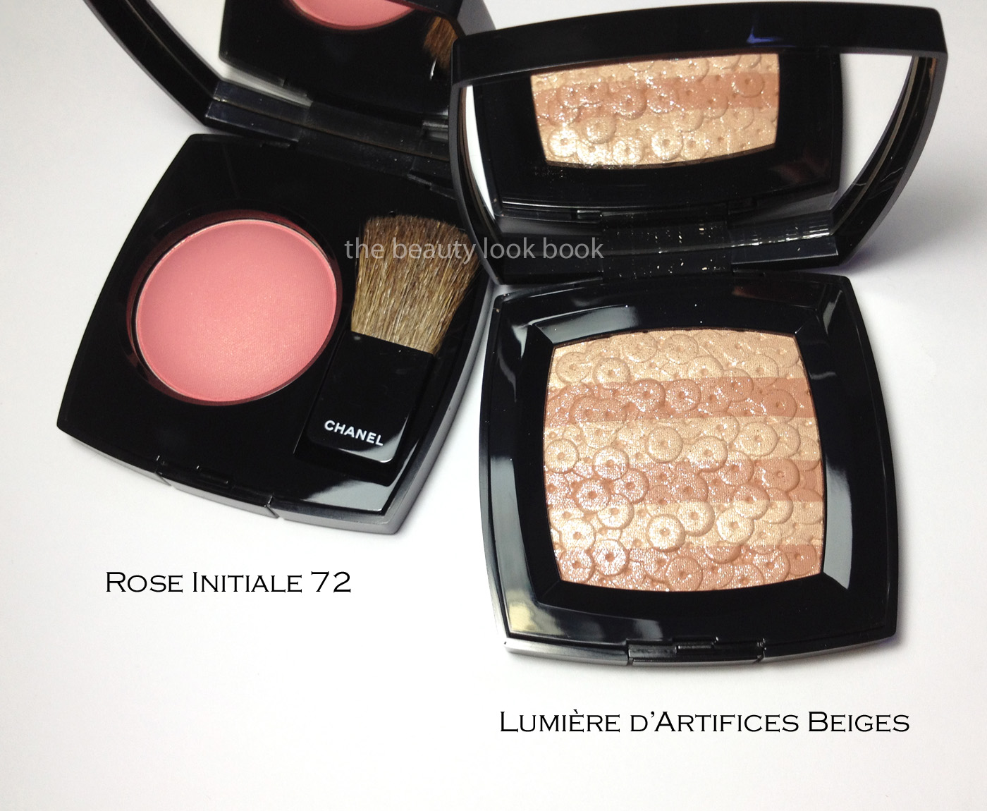
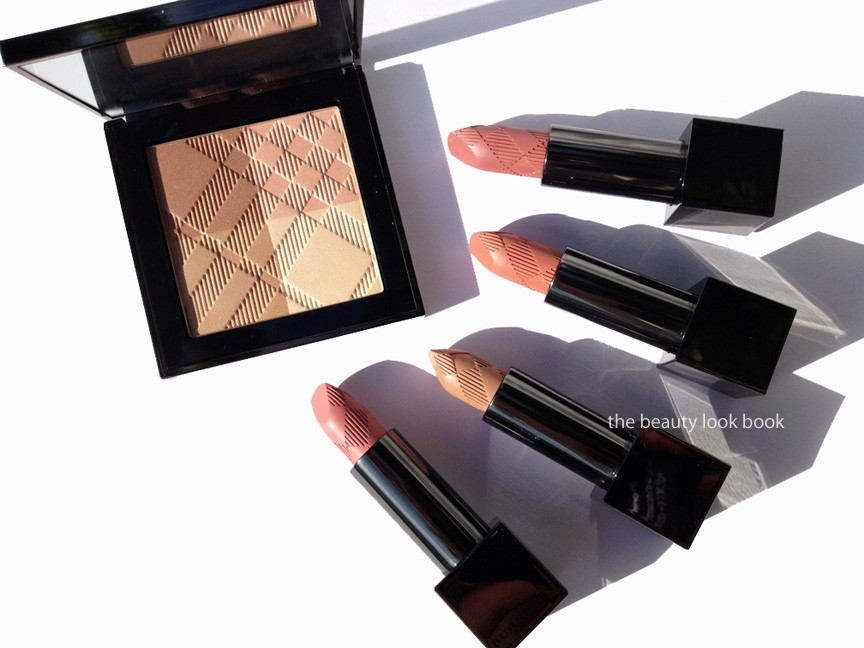
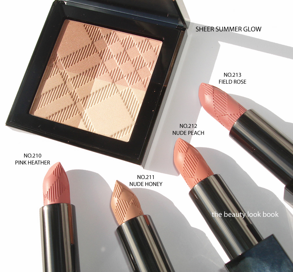
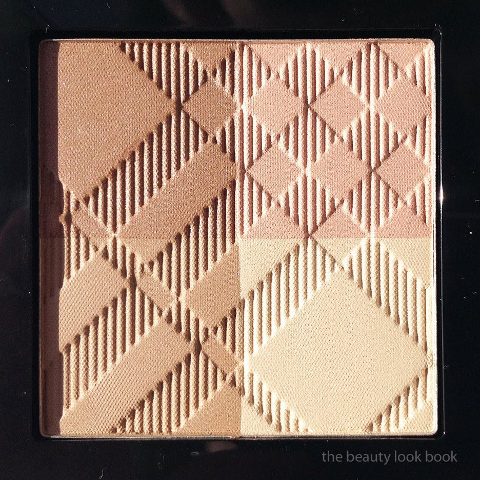
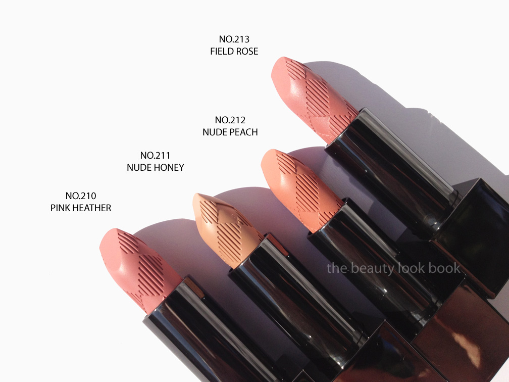
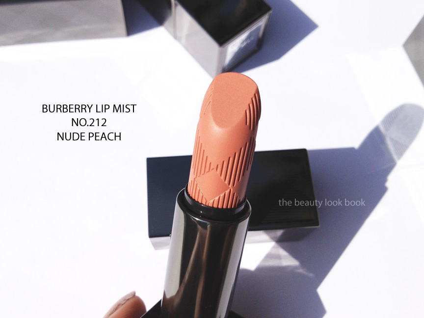
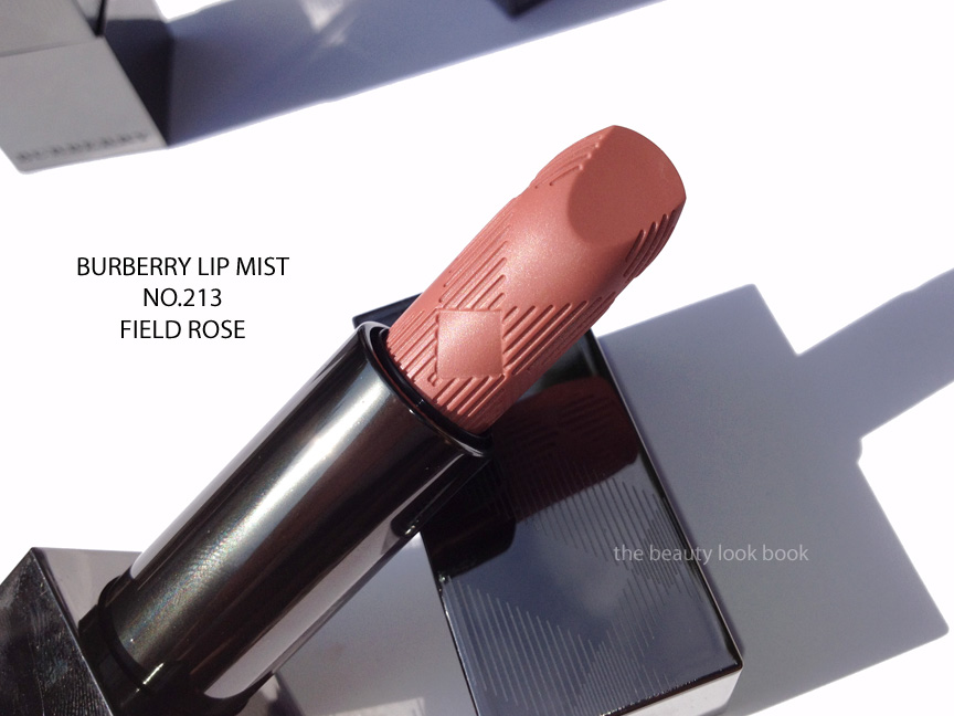
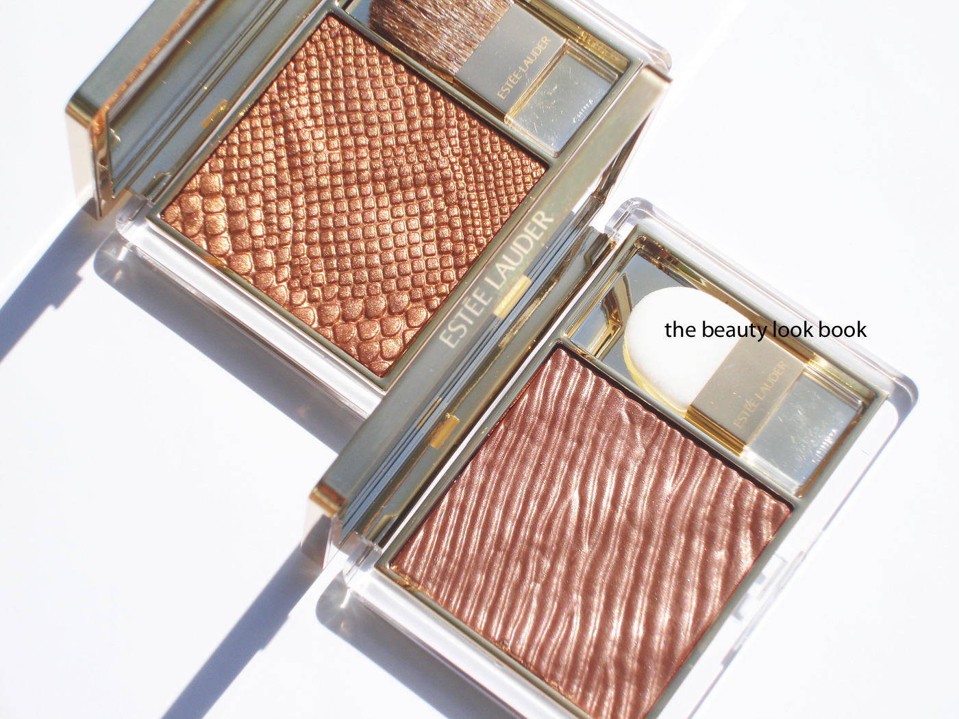
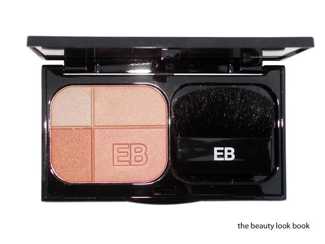
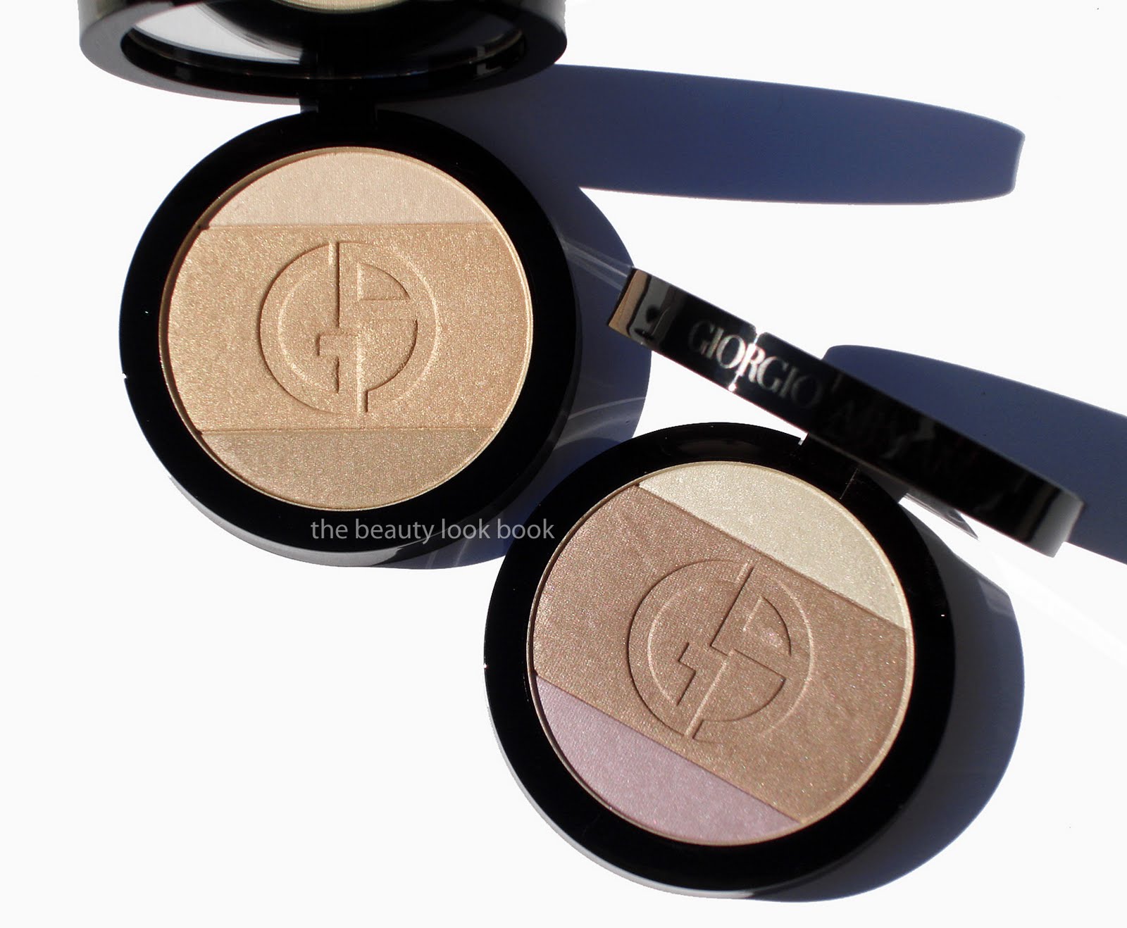
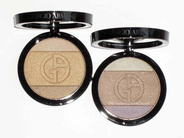
This summer Burberry Beauty has released a small collection featuring a new highlighter quad Sheer Summer Glow ($50) and four new shades of their sheer lipstick in the lip mist formula, 210 Pink Heather, 211 Nude Honey, 212 Nude Peach, and 213 Field Rose ($30 each). The theme for the entire look is subtle nudes. Everything is extremely natural.

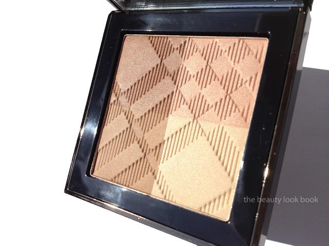
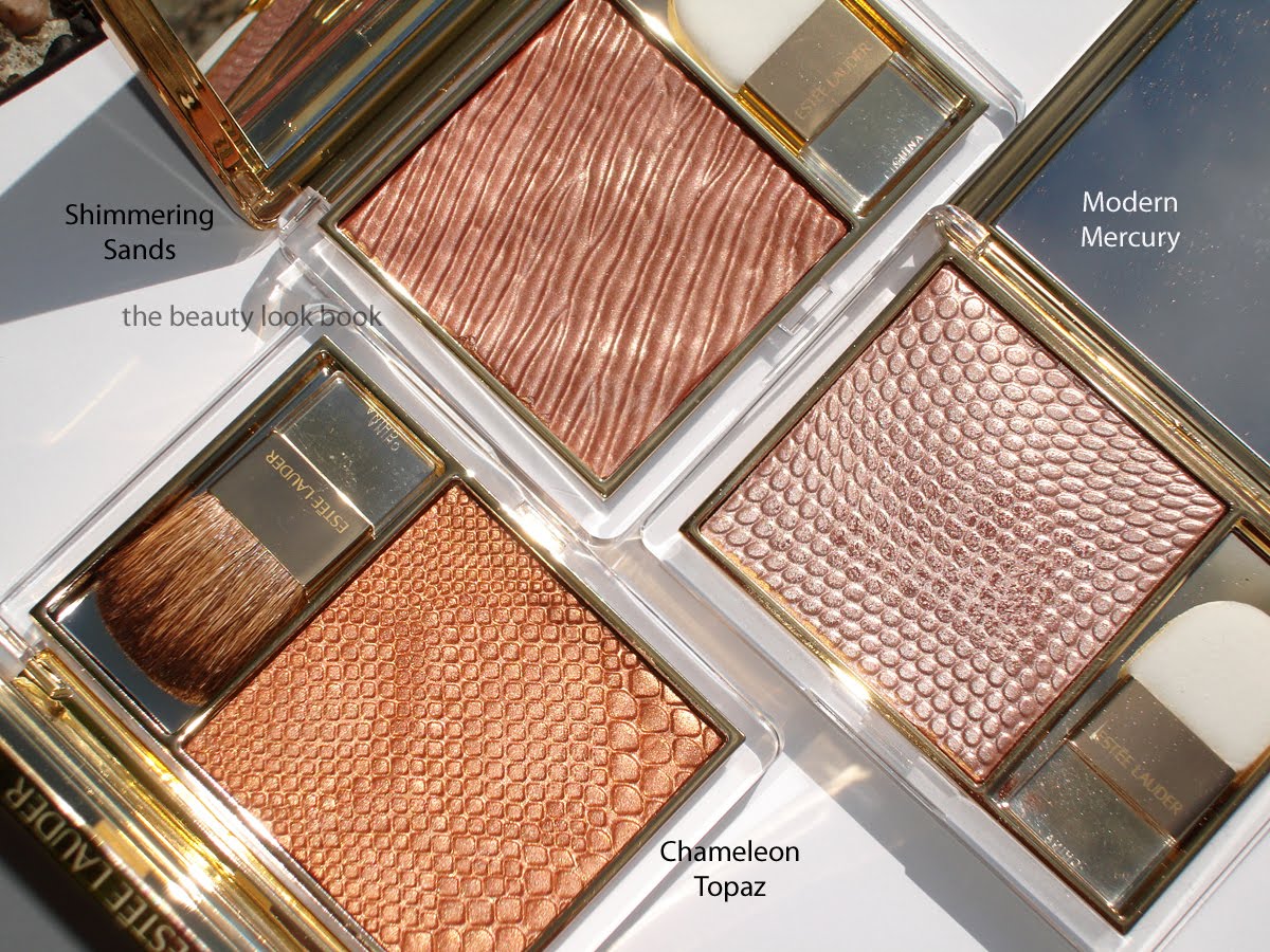
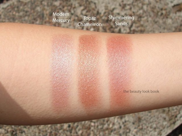
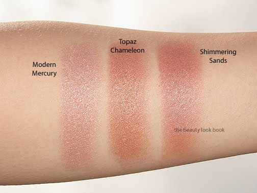
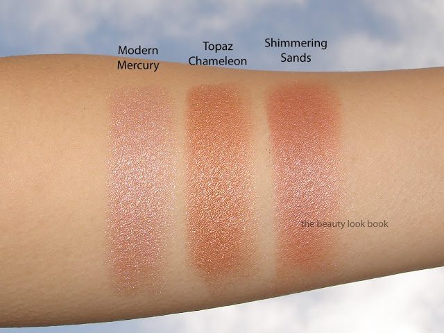
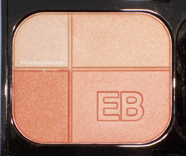
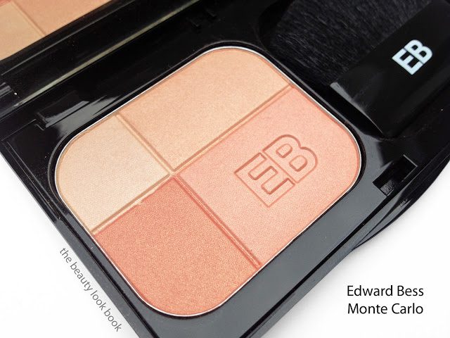
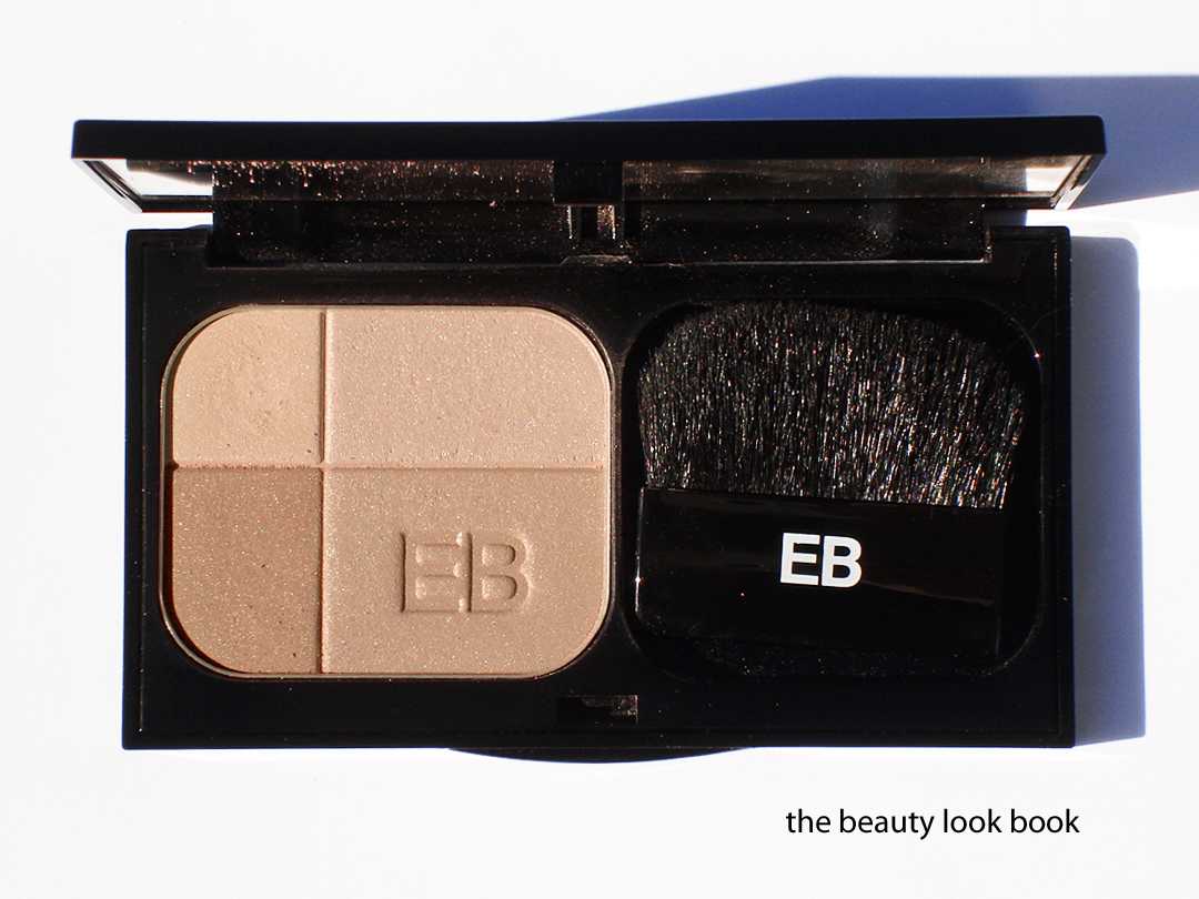
Based on preview promotional photos, I envisioned the Sheer Summer Glow to be subtle and natural, but I didn’t expect it to be that natural. The quad is designed for the face as a highlight or contour. There are two shades of tan, a soft mink pink and a warm pearly ivory color – all shades have a luminous sheen. Some have discussed using this as an eyeshadow as well. I personally think it is too sheer to pull off on the eyes for my coloring, although it does create a soft wash of color (high emphasis on soft). Note that the wash is extremely subtle and sheer. On the face, to have this show up better on my skin, I applied over a cream bronzer like Chanel’s Tan Soleil (their cream bronzer in the round tub which I’m not sure if it’s still available) or NARS St Barts Multiple. The finish is a luminous sheen without the frost.

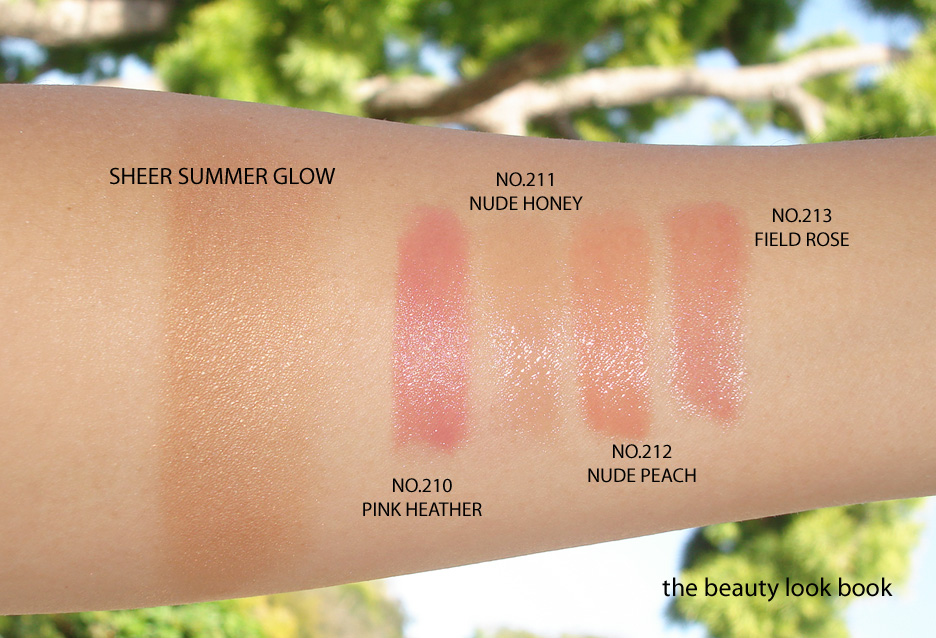
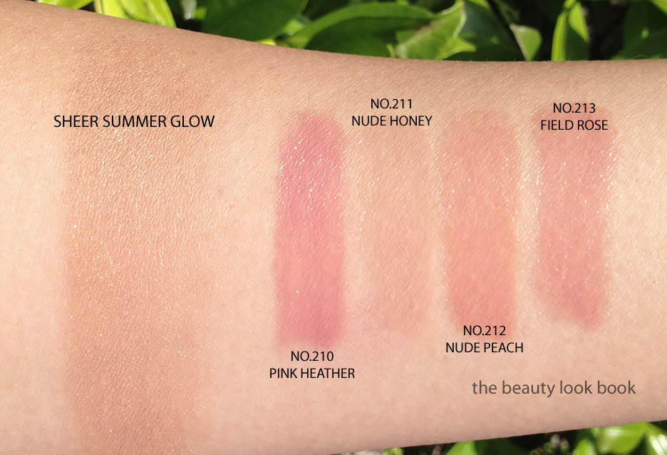
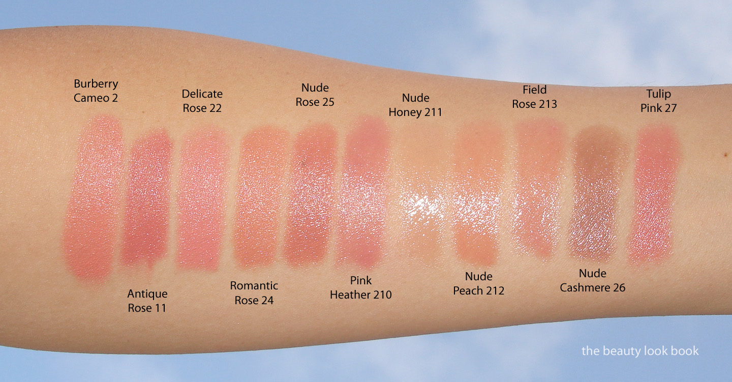
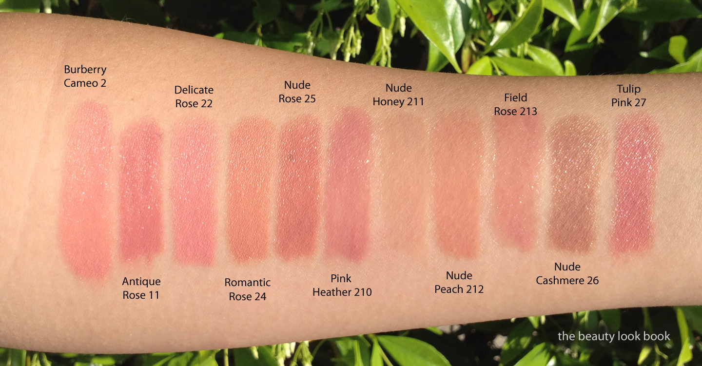
Lip Mists are a sheer creamy gelled type of lipstick formula. They are the sheerer option in the Burberry line. This season has four shades, don’t let the swatches below fool you. They are indeed sheer but apply with much more coverage on the lip with excellent lasting power. The impact on the lips surprised me with Pink Heather and Nude Peach. I have not yet tried Nude Honey but it looks extremely nude.
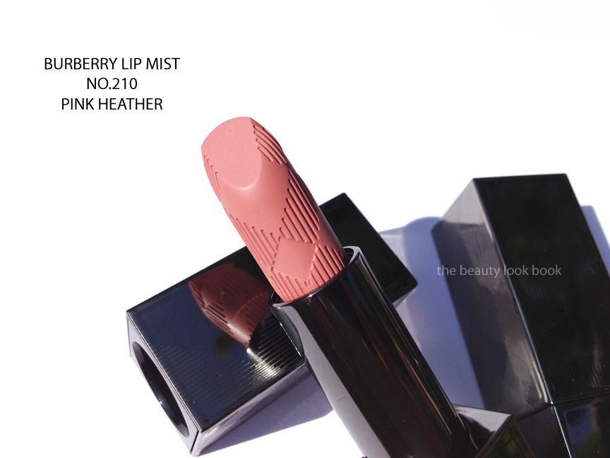
  • 210 Pink Heather is a soft cool pink
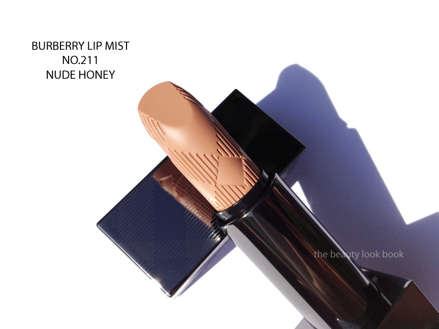
  • 211 Nude Honey is a sheer flesh beige
  • 212 Nude Peach is a nude light peach
  • 213 Field Rose is a soft rose pink (warmer than Pink Heather)

As many others have noted the entire Burberry Beauty line has been extremely well designed in all aspects from packaging, to quality, product finish and color selection. I’m currently obsessed with Pink Heather Lip Mist – it’s the perfect natural cool pink. The highlighter I could have passed on mainly because I like a more defined contour rather than something so subtle. Swatches of the entire collection (note I swirled and swiped the highlighter palette with a heavy hand, be sure to check other blogs for individual swatches and different application methods):

See other reviews and swatches on other skin tones:

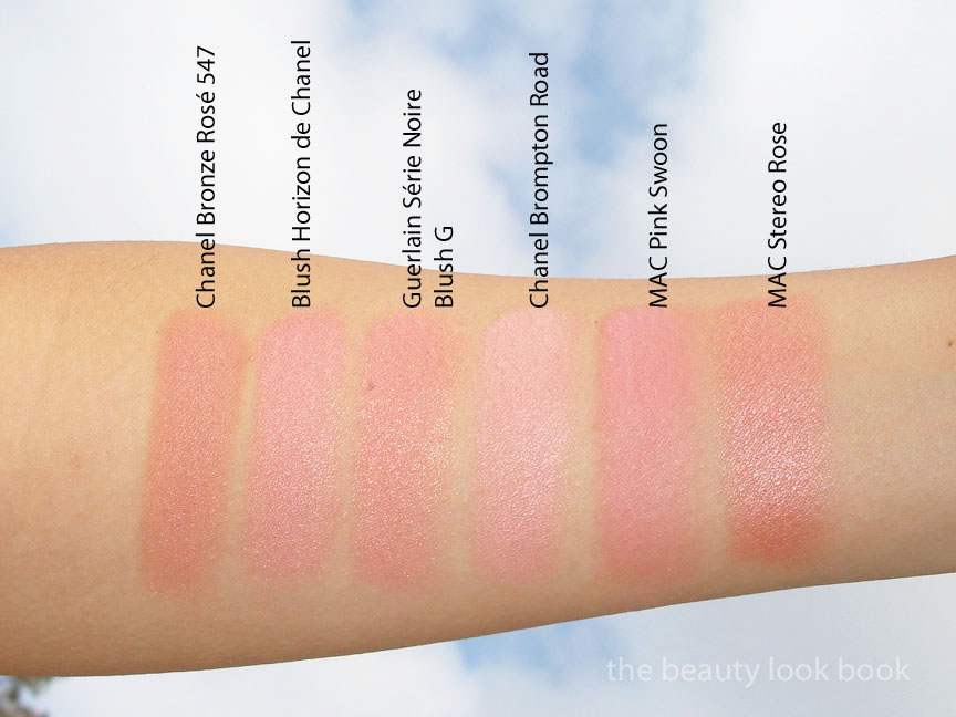
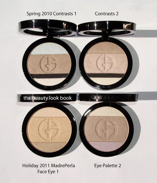
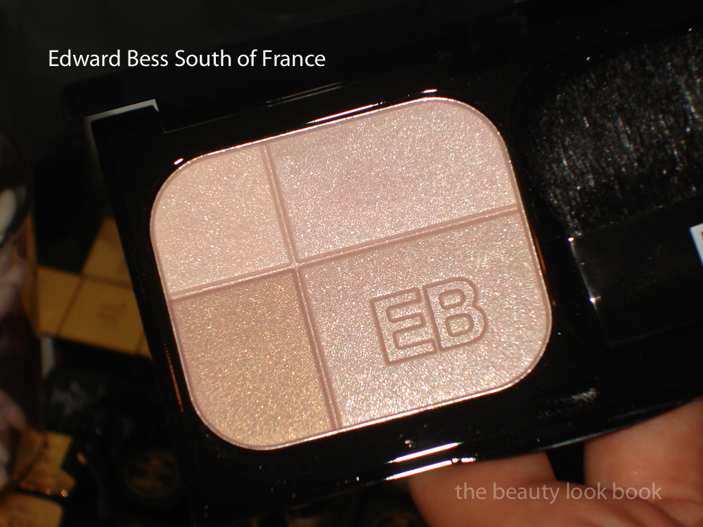
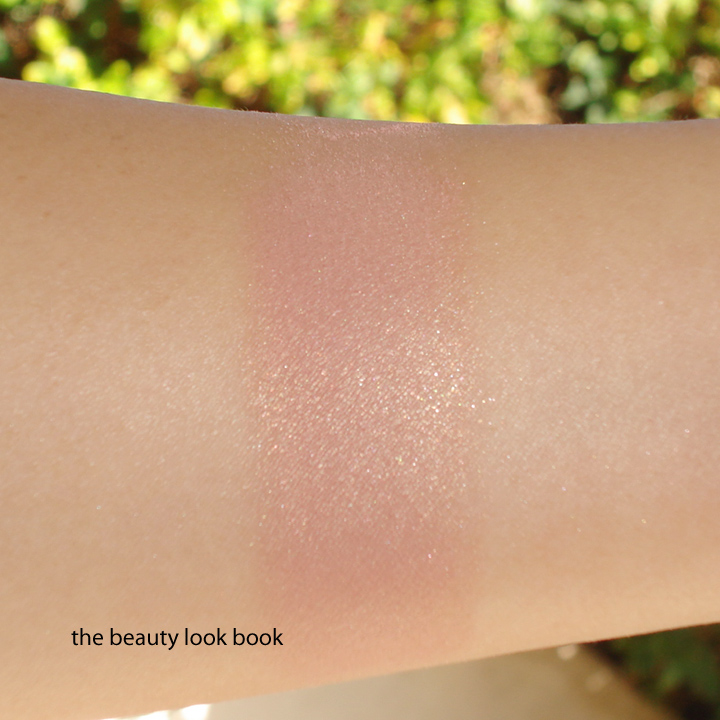
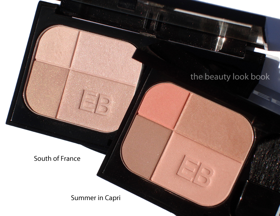
Swatched comparisons below, two views of each set in different lighting.

You will notice with the lip shades that most swatched comparisons have more pigment because they are the Lip Cover Formula (Burberry’s regular lipstick). Yes, there are very similar colors in the existing lineup, there are subtle differences between each shade in the undertone or base color. Do note that the colors will apply differently on your lip based on your skintone and natural lip color. For more detailed descriptions on the differences, I highly recommend you call your local Burberry counter for extra assistance. In my experience they’ve been extremely helpful in describing the differences between all the nudes, pinks and roses in the line.


I found the entire line at Nordstrom. It’s currently available online at Nordstrom.com as well.
Uncategorized

Estée Lauder Pure Color Illuminating Powder Gelée: Topaz Chameleon and Shimmering Sands

February 27, 2012

It feels as though I blinked and an entire week flew by without me realizing it. It’s almost the same with spring and summer collections these days. I could have sworn I just looked at the Spring Topaz collection from Estée Lauder and I was completely surprised to see the Summer Bronze Goddess collection at Macy’s during my lunch break on Friday. (Summer in February?!) Continuing the trend with the Pure Color Illuminating Powder Gelée, Estée Lauder has released another gorgeous embossed face highlighter this season called Shimmering Sands ($42 for .15 oz/4.5 g) which is a metallic bronzey pink. Topaz Chameleon ($40 for .17 oz/5 g) was from their Spring Topaz collection and I was lucky to find one in store this late after the collection launched. (It took me a while to decide to buy this one if you’re interested, I suggest you act fast).
Both highlighters are highly metallic but easily layerable for a more subtle glow. Illuminating Powder Gelées have a very unique gel-powder-cream formula. It’s not quite a cream like NARS Multiples but not quite a powder. Still, I wouldn’t describe it as a cream to powder since the finish is slightly dewy (only very slightly). Shimmering Sands and Chameleon Topaz both come with a beautiful embossed texture. I found both extremely pigmented with multidimensional shimmers. The formula seems to adhere to the skin quite well but blends in without looking like it sits on top like some metallic highlighters do. Although these are called “highlighters” there is so much color I can’t imagine wearing these over any other product (aside from powder and foundation). The tiny applicators pick up quite a bit of pigment but I prefer to use a full sized powder brush for a sheerer application over the cheeks. I love that the shimmers are not oversprays. Here are a few more photos side by side at different angles.

In direct sunlight with flash, here you can see the metallic flashes:

Topaz Chameleon is a warm golden copper. At first swipe I was intimidated by how warm and pigmented the color was and walked away. It wasn’t until after seeing it on Karla Sugar, Temptalia and Makeup and Beauty Blog that I decided to revisit and try on the face. I thought it would look too orange/copper/yellow but it surprised me. It warms up the face to give a summery bronzed copper glow. I do recommend using with caution. One extra swipe could easily overdo it. Make sure your face is well prepped with a good base and foundation. Without it this can emphasize pores (at least in my experience, I like to use Koh Gen Do’s Royal Massage Milk and NARS Tinted Moisturizer these days). This one is very limited in stores but can still be found online at a few places.

Shimmering Sands looks like a soft champagne bronze in the compact but goes on quite a bit darker than I expected – like a bronzed pink. On my skin the pink/brownish tones pull more strongly and gives me an almost brown-burnt look if applied too heavily. Finding the right balance might take a bit of work but this one is still lovely. The shimmer effect is more subdued compared to Modern Mercury (from fall 2011) and Topaz Chameleon. I find this to be more of a true bronzer rather than a highlight. Does this one pull brown/reddish on your skin or is it just me? Perhaps tan skinned or darker skin girls will find this less of a bronze and more of a highlight.

Here are all three Illuminating Powder Gelées from Estée Lauder: Modern Mercury (Fall 2011), Chameleon Topaz (Spring 2012), Shimmering Sands (Summer 2012).

Swatches, heavily on the skin. I recommend you check out the other blogs I linked above to see the sheer vs. heavy swatches. There is no way I would ever wear these this heavy on the face but sheered out it was hard to get photos of the arm-swatches. I think Temptalia’s photos demonstrate how well these blend on the face. Also re-visit the reviews from Cafe Makeup on Modern Mercury to see the effect on Liz (see how it blends out on the cheeks versus swatched on the arm).

Modern Mercury is still my favorite. I wish it was a permanent product as I do think it is something I would like to repurchase when I hit pan (not that it will happen soon, but still). Topaz Chameleon is close second. I feel the latest Shimmering Sands is too dark for me right now, but when real summer arrives and I get my tan back I think this will work better for me. I’m all about dramatic bronzers but even this one is a bit too much for me.
Uncategorized

Edward Bess Quad Royale in Monte Carlo 02

January 16, 2012

This past weekend I had a much needed girls’-day-out in LA. On our list was a stop at Neiman Marcus Beverly Hills to check out the newly launched Tom Ford beauty line and of course our favorite girls at the Edward Bess counter. I didn’t expect to see anything new from his line (although I’ve been eagerly waiting for his eye bases to be released) but spotted a new Quad Royale in Monte Carlo 02 a beautiful highlighter quad of peachy goodness ($45 for 0.25 oz/7g). Being the peach fanatic and EB fan that I am, I snapped one up immediately without even trying it at the counter (I had other blushes on that I was testing from another brand).

Monte Carlo 02 is the third Quad Royale face highlighter Edward Bess has released. It has four colors in a black mirrored compact, all different variations and intensities of peach shimmer. The lightest shade is a pale champagne but the others are darker and more pigmented. I previously featured Summer in Capri 03 and South of France 01 in prior months and love layering them over his Daydream Bronzer or other blushes to add a soft glow. I find they are perfect for my medium skintone to add a subtle highlight to brighten the face. Monte Carlo is also a highlighter but I find the colors darker so this could also work as a blush. I do find it more pigmented and more shimmery than the others but in a beautiful sense (it’s not overly frosted). The texture is similar to that of the other quad royales: smooth, finely milled shimmer and easy to blend on the face for a natural glow. I do find it a bit harder in texture compared to his original version of the Daydream bronzer which is the one I have featured in the past. The Quad Royale still applies smoothly and easily on the skin. Monte Carlo has no detectable scent. I love the brush that comes in the compact – it’s a step up from most compacts other brands have and is usable to dust the cheeks evenly with color. Here are all 3 of Edward’s face quads plus a few more close up shots:

Outdoors, cloudy lighting, no flash:

Ingredient listing (clickable for larger viewing):

On the face it applies shimmery. I have worn this as a blush alone but prefer this layered over another semi-matte to fully-matte product (whether it is blush or bronzer). I was hoping for sun this weekend but it was overcast. Here are the best swatches I could manage:

A few comparisons to other peachy blushes and bronzers. There are others I could have pulled but right now I am limited on time so I pulled a small sample to help give you an idea of the color. Please note that right now I do not have time to accommodate extra comparison or dupe requests.

Swatched left to right: Bobbi Brown Nectar Shimmerbrick, Dior Aurora, Edward Bess Summer in Capri, Edward Bess Monte Carlo, MAC Ripe Peach

Bottom line: love. It gives a natural peachy glow with a subtle refined shimmer. Pigment is sheer but noticeable on the skin with one swipe and it is also layerable for more color. If you have Summer in Capri, do you need Monte Carlo? They are similar in color but the Summer in Capri has bigger portions of lighter shades while Monte Carlo has more peach. I think they are different enough to justify both. Is Monte Carlo a must-have? In my opinion yes, even with the dozens of peachy shimmers I already own, yes.
As of this past weekend I was not able to find this anywhere online for sale. I do know the Beverly Hills Neiman Marcus counter has this. I highly recommend you call them to order if you’re interested. I have not yet checked with the Bergdorfs counter.
Uncategorized

Blush Horizon de Chanel for Spring 2012

December 12, 2011

The new Blush Horizon de Chanel ($58) is the star product of the Harmonie de Printemps Collection for Spring 2012. The new Glowing Blush Harmony is a stunning palette of soft luminous pinks, white, plum, peachy-pink and gold. I believe this will be a universally flattering pink. It has a good mixture of cool and warm tones with the alternating stripes. There are several variations of pink to suit everyone’s taste. This powder I took a soft blush brush and swirled the colors together before applying. On the face this is a very soft glowing pink, not overly frosty, but a hint of shimmer is visible on the face. Each stripe appears to have a different degree of shimmer which I find lovely. On my medium-toned olive skin (Chanel Perfection Lumiere B30) it gives a soft medium pink glow. On darker skins I think this will be more of a lighter highlighting pink, still visible, and absolutely gorgeous. Be sure to check out Makeup Magpie and Best Things in Beauty if you haven’t seen their photos yet.

Here at an angle you can see the glow better and the variations in the colors between each stripe (I believe the gold goes all the way through to the bottom of the pan):

Swatched & swirled (the heavy blended swatch looks frosty because of the high flash, but on the face it is not quite as frosty, I recommend you check out Best Things in Beauty’s swatches):

While striped blushes aren’t new, Chanel has created a beautiful fresh new variation with the Blush Horizon de Chanel. In the past few weeks, Amy from Café Makeup and I pondered how the new Chanel compared to compared to Guerlain’s Série Noire Blush G from last spring. On my skin, the Guerlain looks brighter and more peachy. The Blush Horizon de Chanel is more subtle & pink. I feel it’s a combination between Brompton Road and Narcisse without the chalkiness.

I haven’t seen any other spring collections in person yet, but I can already tell you this is a must-have for the season.
Uncategorized

Armani Madre Perla Palettes for Holiday 2011

November 14, 2011

Armani has released two palettes this holiday season for their Madre Perla Collection. The theme for the eyes and cheeks are shimmery golds, nudes, pearls and silvers. I found the collection has arrived in-store at Neiman Marcus. One is a Face & Eye Palette #1 (the golden one) and the other is designed as an Eye Palette #2. Both are $59 each and are limited edition. The two palettes contain three shades each, very reminiscent of Nude Contrasts from Spring 2010. I approached these with a bit of hesitation. As beautiful as the colors were from Spring, I have to admit both palettes have barely been used. All the colors (except the black) from the spring eye palettes show up similar on the skin which results in just one overly-sparkly eye when the colors are layered. Still, the palettes this season took my breath away as soon as I saw them. The palettes were a bit difficult to photograph to capture the dimensional aspect of the shimmer. I’ve tried several angles to try and help give you an idea.
Madre Perla Face and Eye Palette 1 is a trio of golds. The texture is soft, slightly powdery and fairly shimmery. Applying with an eyeshadow brush (or a denser brush) results in a very shimmery pigmented application. I wore this on the eyes last night to a play and it was beautiful but definitely on the sparkly side. The three colors you have are pale ivory, warm pale gold, neutral tan gold. I feel the colors are uniquely distinct from each other when swatched on the hand but if you want to layer three shades I think you can only create a subtle gradient. Since the payoff with a small brush was so pigmented I was worried it would be too frosty for the face, but applying with a regular brush brush (I used Bobbi Brown’s when testing this one) resulted in a sheer but visible wash of shimmer. Love!

Madre Perla Eye Palette 1 is also beautiful with a cool sharp white with gold frost, neutral tan beige shimmer and cool lavender. I’m not a fan of lavender shades but I learned from Le Metier that this color can be a great highlight to layer over beiges/tans and golds. I really love the middle shade, it’s like a soft beige with a slight hint of grey shimmer. I applied the middle shade first over most of the lid, then added the lavender to center on top and blended. I then added the ivory-gold as a very soft highlight near the top. Today I used Bobbi Brown Bronze gel liner to finish the look. Overall it’s a stunner but very pale. Next time I will need to add a darker contour like Chanel Sand.

Here’s another close up plus swatches:

Comparisons of last year’s highlighter (less yellow and lighter) to this year’s:

Palette comparisons from Spring 2010 to Holiday:

Overall all out gorgeous, not overly frosty, beautiful for holiday. I will definitely get more use out of these than the spring 2010 palettes. They are more versatile and wearable in my opinion.

Uncategorized

Edward Bess Quad Royale in South of France

November 5, 2011

Edward Bess has released some new things for holiday this month including his new South of France face quad and two palettes Berry Chic and Back to Basics (see sneak peek here and also featured on The Non-Blonde). These items literally just arrived at counters to Bergdorf Goodman and the palettes are now on EdwardBess.com. First up is a review on his newest Quad Royale palette, South of France 01 ($45 for .25 oz/7 g), a beautiful glowing opalescent powder quad of pale shimmers. The palette is inline with this year’s holiday theme of subtle-glow and has the slightest bit of overspray on top (at least it appeared so in my eyes). Underneath the powder is still shimmery and glowy and beautiful.  The colors from the top left clockwise are: soft cream beige-peach shimmer, soft nude pink, soft darker nude pink, subtle golden pink beige. When mixed together the effect is subtle and South of France gives the cheeks a soft pale opal pinkish glow that is understated but visible. Using the brush in the compact (soft and fluffy) gives an ultra sheer wash. I prefer using a denser blush brush (like Bobbi Brown’s or Shu Uemura’s) for a more visible look.
With the overspray and a high flash, the powder simply glows:
In direct sunlight, overspray removed, without the flash you can see the palette is subtle and not overly frosted. Here you can’t really see the glow well, but this gives you a good look at the base colors and undertones of each shade. Note that even with the overspray gone it still glows depending on the angle you hold this against the light.

See here this still glows when held at an angle:

Note this is swatched with a very heavy hand, on the face it’s lighter and more subdued:

Here are his two Quad Royale quads, South of France 01 (more pink and glowy) and Summer in Capri 03  (more contoured and peachy, reviewed a few days ago), I’m hoping there is a #02 to be released soon, maybe for spring?

Overall I adore. Subtle, refined, and absolute glowy perfection. These are sheerer than his cream highlighter in Sunlight so if you want something more visible I think you will be happier with the creams. I tried to think of something I could compare South of France to but just couldn’t. The mixture of gold, pearl, beige, pink in South of France is just gorgeous and the powder gives depth with the darker tones of the bottom left corner shade. Is this a must-have? Absolutely yes. If you asked me to choose between the two quads, I would not be able to, I need both.