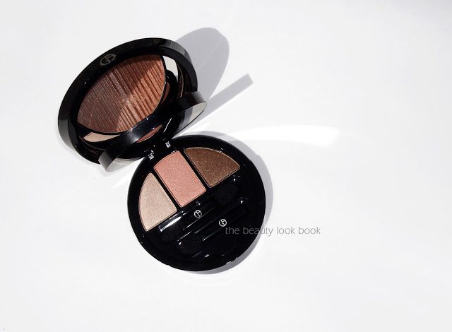
Giorgio Armani’s Bronze All-Over Palette for Summer 2013 just might be this season’s prettiest palette ($88, limited-edition). It’s a sleek two-tiered palette with a gorgeous bronzer on the top and three shimmery neutrals on the bottom. Many thanks to Café Makeup for giving me the heads up as soon as this arrived online at Giorgio Armani Beauty. It’s a luxurious splurge but a definite must-have for this season.
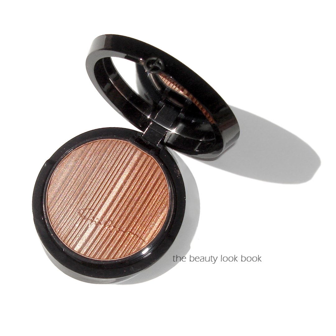
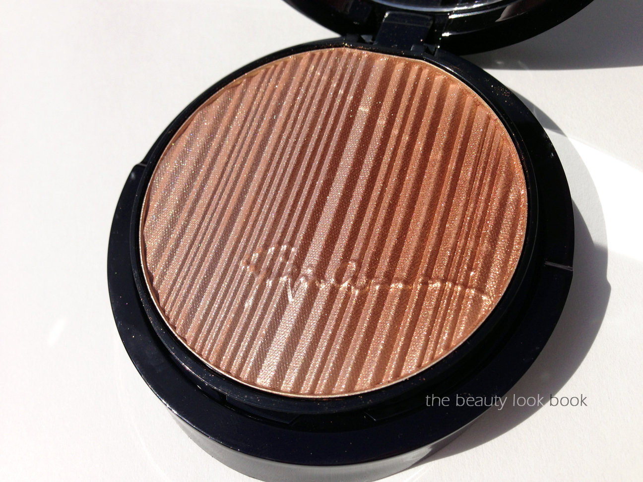
The bronzer is a stunning golden luminous bronze. It has a metallic overspray making it look like sunshine in a compact. Underneath is a soft glowy golden bronze that makes the skin just glow. I love that it’s luminous without emphasizing pores and that it does not turn orangey on the skin.
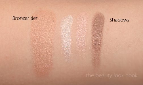
The three shadows below are stunning neutrals with incredible pigment. There’s a soft cream, a neutral peach-pink and a bronzey shimmer. Without any base the colors are rich and very pigmented. The textures are extremely soft and finely milled (think along the lines of the better Burberry and Urban Decay soft shadows). They are very easy to blend and goof-proof.
Swatches below, two different views with different lighting:
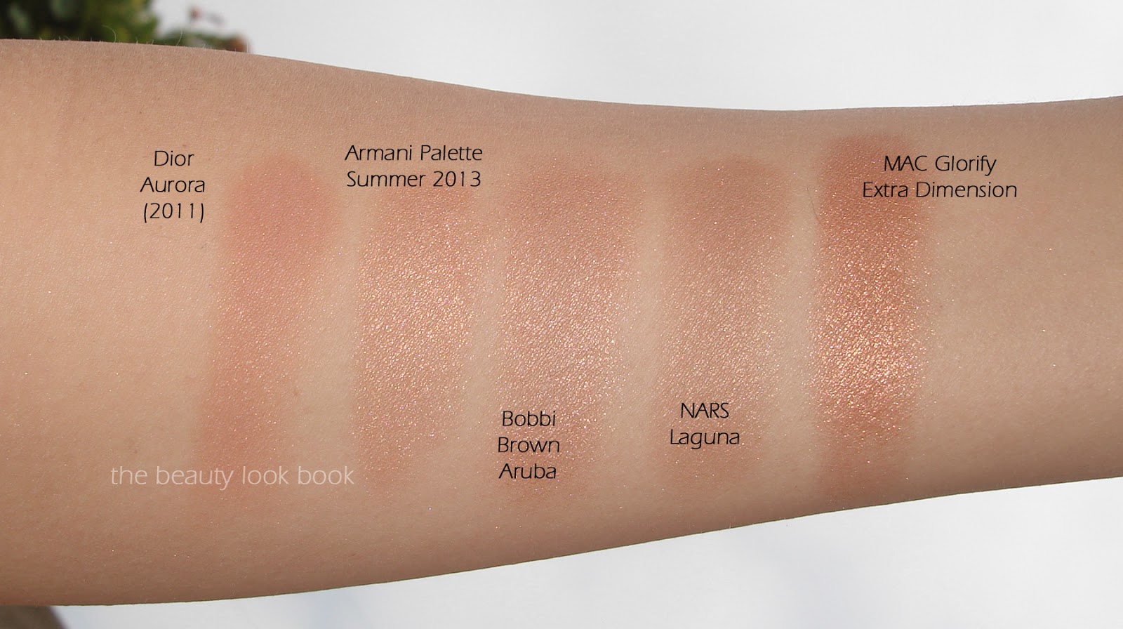
A few comparisons below. The Armani Summer 2013 Bronzer is similar to Bobbi Brown’s Aruba, but the Armani is less frosty on the skin and the soft texture prevents it from turning orange.
For eyeshadows, I thought Armani Summer 2013’s shades would be a dupe for Chanel’s long discontinued Shimmering Dunes, they are actually different.
Armani’s Summer 2013 Bronze All-Over Palette is definitely a luxurious splurge but worth every penny. See other swatches and reviews on other skintones at Café Makeup, Temptalia, Beautezine and Best Things in Beauty.
Giorgio Armani Summer 2013 Bronze All-Over Palette retails for $88 and is limited-edition. It is available at all Armani Beauty counters and online at Nordstrom.com (free shipping), Giorgio Armani Beauty (complementary shipping with orders of $75+), Saks.com.
This post contains an affiliate link, for more information see the About/FAQ section.
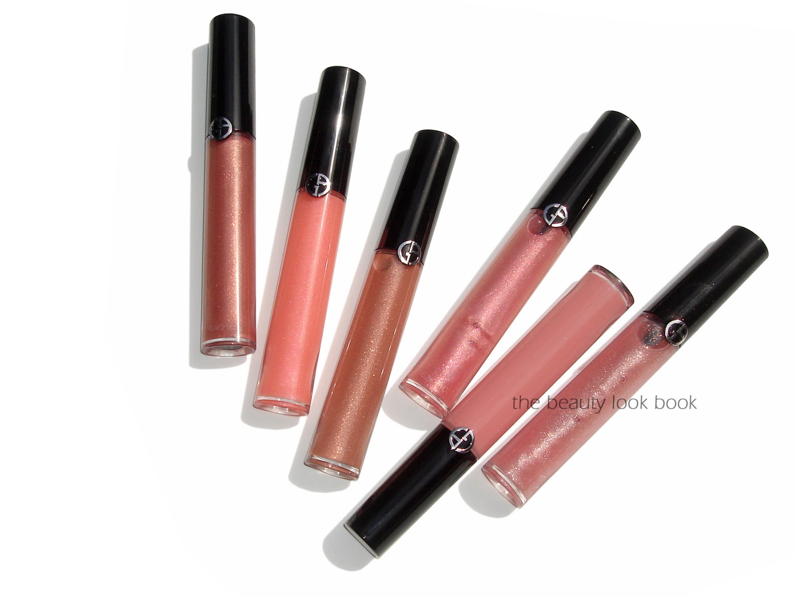
Armani has released 18 new shades of lip gloss in a new high shine formula called Flash Lip Lacquers ($29 each for 6.5 ml/0.22 fl oz, Nordstrom.com). Armani has revamped and released numerous formulas of lipgloss. Before I saw these in person I thought they would be old discontinued shades brought back under a new name. I was pleased to find the Flash Lip Lacquers are all new shades with improved pigment. While Armani is known for having natural looking products, recent releases show they are moving towards more color. The Flash Lip Lacquers have more pigment than most of the other shades but are still natural looking with a luxurious smooth high gloss shine. I am in love with each and every shade they released but tried to limit myself to:
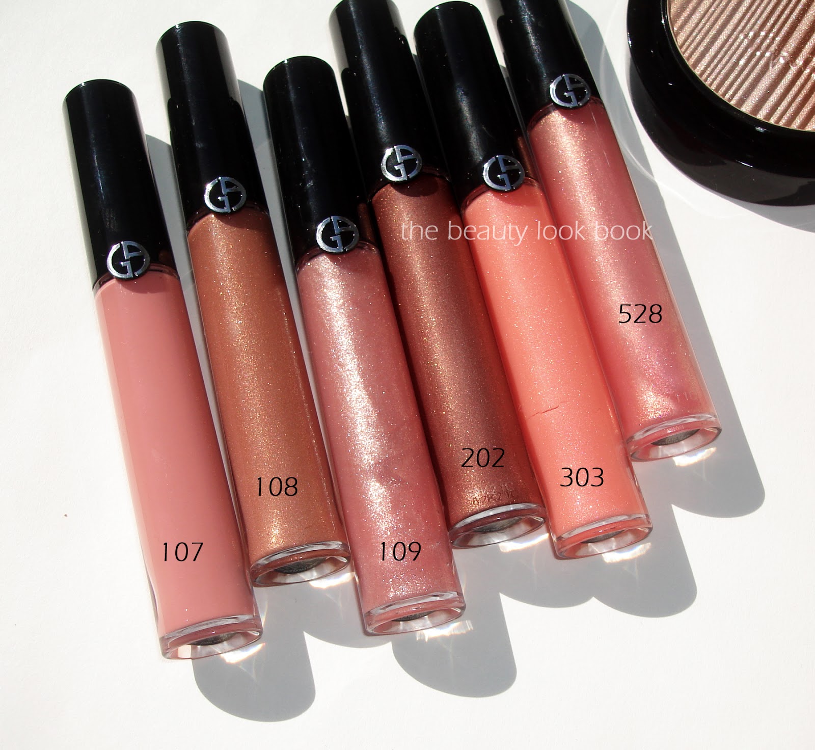
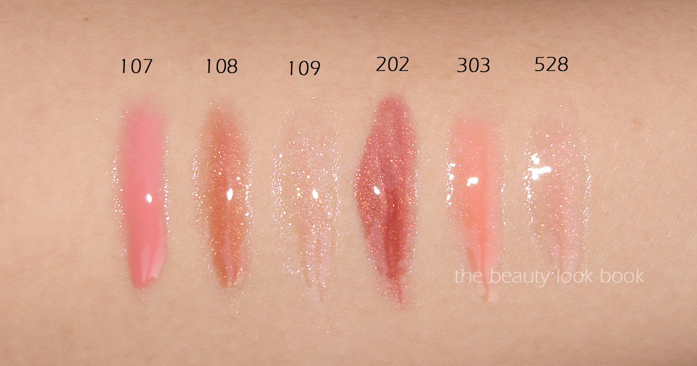
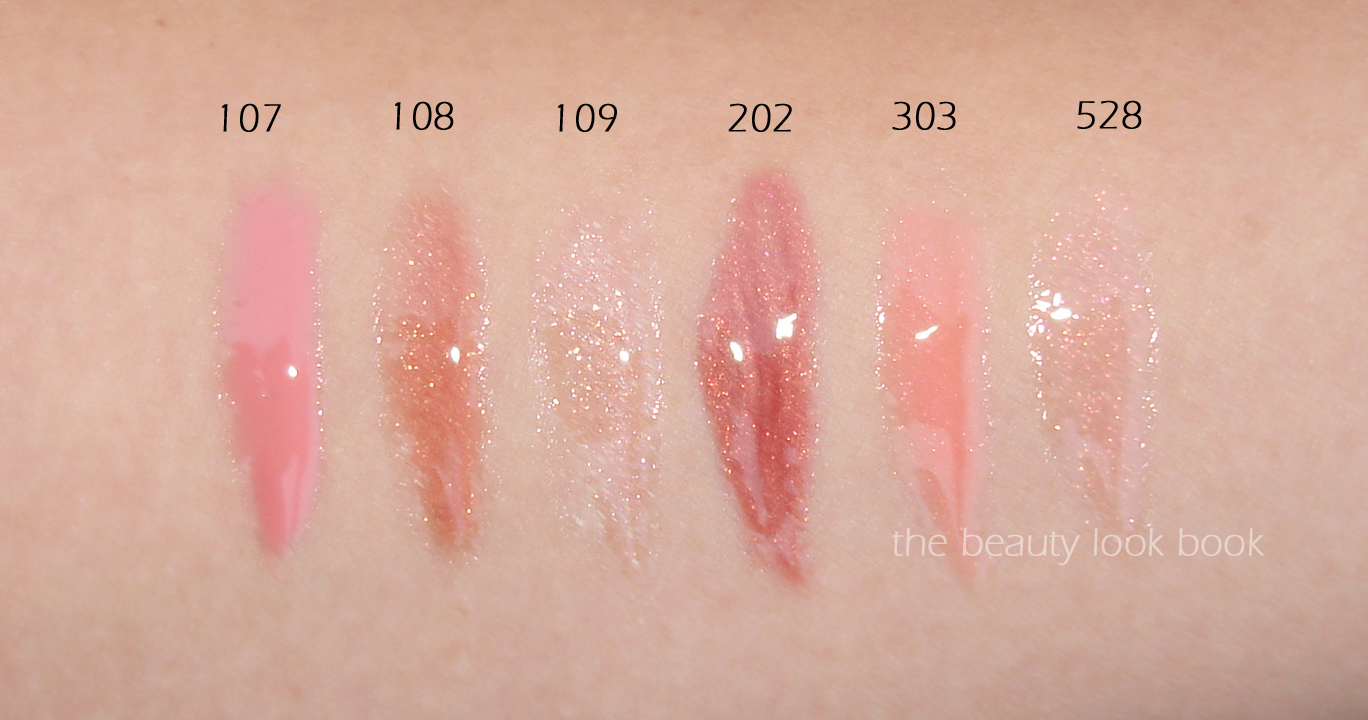
107 is a neutral nude pink cream with enough pink so it’s not washed out
108 is a stunning almond caramel with golden shimmer (think Dolce & Gabbana Almond lipstick in gloss form)
109 is a soft sparkly champagne pink (goes on clear with sparkle)
202 is a complex bronze rose shimmer
303 is a fresh peach-pink shimmer
528 is another semi-transparent pink sparkle, this one flashes iridescent pink sparkles instead of silvery ones
More photos:
Swatches:
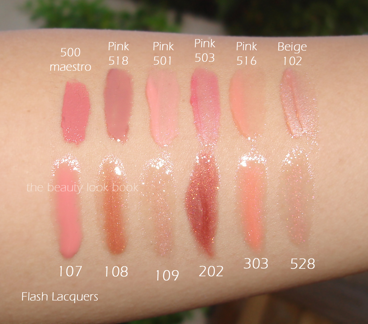
Swatch comparisons to a Lip Maestro and other Gloss d’Armani shades:
Bottom line I’m impressed with the quality, finish and pigment. The ones that are mostly sparkle have enough color and shimmer to show up on the lips although they are more on the transparent end of glosses. All the shades (even the darker ones) are right up my alley, it’s only a matter of time before I cave and purchase a few more.
Giorgio Armani Flash Lip Lacquers retail for $29 each at all Armani counters now, online at Nordstrom.com, Giorgio Armani and other retailers. Did you buy any of the new Armani glosses? What about the fluid sheers or bronzer palette?
This post contains an affiliate link, for more info refer to the About/FAQ section. Affiliate links generate a small commission only when you click through and make a purchase. These help support this site.
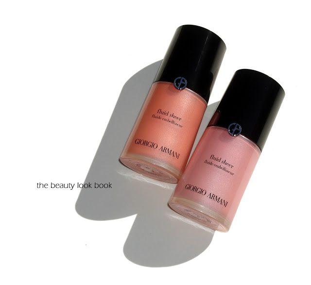
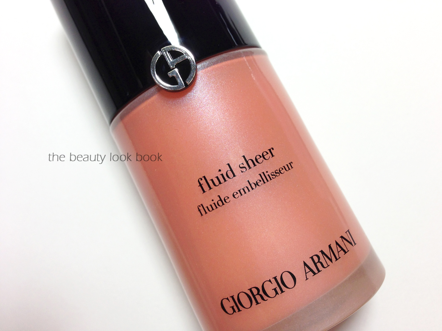
Armani Fluid Sheers ($59 for 30 ml/1 fl. oz.) are well loved among liquid highlighter fans. This season Armani revamped the packaging and brought out some new shades. You can see the newer shades swatched on Café Makeup’s Instagram account. I picked up #5 a light coral peach shimmer and #8 a pale frosted pink.
For those new to Armani, Fluid Sheers are liquid pearlescent highlighters. The shimmer varies per shade, some have a subtle pearly finish, others have a more noticeable frost. The uses are endless. Armani suggests that you can blend with foundation to add radiance, use as a sculpting product, alone as a makeup
base, or as a highlighter. To date the only one I have used mixed in with foundation is #7 which has a similar but slightly more visible finish compared to MAC’s Strobe Cream. The other shades are either too shimmery or dark for me to use all over the face or to mix in with foundations. I like to use these as highlighters or a cream blush.
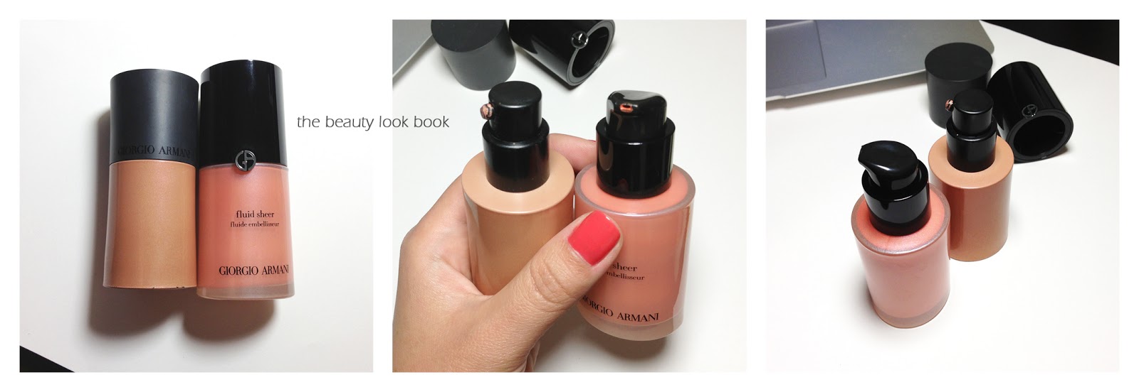
The newer bottles are slightly taller than the original packaging although they contain the same amount of product as the original one. The differences are in the overall look and packaging. The new version has a frosted bottle so you can see the product inside and has an all over sleeker look.
I played with the newly released colors at my local Armani counter and settled on two of the lighter shades. I always love a stronger vibrant blush (blended out of course) but the darker shades are extremely pigmented and ended up looked a bit muddy on my skintone.
The peach shimmer #5 is absolute perfection. It has just the right amount of color and shimmer to give a healthy glow to the skin. The pale pink #8 is a lovely color but too light for me to wear alone. It makes a lovely highlight but definitely needs blush or bronzer added. If I were just a tad bit darker it would have a white cast on me due to the paleness.
Some close ups:
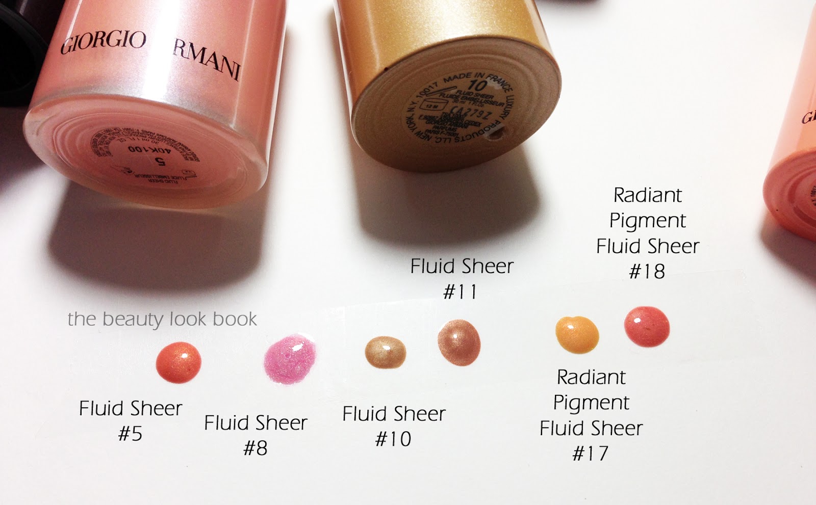
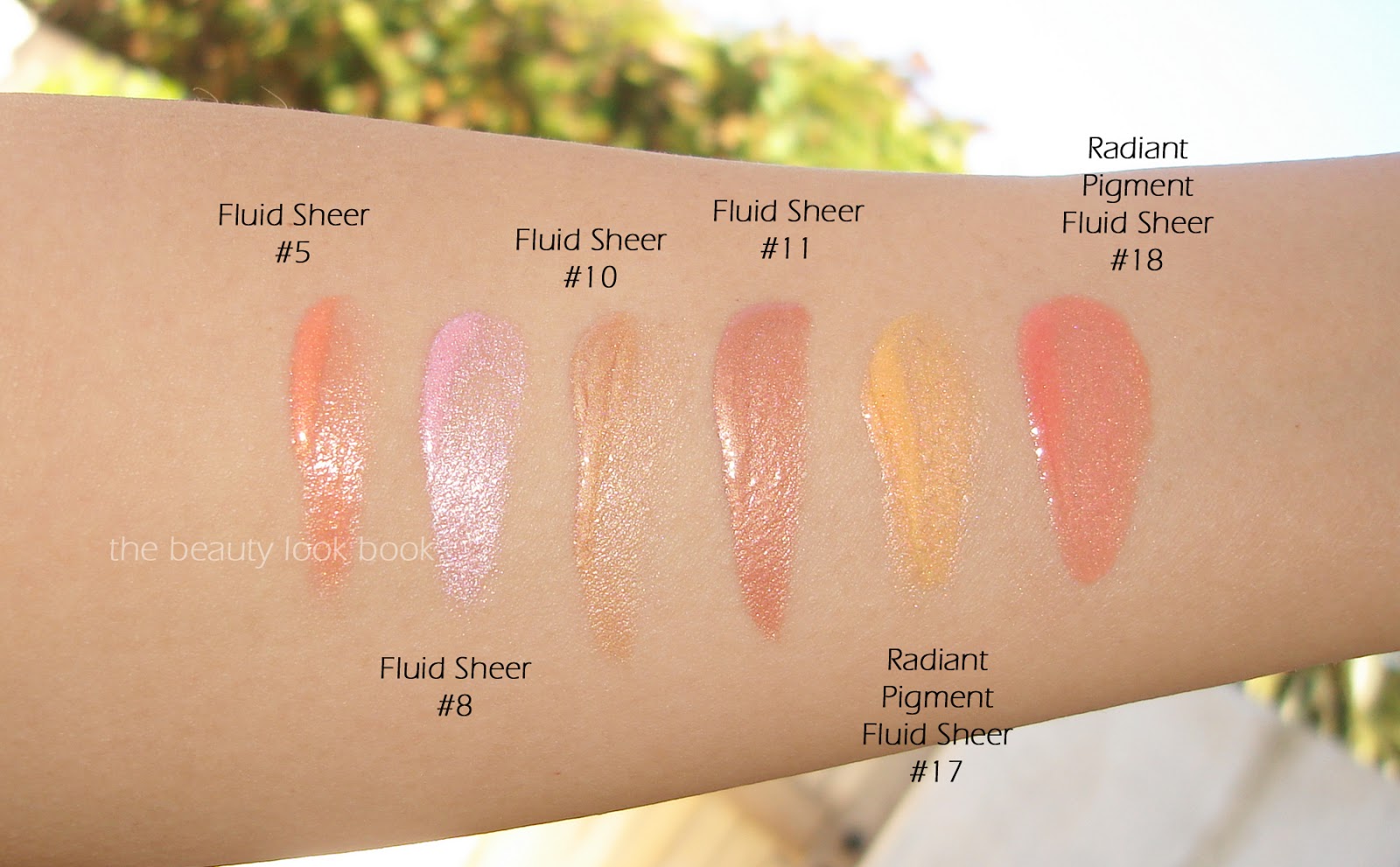
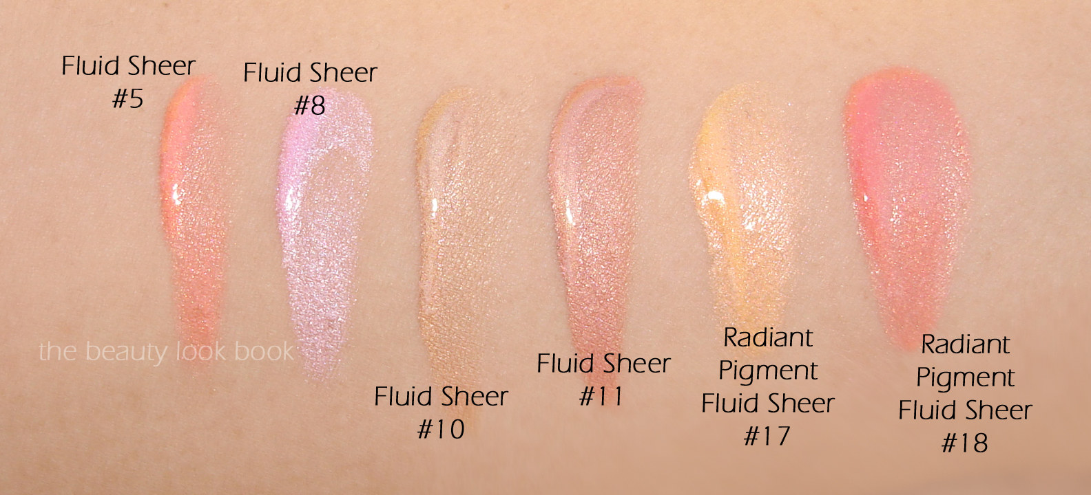
I pulled some of my current Fluid Sheers to compare, #5 looks very similar to one of the limited shades from several years ago, the Radiant Pigment Fluid Sheer #18 (however the new #5 has more pigment).
Note that the Radiant Pigment Fluid Sheers #17 and #18 were limited-edition from 2008ish and are now discontinued. They are shown below only for comparison purposes.
Swatches, same set, two different views:
I see myself getting the most use out of #5. I do think #8 is lovely but wish it were a few shades darker or less white on the skin. Fairer skinned makeup fans will love this one. Did you purchase any of the new shades? What’s your favorite Fluid Sheer?
Armani has a number temptations this summer including a collection of new Flash Lip Lacquers newly repackaged Fluid Sheers (with a few new shades) and a breathtaking Bronzer/Shadow palette. I passed on everything from the spring collection but fell in love with summer. If you’re an Armani fan, you’re bound to fall in love the new items. Swatches to come soon.
Giorgio Armani has reformulated and repackaged their eyeshadow quads into eight new color options. The new Eyes to Kill Eye Palettes ($59 each) come with a double tiered black lacquered compact. The top layer has four eyeshadows, underneath there are two sponge-tipped applicators. At the Armani counter it was hard to not to fall in love with them all. I decided to try two safety neutrals first: 02 Terra Sienna and 06 Boudoir. The packaging below:
Both shades I picked turned out to be fairly similar. They are both neutrals with two shimmery light shades and two darker matte shades. Those who have been long time Armani fans will be pleased to learn that the latest eyeshadow formulation is a significant improvement in pigment and texture over the past quads. Over the years it seems Armani has reformulated almost all their color products. I noticed many of the Maestro singles are no longer for sale – I asked the Armani rep if they were being reformulated too and at this time he wasn’t sure but said it wouldn’t surprise him if they did.
Terra Sienna is the cooler-neutral option with a light cool champagne frost, a lovely warm taupe shimmer, a matte brown and a matte dark brown. The texture is soft and well pigmented and easy to blend and layer. The matte shades did feel a bit dryer in texture but still applied beautifully. This is a great neutral for everyday.
Boudoir is another beautiful neutral but warmer. It has a soft peachy shimmer, a soft seashell shimmer, a warm terracotta matte, and a warm dark matte brown. I normally wouldn’t have looked at this in the past because of the terracotta shade, but I found that layering it brings warmth and depth to the eye. It’s quite lovely.
Close ups and swatches:
The shades I picked are similar to the Neo Brown Eye and Face Palette from fall. Here they are side by side for reference:
I’ve tested these for a few weeks now and can report that these are amazing in pigment and texture for a natural soft eye. The look is natural but not too natural and the shades are easy to layer. I’ve been applying with brushes rather than the sponges but they are nice to have for touch ups. If you’re looking for something even more basic and neutral, check out the 04 Effeto Nudo – I thought it was too basic for me but the formula of these palettes is really nice so I might go back to check it out. I didn’t pull any palettes or eyeshadows to compare or dupe. Given the fact that these are neutrals I’m fairly certain there are close dupes out there, but I like the convenience and texture of these. Plus Armani always releases the most amazing neutral shimmers I couldn’t resist.
A few other reviews I highly recommend you check out:
So many brands are releasing new quads this time of year – Armani, Chanel, Burberry and Edward Bess. Have you checked them out yet? What were your thoughts about Armani’s?
Many have asked me to share my skincare routine. I had plans to write about it earlier in the summer, however just when I was ready to publish the post, my skin decided to act up (about 3 months ago) and certain problem areas would not clear up. I thought it could be attributed to stress or weather changes. I tried a number of different things: I drank more water, changed my eating habits, washed my brushes and pillow cases more frequently etc. After several months of no improvements, I decided it was time for a skincare change. My prior routine consisted of: Clé de Peau Beauté’s Gentle Cleansing Foam or Clinique’s Rinse Off Foaming Cleanser, La Mer’s The Tonic, Clé de Peau Beauté Eye Cream, Le Métier de Beauté Peau Vierge Day Cream, and Koh Gen Do’s Cleansing Water (plus the occasional mask treatment). I suppose my skin became so used to holy-grails that the items became less effective (if that makes sense).
Thanks to the help of my trusted sales associates from various brands, I was given some recommendations and mini sample packets to try. In just a short time, my skin has cleared up and is almost back to it’s normal blemish-free state. I also changed my foundation routine. My holy grail loves started to seem a bit heavy (but still amazing).
My current skincare routine is split up into two categories, The Basics and The Extras. I’m not a skincare expert and unfortunately can’t elaborate on the benefits of each product, nor do I have the ingredients listing on the items. This is a list of what works for me. I’m hoping others who have tried the same can chime in the comments below. Also check out Makeupalley Product Reviews – this is an excellent resource.
The Basics:
Morning Cleanser – Clé de Peau Beauté Gentle Cleansing Foam ($63) is one of my holy grail cleansers, it’s a gentle foaming cleanser, a little goes a long way leaving the skin feeling clean but not dry. I’ve repurchased this numerous times.
Night Cleanser – Dior Purifying Foaming Cleanser ($33) was recommended to me by my local Dior artist. The Cle de Peau became less effective for me, so she recommended that I try this one from Dior. I found it to be amazing in terms of really purifying and cleansing the skin. Given the weather changes, I found it to be a bit too stripping for both morning and night, I like to use this one in the afternoon/night because it removes the makeup better.
Toner – Giorgio Armani ‘Regenessence 3.R’ Pre-Regenerative & Retexturizing Lotion ($48) is a gentle toner that works to refresh the skin and noticeably improved my skin texture. I have not purchased this item yet, I received a generously sized sample in one of the Neimans Armani Gift With Purchase sets (they have generously sized skincare samples). So far it’s lasted me 3 weeks and counting. I intend on purchasing once it’s used up.
Moisturizer/Serum – Giorgio Armani ‘Luminessence’ Bright Regenerator Concentrate ($150) is a brightening concentrated serum. I actually really liked some of the creams by Armani but my Armani artist felt that they would be too heavy for my skin and age (31). He personally said he loved the Luminessence Concentrate and used it under makeup alone (no other moisturizer or creams, other than eye cream). He made a small sample for me which I’ve been testing. So far I love it. I’m waiting for a gift with purchase event before I buy since it’s pricey.
Eye Cream – Clé de Peau Beauté Intensive Eye Contour Cream ($250) was gifted to me by Cle de Peau and Neiman Marcus a year ago. I had my doubts about it’s effectiveness, but it’s everything it says it is. I’ve tried a number of eye creams (Clinique, NARS, Shiseido, Chanel, Lancome, Dior) but am still at the stage in my life where eye cream isn’t a necessity yet. I don’t have under-eye wrinkles or creasing (yet). All women told me to start using eye cream in my early 20’s so I did occasionally. I never saw any changes, nor did I feel anything different. The Cle de Peau is the first that I’ve actually seen and felt results. It fully hydrates the eye area and gives a smoothing finish with the moisture. It doesn’t dry out and it isn’t too greasy. It’s the perfect prep for a bit of concealer under the eye because it primes the skin for a more natural look (sometimes concealer can look a bit cakey under the eyes, the CdP helps prevent that). My husband uses this too.
Essential Cotton – Shiseido Facial Cotton ($9.50 for 165 squares) is by far the best facial cotton out there. I’ve tried many other brands and nothing compares for me. The Shiseido is perfectly sized, very soft and gentle and sold at a decent price. They are more expensive than drugstore cotton but well worth every penny.
The Extras:
Cleansing Water – Koh Gen Do Cleansing Spa Water ($39) reviewed here is my go-to for removing makeup from the face in the afternoon (before cleansing), it’s also perfect for cleaning up eyeshadow-fallout around the eyes.
Mask – Koh Gen Do Brightening Moisture Mask ($75) is pricey but lasts a long time. I did a brief feature here before. To recap, this is a great purifying yet moisturizing mask. The Macro Vintage Face Masks are equally amazing, but the Brightening one helps purify while the Macro Vintage moisturizes and hydrates more.
Eye Makeup Remover – Chanel Gentle Bi-Phase Eye Makeup Remover ($32) is one of the few eyemakeup removers that really removes all traces of mascara without burning my eyes, Neutrogena’s is also awesome but has a slightly more emollient feel.
I hope this helps give you ideas on what works for me. Everyone’s skin is different so I can’t say these will work for everyone. My skin is normal but sensitive. I try to keep skincare items I use minimal. Most of the testing has to be done over long period to see if it really works. I also usually test only one new thing at a time while keeping the rest of the routine the same to test the effectiveness of that one product (even though sometimes it’s a combination of products that may make something work better). Also due to the pricey nature of skincare, I try to spread out my purchases. Most of the items are long-lasting with a little product going a long way.
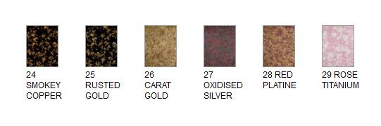
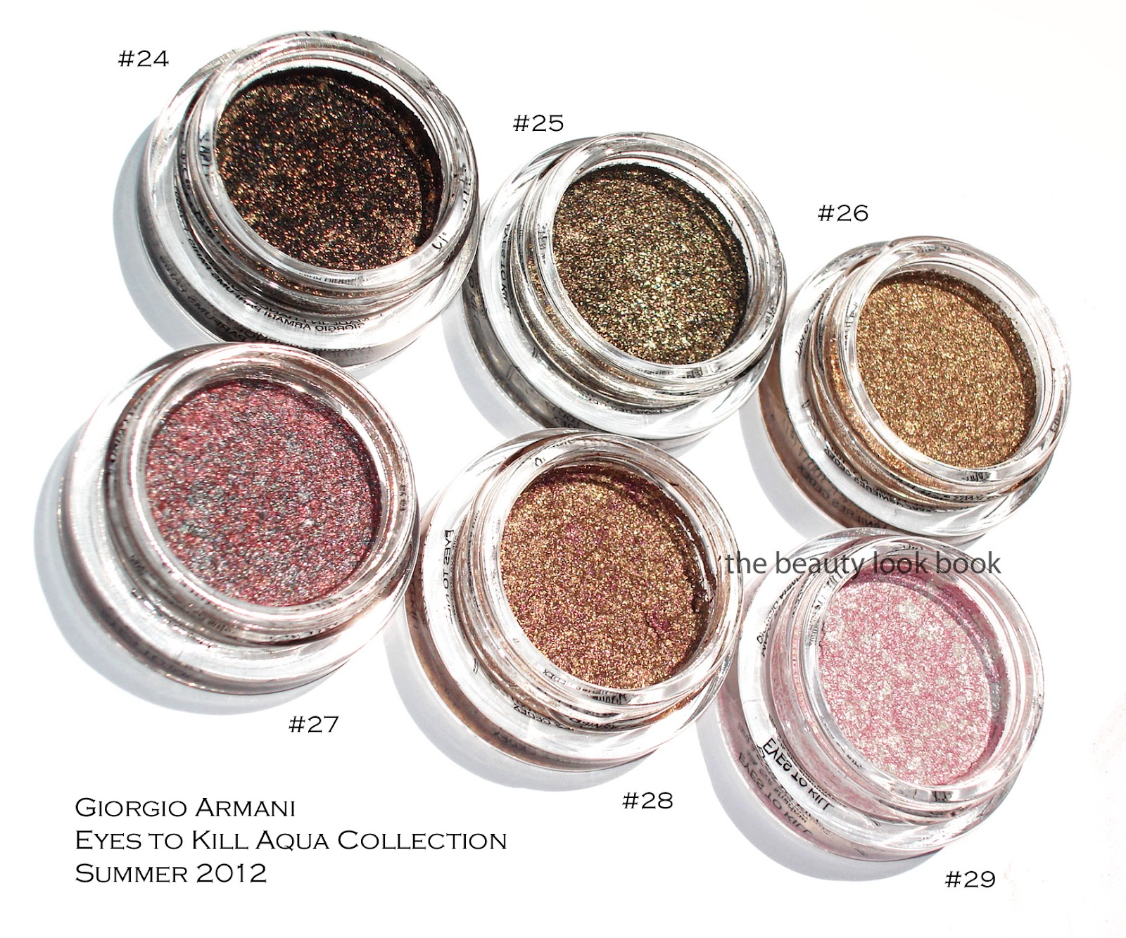
This summer Giorgio Armani has released a few mini collections focusing on lips and eyes. The new Gloss d’Armani shades from the Skin Lacquers Collection was featured last month here. The latest release is their Eyes to Kill Aqua collection featuring six new Eyes to Kill Intense shades, waterproof mascara and eyeliners. I ordered all six of the Eyes to Kill Intense shades from Saks sight unseen ($32 each for 4g/0.14 oz, all listed as limited edition, made in France). The colors looked amazing online and I am happy to report these indeed are stunners. The newest shades are #24, #25, #26, #27, #28 and #29. Some sources have actual names for these. For Armani, I always reference the numbers since the names are rarely printed on the box or packaging for shadows or lipsticks or glosses. Here is the lineup from Saks online and then one of my photos below. I have to give the thumbs up to Armani and Saks for improving their online swatches for these.
I’ve reviewed the Eyes to Kill Intense formula before, but to recap for those new to these shadows, Armani’s Eyes to Kill Intense are a potted hybrid cream/powder eyeshadow. The texture is spongy and almost-cream like but not quite. They are indeed intense in pigment and sparkle. Most contain a complex blend of colors almost like a kaleidoscope making them multidimensional. I like to think of them as a pumped up version of MAC’s MSFs but for the eyes and in a cream formula. Armani boasts that these are long-wearing shadows with 24 hour lasting power. I have never worn any type of makeup for 24 hours straight, but I do find the lasting power to be stronger than the typical shadow. If I don’t touch my eyes at all during the course of a regular day, I find that they last without fading.
The formulas are easy to blend and layer under and over shadows. I do find layering a powder over these will sometimes make the Armani cream shadow fade a bit. If you want to layer over these but still want to maintain the sparkle intensity, I recommend you pat. These aren’t emollient enough for me to be a base though.
Compared to Chanel’s Illusion d’Ombres, Armani’s Eye to Kill Intense last longer and have a less bouncy feel in texture. Although some are more sparkly, I find Armani’s easier to wear and pull off for everyday or for evening. Now onto the colors:
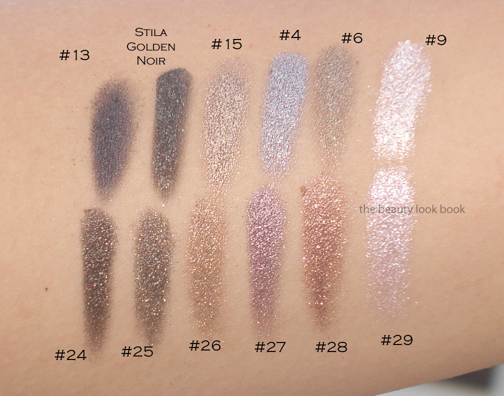
#24 is a blackened gold sparkle. It’s beautiful for a smokey liner or smokey eye. What I love about these is that they the pigment is easy to control by layering.
#25 is another black-gold sparkle but with more of a lighter khaki base. On me it pulls slightly olive because of the gold tones.
#26 is a beautiful warm gold. Some of you may wonder how close this is to #5, #6 and #15. It’s close but slightly less khaki and more golden/warm. I’ll show a few comparisons below.
#27 is a complex silver-taupe-red sparkle. I expected a silvery-taupe but mixed together it pulls more purple on my skin due to the red metallic streaks.
#28 is a gorgeous gold with burgandy/purple blend. It’s what I wanted NARS Kuala Lumpur to look like on me (which was way too warm/red). This has just the right amount of copper and burgandy blend to work for me.
#29 is a pale frosted pink-white pearl. I would say if you have either #8 or #9, this might be too similar to justify owning for you. I do find it’s brighter and whiter (even with the pink veins) so it’s a bit more contrasted on my skin (especially with a tan). This one and #28 arrived a bit cracked/separated from the container. If you search other reviews you will see the packaging comes with a black insert which you can use to press down the product. I used those to try and press down the shadows and fix the cracks a bit.
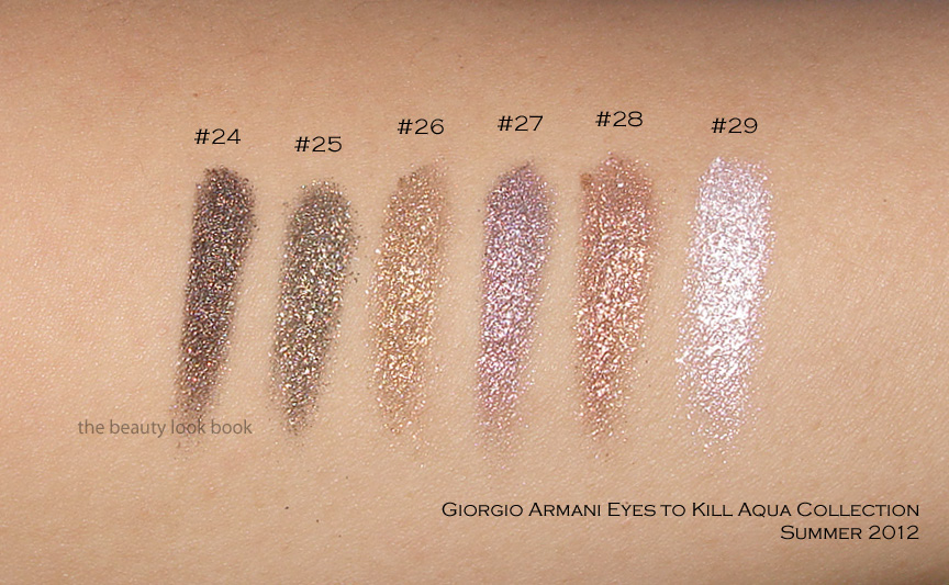
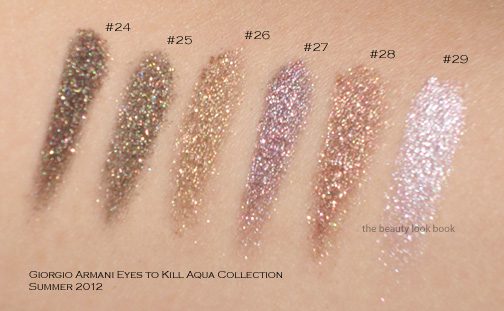
Now swatching these will definitely vary depending on what kind of brush or how much pressure you use. I’ve swatched these a few different ways and under different lighting to show the complexity. Messy Wands has swatched these on her skin (which I believe is lighter than mine), definitely check out her blog to see how they look on her.
Swatch set #1 on the arm:
Swatch set #2 at an angle so you can see the sparkles shine in the sun:
Swatch set #3, bigger swatches blended:
These were all swatched without a base and with a variety of cream shadow brushes (from MAC, Bobbi Brown and Becca). Note that while these look uber-frosty and metallic, they are wearable on the eyes without being too frosty. At least on me. I only had time to swatch a few comparisons to other Armani shades, sorry my schedule can’t accommodate more comparisons right now. I do find these relatively unique compared to the existing Armani lineup. Two views below.
Overall a huge thumbs up. I do think #24 and #25 are very similar and you definitely don’t need both. I prefer #24 because it’s darker and more intense. Have you checked out the new Armani Eyes to Kill Intense shades yet? Thoughts? Did you pick anything up?


