Browsing Tag

Fall 2010

Uncategorized

Paul & Joe Autumn Creation 2010: My Picks

August 13, 2010
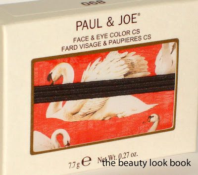
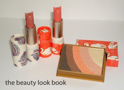
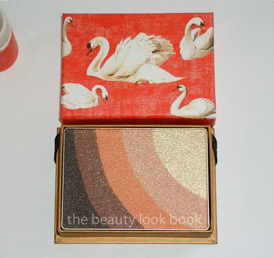
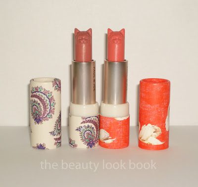
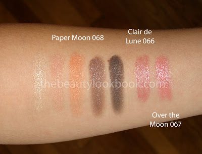
I tried to resist, but Paul & Joe still has managed to capture my interest despite the odd packaging design for their fall collection. I picked out a few things from their Fall Collection Sparkles: Face & Eye Color CS 068 Paper Moon, Lipstick C in 066 Clair de Lune and 067 Over the Moon.


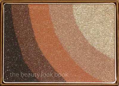
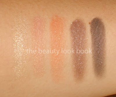
My favorite item is their Face & Eye Color CS ($35), a multi-purpose powder for eyes and cheeks. The colors are all pigmented with a gold sparkle in 068 Paper Moon. The stripes are similar in size to the Armani Eyes to Kill bulls-eye palettes, but the shape of the Paul & Joe palettes seem to be easier to work with. You will still need a smaller sized brush to keep from mixing the colors. It’s packaged in a cardboard box with an elastic brown strap. The packaging is delicate but simply stunning. I think the lighter shades will make a good highlighter – the trick for me will be to find a brush small enough to pick up only the lighter shades, but big enough for my cheek. I see myself using this for the eyes more than the face.

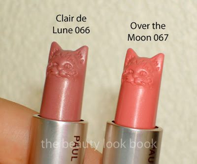
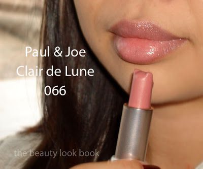
The Lipstick C ($25) this season seems to be sheerer than most of the Paul & Joe lipsticks I’ve tried. I thought I would be creeped out by the cat head but looking at them in person, the detail is adorable. The lipsticks are a semi-sheer cream with a hint of sparkle. The finish is highly glossy and has a moisturizing feel. It has that signature P&J scent – I can’t quite put my finger on it, but it’s almost like a soft powder. Note that the glossy finish on these made it difficult to swatch on the arm accurately. 066 is a pink mauve and 067 is a brighter sheer coral pink. I applied 066 on the lips and have to say as much as I love cats, the shape of the lipstick in a cat-head made this difficult to apply on the lips. Innovative and chic, but not very practical for application.


Swatched:

Overall – Paul & Joe still has my heart. I got these from the lovely ladies at Bergdorf Goodman. The collection should be available at most P&J retailers by now – I was a little late with my order this fall.
Uncategorized

Giorgio Armani Fall 2010 Picks For Me

August 4, 2010

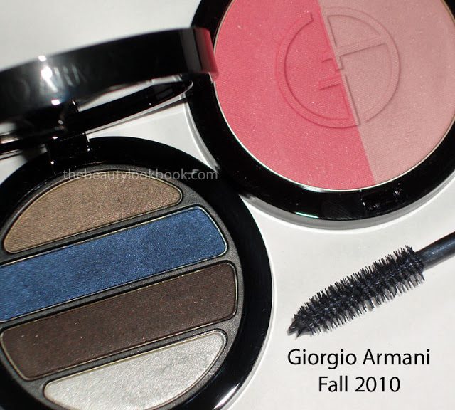
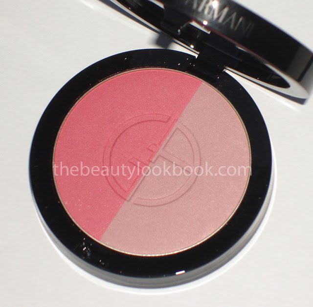
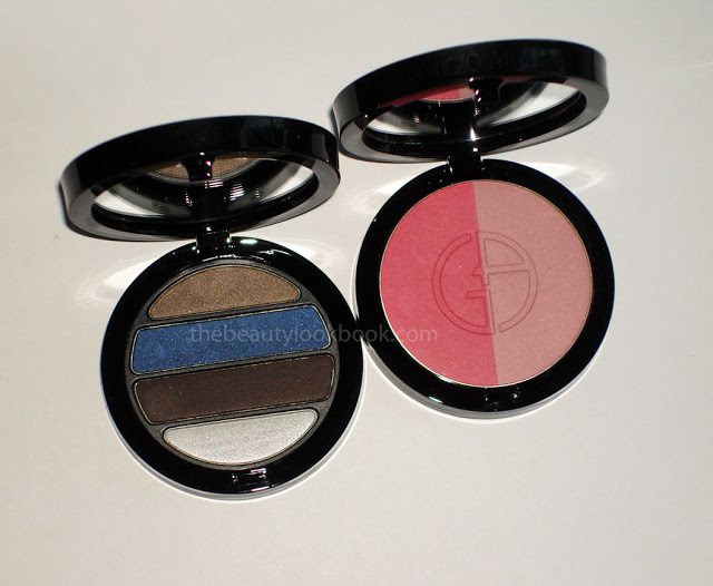
When I saw that the fall collection from Armani had launched online, I knew I had to get the new Eyes to Kill Mascara in #5 Blue Grey Night ($30) and the Powder Blush Duo ($49). I’ve loved every single powder blush released by Armani and the new one for fall is exquisite. The Fall Quad ($59) purchase, I credit to Gaia from The Non-Blonde (see her sneak peek here) who has a way of creating major lemmings for me.
My sales associate called me as soon as they came in, which I highly appreciate (it pays to be a loyal customer). For some reason, Armani has been distributing extremely limited quantities of stock to the counters near me. For the past year they have received extremely limited stock and usually don’t get testers until months after they receive the product to sell. For this collection, she only received 3 blush duos and 3 quads. There were no testers, but being familiar with the quality of their eyeshadow quads and blushes, I didn’t need to test these before purchasing.


My thoughts on each item:

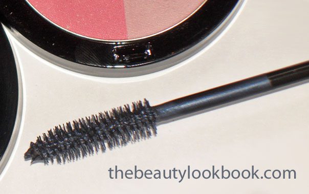
Eyes to Kill Mascara #5 (not swatched) – For this one they had a brand new tester so I eagerly tried this one out with a tester mascara wand. In the tube it’s a metallic smokey blue-grey. It goes on darker than it appears in the tube and looks lovely on the eyes. This is my first non-black mascara purchase. There are a number of gorgeous shades by Chanel (plum, bronze, aubergine, etc.) however, the formulas cannot compare to Armani’s Eyes to Kill (my all time favorite mascara). The Eyes to Kill Mascaras defines the lashes, thickens, lengthens and holds the curl. All without flaking or smudging or making the lashes feel brittle. It’s pure love and worth every single penny.

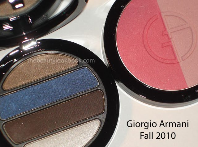
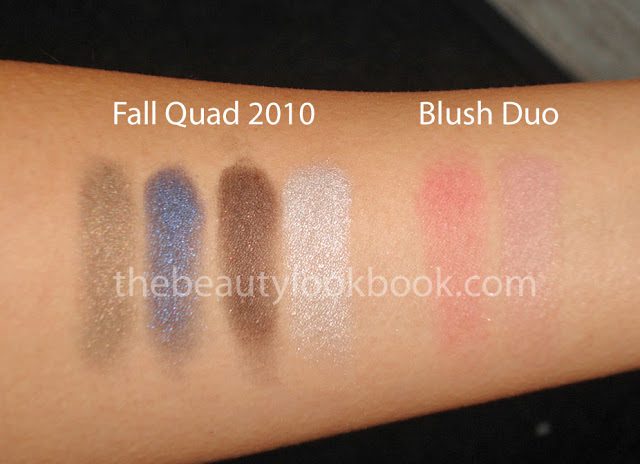
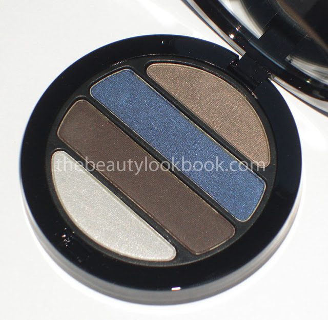
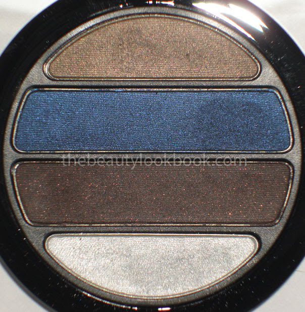
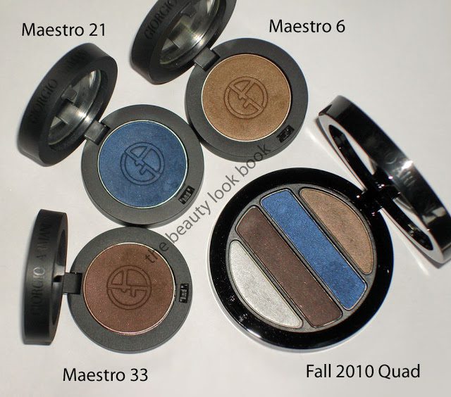
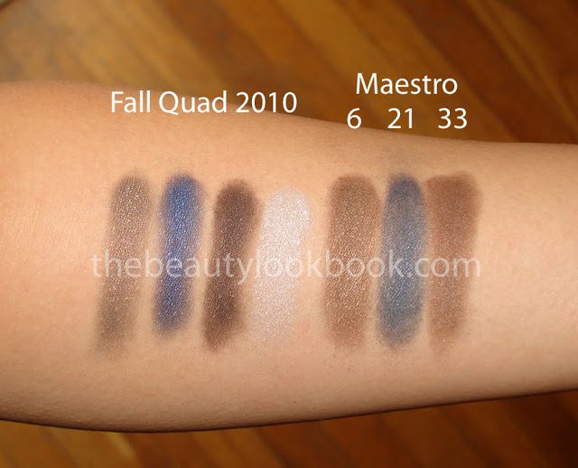
Maestro Eyeshadow Quad Fall 2010 – The pigment on this is incredible. The colors however are definitely out of my personal comfort zone. I think the combination of colors are odd for use all at one time. I really have no idea how I will be able to pull off all shades at once. I’m not sure that I think “fall” when I see it. The blue and navy makes me thing “nautical” which is not something I really associate with fall. Still the colors in the palette are stunning and unique to Armani (see comparisons to Maestro Singles 6, 21 and 33 below). In it there is a denim-colored shimmery bright navy, smokey deep brown with plum, pale silvery blue, shimmery olive almost khaki colored brown. The artist suggested mixing the navy and dark brown together for a smokey eye.

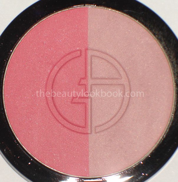
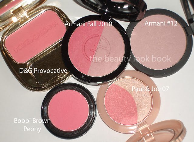
Blush Duo Fall 2010 – Lovely fresh hot pink with a soft pale pink. In typical Armani Blush style, soft texture/finish, natural semi-sheer finish, makes the cheeks just glow. The pale side has more color and is more pink than Blush #12. I used this blush duo as soon as I got home mixed together. It’s just so pretty. I’ve compared it below to some other pinks from D&G, Bobbi Brown, Paul & Joe and Armani. No swatch comparisons as blush shades are extremely hard for me to swatch accurately. *Note* someone mentioned this is $80+ on the armani website and is also listed under the cream-blush duo, I think this an error but I’m not certain. Mine was $49 US (before tax) and it’s definitely powder on both sides. The price can be confirmed on Nordstrom.com.

More photos.


I passed on the new Purple Eyes to Kill #7 (simply too purple for me, just as Gaia described). I didn’t see the new lipsticks, but they seem a bit dark for my taste.

Uncategorized

Chanel Taupe-Délicat & Misty-Soft Ombres Contraste Duos & Gris Stylo Yeux

August 3, 2010
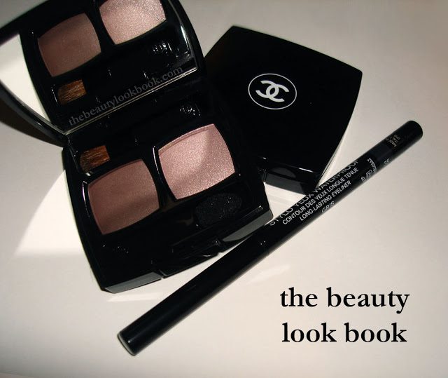
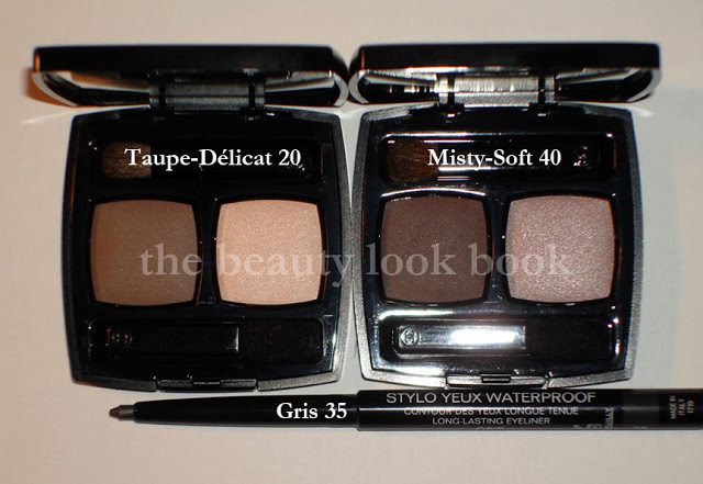
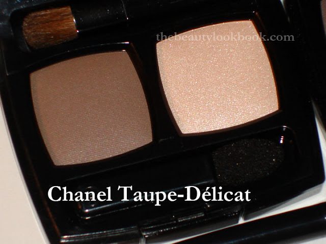
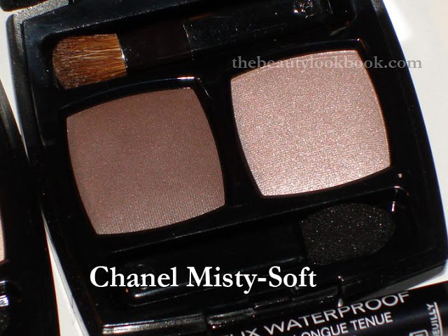
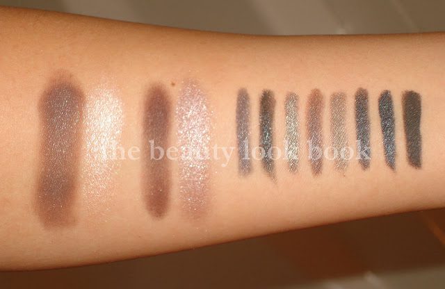
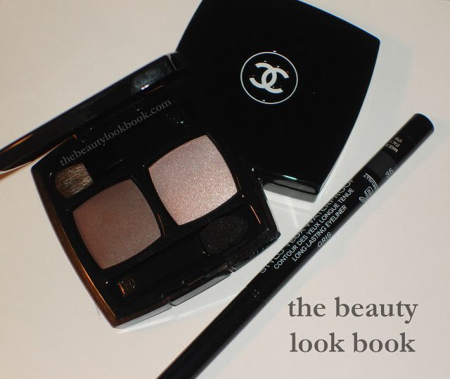
Chanel has released a new collection of Eyeshadow Duos called Ombres Contraste Duo ($42) along with a new mascara called Inimitable Intense. Also in the collection are a few repromoted Stylo Yeux Waterproof Eyeliners ($28). I picked up Taupe-Délicat & Misty-Soft Duos and the new Gris Eyeliner. The eyeshadow duos are all on the neutral side and very basic for a neutral eye. Each duo has one side that is darker with a satin finish (not quite matte, not quite shimmer), and then one other side that is paler more shimmery. Taupe-Délicat is your basic soft neutral brown and a shimmery pale champagne with a slight pinkish sheen. Misty-Soft is has purple tones on me. One side is a brown with plum, the other is a soft light mauve-purple.

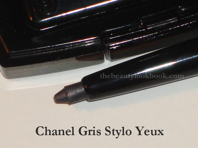
I’ve already reviewed my Stylo Yeux Eyeliners a few days ago here. Gris is their newest addition which is a light-medium cool grey. At the counter at Nordstrom, it looked like a full matte. However at home in different light, it looks like it has a subtle sheen.
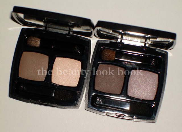
Taupe-Délicat 20, Misty-Soft 40 and Gris 35


Gris Stylo Yeux 35

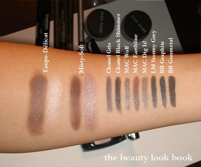
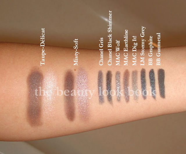
Swatches of Taupe-Delicat, Misty-Soft and Gris compared to my other grey eyeliners, Chanel Black Shimmer, MAC Wolf, MAC Earthline, MAC Dig It!, Laura Mercier Stormy Grey, Bobbi Brown Graphite, Bobbi Brown Gunmetal


I definitely love the Gris eyeliner. It makes Black Shimmer look black (when it’s actually more greyish compared to a true black, like here). It goes perfectly with NARS Tzarine Eyeshadow Duo. The eyeshadow duos are lovely, but I don’t think they are worth the high price tag. At $42, I personally would rather have another Burberry Blush. Just my two cents. If I didn’t have a gift card, I probably wouldn’t have purchased both. Granted, I know I will definitely get a lot of use out of both in the upcoming weeks (currently interviewing). They are perfect neutrals for everyday wear. Subtle but sophisticated to give a pretty soft eye-look.


For other swatches of the other shades, check out Yuki’s Lazy Channel here. She has amazing photos and swatches. Unfortunately, in the U.S. we didn’t get the new mascara or eyelash curler that Asia did.

Uncategorized

NARS Fall 2010: Rajasthan, Tzarine & Douceur

July 15, 2010
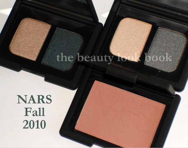
I’ve been excited about NARS Fall ever since Karen at Makeup & Beauty Blog featured a sneak peek of the collection. Imagine my surprise to see the collection display up today when I went to Nordstrom to pick up my pre-sale items from the Anniversary Sale. The NARS summer collection left me unimpressed but the fall collection seems to be right on track for the typical stunning, inspirational and unique releases they normally do. I picked up three items:
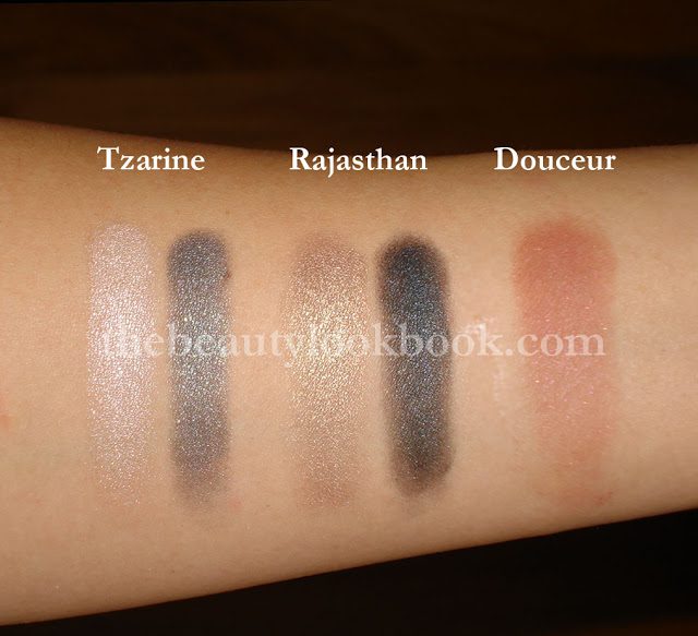
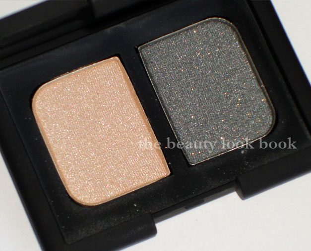
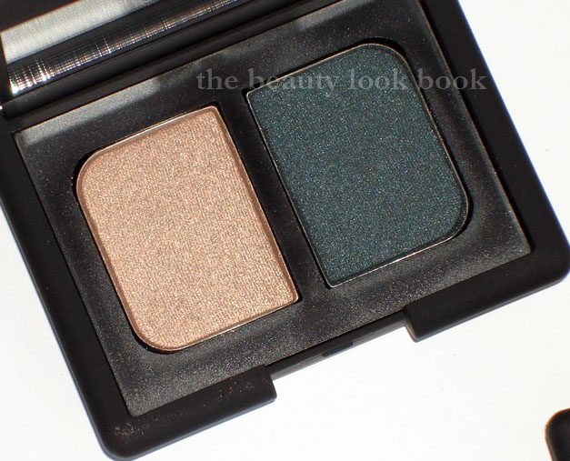
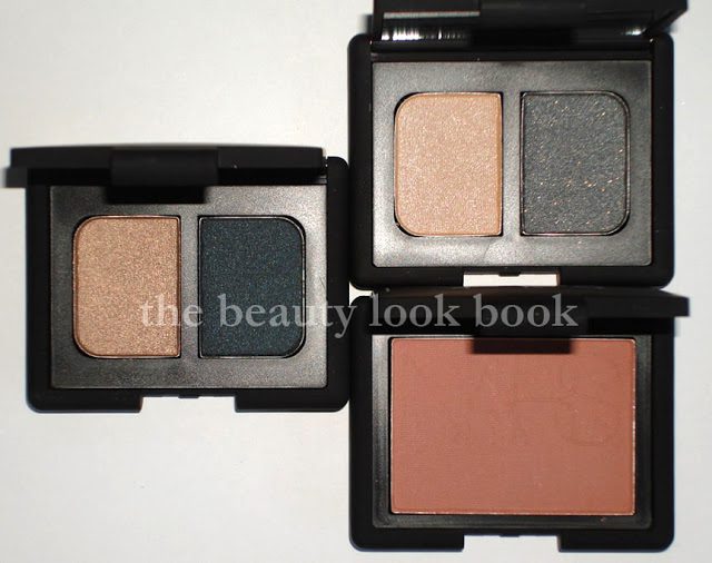
  • Rajastan Eyeshadow Duo – shimmering sandy beige & deep smokey blue-green
  • Tzarine Eyeshadow Duo – lovely cool sparkley champagne & cool-toned dove grey with gold microglitter sparkles
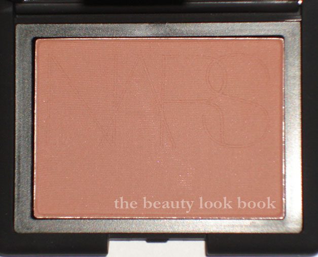
  • Douceur Blush – a neutral dusty pink with slight brownish tones

Top: Rajasthan & Tzarine Eyeshadow Duos
Bottom: Douceur Blush

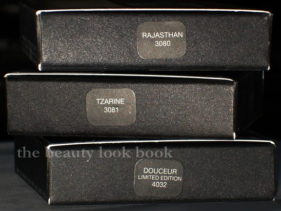
* Labels corrected, thanks Stephanie!

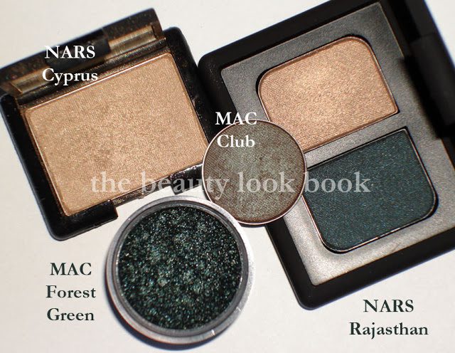
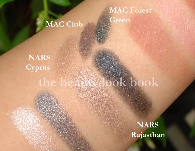
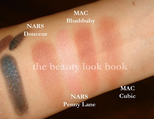
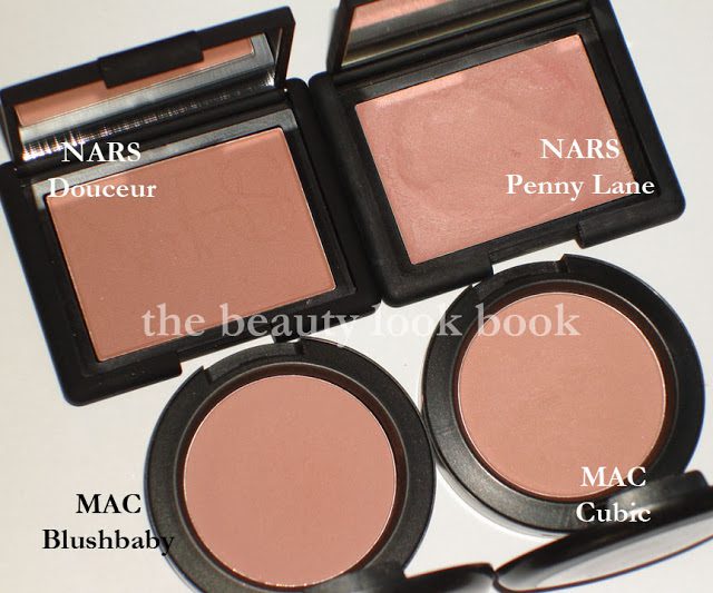
I couldn’t find any dupes for Tzarine Eyeshadow Duo. For Rajastan, I couldn’t find any dupes either, but the golden shade is similar to Cyprus Single Eyeshadow. I compared the smokey blue-green to MAC Club and Forest Green Pigment (discontinued) and Rajastan has more blueish tones. For Douceur Blush, I thought in my mind “perhaps it’s a powder version of Penny Lane.” I was way off. It is pink, but has more brown and is darker. Douceur seems most similar in finish to Cubic. Compared to Blushbaby, Douceur has more dusty pink where Blushbaby is more brownish. I haven’t tried them on the face to see how the colors look though. Below are the close ups, comparisons and more swatches.

NARS Tzarine

NARS Rajasthan

Compared to NARS Cyprus, MAC Club, MAC Forest Green Pigment (discontinued, pro)


NARS Douceur Blush (Limited Edition)

Comparisons to NARS Penny Lane, MAC Blushbaby, MAC Cubic


These were the three standouts to me. I didn’t check the lip products or single shadows. I have to say I was extremely surprised to find Douceur Blush is limited edition. I didn’t ask the specialist about the other items in the collection, but I one of the things I love about NARS is that he typically doesn’t do “limited edition” colors. I have noticed that in the past couple years a number of beautiful shades such as Mogambo Duo, Galaxy Girl Lipstick, Cannes Multiple, Antibes Multiple have been discontinued and retired to the “vintage” section of the NARS website. I have found similar colors for these and understand they probably can’t keep everything, but still am very sad about Cannes being discontinued.

Uncategorized

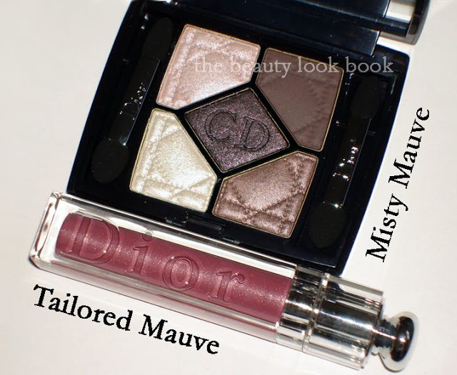
Dior Misty Mauve Quint 844 & Tailored Mauve Addict Ultra-Gloss 692

July 5, 2010
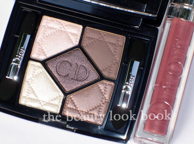
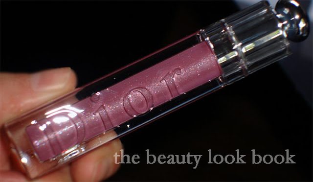
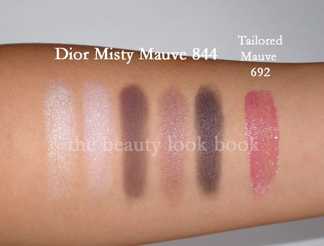
Dior Fall 2010 has arrived in Nordstroms although the full tester unit wasn’t up yet, the counter did have the testers scattered in the regular tester unit. I picked up the Misty Mauve Quint $58 and Tailored Mauve Lipgloss $26.50 – both stunning colors for fall. I probably won’t be wearing this for a few months until fall arrives, they seem a bit too cool-toned for summer wear.

In direct sunlight:


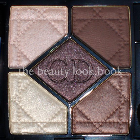
The Misty Mauve quint has a good mix of mauve shades which will allow you to achieve a diverse range of looks from neutral to smokey. It does appear more mauve and a bit more subdued compared to the promotional photos released by Dior, but is still pretty in my opinion. While the colors in this palette might not be the most original, I love the texture and finish of these particular shades and they are well coordinated. As a lover of neutral shades, I think this is a good palette for those who want something smokey but not too dramatic. I call it a natural-smokey eye palette with a bit of attitude.

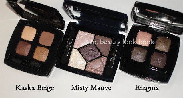
I’ve had a little debate with a fellow makeup fan of mine about this new quint. She thought it unoriginal and something Dior has done a million times before. It’s possibly similar to the purple palette Nordstrom released last year for their anniversary sale (which I do not have), but in terms of the quints I own, it seems quite different. I will say the lighter shades definitely seem familiar. Looking back on past quints, it appears that I have neglected them. I need to use these more often. In the past year I find myself using Chanel, Edward Bess, D&G and Paul & Joe more frequently.
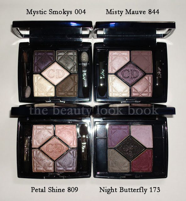

Per reader request from the comments, you can see it’s very different from Chanel Kaska Beige. Here it is also compared to Chanel Enigma.

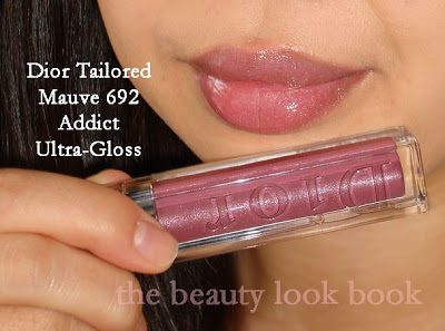
Dior Addict Ultra-Gloss in Tailored Mauve 692:


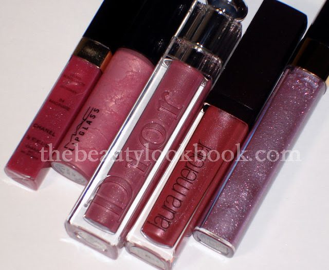
Tailored Mauve is a pretty purple-pink gloss. I was worried it would be too purple on the lips and I normally don’t try out tester glosses on my lips, but my SA pulled out a brand new tester so I felt safe trying it out. It was surprisingly wearable and I normally can’t pull off purpley shades. I need a smidge of pink or red in my purple-tones. This will look good with a classic smokey bronze eye (like NARS Cordura) or even a classic smokey eye (like Chanel Enigma or Mystic Eyes). I find that it goes extremely well with the Misty Mauve quint and isn’t overly purple when worn together. It’s semi-sheer to medium with a lovely glossy finish. No detectable scent. Lasting power isn’t the greatest, but I don’t mind reapplying lipgloss regularly throughout the day.

L to R: Chanel Imaginaire, MAC Cultured, Dior Tailored Mauve,
Laura Mercier Violet, Chanel Delight

I checked out the other items. There are a number of new gorgeous Serum de Rouge shades in bright pinks, plums and mauves. Nordstrom is doing a GWP for their Anniversary Sale, so I had my sales associate put aside a couple to qualify for the gift later in the month. I’m also testing out samples of their new Hydra Life skincare line. So far, so good and it’s surprisingly well priced. Will be writing a review once I feel I’ve tested it long enough to get a good feel for how it works on my skin.

Swatches of my Dior Fall Picks (Serum de Rouges not included b/c they are being held for the Anniversary Sale):

Uncategorized

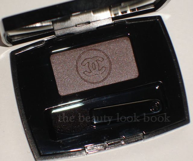
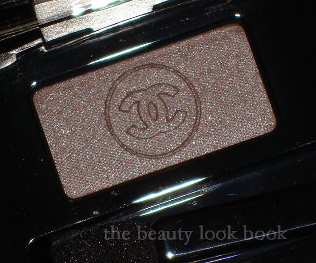
Chanel Taupe Grisé 87 Soft Touch Eyeshadow

June 30, 2010
*Updated – see below at bottom*


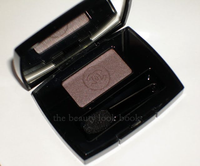
Taupe + Shimmer + Chanel = must buy. If there’s a taupe Chanel makes, it’s instantly a must have for me. I am taupe-obsessed much like Elvira and Josie, and there’s no stopping us, ever. Taupe Grisé 87 is the newest taupe released by Chanel for their Fall 2010 collection. My makeup-twin Amy at Café Makeup has given a lovely review here (I call her my twin because we love the same things, although she has fairer skintone = Chanel Cameo/NC15 while I am Chanel Shell/NC30-35).


There a number of other great reviews, photos and swatches out there so the focus of this post will be on comparisons to similar shades.

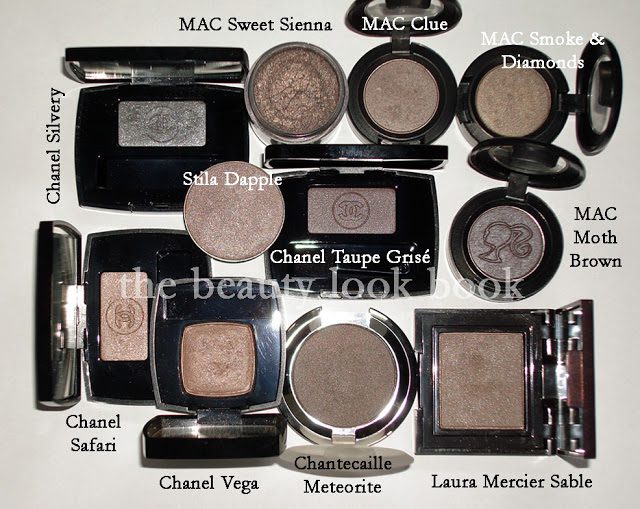
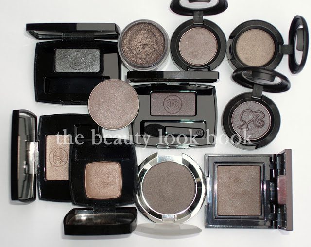
There are a million other taupes out there (click on the Taupe Label below this post to see the other ones I have obsessed over) but I picked out the ones in my mind I thought, “Could this one be a dupe?” I personally could not find a dupe for this lovely color. There are similar shades, but from what I have, no dupe.

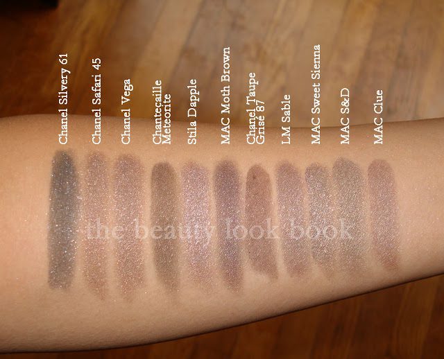
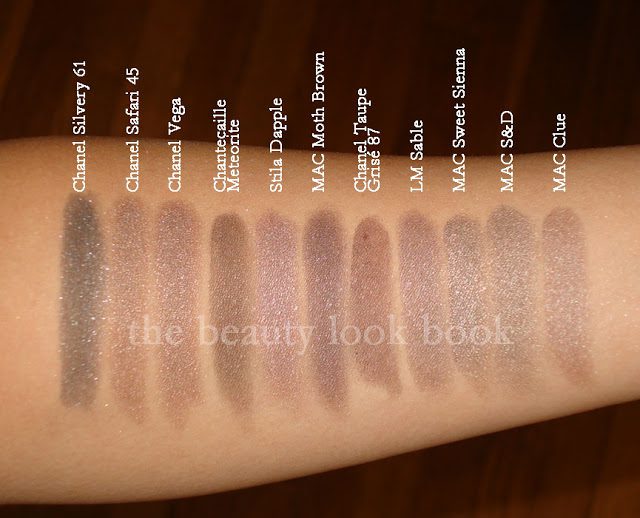
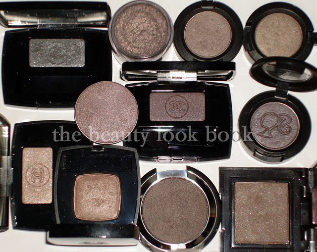
Compared to: Chanel Silvery, Chanel Safari, Chanel Vega (d/c), MAC Moth Brown (l/e), MAC Sweet Sienna (l/e), MAC Smoke & Diamonds (l/e), MAC Clue (l/e), Stila Dapple (d/c), Chanetcaille Meteorite, Laura Mercier Sable

In natural light (still cloudy weather):

Swatched over bare skin:

One more view with different lighting:


Is it a must-have? For me it was being a Chanel fan and a taupe fan. I have no willpower when it comes to Chanel. I played around with it on the eyes today, it works better when applied over a cream base, otherwise it just ended up looking bruisey on my eyes. I would describe it as having a subtle sheen. It looks shimmery in the container but when applied on the eyes, it looks more satin-matte rather than shimmery.
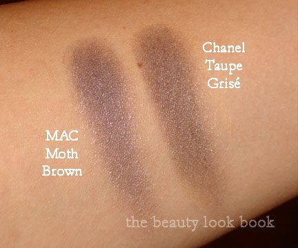
*Update* Upon reviewing my swatches and those on other websites, I thought Taupe Grise looked extremely brown on me compared to other girls. Much more brown than it appears in the container. I swatched it again alone, and then next to MAC Moth Brown to see if perhaps I made a mistake – but no. For some reason, it looks cool in the container, but on my skin, it’s not quite as cool. Here is another swatch comparison. Note that I have olive medium skin. This may look different on you. It’s still a cool colored taupe in my opinion, but next to Moth Brown it just looks warm perhaps because Moth Brown is overwhelmingly cool with an almost blueish sheen.

Hope this helps give you a better idea!

Uncategorized

Chanel Pink Explosion 64 Joues Contraste

June 28, 2010
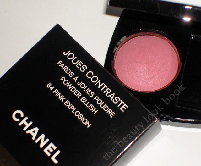
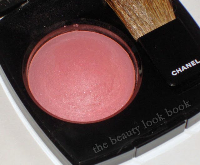
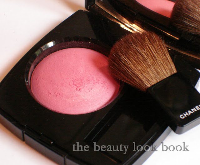
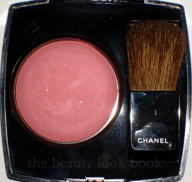
Another one of my picks from Chanel Fall 2010, Pink Explosion Powder Blush, a dusty cool pink with tiny bits of silver sparkle. It’s a lovely shade of pink, but I bring my first less-than-satisfactory review for Chanel. I normally love the color products Chanel makes – the formula, texture, finish are all divine and I feel the higher price tag justifies the purchase because of the higher quality. The items I don’t like are typically just because the color isn’t me, but I am usually able to find at least one thing that I like with each collection. This fall, Chanel has released the blushes in the Asia/Euro baked version and I am slightly disappointed.

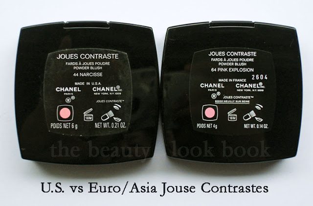
Chanel has two types of product batches they produce (as far as I know): U.S. versions and Euro/Asia/Canada versions. The difference is in the product names and finish (why many like the number reference so they know which overseas products to compare). Euro/Asia eyeshadows and blushes come in a baked formula with round pans and have a more powdery-like finish. I will say up front, I am not a fan of the Euro/Asia formulas at all. I have a couple Euro blushes from custom purchases (Candy and Tea Rose) and I only purchased them because I was interested in the color. The formula has left me wanting for more. Both definitely show up, but the finish is not the same as the U.S. – they are sheerer, more powdery, and just sit on the skin rather than blending into the skin like a natural blush does.

The labeling shows Made In U.S.A. versus Made in France:

That being said, I decided to give Pink Explosion a try. The verdict is still out. The color is pretty, but I’m less than thrilled with the finish – one swipe and you get a powdery mess. I find the formula too soft. Also there’s the glitter. Granted, it’s extremely fine and tiny. But still, I love Chanel for their finely milled shimmers, not glitter. Hence the less-than-satisfactory review. I know I would have loved this one had it been in the US formula.

Here you can see the powdery crumbly debris,
(natural light, no flash but cloudy weather):

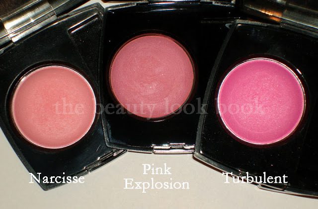
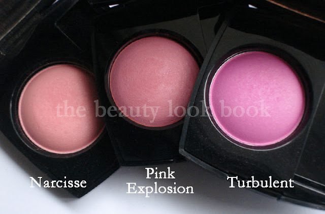
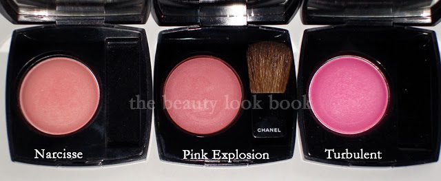
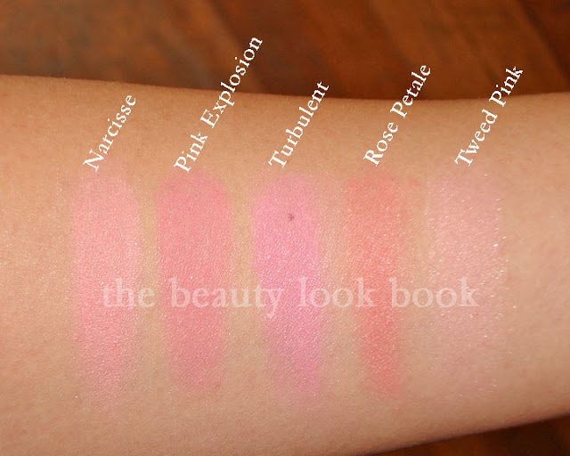
If you own other Chanel blushes, you may be wondering how it compares to other pinks. Here it is compared to Narcisse and Turbulent (both discontinued):

No flash, in natural light (cloudy weather light though):


Swatch comparisons to other Chanel Pinks:
Narcisse, Pink Explosion, Turbulent,
Rose Petale, Tweed Pink


So all in all, I think it’s a nice blush. Just not the usual quality I find for Chanel. The clouds have me slightly off my game – photography wise. I’d suggest checking out other blogs to see how Pink Explosion looks photographed in different lighting. It will give you a better idea of how it looks. I’m in between a MAC NC30-35.

  • Check it out on darker skintone on Karen at Makeup and Beauty Blog here.
  • Also check it out on lighter skintone like Christine’s from Temptalia here.

I’d say my skintone is probably somewhere in between those two 🙂 If you have this photographed or swatched, please feel free to link to your blog in the comments.

US girls who have purchased Chanel blushes in the past – what are your thoughts about the Asia/Euro formula for blushes?