Browsing Tag

Eyeshadow

Uncategorized

Guerlain Écrin 4 Couleurs Eyeshadows Fall 2011 – A Preview

August 6, 2011

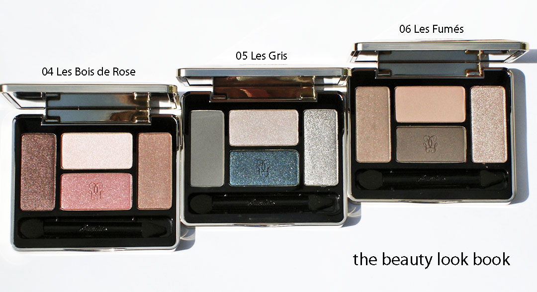
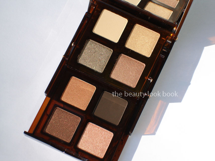
This fall Guerlain has released a stunning collection for fall. The standouts for me are the Écrin 4 Couleurs: nine eyeshadow quads in a diverse range of shades from neutral to colorful to dramatic ($59 each). Each palette is encased in a heavy-weight luxurious compact. I love that each palette comes with a unique mixture of finishes (matte, satin, iridescent). I’m one that prefers a finely milled shimmer in shadows to add depth to the eyes, but find the matte colors in each are equally beautiful as they do not fall flat like some mattes tend to do so.

The colors designed by Guerlain are all exquisite. It was hard to pick just one and I was eager to order even before seeing or trying these in person. You can see all nine colors 01 Les Violets, 02 Les Bleus, 03 Les Verts, 04 Les Bois de Rose, 05 Les Gris, 06 Les Fumés, 07 Les Cuirs, 08 Les Perlés, 09 Les Noirs previewed with details on Café Makeup and swatched on Yuki’s Lazy Channel. Thanks to their lovely previews I narrowed down my initial picks to 04, 05 and 06. I have been further tempted to purchase one more, but am going to wait for the next beauty event.

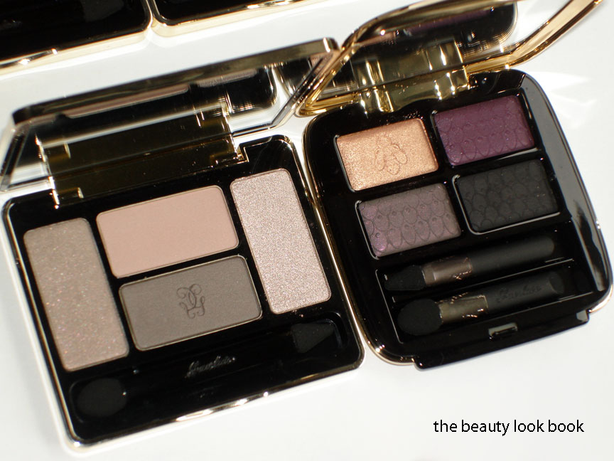
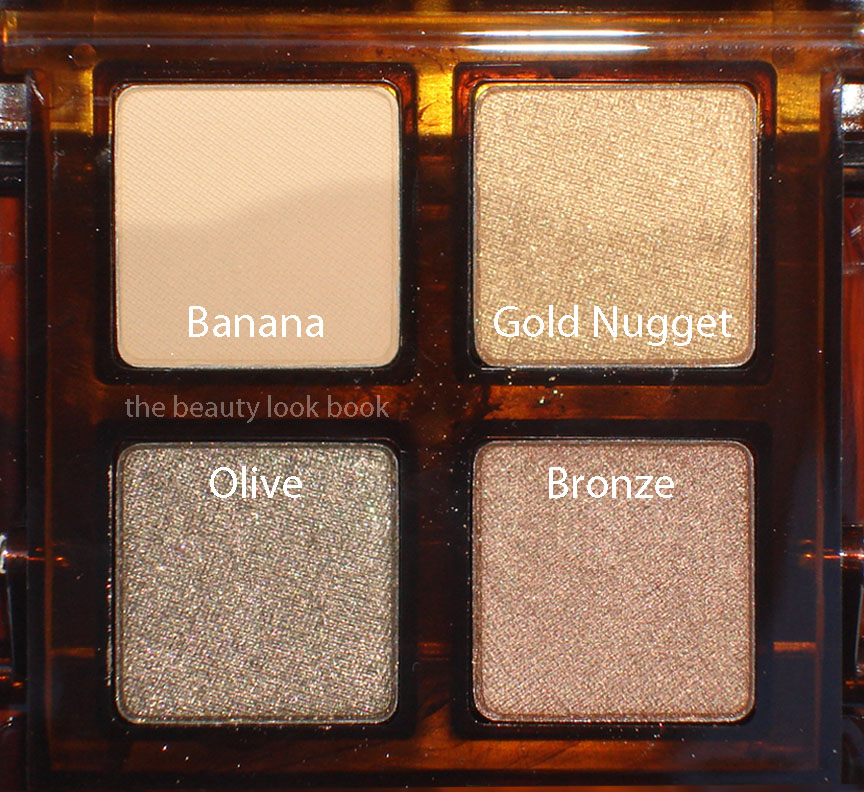
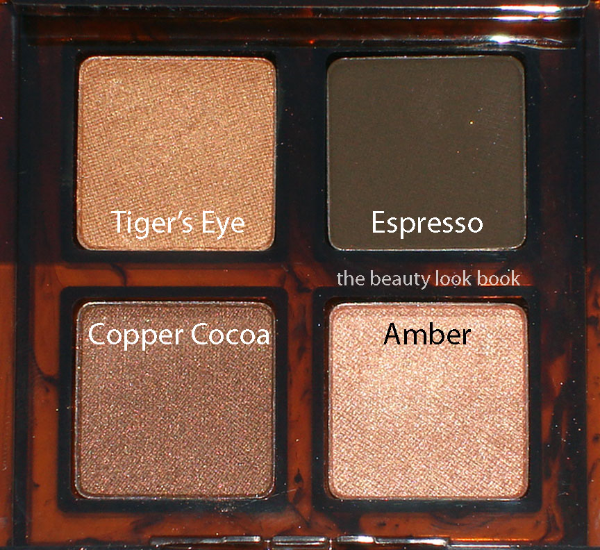
I have yet to play with these as they just arrived yesterday from Bergdorfs, however, my initial thoughts are that these appear to be highly pigmented, versatile, classic, polished and well designed. Even the neutral palettes seem fresh and unique compared to what we’ve seen in past years – something I think can be difficult to do given all the innovative products various brands have released in recent years. I definitely think the packaging and design is an improvement from the past quads. I only have 3 quads from Guerlain (here and here) and as you can see from the comparison below, I don’t find myself using them frequently.

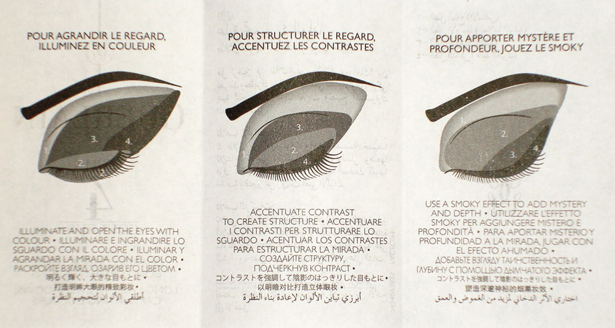
Each palette comes in a black slip case (which I usually toss) and a tiny booklet of instructions/how-to’s. I haven’t tried these ideas yet but thought I’d include it for your reference. The diagrams, while detailed and inspirational, rarely work for me as my eyeshape rarely is the same as what is on the pictures.

Last fall Guerlain released a stunning collection of luxurious eyeshadow palettes with 6 shades per compact at jaw dropping price of $85 each. Amazing reviews, detailed features and lovely how-to’s complete with swatches tempted me from Karla Sugar, Temptalia, The Non-Blonde, Café Makeup and Yuki’s Lazy Channel (to name a few). I must admit I was very tempted. Yet when I saw these in person, as lovely as each palette was, I could not bring myself to spend a full $80+ on a single item. Irrational, I know. Buying multiple eyeshadows individually can easily exceed a total price of $80, still $85 on a single item was too much for me to swallow given the neutrality of each palette (they seemed very basic when I swatched them in person). The fall offerings this year seem better suited for me in terms of price and color selection. There is more to choose from, a more diverse range of textures in each palette and the price is lower making it easier for me to justify.

Detailed reviews and swatches to come soon on each palette. Have you seen the new quads for fall in person yet? Initial thoughts? Did you love last fall’s collections? Is there something I missed that I need to go check out again?

Uncategorized

Dolce & Gabbana Autumn 2011: Cinnamon Eyeshadow Duo & Shimmer Illuminator Powder

July 31, 2011

Dolce & Gabbana has released soft angelic shades for eyes and cheeks in their Autumn/Winter 2011 collection called Sweet Temptations. Cinnamon # 80 Eyeshadow Duo has a shimmery combination of soft opal pink and soft beige-gold. Shimmer #6 Illuminator is a soft finely milled sheer glowy pink-beige. The shades are soft and neutral and make the skin glow with a subtle sheen. Each shade has this beautiful multi-color reflective quality which makes the product look either more beige or more pink depending on how the light hits the shimmer particles. Above is more pinkish, below in different lighting you see more warm beige tones. Both items are very neutral, nude and sheer. On my medium skintone, these blend in with my skin for a barely-there glow.

Cinnamon Eyeshadow duo has a soft opal pink and a soft champagne beige gold. Both are shimmery neutrals. On the fingers and arms you can clearly see the difference in color. On the eyes for me, they both look the same (whether they are layered or applied separately). These give just the slightest glimmer to the lids. Layering actually makes these look chalky but then I reminded myself other duos like this did the same. The best way for me to apply duos like Dolce & Gabbana Cinnamon is to put on a dewy eye base first, mix both shades by swirling a brush and then dusting lash to brow in a back-and-forth sweeping motion. Just add liner (like a bronze) and mascara. Cinnamon no doubt is a stunner when you see the compact. On my skin it doesn’t translate the same – it’s very similar to the colors you get with others like Stila Kitten, MAC Deckchair Pigment, Bobbi Brown Seashell, Chanel Island, just more subtle and not quite as frosty.

Swatch comparisons: Dolce & Gabbana Cinnamon, NARS New Delight, MAC Shimmertime Pigment, MAC Deckchair Pigment, Bobbi Brown Seashell Shimmerwash Eyeshadow

Shimmer Illuminator is a soft neutral nude pink. I’m not sure what to make of this one. I had anticipated a glowy highlighter because in the compact you can see a soft luminous glow. On the skin however it goes on darker and the shimmer is non-detectable. Fair skinned ladies who are looking for a good contour shade for your cheeks, Dolce & Gabbana Shimmer is the answer to your prayers. The grey undertones of most contour shades that make us look ashy are non-existent here. It does have some brownish qualities but they are soft-nude-browns meaning this will go well with your natural skintone. What I swatched on the fingers was very true-to-pan. What I applied on my arm and face was just completely different. Hence my confusion on the name “Shimmer” for this product. I can’t say whether or not it will show up on darker skins. This one is hard to tell for me.

Comparisons to MAC, NARS and YSL


Overall thoughts: I fell in love with these the moment I saw them at Beverly Hills. Upon finger-swiping my heart skipped a beat. However, after playing with these at home, I think while these are gorgeous, they are just not must-haves for me. I believe I that my skintone is at that point (slightly tanned) where these blend into my skin so well they barely show up. Granted, they are neutrals intended for a “natural look” I find them a bit too natural for me. They are beautiful and high quality products though. Lighter skin ladies, if you can get to a Dolce & Gabbana counter, you must try Shimmer on your cheeks. Given the fact that it’s less brown than NARS Douceur (for some reason this one turns brownish on me), I think many will love Dolce & Gabbana Shimmer and find it a wonderful natural contour. As for Cinnamon, it’s so pretty in the compact, nothing would have stopped me from owning this. However, most light pearly shades end up looking the same on me no matter what variation. The shimmer is subtle so those who have found other brands too frosty will like Dolce & Gabbana Cinnamon.

Have you been to Saks lately to see these or try these in person yet?

Uncategorized

Dior Blue Tie for Fall 2011: Blue Tie Palette & Serum de Rouge Crystal

July 29, 2011

Dior’s Fall Collection this year is called Blue Tie with a heavy emphasis on deep rich navy blues for eyes and nails. The look featured for Dior is quite dramatic with an intense smokey eye and soft pink lips. The collection launched several weeks ago and I initially decided to pass on the entire collection. I can’t pull off navy on the eyes and I was already smitten with Chanel Blue Satin for the nails. The colors for lips are amazing (there are some amazing pinks and nudes) but did not seem like must-haves for me.
So how did I end up with items from this collection? Well, after I played at the counter and passed, I saw Karla Sugar’s Blue Tie swatches and knew I had to go back. The Serum de Rouge formula is among my favorites (I’m not sure why I haven’t written about them before) for lipsticks. They are truly moisturizing and make the lips glow and feel hydrated without having too much slip. The colors work well to enhance the lips while making them look completely luscious. I picked out Primrose Crystal 215 and Tea Rose Crystal 455.
The Blue Tie Palette in Smoking Blue 001 was kindly sent to me by Dior (a lovely surprise!). I would not have purchased this on my own since navy looks too sharp on my skin and especially given the reports of sheerness and chalky textures on KarlaSugar, Temptalia and  Beauty Moogle. The packaging is indeed stunning in a heavy silver mirrored compact complete with applicators and a swivel lid to protect the lip product from shadow debris. I was a bit weary of how this would perform, but a few beautiful look reviews gave me hope, especially from The RAEviewer, Lipstick Musings and Tiffany’s Makeup Story. Photos first and then my review at the bottom of this post.

My thoughts:
The Blue Tie Palette in Smoking Blue 001 has a quad of smoky colors in sheer matte navy-black, deep denim blue shimmer, deep charcoal with silver flecks and a metallic smoky grey. The lipgloss seems to be a lipstick-lipgloss hybrid and is a sheer petal pink without shimmer. When swatched on the back of my hand, the shadows barely showed up. The texture is indeed rather dry. I layered a primer (UDPP) on the arm and then swatched the shadows as heavily as I could with the sponge tip applicators. As you can see, they are still fairly sheer, especially the top left matte shade. I applied this on the eyes following the tips from the other vlogs and blogs. I was pleasantly surprised to find the color shows up better on the eyes (but only over a  well primed eye.) Still, the product looks so much prettier in the palette. The result for me was a soft smokey eye. If you’re scared of over-doing a smokey eye, then sheer-darks are the way to go because it will be virtually impossible for you to mess up your eye makeup. The colors are layerable for a medium-intense smoky eye. Still, the colors aren’t really me, I would not have purchased this palette on my own. It’s workable, but takes more effort than your average eyeshadow palette to get a decent application.

Primrose Crystal is a nude pink-beige and Tea Rose Crystal is a sheer brighter pink. I picked the most neutral of the options but really all of the colors in this collection are lovely. The colors I picked look sheer when swatched but they work well with your natural lip color to enhance the lips and they do show up. Karla’s swatches are a better representation of the true color (in my opinion). These are pricey at $32 but completely worth every penny. I love the twist-up and click feature. Makes these easy to use and non-messy. They are your easy swipe-and-go kind of lipstick and require no extra tweaking.

Did you try anything from the Blue Tie Collection? What were your likes/dislikes?

Uncategorized

Burberry Fall 2011: Nude Rose, Nude Cashmere & Midnight Brown

July 26, 2011

Burberry has some new items for fall currently available instore at select Nordstrom counters. The items I ordered from Nordstrom San Francisco: Nude Rose No. 25 and Nude Cashmere No. 26 Lipsticks along with Midnight Brown No. 21 Eyeshadow. These are beautiful neutrals that will definitely become weekday staples.

Left is Nude Cashmere, Right is Nude Rose
Nude Cashmere No. 26 (left above) is a cream neutral nude brown. To me this is in the same color family as Edward Bess Sundown. It’s very fleshy-nude-taupe kind of shade. For me this is not a flattering shade. It makes me look dead. However, if you’re one of those lucky girls who can pull off colors like MAC Spite Lipglass, then you will love this.

Nude Rose No. 25 (right below) is a neutral cream pink-rose-peach. The color changes depending on the angle you look at it. Sometimes it looks like a straight rose, other times it looks more peachy. On the lips, it goes on fairly nude (like the name suggests). I like the smooth creamy coverage.

Midnight Brown No. 21 is a beautiful complex shimmery taupe-brown. This is definitely a must-have in any taupe-lovers collection. Although it’s more brown (rather than taupe) there is a beautiful taupeish tone that comes from the shimmer. I believe this is the most complex shadow Burberry has released to date. I absolutely adore it. Even though the shimmer factor is higher than most other Burberry shadows (on par with Rosewood’s complexity), the texture is still very smooth and finely milled. The pigment is just amazing with this and you can blend and layer easily to achieve the intensity you want. LOVE.

Swatched 3 ways
Overall … if you’re not digging the metallics or greens and blues from other brands this season, Burberry has a few beautiful neutral options that will be suitable for year round. While Nude Rose isn’t the most unique, it is easy to wear – sometimes finding a good nude pink rose can be difficult. This one has just the right mixture of nude and pink. Midnight Brown is the must-have for me. There are so many different ways to wear this shade and it’s texture makes it easy to apply.
I haven’t pulled any other products to compare so I can’t really say how unique/similar these are to existing colors. I do believe regardless of existing dupes that Midnight Brown is a must-have. I recommend you also check out The Ultimate Makeup for her thoughts and swatches 🙂 She’s done a few helpful comparisons.
Uncategorized

Collection Byzance de Chanel: Rouge, Or, Topkapi and Rouge Byzantin

July 6, 2011

The Collection Byzance de Chanel was designed for Karl Lagerfield’s presentation of the Paris-Byzance Métiers D’Art Collection last December. There are four items in this limited-edition collection which include Joues Contraste Rouge, Joues Contraste Or, Quadra Eye Shadow Topkapi and Rouge Allure in Rouge Byzantine. The colors are rich and vibrant and extremely unique.

There are a few lovely preview photos on La Chanelphile and Rouge Deluxe. You can see that this collection is more decorative and costume-like rather than practical for everyday wear. Still, Chanel has managed to create a beautiful collection that can be taken from runway to real-life, although for me, it won’t be for everyday. The window displays at the Chanel Boutique at South Coast Plaza last month were decorated for the new Paris-Byzance releases in leather goods, jewelry, shoes and accessories. The displays were truly breathtaking with the rich and vibrant colors.

Close up photos of the products:

The collection is indeed beautiful and stunning. Even though the blushes are both of the baked formula, they are highly pigmented and apply beautifully. The richness of the collection seems to me like these shades would be better suited for holiday with the red and the gold. With the exception of Topkapi Quad, the other items  fall outside of personal comfort zone. I personally do not think any of these are must-haves, although I did fall prey to the “limited edition” factor. I did not want to have Chanel-regret (which can be oh-so-expensive).

After playing with these items this evening, I’ve found that I love the quad, but am luke-warm on the blushes. My swatches turned out horrible so I will not be posting them. After a few hours of looking at the lipstick, I am still too scared to try it. Since my testing/swatching photos will be missing, I’m going to reference other blogs heavily for reviews I found helpful. Below are my thoughts on each item:

Rouge Blush is a stunning red. It’s rich in color and pigment and a little bit goes a long way. For me, this will not be an everyday color. It will be a going-out/special-occasion kind of color. It’s lovely, but too rich for me. I prefer D&G Sole (shown here) because it is warmer toned and works better with my skin. It’s a beautiful shade but I think it will be difficult to coordinate with other lip colors other than red or perhaps a neutral caramel nude? This applied surprisingly smoothly for the baked formula. I expected this to be a high maintenance blush with a slight blotchy finish (because it’s baked). It applied beautifully with a super light hand. The downside is the lack of versatility with this color. It won’t go with just any pink or nude.

Or Blush is a sheer chunky gold shimmer. I’m not a fan. For golds, I prefer something finely milled. This will be lovely for layering over other blushes, however alone, it emphasizes the pores in my cheeks. I don’t love it. This evening I layered Or over Rouge. I could barely see any change. I probably need more experimenting with this, but initial thoughts are “blush fail.”

See some lovely reviews of the blushes here:

Topkapi Quad is the winner of the collection. Any taupe lover will think this is a must-have. The colors are rich with finely milled shimmer. It’s just breathtaking with the dark chocolate, lovely taupe, rich sparkly gold and bronzey brown. The quilted embossed surface is beautiful in classic Chanel style. This seems like a versatile quad to use on any occasion for any season. The sharp contrast of the rich gold is beautiful.  This evening I applied these from lightest to darkest. They layered beautifully. Some lovely reviews and looks from others:

Best Things in Beauty

Rouge Byzantin Rouge Allure is a bright fuschia red. Just one look at this and I know it’s not “me.” It’s too bright, too red, and frankly, it scares me. I can’t bring myself to test it out. My mother, on the other hand, loves brighter reds and looks beautiful in anything pink, fuschia or bright. She has a fairer complexion without the olive that I have. This one will be passed along to her. There are lovely swatches:

Overall thoughts: Chanel has released a unique set of colors with the Byzance de Chanel collection. The colors are beautiful, unique and different than most other collections I’ve seen in a long time. However, the timing of the release seems a bit off to me. I believe the Fall 2011 Illusion d’Ombres overshadows this collection by far. Also given the fact that rumors of Byzance surfaced as early as last December, the delay in the release scheduled in the heat of summer seems ill-timed. Combine all these factors with the fact that these shades are well outside of my comfort zone, and the result is that my feelings about the Byzance items right now are luke-warm. As the holiday season approaches and I have more time to experiment with the reds and golds, I will probably change my mind, but I’m still finding myself obsessed with last spring and summer and now fall. I have a lot to keep me occupied and I think these will be stored away until the cooler season arrives. As an updated side-note, my husband loves the Rouge Blush on me. Perhaps I will give this a second look and experiment with it more.
The Collection Byzance de Chanel items are currently available on Chanel.com for a limited time and in select Chanel Boutiques and Chanel Beaute Studios. I purchased mine from Nordstrom Seattle. They have a Chanel Studio at the flagship store which carries special collections including various imported collections.
Uncategorized

Bobbi Brown Bronze Tortoiseshell Eye Palette

July 1, 2011
Bobbi Brown has 2 different neutral eye palette options with her Tortoiseshell Collection: Sand and Bronze. I opted for the darker version, Bronze Tortoiseshell ($60), although both were equally gorgeous. The palette comes in a two-tiered brown mirrored compact and I love that the packaging is beautiful, simple and sturdy with no frills. These palettes have a good mix of textures ranging from matte to shimmer to sparkle. I think Bronze will be an extremely versatile palette that will allow one to create a wide range of looks.
The Bronze Palette is the warmer/darker option of the two in Bobbi Brown’s Fall collection. I find it neutral-warm, leaning more towards warm. The shades in the top layer of this palette:
  • Banana is a matte yellowish cream (doesn’t show up on my arm, but mattes out the lids)
  • Gold Nugget Sparkle is a bright gold with micro sparkles (I normally don’t like Bobbi Brown’s sparkle eyeshadow formula but this one is lovely)
  • Olive Sparkle is a sparkly olive-gold (same lovely olive with gold flecks, subtle enough so the sparkles aren’t like glitter)
  • Bronze Metallic is a soft warm bronze (not to be confused with her Bronze Shimmer Wash Eyeshadow which is more golden)
The bottom layer colors include:
  • Tiger’s Eye Metallic is a shimmery orangey amber
  • Espresso is a matte dark brown
  • Copper Cocoa Shimmer Wash is a shimmery warm chocolate
  • Amber Shimmer Wash is a soft peachy orange-gold

When I saw the preview photos pop up a few weeks ago, I immediately dismissed these thinking they would be repeats of prior seasons. Both Sand and Bronze are indeed similar to past creations, and while I’m not a fan of palettes that have more than 5 shades, they are good staples. I wouldn’t call these must-haves. However, Bronze does have a gorgeous palette of shimmers with a few new unique shades. This is very “summery” which I find season-appropriate for right now. Add the fact that I liked 6 of the 8 shades in this palette made it a very easy sell for me. To date, I’ve only had a chance to do one look with this using the top four shades layered and blended together with Espresso applied with a damp brush as a liner. I’m looking forward to experimenting more with this.
Uncategorized

Bobbi Brown Bronze Tortoiseshell Eye Palette & Soft Nude Rich Lip Color Coming Soon …

July 1, 2011

Bobbi Brown’s Fall 2011 Tortoise Shell Collection features two gorgeous palettes of classic neutrals along with beautiful naturals for lips. I had vowed to not cave for another BB palette, but my resolve was weakened by KarlaSugar and Best Things In Beauty. I opted for the Bronze Tortoiseshell Eye Palette (a double decker eyeshadow palette with 8 shades) and Soft Nude Lipstick (a lovely full coverage true nude-pink). Initially I was a bit concerned the Bronze Palette might be too warm for me. Today, DSK Steph’s lovely feature confirmed that the Bronze option is gorgeous, wearable and naturally flattering.

 Details, swatches and review on each to come separately very soon.