I’ve been eagerly waiting for the official release of Edward Bess’s Illuminating Eyeshadow Base for over a year now. I was able to test a prototype at Neiman Marcus Beverly Hills and was particularly impressed how it helped my eyeshadow last. As reviewed and mentioned by The Non-Blonde, the formula has probably changed, as well as the packaging, but the final product is just as amazing. Cafe Makeup showed us a preview of his eye base in action at Liz’s makeover at Bergdorf Goodman. Best Things in Beauty also featured a review for Cashmere.
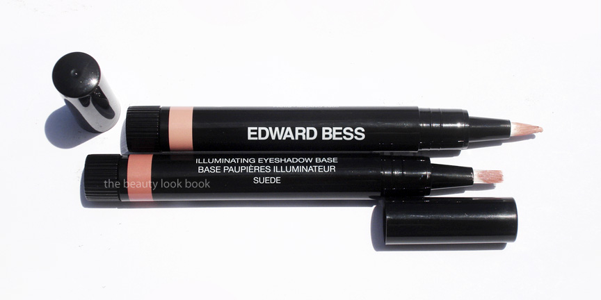
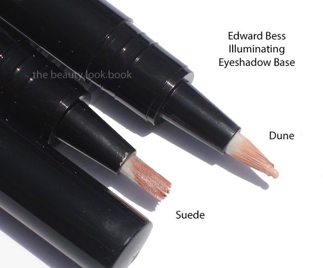
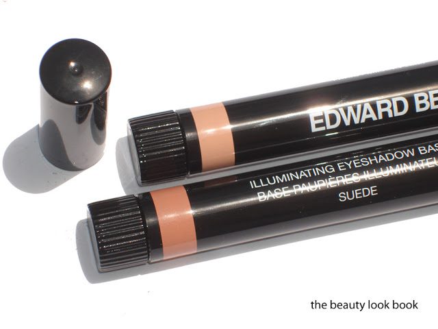
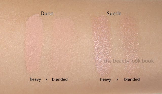
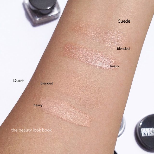
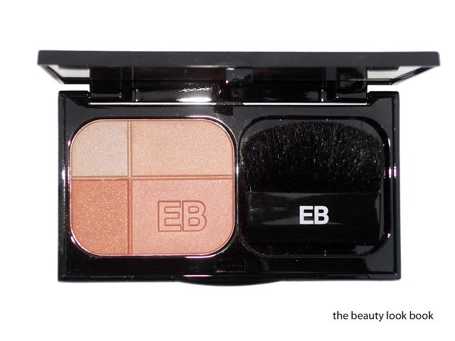
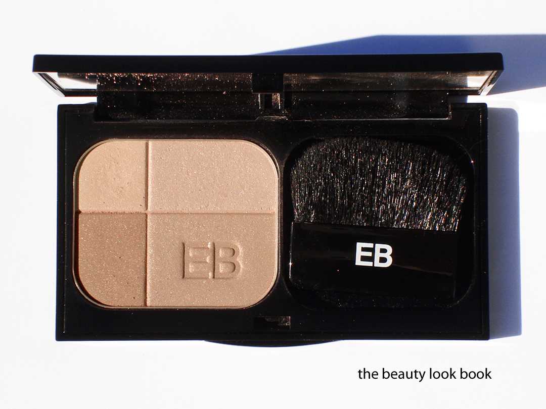
Edward Bess’s Illuminating Eyeshadow Base ($30 for .12 fl oz/3.5 ml) comes in three shades. I purchased the darker two in Dune, a cream medium flesh beige and Suede, a darker tan with a luminous sheen. These come in a twist tube with a built in brush applicator. Both shades work well with my medium olive toned skin (Chanel B30).
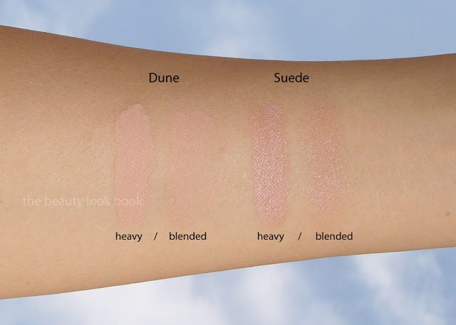
Dune has more of a matte/satin coverage while Suede is a perfect contour with shimmer. Both work equally well for me just think of Suede as a few shades deeper and more contrasted for my skintone. What these give is perfect natural coverage to the eye. While Dune seems more matte, there is an illuminating quality about it that gives my lids a flawless even glow. I’ve tried a number of other eye bases and have never found my perfect base. I have normal lids (neither dry or oily). I feel like most other eye primers I’ve tried are focused on oil control and the ones I’ve tried end up drying up my lids creating creases and lines even though I have no visible crease. Note I distinguish Eye Bases/Primers from Cream Eyeshadows. Primers/Eye Bases I’ve tried and did not love include ones from Trish McEvoy, Laura Mercier, Chanel’s Concealers (which are almost always used as a base in makeovers), NARS, Urban Decay’s Original Primer Potion (I do love the ones with shimmer/color for my skintype), Too Faced and probably several others that either irritated my skin or dried it out.
Back to the Edward Bess. This applies smoothly and evenly and dries at a slower rate than others which means I have more time to blend and smooth on the eye. I’m personally not a fan of twist-up brush-tipped applicators. I find they get dirty easily and I’d much rather apply with a full sized flat cream brush or my fingers. Still, the actual product is still amazing enough and the brush is fully functional for application so I can’t complain. Both shades indeed are brightening/illuminating. I agree with Best Things in Beauty that these offer amazing coverage and last all day into the night without creasing or creeping. This somehow helps the eyeshadow stay fresh-looking like you just applied it hours later. Both of the ones I purchased are winners and absolute must-haves
Below, more product shots and swatches applied with different intensities:
I have great news for everyone! Edward Bess is now available on Sephora.com! The latest from the Edward Bess team …
“Following huge success in Bergdorf Goodman and Neiman Marcus, Edward Bess is expanding into Sephora, launching on Sephora.com this January 2012 and will debut in store in early May 2012. As the Edward Bess brand extends its reach, Edward is excited to continue to share his vision with the brand’s legion of devoted followers and introduce the edited range to Sephora customers. “It has been a dream of mine to share my beauty philosophy with women everywhere and I am especially excited to partner with Sephora.”
Edward Bess quickly became the name on every woman’s lips since his debut collection of revolutionary lip colors took the world of beauty by storm. Coveted by Hollywood starlets and everyday women alike, Edward Bess is synonymous with refined style, exquisite luxury, and innovation. Edward perfects the art of understated sophistication time and time again, harnessing his extraordinary creative force with exceptional attention to detail in the creation of his edited neutral makeup colors and cutting-edge skincare. His paired-down, “less is more” approach allows each woman’s natural beauty to shine through while putting her Bess face forward.”
This past weekend I had a much needed girls’-day-out in LA. On our list was a stop at Neiman Marcus Beverly Hills to check out the newly launched Tom Ford beauty line and of course our favorite girls at the Edward Bess counter. I didn’t expect to see anything new from his line (although I’ve been eagerly waiting for his eye bases to be released) but spotted a new Quad Royale in Monte Carlo 02 a beautiful highlighter quad of peachy goodness ($45 for 0.25 oz/7g). Being the peach fanatic and EB fan that I am, I snapped one up immediately without even trying it at the counter (I had other blushes on that I was testing from another brand).
Monte Carlo 02 is the third Quad Royale face highlighter Edward Bess has released. It has four colors in a black mirrored compact, all different variations and intensities of peach shimmer. The lightest shade is a pale champagne but the others are darker and more pigmented. I previously featured Summer in Capri 03 and South of France 01 in prior months and love layering them over his Daydream Bronzer or other blushes to add a soft glow. I find they are perfect for my medium skintone to add a subtle highlight to brighten the face. Monte Carlo is also a highlighter but I find the colors darker so this could also work as a blush. I do find it more pigmented and more shimmery than the others but in a beautiful sense (it’s not overly frosted). The texture is similar to that of the other quad royales: smooth, finely milled shimmer and easy to blend on the face for a natural glow. I do find it a bit harder in texture compared to his original version of the Daydream bronzer which is the one I have featured in the past. The Quad Royale still applies smoothly and easily on the skin. Monte Carlo has no detectable scent. I love the brush that comes in the compact – it’s a step up from most compacts other brands have and is usable to dust the cheeks evenly with color. Here are all 3 of Edward’s face quads plus a few more close up shots:
Outdoors, cloudy lighting, no flash:
Ingredient listing (clickable for larger viewing):
On the face it applies shimmery. I have worn this as a blush alone but prefer this layered over another semi-matte to fully-matte product (whether it is blush or bronzer). I was hoping for sun this weekend but it was overcast. Here are the best swatches I could manage:
A few comparisons to other peachy blushes and bronzers. There are others I could have pulled but right now I am limited on time so I pulled a small sample to help give you an idea of the color. Please note that right now I do not have time to accommodate extra comparison or dupe requests.
Swatched left to right: Bobbi Brown Nectar Shimmerbrick, Dior Aurora, Edward Bess Summer in Capri, Edward Bess Monte Carlo, MAC Ripe Peach
Bottom line: love. It gives a natural peachy glow with a subtle refined shimmer. Pigment is sheer but noticeable on the skin with one swipe and it is also layerable for more color. If you have Summer in Capri, do you need Monte Carlo? They are similar in color but the Summer in Capri has bigger portions of lighter shades while Monte Carlo has more peach. I think they are different enough to justify both. Is Monte Carlo a must-have? In my opinion yes, even with the dozens of peachy shimmers I already own, yes.
As of this past weekend I was not able to find this anywhere online for sale. I do know the Beverly Hills Neiman Marcus counter has this. I highly recommend you call them to order if you’re interested. I have not yet checked with the Bergdorfs counter.
Edward Bess Berry Chic is the more dramatic pink-plum palette option this season. I ordered this sight unseen and did not ask for descriptions in advance so I did not know what to expect. I will say that Back to Basics is my favorite of the two, but Berry Chic is surprisingly wearable even though it has pinks and warm plums for the eyes (which I normally cannot wear at all). The formulas/textures are the same as his other palette so I will mainly describe the colors. The cream products also have the same fig scent as his lipsticks, glosses and bronzer.
Lip/Cheek color – muted plum rose (not as bright as his Island Rose Compact Rouge)
Highlighter – pale shimmery pink (smoother in texture than his Back to Basics highlighter)
Eyeshadows -soft satin ivory, warm pink-tinged plum shimmer, warm pale bubblegum pink, warm brown shimmer (all very pigmented, layerable and easy to blend)
Glosses – top shade is a sheer cool light fuschia, bottom shade was a complete surprise, the top layer seemed to be slightly oxidized, the color once top layer was swiped was a warm rich plum-red (the bottom color is very pigmented)
I applied this over the weekend with slight hesitation. I think the eyecolors in this palette aren’t the easiest to pull off with ease. If you can wear warm pinks or plums (think NARS Kuala Lumpur or MAC Swish) then this will be pure love for you. I tend to avoid pure pinks or warm reds/burgandies/plums on the eyes because they give me that pink eye look. Edward Bess Berry Chic was surprisingly wearable and naturally flattering. I applied the eyeshadow colors by layering them (lightest to darkest). Still I will mainly stick to my safer neutrals for eyes. Perhaps the next time I visit the EB counter I will ask someone to show me how to use it. Bottom line: still undecided but trying to go outside my comfort zone.
LA/OC girls, not to sound like a broken record, but Edward will be in LA starting tomorrow for a week. If you can get to the Beverly Hills Neimans I highly recommend you try and visit.
Berry Chic retails for $75 and is available online at EdwardBess.com and instore at Bergdorf Goodman.
Edward Bess Back to Basics ($75) is the perfect palette of polished neutrals for the woman on the go. It’s natural yet not too natural and I believe it’s as goof-proof and universally flattering as his Daydream Bronzer. The Non-Blonde has a great review with beautiful photos and swatches. I agree whole-heartedly with everything she says. My thoughts & descriptions (working my way from the left side of the palette to the right side):
Lip/Cheek color – This has the same texture as the Compact Rouges. The color in pan for Back to Basics was slightly misleading but in a good way. In the compact I expected a warm nude with brown tones. Instead it goes on a nude-pink. It’s lovely on the cheeks for an understated pink tint and gorgeous on the lips. The pigment is excellent – buildable, non-greasy and easy to blend very much like his compact rouges. Also has the fig scent.
Highlighter – The highlighter is a cream formula. It’s a warm sheer nude sparkle. I felt the texture of this one was slightly textured to the touch of the fingers (in pan) but it felt completely smooth when applied to the skin. The color is sheer but more sparkly than his other cream highlighters. Still not overly so. I layered this over the lip/cheek color on the face and it added a wonderful highlight. This does have the fig scent.
Eyeshadows – The eyeshadows in the palette are beautifully pigmented – even more so than his regular shadows. The colors are all shimmery. I found the shimmer factor to be higher than all his other shadows. The colors are an ivory shimmer, a beige shimmer, a warm pale copper frost, a deeper warm brown shimmer. I was scared of the light coppery shade thinking it would be too warm. Alone, I think it is. But when layered with the other paler shades it gives the eyes warmth and depth.
Glosses – I agree with The Non-Blonde these were the weakest points of his palette. Both are sheer beiges, one with slight pink tones. They do add a nice shine to the lip/cheek color, but alone I suspect they will appear very sheer.
The Brush – The double-ended brush contains one side for applying cream products, the other for shadows. Initially thoughts were a let-down. The brush seemed to be not-the-greatest quality. The bristles for the powder didn’t appear to be hand-made. Yet again Edward Bess never fails to please. The brush is a wonderful mini applicator and applied the eyeshadows with ease.
A few close ups of each side:
Swatches below. Note mine are applied with a very heavy hand. Don’t be scared of the shimmer factor for the shadows. If you’re familiar with Edward Bess Eyeshadows you know they apply beautifully but are layerable. The colors in his palette work the same magic as the individual colors. The frost isn’t overpowering at all. Be sure to check out The Non-Blonde’s review. Her swatches are more inline with what the colors look like when applied naturally.
Bottom line: Even though I prefer to pick items individually (rather than palettes) and prefer creams to be separated from powders (in palettes), I adore this. It made my whole face glow naturally. It’s worth every penny and I will just take extra care to try and not get the debris from the shadows in the other cream-based products. The palette is available at Bergdorf Goodman in-store. It is also up online at Neimanmarcus.com and EdwardBess.com. I haven’t checked with the Beverly Hills store to see if they have this yet, their number is (310) 550-5900. PS – I just heard that Edward will be in LA starting tomorrow until next Thursday. I highly recommend calling the counter for the details, if you can visit while he is in-store, you are in for a real treat.
Edward Bess has released his first two palettes this holiday season ($75 each). Each palette comes in a black mirrored rectangular compact containing:
one lip/cheek color (similar to Compact Rouges)
one cream highlighter
four eyeshadows
two glosses
a double-ended brush (one side for creams other for shadows)
Back to Basics is the neutral-nudes option and Berry Chic is a palette which has cool-toned pink plum shades. The palettes are currently available at counter in-store at Bergdorf Goodman and also on EdwardBess.com. Here is the packaging:
A few close ups of the lips/cheeks:
Next up will be details, descriptions, reviews and swatches of each palette individually. Both were purchased sight-unseen. I’ve only been testing for a few days but initial thoughts are thumbs-up. All the cream items in this palette have the beautiful EB fig scent (I can’t smell anything from the shadows). I’ll be putting up my reviews as fast as I can. For more details you can call the Bergdorf Goodman Edward Bess counter (212) 872-8826.
Edward Bess has released some new things for holiday this month including his new South of France face quad and two palettes Berry Chic and Back to Basics (see sneak peek here and also featured on The Non-Blonde). These items literally just arrived at counters to Bergdorf Goodman and the palettes are now on EdwardBess.com. First up is a review on his newest Quad Royale palette, South of France 01 ($45 for .25 oz/7 g), a beautiful glowing opalescent powder quad of pale shimmers. The palette is inline with this year’s holiday theme of subtle-glow and has the slightest bit of overspray on top (at least it appeared so in my eyes). Underneath the powder is still shimmery and glowy and beautiful. The colors from the top left clockwise are: soft cream beige-peach shimmer, soft nude pink, soft darker nude pink, subtle golden pink beige. When mixed together the effect is subtle and South of France gives the cheeks a soft pale opal pinkish glow that is understated but visible. Using the brush in the compact (soft and fluffy) gives an ultra sheer wash. I prefer using a denser blush brush (like Bobbi Brown’s or Shu Uemura’s) for a more visible look.
With the overspray and a high flash, the powder simply glows:
In direct sunlight, overspray removed, without the flash you can see the palette is subtle and not overly frosted. Here you can’t really see the glow well, but this gives you a good look at the base colors and undertones of each shade. Note that even with the overspray gone it still glows depending on the angle you hold this against the light.
See here this still glows when held at an angle:
Note this is swatched with a very heavy hand, on the face it’s lighter and more subdued:
Here are his two Quad Royale quads, South of France 01 (more pink and glowy) and Summer in Capri 03 (more contoured and peachy, reviewed a few days ago), I’m hoping there is a #02 to be released soon, maybe for spring?
Overall I adore. Subtle, refined, and absolute glowy perfection. These are sheerer than his cream highlighter in Sunlight so if you want something more visible I think you will be happier with the creams. I tried to think of something I could compare South of France to but just couldn’t. The mixture of gold, pearl, beige, pink in South of France is just gorgeous and the powder gives depth with the darker tones of the bottom left corner shade. Is this a must-have? Absolutely yes. If you asked me to choose between the two quads, I would not be able to, I need both.