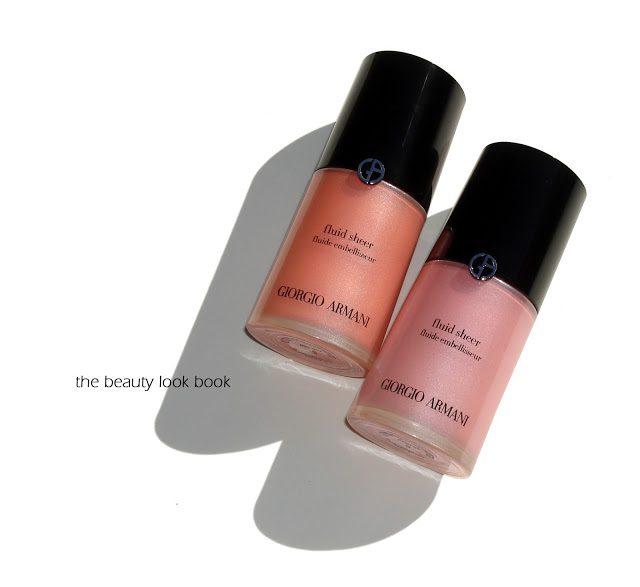
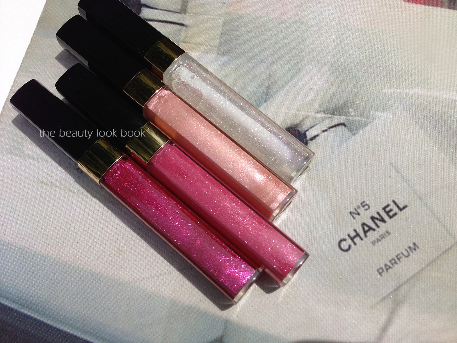
Armani Fluid Sheers ($59 for 30 ml/1 fl. oz.) are well loved among liquid highlighter fans. This season Armani revamped the packaging and brought out some new shades. You can see the newer shades swatched on Café Makeup’s Instagram account. I picked up #5 a light coral peach shimmer and #8 a pale frosted pink.
For those new to Armani, Fluid Sheers are liquid pearlescent highlighters. The shimmer varies per shade, some have a subtle pearly finish, others have a more noticeable frost. The uses are endless. Armani suggests that you can blend with foundation to add radiance, use as a sculpting product, alone as a makeup
base, or as a highlighter. To date the only one I have used mixed in with foundation is #7 which has a similar but slightly more visible finish compared to MAC’s Strobe Cream. The other shades are either too shimmery or dark for me to use all over the face or to mix in with foundations. I like to use these as highlighters or a cream blush.
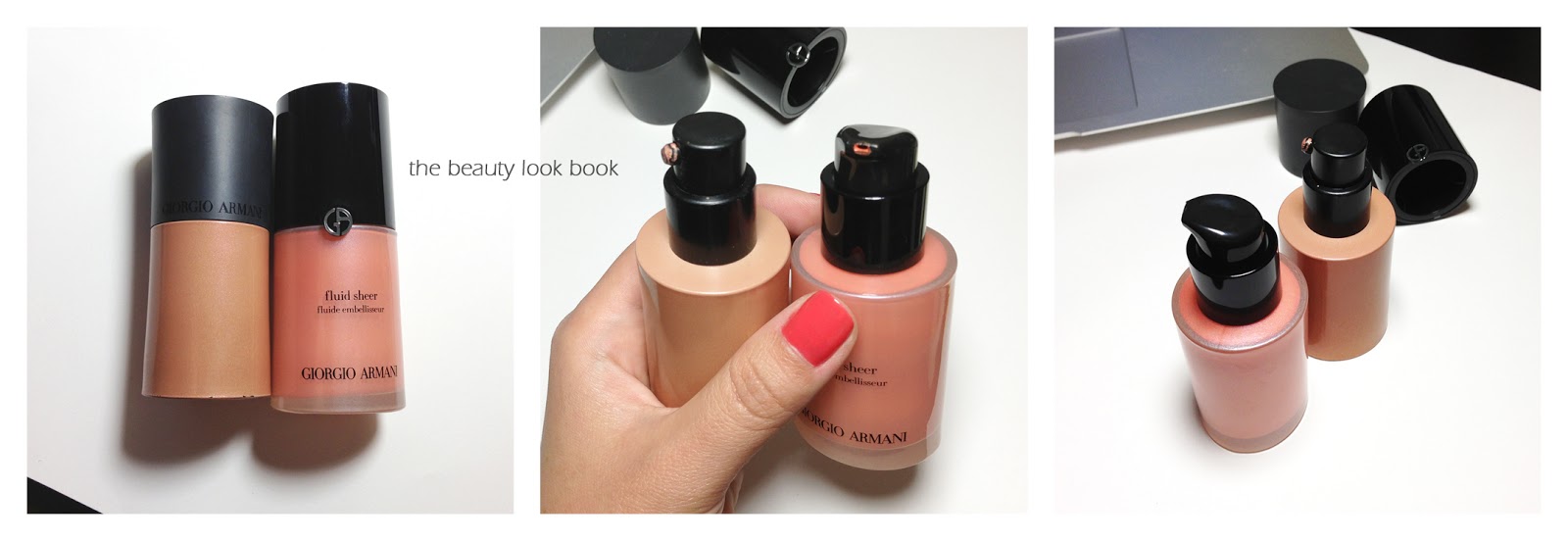
The newer bottles are slightly taller than the original packaging although they contain the same amount of product as the original one. The differences are in the overall look and packaging. The new version has a frosted bottle so you can see the product inside and has an all over sleeker look.
I played with the newly released colors at my local Armani counter and settled on two of the lighter shades. I always love a stronger vibrant blush (blended out of course) but the darker shades are extremely pigmented and ended up looked a bit muddy on my skintone.
The peach shimmer #5 is absolute perfection. It has just the right amount of color and shimmer to give a healthy glow to the skin. The pale pink #8 is a lovely color but too light for me to wear alone. It makes a lovely highlight but definitely needs blush or bronzer added. If I were just a tad bit darker it would have a white cast on me due to the paleness.
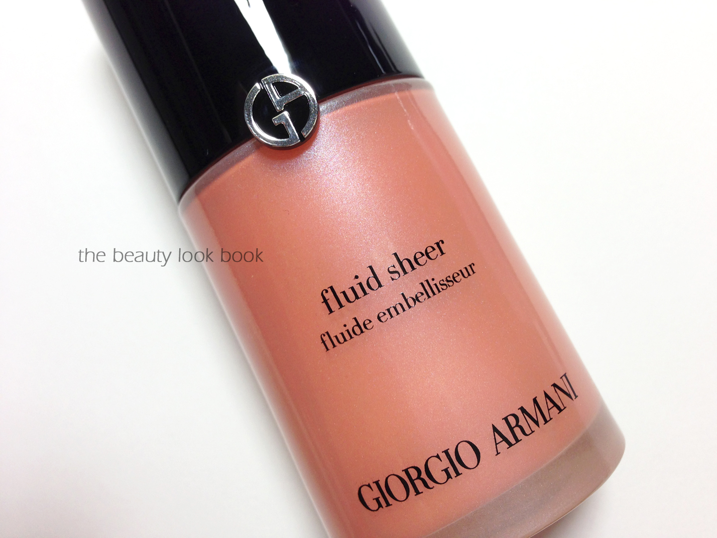
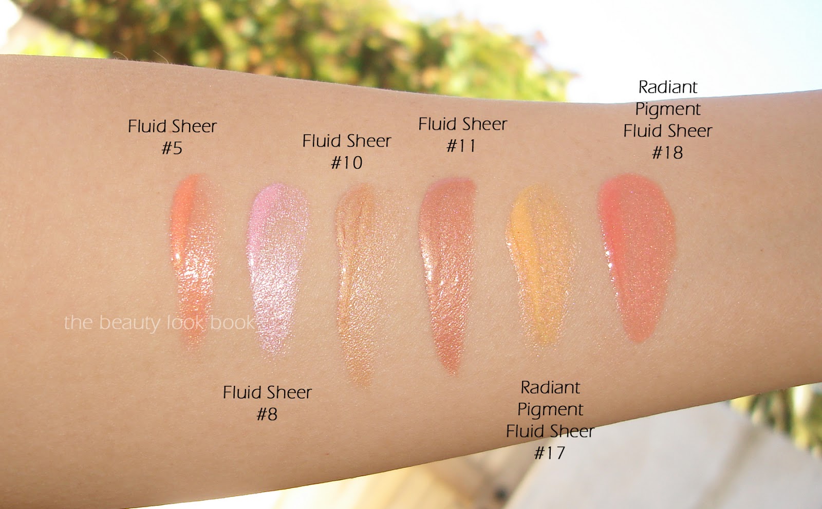
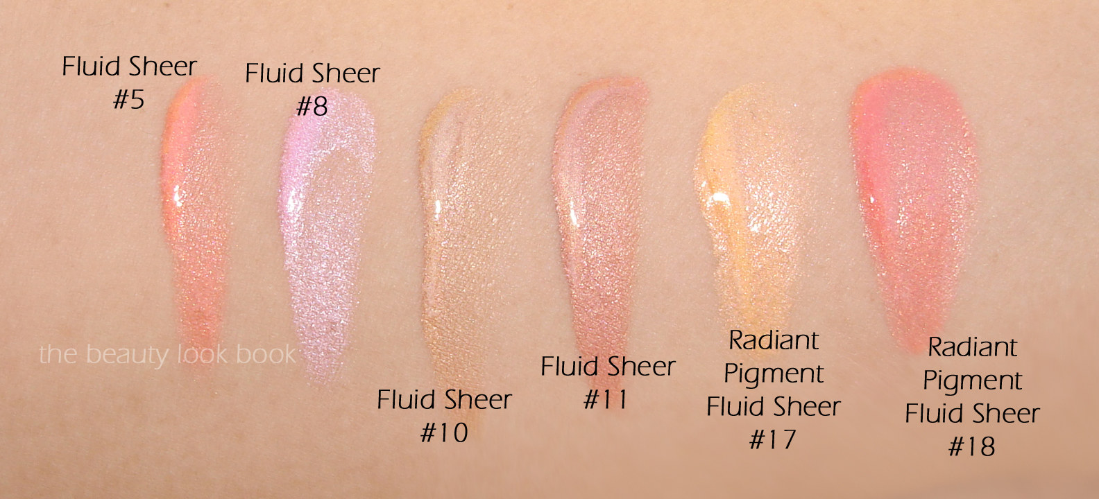
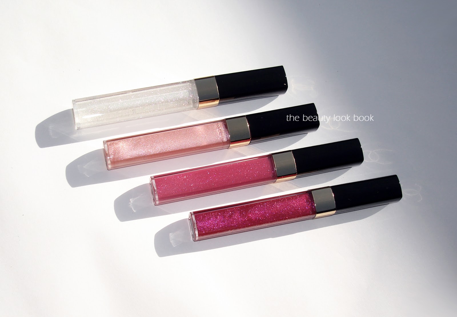
Some close ups:
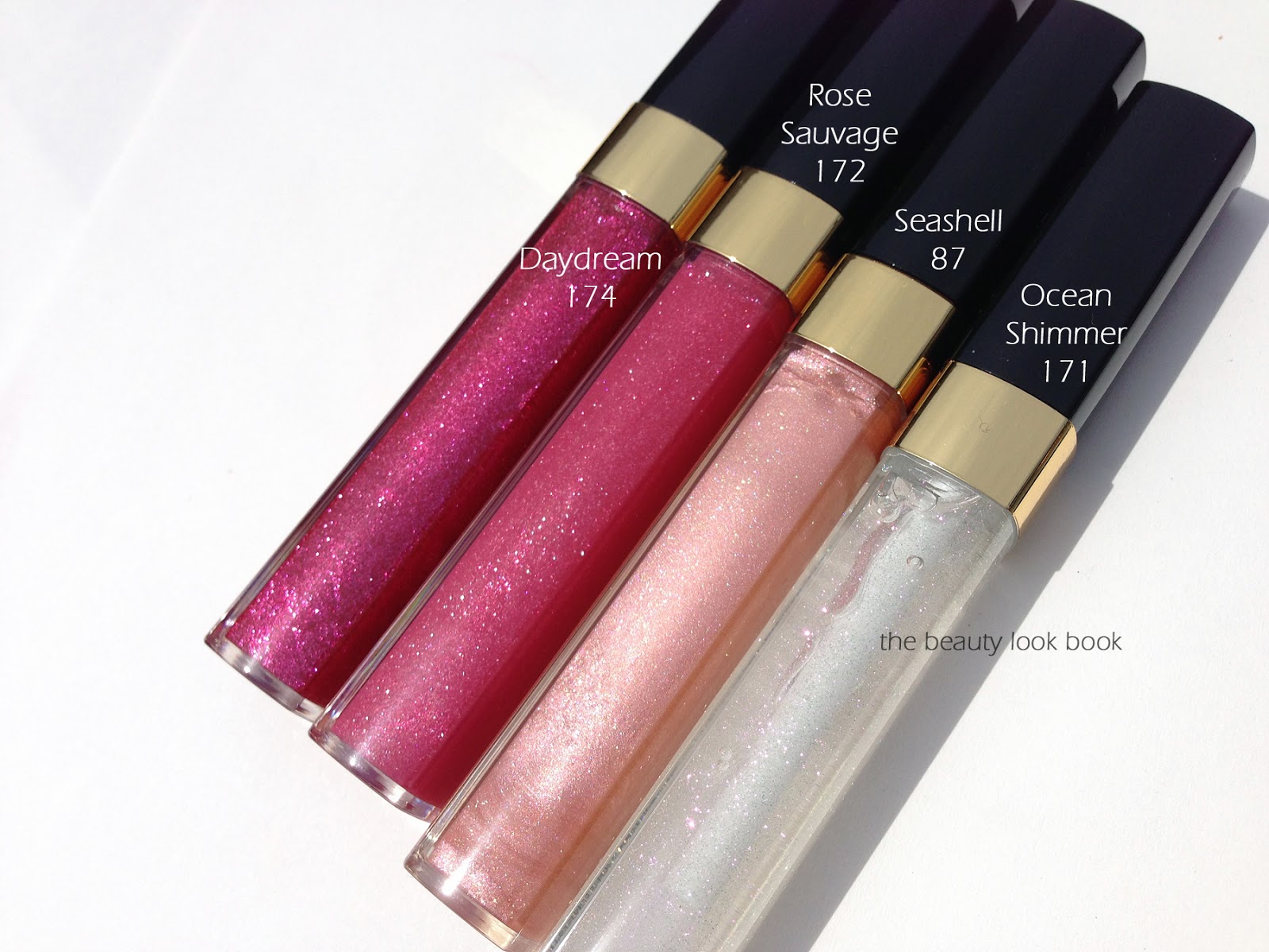
I pulled some of my current Fluid Sheers to compare, #5 looks very similar to one of the limited shades from several years ago, the Radiant Pigment Fluid Sheer #18 (however the new #5 has more pigment).
Note that the Radiant Pigment Fluid Sheers #17 and #18 were limited-edition from 2008ish and are now discontinued. They are shown below only for comparison purposes.
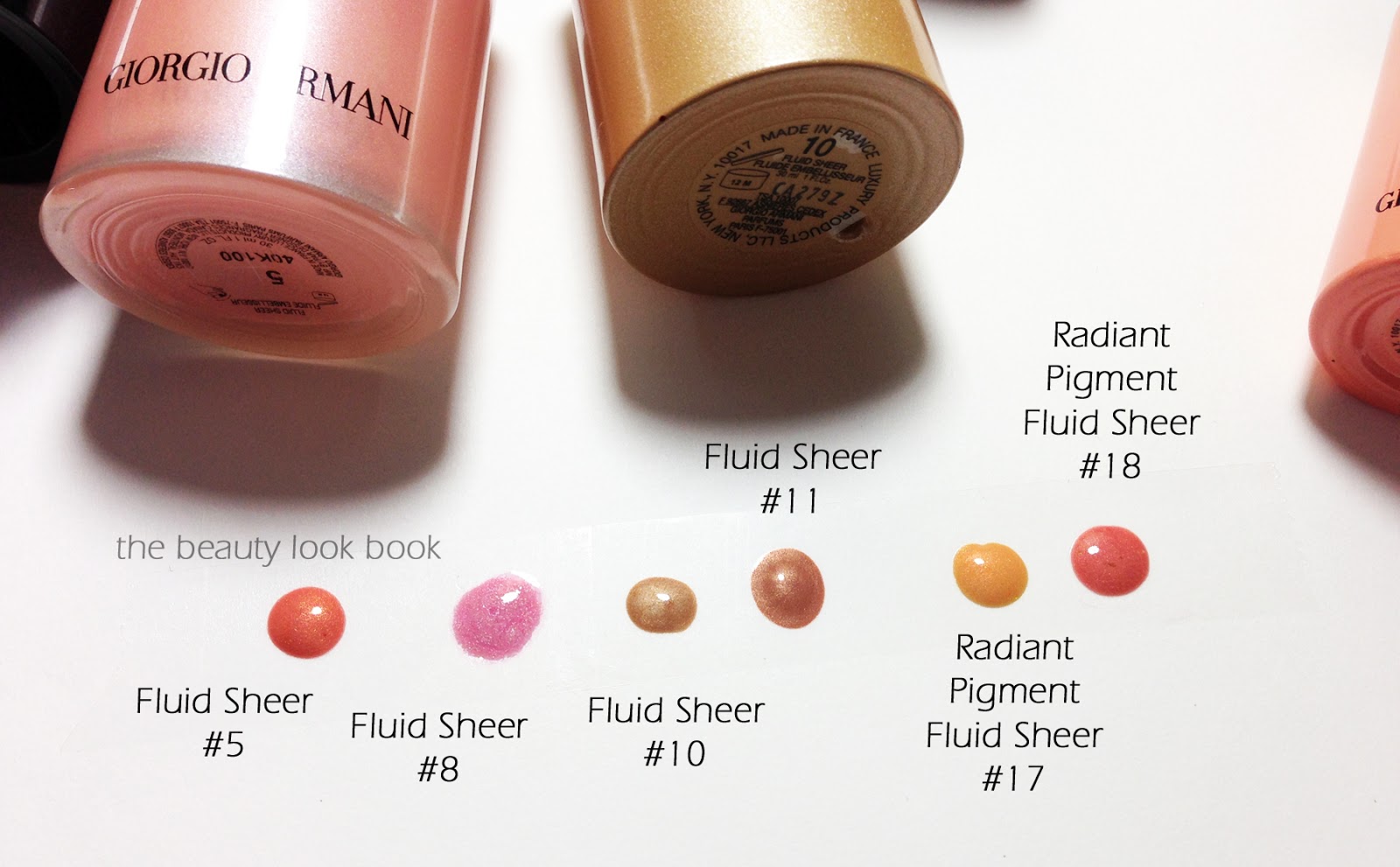
Swatches, same set, two different views:
I see myself getting the most use out of #5. I do think #8 is lovely but wish it were a few shades darker or less white on the skin. Fairer skinned makeup fans will love this one. Did you purchase any of the new shades? What’s your favorite Fluid Sheer?
Armani has a number temptations this summer including a collection of new Flash Lip Lacquers newly repackaged Fluid Sheers (with a few new shades) and a breathtaking Bronzer/Shadow palette. I passed on everything from the spring collection but fell in love with summer. If you’re an Armani fan, you’re bound to fall in love the new items. Swatches to come soon.
Teal, emerald, green and aqua seem to be the focus for nails in several collections this season. There are a number of gorgeous new green nail polishes – all of which I was unable to resist. Some are more subtle and subdued while others are bright and electric. The new shades this season inspired me to pull out my other greens for comparison. I’m currently running a top coat experiment so I won’t be able to swatch these on the nails just yet, hopefully these photos will help give you an idea in the meantime.
The inspiration: new shades for summer from Dior, Chanel, YSL, MAC and Deborah Lippmann (spotted near me in stores now at Macy’s, Neiman Marcus and Nordstrom):
Dior’s Samba Duo ($29, spotted instore at Macys, Nordstrom and Nordstrom.com)
YSL Vert D’Orient #36 ($25 instores and here at Nordstrom.com)
MAC Mineralize Lip Balm in Glacé ($20 here at Nordstrom.com)
Deborah Lippmann Rockin’ Robin ($19 at in store and online at Nordstrom.com)
All the nail colors in greens, teals, aquas: OPI Thanks a Windmillion, YSL Jade Imperial (limited from spring 2013), Dior Waterlily (limited from spring 2012), Dior Samba Duo (summer 2013), Chanel Azure (summer 2013), Deborah Lippmann Mermaid’s Dream, Rescue Beauty Lounge Jack (limited), JINsoon Charade (at Sephora), JINsoon Metaphor (at Sephora), Chanel Black Pearl, YSL Vert d’Orient, Deborah Lippmann Rockin’ Robin (spring 2013):
For quick reference here’s one more shot of the bottom wheel at a different angle so you can see the difference in undertone between Chanel Azure and Dior Samba:
I love how vibrant and bright the shades are this season although I do wonder if I will be brave enough to pull them off on the fingers for everyday wear at the office. I definitely wouldn’t hesitate to wear them on the toes. Teal/Emerald as a small accessory or accent piece? Even a blouse? Definitely yes, but on the fingers, I’ll have to experiment to see. More detailed swatches and reviews to come in the next few days as soon I possibly can.
What’s your favorite teal, green or emerald shade for nails? Are you picking up any of the new greens this spring/summer?
This post contains affiliate links, for more info see the About/FAQ section.
Dior has released a Sephora-exclusive nail polish called Lilac Colorvision #398 ($24, limited on Sephora.comand in stores). It’s a new shade to the US, but actually a repromote of a Japan Exclusive Frou Frou #398 (see review on Ala Peach). It’s currently sold out online but the Find In Store feature shows that physical stores should still have it in stock. I found mine in-store several weeks ago.
Lilac Colorvision #398 is a lovely cream light lilac nail color. Many lilacs are either too pink or pale and end up clashing with my skintone but the Dior #398 has enough color to not look chalky. It has a very fresh youthful look that’s lovely for spring. The application was smooth and flawless with two coats – Dior keeps getting better and better.
Swatches below with two coats, no top coat, I was happy to find it dried to a glossy finish very quickly:
I don’t own many lilac shades to compare, but I pulled a few purples from Chanel, Dolce & Gabbana and OPI to compare (each photo has the same set, just different lighting):
Bottom line gorgeous. If you’re interested I suggest you try to track it down at your local Sephora store soon, I don’t know if it will be restocked at Sephora.com. Did you try Dior’s Lilac Colorvision? What’s your favorite lilac shade for nails?
Edward Bess fans like myself were ecstatic to learn he had his first debut on QVC this past Friday on the Lisa Robertson Show where he launched his new Black Sea Mousse Foundation with Expert Blending Brush (exclusive to QVC.com). I caught the end of his appearance on TV Friday night and by that time, Fair and Light had already sold out. Edward was kind enough to send me samples to try and I was beyond thrilled. Some product information along with my testing experience, thoughts on the formula and color selection.
The Black Sea Mousse Foundation is a breakthrough mousse foundation formulated with anti-aging ingredients inspired by the Black Sea to help reduce the appearance of the visible signs of aging. It has an innovative air-whipped mousse texture that floats on the skin for the feel
of wearing no makeup at all, while still providing full coverage with
its pigment-rich formula for a flawless complexion in an instant. QVC set comes in five shades, Fair, Light Medium, Tan and Deep (1.5 oz) with the Expert Blending Foundation Brush (prices online at QVC subject to change). In case you missed the segment, you can watch the Video online (click below, models are wearing Light and Medium, Edward demonstrated application of Fair):
I’ve been lucky to have really good experiences with his Compact Foundation (I use Beige) and his new Complexion Cream (I use Medium, reviewed here). Foundation is one of the trickiest makeup items to find because of color/skintype/coverage matching preferences. I almost never buy foundation without trying first. Since this was a gift from Edward (sight unseen), as I opened my package I kept my fingers crossed.
Color thoughts: When I opened up Medium 03 first and was surprised at how dark it appeared. The next shade down Light 02 also appeared quite dark. I tested both, each on separate days all over the face to see how the color looked. I was relieved to find that these blend out on the skin beautifully and once blended don’t look as dark as they do in the pots.
Light is an exact match for my skin, although sometimes that exact match ends up looking a bit too light when applied and blended all over. This can sometimes be fixed by mixing in something darker or setting with a darker powder. Medium is visibly dark on my skin when swiped, but blended out for a pretty good match as well. I wore this and it looked just slightly too dark. So what’s my color? I would say I’m in between, but closer to Light which is a 95% good match on me right now. I was happy to find that it does warm up on the skin slightly but doesn’t darken or oxidize.
Formula thoughts: The formula is really incredible. Years ago one of my holy grail matte-finish foundations was Chanel’s Double Perfection (the one that came in the black squeeze tube). I literally had a meltdown when they discontinued it and was sad they never re-released it. Edward Bess’s Black Sea Complexion Correcting Mousse Foundation is the closest thing I’ve found but better in terms of wear, texture, blendability. The video segment on QVC will show you how well this foundation covers. It’s lightweight but gives full natural coverage and dries to a semi-matte finish. You don’t need to set with any powder. On the 2.5 days I’ve tried this I found it lasted well into the afternoon without requiring any touchups. I like that it’s full coverage but not heavy.
Brush thoughts: I applied the foundation with the Expert Blending Brush and it really provided perfect streak-free application.
Photos of Light and Medium below, they look really dark in the pots:
I swatched them along my jawline on a bare face, swatched heavily, blended only a little bit. Light 02 might be a bit hard to see because it matches closely. Note this photo was taken under artificial light which makes my skin look more yellow than it is in real life.
Since it can be hard to gauge the colors, I highly recommend you look at QVC’s color chart. I debated what other foundations to compare these to. Formulas and textures can impact the color and blending will affect how certain colors mesh with one’s skintone. I picked a few to show, it’s not as comprehensive as I’d like, but foundations are difficult for me to photograph accurately. They tend to dry and darken if I don’t photograph right away.
I picked the other foundations I have that are creamy pot formulas. Dolce & Gabbana’s Perfect Creamy Foundation has a wider color selection but a more dewy finish while the Edward Bess is matte. I’ve always been in between shades for Dolce & Gabbana and currently mix Warm 100 and Natural Beige 120 (see the Dolce & Gabbana review/swatches here).
I only swatched the Dolce & Gabbana Warm, but added Edward Bess’s Complexion Cream in Medium for comparison purposes (that review is here).
I’m overall very pleased with Edward’s new Black Sea Mousse foundation. The formula is really best in class with the coverage, texture and blendability. Huge thumbs up. The color selection however is limited, leaning towards the darker side. The formula is melds with your skin so it is possible that you don’t need an exact match (these days I’ve been buying 2 shades in NARS, Armani and Dolce & Gabbana anyways). I do think fairer skin ladies with yellow or olive tones might find it challenging to get a good match. Right now the foundations are exclusive to QVC.com and the lightest shades are on waitlist. I hope that Edward might consider extending the color options in the future. I was really lucky to find a good match in Light.
Did you watch Edward on QVC last Friday? Have you had a chance to try the foundation? If so please share what color and perhaps other brands/shades you use to help the rest of us who are debating whether or not to try.
This post contains a press sample provided without charge for review. For more information please see the About/FAQ section.
Edward Bess fans will be thrilled to know he is scheduled to debut on QVC® tonight, Friday, April 12 at 10 PM (ET) during “The Lisa Robertson Show.” Expanding his Black Sea brand, Bess will introduce the first color cosmetic item offered exclusively through QVC: his Black Sea Complexion Correcting Mousse Foundation and Blending Brush duo (QVC Item #A232023, on QVC.com) will retail for $75.00 and will remain exclusive to QVC through April 12, 2014 (currently a special price online).
The Black Sea Complexion Correcting Mousse Foundation is formulated with algae and sea fennel plus vitamins C and E, which help to achieve the look of healthy, youthful skin. The ultra-lightweight formula is available in five shades (“Fair,” “Light,” “Medium,” “Tan” and “Deep”) and Bess’ expert Blending Brush will help create a flawless finish every time.
Visit QVC.com to see a helpful visual of the different shades. Personal review on the foundation from The Beauty Look Book to come soon!
This spring season has brought us a wide selection of new lipgloss formulas and colors. Many lines are expanding their color options or developing new-improved formulas through mini-extension releases. The Revelation de Chanel collection focuses mainly on Glossimers ($29.50 each, Nordstrom.com) with some new colors mixed in with some repromotes. I purchased mine almost a month ago and have been using Rose Sauvage non-stop. The shades I bought:
Ocean Shimmer 171 is a clear gloss with delicate tiny sparkles suspended
Seashell 87 (repurchase) is a pale shimmery champagne pink
Rose Sauvage 172 is a soft rose pink shimmer
Daydream 174 is a rosey pink with metallic fuschia sparkle particles
The colors are typical of Chanel glossimers: naturally gorgeous, delicate with high shine. Daydream’s shimmer is borderline glittery but the color blends out evenly and smoothly on the lips. Those who love Chanel Glossimers will love Rose Sauvage and Daydream. Seashell is a good natural staple I think is universally flattering on all skintones. Ocean Shimmer is definitely a pass for those who have clear gloss in their makeup wardrobe (I still caved).
Swatches:
I managed to get in lip swatches of Rose Sauvage and Daydream:
Comparisons to others show that you these are different from other Chanel glosses, however due to the sheerness, you can get a similar effect with other shades:
I love the color of Rose Sauvage. It’s rosy enough to show up on my lips but still very natural. I love it layered over Perle Rouge Coco. Daydream is also lovely although might be too sparkly for some. Given all the new lipgloss offerings this season from Chanel, Dior, Guerlain and Armani you might feel a bit overwhelmed (like me). I am still waiting for Armani’s Flash Lacquers to arrive at counters to test (although I usually do like Armani). I just tested out Guerlain’s today instore briefly but haven’t played extensively. I personally have a soft spot for Chanel and Dior glosses (they are my favorites) so I knew I couldn’t go wrong with either. Those who have been waiting for all to arrive will be happy to know that most new gloss formulas should be available at counters to test now. Based on my testing, I feel all the glosses from Chanel, Dior, Guerlain and Armani are all excellent in quality and pigment. My suggestion is to look at the colors you are drawn to first since the formulas are all very similar (in my opinion).
The full Revelation de Chanel collection is listed: