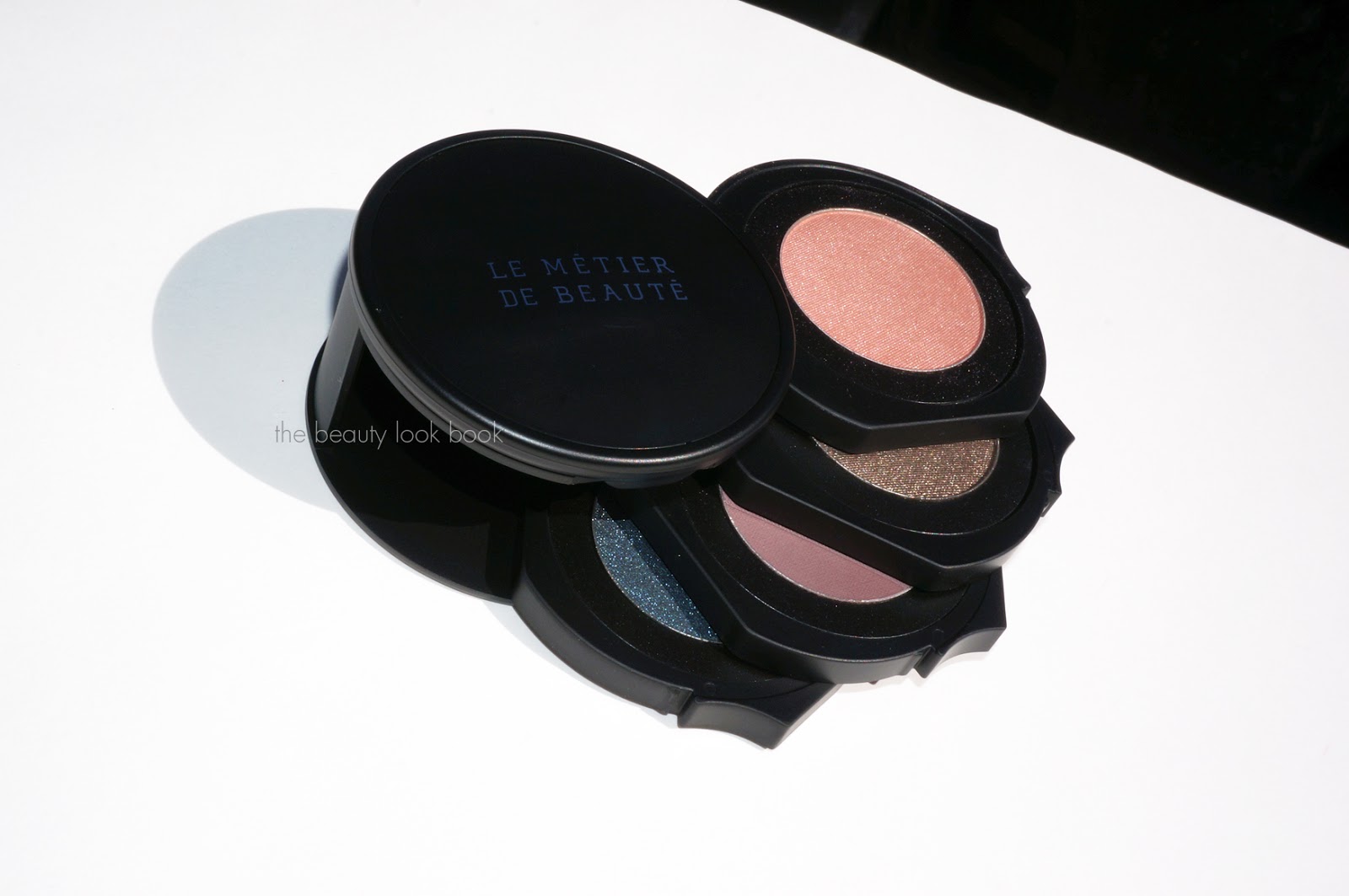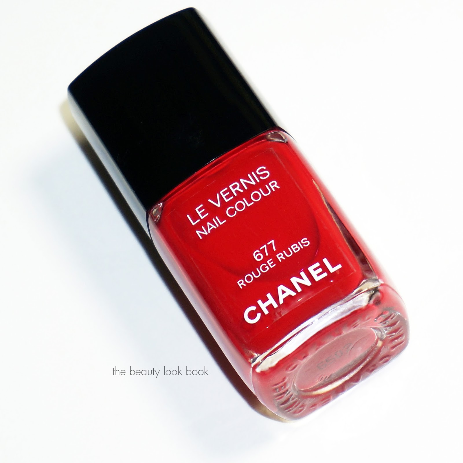
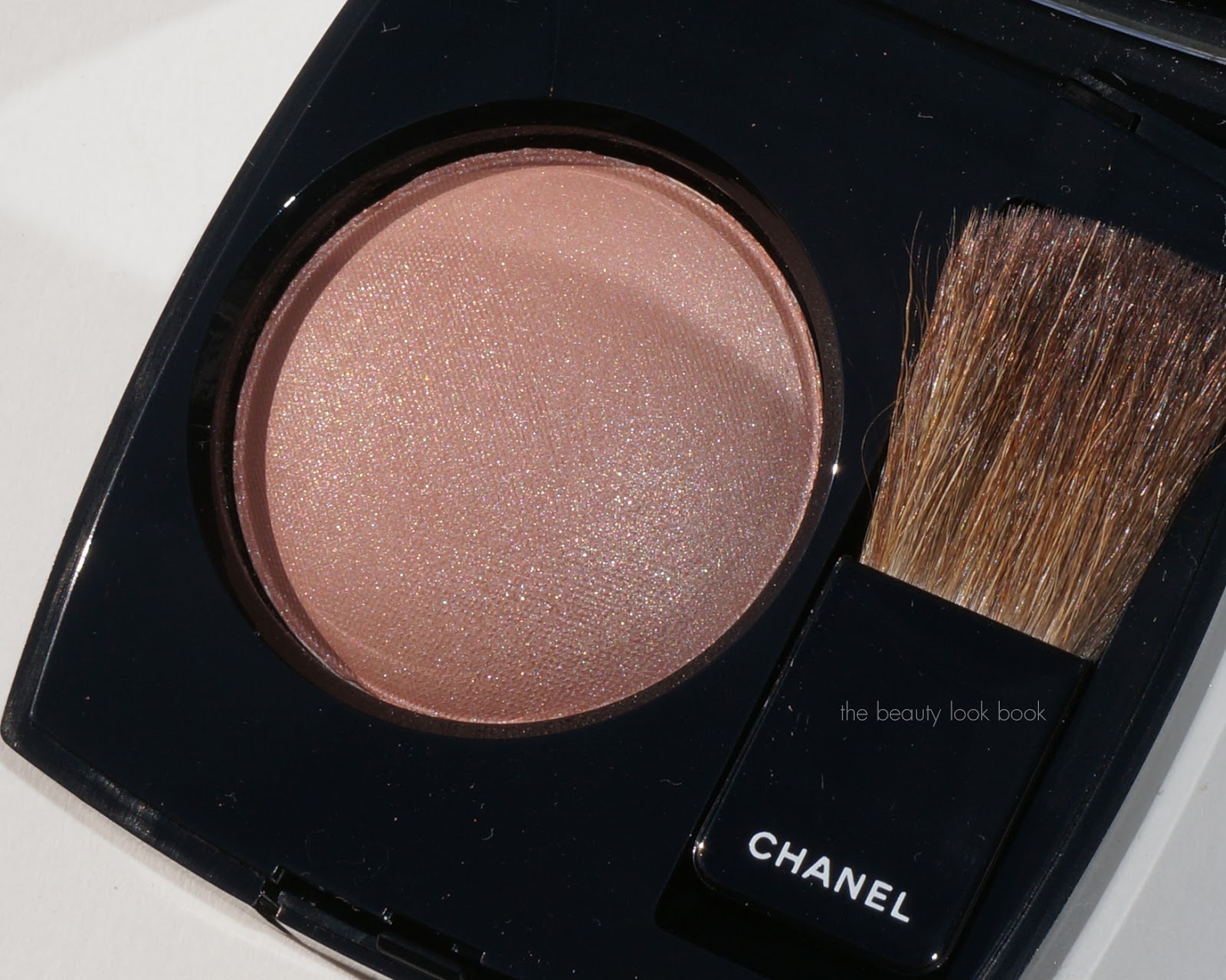
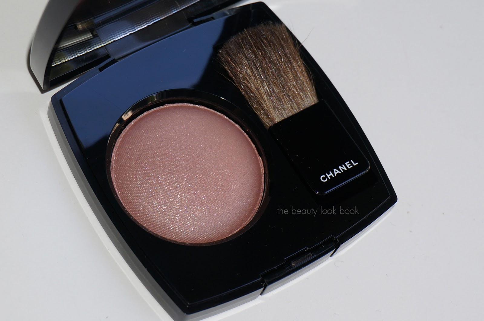
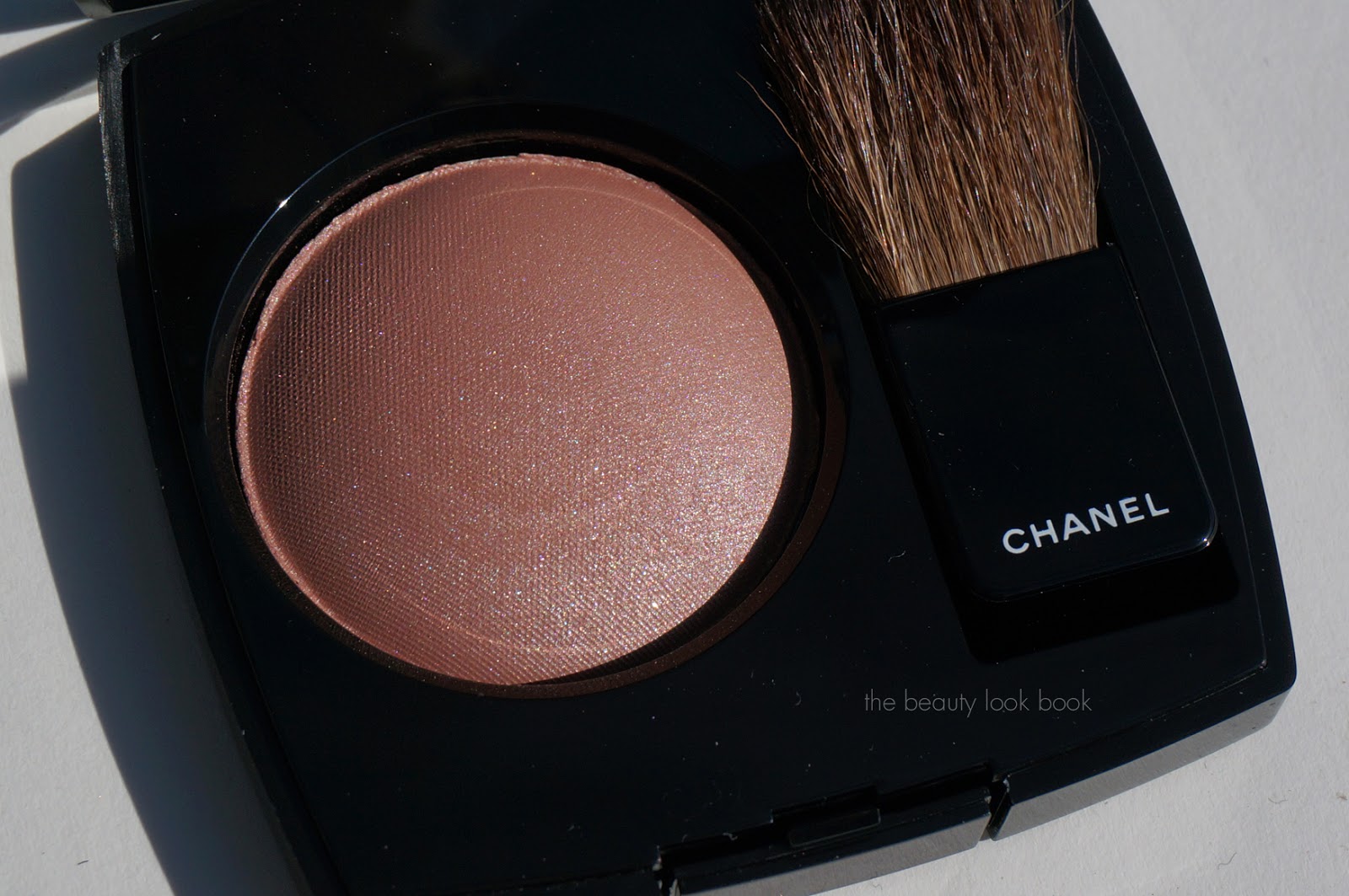
Chanel Accent #84 Joues Contraste ($43) is new for this holiday. There are two versions, the US version and the baked version released everywhere else. I ordered mine from Nordstrom.com and received the US version 6g/0.21 oz which is made in France. This one is a sparkling mixture of rose mauve and beige. It’s beautiful and has both warm and cool tones mixed together. At some angles it’s clearly beige, at others it’s more of a dusty mauve rose. On my skin it applies like a neutral mauve with a hint of beige. The sparkles and shimmers are more visible in this color than most traditional Chanel blushes and I love that it’s different from anything they’ve released. It’s a cross between their regular blushes and highlighters.
More photos below will show the complexity. Note this was difficult to photograph. The blush has more of a beige-colored base, but the shimmers are cool-toned mixed with mauve and silver. It will look different depending on what light and angle you hold this at.

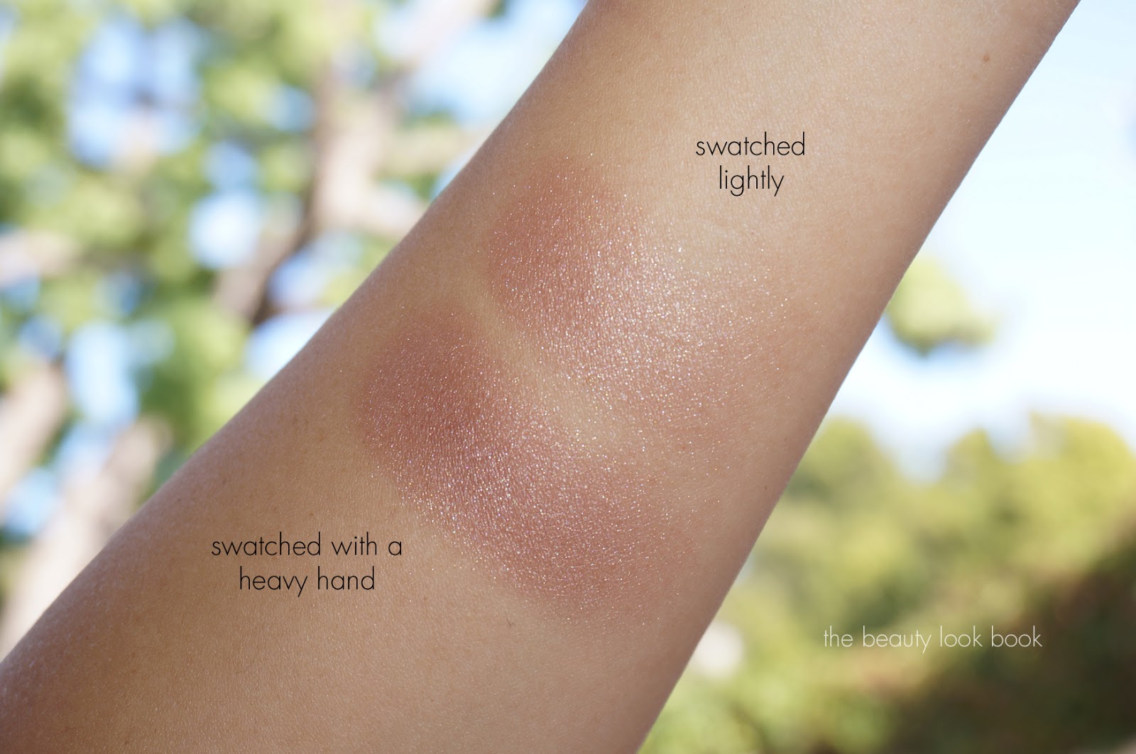
Natural light:
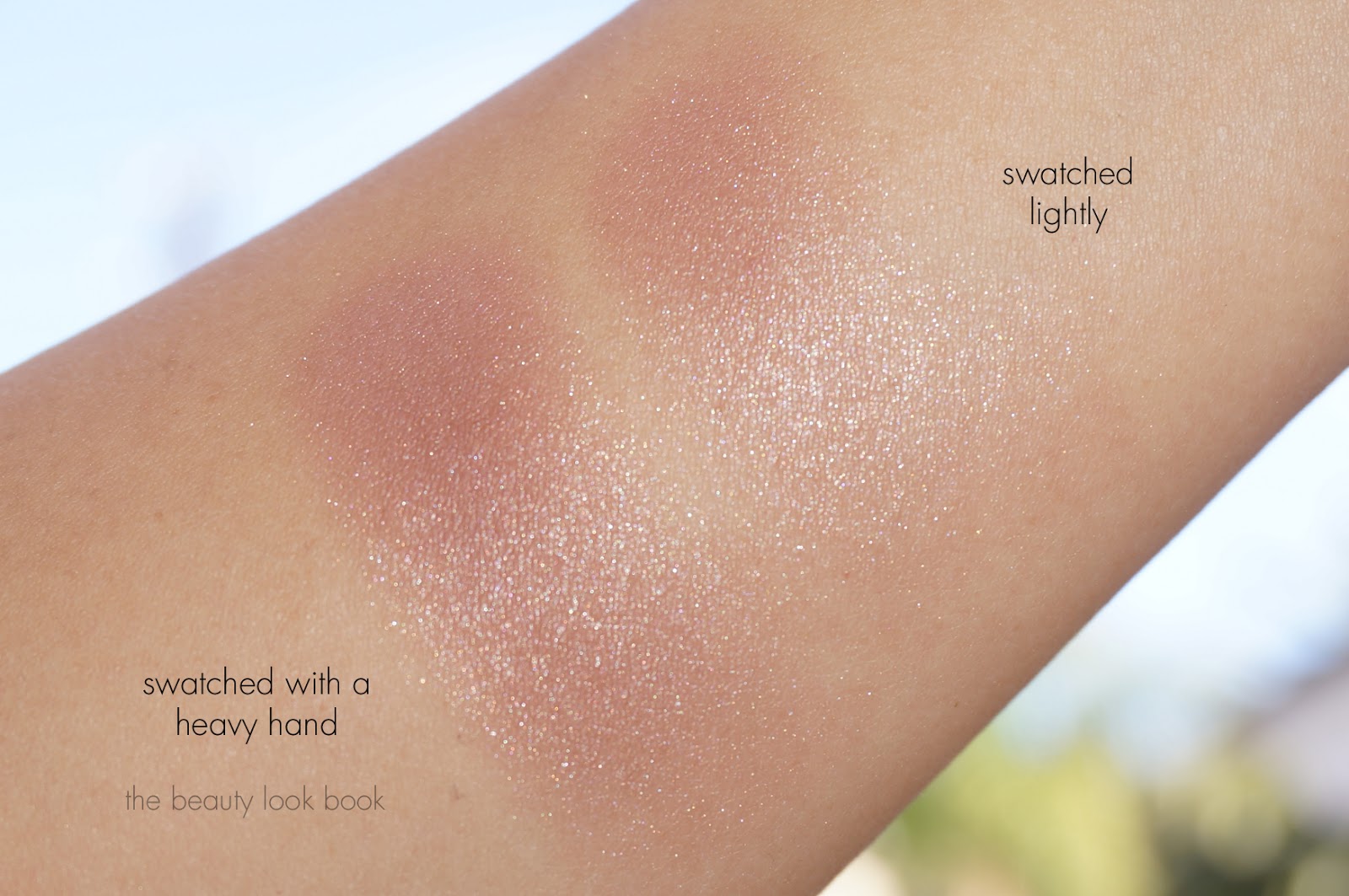
In sunlight:
Swatched heavy and light, two views, it swatches mauve on and pinkish on my arm. On my face it’s slightly more warm but still clearly mauvey-brown. This will vary depending on your skintone. (I have a lot of olive/gold).
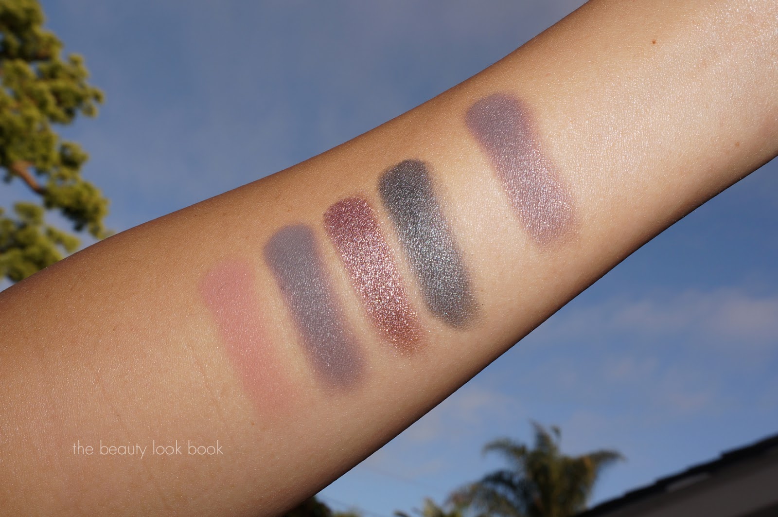
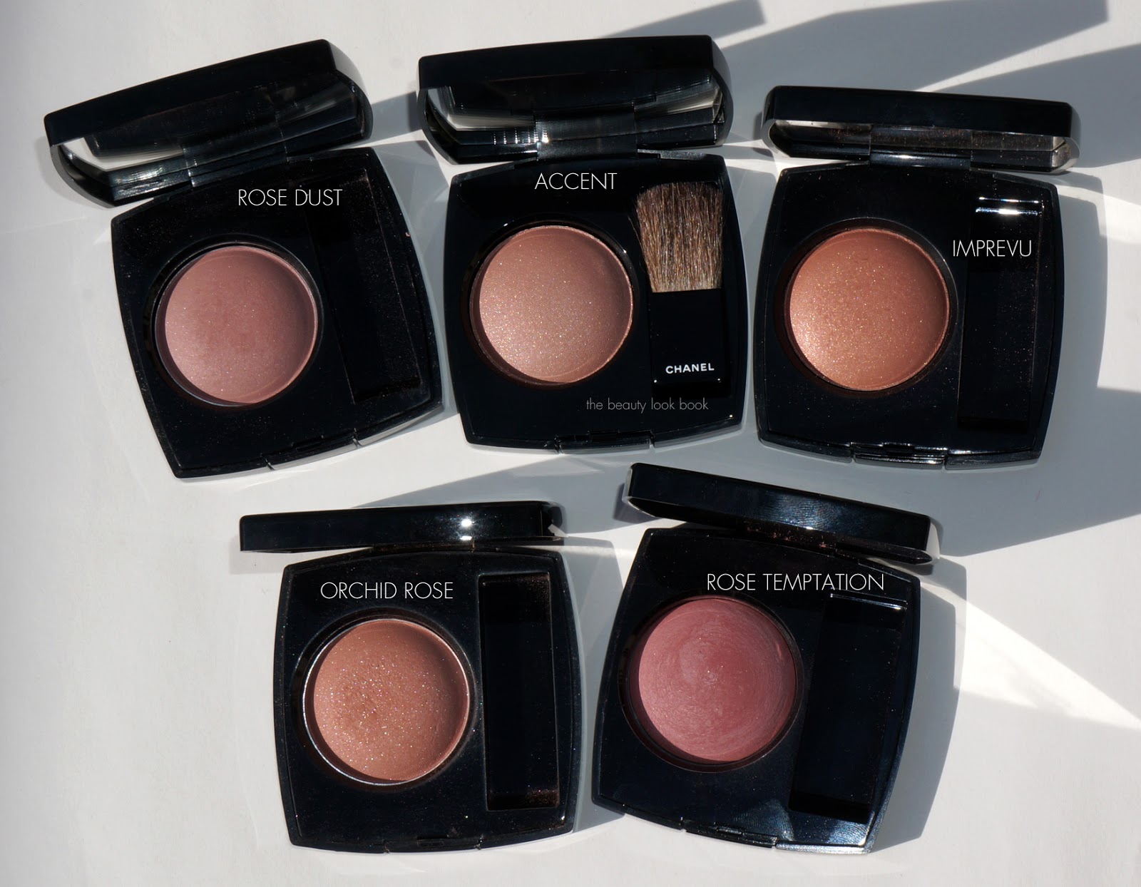
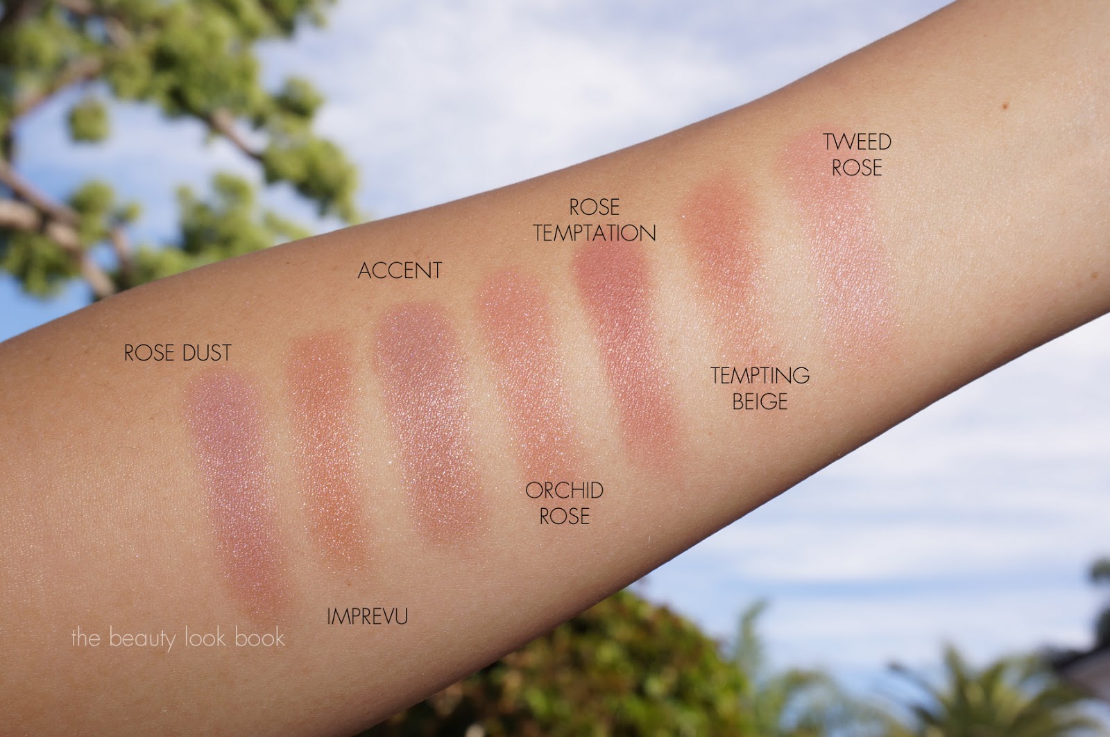
I pulled some other Chanel blushes I thought might be similar based on what I saw in the pan. I thought it could be a dupe of the discontinued Orchid Rose or Rose Dust. For some reason Chanel discontinued a lot of their classic blush shades. By my comparisons, the new Accent is unique and different. Much to my dismay most of my comparisons are discontinued colors. Here are comparisons to Rose Dust #54, Imprevu 59, Orchid Rose, Rose Temptation, additional swatches include Tempting Beige and Tweed Rose (still on Chanel.com).
Blushes, same set with 2 views:
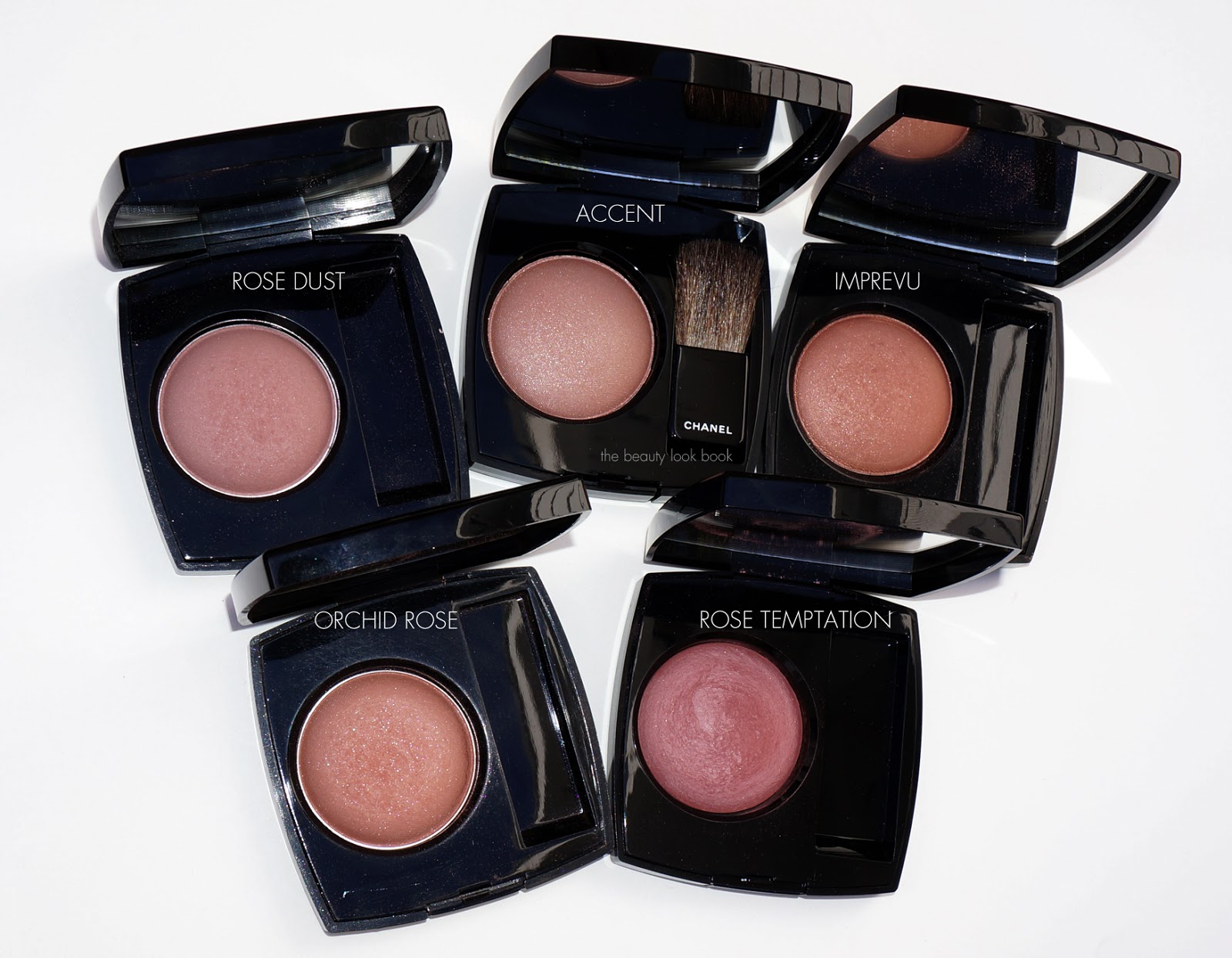
Swatches, same set with two views:

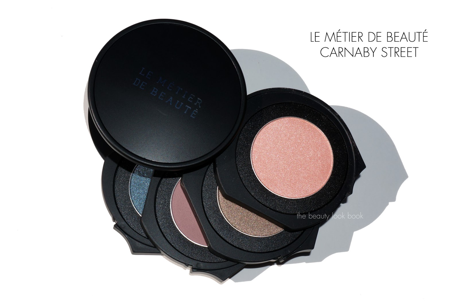
Chanel Accent proves to be an easy to wear neutral. It’s a dusty mauve without being too brown or cool-toned. On my olive skin it adds a nice definition to the cheeks without being too natural or too harsh with the shimmer. I’m wearing it today with the Le Métier de Beauté Saint-Domingue Eye Kit and Chanel Boy Rouge Coco Shine. By Chanel comparisons, Accent is different enough from other Chanel colors to justify purchasing. Update: For reference see Temptalia for the baked version swatches and Best Things in Beauty for the US version on lighter skintone.
Chanel Holiday should start arriving at counters soon. My Nordstrom only had a few pieces so far. You can find Accent at Nordstrom and Nordstrom.com.