Browsing Tag

Quint

Uncategorized

Dior Bonne Étoile 384 and Constellation 864 (Preview)

July 14, 2013
Affiliate Links        
Dior has released two stunning quints for fall this year in Bonne Étoile 384 and Constellation 864 ($61 each, limited-edition). Both are listed as exclusive to Nordstrom (for now). You can purchase Bonne Étoile now in stores and online, however Constellation is listed as an Early Access item for Nordstrom cardholders only (available to everyone on July 19th). I picked up both of mine in store today so I haven’t had time to play with these extensively. I did have my Dior artist apply Bonne Étoile on me, and although greens usually aren’t my thing for eyes, I’m already in love with this one (it’s a bold pick for me). The teal and green layer beautifully with the khaki and bronze shades. Detailed swatches and photos to come very soon. For now, check out these awesome bloggers for swatches and details:

Bonne Étoile 384

______________________________________

Constellation 864

Some more preview photos of both side by side:

With flash:

In direct sunlight, no flash:

In direct sunlight with flash:
 

Follow the beauty look book via Twitter | Instagram | Bloglovin
Uncategorized

Dior 5-Colour Eyeshadow in Royal Kaki 454

January 29, 2012

Dior Royal Kaki 454 is another quint that has been released as part of Dior’s New Look Collection. I purchased this sight unseen hoping it wouldn’t be too cool-toned. Some websites show this labeled as “Royal Khaki” but I looked at the compact, and it’s named “Royal Kaki.” The colors in the quint on my skin:

  • Sharp shimmery cool white
  • Yellow-tinged gold shimmer with slight olive tones
  • Khaki green (army green) matte with small flecks of sparkle
  • Matte black (applies a bit satiny, but leans more matte)
  • Cool gunmetal silver shimmer

In the compact, the combination of colors is beautiful, but odd. The white and black and khaki green are a bit harsh in my opinion making this quint a bit tricky to pull off. So far I’ve tried this 2 ways:

  • Method 1: Use the left shades + middle, gold shimmer + khaki green + black, I found this to work ok, but the gold in this quint plus the khaki are a bit too green for my olive skin and make my eyes look a bit tired.
  • Method 2: Use the right shades + middle, the white is too sharp for my medium skin, even when the other colors are layered on top.
More close ups and swatches below:

Right now I’m undecided about this one. I prefer Dior’s Smoky Khaki trio (reviewed here) by far, even though it has a khaki/greenish tinge, I find the trio easier to pull off than the new Royal Kaki Quint. I am scheduled to attend a Dior event soon at my local Nordstrom. Perhaps I will ask for tips on how to apply this, although I’m not sure that this will be one that is workable for my medium olive skintone. Lesson learned to wait for Dior items to arrive in store to try before buying. With so many successes with Dior I thought I would be safe!

Have you purchased/tried Royal Kaki? Did it work for you? Whether it did or did not, please share your thoughts and skintone.

A special note: Many have brought to my attention that the Numbers/Names on Sephora.com do not match my reviews and asked that I double check my labeling. I’ve added photos of the backs of my quints to show the corresponding number and name and believe I have them correct in each post, at least based on the packaging labels. At this time I believe that Sephora.com has the incorrect labeling but if you plan on only ordering 1, I suggest you contact their Customer Service if you’re at all unsure. Since I ordered both I figured I’d find out which was which once I received my package. As labeled on my quints:

Uncategorized

Dior 5-Colour Eyeshadow in Grège 734

January 29, 2012

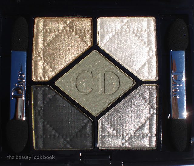
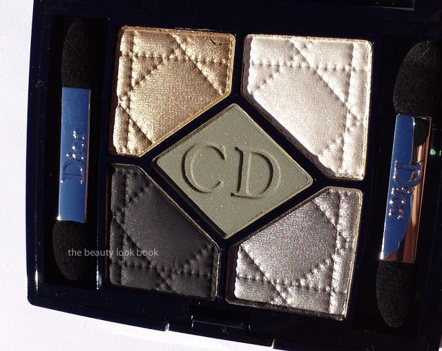
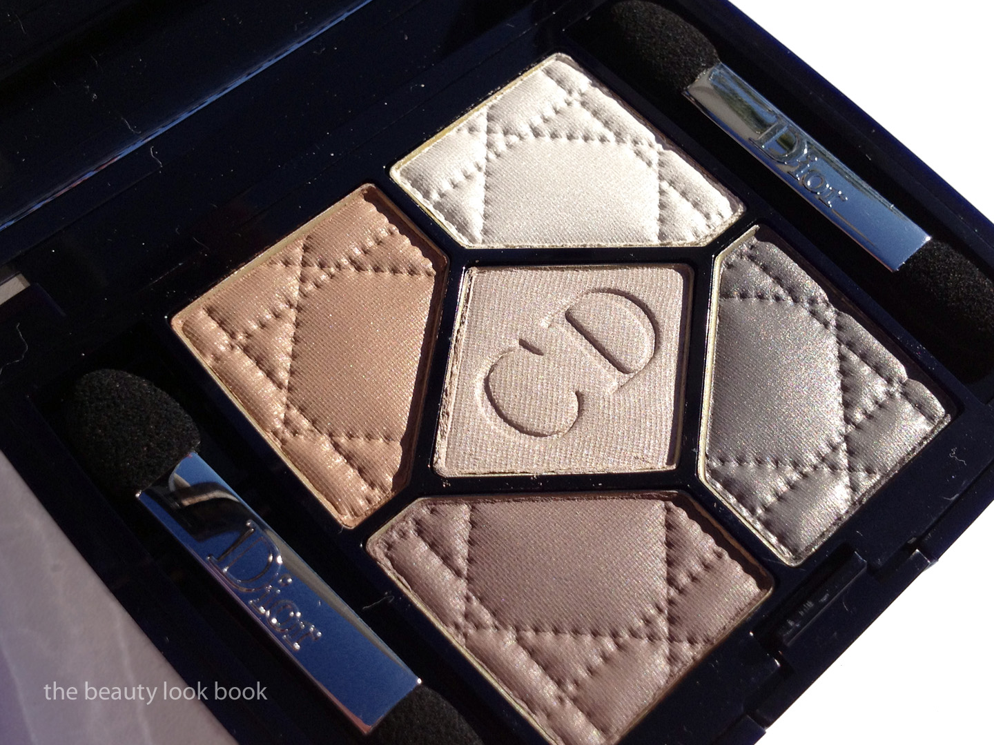
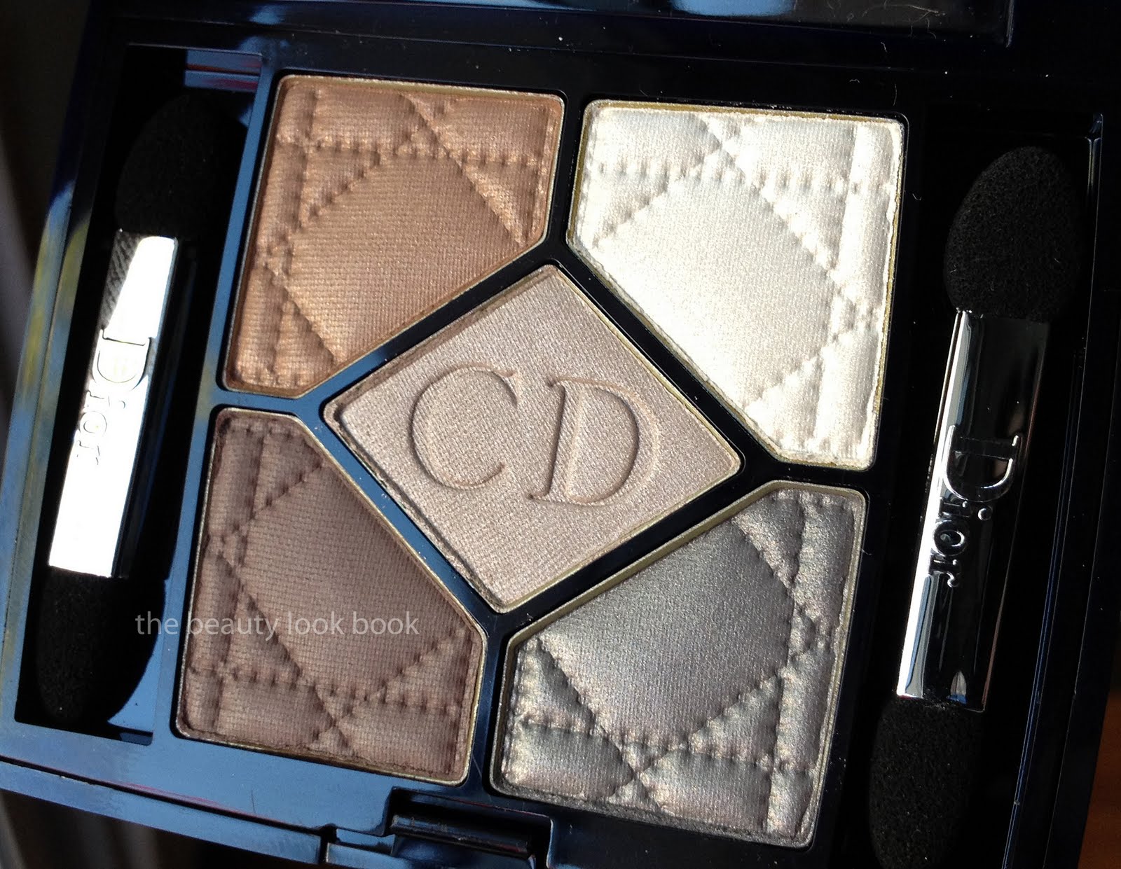
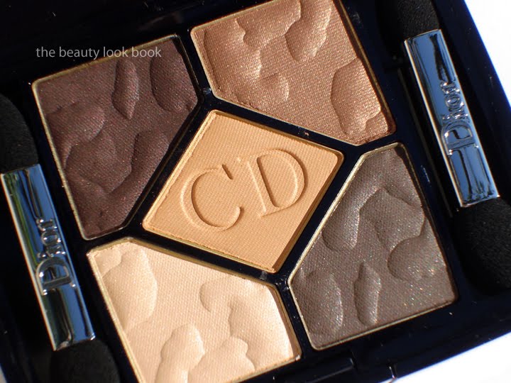
Dior Grège 734 is a stunning soft satiny neutral quint. I think this is a must-have for any neutral lover, especially if you’re a fan of Dior eyeshadows. I found mine online at Sephora.com ($59 for 6 g/ 0.21 oz, made in France). It has a soft earthy feel with a mixture of shimmer and satiny shades. I personally find the combination of the colors unique, descriptions of each shade:
  • Soft warm tan camel brown (slight shimmer, satiny finish)
  • Pale greyed white frost (higher shimmer)
  • Pale mauve grey cream shimmer (high shimmer, but not frost)
  • Muted brown grey with mauvey tones (more matte, slight satin finish)
  • Shimmery blue grey with mauve tinge (shimmery)

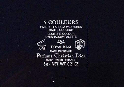
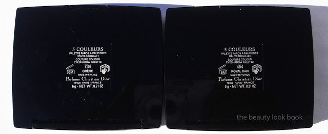
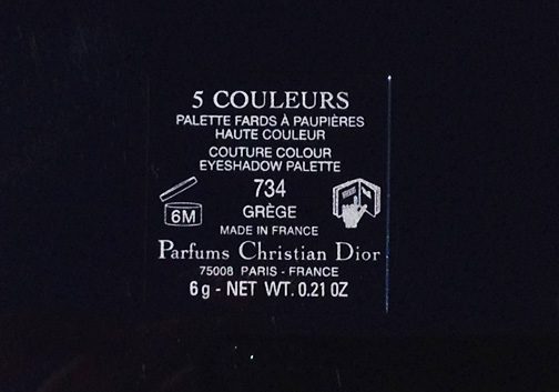
Update: someone requested I confirm that I have the numbers of the quints correct b/c there is an inconsistency online at Sephora.com, here is the back of Grège to show the number is in fact 734:

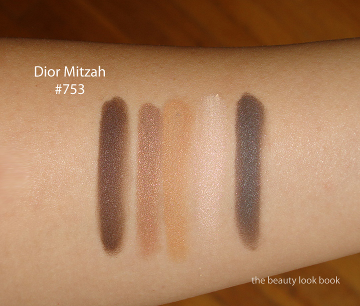
The texture is similar to that of the Mitzah quint: soft, blendable with a soft shimmer finish. There is apparent shimmer in the compact, on the eyes it translates into a softer satiny look. The shimmer gives a subtle glow. The colors are layerable and easy to blend.

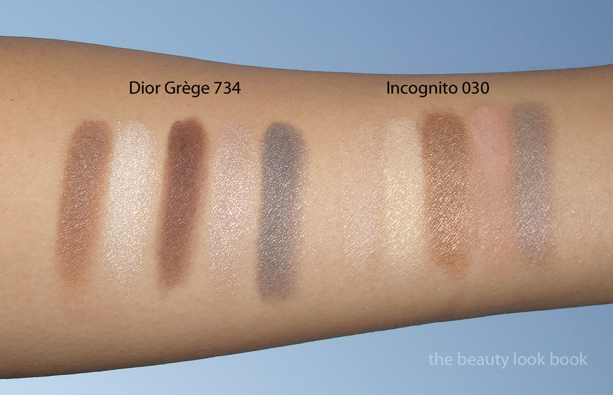
Swatches applied with a brush (I find that these apply better with a brush versus the sponge applicators that come in the compact):

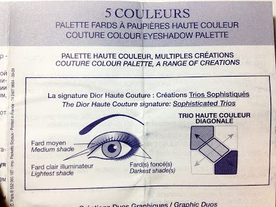
I often find it difficult to wear all 5 shades at once with Dior quints but I do not think they are designed to all be worn at once. If you read the little pamphlets that come with the boxes you will find that Dior has helpful diagrams and tips. Dior suggests several different methods. One is to use any 3 shades that are touching, whether it is diagonal, the top + middle, or sides + middle. Pardon the poor quality of the snapshot, but the paper is so thin, scanning shows both sides of the ink. Hopefully these diagrams will help you if you haven’t seen them before.

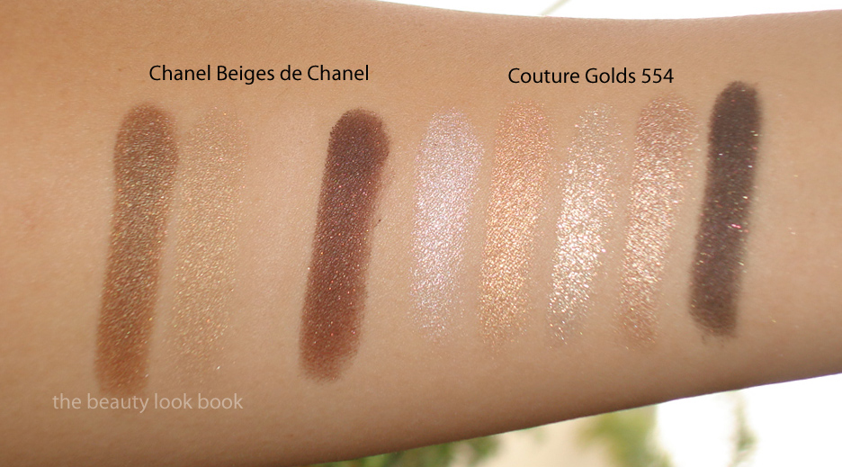
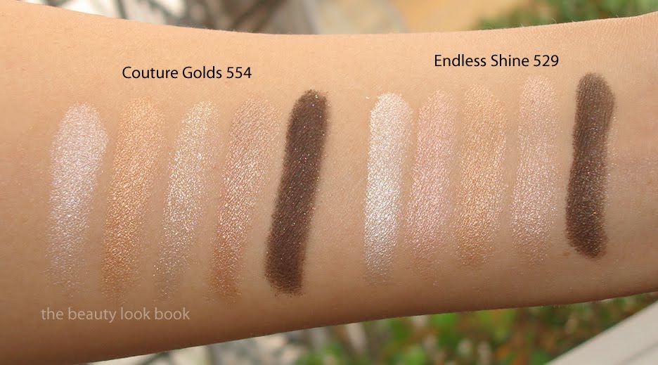
How does this compare to other palettes? I’m sure individually you could find similar shades, but palette-wise, I found Grège to be unique. I didn’t look for dupes this time but I did pull Chanel Stupendous and the classic Dior Incognito (older version) to compare. Grège is an amped-up version of Incognito. While Grège is soft, the contrast of the colors in this palette are sharper than Incognito making it easier to wear (in my opinion). I only swatched the diors side by side.

Grège 734 is a lovely wearable neutral. Today I managed to wear all 5 shades on the eyes by layering them, medium tan shade first, soft lighter colors on top to blend the edges, then darkest shades along lash line and outer corners blended. I can easily see myself wearing this on a regular basis for everyday. For a base I used a combination of Urban Decay’s Primer Potion and Laura Mercier’s Metallic Cream Shadow in Platinum. It lasted all afternoon. I give it a big thumbs up.
The Dior New Look Collection is already out online at Sephora and also should be in store at Nordstrom now.
Uncategorized

Dior New Look Collection 5-Colour Eyeshadows: Grège 734 and Royal Kaki 454

January 29, 2012

Dior’s latest release is a New Look Collection which includes a new formula of DiorShow Mascara and four new quints. If you don’t follow Rouge Deluxe already, I highly recommend you do. I found out about this upcoming release on her blog. My love for shimmery neutrals is still going strong and I ordered the neutral options in Grège 734 and Royal Kaki 454 from Sephora.com last week (gotta love their samples and super fast shipping). Here is a quick peek at both palettes side by side. A detailed post with better swatches on each quint to follow.

Uncategorized

Dior Couture Golds 554 Eyeshadow Palette

October 22, 2011

Dior Couture Golds 554 Quint ($59 for 6 g/ 0.21 oz) has finally been spotted in-store at Nordstrom. I’ve looked everywhere online for this and have yet to find it listed anywhere yet. It appears to have had a slight delay in release compared to the other items in this year’s holiday collection (much like last year’s Five Golds). If you’re looking online I suspect it might be a while before we see it show up. I’d recommend you call your Dior counter to see if it has arrived. Couture Golds is a particularly festive mix of golds and creams. The colors in the palette are all high frost/shimmer with the exception of the dark blackened-brown. I would describe the shades as (from top left going clockwise finishing at the center):
  • frosted ivory cream
  • frosted warm coppery gold
  • shimmery warm golden bronze with slight beigey tones
  • dark matte black-brown with gold flecks
  • sparkling yellow-gold champagne that has slightly chunky reflective particles

All have excellent color payoff, except for that dark color which I think needs a dense brush and quite a bit of packing on to get decent pigment. All together Couture Golds has a beautiful glowy quality that is perfect for holiday.

Is this a must-have? My initial thoughts were “yes! this is the best palette of the season yet!” I still feel that last year’s holiday quint, Five Golds wins hands down, but I did think this year’s Couture Golds was a huge thumbs up until I swatched it on the arm and thought it looked oddly familiar – like Endless Shine. Here is Couture Golds with some comparisons and swatches. You can judge for yourself on the similarities. There are differences in sparkle quality and undertone. Perhaps they just look identical because of my skintone. For me, they are too close for comfort. After seeing them swatched side-by-side I couldn’t help but feel a bit let down thinking this was simply a re-hash or a previously released quint. I couldn’t fit everything on one arm, so swatches are grouped into twos.

Overall, I still feel that Couture Golds is the best eye palette of the holiday season. The sparking champagne in the center is so gorgeous with the chunky reflective particles. I prefer it over Endless Shine (even though they are very similar) so I can justify keeping it instead of re-gifting it to someone else. Will I be using Couture Golds this season? Absolutely yes. I just feel it could have been a bit more different than something previously released by the same brand.
Have you seen Dior Holiday in person? What were your thoughts?
Uncategorized

A Few Dior Mitzah Quint Comparisons

September 20, 2011

Although Dior’s Mitzah Quint is quite basic and very neutral, I had a hard time finding another palette similar. I pulled a few with similar tones but none are dupes. Above shows Dior Endless Shine, Chanel Kaska Beige and Dolce & Gabbana Nude. Unfortunately I did not get swatches of all the palettes today before the sun went down and my camera battery died. I do have Endless Shine swatched to compare for you in decent lighting so you can see the difference in shimmer/finish. Most Dior Quints have at least one high frost color, Iridescent Quints have the majority of the shades frosted. As you can see below Mitzah is satiny and almost matte.

Here is Mitzah at night swatched next to a few other palettes, Chanel Kaska Beige, Dolce & Gabbana Nude and Chanel Variations.

Some might say Mitzah is too basic and lacks luster. It doesn’t make the eyes pop or have that intense wow-factor, but it has a kick that gives a beautiful subtle defined eye that can be intensified for a soft-smoky look. I personally love it for everyday. For a bit of an extra shimmer or kick, I’d recommend layering over a more sparkly cream base to add a bit of luster.
Uncategorized

Dior Mitzah Picks: Camel & Ebony Dior Vernis and Mitzah Quint

September 19, 2011

I’ve been eagerly waiting for the release of the Mitzah Collection to Sephora in the US. The collection was designed to commemorate Mitzah Bricard, Christian Dior’s legendary muse who was known for her love of leopard. The Mitzah Collection features pieces for eyes, face and nails in shades of camel, chocolate brown and beige in a jungle-print theme. While traveling in Paris last March, Café Makeup was lucky to find the collection early and shared beautiful photos of the palette and nail polishes. The collection has finally arrived in the US exclusively at Sephora and Sephora.com.
My picks included the new eyeshadow quint Mitzah #753, Camel Nail Polish #622, Ebony Nail Polish #912 and the new Golden Brown DiorShow Mascara #598 (not featured). All are currently exclusive to Sephora and are limited edition.

The Mitzah 5 Couleurs Eyeshadow Palette ($60 for 6 g / 0.21 oz) palette is a collection of neutrals with a slight kick. The four outer shades have an embossed animal print in the powder and have a very subtle finely milled shimmer. The shimmer is so slight the colors glow with a slight sheen. The colors in the palette include a dark aubergine-brown, a medium caramel brown, a soft camel with a light orangey tinge, a warm beige and a soft greyed-brown.

After seeing this swatched and reviewed on Beauty Moogle Zone, Café Makeup, Iron Spy I was worried it would be too warm for my olive skin. Still I could not resist the lovely descriptions of the satiny finish and when I tested the palette at Sephora I fell in love. The colors are very soft and refined. I find them a bit different from the traditional Dior palettes which typically have at least 1 high frost shade. This palette has a very subtle sheen in all shades and a very natural finish. If you’re looking for high impact or high shimmer, you might be disappointed with this one but I love it.

It’s usually difficult for me to use all 5 shades in Dior quints, however the Mitzah Quint has a wonderful layering quality and today I put all 5 shades on my eyes. I apologize I do not have photos to share, but for my application method, I started with MAC’s Cream Color Base in Seaside, applied the pale cream all over the lid, then followed with the bronzey top right about 1/2 way up the lid brushing the color back and forth into a soft gradient from the lashline upwards. I then took the bottom right greyish brown and smudged it right along the upper lashlines heavily. Next I took the upper left aubergine and applied it from outer corners about 1/4 way into the eye. Last step was to take the middle orange shade and lightly dip a soft fluffy brush and blend the two dark shades just to soften the edges.

Camel and Ebony Nail Polishes ($22 each for 10 ml / 0.33 fl oz) are both opaque creams. I love this photo from Dior’s International Website. They apply beautifully with 2 coats and have a gorgeous glossy sheen on the nails.

Camel is a yellowed beige and Ebony is a deep cool brown. Both are pure love. I thought Camel might be too yellow but oddly once applied on the skin it just works. Might not be everyone’s cup of tea. This is one you have to see and test in person to really tell. I don’t think it photographs well on the fingers but in person I find it more flattering.

Ebony is a dark beautiful brown cream. It’s very similar to Underground which was released earlier this year. If you have Underground (slightly more purple undertone), you can safely skip Ebony (comparisons to come soon). These shades apply beautifully with 2 coats. The tapered brush makes application easier for those of use who have unsteady hands.

I highly recommend you check out additional swatches and reviews at Joey’space, Fashion Polish, and Café Makeup if you haven’t already. They have lovely comparisons and swatches.

Overall love. Bravo Dior! They did an excellent job creating a beautiful collections of neutrals with a kick. If you’re at all interested I recommend purchasing soon since all pieces are limited edition and exclusive to Sephora in the US. If you’re unsure about the quint because your coloring doesn’t do so well with warm shades, just use the middle shade with a very light hand. The other colors are very easy to wear and even on my warm skin worked just fine. At this time I won’t be reviewing the mascara I purchased. I have several tubes of other brands I have to use up. By the time I get around to opening up this one to test I’m afraid it will be sold out. At Sephora, the mascara tester looked like a dark brassy brown shimmer which I found intriguing.

I’ll be posting comparisons very soon in a separate post. Did you check out the Mitzah Collection at Sephora or elsewhere? What were your thoughts?