Browsing Tag

Holiday 2013

Highlighters Hourglass Cosmetics

Hourglass Ambient Lighting Palette

October 16, 2013

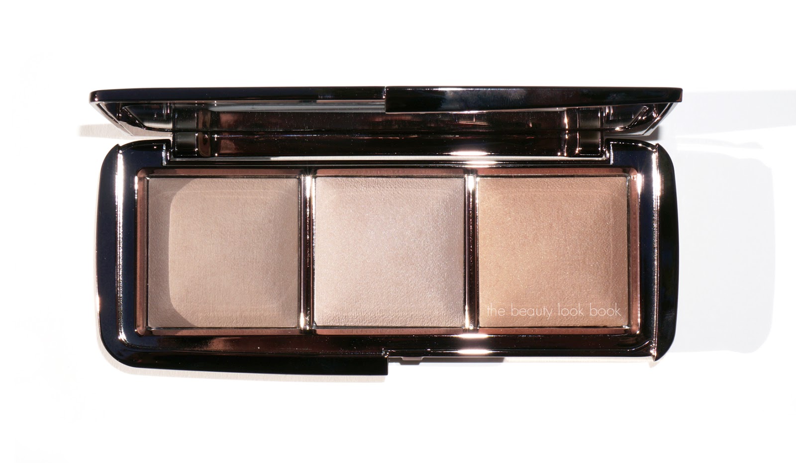
Hourglass’s latest release is the new Ambient Lighting Palette ($58 for 0.35 oz/9.9g, limited-edition). It’s a travel-sized trio of Ambient Lighting Powders in Dim Light, Incandescent Light (new) and Radiant Light. The trio also comes with a small sample of their Mineral Veil Primer (see review here). Hourglass says this palette is just like having your own personal lighting technician. I couldn’t describe this better.  Being a huge fan of Luminous Light, I was very excited about the release of this palette.
I love everything about this palette. The pans are smaller than the regular Ambient Lighting Powders but large enough to easily dip a fluffy brush into to apply to the face. It’s perfect for travel and arrived just at the right time for me. I brought it with me on my recent trip. It was the only highlighter I brought which was perfect because it provided three options in one palette. I wore this every evening out and felt it gave that perfect glow by mixing the three shades.

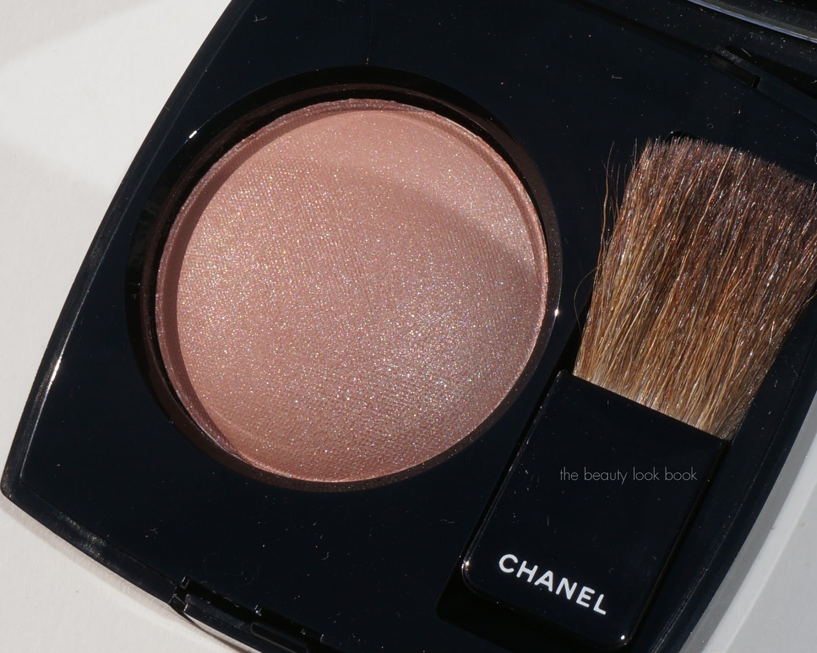
The Ambient Lighting Palette featured below:

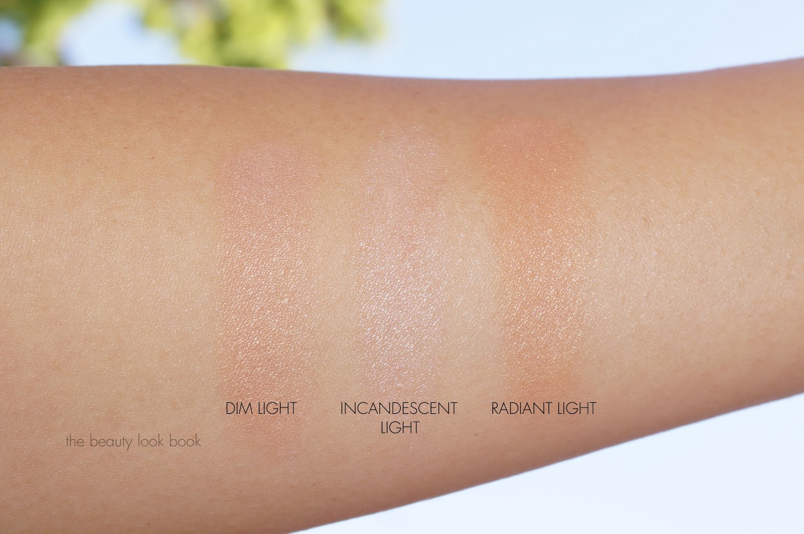
Here you can see how they glow in the sunlight, colors left to right: Dim, Incandescent and Radiant

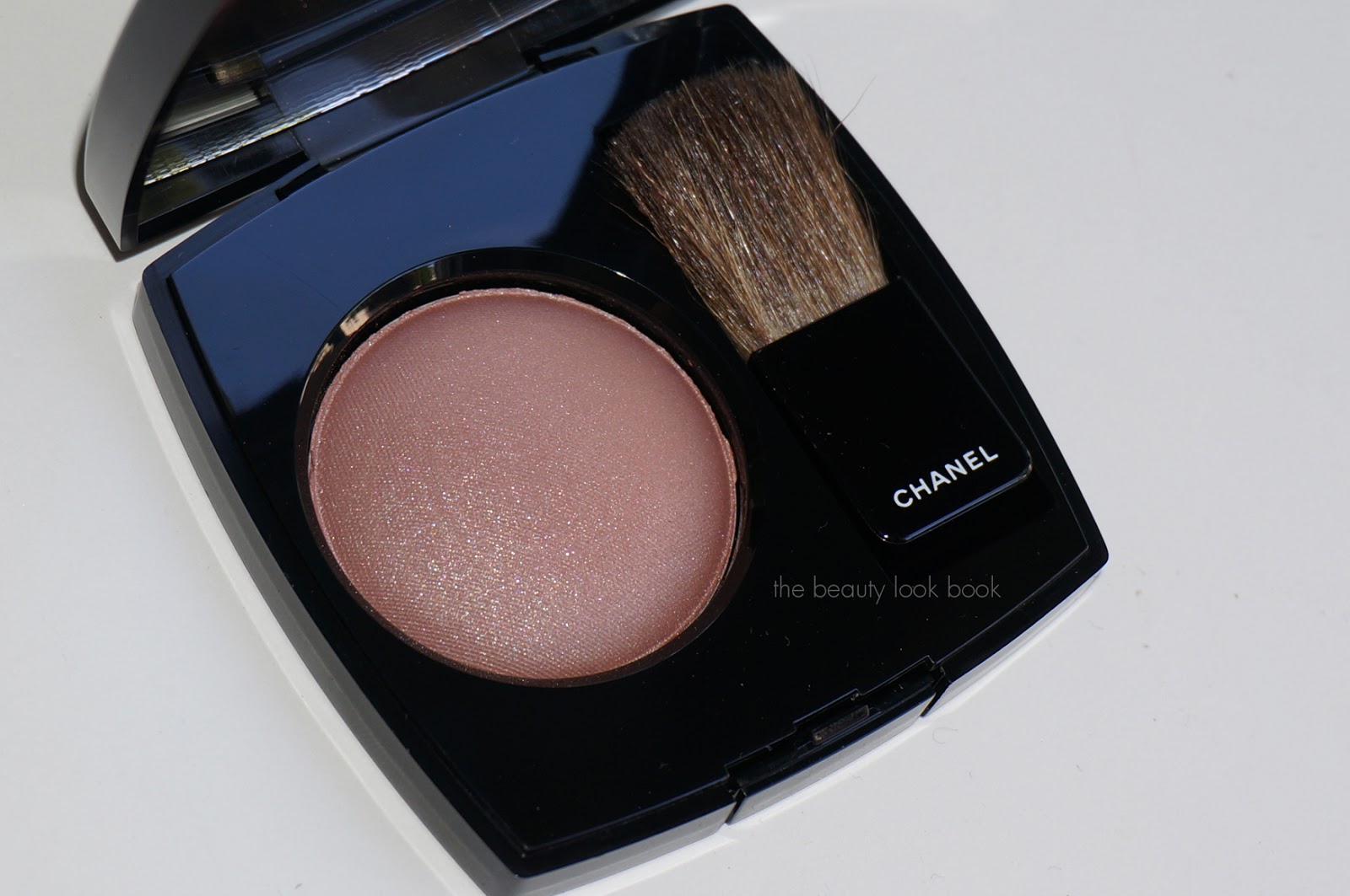
Here you can see the softness of the powders:
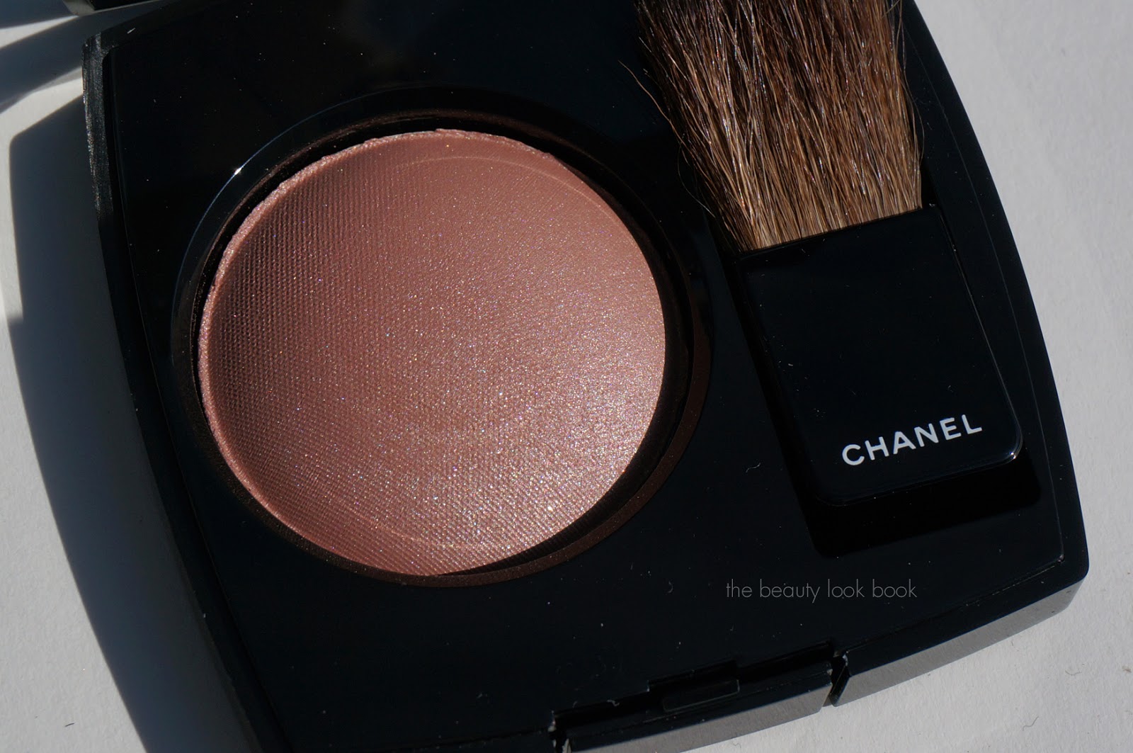
The three shades:

Dim Light is an existing shade in the regular full-sized line but is new to me. It’s described as a neutral peach beige and is supposed to blur imperfections and highlight the skin. I think the effect will vary depending on your skintone. I am a bit too tan to wear this all over as a setting powder, but it makes an amazing under-eye highlight and over the cheeks blending color. There is a subtle luminous quality – but very subtle. If you’re afraid of any kind of shimmer – this is the highlighter for you.

Incandescent Light is a new shade and currently only available in this palette. It’s a pearlescent pearly color. In the pan it resembles Luminous Light (my holy grail highlighter, see review here) however Incandescent Light is slightly paler in color and not as shimmery. Luminous Light by comparison is almost peachy when swatched next to Incandescent Light.

Radiant Light is another existing shade which I also own. It’s the sheerest bronze powder I have that adds a warm golden glow without being brownish like a traditional bronzer. It has tiny gold sparkle particles but doesn’t look glittery.

The application tips are endless with this palette. I wear Chanel B30, NARS Groenland Tinted Moisturizer, Dolce and Gabbana Warm 100 Powder Foundation and Tom Ford Foundation Stick #5 and I used all three shades every time I’ve worn it to date. My favorite way:
  • Use Dim Light as a soft dusting powder in the center of the face and on the cheeks to blend out edges of your blush or bronzer.
  • Use Incandescent Light as an all over highlight on the eyes, top of cheek bones.
  • Apply Radiant Light directly on the cheeks or as a contour along outer edges in a 3 shape to add warmth and a soft glow, also works well to add warmth to the eyes by dusting a soft layer over your shadows and blending very softly
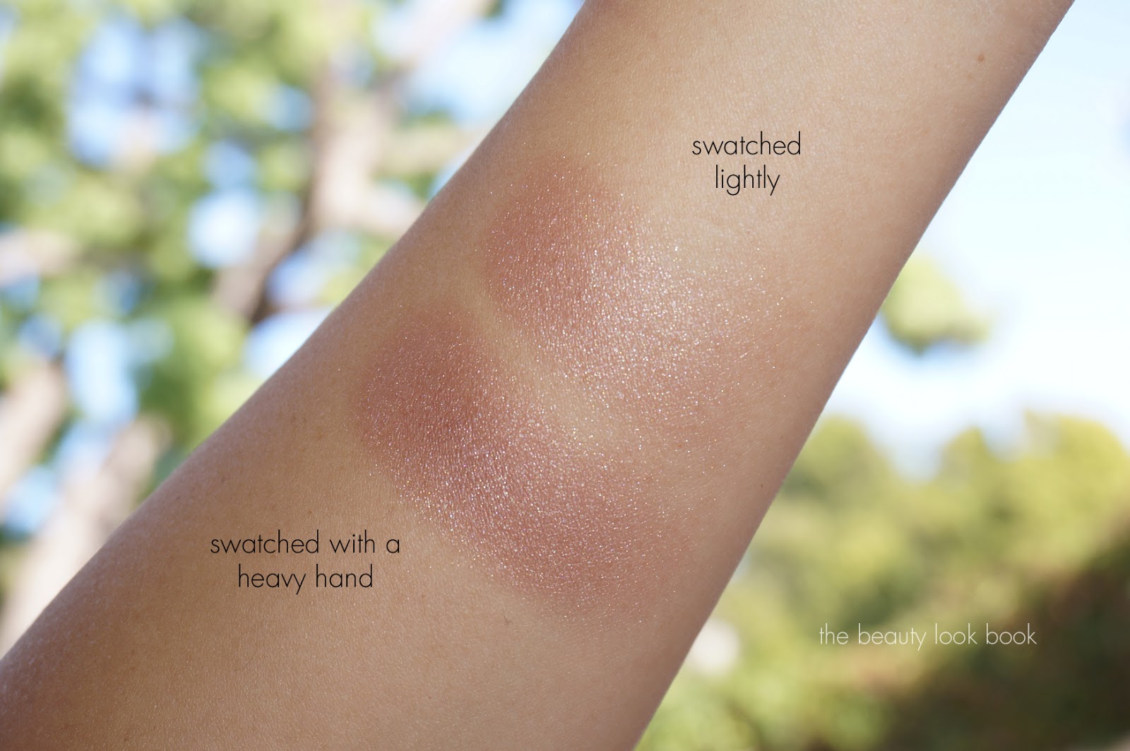
 Swatches:

Comparisons to Luminous Light:

Size comparison to MAC and Armani Blushes. It fit perfectly in my travel case:
I highly recommend this palette. The price is higher than the individual sizes (and slightly more expensive per oz) but this is a great way to try three shades in one palette rather than purchasing individual colors. If you’re more a fan of shimmery highlighters you may find this too subtle but I do find the shimmer is visible enough on the skin to be able to tell that there is a glow.

SUGGESTED RETAIL PRICE: USD $58 | CAD $67
AVAILABLE AT: Sephora, Sephora.com, Barneys New York (beauty bag event until the 19th), Bergdorf Goodman and Space NK

Uncategorized

Chanel Illusion D’Ombre Fatal and Initiation | Holiday 2013

October 13, 2013


Chanel has released two new shades of their Illusion D’Ombre Long Wear Luminous Eyeshadow ($36 each) in Initiation and Fatal. Each color is beautiful alone with a simple coat of mascara but also look lovely when layered together. Lasting power is quite good for these – they did not budge from my eyes from morning to early evening when I tested these.

Below: Left – Fatal, Right – Initiation

Fatal is a stunning purple-red with silver sparkles. It’s like a mix between Chanel Illusoire and Ebloui but with an added kick of visible silver shimmer to make it unique. Purples can be hard for me to pull off if they have too much blue or too much red. Fatal is the perfect in between. It does look warmer in the pot than it applies on the skin but it’s a chameleon-like color. The shimmers are both red and purple so it may look different depending on what angle you hold the pot at.

Initiation is a stunning warm bronze with silver and gold flecks. I find this one to be extra sparkly but in a good way. There was no fall out with the sparkles. I like to use the little applicator brush to apply but fingers or a basic cream shadow brush works well too. (One of my favorites is MAC #242 for creams or Chanel Concealer #10.) I’m glad Chanel released a bronze shadow – it was a much-needed color in the Illusion D’Ombre lineup.

Swatches, two views. The colors are easy to control for pigment. I swatched with a heavy hand but they are easy to blend out and layer.

Comparisons show that Chanel Initiation is quite different from most bronze colors I own. Armani Eyes to Kill #15 is warmer and #26 is more brassy. For Chanel Fatal I found Armani Eyes to Kill #27 almost identical in finish. The Armani is just slightly lighter with a bit more silver frost.

Comparisons below: MAC Buried Treasure Paint Pot, Armani Eyes to Kill #15, Armani Eyes to Kill #26, Chanel Ebloui, Chanel Illusoire and Armani Eyes to Kill #27.

With flash:

Without flash:

Overall beautiful colors perfect for fall to holiday. Versatile enough to incorporate into many different looks for both day and night. Also wearable alone, mixed, or layered over other powder shadows for added depth and sparkle. Definitely must-haves in my book.
Both Chanel Fatal and Initiation Illusion D’Ombres are limited-edition colors. Available now at Neiman Marcus.
Uncategorized

Chanel Accent #84 Powder Blush | Holiday 2013

October 8, 2013

Chanel Accent #84 Joues Contraste ($43) is new for this holiday. There are two versions, the US version and the baked version released everywhere else. I ordered mine from Nordstrom.com and received the US version 6g/0.21 oz which is made in France. This one is a sparkling mixture of rose mauve and beige. It’s beautiful and has both warm and cool tones mixed together. At some angles it’s clearly beige, at others it’s more of a dusty mauve rose. On my skin it applies like a neutral mauve with a hint of beige. The sparkles and shimmers are more visible in this color than most traditional Chanel blushes and I love that it’s different from anything they’ve released. It’s a cross between their regular blushes and highlighters.

More photos below will show the complexity. Note this was difficult to photograph. The blush has more of a beige-colored base, but the shimmers are cool-toned mixed with mauve and silver. It will look different depending on what light and angle you hold this at.

Natural light:

In sunlight:

Swatched heavy and light, two views, it swatches mauve on and pinkish on my arm. On my face it’s slightly more warm but still clearly mauvey-brown. This will vary depending on your skintone. (I have a lot of olive/gold).

I pulled some other Chanel blushes I thought might be similar based on what I saw in the pan. I thought it could be a dupe of the discontinued Orchid Rose or Rose Dust. For some reason Chanel discontinued a lot of their classic blush shades. By my comparisons, the new Accent is unique and different. Much to my dismay most of my comparisons are discontinued colors. Here are comparisons to Rose Dust #54, Imprevu 59, Orchid Rose, Rose Temptation, additional swatches include Tempting Beige and Tweed Rose (still on Chanel.com).

Blushes, same set with 2 views:

Swatches, same set with two views:

Chanel Accent proves to be an easy to wear neutral. It’s a dusty mauve without being too brown or cool-toned. On my olive skin it adds a nice definition to the cheeks without being too natural or too harsh with the shimmer. I’m wearing it today with the Le Métier de Beauté Saint-Domingue Eye Kit and Chanel Boy Rouge Coco Shine. By Chanel comparisons, Accent is different enough from other Chanel colors to justify purchasing. Update: For reference see Temptalia for the baked version swatches and Best Things in Beauty for the US version on lighter skintone.
Chanel Holiday should start arriving at counters soon. My Nordstrom only had a few pieces so far. You can find Accent at Nordstrom and Nordstrom.com.

Uncategorized

Chanel Le Vernis Rouge Rubis #677

October 3, 2013

Chanel’s latest for nails is their Rouge Rubis #677 Le Vernis ($27). Bits of Chanel’s holiday collection have been trickling in stores and online at Nordstrom (see this post for what’s online now). I ordered mine sight unseen from Nordstrom.com. When it arrived I thought it might be just another basic red. After applying it I think I have found my holy grail red (it beats Dragon and Pirate in my eyes). It’s a drop-dead gorgeous jelly red. The formula is absolutely amazing. It’s the jelly of all jellies. Smooth flawless coverage with a slight transparent look due to the thin jelly-like finish. One coat covered the entire nail perfectly but I almost always do at least two coats. The texture is on the thinner side like Pirate making it super easy to apply – flawlessly. It’s a bright true red that just glows. There’s no orange or blue base/undertone. Just a straight classic bright red with a naturally glossy finish.

Here it is swatched with two coats, with Deborah Lippmann Rehydrating Base Coat and Chanel Brilliance Extreme Top Coat. Here you can see the slight transparent/jelly-like finish with a high gloss shine:


In natural light it glows:

In direct sunlight it’s electric:

For comparisons, I think you can almost always dupe reds. I did find this one unique in Chanel’s line. There’s not a single color that has the same brightness while still being a true red (others have blueish bases or a distinct bright orange undertone). Here are a few comparisons, I believe most are still available for purchase right now:

  • Chanel Cinema (reviewed here) is darker and slightly dusty (not quite as bright)
  • Chanel Rouge Carat (reviewed here) flashes more blue/cool toned due to the shimmer
  • Chanel Pirate is more blue-based
  • Chanel Dragon is a darker red
  • Chanel Rouge Fatal is even darker
  • Chanel Lotus Rouge almost looks mauve next to Rouge Rubis
  • Guerlain Rouge d’Enfer #121 is very similar but slightly more orange and slightly darker
Bottom line it’s a must-have. Chanel Rouge Rubis #677 retails for $27. It should arrive at all Chanel counters very soon, right now it’s available for purchase online at Nordstrom.com.