
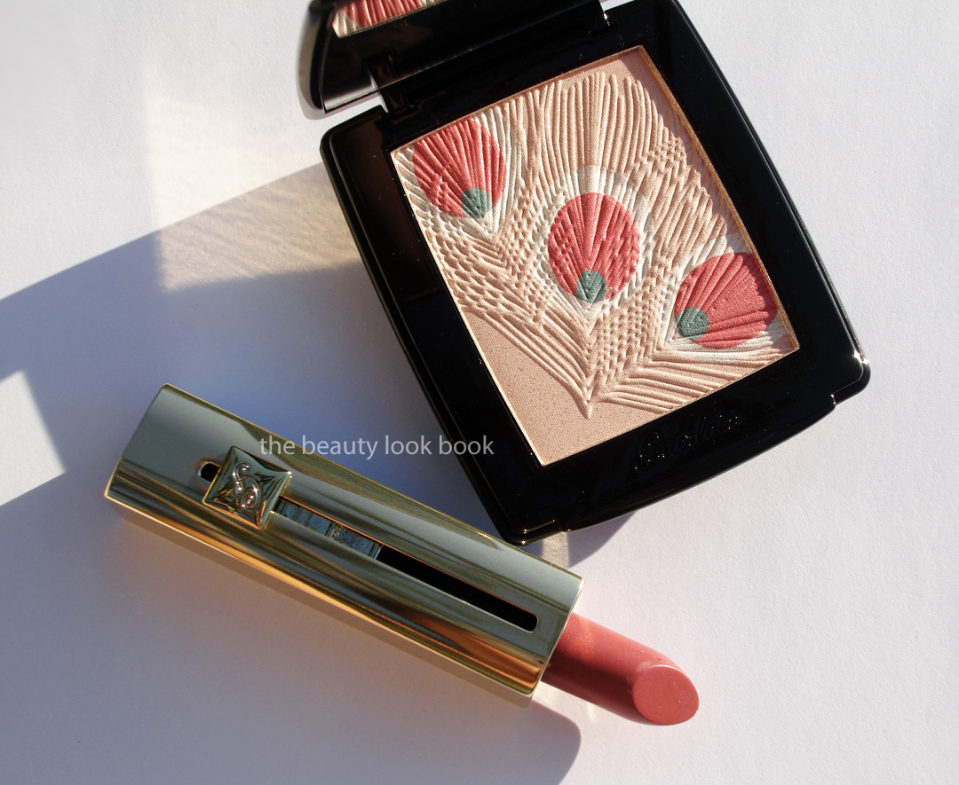
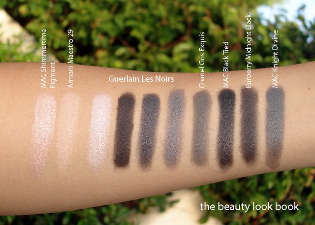
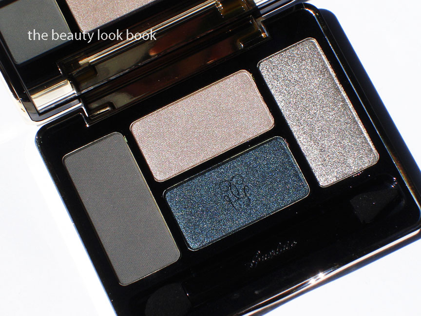
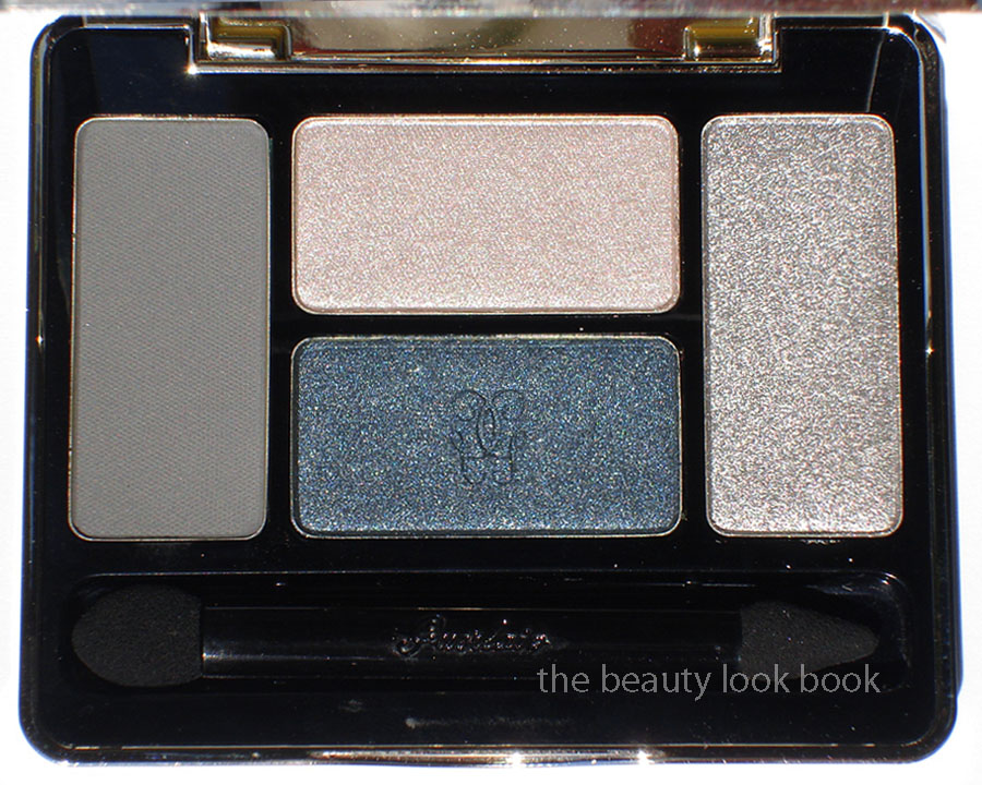
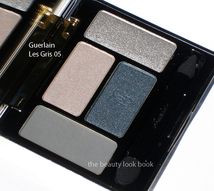
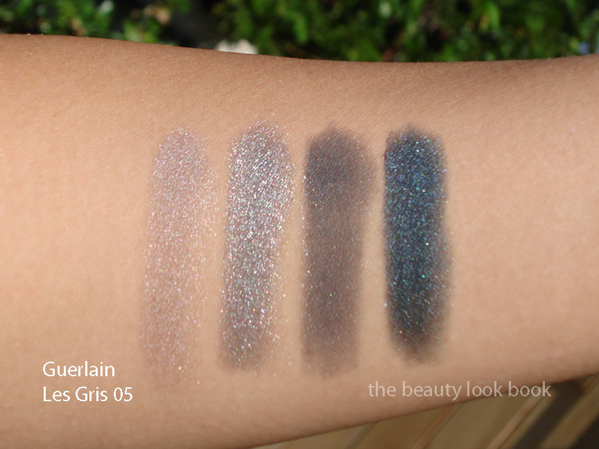
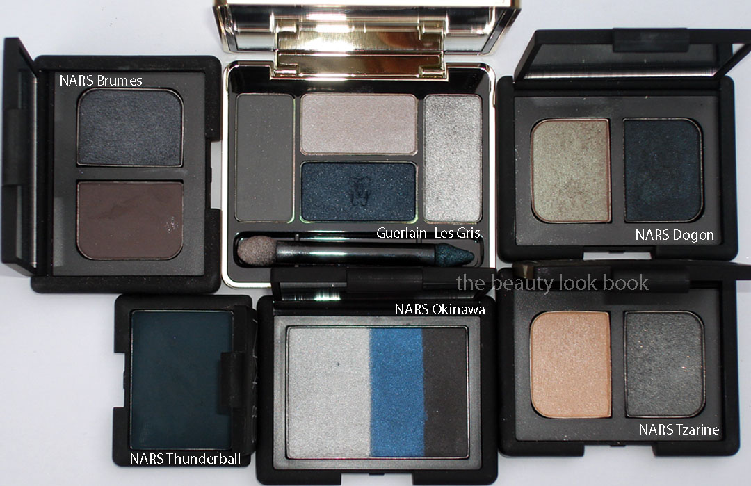
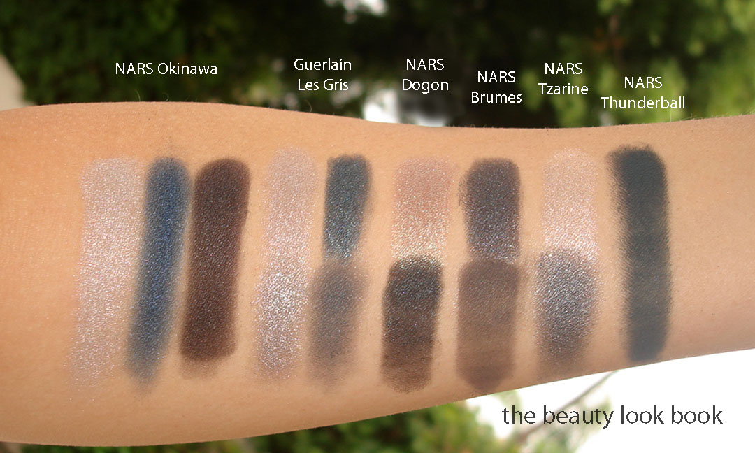
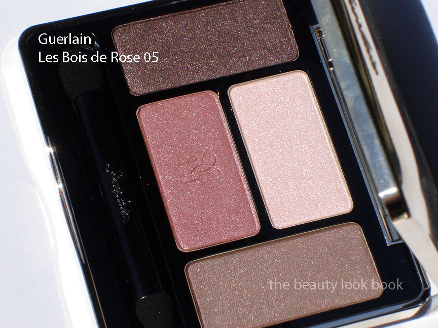
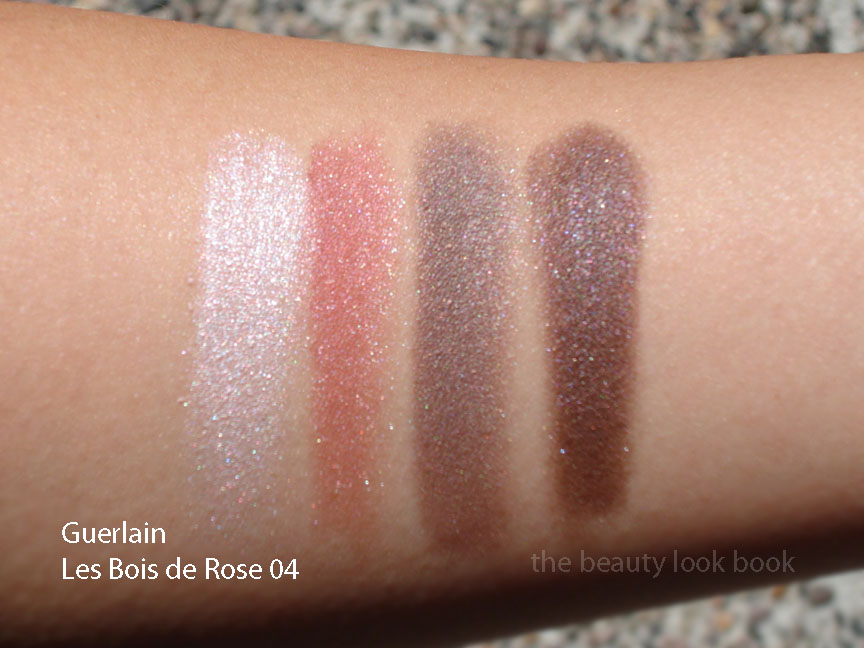
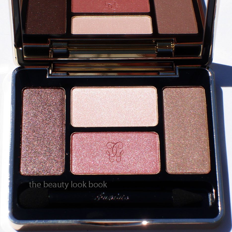
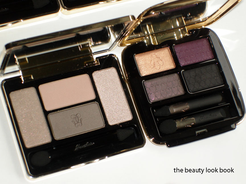
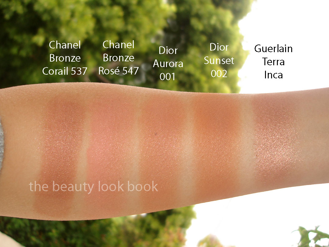
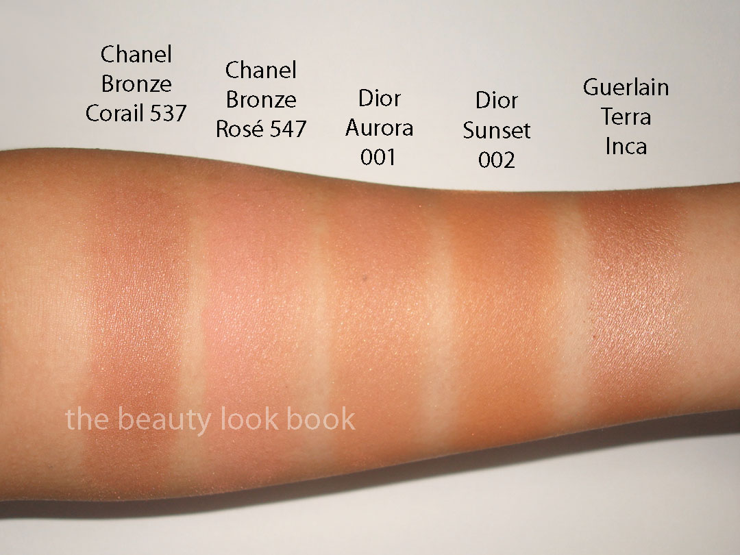
Guerlain seems to be the earliest with holiday releases this year. I was only planning on the Meteorites Powder, but instead caved on the Parure de Nuit Pressed Powder & Blush and Rouge Automatique in Flirt d’un Jour #169. I am still relatively new to Guerlain products but have discovered quite a bit this past year from the line. I’ve fallen in love with the Lingerie de Peau and new eyeshadow quads that were released for fall. My interest is slowly growing. For those interested, I spotted the collection at Neimans last week. It should be arriving at your Guerlain counters very soon.

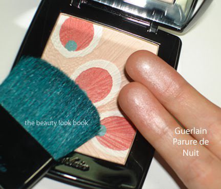
After my fall highlighter post, several have asked for my thoughts on the ones for holiday. To date, I’ve only seen Guerlain’s. The Parure de Nuit Pressed Powder & Blush ($67) design was too pretty to pass up on and from a distance I thought the red circles were ladybugs, although they are in fact in the pattern of peacock feathers. This comes in a double tiered compact with a compartment for a turquoise/teal goat-hair brush. The brush feels very nice on the skin but I am not sure it’s the best for this highlighter/blush. The Parure de Nuit is a very soft and sheer pearly shimmer powder. There is a gorgeous overspray of an iridescent opal pink and I was sad to find that it disappeared after the initial application/swipe. What lies beneath is a soft pinkish pearl – even after swirling your brush in all the colors over the red circles, all that you really see is a luminous pearl. It gives a beautiful soft glow but I wish there was more pigment or more visible shimmer. I could not get a decent arm swatch to photograph. On the face it gives the slightest hint of glimmer when applied with a stiffer denser blush brush. I would not use this as an all over the face powder, although some might.

I took my fingers and swiped them back and forth three times all over the powder for this swatch. Below it’s been swatched heavily on fingers so you can see the pearly finish, but on the face it is barely detectable.
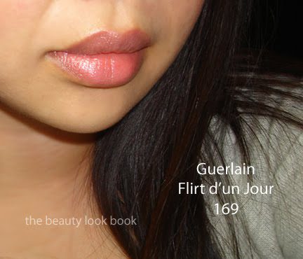
Rouge Automatique in Flirt d’un Jour #169 ($35) is a beautiful soft pink. The texture is very smooth and feels moisturizing on the lips. It has a natural sheen but gives decent coverage to cover the entire lip. The finish is the slightest bit transparent so your natural lip shows through a little bit. I’m not the biggest fan of gold packaging but the push nob in the front almost makes this lipstick feel like a toy.


Overall I love the lipstick and semi-like the highlighter/blush. I realize the highlighter was designed to give a subtle glow, but as Messy Wands wrote, I do agree that I think darker skins will find it will not show up. I’m not dark or tan, but with my medium skin, it barely shows up. It does give a nice soft luster to the cheeks but I personally prefer something that is more visibly glowy or pearly (without the frost). If Guerlain had kicked up the pigment/intensity by 1.5 notches this would have been a winner for me. The darker berry lipstick looked divine but I’m still scared of dark berries. Perhaps I will be brave enough to try it the next time I’m at the Guerlain counter.


