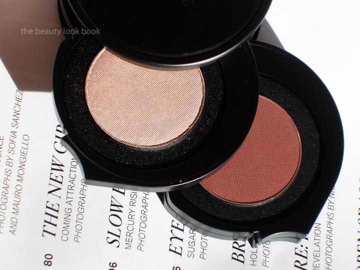
Many thanks to the NY bloggers who gave us sneak peeks, swatches, and even a few eye-looks of Bergdorf Goodman’s latest holiday Kaleidoscope from Le Métier de Beauté, Antiquité Poupée ($95, limited edition, exclusive to BG). I was hesitant to buy for several reasons, mainly because it contained a warm matte rust shade and also because it was not available for sale online. The Black Panties and Josie pushed me over the edge though, both assuring me that the reddish color warmed up the eye look and was easy to pull off. It looked stunning on Messy Wands as well. I typically try to avoid any eyeshadows and liners that contain red but decided to give this a try and ordered two kits (one as a gift). The colors and descriptions are as follows (thanks to The Black Panties for providing the names for us):
Dusty Rose – a soft shimmery pink with a subtle gold shimmery sheen
Burlap Sorrel – a warm shimmering taupe
Tarnished Russet – matte rust brick
Ember Ash – a deep shimmering blue-grey
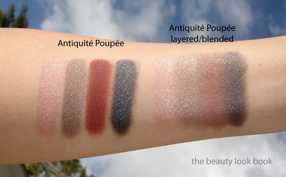
Close ups of the shades #1 Dusty Rose and #3 Tarnished Russet
Close ups of the shades #2 Burlap Sorrel and #4 Ember Ash
I applied it the second I received it using the Couches de Couleur layering technique, starting with the top shade all over the lids, then working my way down, applying the remaining shades in a gradient towards the lashline. The result: a truly stunning smokey eye. I was really amazed at how wearable the rust shade was when layered over the pink and taupe (although I dusted it with a loose fluffy brush to apply sheerly). I’ve tried to show it layered in a few swatches here. The pigment is rich but easily blendable. The shimmer is exquisite. Texture is soft, luxurious and easy to blend.
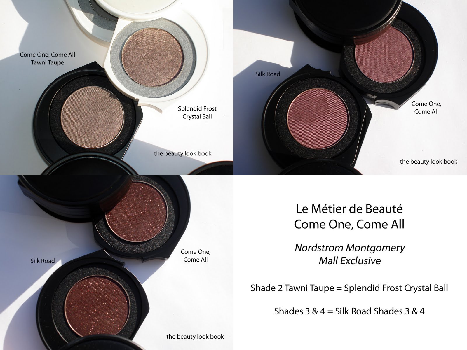
When I reviewed the Come One, Come All Kit, one of my readers mentioned she purchased the new Antiquité Poupée and said the taupey shimmer was the same as the taupe in Come One, Come All and Splendid Frost. I pulled out all my Le Métier kits and singles to do the comparison myself. Unfortunately, to my dismay, I discovered that my reader was right, the Antiquité Poupée has a repeat taupey shade compared to other previously released kits. I now have 3 of the same shade among 3 different kits. Not a complete deal-breaker for me, but still, I had hoped for something truly unique and different, something more silvery/grey. Here are comparisons for all four shades.
The more I wear this kit, the more I fall in love with it. The color combination is pure genius, especially considering the fact that I have never been able to pull off warm reddish colors. It’s suitable for a daytime look to wear to the office yet also perfect for night by adding a bit more of the darker shades to give a smokier effect. Yes, this kit contains colors that are similar to other existing shades from Le Métier (including the one true dupe in the taupe color), but I still like it. I am now no longer afraid to wear reddish eyeshadows, but my heart still belongs to neutrals and I am hoping that future Kaleidoscopes from Le Métier will include more neutral or cool toned shades.
Bottom line: Was this worth another $95 (times two for two kits)? Almost. One of the two kits I received had a packaging flaw. The glue used for the pans seems to have been so hot it melted the plastic bottoms causing it to shrink which made the actual shadow pans pop up (they were uneven). I was worried that I would damage the product if I didn’t open super carefully so I proceeded to spend over an hour using my blow dryer, flat iron, screw driver and scissors to try and depot/melt/flatten the plastic casing. (This is something I do not recommend, thank goodness there were no shadow casualties. Hours later it was fixed with only a few melted spots on the sides. FYI, the one photographed was the kit that was perfectly intact, the swatches were from the one I fixed.)
Overall I am pleased with this kit. I would have never thought to layer these four colors together and the convenience of having all four shades in one kit is a huge plus. I am really astounded at how beautifully these colors layer together for a pretty smokey eye. The texture of Le Metier’s shadows is hard to beat (in my opinion). If the taupe been different and unique and if the packaging hadn’t been flawed for 1 of the kits, I would have been 100% in love, but I am still one happy girl to be able to own Antiquité Poupée.
From what I’ve read on Twitter and Facebook, I understand this kit sold out immediately, but BG still might have a few more left coming in. If you’re considering this at all, I recommend calling the BG counter ASAP. If you missed out, the upside is that I believe you can achieve a similar effect with other shades from Le Métier de Beauté.
Did you purchase Antiquité Poupée? What were your thoughts?
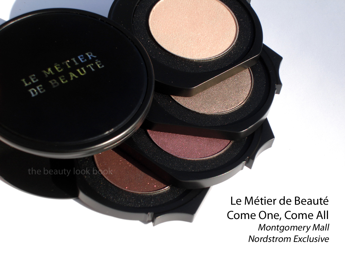
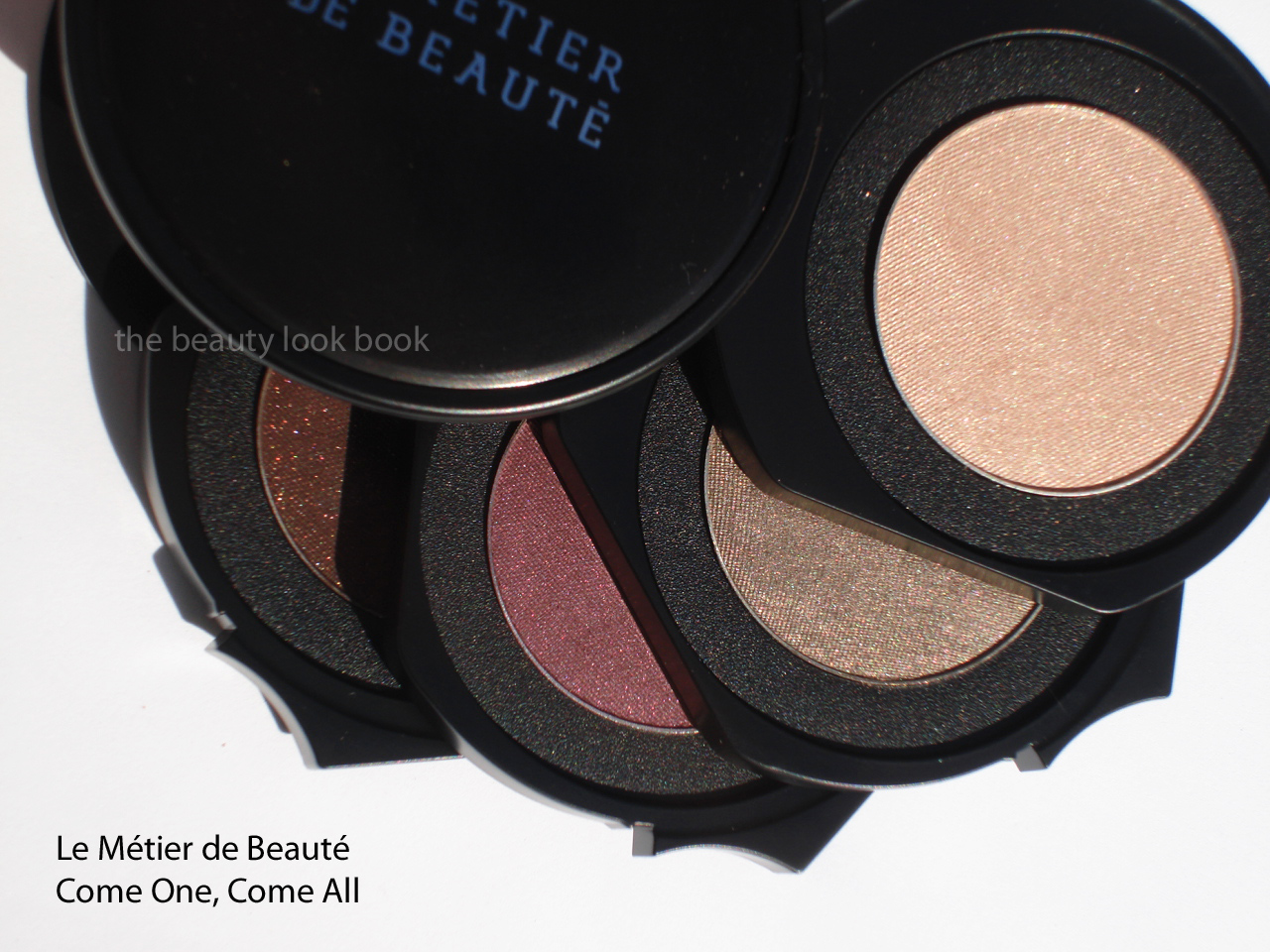
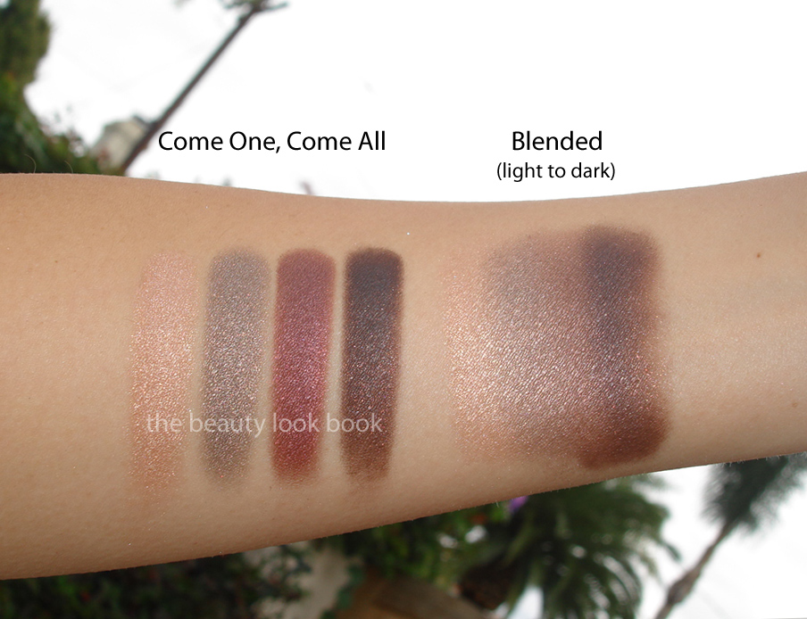
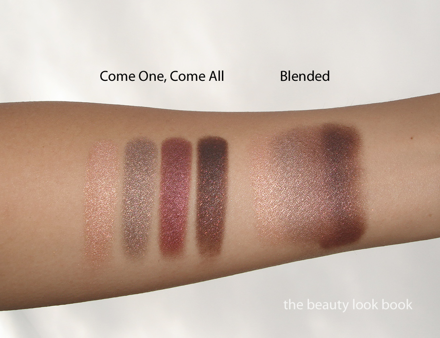
Le Métier de Beauté Come One, Come All Kaleidoscope Eye Kit ($95) was recently released as an exclusive to Nordstrom Montgomery Mall in Bethesda, Maryland. Many thanks to Best Things in Beauty who told us all about this the morning it was released for the Trend Show. She provided detailed descriptions, contact information, swatches and photos and I called to order as soon as I saw it. The colors & descriptions (thanks to Charleston Girl for providing the names as well since the kits don’t have names on them):
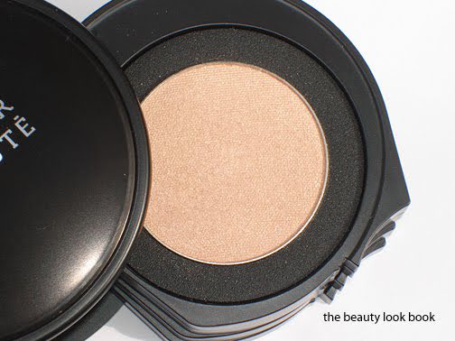
Haute Honey is a glistening warm champagne gold
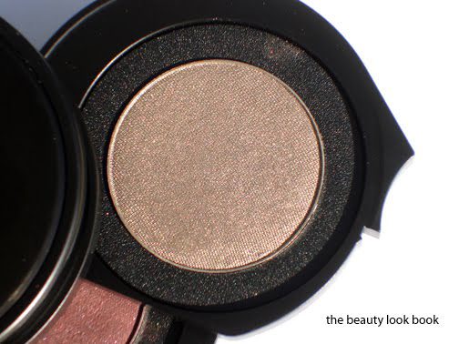
Tawni Taupe is a shimmering frosted taupe with gold shimmer and slight olive tones
Montgomery Mauve is a mauve reddish purple
Bethesda Brown is a deep brown with gold flecks
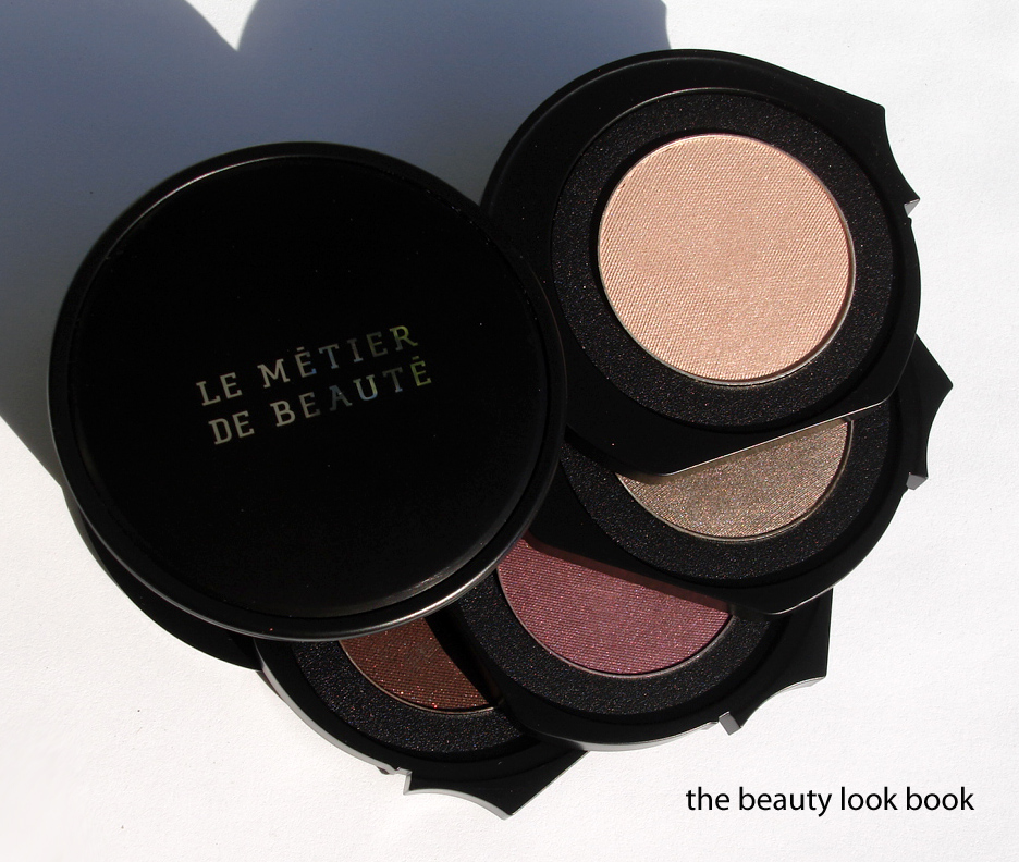
Haute Honey
Tawni Taupe
Montgomery Mauve
Bethesda Brown
It took a little over a week to arrive from the East Coast and when it did, it took my breath away. I was however slightly let down for two reasons: 1) The kit contains yet another warm burgandy/plum/mauve shade which I feel are in too many Le Métier Eye Kits (I find these difficult to wear on my eyes, even with layering). 2) I found that three of the four colors are duplicates from other kaleidoscope kits, Splendid Frost from last holiday and Silk Road from this past fall. Makeup Magpie has also identified the same dupes. I highly recommend you check out her beautiful photos and swatches on her blog to see them on different skintones. (I did not photograph my swatches of the dupes but they are indeed identical. You can click for larger viewing.)
I applied this on the eyes as soon as it arrived using the Le Métier couches de couleur method of layering from top shade in the kit to the bottom color. The result: unexpectedly gorgeous. Yes, I detest warm reddish shades, but layering these colors resulted in a really stunning eye look (not to sound vain, but the color combination is really astounding). So I take back part of my pouty attitude, the colors are really very wearable. I wore this kit every day for the last week. I still cannot take good eye pics so I tried to layer on my arm to show you how they look mixed. I love the convenience of this kit.
At this time I do not know if the kit is still available but check out Best Things in Beauty for the contact info for the counter. If you have Silk Road and Splendid Frost, I don’t think you need this one. I still haven’t found a good dupe for the top shade although it reminds me of Chantecaille’s Rose Gold Eyeshadow (currently missing in action, I’m just disorganized at the moment).
Even with the dupes, many might ask: was it worth the $95? I think so, but I could have lived without this. Curiosity got the best of me. Still, I adore it and I would have never thought to combine the colors together like they are in this palette. The versatility of this palette is amazing. I think that Come One, Come All should have been released for fall instead of Silk Road since it appears to be more neutral and universally flattering. Silk Road is indeed gorgeous, but a bit difficult to pull off because it’s so warm (at least in my mind but of course I still caved even though I did not review/feature it).
Many have been asking if I will order Dustin’s new kit from Bergdorfs (see preview on Messy Wands). I’m still undecided. That rust-shade scares me but every NY girl tells me it warms up the look wonderfully. I’m still not sold … yet.
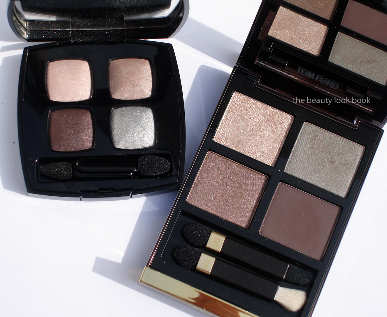
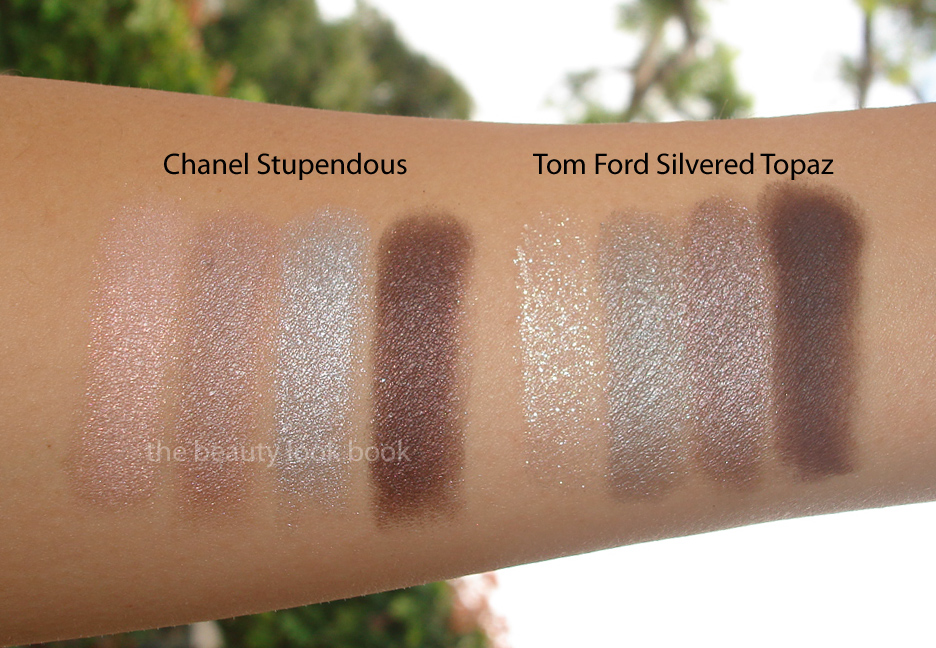
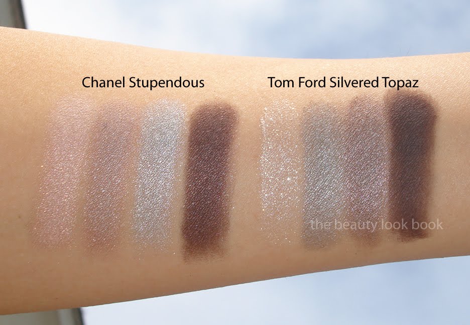
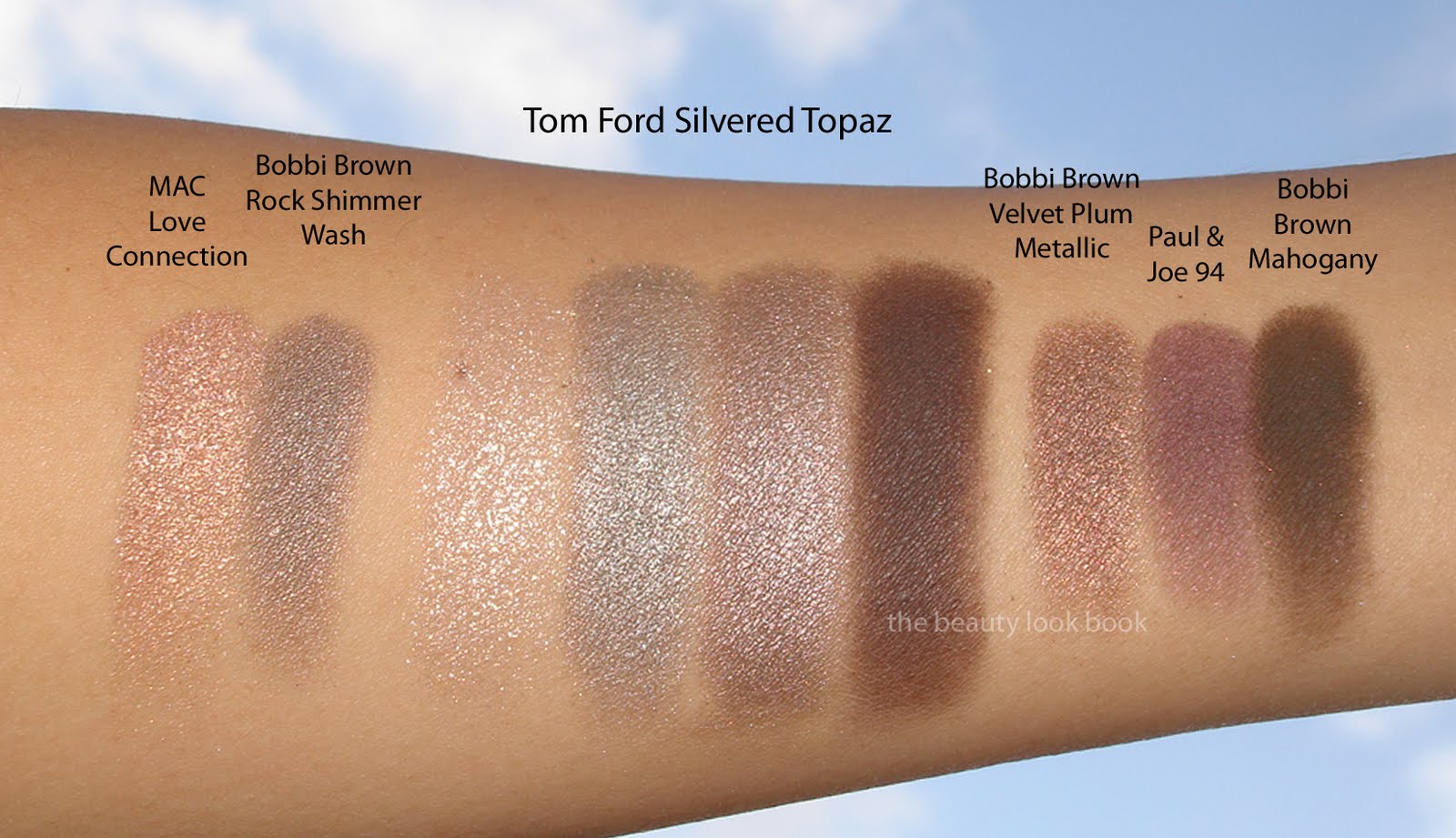
Here is Chanel Stupendous (from the Soho Collection last year) compared to Tom Ford Silvered Topaz. They are not identical dupes but very similar. I prefer the Chanel to the Tom Ford by far. I had thought Stupendous was a limited edition quad, but I just checked Nordstrom.com and it still shows up available for purchase. Swatches side by side:
Tom Ford Silvered Topaz: $75 for .35 oz/10 g, made in Italy = $7.50 per gram
Chanel Stupendous: $57 for .24 oz/6.8 g, made in France = $8.83 per gram
Even though the price per oz/g is more for the Chanel, I think it’s more justifiable at $57, plus I think the overall finish and quality of the Chanel looks better on my skin. Don’t let my reservations about Tom Ford Silvered Topaz stop you though. I still highly recommend that you check out the line in person if you can. If you can get to the Beverly Hills area, Neiman Marcus is the ideal place to shop for Tom Ford because they have Edward Bess and Le Metier among a number of other fabulous brands. Also Dolce & Gabbana is next door at Saks, not to mention all the goodies at Barneys like Koh Gen Do, L’Artisan, Serge Lutens, Le Labo, Byredo etc.
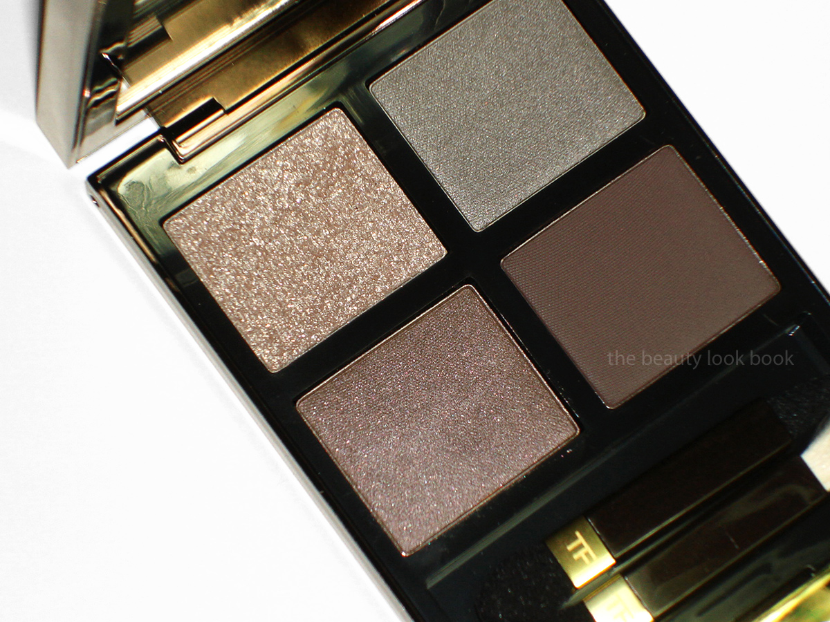
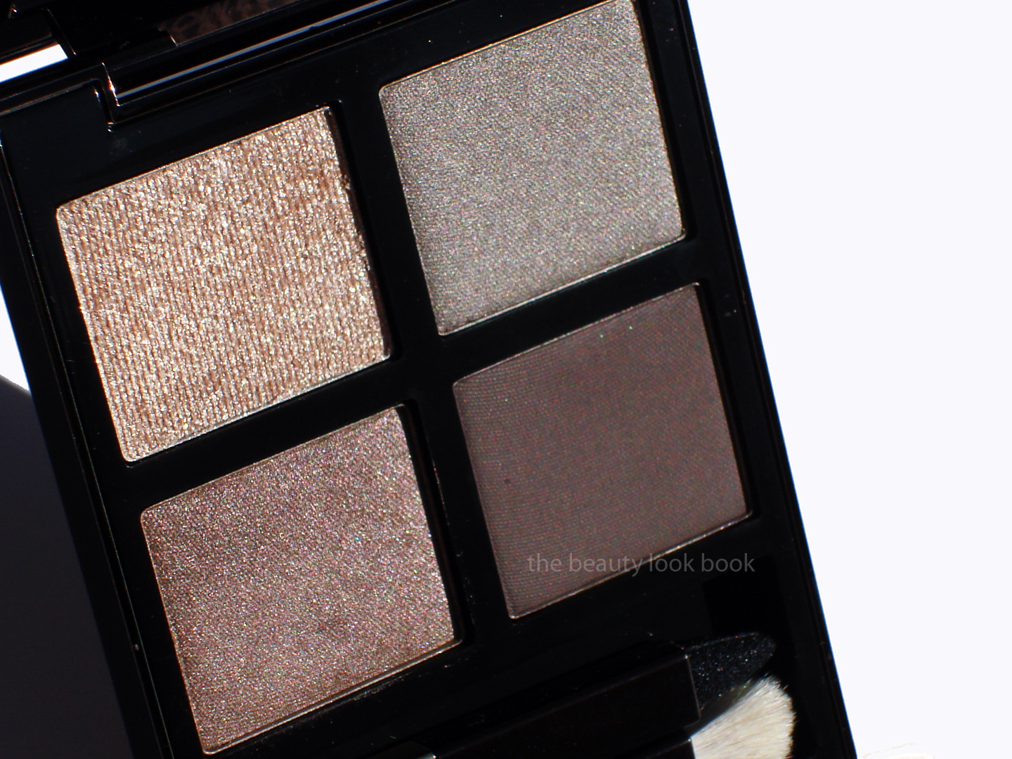
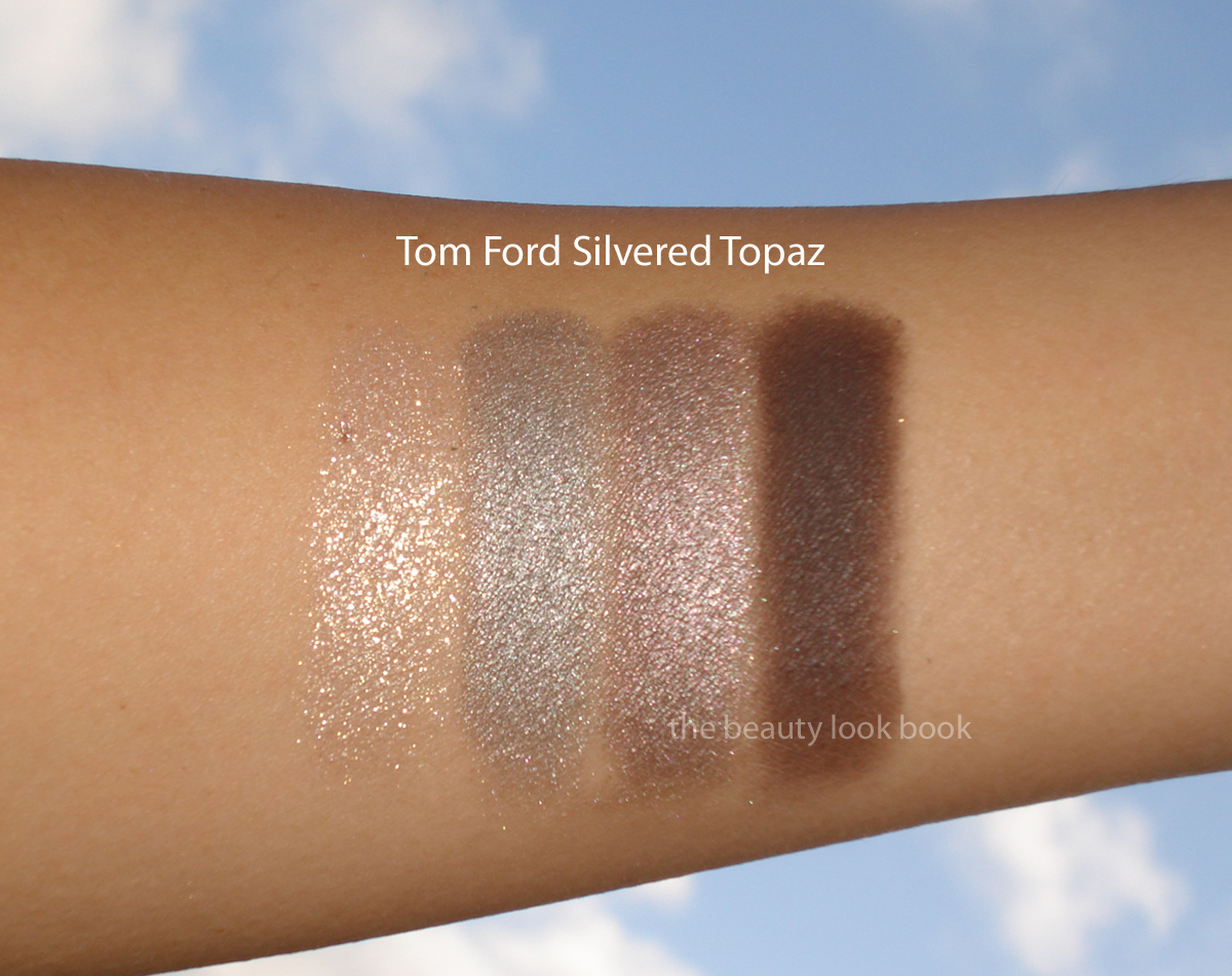
Tom Ford’s full makeup line has just been launched in the US at Bergdorf Goodman and select Neiman Marcus locations. I have not yet had a chance to see the entire lineup in person but I did pre-order a few items online. I’ve been enamored with the formula of all his lipsticks (original and new revamp) so my expectations were set pretty high for the rest of the line. First up to be reviewed is his eye color quad in Silvered Topaz 05 ($75 for .35 oz/10 g). Each quad has a diverse range of finishes, Silvered Topaz has an intense champagne sparkle, a satiny silvery grey, shimmery pale mauve and matte brown plum. The overall undertone of this quad is very cool, I found it a bit too silvery for my olive skintone but it looks amazing on Karla Sugar (see her makeover results here). (On thumb at top is Chanel Rose Cache.)
Here are some more close ups and swatches (scroll down for the review):
* On thumb is Chanel Nuit de Russie (from 2008)
Quality, Pigment & Texture: The quality of the shadows in Silvered Topaz are good but not great. The texture is smooth and easy to blend which is nice and the shimmer is finely milled for the satin/shimmer shades. The high-sparkle shade is lovely as a finishing color with no fall out but very intense. The matte shade is also smooth. Pigment is medium but layerable. Overall I think the quality is decent, but perhaps I’ve just been spoiled by Le Metier & Dior lately. $75 is a huge ouch to the wallet. I would rather pick out shades I love individually or spend an extra $20 for a Le Metier Kaleidoscope.
Packaging: The compact has a large mirror, magnetic closure and two double-ended applicators. I like that the compact comes in a decent size. It feels sturdy but not $75-worthy. Again, I feel it’s good, but not great. I highly recommend you check out The RaeViewer’s Video Tutorial and Swatches of Cognac Sable. I felt her thoughts resonated with me.
Colors: The promotional photos and previews from UK girls Get Lippie & London Makeup Girl had me drooling. Upon receiving the quad and seeing it in person, I was a bit less than wowed. It’s a bit too cool-toned for me and the colors don’t seem all that original. Still, in my stash, I couldn’t find a dupe for any of the colors.
Here are a few comparisons:
Bottom line: It’s like but not love. At $75 I need to love everything about this to feel ok about the price. Yes, buying four shadows individually from most brands will most likely cost me over $75, but I still haven’t been completely won over. Upon further digging through my stash I figured out why I thought this wasn’t so original. It appears to be close to Chanel Stupendous (comparisons to come tomorrow). My heart still belongs to his lipsticks. (I’ve also purchased one blush and lipgloss but still need to do some more testing on those.)
Have you been able to check out Tom Ford’s Beauty Line in person? What were your thoughts? Share your hauls or testing experiences at the counter so the rest of us can live vicariously through you. (For inquiring minds, nail polish featured in the top photo is Chanel Rose Cache while nail polish in the middle with the back of the compact is Chanel Nuit de Russie. Photos were taken over different days.)
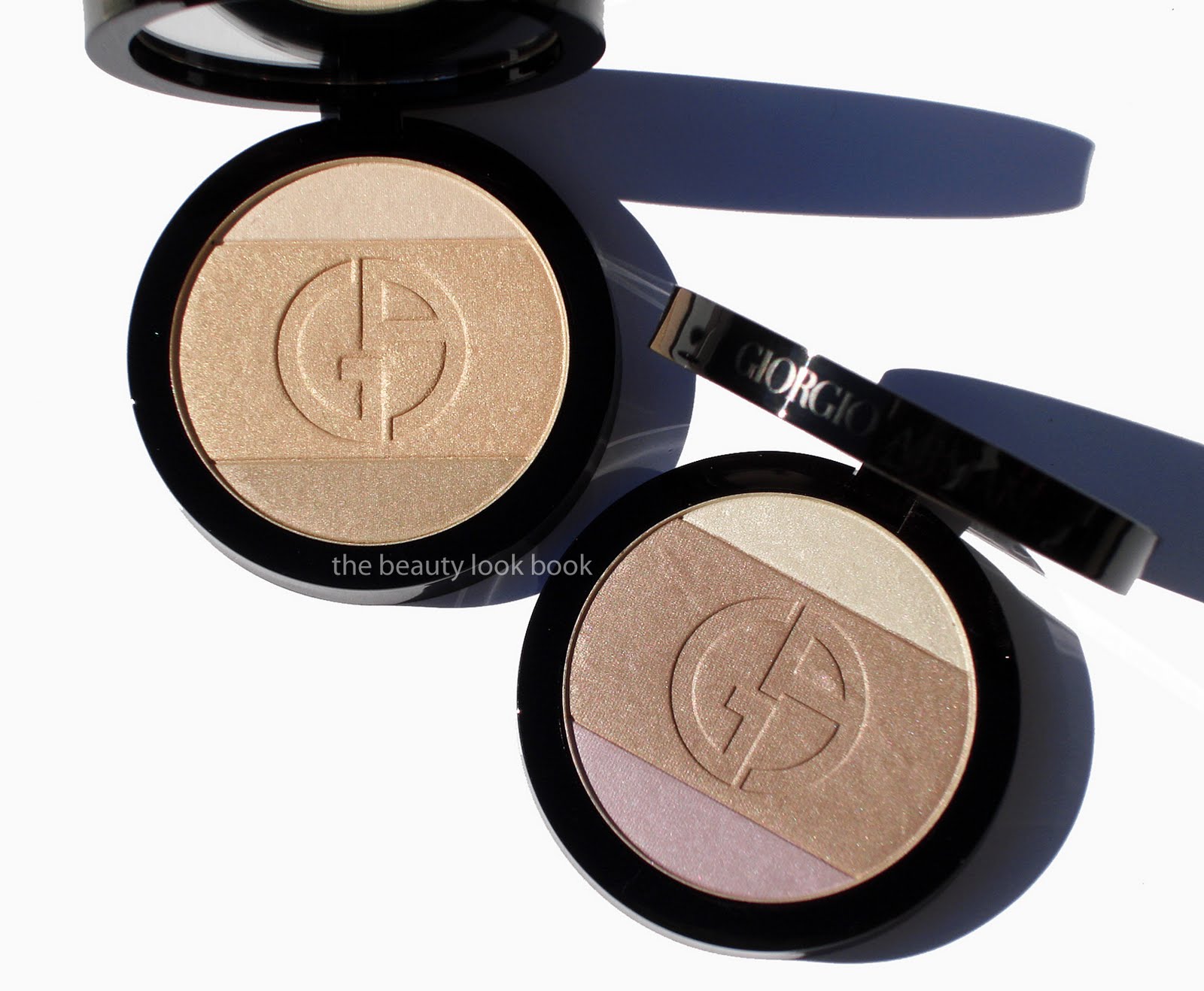
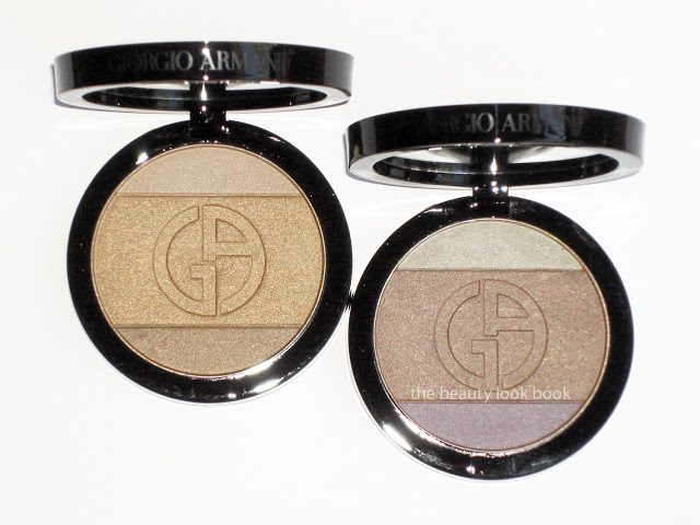
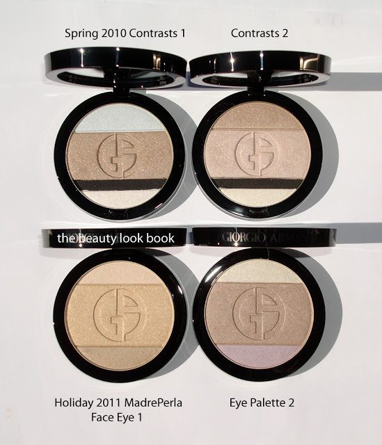
Armani has released two palettes this holiday season for their Madre Perla Collection. The theme for the eyes and cheeks are shimmery golds, nudes, pearls and silvers. I found the collection has arrived in-store at Neiman Marcus. One is a Face & Eye Palette #1 (the golden one) and the other is designed as an Eye Palette #2. Both are $59 each and are limited edition. The two palettes contain three shades each, very reminiscent of Nude Contrasts from Spring 2010. I approached these with a bit of hesitation. As beautiful as the colors were from Spring, I have to admit both palettes have barely been used. All the colors (except the black) from the spring eye palettes show up similar on the skin which results in just one overly-sparkly eye when the colors are layered. Still, the palettes this season took my breath away as soon as I saw them. The palettes were a bit difficult to photograph to capture the dimensional aspect of the shimmer. I’ve tried several angles to try and help give you an idea.
Madre Perla Face and Eye Palette 1 is a trio of golds. The texture is soft, slightly powdery and fairly shimmery. Applying with an eyeshadow brush (or a denser brush) results in a very shimmery pigmented application. I wore this on the eyes last night to a play and it was beautiful but definitely on the sparkly side. The three colors you have are pale ivory, warm pale gold, neutral tan gold. I feel the colors are uniquely distinct from each other when swatched on the hand but if you want to layer three shades I think you can only create a subtle gradient. Since the payoff with a small brush was so pigmented I was worried it would be too frosty for the face, but applying with a regular brush brush (I used Bobbi Brown’s when testing this one) resulted in a sheer but visible wash of shimmer. Love!
Madre Perla Eye Palette 1 is also beautiful with a cool sharp white with gold frost, neutral tan beige shimmer and cool lavender. I’m not a fan of lavender shades but I learned from Le Metier that this color can be a great highlight to layer over beiges/tans and golds. I really love the middle shade, it’s like a soft beige with a slight hint of grey shimmer. I applied the middle shade first over most of the lid, then added the lavender to center on top and blended. I then added the ivory-gold as a very soft highlight near the top. Today I used Bobbi Brown Bronze gel liner to finish the look. Overall it’s a stunner but very pale. Next time I will need to add a darker contour like Chanel Sand.
Here’s another close up plus swatches:
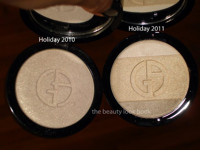
Comparisons of last year’s highlighter (less yellow and lighter) to this year’s:
Palette comparisons from Spring 2010 to Holiday:
Overall all out gorgeous, not overly frosty, beautiful for holiday. I will definitely get more use out of these than the spring 2010 palettes. They are more versatile and wearable in my opinion.
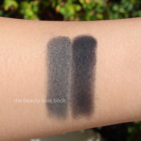
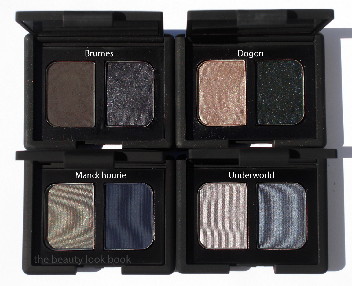
NARS Mandchourie Duo Eyeshadow ($33) is the new holiday duo from NARS this season. It’s an intensely smoky palette of olive-golden-indigo shimmer and a deep dark matte indigo blue. The colors are deep and dark and not for the faint of heart. Playing around with this resulted in a super smokey dramatic eye. I recommend having a paler neutral shimmer on hand to help tone down the intensity or to help blend harsh edges out. My favorite way to apply so far is to use Laura Mercier’s Platinum Metallic Creme Eyeshadow as a base and then apply the dark golden-olive shade on lids with a soft fluffy brush like MAC 217 then apply the darker matte navy with a pencil brush and smudge over the lash line upwards. The pigment in this duo is quite good, the matte shade can be a bit chalky on first swipe but layers well.
Compared to other NARS duos, Mandchourie is quite different and unique. Here are comparisons to Brumes, Dogon and Underworld. I also swatched Stila’s Diamond Lil to show how intense the NARS Mandchourie is by comparison.
Overall NARS Mandchourie is beautiful, unique, dramatic and intense. It’s lovely but a bit too dramatic for my taste – for everyday. For smokey eyes I will be reaching for NARS Brumes or Cordura more often since I feel those duos are easier to pull off although Mandchourie does go well with a softly bronzed cheek and pink lips. I’m one who prefers a natural smokey eye and while Mandchourie can easily be layered lightly for a less smokey look I still think it’s very intense (in a good way though!). It’s neutral enough in color so it won’t look too harsh on any skintone (at least in my mind). Some pure greys/blacks can look harsh and even some navy blues can look too contrasted on the skin. Mandchourie has an excellent blend of other colors in the undertone to make this intense/smokey/dramatic without being too harsh on the skin.
(For inquiring minds, the only other holiday items I picked from NARS were the multiple and highlighter but those are on presale for Nordstrom’s Trend Show, so they most likely will not be making an appearance on the blog for quite some time.)
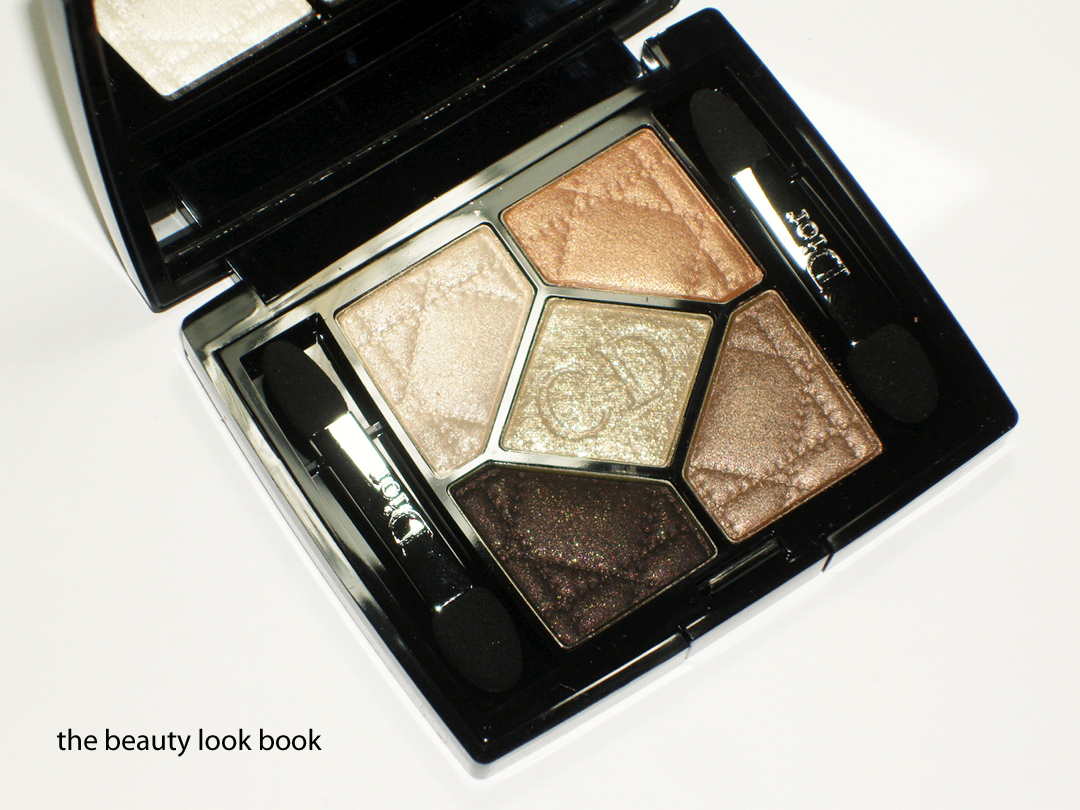
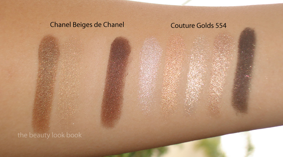
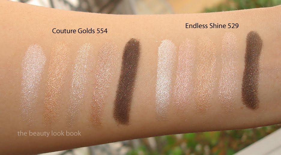
Dior Couture Golds 554 Quint ($59 for 6 g/ 0.21 oz) has finally been spotted in-store at Nordstrom. I’ve looked everywhere online for this and have yet to find it listed anywhere yet. It appears to have had a slight delay in release compared to the other items in this year’s holiday collection (much like last year’s Five Golds). If you’re looking online I suspect it might be a while before we see it show up. I’d recommend you call your Dior counter to see if it has arrived. Couture Golds is a particularly festive mix of golds and creams. The colors in the palette are all high frost/shimmer with the exception of the dark blackened-brown. I would describe the shades as (from top left going clockwise finishing at the center):
frosted ivory cream
frosted warm coppery gold
shimmery warm golden bronze with slight beigey tones
dark matte black-brown with gold flecks
sparkling yellow-gold champagne that has slightly chunky reflective particles
All have excellent color payoff, except for that dark color which I think needs a dense brush and quite a bit of packing on to get decent pigment. All together Couture Golds has a beautiful glowy quality that is perfect for holiday.
Is this a must-have? My initial thoughts were “yes! this is the best palette of the season yet!” I still feel that last year’s holiday quint, Five Golds wins hands down, but I did think this year’s Couture Golds was a huge thumbs up until I swatched it on the arm and thought it looked oddly familiar – like Endless Shine. Here is Couture Golds with some comparisons and swatches. You can judge for yourself on the similarities. There are differences in sparkle quality and undertone. Perhaps they just look identical because of my skintone. For me, they are too close for comfort. After seeing them swatched side-by-side I couldn’t help but feel a bit let down thinking this was simply a re-hash or a previously released quint. I couldn’t fit everything on one arm, so swatches are grouped into twos.
Overall, I still feel that Couture Golds is the best eye palette of the holiday season. The sparking champagne in the center is so gorgeous with the chunky reflective particles. I prefer it over Endless Shine (even though they are very similar) so I can justify keeping it instead of re-gifting it to someone else. Will I be using Couture Golds this season? Absolutely yes. I just feel it could have been a bit more different than something previously released by the same brand.
Have you seen Dior Holiday in person? What were your thoughts?


