Browsing Tag

Eyeshadow

Uncategorized

Chanel Premier Regard #38 Quadra Eye Shadow – Fall 2012

June 22, 2012
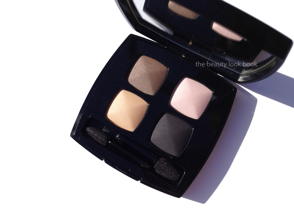
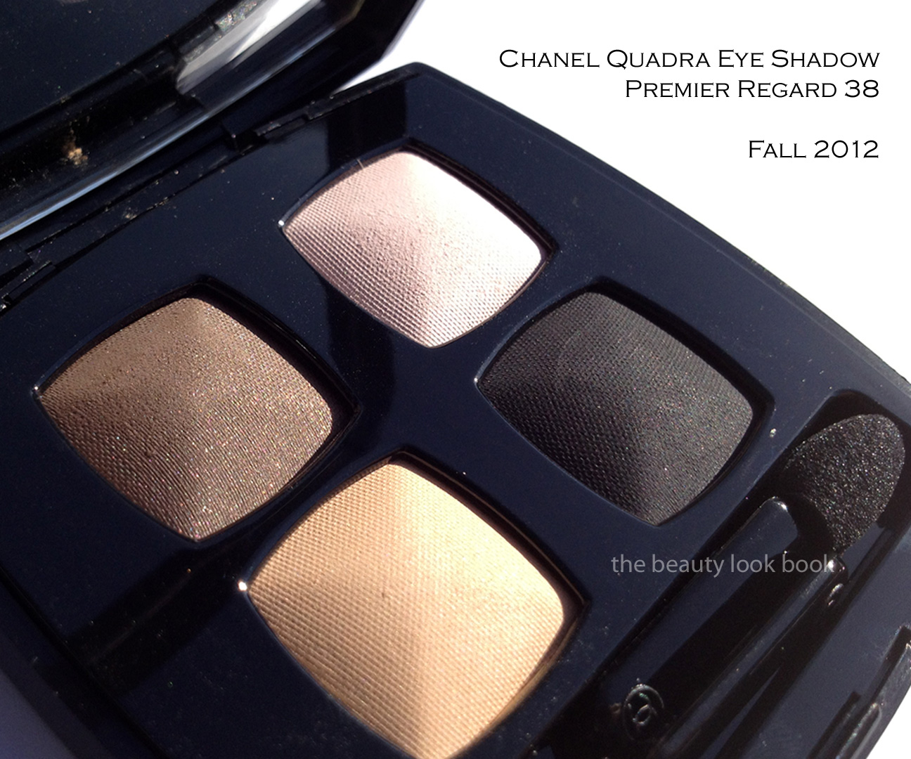
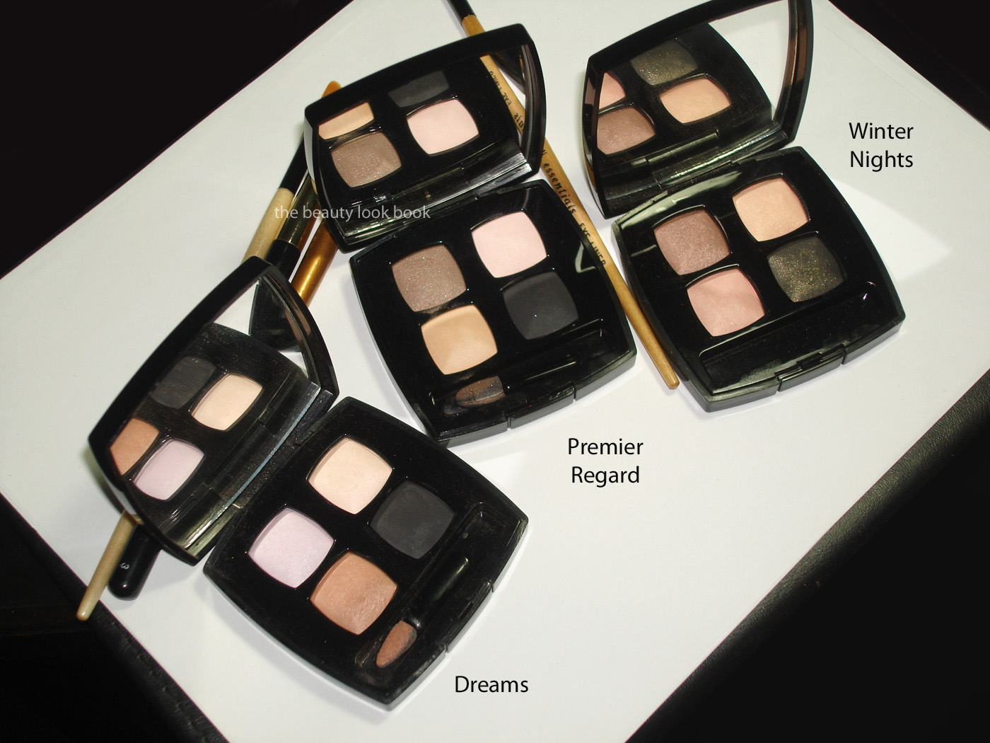
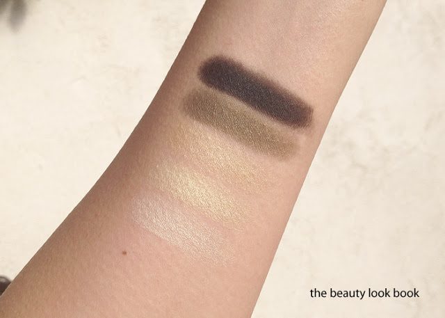
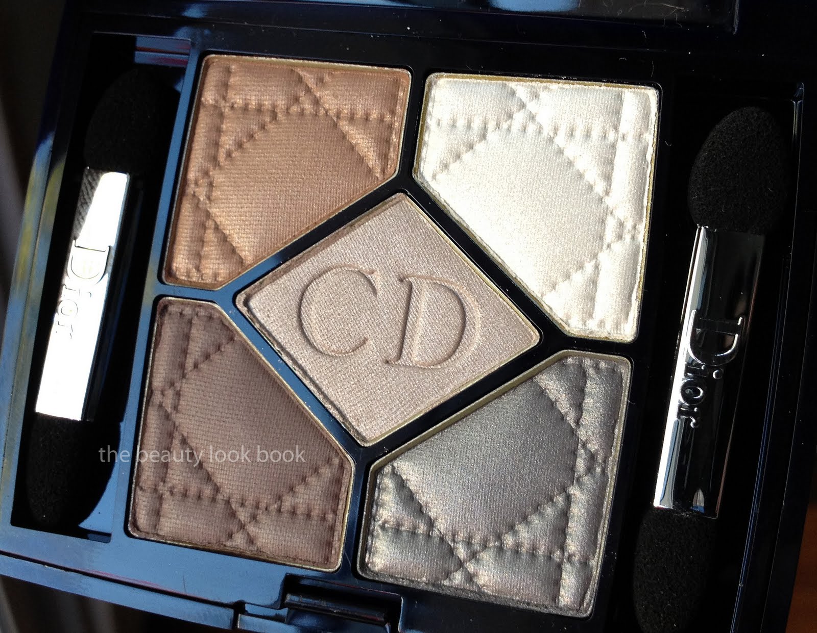
For the eyes this fall, Chanel has released one quad, two eyeliners and a number of single shadows. First up is Chanel Premier Regard #38 Quadra Eye Shadow ($58 for 6.8 g/0.24 oz). This is a subtle, soft and understated palette of sheer warm taupe-brown shimmer, pale dusty satiny pink, pale satiny peach-champagne and a muted black-grey matte. In the compact there appears to be a mix of satiny-shimmers and soft mattes, on the eyes these appeared mostly matte for me.
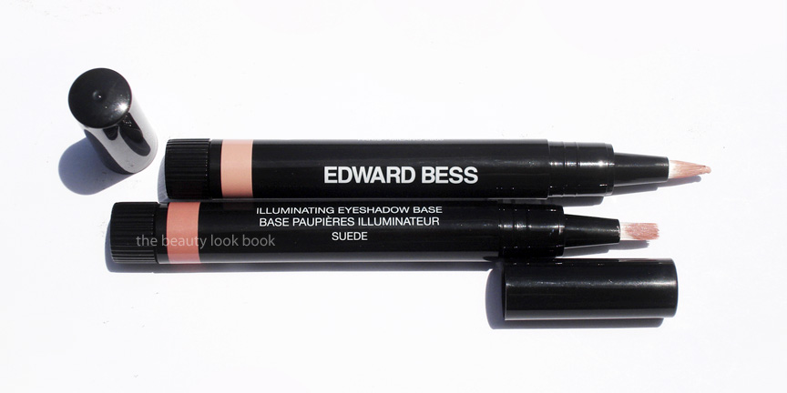
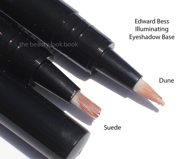
This quad took me three tries to get a decent application. By itself with only 1 base (I used Edward Bess’s eye primer), this was a disappointment for me. The colors were too sheer and the only color that had good pigment was the black-grey. I felt like the colors went on chalky and too sheer. The third time I finally found a good method of application. Note this quad needs a bit of extra work to show up (at least on my olive Chanel B30 skin).
Step 1: Prep with a good dose of eye cream on the lids and then apply your usual cream base/primer (I used Cle de Peau and Edward Bess).
Step 2: Mix the pink and peach together and blend over lids to soften the skin (this will be sheer but you can apply with a heavier hand if you want them to show up more).
Step 3: Use some kind of a tan/taupe/light cream shadow and blend along lashline and upwards (this serves as the base for the taupe shade, so apply the cream where you want the powder to go, I used Tom Ford’s Platinum Eye Shadow)
Step 4: Take the taupe-tan shade of the quad and dust over the cream eyeshadow (the cream eyeshadow helps the color adhere and blend well, using just a regular base was too dry for me to get any blendability out of the color)
Step 5: Apply the grey-black as a smokey liner (or as a crease shade, or wherever you prefer!)

Under different lighting:

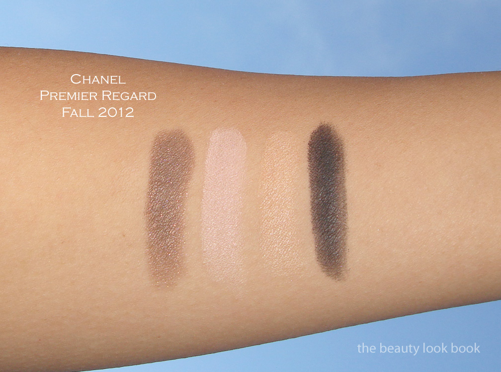
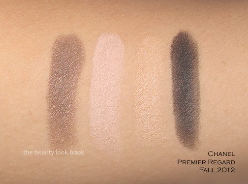
Swatched, three views:

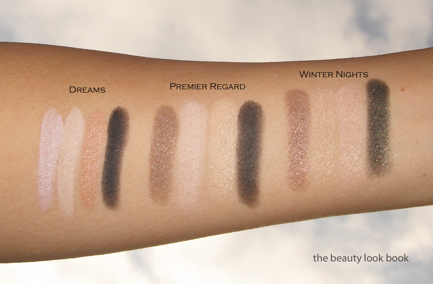
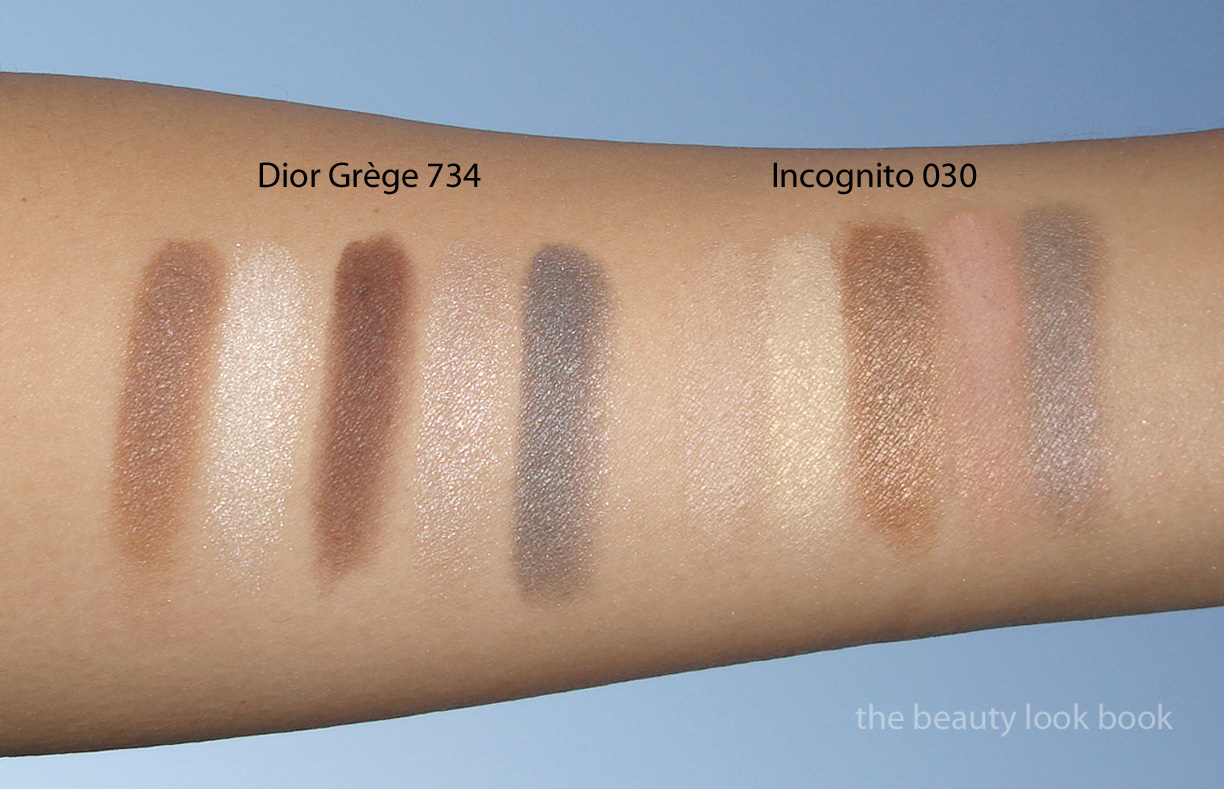
Right now, I only had time to pull two comparisons. When I first saw the promo photos of Premier Regard, I thought it looked strikingly similar to Winter Nights and possibly Dreams (I think both are discontinued in the US now?). The overall effect/theme is similar but the quads are still different. Here they are below.

Overall lovely and understated. At a glance, this seems to be a quad that is goof-proof and easy to apply. I was disappointed in the pigment by itself. The pink and peach look identical on my skin and borderline dusty. I need a moisturized eye base to prevent them from looking chalky on my eyes. A bit of tweaking and this worked better for me. I will definitely need to experiment more.

Have you checked out Premier Regard? How do you use it?

Uncategorized

Edward Bess Illuminating Eyeshadow Base

May 15, 2012

I’ve been eagerly waiting for the official release of Edward Bess’s Illuminating Eyeshadow Base for over a year now. I was able to test a prototype at Neiman Marcus Beverly Hills and was particularly impressed how it helped my eyeshadow last. As reviewed and mentioned by The Non-Blonde, the formula has probably changed, as well as the packaging, but the final product is just as amazing. Cafe Makeup showed us a preview of his eye base in action at Liz’s makeover at Bergdorf Goodman. Best Things in Beauty also featured a review for Cashmere. 
Edward Bess’s Illuminating Eyeshadow Base ($30 for .12 fl oz/3.5 ml) comes in three shades. I purchased the darker two in Dune, a cream medium flesh beige and Suede, a darker tan with a luminous sheen. These come in a twist tube with a built in brush applicator. Both shades work well with my medium olive toned skin (Chanel B30).

Dune has more of a matte/satin coverage while Suede is a perfect contour with shimmer. Both work equally well for me just think of Suede as a few shades deeper and more contrasted for my skintone. What these give is perfect natural coverage to the eye. While Dune seems more matte, there is an illuminating quality about it that gives my lids a flawless even glow. I’ve tried a number of other eye bases and have never found my perfect base. I have normal lids (neither dry or oily). I feel like most other eye primers I’ve tried are focused on oil control and the ones I’ve tried end up drying up my lids creating creases and lines even though I have no visible crease. Note I distinguish Eye Bases/Primers from Cream Eyeshadows. Primers/Eye Bases I’ve tried and did not love include ones from Trish McEvoy, Laura Mercier, Chanel’s Concealers (which are almost always used as a base in makeovers), NARS, Urban Decay’s Original Primer Potion (I do love the ones with shimmer/color for my skintype), Too Faced and probably several others that either irritated my skin or dried it out.
Back to the Edward Bess. This applies smoothly and evenly and dries at a slower rate than others which means I have more time to blend and smooth on the eye. I’m personally not a fan of twist-up brush-tipped applicators. I find they get dirty easily and I’d much rather apply with a full sized flat cream brush or my fingers. Still, the actual product is still amazing enough and the brush is fully functional for application so I can’t complain. Both shades indeed are brightening/illuminating. I agree with Best Things in Beauty that these offer amazing coverage and last all day into the night without creasing or creeping. This somehow helps the eyeshadow stay fresh-looking like you just applied it hours later. Both of the ones I purchased are winners and absolute must-haves
Below, more product shots and swatches applied with different intensities:

Available now at Neiman Marcus.
Uncategorized

Chanel Ombres Matelassées 51, Montaigne Eyeshadow Palette

March 15, 2012
Chanel has released a new beautiful palette to celebrate the opening of one of their new boutiques in Paris. The palette is called Ombres Matelassées 51, Montaigne ($80 for 6g/0.21 oz, Made in Italy). It comes with five stunning soft silky-smooth shimmery eyeshadows embossed with the classic quilted pattern. The colors aren’t all that unique to Chanel’s prior releases but the texture is amazing with an ultra-smooth finish and satiny feel. Pigmentation is medium, like most Chanel eyeshadows. The shimmer is very soft and subtle. At $80 this is extremely pricey (especially when you consider the fact that the Ombres Perleés de Chanel from Spring 2011 was $65). I fell in love with the beautiful presentation and packaging but I’m not really comfortable with the price. (I skipped the Vegas de Chanel face highlighter and so felt this splurge was justified.)
The colors, left to right: soft iridescent ivory, pale gold shimmer, satiny warm gold, khaki olive shimmer, soft greyed-black with a tinge of navy. A few more close ups.

Swatches:

Comparisons to a few other shades, Chanel Ivory, Chanel Blazing Gold, Burberry Midnight Black, Chanel Black Star and Chanel Noir-Ivoire. (The greenish/olive shade wasn’t compared because I don’t own any of the Chanel khaki shimmers.) As you can see the theme is not extremely unique, but still extremely beautiful.

I’m not sure exactly where this will be available. My guess is this will be available at the counters and stores that receive the special exclusive launches (such as Les Jeans de Chanel, Vegas de Chanel, etc.) I know Nordstrom in Seattle has received the palette and have seen reports of this being spotted at various Boutiques and select Neiman Marcus counters. I’m assuming it will be launched online at Chanel.com eventually but at this time I’m not sure. I purchased mine at my local Neiman Marcus although they did not have any testers. See other photos at Best Things in Beauty and Luxury-Makeup Livejournal.

Overall beautiful presentation and extremely high quality. There is a lack of originality with the colors (I found them to be repeats of prior/existing shades) but the palette is a classic and I really love it. The texture is better than some of the singles, which I’m a huge fan of, but sometimes can be a bit chunky in feel. I personally cannot envision wearing all 5 shades at once. I’ve tried a few combinations and prefer to use 3 at most at one time. I find it wears very well and adheres well to the lids like the classic Chanel eyeshadows do.

Bottom line, it’s a true luxury product, not a necessity. I love it but I don’t think it’s a must-have for those who have a lot of other Chanel eyeshadows. I simply think you will find this redundant. I like the convenience of having all shades in one palette and felt the presentation is just exquisite. At the price it’s definitely a splurge. If I could only have 1 palette this season, I think it would still be Dior Grège 734 (reviewed here), although a few photos of summer collections have been surfacing and I’m kinda dying over the NARS trio coming out for summer (see it on Specktra.net here).

Have you seen/tried this yet? What are your thoughts?

Uncategorized

NARS 413 Blkr and Lhasa Single Eyeshadows

February 12, 2012

This spring NARS has released two gorgeous dove-grey shimmer shadows with a tinge of lavender in 413 Blkr and Lhasa ($24 each for 0,07 oz/2.2 g). Both shades are similar with just slight differences between them, but equally gorgeous. 413 Blkr is the latest addition to the NARS 413 Blkr Collection which is exclusive to the NARS boutique on Bleeker Street in New York and Narscosmetics.com. Lhasa is available at all NARS locations as part of the Spring 2012 Collection.
I think most of you are familiar with NARS shadows so I won’t go into a detailed review on the texture/pigment/finish. Both are typical of NARS single shadows: soft, blendable, layerable and gorgeous on the eyes. The pigment of these is medium but easily layerable. For the colors, both shades look almost identical in the compact unless you move them at different angles in direct sunlight. The differences are subtle but more noticeable when swatched. 413 Blkr is a soft lavendar-blue grey shimmer that is lighter. Lhasa is a lavender-grey shimmer that’s slightly darker and more purple.

Both side by side in direct light:

413 Blkr close up:

Lhasa close up:

I use Lhasa last week and found that it worked best when layered over warmer colors. I particularly liked the effect when layered over Burberry’s Pale Barley or Midnight Brown. I found that both Burberry shades helped warm up Lhasa on the eyes.
413 Blkr while cooler is easier for me to pull of alone on the eyes. Perhaps it’s because it’s a smidge lighter in tone. I love it layered with Ashes to Ashes, which until now I considered a cool taupe. When Ashes to Ashes is placed next to either of these shades, it now looks like a warm bronzey color. Some might wonder if 413 Blkr is a reincarnation of Notorious that was discontinued a few years ago. At first I thought yes, but after swatching I do see a slight variation. Here are some other NARS greys and purples along with one comparison from Chanel:
Ashes to Ashes, 413 Blkr, Lhasa, Notorious (d/c), Barbuda

One swatch added of Gris Exquis (previously featured here, odd that when swatched side by side, the Chanel looks almost khaki/greenish)

So there you have it. I hope this helps girls who aren’t in NY! I ordered 413 Blkr sight unseen because the promo photos looked stunning even though it looked strikingly similar to Lhasa. I think it’s a must-have. If I could only pick 1 out of the 2 it would be impossible. I do prefer these over Chanel’s Gris Exquis. I think the shimmer and texture of the NARS shades are easier to work with. They blend beautifully on the lids.
Have you bought any of the NARS 413 Blkr collection? Or have you bought/seen 413 Blkr shadow in person? What about Lhasa? Yays/nays?

P.S. You can see the rest of the NARS 413 Blkr Collection online at NARS (click the photo above to go to NARS website). See reviews of the gloss on Gaia at The Non-Blonde and the pure matte lipstick on Karen at Makeup and Beauty Blog.

Uncategorized

Dior 5-Colour Eyeshadow in Royal Kaki 454

January 29, 2012

Dior Royal Kaki 454 is another quint that has been released as part of Dior’s New Look Collection. I purchased this sight unseen hoping it wouldn’t be too cool-toned. Some websites show this labeled as “Royal Khaki” but I looked at the compact, and it’s named “Royal Kaki.” The colors in the quint on my skin:

  • Sharp shimmery cool white
  • Yellow-tinged gold shimmer with slight olive tones
  • Khaki green (army green) matte with small flecks of sparkle
  • Matte black (applies a bit satiny, but leans more matte)
  • Cool gunmetal silver shimmer

In the compact, the combination of colors is beautiful, but odd. The white and black and khaki green are a bit harsh in my opinion making this quint a bit tricky to pull off. So far I’ve tried this 2 ways:

  • Method 1: Use the left shades + middle, gold shimmer + khaki green + black, I found this to work ok, but the gold in this quint plus the khaki are a bit too green for my olive skin and make my eyes look a bit tired.
  • Method 2: Use the right shades + middle, the white is too sharp for my medium skin, even when the other colors are layered on top.
More close ups and swatches below:

Right now I’m undecided about this one. I prefer Dior’s Smoky Khaki trio (reviewed here) by far, even though it has a khaki/greenish tinge, I find the trio easier to pull off than the new Royal Kaki Quint. I am scheduled to attend a Dior event soon at my local Nordstrom. Perhaps I will ask for tips on how to apply this, although I’m not sure that this will be one that is workable for my medium olive skintone. Lesson learned to wait for Dior items to arrive in store to try before buying. With so many successes with Dior I thought I would be safe!

Have you purchased/tried Royal Kaki? Did it work for you? Whether it did or did not, please share your thoughts and skintone.

A special note: Many have brought to my attention that the Numbers/Names on Sephora.com do not match my reviews and asked that I double check my labeling. I’ve added photos of the backs of my quints to show the corresponding number and name and believe I have them correct in each post, at least based on the packaging labels. At this time I believe that Sephora.com has the incorrect labeling but if you plan on only ordering 1, I suggest you contact their Customer Service if you’re at all unsure. Since I ordered both I figured I’d find out which was which once I received my package. As labeled on my quints:

Uncategorized

Dior 5-Colour Eyeshadow in Grège 734

January 29, 2012

Dior Grège 734 is a stunning soft satiny neutral quint. I think this is a must-have for any neutral lover, especially if you’re a fan of Dior eyeshadows. I found mine online at Sephora.com ($59 for 6 g/ 0.21 oz, made in France). It has a soft earthy feel with a mixture of shimmer and satiny shades. I personally find the combination of the colors unique, descriptions of each shade:
  • Soft warm tan camel brown (slight shimmer, satiny finish)
  • Pale greyed white frost (higher shimmer)
  • Pale mauve grey cream shimmer (high shimmer, but not frost)
  • Muted brown grey with mauvey tones (more matte, slight satin finish)
  • Shimmery blue grey with mauve tinge (shimmery)

Update: someone requested I confirm that I have the numbers of the quints correct b/c there is an inconsistency online at Sephora.com, here is the back of Grège to show the number is in fact 734:

The texture is similar to that of the Mitzah quint: soft, blendable with a soft shimmer finish. There is apparent shimmer in the compact, on the eyes it translates into a softer satiny look. The shimmer gives a subtle glow. The colors are layerable and easy to blend.

Swatches applied with a brush (I find that these apply better with a brush versus the sponge applicators that come in the compact):

I often find it difficult to wear all 5 shades at once with Dior quints but I do not think they are designed to all be worn at once. If you read the little pamphlets that come with the boxes you will find that Dior has helpful diagrams and tips. Dior suggests several different methods. One is to use any 3 shades that are touching, whether it is diagonal, the top + middle, or sides + middle. Pardon the poor quality of the snapshot, but the paper is so thin, scanning shows both sides of the ink. Hopefully these diagrams will help you if you haven’t seen them before.

How does this compare to other palettes? I’m sure individually you could find similar shades, but palette-wise, I found Grège to be unique. I didn’t look for dupes this time but I did pull Chanel Stupendous and the classic Dior Incognito (older version) to compare. Grège is an amped-up version of Incognito. While Grège is soft, the contrast of the colors in this palette are sharper than Incognito making it easier to wear (in my opinion). I only swatched the diors side by side.

Grège 734 is a lovely wearable neutral. Today I managed to wear all 5 shades on the eyes by layering them, medium tan shade first, soft lighter colors on top to blend the edges, then darkest shades along lash line and outer corners blended. I can easily see myself wearing this on a regular basis for everyday. For a base I used a combination of Urban Decay’s Primer Potion and Laura Mercier’s Metallic Cream Shadow in Platinum. It lasted all afternoon. I give it a big thumbs up.
The Dior New Look Collection is already out online at Sephora and also should be in store at Nordstrom now.
Uncategorized

Dior New Look Collection 5-Colour Eyeshadows: Grège 734 and Royal Kaki 454

January 29, 2012

Dior’s latest release is a New Look Collection which includes a new formula of DiorShow Mascara and four new quints. If you don’t follow Rouge Deluxe already, I highly recommend you do. I found out about this upcoming release on her blog. My love for shimmery neutrals is still going strong and I ordered the neutral options in Grège 734 and Royal Kaki 454 from Sephora.com last week (gotta love their samples and super fast shipping). Here is a quick peek at both palettes side by side. A detailed post with better swatches on each quint to follow.